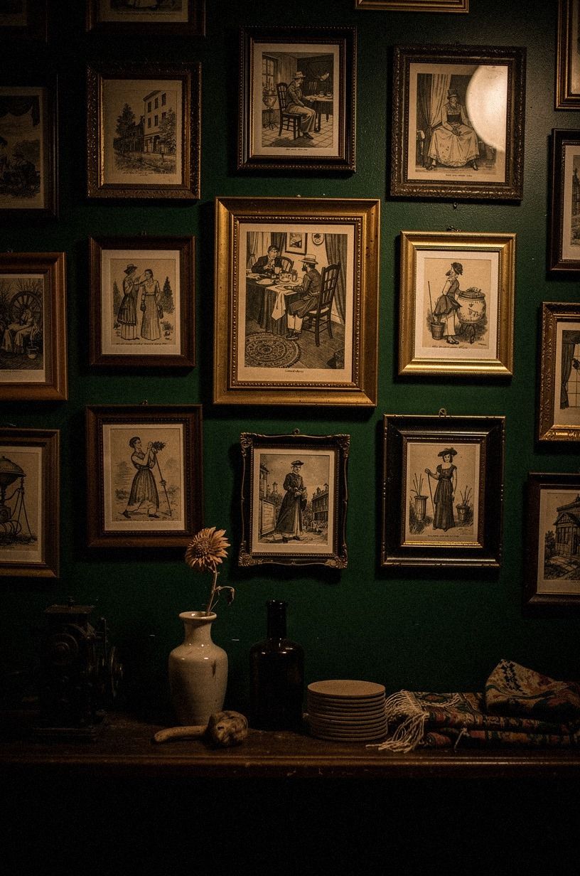
14 Speakeasy Wall Art Ideas With Vintage Prints, Newspaper and Neon
14 october 2026Speakeasy wall art ideas usually cost $200 to $800 for paint, textiles, art, and organization. I learned that after covering a blank wall with tiny prints that looked busy instead of intimate. Your room needs visual rhythm, not more stuff. These ideas make vintage pieces, newspaper, and neon feel collected, warm, and quietly dramatic.
- Layer the Two-Wood Rule around vintage prints
- Hang a newspaper salon wall with uneven spacing
- Build the Three-Height Light Stack for speakeasy wall ideas
- Swap matching frames for an aged-brass grid
- Frame a bar menu instead of another poster
- Use a velvet pinboard for unique wall decoration inspiration
- Paint one arch behind the neon sign
- Should you choose newspaper or neon first?
- Arrange a library ledge with newspaper layers
- Choose dark paint over a gallery of tiny signs
- Mix the Four-Corner Newspaper composition
- Let one neon word interrupt the paper
- Turn a map into the room’s visual anchor
- Install a removable matchbook display
1Layer the Two-Wood Rule around vintage prints
The Two-Wood Rule keeps a speakeasy wall from looking like a themed restaurant. Choose one darker wood, such as walnut, and one lighter wood, such as natural oak.
Your framed walnut poster frame can anchor the arrangement while a narrow oak ledge keeps smaller prints from feeling stiff. I’d skip matching every frame because the room starts looking purchased in one afternoon.
Hang your largest print with its center about 57 to 60 inches from the floor. Then let smaller pieces sit slightly lower, close to the ledge.
A 3/4-inch solid natural oak picture ledge gives your eye a warm horizontal line, and you’ll notice how it catches lamplight after dark. If you’re styling a rental, lean the art instead of drilling.
It’s less dramatic, but your deposit will thank you!
The best version of this arrangement has one piece that feels inherited. Try an old theater program, a sepia botanical print, or a narrow architectural drawing.
The wood should support the paper, rather than compete with it. When the frames have different ages and finishes, the wall feels personal, soulful, and convincingly lived in.
Create a little hierarchy before you hang anything. Let the largest frame carry the visual weight, give the ledge a supporting role, and place the smallest pieces where they can reward a closer look. That gentle progression makes the arrangement feel curated and inviting.
2Hang a newspaper salon wall with uneven spacing
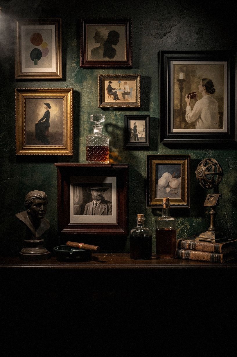
A newspaper salon wall works best when your retro newspaper wall art has room to breathe. Start with one framed front page, one narrow typographic print, and one faded city map.
Your pieces don’t need identical gaps. I prefer 2 inches between related prints and 5 or 6 inches before a larger frame because the irregular pause feels more collected.
Set the arrangement above a warm travertine console, especially if you’ve found an old theater listing or a yellowed newspaper at a thrift shop. You’ll want the glass to protect the paper, but direct afternoon sun can still fade it.
And if your wall is small, keep the salon arrangement vertical rather than wide. A tall grouping makes your ceiling feel higher without asking your room for extra furniture.
A newspaper wall becomes more compelling when every piece has a different visual job. Let one provide dense text, another offer open cream space, and a third introduce a crisp border or map line. That contrast creates a nostalgic, layered effect without making the whole arrangement feel cluttered.
Before hanging anything, place the frames on kraft paper cut to their sizes. Move the shapes around until the arrangement feels slightly unexpected.
You’re looking for balance, not perfect symmetry. The wall should feel edited, atmospheric, and quietly confident.
Vary the emotional tone as well as the scale. A serious headline can sit beside a tender theater advertisement, while a faded map adds a wistful sense of place. Those small contradictions keep the wall from feeling like a showroom display.
3Build the Three-Height Light Stack for speakeasy wall ideas
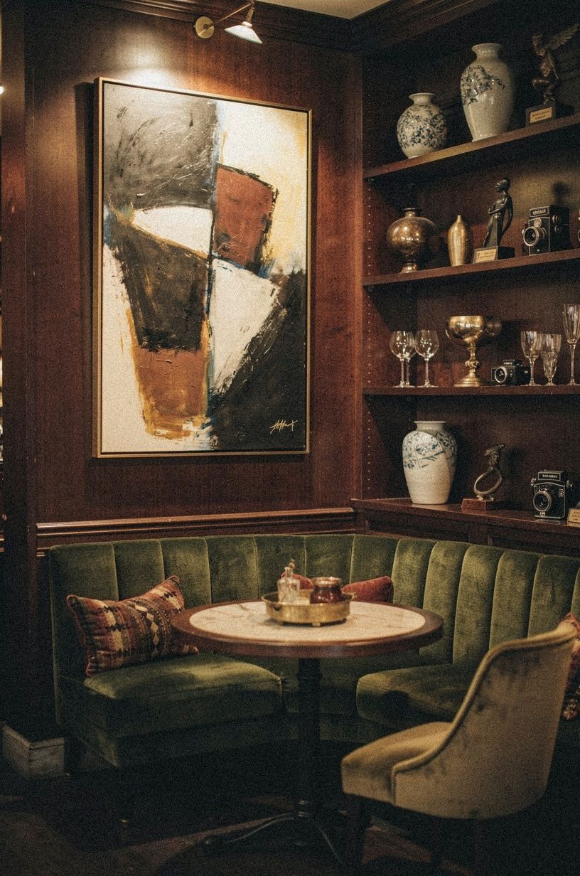
The Three-Height Light Stack gives your wall depth after the overhead fixture goes off. Place a low table lamp, a middle-height framed print, and a high accent such as a small unlacquered brass sconce. Your eye moves upward in a relaxed way, and the wall won’t read as a flat collection of rectangles.
I made the mistake of using three lights with the same warm bulb once. The glow became muddy, so now I vary the placement instead.
A lamp at table height, a plug-in sconce around eye level, and a tiny neon sign above the art give you three distinct pools of light. You’ll want the neon to be the smallest source, rather than the brightest one.
Otherwise, the wall starts shouting before anyone has had a drink.
Use a 2700K amber bulb in the table lamp and a slightly softer bulb in the sconce. The difference is subtle, but it makes the wall feel more cinematic. A linen drum shade can soften a hard beam, while a smoked-glass lamp adds a moody glint without taking over.
Leave enough darkness between the light sources. The shadows are part of the atmosphere. If every corner glows equally, the wall loses its mysterious quality and starts to resemble a showroom.
Think of the stack as a slow visual rhythm. The lowest light should feel useful, the middle element should feel decorative, and the highest glow should provide the little jolt of theater. That balance makes the entire wall feel richer after sunset.
4Swap matching frames for an aged-brass grid
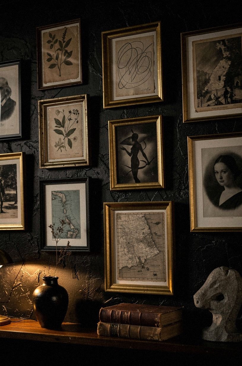
Oversized-chip terrazzo can make inexpensive prints feel connected, but a perfect grid can make your wall feel corporate. Choose oversized-chip terrazzo frames in two widths, then line up one edge while allowing the other edges to shift.
Your arrangement will look intentional without becoming rigid. I’d avoid a high-gloss finish because it reflects the room too sharply and competes with the art.
For a calmer base, paint the wall in Farrow & Ball Pigeon No.25. Its muted blue-gray undertone lets sepia paper, black ink, and warm metal sit together without turning the wall orange.
You can use five 8-by-10-inch frames around one 18-by-24-inch print, then leave a little breathing room at the bottom. It’s a small change, but your wall will feel older and more settled.
Oversized terrazzo works particularly well beside tobacco-colored paper, dark wood, and faded green. If the frames look too bright, let their edges remain slightly irregular instead of distressing every surface. One imperfect frame is more convincing than an entire collection made to look old.
The grid also gives you a useful boundary. Keep the outside edges fairly disciplined, then allow the paper inside to vary. That contrast creates a handsome tension between structure and history.
For extra warmth, let one frame hold something unexpectedly delicate. A botanical study or handwritten menu can soften the stern geometry of the grid. That single tender detail makes the composition feel human.
5Frame a bar menu instead of another poster
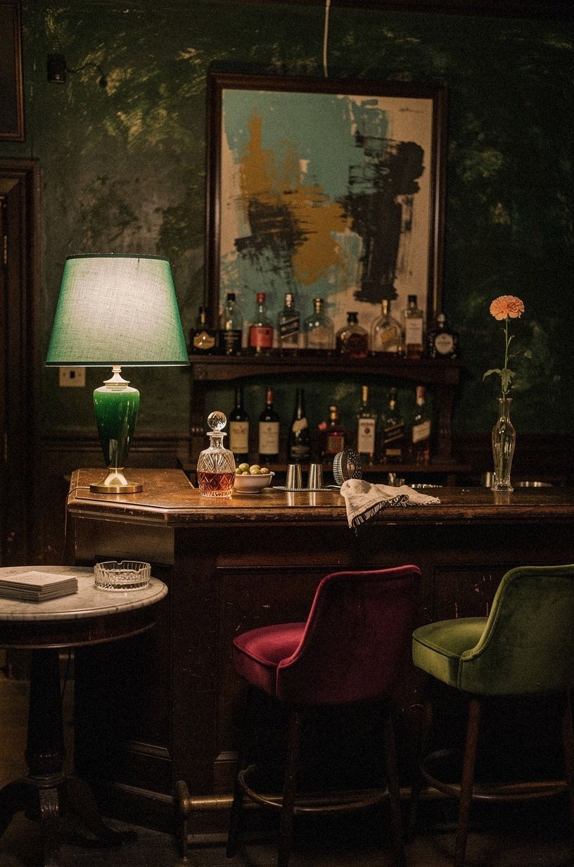
A framed bar menu gives your wall a story, rather than just a color scheme. Look for a menu with visible pricing, uneven type, or a dated illustration, then place it in a natural wood frame with a warm white mat against a wall finished in hand-applied Venetian plaster. Your eye gets a tiny narrative to read, and guests tend to stand there longer than they do beside a generic cocktail print.
I’d skip fake distressing on new paper. It often looks too even, while a real crease or faded corner gives you something honest.
If you’re making your own menu, use cream cardstock and one serif typeface, then keep the ink black or deep brown. A little restraint helps your speakeasy wall ideas feel intimate, and you won’t need six decorative signs to explain the mood.
Try displaying the menu beside something that contradicts it. A delicate floral study, a small city map, or an elegant architectural sketch can keep the wall from becoming too literal. The menu provides humor and history, while the quieter piece gives the eye somewhere to rest.
If the menu is valuable, use UV-filtering acrylic rather than ordinary glass. It’s lighter, safer above a console, and kinder to fragile paper. A thin mat will also keep the document from touching the glazing.
The most charming menus often have a little imperfection. A crooked price, a faded letter, or a faint coffee mark can make the piece feel wonderfully specific. Preserve those clues instead of trying to make the document look pristine.
6Use a velvet pinboard for unique wall decoration inspiration
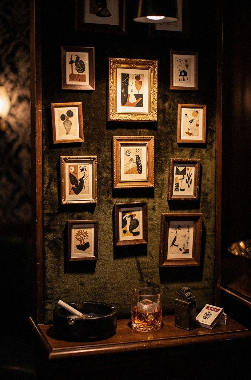
A pinboard can hold newspaper clippings, matchbook art, postcards, and temporary notes without damaging every piece. Cover a terracotta velvet board with a slim oak frame and a small olive shagreen accent, then pin only five or six items at a time. Your wall will feel alive, but you’ll still have space to change the display when the season shifts.
The material matters here. Thin felt looks crafty, while 18-ounce cotton velvet gives you a richer surface and hides tiny pinholes.
You’ll want to keep the board away from a sunny window because paper and velvet both fade. And honestly, a pinboard is more useful than a fixed collage if you’re still deciding what your room wants to be.
It lets you edit without starting over.
Use brass map pins for a refined finish, or choose black pins if the board already has warm color. Keep a few pieces partially overlapping. That little bit of layering feels spontaneous and makes the display more generous.
The pinboard can also hold practical fragments: a handwritten drink recipe, a matchbook from a favorite restaurant, or a postcard from a memorable trip. Those details make the wall feel lived-in, rather than merely decorative.
Change one or two pieces every few months. A winter postcard, a new menu, or a bright matchbook can refresh the entire corner without a costly makeover. That flexible quality is what makes the pinboard especially appealing in a small room.
7Paint one arch behind the neon sign
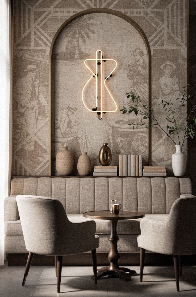
A painted arch can make a small neon sign feel architectural.
8Should you choose newspaper or neon first?
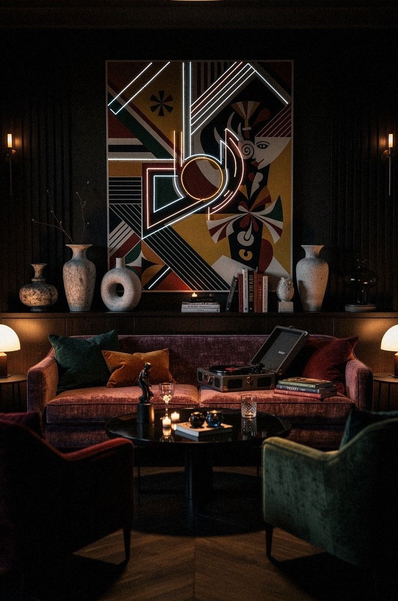
Choose newspaper first if your room already has strong lighting, reflective metal, or a busy bar cart. Choose neon first if the wall is visually quiet and you need one clear point of energy.
Your decision should follow the room’s existing noise, rather than a trend photo. Why make the brightest object compete with six other focal points?
I’d choose one hand-painted neon-style sign over several small glowing pieces. A single phrase, symbol, or cocktail glass shape gives you a readable silhouette, while multiple signs can flatten the wall into a storefront.
You’ll want a dimmer if the sign allows one, and you should place it around 60 inches from the floor. The softer glow will feel warmer at night.
Newspaper is the better first choice when you want texture, history, and a quieter mood. Neon is better when the room needs movement or a playful jolt.
Either way, leave a calm area around the focal piece. The empty space is what makes the dramatic element feel special.
A warm sign beside faded grey paper can be beautiful, but avoid placing neon directly over dense black text. The glow will make the arrangement difficult to read. Let the light interrupt the display, rather than erase it.
Ask yourself which element you’ll still love when the trend has passed. Newspaper usually brings a more timeless, literary feeling, while neon adds instant personality and a touch of mischief. The strongest walls often let one lead and the other play a supporting role.
9Arrange a library ledge with newspaper layers
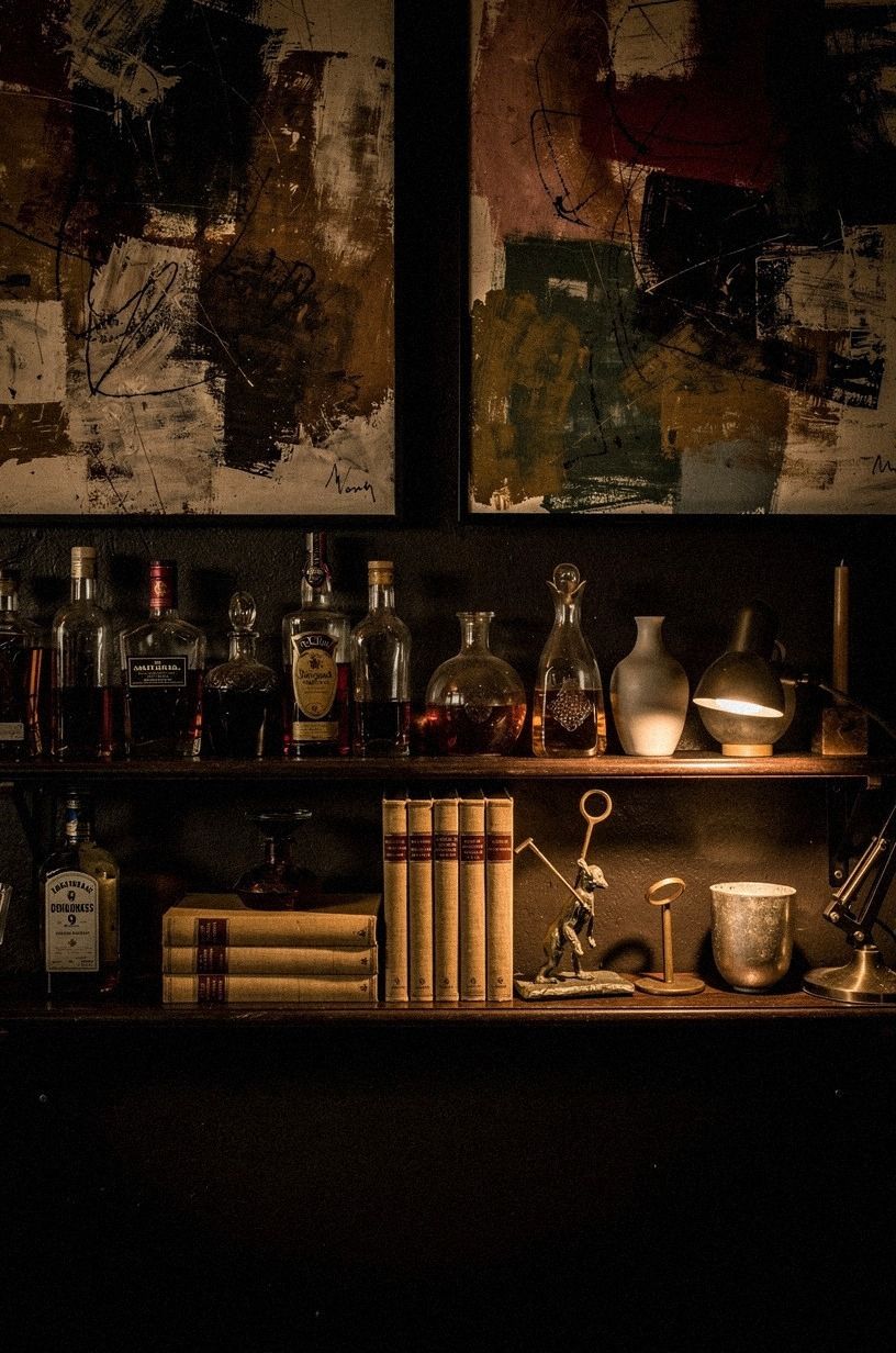
A narrow ledge turns your wall into a shallow library, which suits speakeasy wall ideas especially well.
10Choose dark paint over a gallery of tiny signs
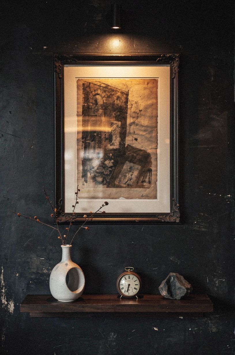
Dark paint often creates more atmosphere than a gallery of tiny signs. Benjamin Moore Essex Green HC-188 can work in a room that needs a rich emerald backdrop, while warm cream and muted gold accents keep the result from feeling heavy.
I’d choose the wall color first, then select paper and metal around it. Starting with accessories usually leaves you trying to force the room into agreement.
Use three larger works instead of twelve small ones. A 24-by-36-inch print, a 16-by-20-inch newspaper, and one narrow vertical piece can fill a wall while preserving quiet space.
Your framed pieces will look more important, and you’ll spend less time correcting uneven gaps. But if your rental rules forbid paint, removable wallpaper in a matte emerald pattern can give you a similar backdrop without a permanent commitment.
A dark wall doesn’t have to be black. Deep emerald, warm cream, and antique gold can create a rich background while preserving softness. Test the color in both daylight and lamplight.
A shade that feels elegant at noon may become surprisingly dramatic after sunset.
A deep-pile mohair velvet cushion or chair can soften the harder surfaces nearby. One warm white mat can create a memorable flash against the paint, while several can make the wall feel busy. Dark art often looks best with a narrow border and plenty of surrounding color.
Before committing to a full wall, paint a large sample beside your light sources. Watch it in the morning, late afternoon, and evening. The most beautiful dark colors reveal different undertones throughout the day, and that changing quality gives the room a particularly seductive atmosphere.
11Mix the Four-Corner Newspaper composition
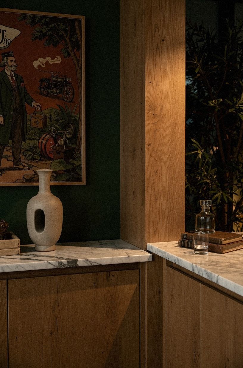
The Four-Corner Newspaper composition gives a square wall a clear structure. Put one large print in the center, then use four smaller pieces around it: a headline, a map, a theater bill, and a botanical or architectural sketch. Your corners create movement, while the center keeps the arrangement from wandering.
Use museum board backing for delicate paper and keep the palette narrow. Black ink, faded cream, tobacco brown, and one muted red are enough. I’d skip adding blue unless your room already has it because cool accents can make old paper look gray.
You’ll want each piece to offer a different shape or texture, so your wall feels layered rather than repetitive.
The center doesn’t have to be the largest frame. A bold headline can act as the anchor even when it occupies less space.
Around it, use quieter pieces with generous mats. This gives the arrangement a visual hierarchy and stops every corner from demanding attention.
Measure from the center outward rather than starting with the outside edges. That method keeps the composition connected. If the outer pieces drift a little, the result can feel collected and charming instead of mechanical.
Give each corner a different emotional temperature. One can be witty, another historical, another delicate, and another mysterious. That subtle variation prevents the composition from becoming predictable while keeping the overall arrangement wonderfully cohesive.
12Let one neon word interrupt the paper
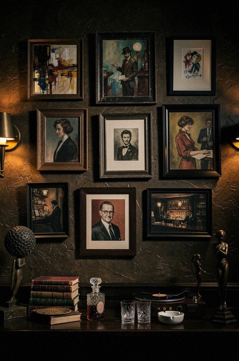
One neon word can interrupt a serious paper display in the best way.
13Turn a map into the room’s visual anchor
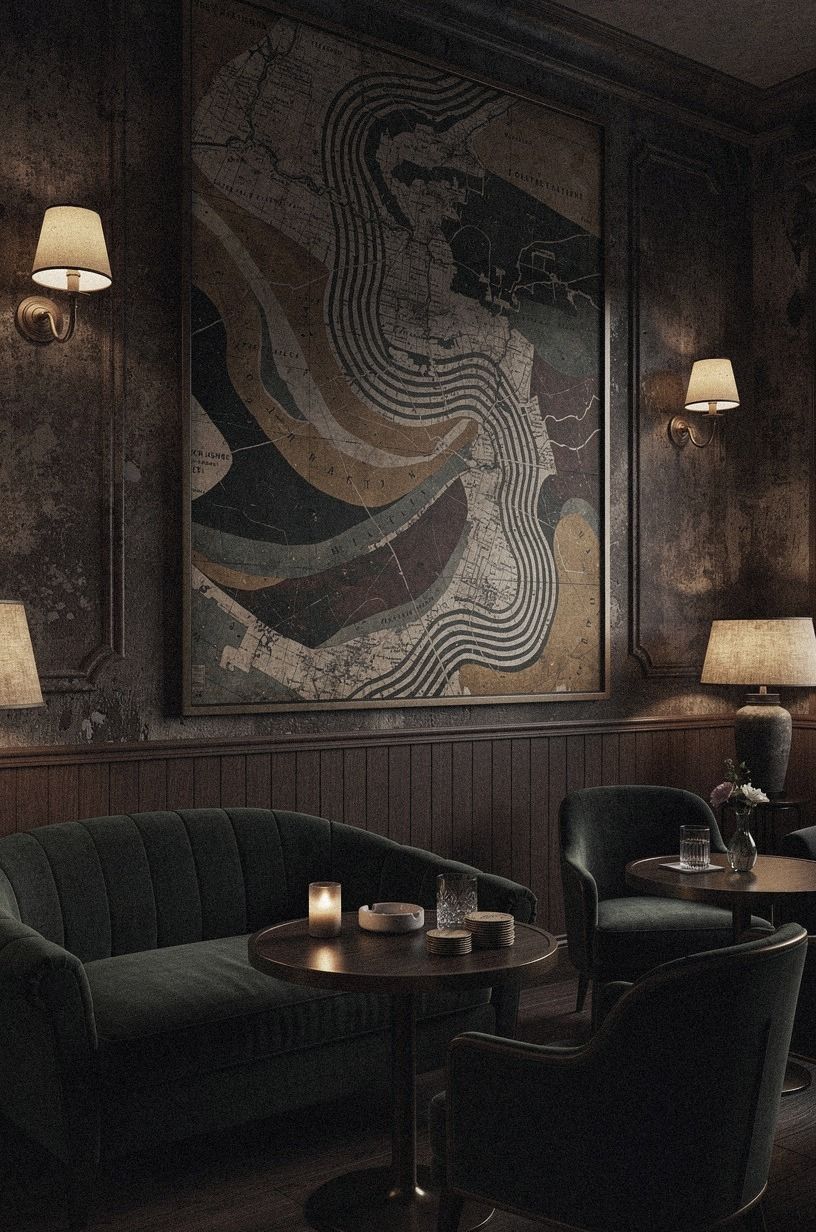
A vintage city map can anchor your wall without leaning too hard into bar decor. Choose a map with warm white paper, camel-toned roads, and black accents, then place it above a Calacatta marble console with subtle gold veining. Your map becomes the large quiet shape, while newspaper and neon provide the smaller moments around it.
Center the map at 57 to 60 inches from the floor, then let the surrounding art sit slightly above or below that line. I’d skip a map with too many saturated colors because it will compete with every lamp and textile nearby.
If you’re styling a narrow hallway, use a portrait-oriented map and one slim black frame. You’ll make the passage feel intentional without reducing its walking space.
A map becomes more personal when it connects to your life. Pick a city you love, a neighborhood where you once lived, or a place that still makes you curious. Even guests who don’t recognize every street will understand that the piece has meaning.
Pair it with one contrasting object, such as a small black matchbook, a cream theater bill, or a charcoal sketch. Avoid surrounding the map with several other maps. One strong geographic anchor is memorable; a wall full of them can feel like a travel agency.
Consider choosing a map with one imperfect feature, such as a soft crease or a slightly faded corner. Those marks give the piece a tender, authentic quality. Frame it carefully, but let its history remain visible.
14Install a removable matchbook display
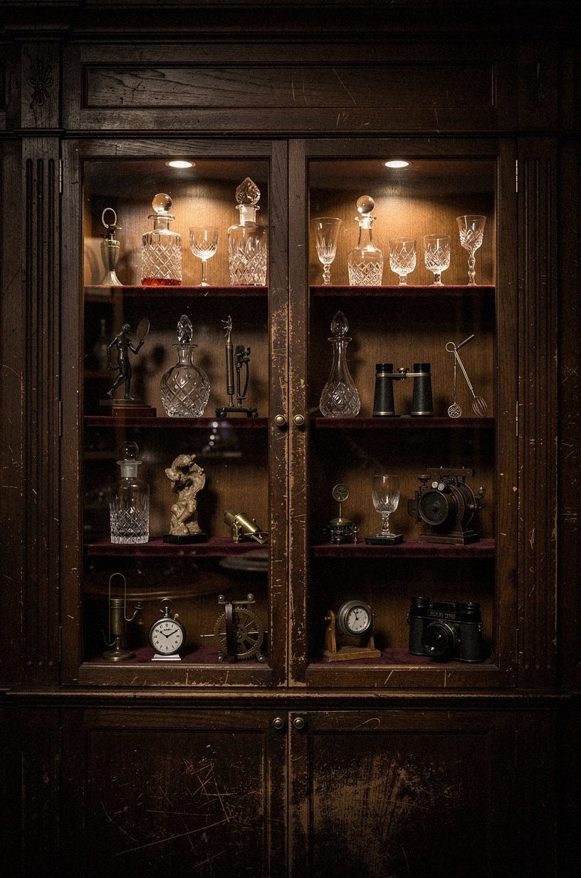
A removable matchbook display gives you a flexible way to show tiny objects without covering the wall in holes. Use a cerused white oak shadow box or a shallow cabinet with removable mounting strips, then arrange matchbooks, ticket stubs, and small cards by color. Your collection gets protection, and you can take it with you if you move.
Keep the display at eye level and away from direct heat. You’ll want to leave the background visible, so six to ten objects are enough for a compact box.
I’d avoid arranging everything by exact size because the display will look like a catalog. Let one copper matchbook, one ivory ticket, or one crooked card break the pattern.
That small irregularity gives your wall its personality!
Use the cerused white oak backing if the objects are colorful, or choose midnight blue paper when the collection is mostly cream, copper, and black. A tiny brass label holder can add structure, but don’t label every item. The pleasure is in noticing the details gradually.
If you’re worried about dust, choose a hinged shadow box with a secure closure. Keep combustible paper away from radiators, candles, and hot bulbs. The display should feel nostalgic and safe, rather than precious or fussy.
Leave a little room for the collection to grow. A display that’s slightly underfilled feels more generous and gives future souvenirs somewhere to belong. That open space also keeps the tiny objects from becoming visually noisy.
What These Walls Cost in Real Life
A speakeasy wall can stay modest if you begin with paint, thrifted paper, and one strong frame. Your cost rises when you add accent furniture, custom lighting, or millwork. These typical US ranges give you a useful starting point, and you can build the wall in stages instead of buying everything in one weekend.
A wool rug may run $400-$1,500, linen drapes for a pair often land around $120-$400, and a statement light fixture can cost $150-$800. DIY paint for a room sits around $200-$600 in the supplied US ranges. You’ll want to spend first on the piece that changes how the wall reads, rather than on five small accessories that disappear.
A sensible first purchase is usually a large frame, a quality lamp, or the paint. Those elements establish scale and atmosphere. Decorative pieces can come later, once you know whether the wall needs warmth, contrast, or a little more restraint.
For the most affordable path, begin with what you already own. A meaningful ticket, inherited frame, or old postcard can provide more character than a matching set bought in a hurry. Spend where the wall lacks something essential, whether that’s height, illumination, or a stronger anchor.
Why I’d Keep the Wall a Little Imperfect
I’ve styled enough themed corners to know that the most convincing ones don’t look as if someone ordered a complete package. My first speakeasy wall had a neon cocktail glass, three framed cocktail recipes, and a faux newspaper print.
It looked good at first, but in person it felt flat. The pieces were all making the same point, so the room had nowhere to go.
Now I look for tension. A serious city map beside a playful sign.
A crisp brass frame beside a scratched wood ledge. A newspaper with hard black type under a lamp that throws a soft amber pool across the wall.
Your eye needs one quiet element to make the louder one feel louder.
I also believe the wall should reveal something about the person living there. A real ticket from a night you remember will beat a generic print every time, even if its edges are crooked. That’s why I’d rather see one meaningful object, one useful light, and one well-chosen frame than a packed arrangement bought all at once.
And I don’t think you need a dark room to make this work. Farrow & Ball Pigeon No.25 can feel moody without closing in, while Benjamin Moore White Dove OC-17 gives old paper a cleaner backdrop.
Your light, rather than just your paint, controls the atmosphere. Start with three sources, overhead, task, and ambient, then soften the brightest one.
The wall should make you want to stay, not make you squint.
There’s also freedom in leaving one section unfinished. A blank patch can make the collected areas feel more deliberate, and it gives you room to add something meaningful later.
Resist the urge to complete the wall simply because there’s space. A little restraint is what keeps the room seductive.
The goal is a wall with a pulse. Let one object carry memory, another provide useful light, and a third bring surprise. When those roles are clear, the result feels intimate, theatrical, and entirely your own.
What People Always Want to Know
What is the best Speakeasy Wall Art Ideas for a small wall?
A framed newspaper, one walnut ledge, and a small IKEA KALLAX birch-effect cube make a strong small-wall grouping. Your best choice is a vertical arrangement because it uses height without crowding the floor. Keep the center around 57 to 60 inches high, and leave one quiet section of wall visible.
Where can I buy speakeasy wall art pieces on a budget?
Look at IKEA, Wayfair, and Target for frames, ledges, and simple lighting. Your best paper finds may come from Facebook Marketplace, thrift stores, or estate sales. I’d inspect the print for fading and odor before buying, then spend your money on archival matting instead of a decorative frame.
How much does a speakeasy wall art makeover cost?
A small makeover usually fits within the $200-$800 budget range when you use paint, thrifted art, textiles, and basic organization. You can spend nothing on new art if you already have tickets, maps, menus, or postcards. Your main upgrade may be one good lamp.
Can I create a speakeasy wall art look on a budget?
Yes, and you can start with three free moves: rearrange paper you own, paint a small arch, and print a personal map or menu. A thrifted frame and removable hooks keep costs low. You’ll get more impact from one large piece than from many tiny purchases.
Is speakeasy wall art worth it in a small space?
Yes, because a small wall can hold a clear story without needing bulky furniture. Use one vertical map, one narrow ledge, and a low-glow light. Your arrangement should stay shallow, and you’ll want furniture to overlap the rug if one is nearby so the room feels connected.
Is speakeasy wall art a good idea for a rental?
Yes. Use removable mounting strips, a tension-mounted picture ledge, peel-and-stick wallpaper, and a plug-in sconce.
Your landlord won’t see permanent holes, and you can pack the display when you move. I’d test every removable product on an unseen patch first.
Where I’d Start First
If I had to pick one, I’d start with the framed newspaper salon wall. Real paper gives your room a story, and uneven spacing keeps it from looking showroom-flat. Pin that arrangement for later, then let one small neon sign bring the glow after sunset.


