14 White & Oak Kitchen Ideas for a Bright-Meets-Warm Combo That Still Feels Cozy
14 october 2026White and oak kitchens feel warm when the white has depth and the oak has texture. I learned that after pairing icy cabinets with pale oak and wondering why the room felt like a showroom. A warmer white, visible grain, and layered lighting fixed it. The difference was immediate!
If you’re planning your palette, start with the warm white cabinet approach, then consider layered lighting and realistic renovation costs before buying anything.
- Paint the uppers in Benjamin Moore White Dove
- Why Does the Two-Wood Rule Work?
- Float a chunky oak island
- Swap cold hardware for unlacquered brass
- Layer the Three-Height Light Stack
- Frame the sink with a tactile backsplash
- Wood Cabinets vs. White Countertops
- Farrow & Ball Studio Green for One Grounded Wall
- Mix white kitchen wood cabinets with open shelving
- Set the budget before you choose the finish
- Anchor the room with a warm floor
- Hang a woven light over the breakfast nook
- Use Sherwin-Williams Evergreen Fog for the lower cabinets
- Style the counter with useful warmth
1Paint the uppers in Benjamin Moore White Dove
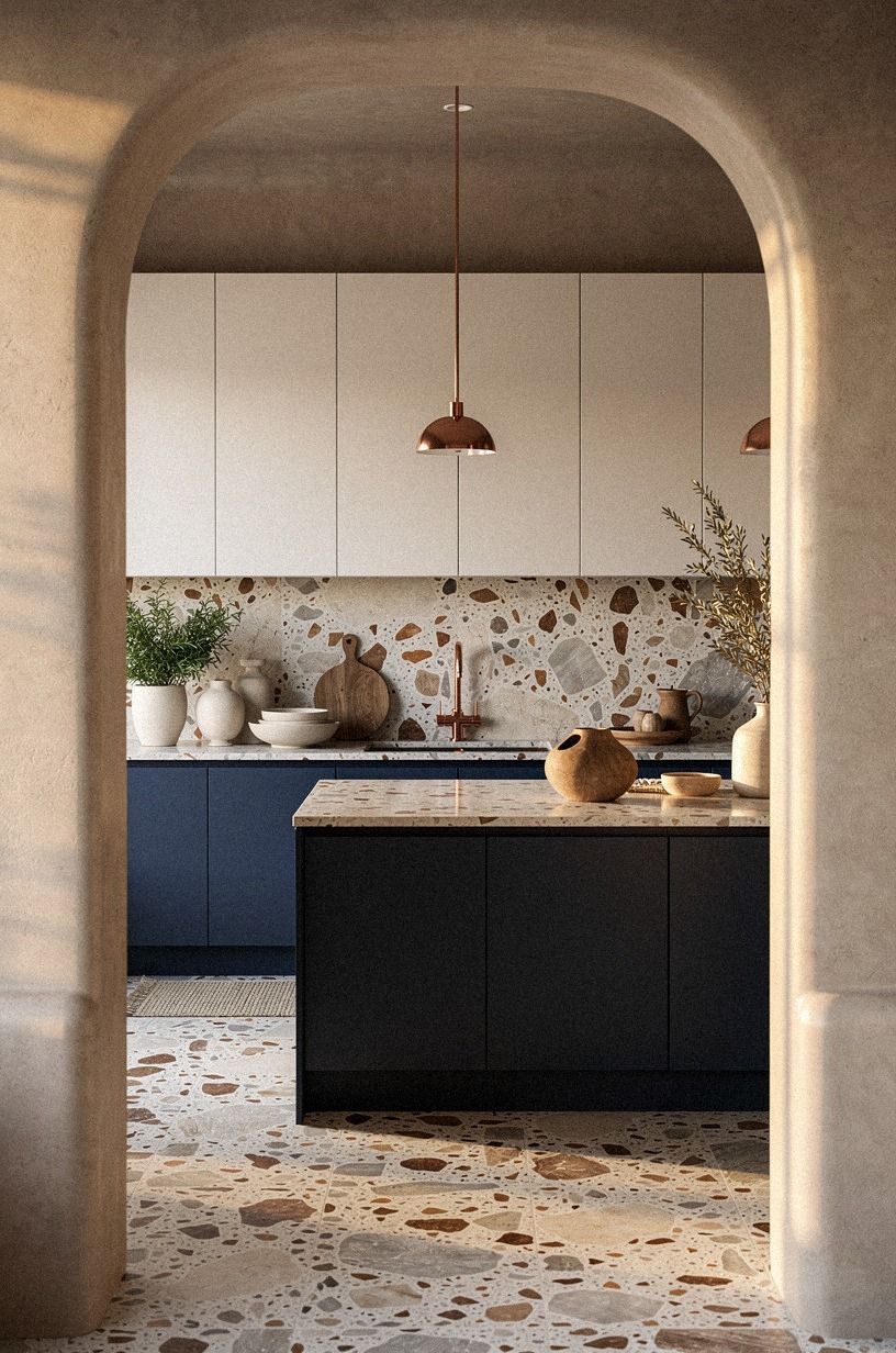
Start with Benjamin Moore White Dove OC-17 on the upper cabinets if you want a bright kitchen that still feels soft. Its warm undertone sits comfortably beside midnight blue cabinetry, copper accents, and ivory surfaces, especially where an oversized-chip terrazzo counter adds scale. I’d skip a stark blue-white because it makes those warmer materials look flat by comparison.
Your counter height will usually sit around 36 inches, so the lower cabinets occupy a large visual band. Keep that band calm with slab fronts or Shaker fronts, then let the midnight blue and terrazzo bring movement.
If your room faces north, test the paint in the morning and late afternoon. It’s warmer than many whites, but it won’t read creamy in every light.
For a small kitchen, use the same white on the walls and uppers. The cabinets will recede, while copper hardware or an oversized-chip terrazzo surface will give the eye somewhere to land. That’s the balance I’d choose over matching white everywhere.
For more warmth underfoot, connect the paint choice with the oak flooring strategy. A consistent undertone will make your whole kitchen feel intentional, airy, and settled.
2Why Does the Two-Wood Rule Work?
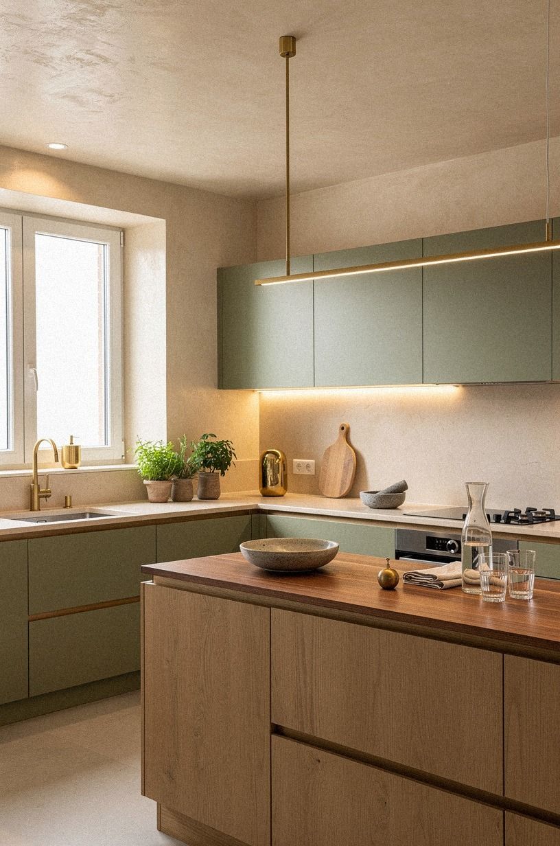
The Two-Wood Rule keeps a white kitchen from looking flat: pair one consistent natural-wood element with one quieter accent, then use sage green, warm cream, and hand-applied Venetian plaster to add depth.
3Float a chunky oak island
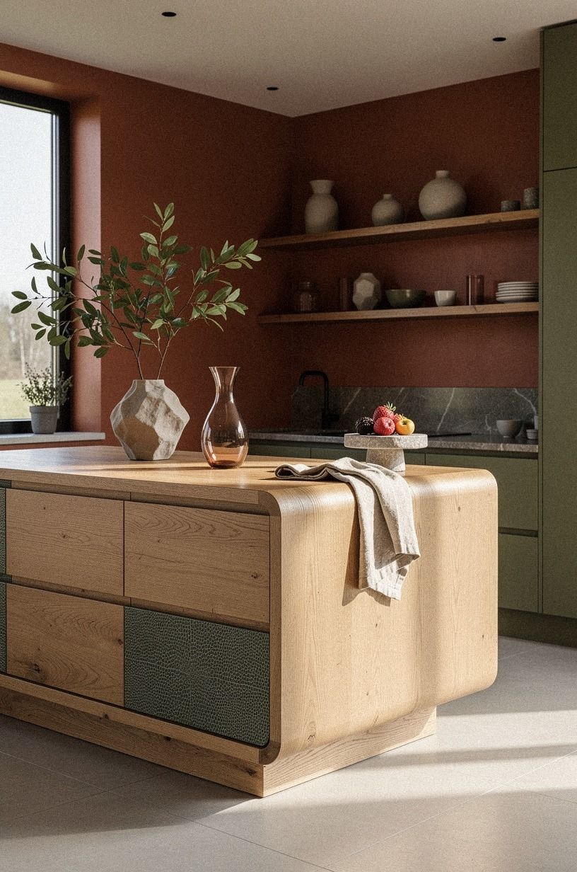
A floating island makes a white kitchen feel less fitted and more collected. Choose a chunky island in a terracotta-toned finish with a stone surface, then leave enough visible flooring around it that the island appears to sit lightly in the room. The effect is especially useful when your cabinets run wall to wall.
Your island needs practical breathing room. Keep 42 to 48 inches of clearance all around, so doors can open and two people can pass without turning sideways.
I’d rather see a smaller island with comfortable circulation than a huge block that steals every walking path. What good is extra prep space if you can’t move around it?
Use a waterfall edge only if the stone slab is thick enough to look intentional. A thin edge can seem decorative in the wrong way. Olive-toned accents and a single ceramic pendant will keep the island warm, while a touch of shagreen adds texture without introducing another competing finish.
If your floor is already busy, choose a quieter island face. If your floor is plain, the terracotta surface can create the warm floor anchor your room needs.
Your island can also serve as the emotional center of the kitchen. A generous overhang, a comfortable stool with shagreen upholstery, or a small vase of branches can make it feel welcoming rather than purely functional!
4Swap cold hardware for unlacquered brass
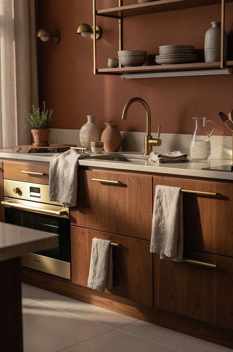
Hardware is a small surface, but your hands notice it every day. Aged brass develops a mellow patina that makes a white kitchen feel more personal and lived-in.
Choose cup pulls for drawers and simple brass knobs for doors if you want a traditional feeling. Bar pulls create a cleaner, more modern line. I’d keep the profile consistent rather than mixing several dramatic shapes.
Your faucet can match the hardware, but it doesn’t have to. An aged brass faucet with clay-toned cabinetry or a washed Belgian linen shade can look handsome when the rest of the palette stays quiet. Use the three-height lighting stack to keep the metal from becoming the only source of visual interest.
I wouldn’t polish every piece until it shines. A little variation helps your kitchen feel like yours, especially once the brass begins to age.
5Layer the Three-Height Light Stack
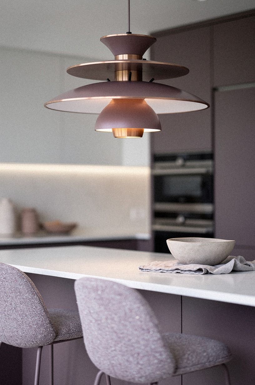
The Three-Height Light Stack uses a ceiling fixture, under-cabinet light, and low glow near the floor or counter. A white kitchen needs this layering because one overhead bulb can flatten the oak and make every surface look equally bright.
Start with warm under-cabinet lighting beneath the uppers. Add a pair of rose-gold sconces or pendants at eye level, then place a small organic-bouclé lamp on an open shelf or counter corner. The lamp’s soft pool should stop near the edge of the cutting board, not flood the whole room.
Your backsplash gap will often be about 18 inches between the counter and uppers, which gives you enough room for a compact fixture or carefully placed art. I made the mistake of using only recessed lights once.
The oak looked dull after sunset, and the room felt like a workplace. A layered setup fixes that fast!
Choose bulbs between 2700K and 3000K if you want a flattering atmosphere that supports plum, grey, and rose-gold accents. Cooler bulbs can make warm white paint look gray and make your oak feel strangely orange.
The most effective lighting plan is usually the least showy. When you can dim each layer, your kitchen can feel crisp in the morning, focused at dinner, and wonderfully intimate late at night.
If you’re unsure where to begin, install the under-cabinet layer first, then add one visible glow. You’ll notice the difference before you buy another decorative object.
6Frame the sink with a tactile backsplash
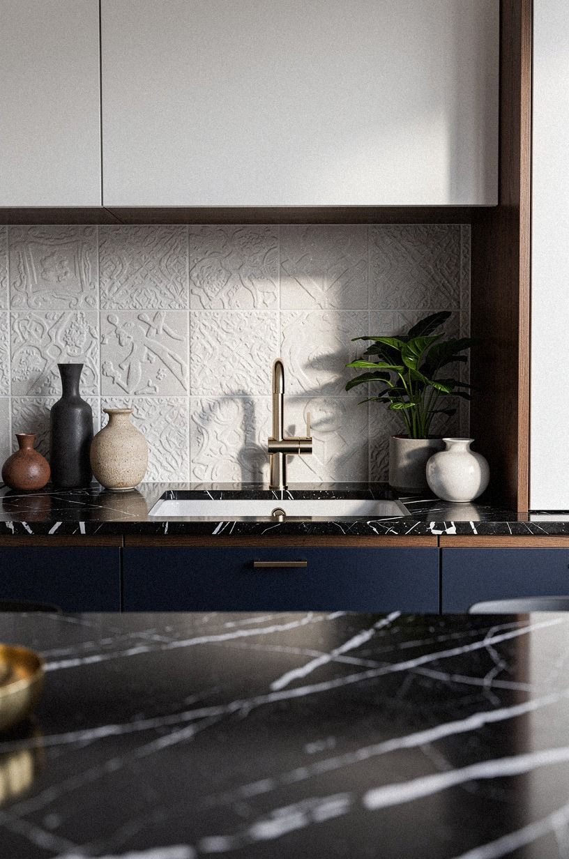
A white and oak kitchen benefits from a navy-and-white backsplash with visible variation, such as Nero Marquina black marble with white veins around the sink.
7Wood Cabinets vs. White Countertops
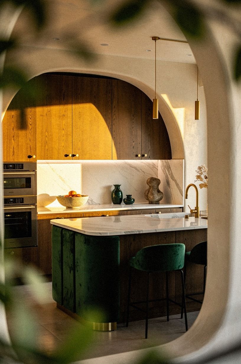
A wood cabinet and white countertop combination works best when the counter has a little movement. A cream surface with restrained gold veining can sit beside emerald cabinetry, while deep-pile mohair velvet on a stool adds softness.
If your cabinetry is strong in color, choose a counter with a quiet ground and restrained veining. A bright white surface with sharp gray lines may make the room feel cooler than you intended. I’d bring a sample home and place it beside the cabinet color in both daylight and evening light.
If your palette is mostly cream, you can take more creative freedom. A softly textured counter and a mohair seat will add a graceful pattern without overwhelming the cabinetry. You don’t need the countertop to repeat every color in the backsplash.
Edge details matter, too. A simple eased edge feels modern and calm, while a small bevel adds a more traditional note. Keep the profile consistent with your hardware and cabinet doors.
For a useful comparison, revisit the tactile backsplash approach and the counter styling plan. Those surfaces decide whether the white feels crisp or sterile.
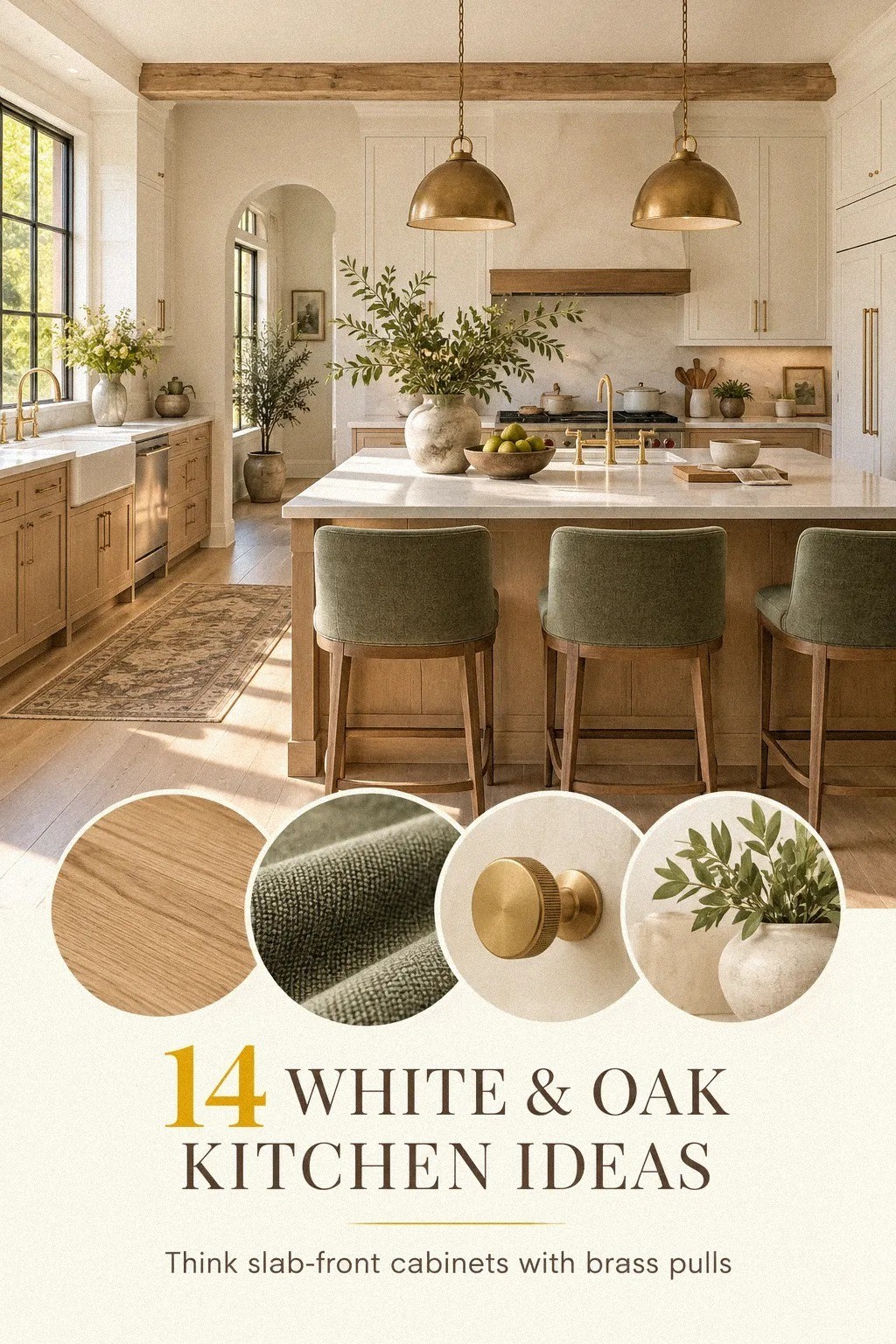
8Farrow & Ball Studio Green for One Grounded Wall
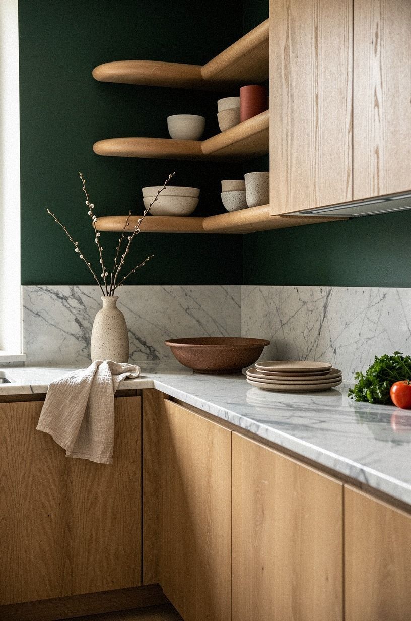
A single deep wall can make white cabinets and oak look richer. Farrow & Ball Studio Green No. 93 works well on a pantry wall, breakfast nook, or short return wall where you want a grounded moment without darkening every cabinet.
Your room needs daylight for this color to feel lush rather than nearly black. Test a sample beside the oak at several times of day.
I’d avoid using it on every wall in a small kitchen unless you want a moody, intimate result. The white cabinetry will still provide brightness, but the room won’t feel as open.
Pair the paint with natural oak, a rust-colored textile, and Carrara marble with subtle gray veining. The contrast is dramatic but calming because the natural materials soften the depth. And if you change your mind later, repainting one wall is far less disruptive than replacing a full cabinet run.
This shade works especially well when the rest of your kitchen is restrained. Let the wall be the confident move, then keep the terracotta lower cabinets as a warmer alternative if you prefer less contrast.
A deep green can make ordinary moments feel special. Morning coffee, grocery unpacking, and late-night cleanup all gain a little atmosphere from that rich backdrop!
9Mix white kitchen wood cabinets with open shelving
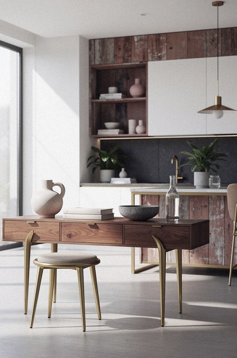
Open shelving can make white kitchen wood cabinets feel less formal. Use reclaimed weathered teak for the shelves, then bring in dusty rose, charcoal, and brass through the surrounding details.
10Set the budget before you choose the finish
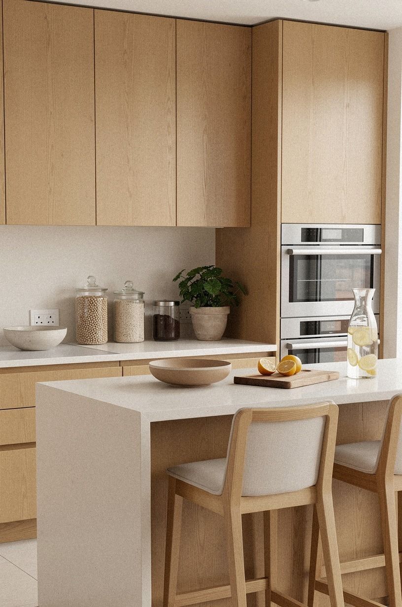
White and oak kitchen ideas can range from a small cosmetic refresh to a full remodel, so your first decision should be financial. Paint, hardware, and lighting may change the feeling of the room without touching the cabinet boxes. New fronts and counters move the project into a different category.
Use these typical US ranges as a planning frame. They’re broad because labor, room size, and material choices vary, but they help you see where a cosmetic project ends and a renovation begins.
If your budget is limited, start with warm white paint and black accents before replacing counters. A calm white and a few darker details can shift the whole room for less than a cabinet rebuild. If you splurge on the surface, Calacatta marble with gold veining can make the scheme feel considered without adding many accessories.
A lighting upgrade can also have an outsized effect. If you’re comparing priorities, review the floating island proportions only after you’ve handled the room’s basic illumination.
Keep a contingency of at least 10 to 15 percent for installation surprises. Old walls, uneven floors, and delayed materials can turn a beautiful plan into a stressful one if you leave no financial breathing room.
The most satisfying renovation isn’t always the largest. A focused, confident update can feel fresh, elegant, and complete.
11Anchor the room with a warm floor
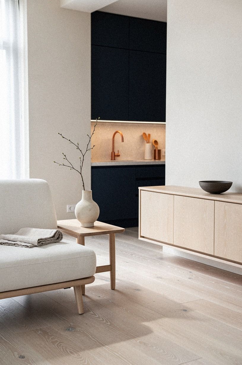
A white kitchen often needs a floor that doesn’t disappear. Cerused white oak flooring, ivory stone, and softly muted surfaces can provide the grounded base that pale cabinets lack, while midnight blue and copper accents give the room definition.
Look at your floor sample beside the cabinet paint before you commit. If the oak floor is too yellow and the cabinets are cool white, each surface will make the other look more extreme. I’d choose a floor with a soft, muted undertone so your island and cabinets can carry the focus.
Wide planks create a calmer surface, while narrow planks or parquet bring more movement. You don’t have to match the floor exactly to the island. In fact, a slight difference often makes the room feel more layered.
If your existing floor is dark, a large woven runner can soften the transition without replacing it. Choose a washable wool or cotton blend near the sink and prep zone. You’ll get warmth underfoot, and you won’t need to protect every inch of the floor.
Use this foundation with the warm white cabinet approach and the woven breakfast-nook light. The combination gives you texture at eye level, overhead, and underfoot.
12Hang a woven light over the breakfast nook
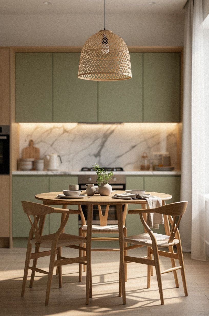
A woven pendant gives a white kitchen a softer silhouette. Choose a backlit translucent onyx fixture over a breakfast table or small corner bench, where its warm cream glow can sit beside sage green and natural wood.
Keep the fixture high enough that it doesn’t block conversation, but low enough to create a defined zone. Your nook should feel separate from the work area without needing another wall. A 2700K warm bulb behind the onyx will cast a gentle glow across the table after sunset.
I’d avoid placing a highly sculptural pendant over an island and another over the nook unless the shapes relate. One can be the focal point; the other should be quieter. And if you’re working with a compact layout, a single translucent shade may do more than several small decorative lights.
For a more layered plan, pair the pendant with the warm floor approach. The combination of a soft onyx glow above and natural grain below feels relaxed, tactile, and welcoming.
A breakfast nook doesn’t need to be large. Even a narrow bench and a small round table can create a charming pause in an efficient kitchen.
13Use Sherwin-Williams Evergreen Fog for the lower cabinets
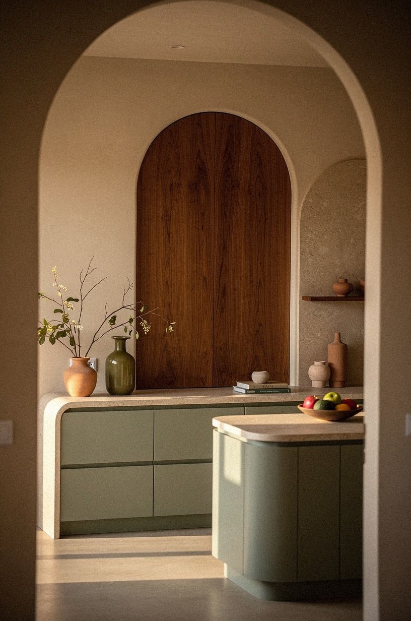
If white uppers feel too expected, let the lowers move toward a terracotta tone and keep the upper cabinets warm white. The earthy color sits naturally beside stone and olive accents, especially when book-matched walnut brings warmth and pattern.
Your lower cabinets can carry more color because the counter breaks up the transition. The white upper half keeps the room bright, while terracotta adds an earthy, serene base. I’d choose this over a saturated red in a small kitchen because it has enough character without swallowing the light.
Pair the cabinets with book-matched walnut panels or a small walnut accent, then soften the scheme with linen. Don’t match every olive or terracotta object exactly.
A little variation makes the palette feel gathered over time. If you’re painting existing fronts, sample two coats on a removable door before committing.
This is a warmer alternative to a full Studio Green accent wall. You’ll still get personality, but the color will sit lower and feel easier to live with.
The lower half of the room is a forgiving place to experiment. If you want color without losing brightness, this is where I’d begin.
14Style the counter with useful warmth
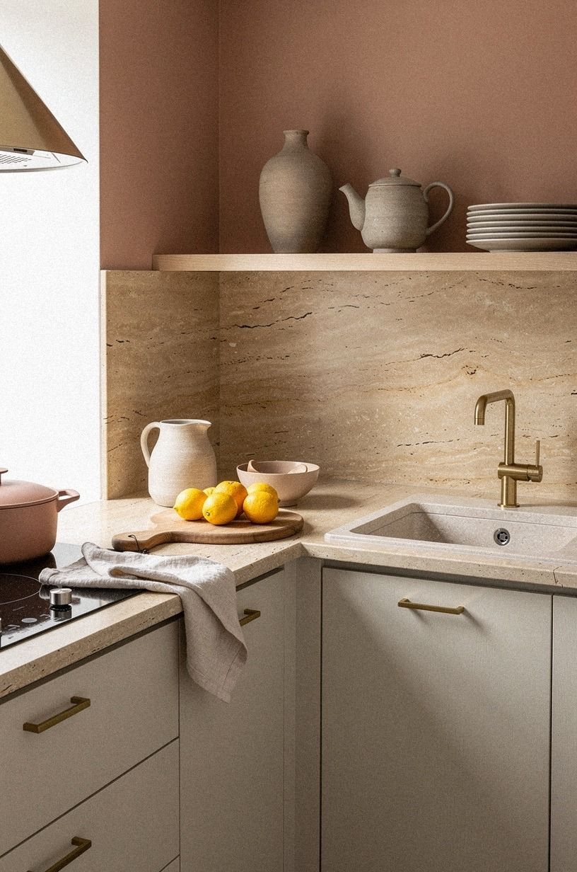
Counter styling should make your white and oak kitchen easier to use, not harder to clean. Start with one warm travertine tray, one clay crock, and one small vessel softened by washed linen.
Keep the everyday tools grouped near where you use them. Your knives can sit in a clay utensil holder, while cooking tools rest beside the range. I’d leave at least one clear stretch of counter so the room still feels calm when you’re making breakfast.
A little metal can help, too. Aged brass, brushed nickel, or dark bronze will connect the counter to your hardware and lighting. Choose one dominant finish, then let the others appear only in small doses.
You don’t need a tray covered with decorative objects. A shallow travertine tray can corral olive oil, salt, and a pepper mill, but it should earn its space by making your routine easier.
For more direction, return to the open-shelving plan and the white countertop comparison. When those elements are edited well, your counter needs very little styling.
Why This Combination Keeps Working
I’ve gone back and forth on white and oak because the pairing can become predictable when every surface has the same pale finish. The version I return to has contrast: warm white against visible grain, a little aged metal, and one color that gives the room a pulse. Without that contrast, the kitchen can feel polished but strangely quiet.
The appeal is also practical. White reflects light, while oak brings the irregular marks that make a room feel settled.
You can repaint the walls, change the hardware, or replace a pendant without losing the foundation. That flexibility matters more than a short-lived color trend, especially when a kitchen has to work for breakfast, homework, and late-night cleanup.
My own mistake was treating the oak as decoration instead of structure. I added shelves, stools, and boards in several similar tones, and the room started looking scattered.
Removing two pieces helped more than buying another accessory. If you’re unsure, keep one strong wood feature, repeat its tone once, and let the white do the quiet work.
There’s room for personality, too. Farrow & Ball Studio Green, a sculptural lamp, or handmade tile can make the scheme feel personal without fighting the calm base.
The best kitchens aren’t frozen in one moment. They have a little wear, a few useful objects, and enough empty space for your life to show up.
When I’m editing a scheme, I check the backsplash texture and the countertop movement before changing the cabinets. Those two surfaces often determine whether the room feels warm, refined, and genuinely inviting.
The Questions Worth Answering First
What is the best white and oak kitchen combination for a small kitchen?
Use warm white uppers, one oak accent, and a slim birch-effect storage unit if you need flexible storage. The strongest small-space layout keeps the floor visible and avoids bulky upper decor. A pale counter and one woven light will add brightness without making the room feel bare.
Where can I buy white and oak kitchen pieces on a budget?
Check IKEA, Wayfair, and Target for stools, lighting, and storage pieces. Facebook Marketplace and local thrift shops can be useful for solid wood boards, vintage stools, and ceramic vessels. You’ll often find better texture second-hand than in a matched new set.
How much does a white and oak kitchen makeover cost?
A small cosmetic refresh may cost about $100 to $300 if you already own tools and use paint, rearranging, and second-hand accents. A broader project can reach the $300 to $1,500 budget range when hardware, backsplash, and lighting are included. For larger changes, use the budget tiers above.
Can I create a white and oak kitchen on a budget?
Yes, and you can start with three low-cost moves: repaint one wall, change the cabinet hardware, and group your existing wood pieces by tone. Peel-and-stick backsplash and a thrifted oak board can add texture without paying for a full renovation.
Is a white and oak kitchen worth it in a small space?
Yes, because white keeps the room visually open while oak adds warmth without requiring much decoration. Keep 42 to 48 inches of circulation where possible, choose one wood tone for the main feature, and use open shelving sparingly. The island clearance guidance is useful even when you have no island.
Is a white and oak kitchen a good idea for a rental?
Yes. Use removable hardware, peel-and-stick backsplash, a tension rod for a linen shade, and freestanding oak storage. Removable hooks can hold art or utensils without permanent damage, while a warm lamp can change the room after sunset.
Where I’d Start First
If I had to pick one, I’d start with warm white uppers and one oak island. That pairing fixes the coldest part of the room without forcing a full remodel, and the grain gives every later choice something real to respond to. Pin this idea for later and build around the wood you already love.


