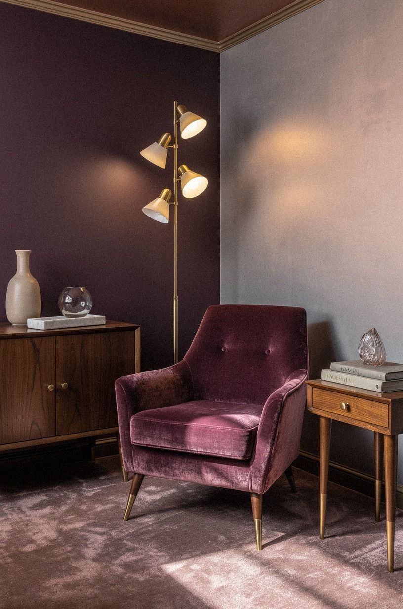
How to Design Speakeasy Paint Colors and a Moody Bar Palette - 12 Ideas
10 october 2026Speakeasy paint colors and color palettes for a moody bar work best when the lighting, wall color, and materials are planned together. Your room feels flat because every surface is competing. I've fixed that with darker paint, warm bulbs, and one stubbornly simple rule: choose fewer finishes, then make each one count. Start here.
- Start with the Three-Source Light Stack
- Paint the Ink Wall Rule for Your Moody Speakeasy
- Warm the Ceiling with the Fifth-Surface Turn
- Choose Dark Walnut Over Matching Oak
- Build the Low Bar Top Line
- Hang Art with the 57-Inch Eye Rule
- Layer the Velvet and Linen Tension
- Frame the Bottles with the Brass Halo
- Float a Smoked Mirror Behind the Bar
- Dress Windows with the Floor-Length Drop
- Price the Palette with a Three-Tier Plan
- Ask: Will Your Moody Speakeasy Work After Dark?
1Start with the Three-Source Light Stack
Plan three lighting sources before you choose paint: overhead, task, and ambient. That’s the difference between a dramatic room and a dark box. You’ll want the overhead fixture to cover movement, a small lamp or sconce to light the bottles, and a low amber source near the seating area.
The room should feel intimate at night, not like a hallway after closing.
I’d skip cool white bulbs because they flatten moody speakeasy colors and make wood look gray. Use warm light instead, then test your swatches under all three sources. Rose-gold metal works beautifully here because it catches the glow without throwing a sharp glare.
And if you’re working with one ceiling fixture, add a table lamp beside the bar before buying more decor. That small change feels surprisingly inviting!
Your shopping note can stay short:
- Warm bulbs. A small lamp. One dimmable fixture. - A sample pot of paint.
Painter’s tape. A clean wall. - One deep-pile mohair velvet throw in plum for the seating corner.
You don’t need a full electrical project to make your palette feel rich. You need light at different heights so your eye has somewhere soft to land.
2Paint the Ink Wall Rule for Your Moody Speakeasy
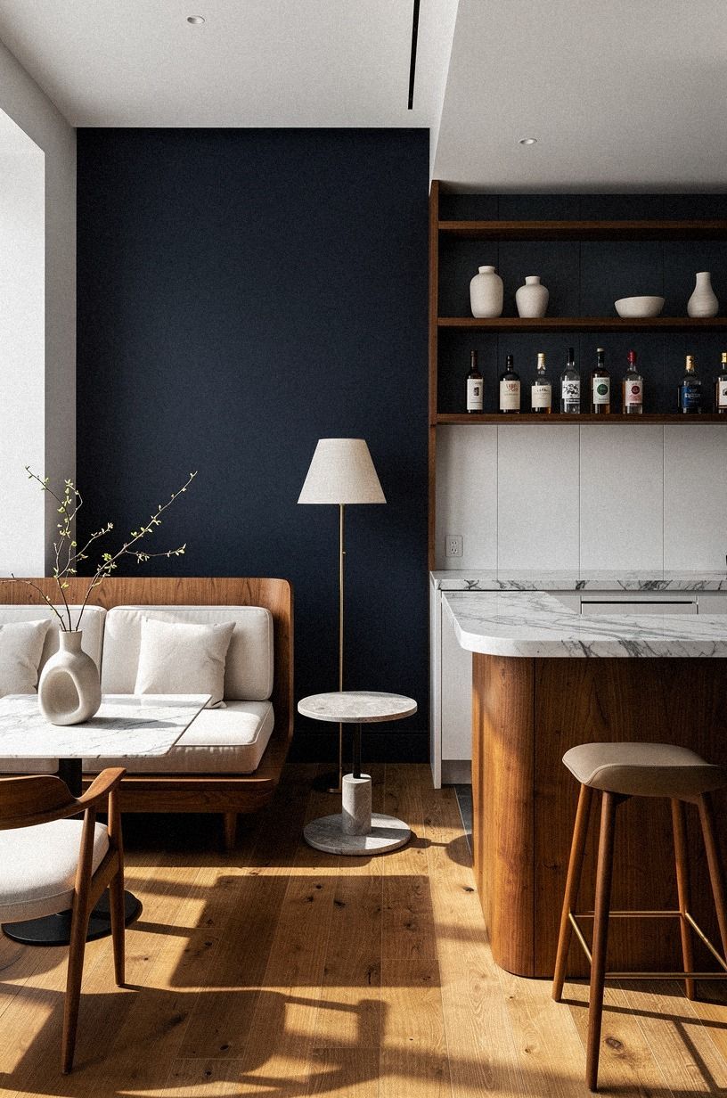
Choose one wall to carry the deepest color, then let the nearby surfaces breathe. Farrow & Ball Hague Blue No.30 is a deep navy with enough richness for a welcoming bar, while a darker green or brown can make the back wall recede.
I’ve used dark paint on every wall in a small room, and I wouldn’t repeat it unless the lighting was excellent. One anchor wall gives you drama without swallowing your shelves.
Your typical US budget can look like this:
If you’re renting, test the color behind the bar or on a removable panel first. You’ll see the undertone before committing, and you won’t have to repaint an entire room if the color turns violet after sunset. Benjamin Moore White Dove OC-17 is a useful nearby trim color, and a Carrara marble ledge with subtle gray veining can echo the white without making the wall look harsh.
3Warm the Ceiling with the Fifth-Surface Turn
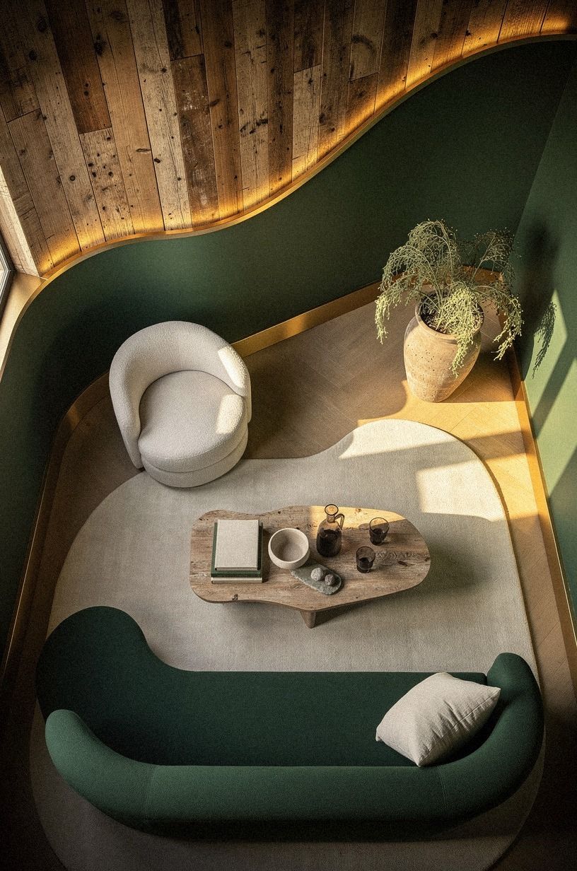
Treat the ceiling as part of your palette. A dark bar with a bright white ceiling can feel chopped in half, especially when your eye catches the contrast from the doorway.
You don’t have to paint it the same shade as the walls, though. A softened cream, warm gray, or muted version of the wall color can make the whole room feel more serene.
I’d choose Benjamin Moore White Dove OC-17 for a ceiling that needs to calm emerald walls and gold accents. It has enough warmth to support moody decor without looking yellow beside brass. If you’re using a wood ceiling detail, choose reclaimed weathered teak instead of a glossy stain.
The grain will show softly when the light is low.
And don’t forget the ceiling edge. A thin line of warm trim can make your paint look intentional, while a stark border can make the room feel shorter.
You’ll want to view the sample from the doorway, from the bar stool, and from the seat where you’ll spend the most time. Paint behaves differently from every angle.
4Choose Dark Walnut Over Matching Oak
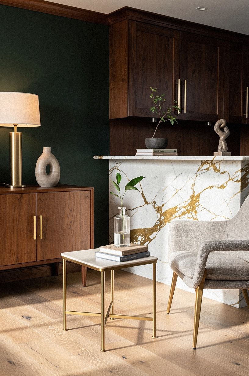
Use natural oak for the bar base or shelving if your walls are forest green or charcoal and your accents are rust. The contrast gives your palette depth. Matching every wood tone sounds tidy, but it often makes a small bar feel like a furniture showroom.
Natural oak veneer has enough warmth to keep a moody speakeasy from feeling cold.
I’d pair it with one lighter wood, not three. A birch-effect IKEA KALLAX can work for bottle storage if you stain or frame it, but I’d avoid adding pale pine, blond oak, and orange bamboo in the same view.
Your eye needs a resting place. That’s why the two-wood rule works: one grounding tone, one supporting tone, and no unfinished leftovers.
If you’re styling a rental, use a dark wood tray on top of a simple cabinet. You’ll get the visual weight without replacing the furniture.
Add a Calacatta marble board with gold veining or a slim marble slab only if your surface can support it. The stone should feel cool and substantial beneath your hand, not like a shiny accent purchased to fill space.
5Build the Low Bar Top Line
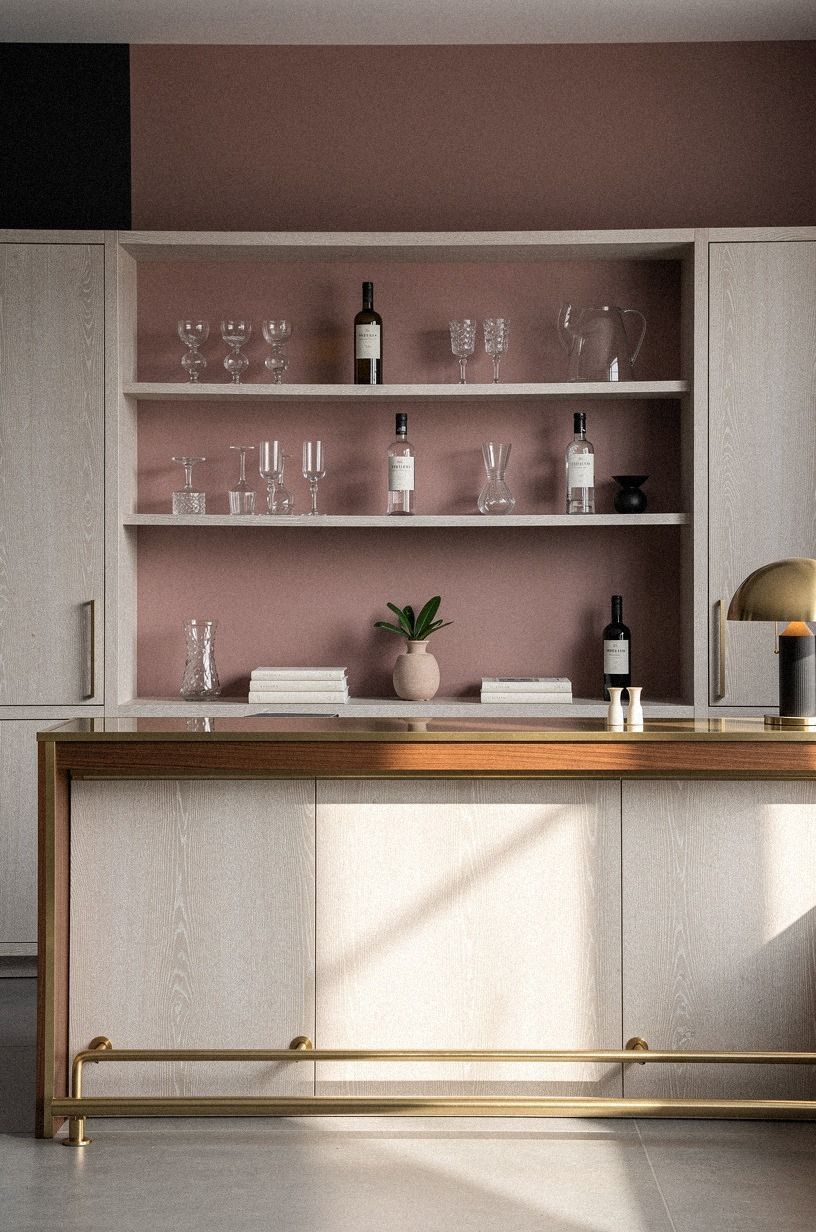
Set the bar surface low enough that the room still feels open. A thick top can look impressive in a catalog, but it can crowd a narrow passage and make the seating zone feel cramped. Your best choice is a simple horizontal line with enough overhang for comfortable elbows and glassware.
I’d choose a cerused white oak top if you want warmth against charcoal walls. Dusty rose upholstery and a small brass detail can bring softness to the palette without making it sugary. If wood feels too rustic, keep the same low profile and use a sealed finish that is easier to live with.
Before you order anything, tape the footprint on the floor and walk around it with a tray in your hands. You’ll notice the awkward corner before it becomes an expensive delivery problem.
And if you’re using an IKEA base cabinet, add a furniture-grade panel to the visible side. Your bar will look built in instead of temporarily parked against the wall.
6Hang Art with the 57-Inch Eye Rule
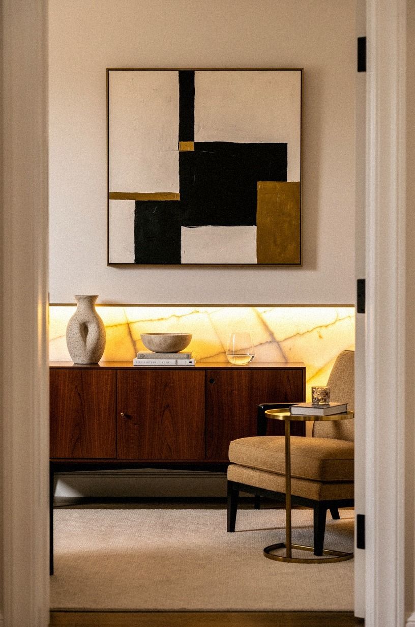
Hang the center of your main artwork about 57 to 60 inches, or 145 to 152 centimeters, from the floor.
7Layer the Velvet and Linen Tension
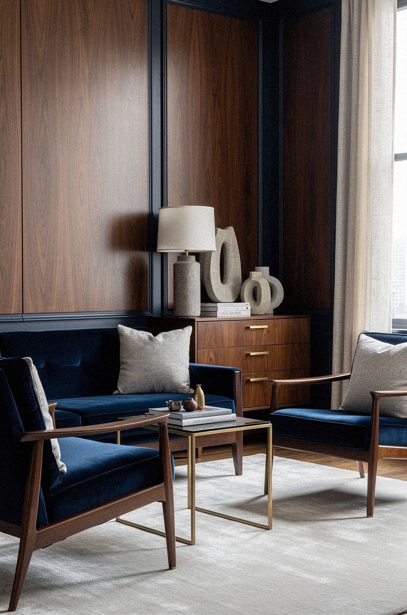
Pair midnight blue velvet with ivory linen, then let book-matched walnut bring a firmer, warmer surface into the room. Copper accents keep the palette from becoming too cool. You’ll get a more lived-in look when the materials disagree slightly but share a warm undertone.
I’d use velvet on one chair or a lumbar cushion, not every seat. A book-matched walnut cabinet can handle the richer fabric nearby because its grain catches light differently.
If you’re starting with a bare bench, add an ivory linen cushion and one mohair pillow rather than buying a matching set. Your room should look collected over time, even if you finished it on a Saturday.
The tactile contrast matters after dark. Velvet absorbs the lamp glow, linen softens the edges, and walnut gives your hand a warmer landing place.
That mix feels comforting without becoming sugary. But don’t overload the room with fringe, tassels, and patterned fabric. One expressive textile is enough to make the bar feel warm and welcoming.
8Frame the Bottles with the Brass Halo
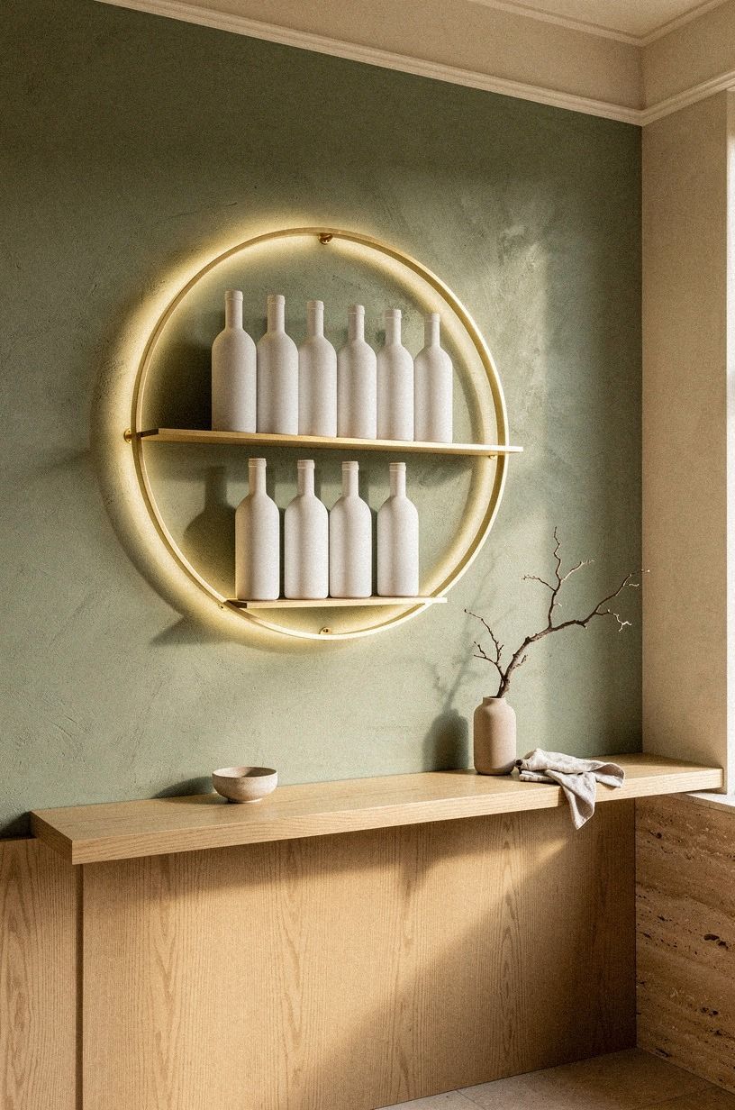
Give the bottles a defined backdrop so they look arranged rather than stored. A shallow shelf, a painted niche, or a small mirrored panel can create that frame. Warm travertine will support a sage green, warm cream, and natural wood palette better than bright chrome, which tends to pull the room toward a sharper modern mood.
Use the shelf for the bottles you reach for, then move overflow into closed storage. You’ll keep the display airy and avoid the dusty visual clutter that makes a small bar feel busy. A low ceramic bowl, a cocktail shaker, and one folded 600gsm Turkish cotton towel are enough supporting pieces.
Your shelf doesn’t need to narrate every hobby you have.
I’d avoid lining up every bottle by height. That arrangement feels stiff. Group by use or color instead, leaving a little negative space between the groupings.
And if your shelves are shallow, place the tallest bottle toward the center so the display has a calm middle. A small brass picture light above the shelf can create the halo without requiring a full cabinet renovation.
9Float a Smoked Mirror Behind the Bar

Add a smoked mirror when your room needs depth but not more color. It reflects a softened version of the bar, so the space feels wider without producing the bright bounce of a traditional mirror. Terracotta, stone, and olive create a grounded palette, while unlacquered brass adds warmth as it develops a natural patina.
You’ll want the mirror to sit behind the bottles or above the bar top, not across every wall. Too much reflection can make your moody bar feel exposed and visually restless. I’d use one broad panel or two narrow panels with a small gap between them.
That break gives your eye a place to stop.
If you’re renting, use a framed leaning mirror instead of adhesive glass. It’s easier to move, and you can change the angle when the afternoon sun shifts.
A mirror should show something worth seeing, such as the warm lamp, the grain of the wood, or a painting across the room. Don’t aim it at a pile of cables. Your palette can be sophisticated and still require a little cable management.
10Dress Windows with the Floor-Length Drop
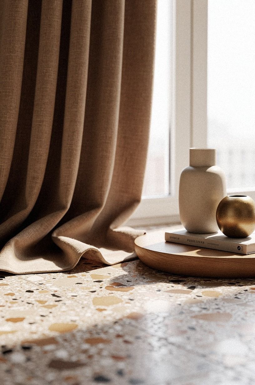
Hang curtains 4 to 6 inches, or 10 to 15 centimeters, above the window frame and let them reach the floor. That length makes the wall feel taller and softens the hard surfaces around a bar. You’ll want the rod to extend beyond the frame so the fabric can stack aside instead of covering the glass.
Choose Belgian flax linen drapes in clay or natural linen if your walls are already deep. An aged brass rod can add warmth without introducing another strong color.
I’d skip bright white curtains because the contrast can make your dark paint look patchy. An oversized-chip terrazzo sill or nearby ledge can bring in a grounded stone note without competing with the fabric.
For a rental, a tension rod and removable hooks can give you the same vertical effect. Your fabric doesn’t need to be expensive to look considered. Press the hem, keep the folds generous, and let the curtain kiss the floor rather than pooling heavily.
That small discipline keeps a rustic, intimate bar from looking accidental.
11Price the Palette with a Three-Tier Plan
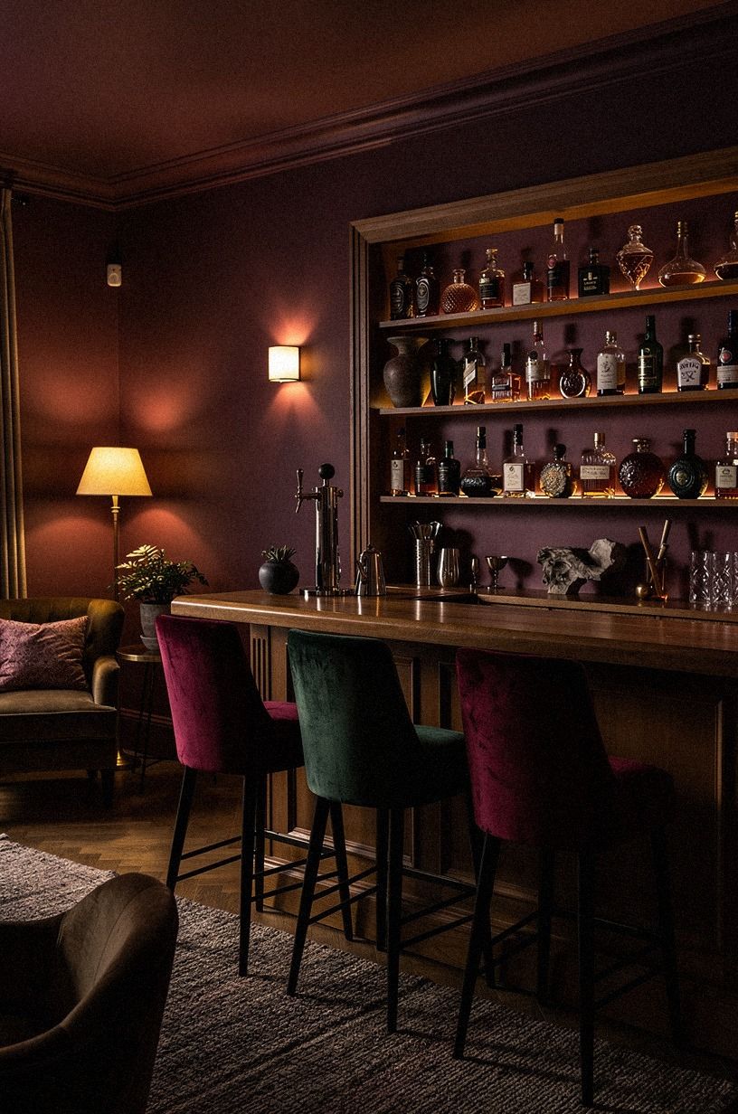
Set your budget by impact, not by the number of objects you can squeeze into the room.
12Ask: Will Your Moody Speakeasy Work After Dark?
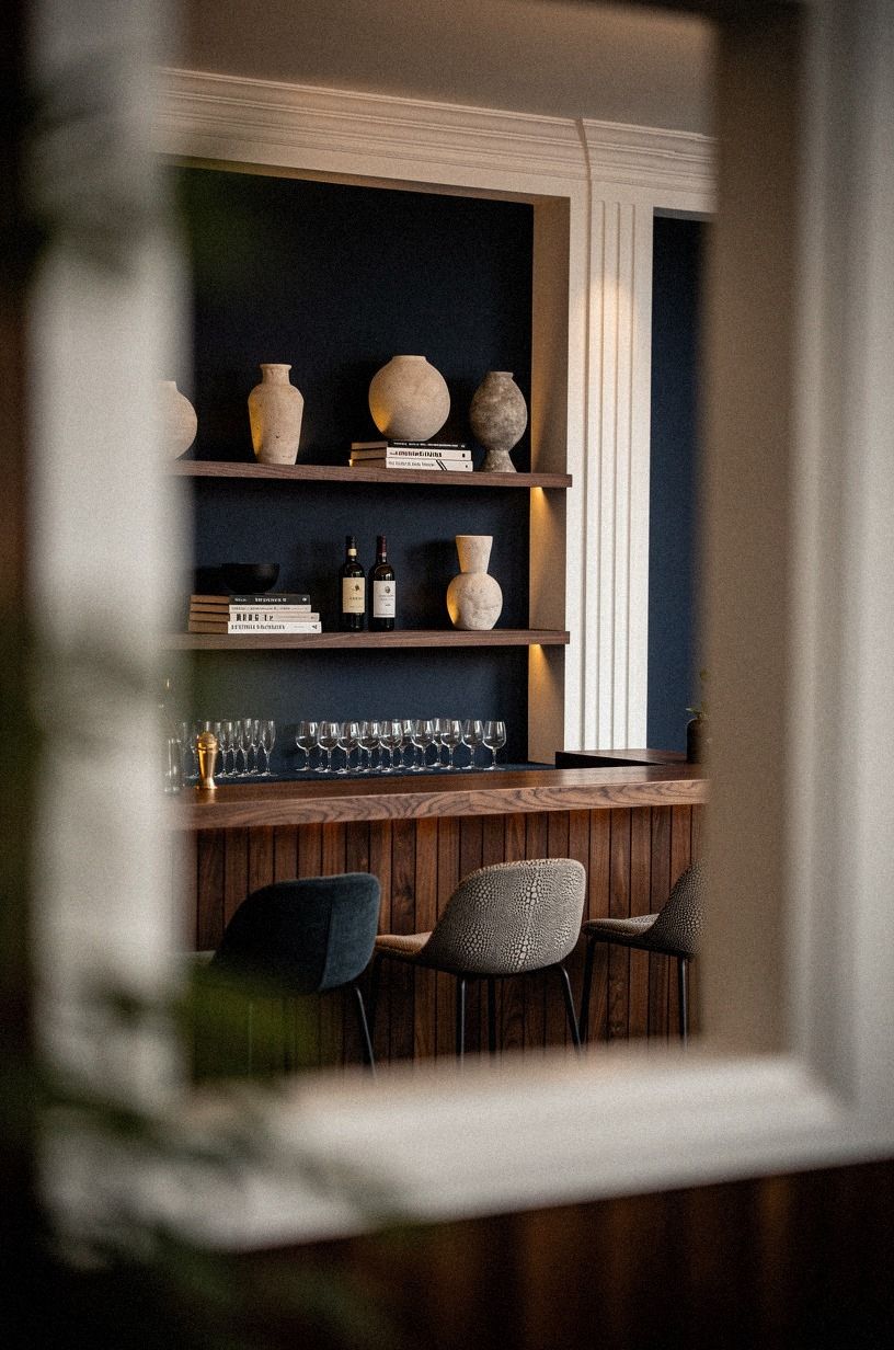
Test the palette at the hour you’ll use the room. Paint a generous sample beside the bar, then look at it in daylight, under the overhead fixture, and beneath the lamp. Farrow & Ball Hague Blue No.30 may look deep and dramatic in the morning, while warm walnut and a small shagreen accent can keep the room from feeling flat at night.
You’re looking for a color that supports the room’s actual life. If you’ll read, mix drinks, or host friends, the palette needs enough contrast to make faces and surfaces readable. If the bar is mainly a quiet evening corner, you can take the walls deeper and let the lighting carry more of the work.
What happens if the room still feels flat? Move the lamp before you repaint.
I made that mistake once, blaming the color when the real problem was a single light source mounted too high. Your best palette won’t rescue bad placement, but three layers of light can make an ordinary paint sample feel rich, dramatic, and wonderfully intimate!
Why I Start with the Room’s Feeling, Not the Bar Furniture
I’ve designed enough small entertaining spaces to know that people usually begin with the object they want to buy. It might be a brass cart, a velvet chair, or a dramatic pendant. I understand the impulse.
Those pieces are easy to picture, and they give you an instant shopping list. But I’ve also watched a beautiful chair look completely wrong because the wall behind it was too bright and the lamp above it was too cold.
My preference is to start with the room’s evening feeling. Do you want a quiet corner where the light settles low, or do you want a lively bar that can handle a crowd?
Your answer changes the paint, the rug, and the amount of reflective material you should use. A smoky mirror suits the first mood. A pale stone top and brighter art may suit the second.
I once chose a deep green without testing it beside the window. By afternoon, it looked elegant.
After sunset, it turned nearly black and made the shelves disappear. I didn’t hate the color, but I hated how it behaved.
That taught me to judge paint beside the actual furniture, with the actual bulbs, before I trust a sample.
So I’d skip the pressure to make every detail dramatic. A moody bar needs contrast, but it also needs relief.
Keep one surface pale, one textile relaxed, and one path through the room clear. Your guests won’t remember whether the brass was aged or antique. They’ll remember that the light was flattering, the chair was comfortable, and nobody had to squeeze past the bar to sit down.
That’s the atmosphere worth building!
What People Always Want to Know
What is the best Speakeasy Paint Colors & Color Palettes for a Moody Bar for a small speakeasy paint colors color?
Farrow & Ball Pigeon No.25 and Benjamin Moore White Dove OC-17 make a strong small-room pairing because the blue-gray wall feels moody while the trim keeps the edges soft. Warm contrast helps your space feel intimate without making every corner disappear.
Where can I buy Speakeasy Paint Colors & Color Palettes for a Moody Bar pieces on a budget?
Look at IKEA, Wayfair, and Target for simple storage, lamps, and textiles. You’ll often find better character through Facebook Marketplace or a local thrift shop, especially for wood stools and framed art. Secondhand texture can make your bar feel less showroom-perfect.
How much does a Speakeasy Paint Colors & Color Palettes for a Moody Bar makeover cost?
A budget makeover typically falls in the $200-$800 range for paint, textiles, art, and organization. Free rearranging costs nothing, while a rug, drapes, or statement fixture can move the project into the mid-range tier.
Can I create a Speakeasy Paint Colors & Color Palettes for a Moody Bar on a budget?
Yes, and you can start with paint, warm bulbs, and furniture you already own. Use a thrifted tray, a removable mirror, and one linen cushion before buying new seating. Layered lighting will usually change your room more than another decorative object.
Is a Speakeasy Paint Colors & Color Palettes for a Moody Bar worth it in a small space?
Yes, because a small room can hold a strong palette without requiring many materials. Paint one anchor wall, keep the walkway clear, and choose furniture with visible legs. Visual breathing room keeps your dark bar from feeling crowded.
Is Speakeasy Paint Colors & Color Palettes for a Moody Bar a good idea for a rental?
Yes. Use peel-and-stick wallpaper on a removable panel, a tension rod for linen curtains, and freestanding shelving instead of built-ins. No-damage flexibility lets you create a moody speakeasy without losing your deposit.
Where I’d Start First
If I had to pick one step, I’d start with the Three-Source Light Stack. Dark paint can’t look warm under one harsh bulb, but layered light will make modest furniture and simple shelves feel intentional. Test your lamps tonight, then Pin this palette for your next room reset.


