
Target Bedroom Patterns Feeling Too Busy? These 12 Designer Fixes Help
10 october 2026The bed can look perfectly inviting in the store and strangely restless at home. In a typical 12-by-14-foot bedroom, a floral duvet, striped pillows, checked curtains, and a patterned rug can fill every sightline before the room has a chance to feel calm.
Designers mix patterns by controlling scale, color, and placement rather than searching for identical prints. These practical rules keep a bedroom layered, personal, and easy to rest in.
What you will find inside
- Start With a Quiet Base
- Repeat One Background Color
- Vary the Pattern Scale
- Pair Stripes With Florals
- Keep the Bed as the Anchor
- Limit the Palette to Three Tones
- Use Solids as Visual Pauses
- Match Pattern Weight to Fabric
- Move Busy Prints Below Eye Level
- Give Curtains One Clear Job
- Add One Controlled Fourth Pattern
- Edit From the Doorway
Start With a Quiet Base
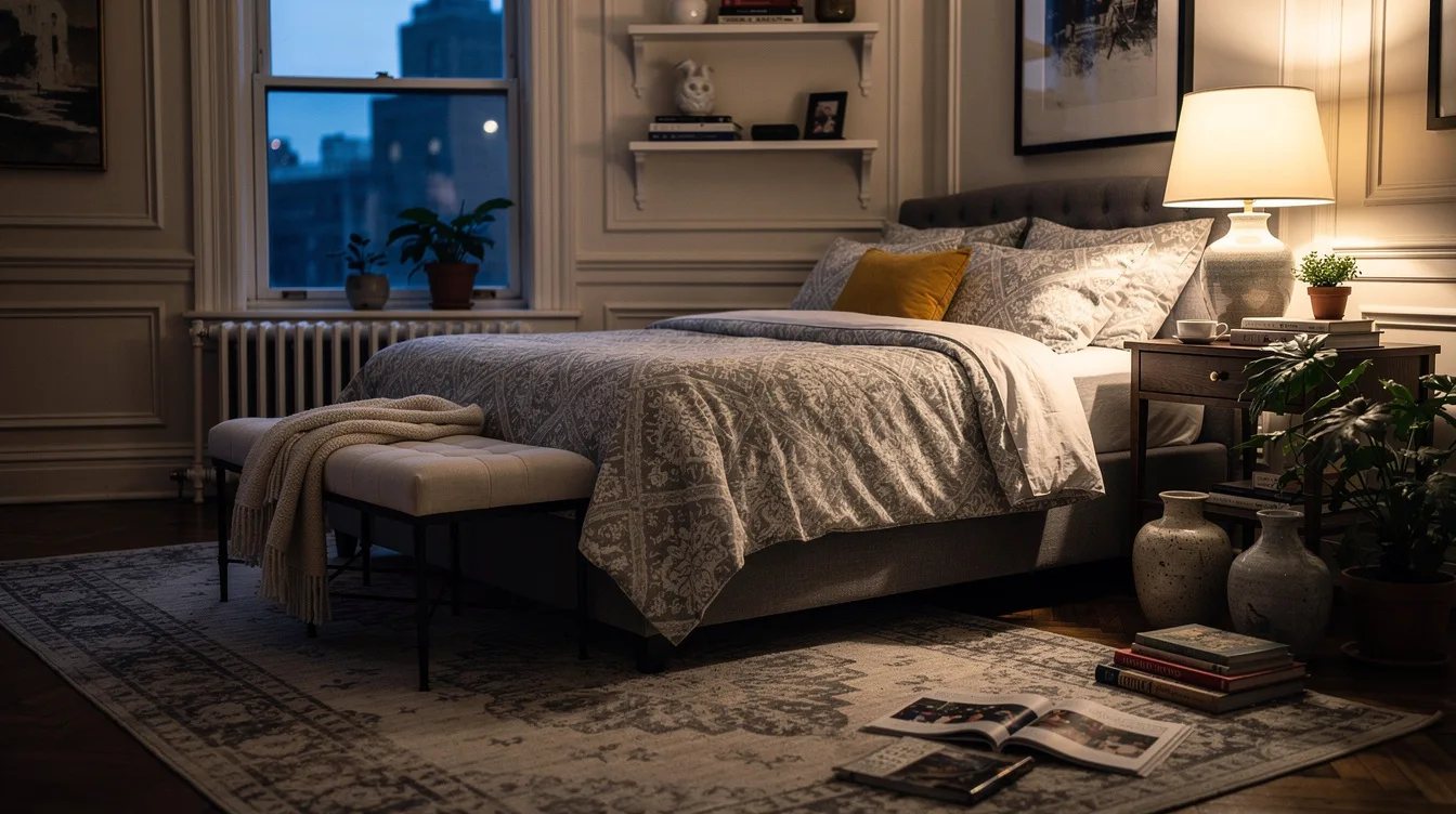
Begin with a calm foundation such as a warm white wall, a natural linen duvet, or a low-contrast rug. A linen duvet cover from IKEA gives the room enough texture without introducing another loud motif.
This is the pattern equivalent of leaving breathing room on a page. Keep the largest surface quiet, then let smaller pieces carry the visual interest.
Repeat One Background Color
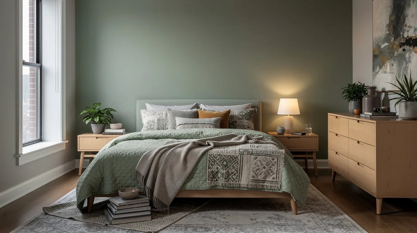
Choose one color that appears behind at least two patterns, such as the soft blue behind a floral print and a narrow stripe. Designers use this repeated background to make separate fabrics feel related.
A blue cotton quilt from Target can connect a patterned pillow and a checked throw without forcing them to match exactly. The shared color does the organizing.
Vary the Pattern Scale
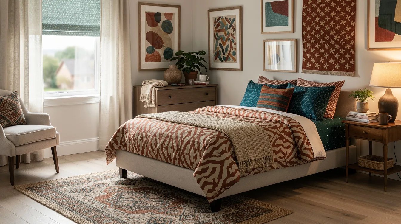
Pair one large motif with one medium print and one small repeat. A generous botanical design on the duvet works beside a pinstripe sham because the patterns occupy different visual distances.
Skip two large prints of equal intensity. A large-scale floral duvet from Wayfair should have smaller companions, such as a fine check or a tiny dot, so the bed does not become one block of competing shapes.
Pair Stripes With Florals
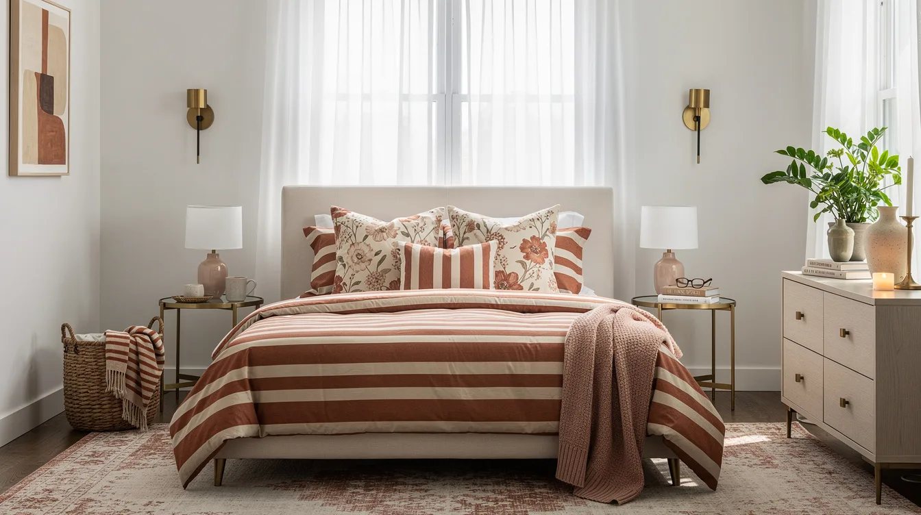
Stripes are reliable partners for organic patterns because their straight lines add structure. Try a muted floral comforter with a ticking stripe pillow in the same color family.
A cotton ticking stripe pillow from Walmart is useful here because its pattern reads as texture from across the room. Keep the stripe narrow when the floral already has strong contrast.
Keep the Bed as the Anchor
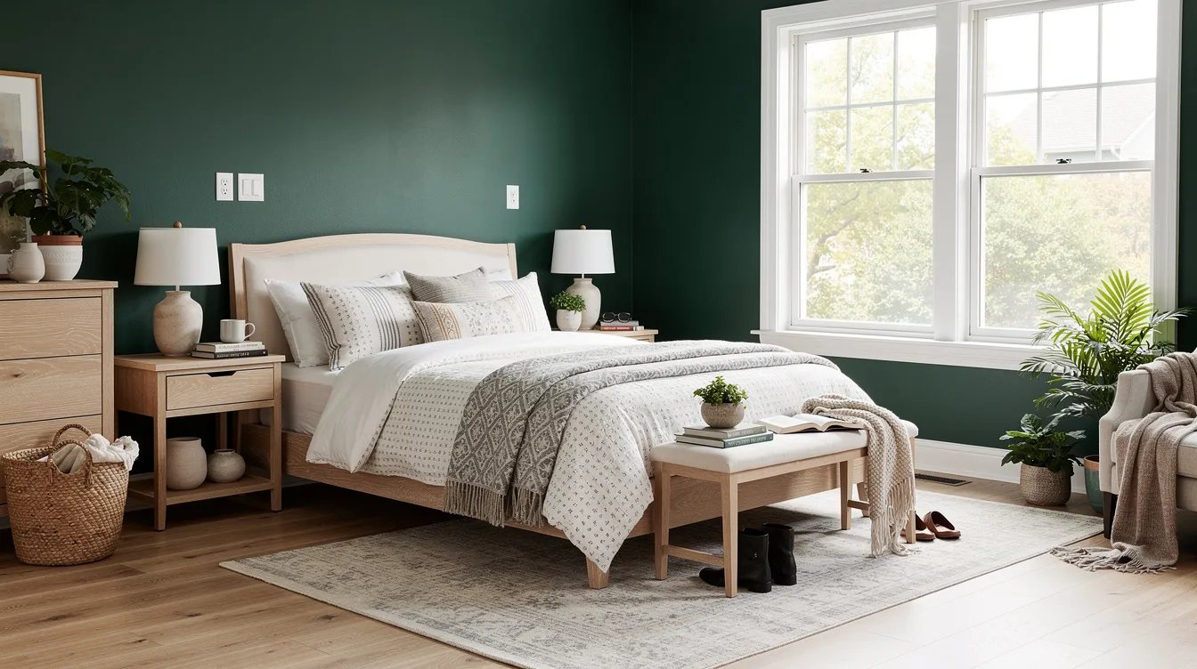
Make the bed the clearest pattern story, then keep the surrounding pieces quieter. If the duvet has a strong print, use a solid upholstered headboard and a restrained window treatment.
A solid wood headboard from Home Depot can provide visual weight without adding another motif. This approach keeps the eye centered instead of sending it from the bed to every wall.
Limit the Palette to Three Tones
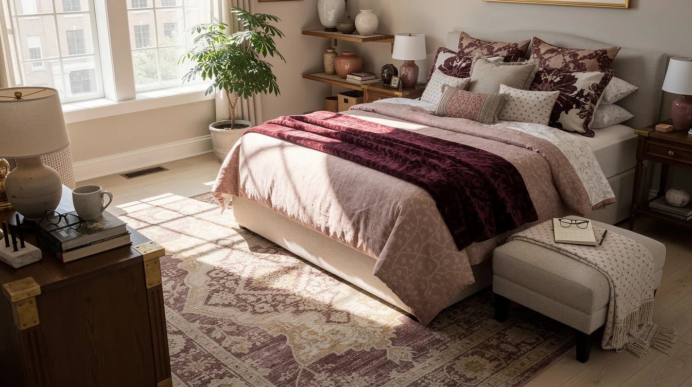
Pattern mixing becomes easier when most fabrics share three main tones, such as cream, rust, and charcoal. The patterns can differ dramatically in subject while the palette keeps them connected.
A rust velvet lumbar pillow from Amazon can repeat the warmest shade in a duvet or rug. Use the third tone sparingly, especially when the bedroom is compact.
Use Solids as Visual Pauses
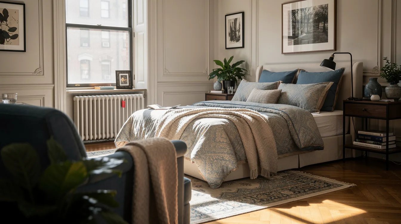
Solid fabric is what lets patterned fabric stand out. Place a plain sham between two printed pillows, or use a solid throw folded across a patterned coverlet.
A solid wool throw from Costco adds softness and gives the eye somewhere to rest. Glossy fabric is usually a poor choice for this pause because it creates extra reflection.

Match Pattern Weight to Fabric
Heavy upholstery, woven cotton, and nubby linen can support stronger motifs than thin, shiny fabric. Match the visual weight of the pattern to the physical weight of the material.
A textured cotton coverlet from Lowe's can carry a small geometric design without looking flimsy. Reserve delicate prints for pillows, shades, or other limited areas.
Move Busy Prints Below Eye Level
Place the most energetic pattern where it will be seen in small doses, such as a bench cushion or the front of a storage basket. Keep the wall and headboard zone calmer so the bedroom still feels restful.
A patterned storage basket from Ace Hardware can add interest at the foot of the bed without competing with artwork. This placement also makes the print easy to remove when the room needs editing.
Give Curtains One Clear Job
Window treatments should either repeat an existing pattern quietly or provide a solid frame around the room. They should not introduce a fourth high-contrast motif beside a busy bed.
Natural woven shades from The Home Depot are a strong choice when the bedding already carries stripes, checks, or florals. Their texture adds warmth while their color stays visually quiet.

Add One Controlled Fourth Pattern
A fourth pattern can work when it is small, low contrast, and placed on a minor accessory. A tiny dot on a bedside lamp shade or a subtle stripe on a stool is enough.
A small geometric lamp shade from Wayfair should repeat one established color and stay away from the bed's dominant print. If the new pattern is noticeable from the doorway, it is probably too large or too bold.
Edit From the Doorway
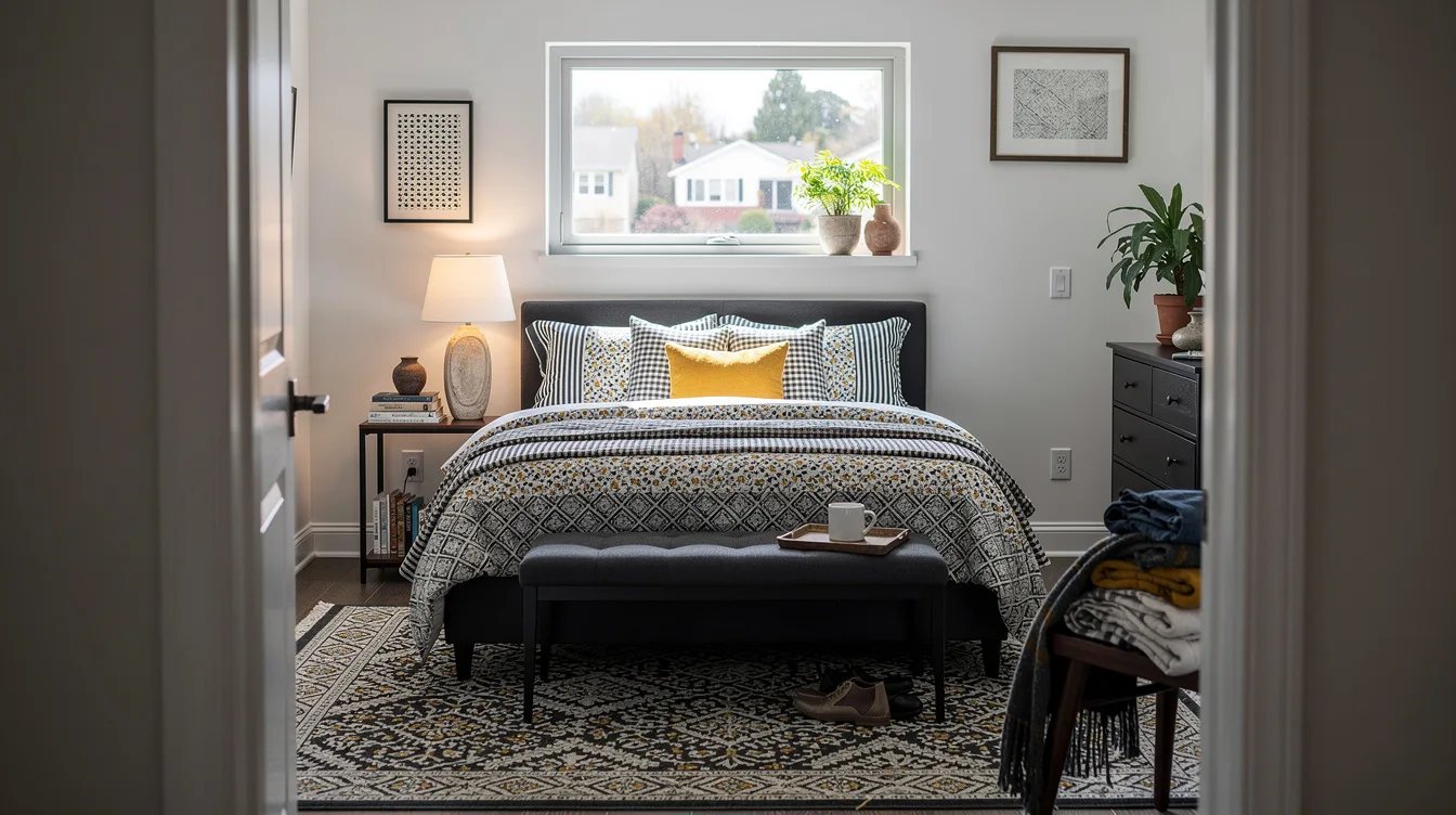
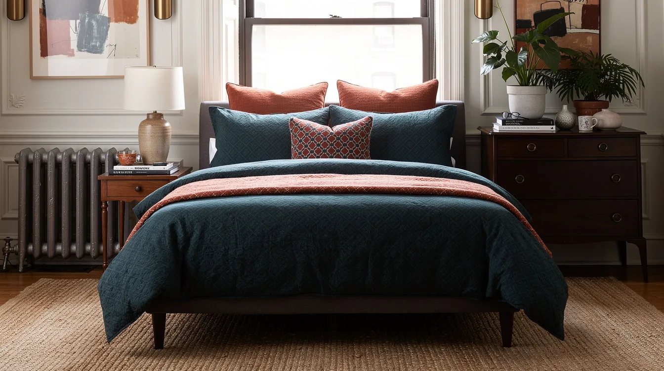
Stand at the bedroom entrance and look for the first pattern that catches your eye. Designers usually keep one clear focal point, then reduce any competing print by changing its scale, color, or location.
A neutral flatweave rug from IKEA can quiet a floor that feels too active. Remove one pillow before buying another accessory, because subtraction often solves the problem faster.

Keep reading
- Target Lid Drawer Avalanching? 14 YouCopia Fixes Start at $10
- Cabinets Screaming for Help? These 14 Dollar Tree Fixes Start at $1.25
- 12 Target Curtain Tricks That Make a Rental Bedroom Look Expensive
Begin by clearing one surface, then choose the single pattern you want to keep as the room's focal point. Build around it with quieter scale, repeated color, and one generous solid pause.


