13+ Small Bedroom Layouts That Actually Make the Room Feel Bigger
07 april 2026Think your bedroom is too small to feel designed? The best small room design bedroom ideas prove otherwise. It's not about size. It's about knowing which moves actually work.
I've rounded up 13 layouts that do a lot with a little. Each one earns its place.
The Floating Shelf That Does More Than Store Things


A floating shelf in a Scandi room isn't décor. It's structure.
Why it holds together: The natural oak shelf spanning above the bed zone creates a horizontal line that anchors the whole layout, so the room feels organized even when it's small.
Steal this move: Mount it at eye level above the headboard and keep it to three objects. Any more and the wall starts working against you.
An Alcove That Makes the Room Feel Designed

I keep coming back to this one. That shallow alcove recessed into the headboard wall does something a painting never could.
The pale limewash finish lining the recess catches the warm LED strip at the top and throws depth where the wall would otherwise be flat. It's a small architectural move, but it makes the room feel finished in a way that's hard to name.
Worth copying: Even a modest 36-inch-wide niche lined in a contrasting finish pulls the bed zone together without a single piece of furniture.
Why Shiplap Works Harder in Small Rooms
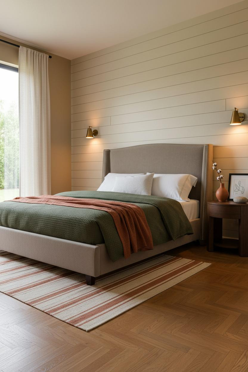
Shiplap in a tiny room sounds risky. It isn't.
Design logic: Each horizontal board casts a shallow shadow line that draws the eye across the wall, making the room read as wider than it actually is. The warm cream finish keeps it from feeling heavy in a compact footprint.
Pro move: Run it floor to ceiling on the headboard wall only. Partial shiplap reads as intentional. Covering every wall in a small room tips into something else entirely.
The Concrete Wall That Somehow Keeps It Light
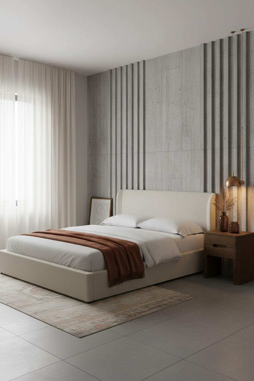

This one is divisive. But I think it works.
The board-formed concrete behind the bed has vertical pour lines that push the eye upward, amplifying ceiling height in a way that smooth plaster can't. And because the remaining walls stay pale stone greige, the room feels calm rather than industrial.
The smarter choice: Keep the concrete to one wall and pair it with ivory linen curtains that run floor to ceiling. The contrast is immediate without splitting the room into two competing moods.
What Textured Plaster Actually Does for a Tight Layout
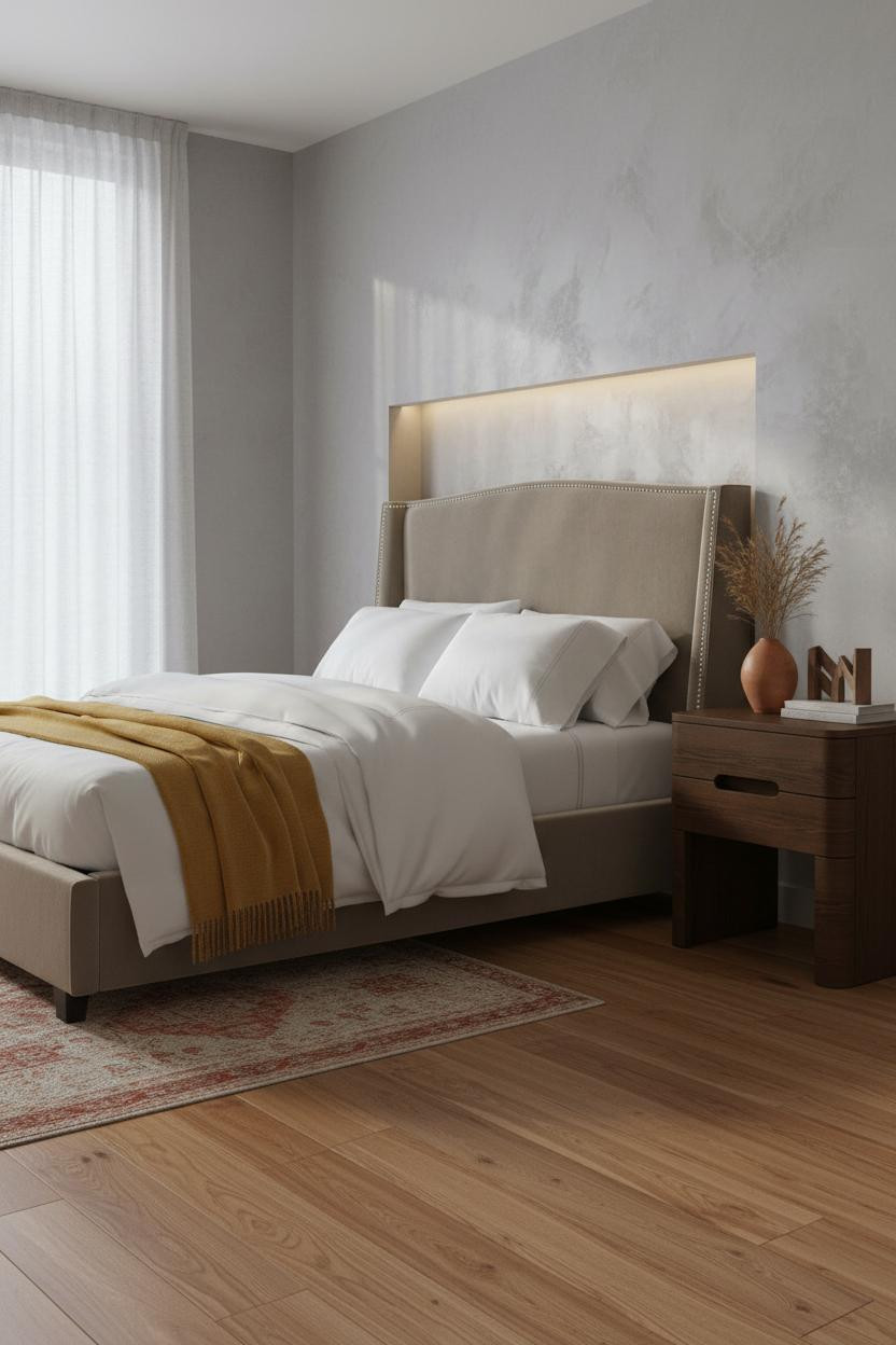
Nothing on this wall is competing for attention. That's the point.
What gives it depth: Matte stone grey plaster catches raking light across its surface and creates subtle shadow gradients that give the wall visual interest without needing pattern or color.
Pair it with warm maple flooring and a mustard wool blanket draped at one corner. The easy win: The contrast between cool plaster and warm wood does the heavy lifting so you don't have to.
Moss Green Walls With a Herringbone Panel Behind the Bed
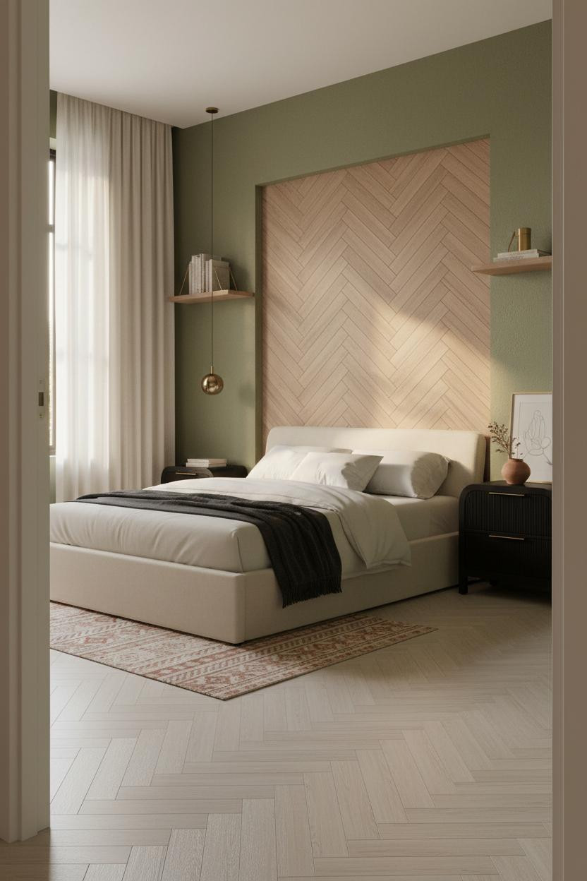
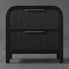
I'll be honest: moss green walls felt bold to me at first. Then I saw what they do with the right floor.
Why it looks custom: The board-mounted herringbone wood panel behind the bed adds geometric rhythm that pulls the eye upward, while the warm grain keeps the dark wall color from reading as cold or heavy.
What to borrow: Keep three walls in moss green plaster and reserve the herringbone for the headboard wall only. The room feels grounded without tipping into a single dark cave.
A Tiny Arched Niche That Punches Well Above Its Size
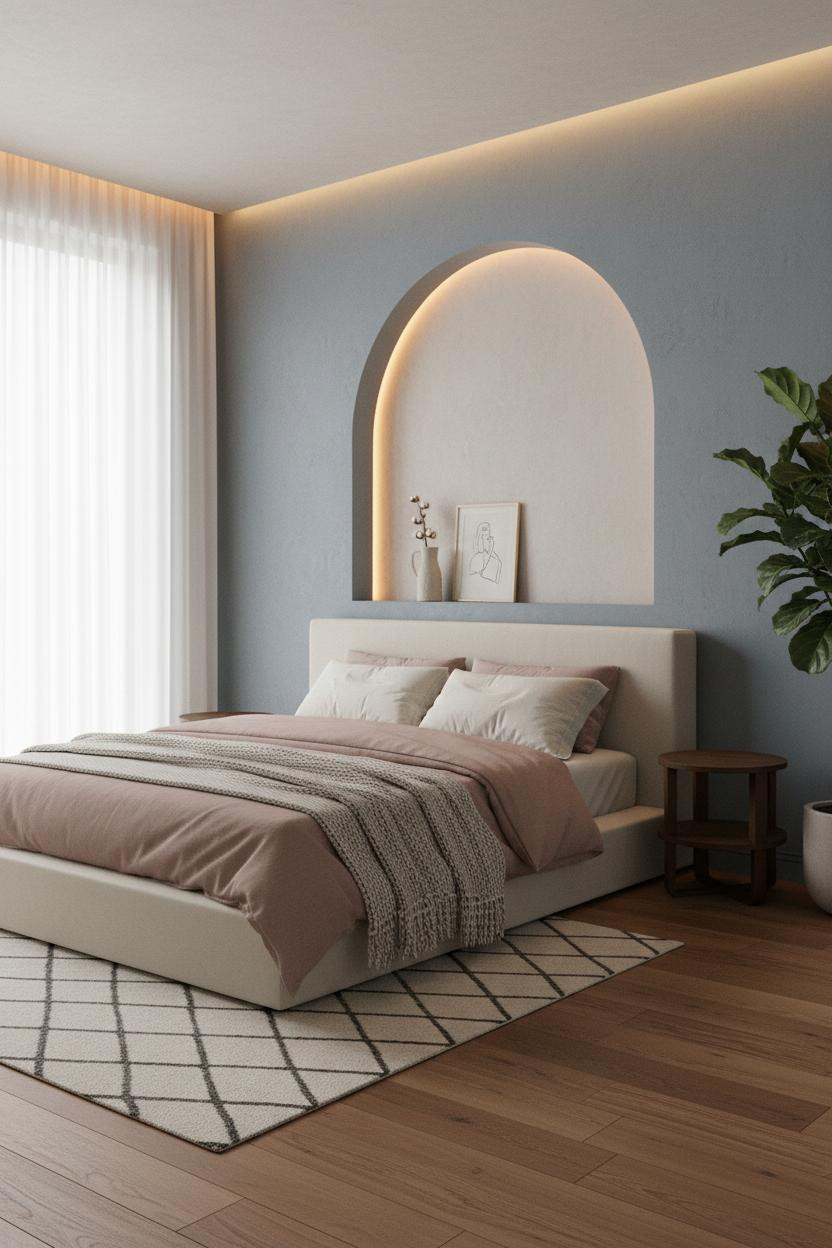
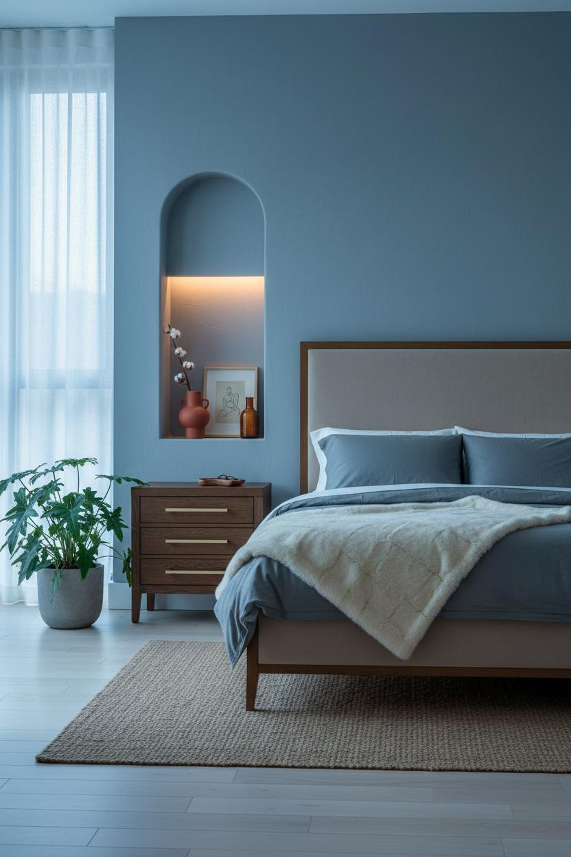
Fair warning. Once you see an arched niche above a bed, it's hard to unsee it in every flat wall you've ever owned.
The rounded top softens the muted blue-grey plaster around it, and the warm LED strip tracing the arch interior creates depth that a framed print on a flat wall simply can't replicate. The room feels calm and cohesive without a single extra piece of furniture doing the work.
Where to start: A shallow 36-inch arch is enough. It doesn't need to be deep to register as architectural. A dusty pink linen duvet against the blue-grey plaster finishes the whole thing off beautifully.
How Half-Height Wainscoting Solves a Narrow Room
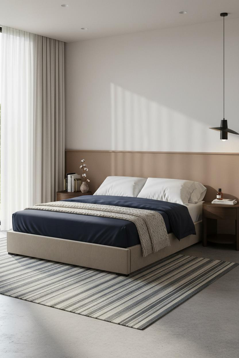

In a small bedroom with a narrow footprint, the horizontal line is your best friend.
Why it feels intentional: Warm clay wainscoting running the lower third of the wall creates a shadow line at the transition point that draws the eye sideways, making the room read as wider than a tape measure would suggest.
Avoid this mistake: Don't run the wainscoting in a competing color. Same warm family, different finish. That's what keeps the room from feeling choppy.
The Japandi Layout That Feels Twice as Spacious
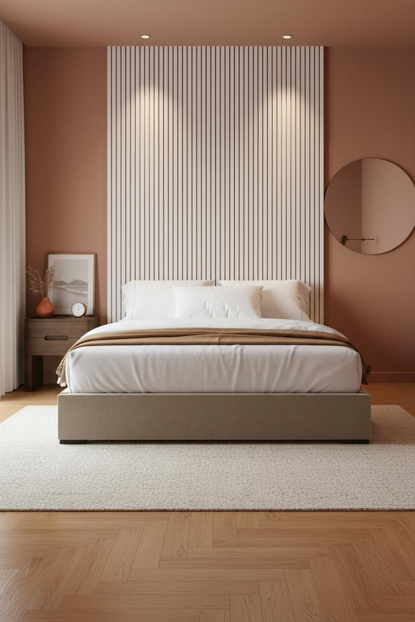
This is the layout I'd actually copy in a small room.
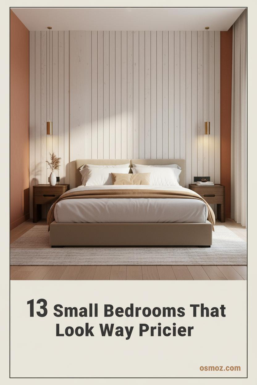
What carries the look: A floor-to-ceiling white oak slat panel behind the bed pulls the eye straight up, and the warm terracotta walls on the flanking sides keep it from reading cold or stark. The contrast is quiet but it does real work on a small footprint.
An oversized round mirror mounted beside the slat wall doubles the perceived depth. The finishing layer: A camel wool throw at the foot ties the warm wall tones back into the bedding without making it matchy.
Board-and-Batten Walls That Make a Small Room Feel Taller
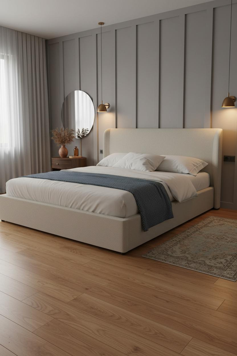
Vertical lines in a small bedroom aren't a design choice. They're a strategy.
Why it feels elevated: Each batten in the dove grey board-and-batten paneling casts a thin shadow stripe that draws the eye upward along the full wall height, making low ceilings register as taller. The matte finish keeps it quiet rather than graphic.
One smart swap: Replace a traditional headboard with a round mirror mounted above the bed against the paneling. The reflection creates depth that a flat wall simply doesn't offer.
Built-In Shelving as the Room's Visual Anchor
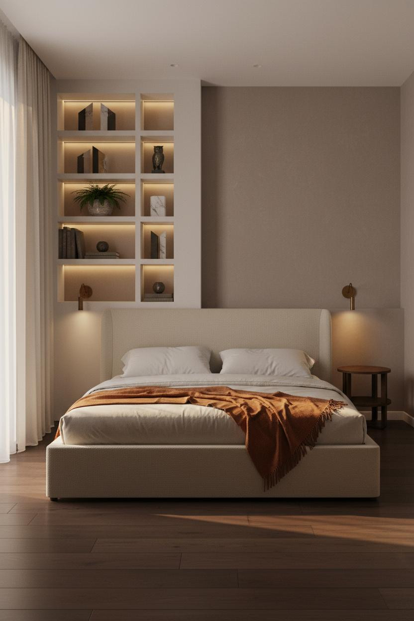
Built-in shelving in a compact bedroom changes how you actually use the room. Not just how it looks.
The real strength: Warm light pooling between each shelf tier of the matte white corner unit creates rhythmic depth against the mushroom-toned walls, while the dark walnut flooring grounds the pale palette so nothing floats.
What not to do: Don't overload the shelves. Four objects per tier maximum. Everything past that starts compressing the room visually, which defeats the whole purpose.
The Scandi Floating Shelf That Keeps a Room from Feeling Cluttered
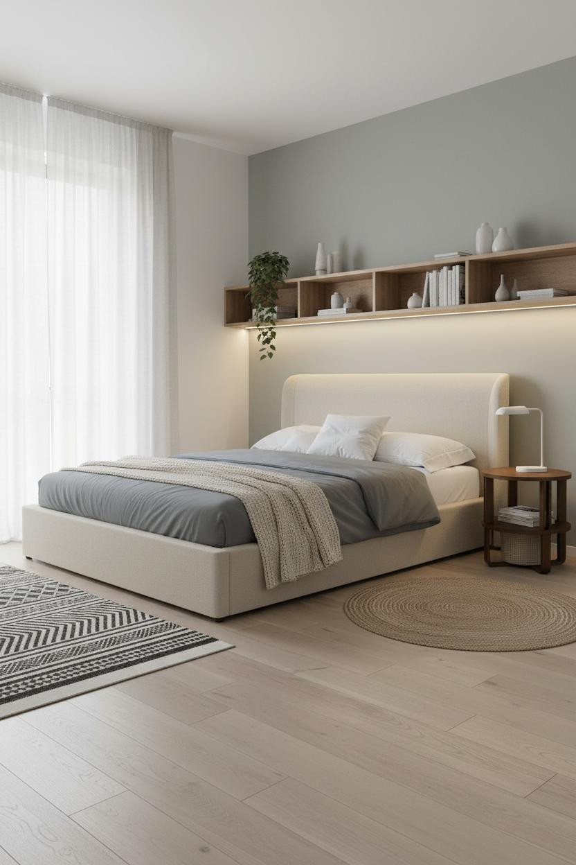
Full-width floating shelves above the bed are the Scandi move I'd recommend to basically anyone with a small room.
Why the palette works: Warm white walls with a soft sage-grey accent panel directly behind the bed define the sleeping zone without needing a physical headboard. The natural oak shelf running wall-to-wall above ties the two tones together in a way that feels collected rather than decorated.
The LED strip underneath casts warm light downward onto the pillows. Just enough warmth to keep things interesting at night without competing with natural daylight. The part to get right: Keep the shelf objects to three or four. Restrained styling is what makes this layout feel airy, not cramped.
 Our #1 Pick
Saatva Classic Mattress
America's best-selling online luxury innerspring. 365-night trial, lifetime warranty, free white glove delivery.
Shop Saatva Classic
Our #1 Pick
Saatva Classic Mattress
America's best-selling online luxury innerspring. 365-night trial, lifetime warranty, free white glove delivery.
Shop Saatva Classic
The Foundation Of Every Beautiful Bedroom
Walls get repainted. Linen gets swapped out. The mattress stays. So it's worth getting that part right, especially in a small room where every element has to earn its place.
The Saatva Classic is the one I'd put under any of these layouts. Dual-coil support that holds its shape over years, breathable organic cotton that doesn't trap heat, and a Euro pillow top that's soft without losing structure underneath. It feels like the good hotel kind. Not the business hotel kind.
Start with the bed. The rest figures itself out.

These layouts prove that a small bedroom isn't a limitation. It's an edit. The rooms people actually save are the ones where nothing looks accidental, and nothing in a well-designed small room ever should.


