12 Target Color Palette Ideas That Make Small Rooms Feel Larger
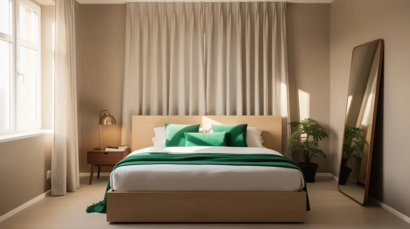
01 september 2026White walls can make an 8-by-10-foot bedroom feel colder, not larger, when the ceiling, trim, bedding, and storage all break into separate visual blocks. The better move is a connected palette that lets the room read as one calm envelope.
Designers generally keep contrast low across the biggest surfaces, then add depth with one darker finish. That approach gives a compact office or sleeping area shape without turning every edge into a boundary.
What you will find inside
- Stop Treating the Ceiling Like a White Lid
- Choose Warm White Over Stark White
- Paint Trim Into the Same Color Family
- Wrap Storage in the Wall Color
- Limit the Room to One Dominant Neutral
- Use Sage as an Envelope, Not an Accent Riot
- Keep Blue Soft and Slightly Gray
- Ground the Palette With One Dark Material
- Use One Large Mirror Instead of a Gallery
- Match Curtains to the Wall Instead of Outlining Windows
- Let the Rug Continue the Quiet Palette
- Repeat One Metal Finish Across the Room
Stop Treating the Ceiling Like a White Lid
Carry your wall color onto the ceiling, or use a version that is only slightly lighter. A soft warm white ceiling removes the hard line that can make an 8-foot room feel boxed in.
In a low-light room, this is more convincing than bright builder white. The room feels taller because the eye keeps moving upward instead of stopping at a sharp border.
Choose Warm White Over Stark White
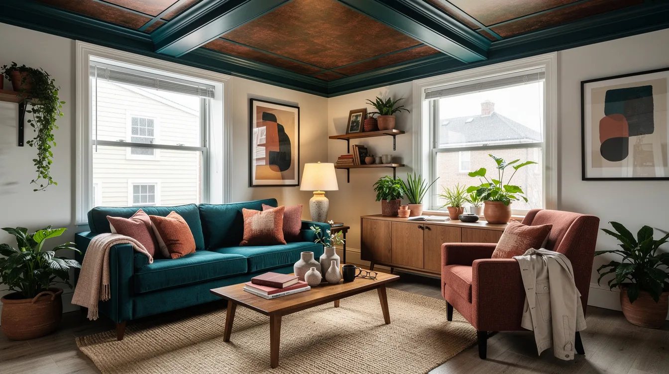
Skip icy white when the room faces north or gets limited daylight. A mushroom white wall color has enough warmth to reflect light without looking gray and flat.
Use ivory linen, pale oak, and soft black hardware alongside it. Cool chrome and blue-white bulbs can undo the effect fast.
Paint Trim Into the Same Color Family
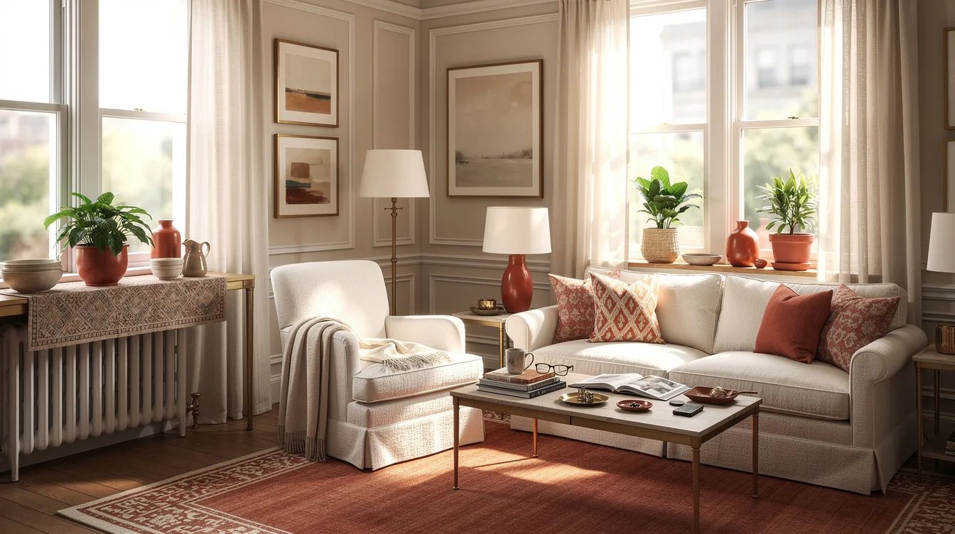
Bright white baseboards around colored walls create a stripe at floor level, which makes the room feel chopped up. Paint the door trim, baseboards, and doors in the wall color or a closely related shade.
This is especially useful around a crowded closet wall. Built-ins begin to read as part of the architecture instead of another object competing for space.
Wrap Storage in the Wall Color
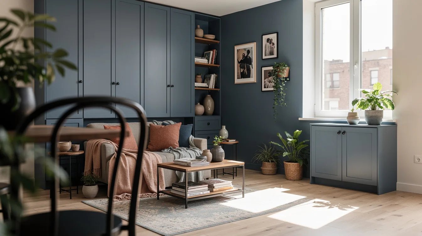
A white freestanding wardrobe against a muted wall can become the first thing you notice. Choose a wall-colored cabinet, or cover a simple storage unit with Target Threshold curtains in a matching oatmeal or sage tone.
Keep the hardware quiet: aged brass or black, not shiny silver. The goal is a broad, uninterrupted plane.
Limit the Room to One Dominant Neutral
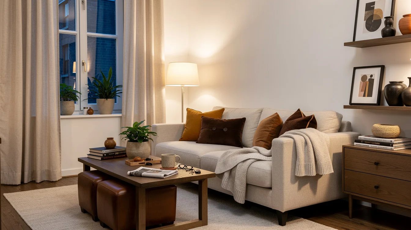
Compact rooms don't need five competing beige shades. Pick one dominant neutral, such as soft clay, pale putty, or warm plaster, and repeat it across walls and large textiles.
Add pale oak as the wood tone, then reserve charcoal for one small anchor. A charcoal picture frame or lamp base is plenty.
Use Sage as an Envelope, Not an Accent Riot
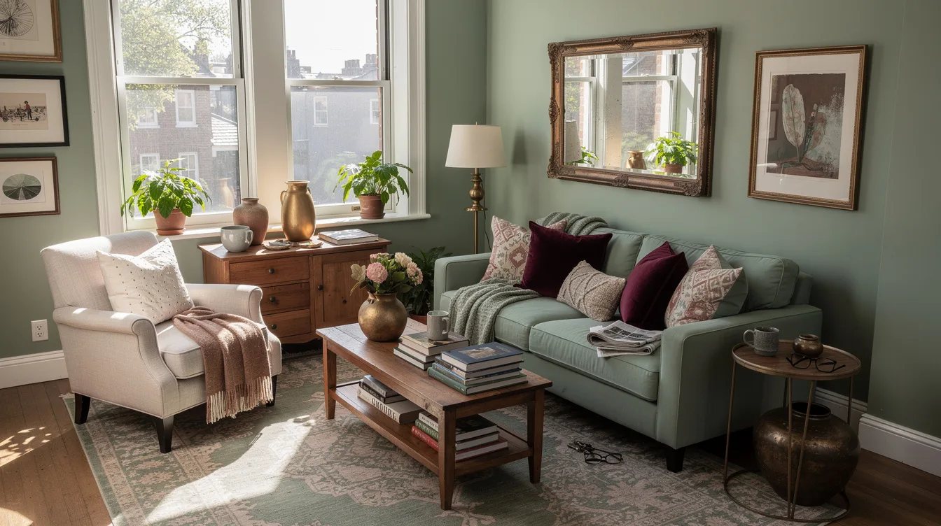
Muted sage can make a compact bedroom feel restful and open when it covers most painted surfaces. Continue the soft sage paint over the door and shallow shelves so those pieces recede.
Pair it with flax bedding and natural wood. One deeper olive curtain panel or upholstered chair gives the scheme weight without multiplying contrast.
Keep Blue Soft and Slightly Gray
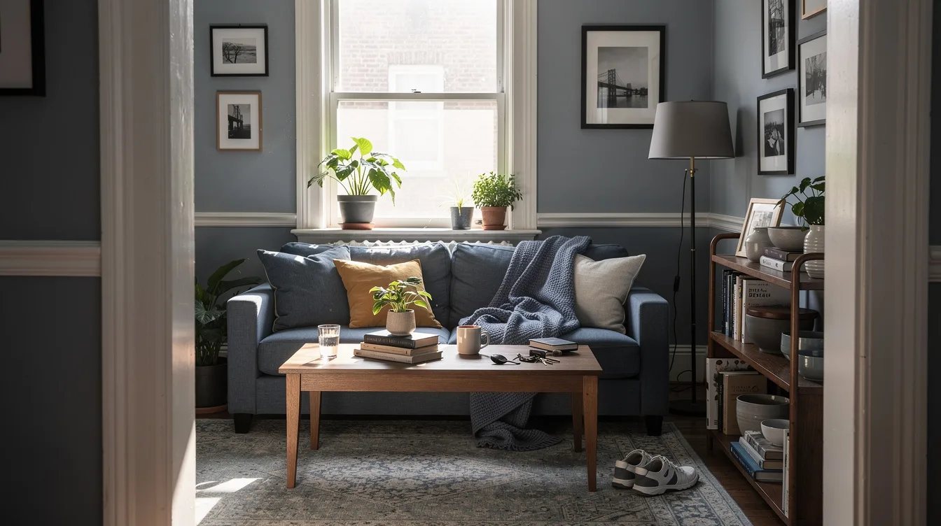
Sharp aqua and navy walls can shrink a small room unless the light is exceptional. A misty blue with a gray undertone works better on walls, ceiling, and trim.
Bring in a Target Casaluna linen duvet in ivory or faded sand. Avoid adding navy rugs, black frames, and bright-white blinds all at once.
Ground the Palette With One Dark Material
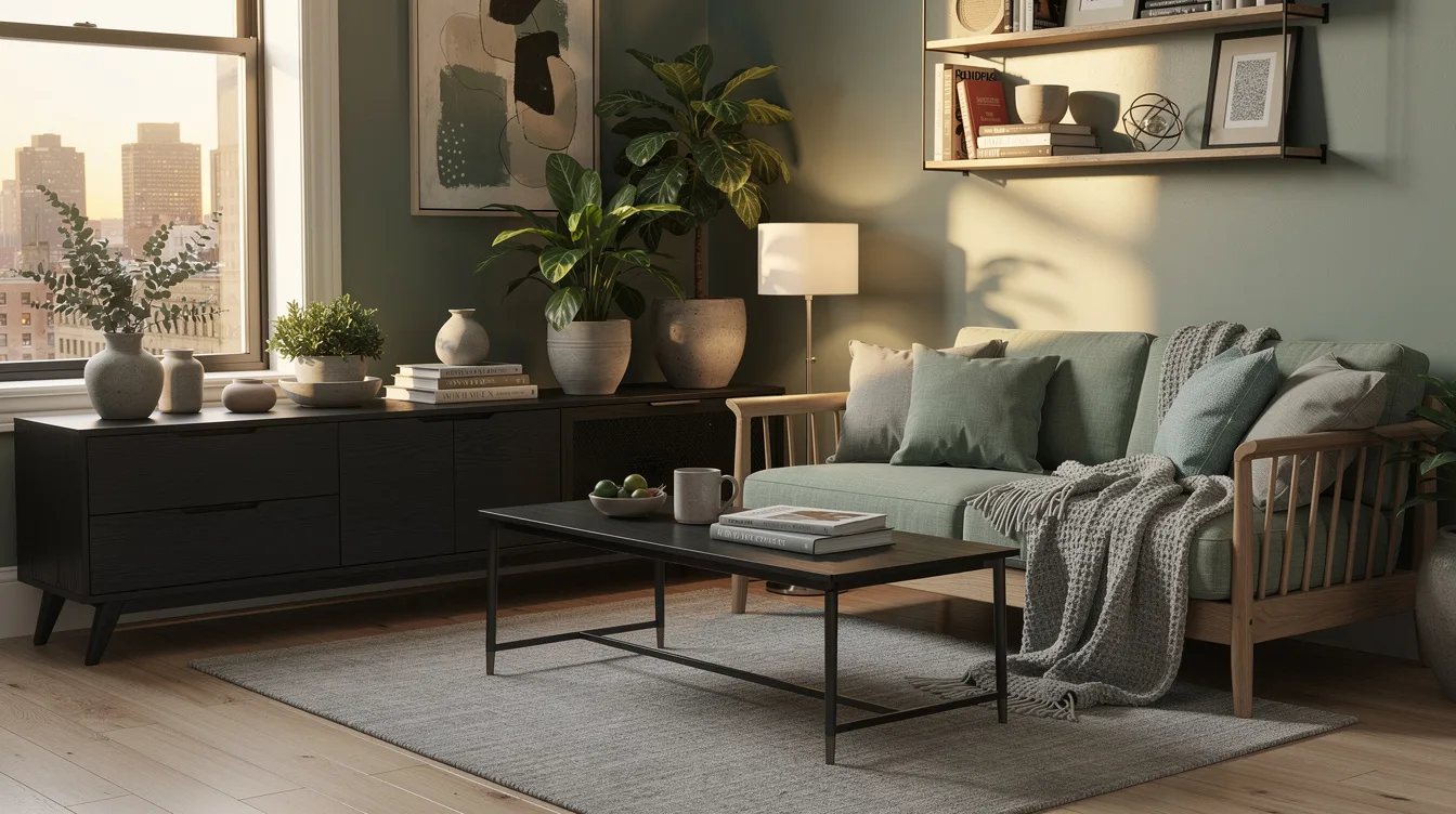
A compact room still needs a little depth, but it needs one dark note rather than a collection of them. Choose a walnut nightstand, dark bronze sconce, or espresso curtain rod.
That single material gives pale walls definition. Repeating dark accents around every wall turns the perimeter into a visual fence.
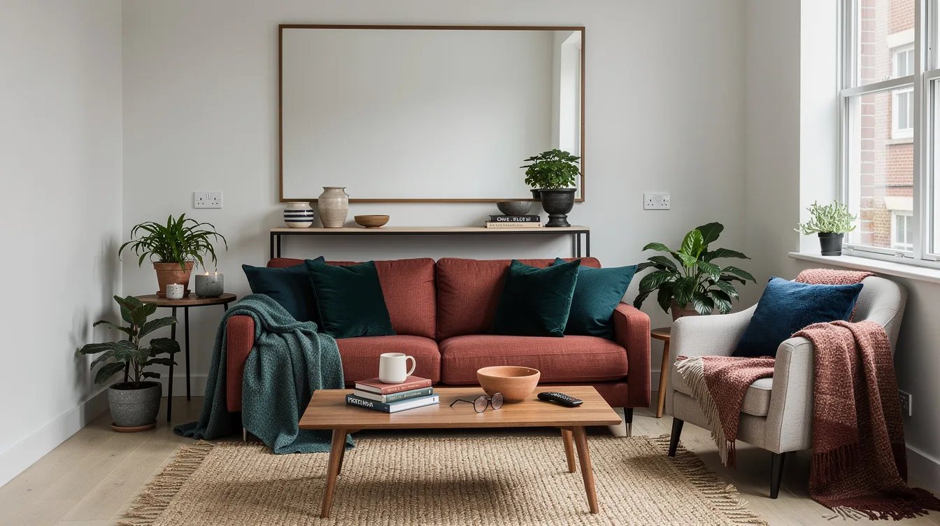
Use One Large Mirror Instead of a Gallery
Several small mirrors create busy reflections and a lot of frame lines. A full-length IKEA HOVET mirror, roughly 31 inches wide and 77 inches high, makes one useful reflected plane.
Place it where it catches daylight or the longest view through the room. Leaning it beside a crowded doorway wastes its best job.
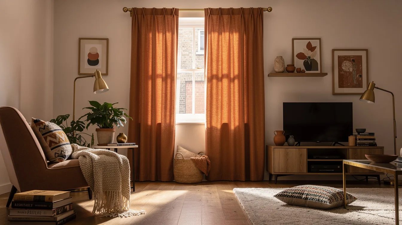
Match Curtains to the Wall Instead of Outlining Windows
High-contrast curtains frame the window like a hard stop. Select oatmeal linen curtains within a few shades of the wall color, then hang the rod close to the ceiling.
The fabric becomes part of the vertical field and makes the window feel taller. A heavy black rod is rarely worth the interruption in a compact room.
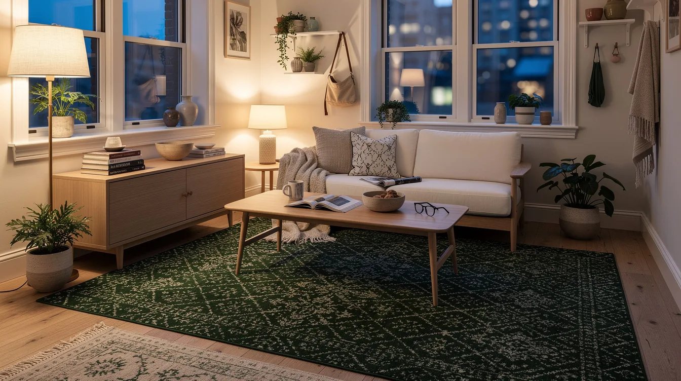
Let the Rug Continue the Quiet Palette
A tiny dark rug floating in the center makes the floor look fragmented. Use a larger low-pile ivory rug that reaches under the bed or desk and stays close to the wall color.
Subtle texture is enough: flatweave, wool loop, or a small-scale stripe. Loud geometric contrast pulls attention downward and outward to every cramped edge.
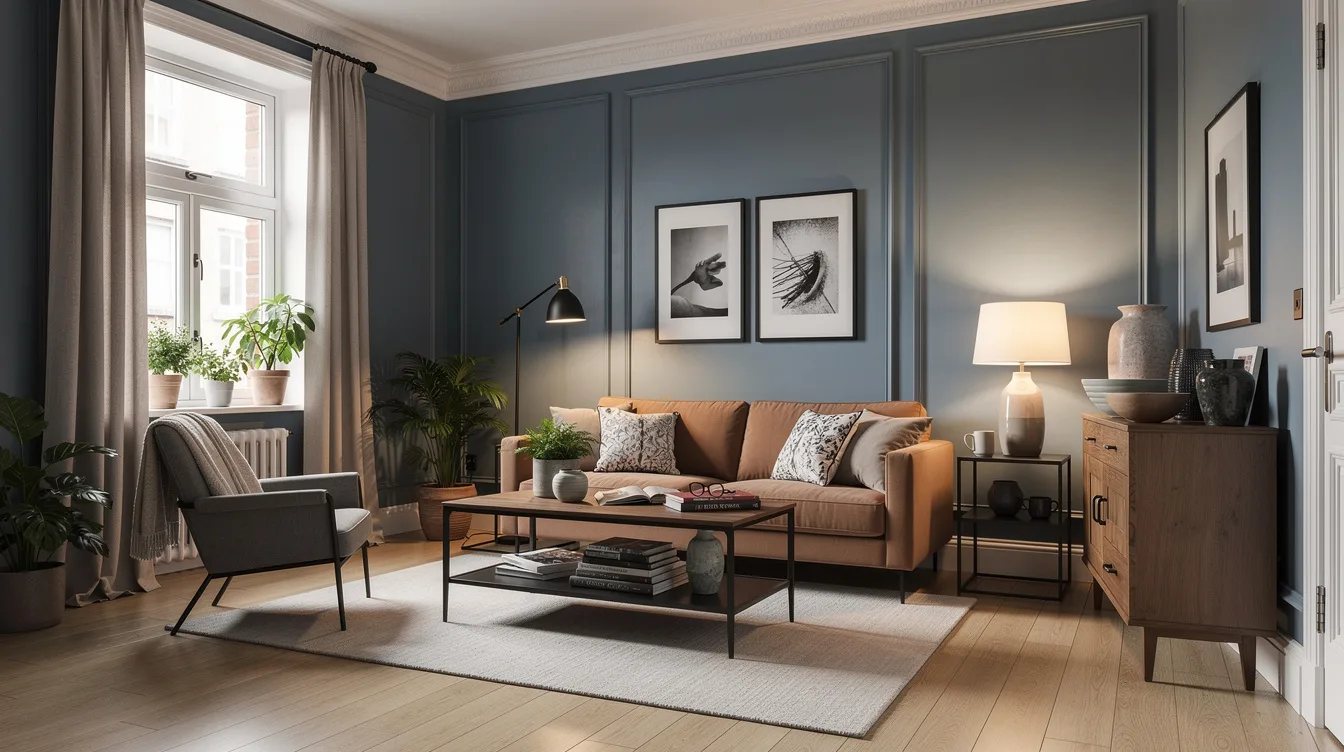
Repeat One Metal Finish Across the Room
Mixed brass, chrome, black, and nickel may work in a large layered room, but a compact one can look accidental. Choose brushed brass hardware for lighting, drawer pulls, and a mirror frame.
Its warm reflection supports plaster, cream, and sage palettes. A single metal family gives the room a more settled outline.
Keep reading
- 12 Bedroom Color Palettes That Make Low Light Feel Brighter
- 12 Designer-Approved Curtain Tricks That Make Small Rooms Feel Taller
- No Windows? These 11 Lighting Layers Make Rooms Feel Less Flat
Start with the largest interruption you can see from the doorway, usually the ceiling line, white trim, or mismatched curtains. Connect that surface to the wall color first, then let one dark material do all the grounding work.


