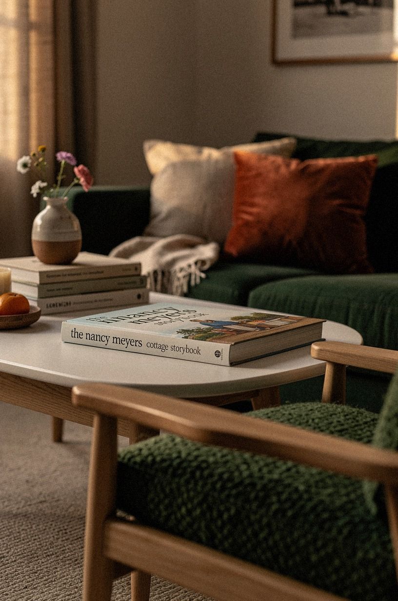
I Reworked My Nancy Meyers Cottage Aesthetic for Storybook Coziness and Here's What Actually Helped
03 october 2026My Nancy Meyers cottage aesthetic makeover worked because I stopped buying charming objects and fixed the room's light, scale, and texture first. I used paint, organic bouclé, warm wood, and secondhand pieces instead of a full renovation. The result feels inviting and lived-in. That difference matters.
- ✓ Start with a soft white anchor for cottage homes
- ✓ Layer the Two-Wood Rule into the room
- ✓ Could Farrow and Ball Pigeon calm the walls?
I made plenty of wrong turns. Here's what stayed.
Here's what it looked like before:
The room had the full starter-home feeling: pale walls, hard overhead light, furniture pushed against every edge, and no clear place for the eye to rest. Nothing was terrible. Nothing had a point of view, either.
I lived with it longer than I should've because every individual piece seemed usable. That's the trap.
You can keep a room functional and still feel no pull to sit there. I wanted something more intimate, rustic, and storybook-like, but I didn't want the room to look like a costume set.
The main problem was scale. The sofa was too small for the wall, the art was too high, and the rug stopped short of every important piece.
I kept trying to solve those problems with accessories. That only made the room feel busier.
The light was equally unhelpful. A single cool ceiling bulb flattened the paint and made the wood appear orange. Once I saw that, I understood why the room never felt comfortable after sunset.
The most useful lesson was that the room needed structure before decoration. I started with the three-height light stack, checked the rug size, and only then reconsidered the art. That order saved me from buying attractive pieces that would've emphasized the wrong proportions.
- Start with a soft white anchor for cottage homes
- Layer the Two-Wood Rule into the room
- Could Farrow and Ball Pigeon calm the walls?
- Hang linen curtains above the frame
- Build the Three-Height Light Stack
- Choose one upholstered anchor
- Mix old and new for living room ideas cottagecore
- Frame the walls at 57 to 60 inches
- Ground the room with a wool rug
- Float storage instead of filling every corner
- Bring country decor in through ceramics
- Can a small room hold a European cottage aesthetic?
1Start with a soft white anchor for cottage homes
I began with Benjamin Moore White Dove OC-17 because the room needed warmth without turning yellow. Against it, forest green, rust, and natural oak felt richer without becoming heavy. An organic bouclé chair softened the harder wood surfaces and gave the room the tactile quality I wanted.
White Dove wasn't my first choice. I tested a cooler white, and it made the wood look orange and the shadows feel sharp.
You won't get a Nancy Meyers cottage feeling from white paint alone, but you'll notice when the white is wrong. A soft base gives your bouclé, ceramics, and aged finishes somewhere calm to land.
A gallon of quality interior paint usually costs around $45 to $75, and I needed two gallons for the main room. That was a better investment than another decorative chair. The paint changed every other decision because the room finally had a consistent background.
I also tested Farrow & Ball Pointing No. 2003, which is creamier and slightly more relaxed. It looked beautiful in the evening but too buttery on the wall beside the window. My opinion is firm here: samples need to stay up for at least two full days before you commit.
I kept the ceiling in the same family rather than creating a hard stripe above the walls. It made the room feel airy without looking bright in a clinical way. And I didn't paint every little surface white, because too much of one tone can flatten the irregularity that makes cottage homes feel collected.
If you're working in a rental, test a removable sample board first. You'll see the color change from morning to evening, and you'll avoid trusting a tiny swatch near a store's fluorescent lights. That small check saved me from repainting.
The paint also gave the Two-Wood Rule somewhere to work. Pale walls can handle deeper furniture, but only when the undertones agree.
2Layer the Two-Wood Rule into the room
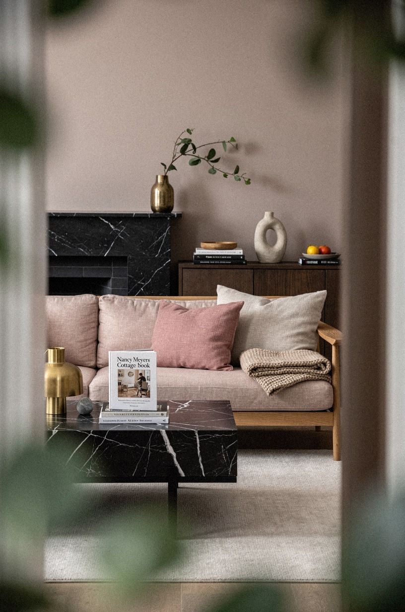
The room had one flat wood tone before, and it looked like a furniture showroom. I introduced a slab of Nero Marquina black marble with white veins on one visible surface, then kept natural oak on a smaller piece. The contrast of dusty rose, charcoal, and brass gave the room an organic rhythm without making it feel busy.
The Two-Wood Rule became my guardrail: natural oak for warmth, charcoal and black for weight, with brass used sparingly. You don't need five finishes to create depth. In fact, five competing stains make a cottage room look accidental rather than collected.
I used an IKEA KALLAX birch-effect unit as the practical storage piece and paired it with a dark marble-topped secondhand side table. The KALLAX isn't precious, which helped. You can fill it with baskets, books, and folded textiles without worrying that every object has to perform.
The unit cost roughly $100 to $250 depending on its size, while the thrifted table cost $65. That price difference shaped the room in a useful way. I spent more attention on placement and proportion than on matching labels.
For the smaller surface, I liked a walnut-toned West Elm side table priced around $250 to $400. Its darker finish worked beside the black marble, but I chose the older piece instead. The worn edge gave the room more personality.
And I skipped glossy orange oak. It catches the light in a harsh way, especially beside cream walls and Nero Marquina marble. A matte or softly worn finish feels more comforting, and your eye can move across the grain instead of stopping at a shiny patch.
The right mix made the soft white anchor feel less precious. That matters because cottage style should feel usable, not like a room nobody's allowed to touch.
3Could Farrow and Ball Pigeon calm the walls?
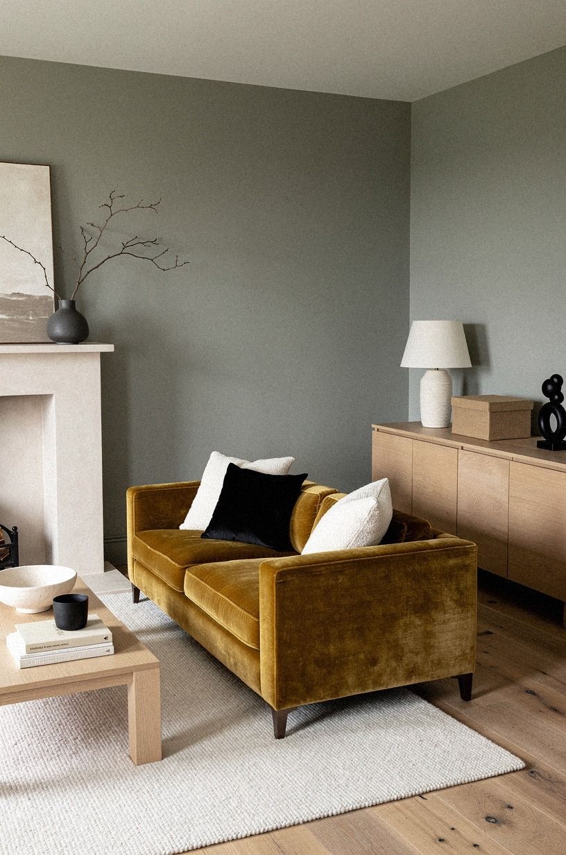
I kept the walls warm white instead, then used camel upholstery, black accents, and deep-pile mohair velvet to bring in the softness I wanted.
4Hang linen curtains above the frame
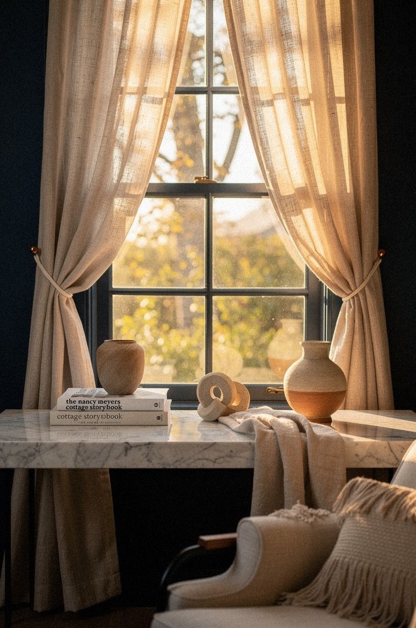
The windows needed height, but I didn't want dramatic drapery that made the room feel formal. I used Belgian flax linen in an ivory shade and hung the rod 4 to 6 inches above the window casing, with the fabric falling all the way to the floor.
That small shift changed the room more than I expected. The ivory linen filters the light into a soft glow, while midnight blue and copper accents gave the room more depth. A Carrara marble surface nearby added a quiet grey veining that connected the pale fabric to the darker palette.
A pair of ready-made linen-blend panels cost me about $160. Custom linen could easily reach $600 to $1,200, and I decided the extra expense wasn't justified for this window. The affordable panels looked convincing because the length and fullness were right.
I made the mistake of buying panels that stopped just above the floor. They looked tidy online and skimpy in the room.
The gap showed too much wall, and the window lost its welcoming shape. Longer curtains gave the room a gentle, relaxed quality.
The rod mattered, too. I chose a slim copper-toned rod from Pottery Barn, priced around $80, instead of a chunky black one. The copper warmed the window without becoming a focal point.
If you're renting, choose a tension rod only when the opening is narrow and the fabric is light. For a wider window, a properly placed removable bracket will look more polished. Your goal isn't a complicated installation.
It's making the light feel intentional!
The curtains also helped the wool rug look warmer because the daylight no longer stopped abruptly at the glass.

5Build the Three-Height Light Stack
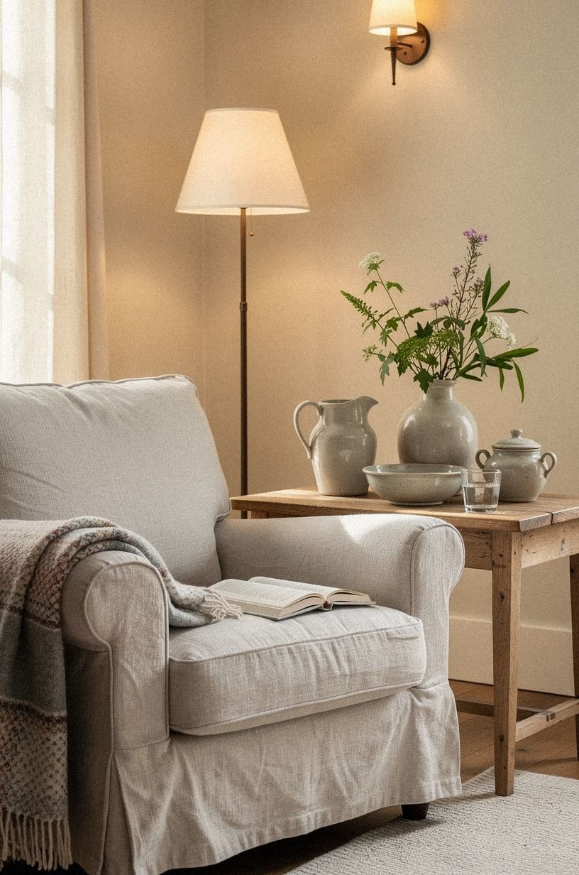
The overhead fixture was the least charming part of the original room. I didn't replace it immediately. Instead, I built a three-source lighting plan with an overhead fixture, a task lamp, and a low ambient lamp.
The rule is simple: three sources per room create more control. You can use the overhead light when you're cleaning, the task light when you're reading, and the ambient lamp when you want the room to feel serene. One ceiling fixture can't do all three jobs gracefully.
I chose a pleated fabric shade for the table lamp and a small lamp with a natural wood base near the chair. Reclaimed weathered teak on a nearby stool added warmth without making the room feel polished. At night, the light pools on the rug instead of blasting every corner.
The pleated lamp cost $145 from Schoolhouse, while the teak stool came from a secondhand shop for $38. The expensive one had better proportions, but the cheaper piece supplied the softer pool of light. Price helped less than placement.
I also added warm LED bulbs between 2,700K and 3,000K. They cost about $8 to $15 for a small pack and made more difference than I expected. The warmer bulbs gave the cream walls a gentle tone after sunset.
And I avoided blue-toned bulbs. They made the walls look dull and the wood look gray.
You don't need a designer fixture to get this effect, but you do need layered placement. A simple lamp in the right spot will beat an expensive fixture used alone.
I tested every lamp from the sofa, the reading chair, and the doorway. That sounds fussy, but the room felt different from each angle. The lighting finally supported the upholstered anchor instead of flattening it.
6Choose one upholstered anchor
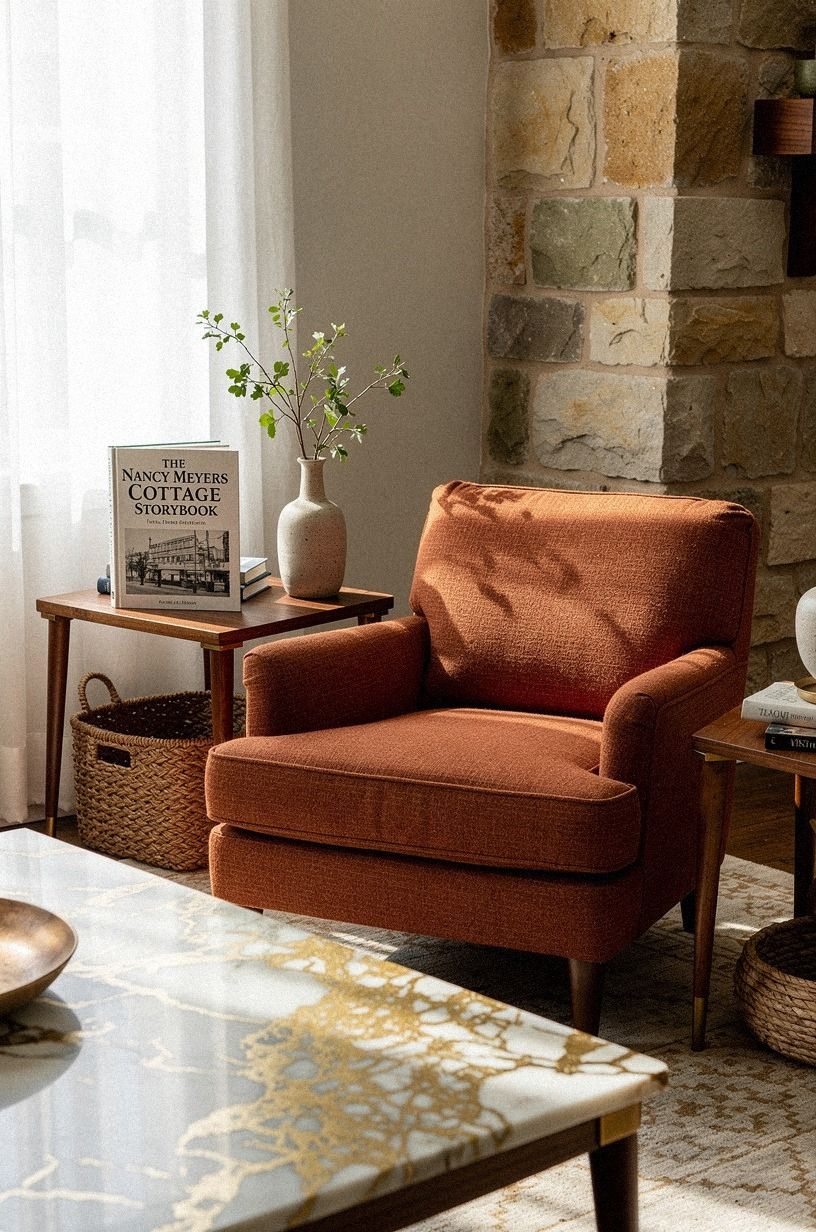
I wanted a sofa that looked comfortable before anyone sat down, so I chose a terracotta mohair velvet chair for the reading corner instead of adding another large piece of furniture. The stone and olive accents kept the color grounded, while a small Calacatta marble table introduced warm gold veining.
7Mix old and new for living room ideas cottagecore
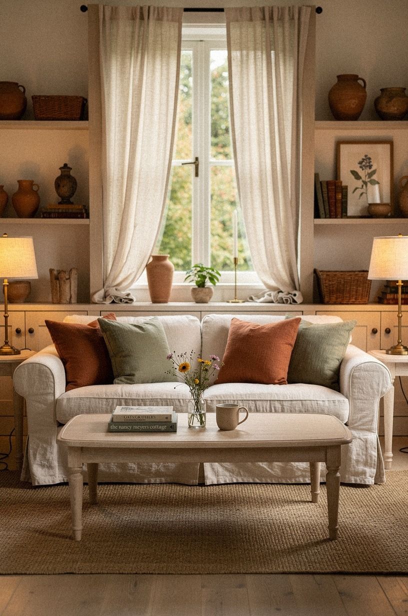
The cottage feeling arrived when I stopped matching everything. I paired a linen cushion in a clay shade with a thrifted pine stool, then added a newer lamp with an aged-brass finish beside a chipped ceramic bowl. The objects don't share a finish, but they share a quiet color story.
I wanted the room to feel charming without pretending it had belonged to the same family for generations. That's where a few modern pieces help. You can let the old objects carry the irregularity while newer pieces handle comfort and function.
My favorite change was a secondhand framed landscape. The paint was slightly cracked, and the frame had a warm brown edge that looked lovely against White Dove. I hung it where the sun could reach it, so the surface changed from flat brown to amber in the afternoon.
The landscape cost $85, while a similar new print from Framebridge could run $200 to $400 with framing. I liked the older piece because its imperfections made the room feel personal. A reproduction would've been attractive, but it wouldn't have carried the same history.
I also mixed in a new cotton cushion from Schoolhouse for about $60. The fabric was sturdy enough for daily use, and its muted stripe connected the rug to the curtains. That small bridge kept the unrelated pieces from looking random.
And I didn't buy a whole vintage collection. Too many distressed pieces would have pushed the room into theatrical territory. One old picture, one worn stool, and a ceramic vessel were enough to make the newer furniture feel grounded.
This balance is why I think the art height matters so much. Good objects still look awkward when they're floating at the wrong level.
8Frame the walls at 57 to 60 inches
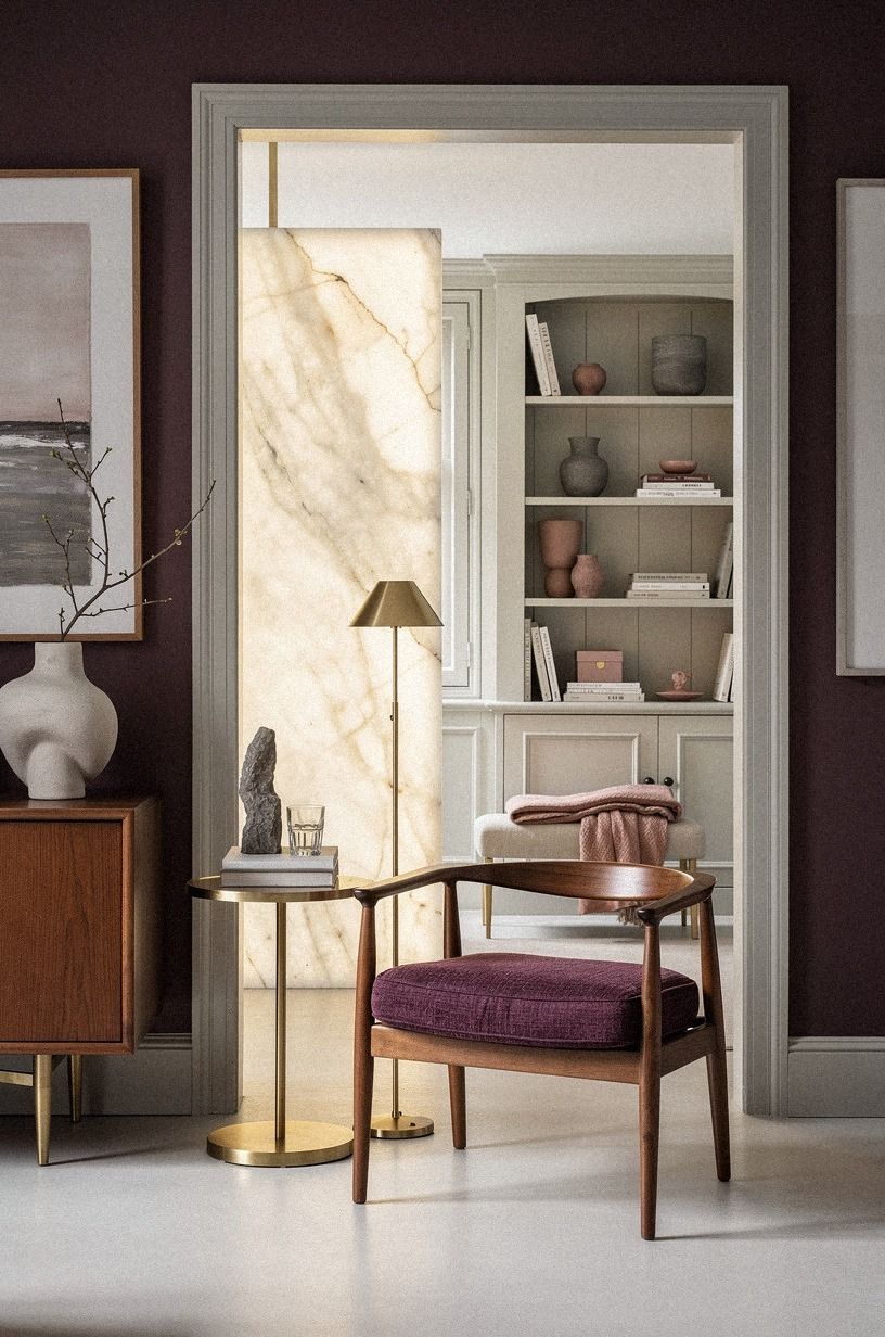
The art had been hung too high, which made the furniture look disconnected from the walls.
9Ground the room with a wool rug
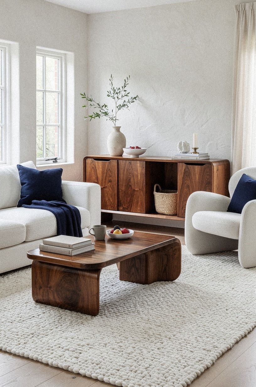
The bare floor made the furniture look scattered, so I added a navy-and-white handwoven wool rug large enough for the front legs of the main seating to overlap it. Book-matched walnut nearby added warmth without competing with the pattern. That overlap was important.
A rug floating in the middle would've made the room feel smaller.
The wool has a gentle unevenness underfoot, and the navy-and-white pattern gives the room structure without making it feel formal. The walnut grain brings in the warmth that the darker palette needs. It feels comforting without looking fluffy or overly casual.
The typical US cost for a wool rug can run from $400 to $1,500, so I treated this as the largest single investment. I didn't buy one until I knew the furniture layout. Guessing first would have been an expensive way to learn the room's scale.
Mine came from Ruggable and cost about $620 for a washable wool-look option. It doesn't have the same depth as a handmade antique rug, but it handles daily spills better. For a busy living room, that tradeoff felt sensible.
I skipped a tiny accent rug beside the chair. It looked sweet in the store and made the chair feel stranded at home. Your rug should connect the main pieces, rather than acting like a small island beneath one pretty object.
I also paid attention to the border. A narrow border framed the seating area without introducing another strong pattern. When the rug arrived, I rolled it out for a week before deciding whether the furniture needed to move.
That week mattered. In daylight, the white looked quiet. At night, under the three-source lighting, the navy threads became deeper and made the room feel finished.
10Float storage instead of filling every corner
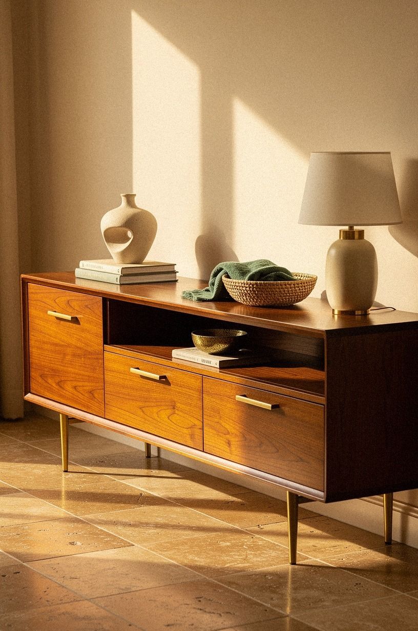
The room needed storage, but tall cabinets would've made the walls feel heavy.
11Bring country decor in through ceramics
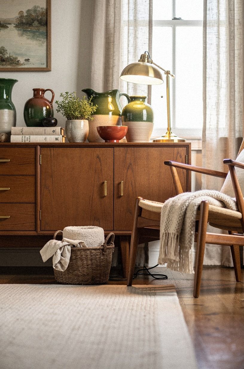
I wanted country decor without turning the room into a themed display, so I used hand-glazed stoneware in forest green and rust, with natural oak nearby. One unlacquered brass detail, already developing a soft patina, brought in the handmade quality I wanted.
The glaze is slightly uneven, and that matters. When the lamp hits the curved side of the pitcher, the surface breaks the light into a soft patch instead of reflecting it cleanly. You can feel the difference even when you aren't consciously studying the shelf.
I placed one bowl on the coffee table with nothing inside it. That sounds too simple, but it gave the table a quiet center. I added a few branches later, though I stopped before the arrangement became a bouquet that demanded maintenance.
A handmade pitcher from East Fork costs around $70 to $120, while a thrifted version may cost $15 to $40. I bought the newer pitcher because its wide handle was comfortable to use. The shape mattered more to me than the maker's mark.
I also added one green vessel from a local pottery sale for $32. Its uneven rim was slightly crooked, which made it more appealing. Perfect symmetry would've made the shelf feel like a showroom.
But I avoided filling every surface with pottery. Too many objects make a room feel like a shop. One generous vessel usually has more presence than six little decorations, and your cleaning routine will thank you.
The ceramics worked because the room already had a calm base. If I had bought them before the Pigeon nook, they would've become another attempt to distract from the wrong paint.
12Can a small room hold a European cottage aesthetic?
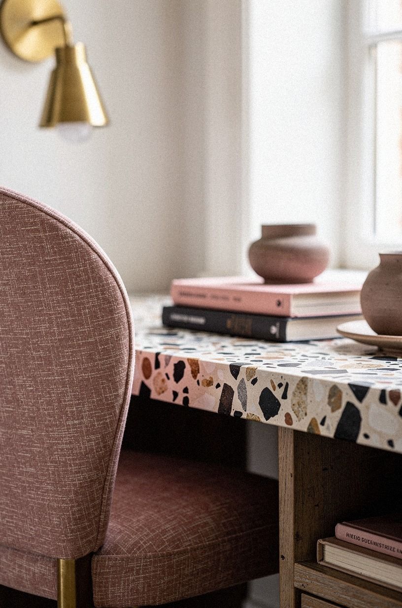
It can, and the limited footprint helped me edit more honestly.
How much it cost
I treated the makeover as a layered project rather than one shopping trip. Paint and textiles came first, then the rug, lighting, and accent furniture. I used the typical US ranges below as the planning guide, because costs change by room size, labor, and whether you buy vintage or new.
The material costs helped me decide where to spend. A pair of linen drapes can run $120-$400, paint for a DIY room can run $200-$600, and a statement light fixture can cost $150-$800.
I wouldn't put every room into the high tier. For this look, the expensive mistake is buying more pieces before solving the light and layout.
My actual spending landed near $3,700. The rug and chair took the biggest portions, while the art and ceramics stayed modest. If I did it again, I'd still spend on the rug first because it changed the scale of everything around it.
The budget version could be much lower. Rearrange the furniture, paint one wall, use lamps you already own, and look for one secondhand wood piece. Those changes create structure before you buy decorative extras.
For a smaller project, I would start with $75 to $150 for paint samples and supplies, then reserve $200 to $400 for lighting and textiles. I wouldn't buy the rug until the layout had settled. That order keeps the makeover flexible and makes the storybook rule easier to follow.
The storybook rule I finally kept
I used to think this style came from collecting enough charming things. It doesn't.
It comes from giving ordinary things a little more patience: letting linen hang to the floor, choosing a rug that reaches the furniture, and waiting to see how paint behaves after sunset. My room became more inviting when I stopped asking each object to be special.
The Nancy Meyers reference works because those rooms feel inhabited. There are books near a chair, a bowl that could hold fruit, and textiles that look soft enough to touch.
The magic isn't perfection. It's the suggestion that someone has been comfortable there for years, even when the room has clearly been considered.
I also learned that storybook coziness needs contrast. Too much pale fabric turns precious.
Too much dark wood turns heavy. Too many old objects feel staged.
The room needs practical pieces, clean lines, and a few irregular surfaces so the warmth has something to push against.
My strongest opinion is this: don't begin with accessories. Begin with the thing your room gets wrong every day. For me, that was the light and the furniture scale.
Once those changed, the paint, wool, ceramics, and linen stopped looking like purchases and started behaving like a home.
If you do only one thing this weekend, move the lamps before you shop. Try one beside the chair, one lower near the sofa, and one where the light can touch a wall. The room will tell you what it needs next!
That was the turning point for me. The room didn't need more personality. It needed fewer competing decisions and better support for the pieces I already liked.
The Questions Worth Answering First
What is the best Nancy Meyers Cottage Aesthetic for Storybook Coziness for a small nancy meyers cottage storybook?
The best starting point is a soft wall color, one compact upholstered chair, and warm wood storage. IKEA KALLAX birch-effect works when you add woven baskets and leave some shelves open. Your small room will feel more intimate if the rug connects the furniture instead of sitting beneath one piece.
Where can I buy Nancy Meyers Cottage Aesthetic for Storybook Coziness pieces on a budget?
Look at IKEA, Wayfair, and Target for accessible lighting, storage, and textiles. Facebook Marketplace and thrift stores are better for worn wood, framed art, and ceramic pieces with character. You don't need a matching collection, and secondhand irregularity can make newer furniture feel more welcoming.
How much does a Nancy Meyers Cottage Aesthetic for Storybook Coziness makeover cost?
A makeover can range from about $200 to $800 for paint, textiles, art, and organization, while a mid-range project with accent furniture, lighting, and a rug typically runs $1,500 to $5,000. Free layout edits and rearranging what you own can change the room before you spend anything.
Can I create a Nancy Meyers Cottage Aesthetic for Storybook Coziness on a budget?
Yes, and you can begin with three low-cost moves: rearrange furniture to clear the walking path, hang art at 57 to 60 inches from the floor, and layer lamps you already own. Paint and secondhand ceramics will usually create more atmosphere than a pile of small decorative purchases.
Is a Nancy Meyers Cottage Aesthetic for Storybook Coziness worth it in a small space?
Yes, because a small room gives you fewer decisions to make. Clear sightlines and one properly sized rug can make the space feel calmer and more generous. Keep the main furniture slightly away from the walls when possible, and leave one surface almost empty so the room can breathe.
Is a Nancy Meyers Cottage Aesthetic for Storybook Coziness a good idea for a rental?
Yes. Use peel-and-stick wallpaper in a small nook, a tension rod for lightweight linen, removable hooks for art, and freestanding storage instead of built-ins. No-damage changes can still add warmth, especially when you focus on lighting, textiles, rug placement, and furniture scale.
Where I'd Start First
If I had to pick one, I'd start with the lighting. Three sources make even plain walls feel warm after sunset, while a beautiful room under one harsh fixture still feels unfinished. Change the light before you buy another object.
Then sit down and see what the room tells you.
I’d check the paint, the rug, and the storage only after the lamps are working. That sequence kept the makeover focused, affordable, and genuinely comfortable.


