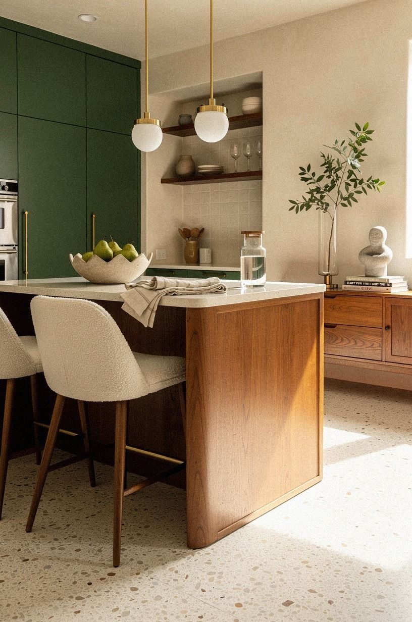
How to Create a Cream & Buttercream Cottage Kitchen for Soft Warmth - 14 Ideas
03 october 2026Cream and buttercream cottage kitchen ideas for soft warmth work best when you build the room from paint outward instead of buying decorations first. I learned that after one expensive cabinet mistake left my kitchen looking flat rather than welcoming. Start with the light, then add aged texture, practical storage, and a little contrast. Your room will feel collected, comfortable, and genuinely lived-in.
Don’t overthink: Why Benjamin Moore White Dove Works on the Cabinets.
- Start with the Light You Already Have
- Why Benjamin Moore White Dove Works on the Cabinets
- Build the Buttercream Color Ladder
- Can Sherwin-Williams Evergreen Fog Ground the Room?
- Anchor the Room with the Two-Wood Rule
- Brass Instead of Chrome: Make the Swap
- Layer the Three-Height Light Stack
- Frame the Sink with Cottage Texture
- Mix Open Shelves with Closed Storage
- Shape the Countertop with Warm Materials
- Hang Linen at the Right Height
- Style the Counter with the Three-Object Rule
- Plan the Island Around Real Clearance
- Farrow & Ball Studio Green Finishes the Upper Cabinets
1Start with the Light You Already Have
Before choosing a paint sample, watch your kitchen for one full day. Notice where morning light lands, where the room turns gray, and which corner stays shadowed after lunch. Your cream kitchen will need a different balance if the windows face north, while strong southern light can make warm paint look surprisingly golden.
I’d begin with Benjamin Moore White Dove OC-17 because it stays soft beside stainless steel without becoming yellow in bright afternoon sun. Test it on foam board and move the sample around the room. A shade that looks delicate at breakfast may feel heavy by dinner.
Your ceiling can stay lighter while the walls take on a creamy finish with a low sheen. If your floor is honey oak, choose a cream with a quieter yellow undertone. If the floor is pale stone, you can move toward a richer buttercream without making the room feel muddy.
This buttercream color ladder will help you keep the palette layered.
Spend time observing before you buy. It’s the least glamorous step, yet it can save you from repainting every cabinet door. A warm kitchen should respond to its natural light and feel settled throughout the day.
2Why Benjamin Moore White Dove Works on the Cabinets
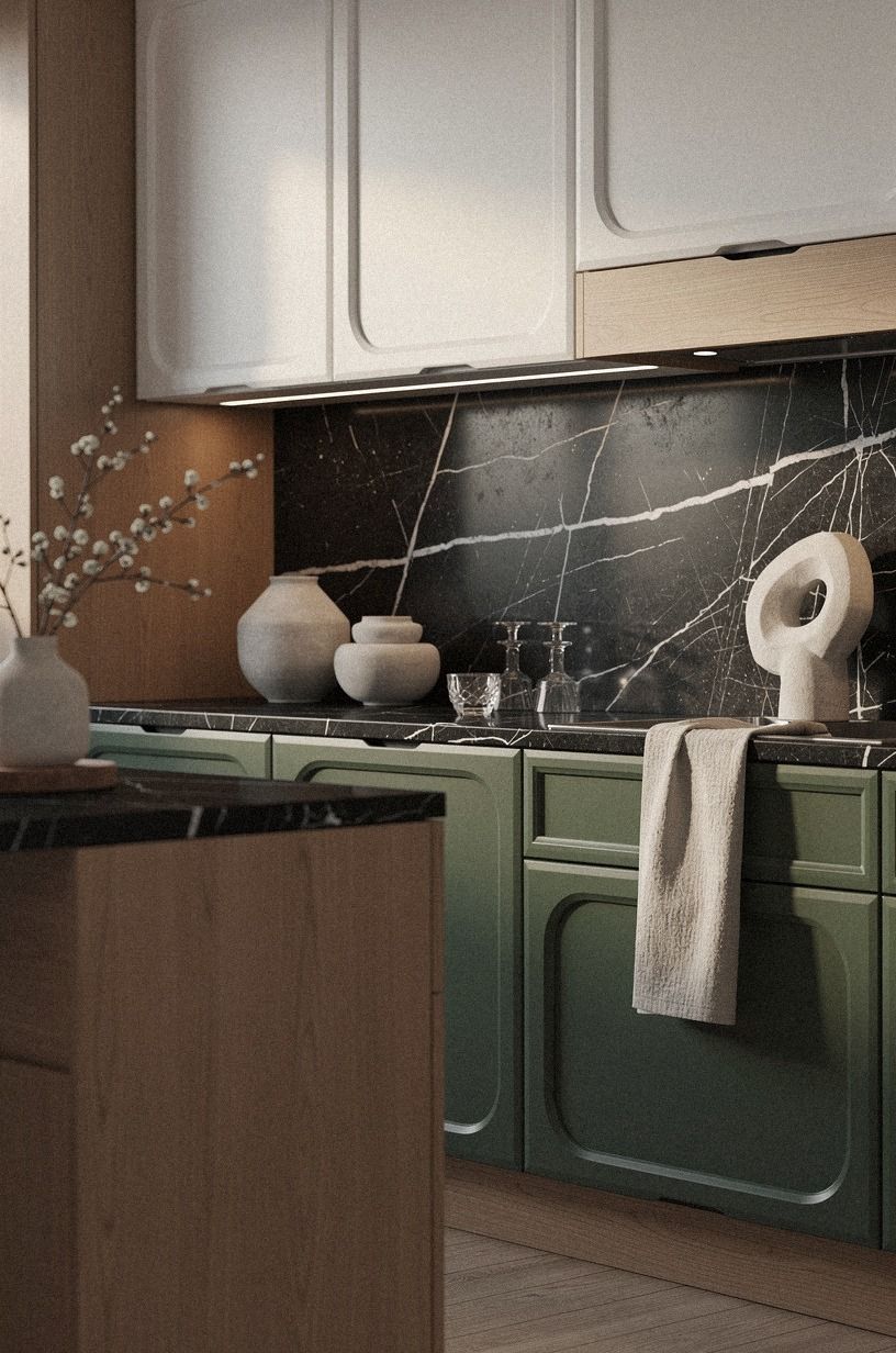
Use Benjamin Moore White Dove OC-17 on the cabinet fronts if your kitchen needs brightness without the sharpness of pure white. Its gentle warmth works with oak floors, aged hardware, woven baskets, and Nero Marquina black marble with white veins. You won’t need to repaint every other surface to make it belong.
I’d choose a satin cabinet finish and an eggshell wall finish because hands touch the doors far more often than the walls. Satin gives the cabinetry a subtle glow while remaining practical around cooking grease. Eggshell keeps the walls softly reflective without creating a plastic-looking shine.
Test the paint beside your countertop rather than in an empty hallway. Cool gray quartz can make White Dove look creamier, while butcher block may push it toward buttercream. Look at the sample beside your backsplash, faucet, and flooring at three different times of day.
If your cabinets are laminate, ask a paint professional about adhesion primer before starting. I once skipped that step on a pantry door, and the first hard scrape exposed the old finish. A careful preparation stage gives the final color a smoother, more durable appearance.
For a richer cabinet effect, use the same color in two finishes. Satin on the doors and a slightly flatter finish on the surrounding walls creates quiet depth.
The palette remains unified, but the surfaces still have their own character. You can then add the two-wood approach without making the room feel busy.
3Build the Buttercream Color Ladder
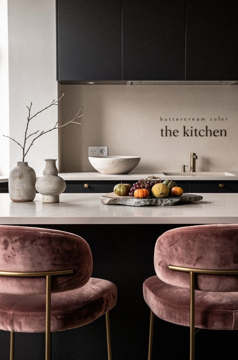
Create three related tones instead of searching for one magical cream. A color ladder gives your cottage kitchen dimension while keeping the atmosphere soft.
Start with a pale base on the ceiling or upper walls. Add a middle cream to the main walls or cabinet surrounds, then use a deeper buttercream on one smaller surface such as a pantry door, breakfast nook, or freestanding hutch. The shades should feel like relatives rather than identical twins.
You can also build the ladder through materials. Pair ivory paint, deep-pile mohair velvet, and warm limestone if you prefer a pale, textural room.
For more richness, combine dusty rose, charcoal, and aged brass. The colors will feel connected because their undertones share the same warmth.
Keep the darkest tone below eye level when the kitchen is compact. A deeper lower cabinet or painted island grounds the room while the lighter upper half preserves openness. In a larger kitchen, a buttercream wall behind open shelves can create a welcoming focal point.
A useful test is to place your samples beside a white plate, a wooden spoon, and a metal handle. If the cream looks green, pink, or intensely yellow beside ordinary objects, it probably won’t stay balanced once the entire room is painted.
Don’t forget the grout. Warm white grout can make pale tile look seamless, while tan grout adds a vintage, handcrafted quality.
That small decision can shift the room from crisp and contemporary to wonderfully timeworn. The restrained palette later in the article shows how to keep those tones from becoming overly beige.
4Can Sherwin-Williams Evergreen Fog Ground the Room?
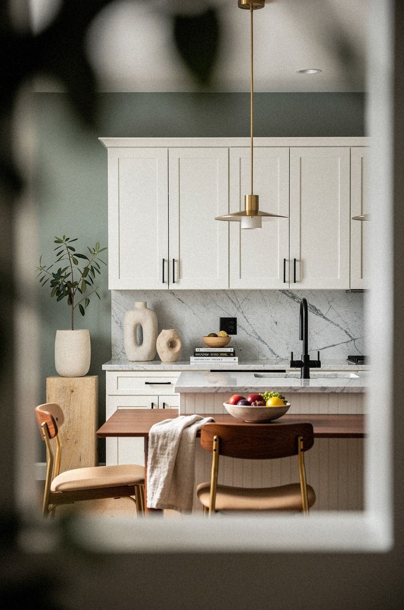
Add Sherwin-Williams Evergreen Fog SW 9130 where your kitchen needs a quiet grounding note.
5Anchor the Room with the Two-Wood Rule
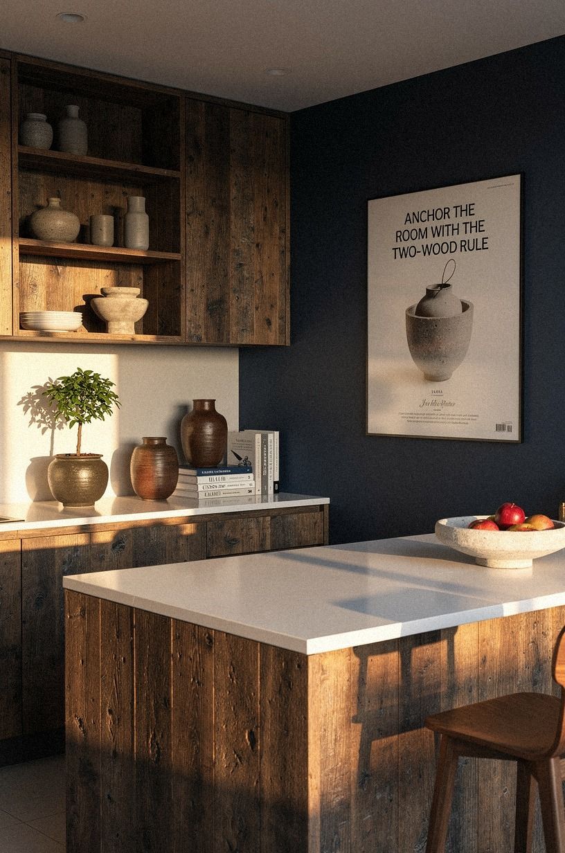
Use two wood tones to keep your cottage kitchen layered while giving your eye somewhere to rest. I’d pair reclaimed weathered teak with pale oak, then leave reddish orange wood out of the mix. The contrast will feel deliberate because the tones are clearly related.
Choose the lighter wood for shelves, stools, or a cutting board, then let the darker tone appear in a small table or frame. You don’t need a matching wood set. Your kitchen will look more lived-in when the grain directions vary slightly.
If your floors are already dark, bring in pale 3/4-inch solid white oak accessories instead of adding another heavy brown surface. A small oak stool or narrow shelf can lift the room without requiring construction.
Wood also adds warmth where paint cannot. A cream kitchen may look beautiful in a photograph but feel strangely flat in person if every surface is sealed and smooth. Natural grain gives your hands and eyes something tactile to notice.
Watch the finish as carefully as the color. Glossy orange varnish can make buttercream paint look harsher, while matte or lightly oiled wood feels more relaxed. If a thrifted table has a strong red undertone, soften it with a pale runner or place it farther from the main cabinetry.
6Brass Instead of Chrome: Make the Swap
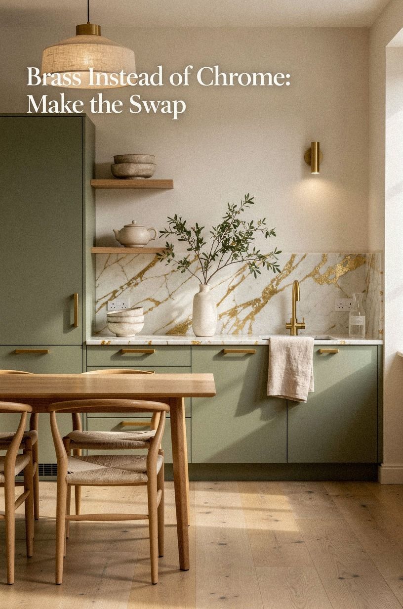
Replace bright chrome knobs with unlacquered brass if you want the room to soften over time. The finish will develop small marks and a warmer patina where your fingers touch it, which suits a cottage kitchen better than a flawless polished surface.
You’ll notice the change most clearly on drawers near the range and sink. Measure your existing hole spacing before ordering anything. Cabinet doors may use single knobs, while drawers need pulls with a specific center-to-center measurement.
I’d avoid mixing five hardware shapes in one room. Choose one knob, one pull, and perhaps a simple latch for a hutch. A little variation keeps the kitchen from looking like a showroom, but too many silhouettes create visual noise.
The brass doesn’t have to match every metal in the room. Aged brass hardware can sit comfortably beside a stainless steel range, an antique copper pot, or a blackened iron shelf bracket. Repeating the finish twice is usually enough to make it feel intentional.
If polished brass feels too bright, look for a brushed or unlacquered option. The softer surface will sit beautifully beside buttercream paint, especially once daily use begins to give it a gentle, irregular patina.
And yes, hardware can transform a tired kitchen in one afternoon! Keep the rest of the room restrained so the new pieces have room to shine. The three-height lighting plan will add another layer of warmth without requiring more decorative objects.
7Layer the Three-Height Light Stack
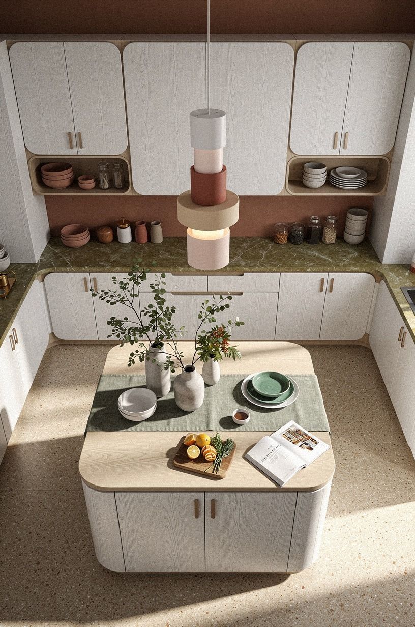
Build the Three-Height Light Stack with ceiling light, task light, and low evening glow. Your overhead fixture handles general brightness, pendant or under-cabinet lighting helps with prep, and a small lamp brings the inviting part after sunset.
I’ve found that the lamp matters most because it gives your eye a warm place to land when the kitchen is no longer working. A compact Schoolhouse Electric pendant over a narrow table can provide enough shape and glow without crowding your sightline.
Use warm bulbs and keep the color temperature consistent across the room. A lamp on a counter, a shaded wall sconce, and a dimmable pendant can make buttercream walls look richer without another coat of paint.
Choose fixtures with different visual weights. A simple ceiling mount can disappear into the background, while a pleated fabric shade or aged brass pendant adds personality. Under-cabinet lighting should remain practical and quiet, with the wiring tucked away whenever possible.
A small lamp beside a cookbook shelf creates a particularly charming evening corner. Choose a ceramic or painted wood base that repeats one material already present in the room. The effect will feel considered without becoming decorative clutter.
If your kitchen has only one ceiling fixture, start with plug-in lighting. You can add a shaded lamp, a rechargeable sconce, or a low-profile strip beneath the cabinets before committing to electrical work. That small change can make the room feel entirely different!
8Frame the Sink with Cottage Texture
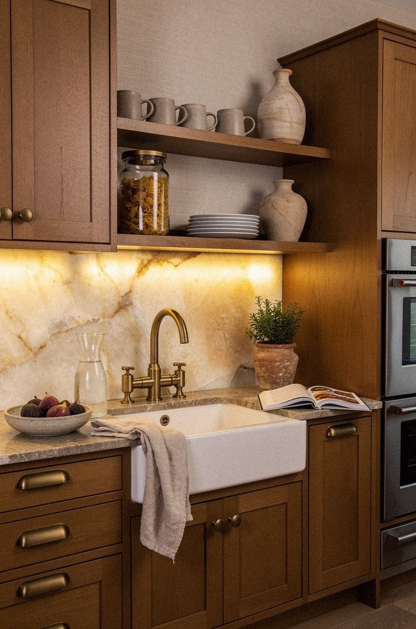
Give your sink wall one tactile feature, such as backlit translucent onyx.
9Mix Open Shelves with Closed Storage
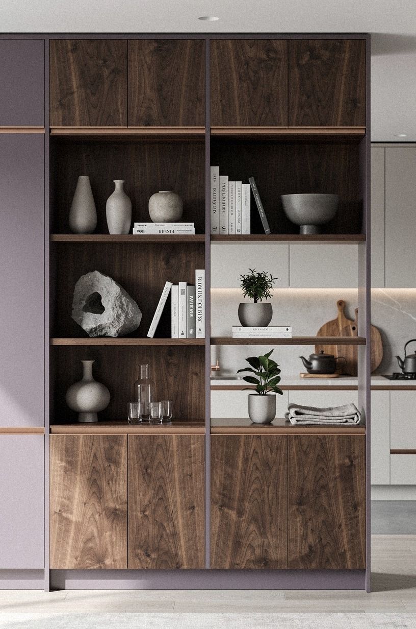
Use open shelving for the pieces you reach for every day, then keep less attractive equipment behind doors. Your kitchen will feel airy without asking you to display every appliance.
A shallow book-matched walnut unit can hold baskets and cookbooks on an empty wall, while closed cabinetry keeps cords, packaging, and spare pans out of view. If you have room for only one shelf, place it where it can support daily routines rather than purely decorative objects.
Two shelves are usually enough for a small wall, especially if your cabinets already carry visual weight. Add a wooden bowl, a stack of linen napkins, and one dark object for contrast. The arrangement should look useful and inviting.
Place shelves where you can clean them easily. Open storage near the stove will collect more grease, so keep frequently used cooking oils in a cabinet or on a washable tray. A shallow ledge near the breakfast area may be easier to maintain than deep shelves beside the range.
Use baskets to soften the practical items. Seagrass baskets, painted tins, and small ceramic crocks can hide tea bags, produce, and dish cloths while preserving the relaxed cottage feeling.
Leave some empty space. A shelf packed from end to end will make the room feel crowded, regardless of how beautiful the objects are.
One quiet gap can make the entire arrangement look more generous. The same principle applies to counter styling.
10Shape the Countertop with Warm Materials
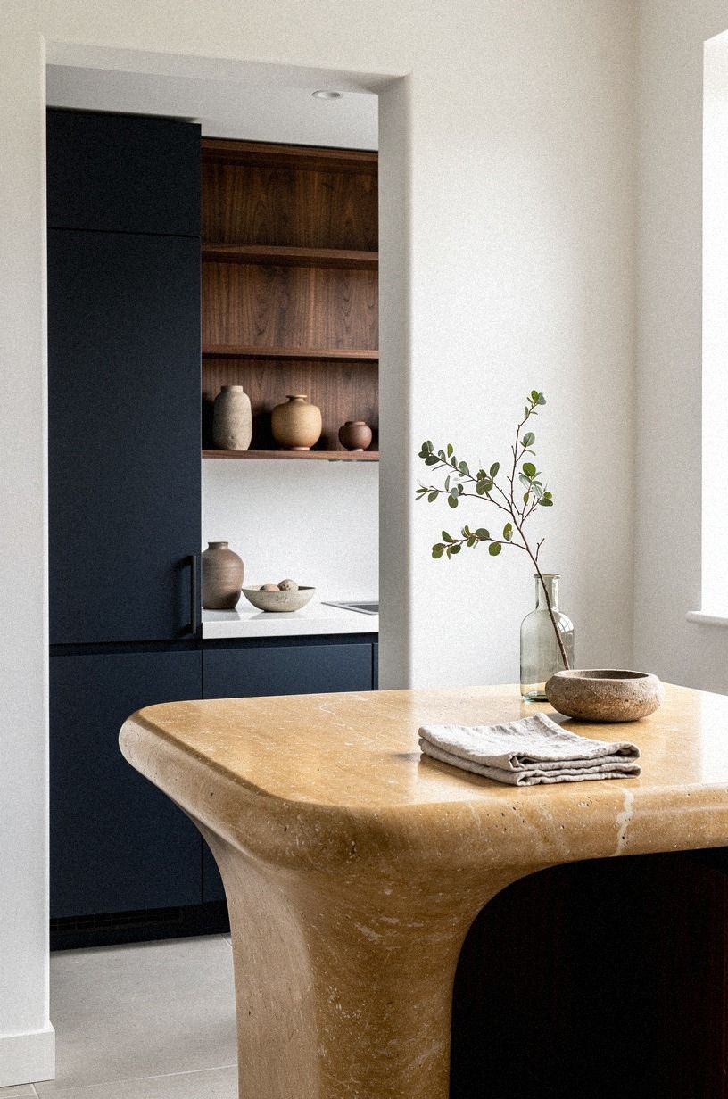
Choose warm travertine countertop material by how you live rather than by a color board alone.
11Hang Linen at the Right Height
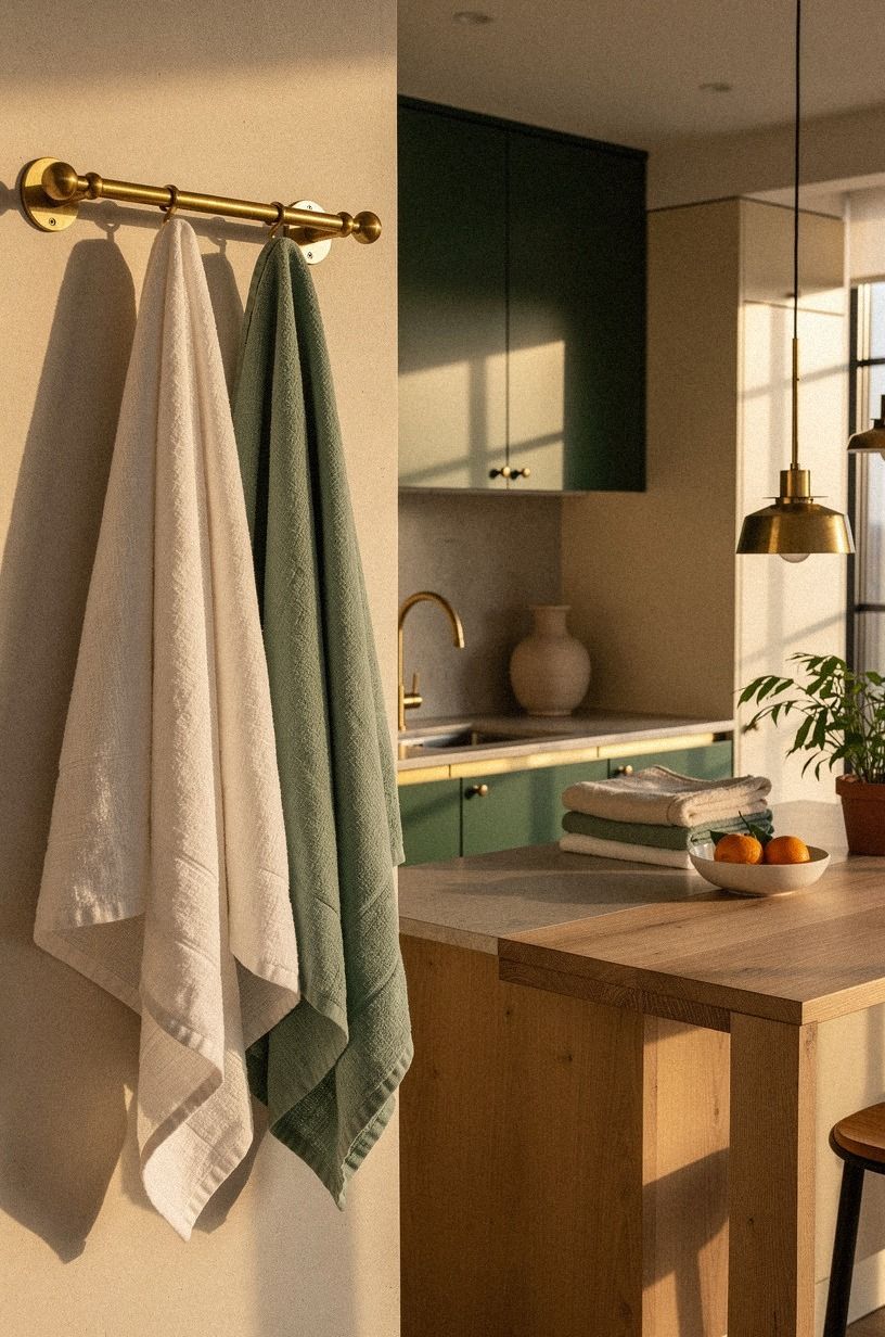
Soften hard cabinet lines with Belgian flax linen curtains or a simple café panel. Hang the fabric so your window still receives daylight, and keep the pattern quiet if your backsplash already has texture.
Your kitchen will feel more intimate when fabric breaks up the wood, metal, and stone. Choose a washable blend if your sink sits nearby. You’ll appreciate that decision the first time sauce splatters during dinner.
A café curtain can cover the lower half of a window while keeping your upper view open, and it works especially well in a rental. If you’re using a tension rod, check the fit every few weeks so the fabric doesn’t sag into the sink area.
For a more polished look, mount the rod slightly wider than the window frame. Let the fabric gather at the sides when open, and choose a length that ends safely above the faucet. A small hem adjustment can make inexpensive linen look far more tailored.
Cream linen works with the palette but doesn’t need to match the walls exactly. A flax shade or soft oatmeal tone can add depth. If the room already has several warm surfaces, choose a pale neutral with a slightly gray undertone to keep the atmosphere fresh.
Avoid heavy patterns near a busy backsplash. A subtle stripe, tiny check, or washed floral can be charming, while a large high-contrast print may overpower the gentle cottage mood.
12Style the Counter with the Three-Object Rule
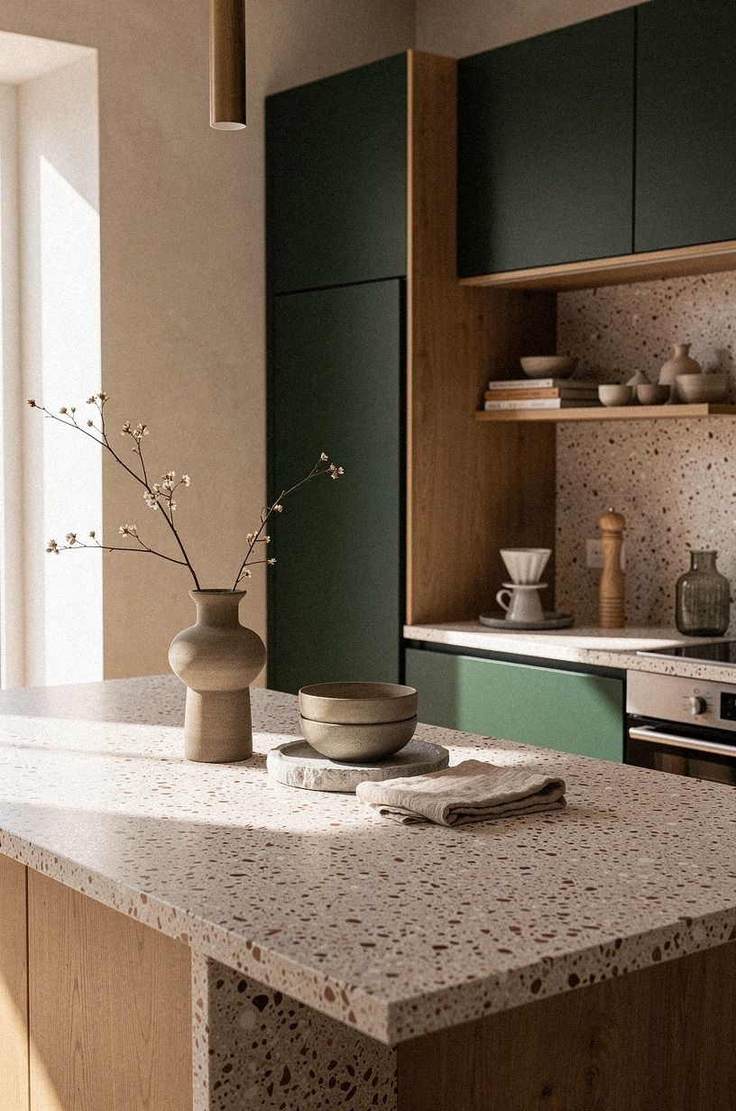
Limit each visible counter zone to three useful objects. The Three-Object Rule might mean a ceramic crock, a cutting board, and a small lamp beside the range. Your eye gets a simple grouping while your hands still have enough room to cook.
I’d rather see three substantial pieces than twelve tiny decorations collecting grease. Use height variation so the arrangement doesn’t look stiff. A tall crock, a medium wooden board, and a low bowl create an easy rhythm.
If you use oversized-chip terrazzo on the counter, let it carry the visual interest rather than adding busy objects. You’ll want every object to earn its space. A kitchen feels warmer when the styling shows how the room is actually used.
Keep one object slightly imperfect. A chipped but stable bowl, an old cutting board, or a handmade mug can bring more soul than a matching set. The room should feel cared for, with enough character to avoid looking sealed behind glass.
Countertop styling also needs a reset point. Decide where mail, keys, and groceries will land before they spread across the work surface. A narrow tray beside the door or a wall hook near the entrance can protect the kitchen from everyday drift.
At the end of the day, clear the main prep area and leave only the pieces that support tomorrow morning. That small ritual keeps the buttercream palette feeling serene.
13Plan the Island Around Real Clearance
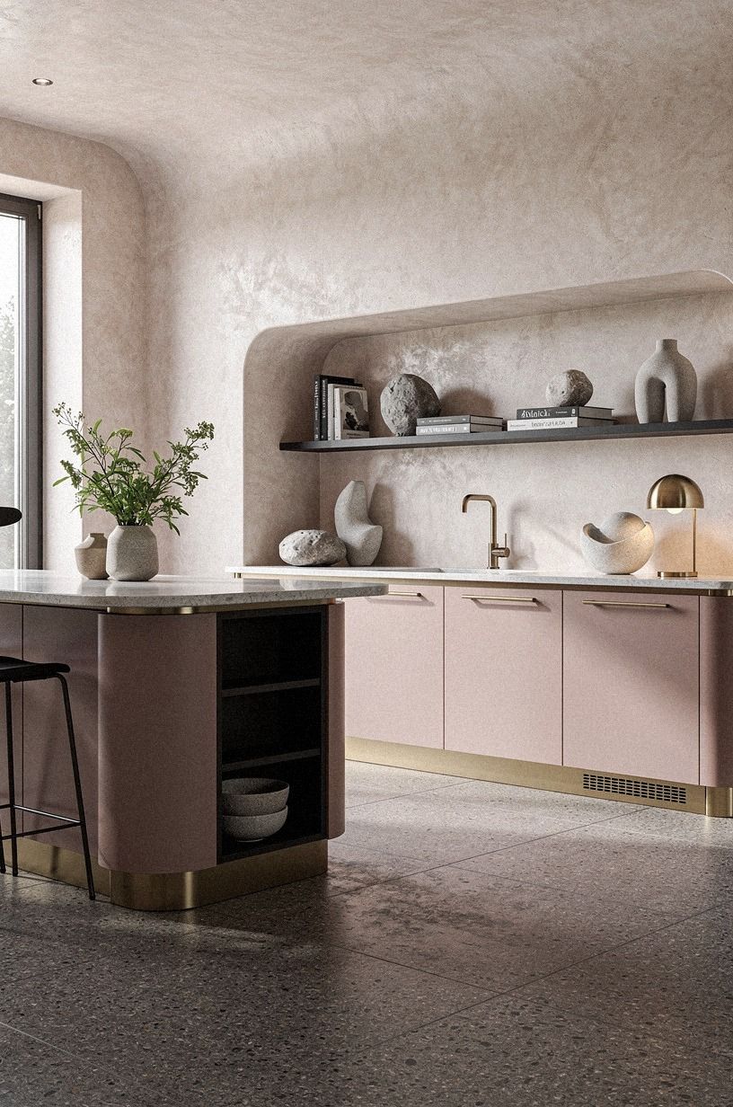
If your layout includes an island, protect the walking space before choosing its finish. A beautiful island that blocks the oven, dishwasher, or refrigerator will make the entire kitchen frustrating.
Aim for at least 42 inches of clearance in a busy work aisle and more if two people cook together. Measure with cabinet doors and appliance handles fully open. Painter’s tape on the floor can help you test the footprint before ordering anything.
A narrow worktable may suit a cottage kitchen better than a deep built-in island. It can provide prep space, storage, and a place for stools without making the room feel crowded. Choose a table with open legs if you want the floor to remain visually visible.
If you need hidden storage, use drawers for pans and shallow shelves for baskets. Deep cabinets often become difficult to organize, especially when the island sits in the center of the room. A few well-planned drawers can be more useful than a large empty cupboard.
Let the island carry one distinct material. A hand-applied Venetian plaster finish, a dusty rose base with charcoal stools, or a brass detail against White Dove cabinetry can all work beautifully.
Leave enough room for the island to feel intentional. A tiny gap around a bulky piece makes the kitchen feel cramped, while a simple table with generous breathing space can look elegant and relaxed. Recheck the measurements before making the budget decisions.
14Farrow & Ball Studio Green Finishes the Upper Cabinets
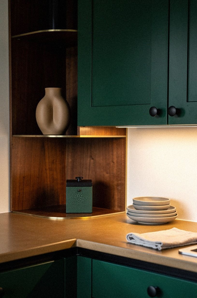
Paint the upper cabinets Farrow & Ball Studio Green and balance them with warm white, camel, black accents, and small shagreen details.
What This Kitchen Should Cost
Your budget depends on whether you’re changing color and hardware or rebuilding the room. A cosmetic update can stay focused on paint, lighting, pulls, and removable backsplash material. A larger refresh may include cabinet fronts, a faucet, and a new counter.
Use these typical US ranges as planning markers rather than a promise for your exact contractor quote.
For individual materials, quartz countertop pricing commonly sits around $60-$120 per square foot, while laminate is typically $10-$40 per square foot. Zellige backsplash can run $15-$35 per square foot, and repainted Shaker fronts often cost $150-$400 per door.
Your best value is usually the change you see every day, so I’d prioritize paint and lighting before decorative containers. Replacing a harsh ceiling fixture may change the room more dramatically than buying a dozen new accessories.
If the budget is tight, divide the work into phases. Paint and hardware can come first, followed by lighting and textiles.
A small butcher-block worktop or vintage table can wait until you know how the new palette behaves. That first focused pass can change the room more than expected!
Why I’d Keep the Cottage Palette Restrained
Cream and buttercream work because they give your kitchen a calm base for texture. They don’t require every surface to be pale. I’ve tried the all-beige approach, and it made the room look sleepy by late afternoon.
The better version uses cream, warm wood, aged metal, and one grounded color so your eye can move without getting lost. A muted green, charcoal accent, or deep walnut can make the lighter surfaces feel even more luminous.
This style is practical for a lived-in home. A Target Threshold basket can hide produce, a vintage stool can add character, and a thrifted ceramic bowl can bring in the slight irregularity that new pieces often lack.
Your room shouldn’t become a collection of props. Keep the items you use, remove duplicates, and let one imperfect object stay imperfect. That’s where the warmth starts to feel honest.
The Opinion I’d Give Before You Buy Anything
I’d spend your first weekend testing paint and studying the light rather than shopping for cottage accessories. The internet makes buttercream kitchens look effortless because finished images hide the decisions underneath.
I know this because I bought the brass before settling the cabinet color, then had to return half of it when the yellow undertone became too strong. The order matters.
Sample, measure, paint, light, then layer texture. If you’re working with a limited budget, choose one visible upgrade and finish it well. A new faucet beside peeling cabinets won’t rescue the room, while fresh cabinet paint beside an old table can look wonderfully settled.
And yes, you can make the space feel warm without replacing everything! The restraint is the point. A few confident choices will give the kitchen more personality than a rushed renovation.
A Few Things Worth Answering
What is the best Cream & Buttercream Cottage Kitchen Ideas for Soft Warmth approach for a small kitchen?
Start with Benjamin Moore White Dove on the cabinets and one warm wood accent. Light cabinets keep the room open, while an IKEA KALLAX birch-effect unit can add storage without a bulky visual block. Keep the counter mostly clear and use one darker object for depth.
Where can I buy Cream & Buttercream Cottage Kitchen Ideas for Soft Warmth pieces on a budget?
Look at IKEA, Wayfair, and Target for practical pieces, then check Facebook Marketplace and local thrift stores for tables, stools, and pottery. Secondhand wood often has better texture than new furniture, and you can repaint it if the undertone doesn’t suit your kitchen.
How much does a Cream & Buttercream Cottage Kitchen Ideas for Soft Warmth makeover cost?
A small cosmetic update can cost about $300 to $1,500, depending on paint, hardware, and backsplash material. Paint-first changes are usually the most affordable.
A larger refresh with cabinet fronts, lighting, a faucet, and a laminate top can reach $3,000 to $12,000. The full cost breakdown gives you a useful starting point.
Can I create a Cream & Buttercream Cottage Kitchen Ideas for Soft Warmth look on a budget?
Yes, and you can begin without remodeling. Paint one cabinet zone, replace the most visible hardware, and bring in a thrifted wood piece. Free styling counts too: remove clutter, group useful ceramics, and move your lamp to the darkest counter corner.
Is a Cream & Buttercream Cottage Kitchen Ideas for Soft Warmth style worth it in a small space?
Yes, because the pale base reflects light while warm texture stops the room from feeling sterile. Small kitchens benefit from restraint.
Use open shelving on one wall, choose a narrow table instead of an island, and keep at least 42 inches of clearance where people need to pass. The island planning section covers the measurements in more detail.
Is a Cream & Buttercream Cottage Kitchen Ideas for Soft Warmth a good idea for a rental?
Yes. Use removable wallpaper away from heat, a tension rod with a linen café curtain, and freestanding furniture instead of permanent cabinetry changes. No-damage layers can include plug-in sconces, peel-and-stick hooks, and hardware you store safely so you can reinstall the original pieces later.
Where I’d Start First
If I had to pick one step, I’d start with Benjamin Moore White Dove on the cabinets. It gives your kitchen a warm base without locking you into yellow, and every wood, brass, and linen choice will look better beside it.
Paint one door tonight, then live with it through breakfast and dinner. Look at it in morning shade, bright afternoon sun, and low evening light. If the color still feels calm in all three conditions, you’ve found the right beginning.


