12 Ways to Mix Wood Tones So Your Room Looks Intentional
02 october 2026The floor is often the first wood tone in a room, and it can make every later purchase feel like a gamble. A reliable starting point is the 60/30/10 palette: about 60% anchor wood, 30% secondary wood, and 10% accent.
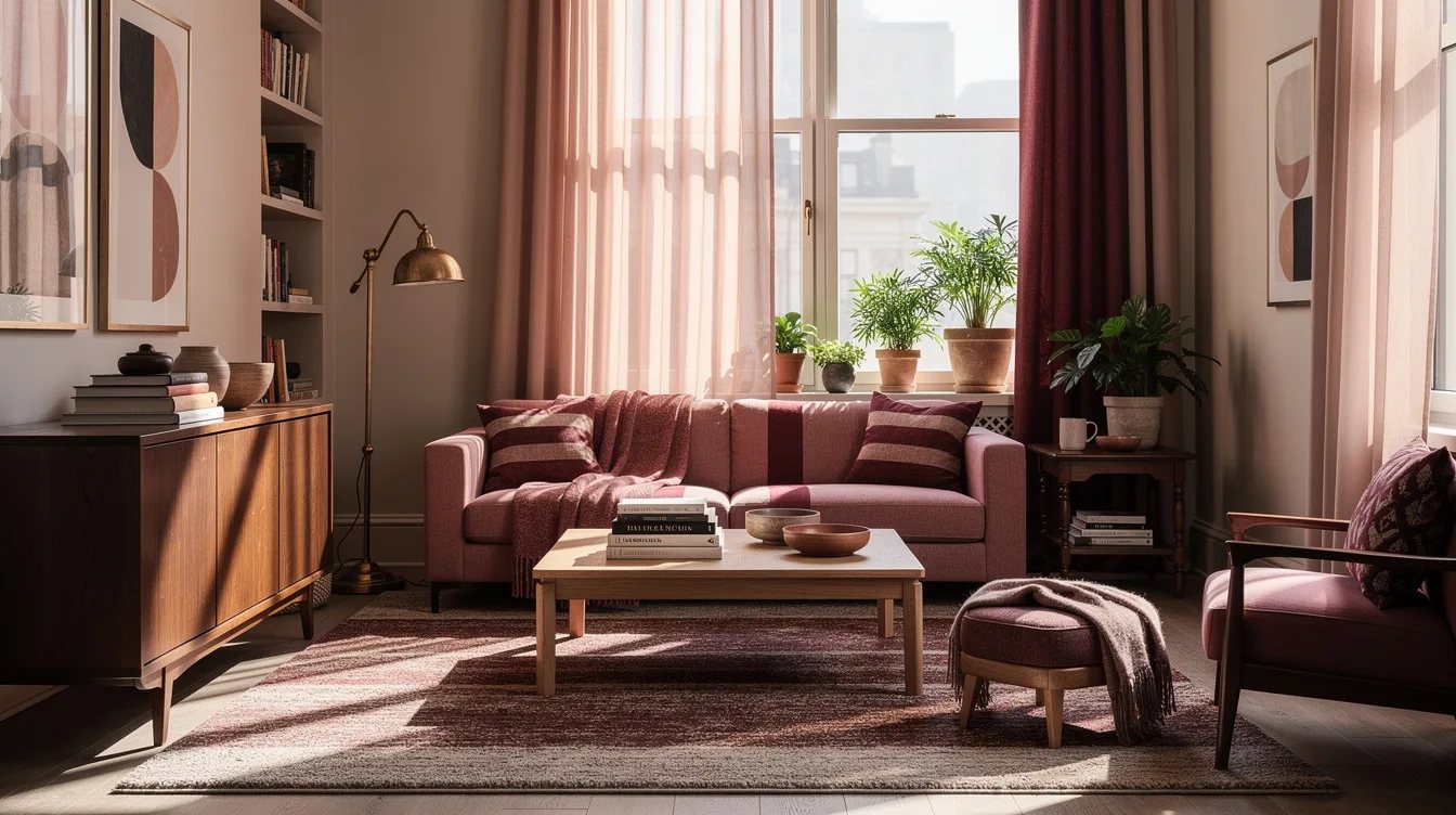
The goal is not perfect matching. It is a small, deliberate mix where tones repeat, undertones make sense, and textiles or painted surfaces give contrasting finishes room to breathe.
What you will find inside
- Set One Wood as the Anchor
- Limit the Palette to Three Finishes
- Separate Almost-Matching Woods
- Read Undertones Before Choosing Species
- Apply the 60/30/10 Wood Ratio
- Pair White Oak With Walnut
- Build Around a Warm Oak Floor
- Bridge Reddish Wood With Deep Contrast
- Cool Gray Wood With Pale Materials
- Repeat the Accent Near the Room’s Edges
- Break Up Gloss With Matte Surfaces
- Use Textiles as Visual Separators
Set One Wood as the Anchor
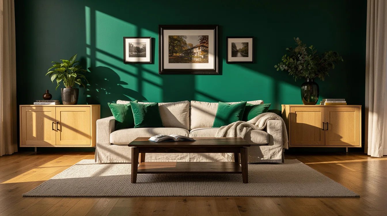
Start with the largest visible surface, usually the floor, built-ins, or a substantial dining table. Treat the existing honey-oak floor as the room’s anchor, then select every other wood in relation to it.
Our preferred approach keeps the anchor dominant while smaller pieces provide contrast. A walnut coffee table can feel intentional beside golden oak because the difference is clear enough to look planned.
Limit the Palette to Three Finishes
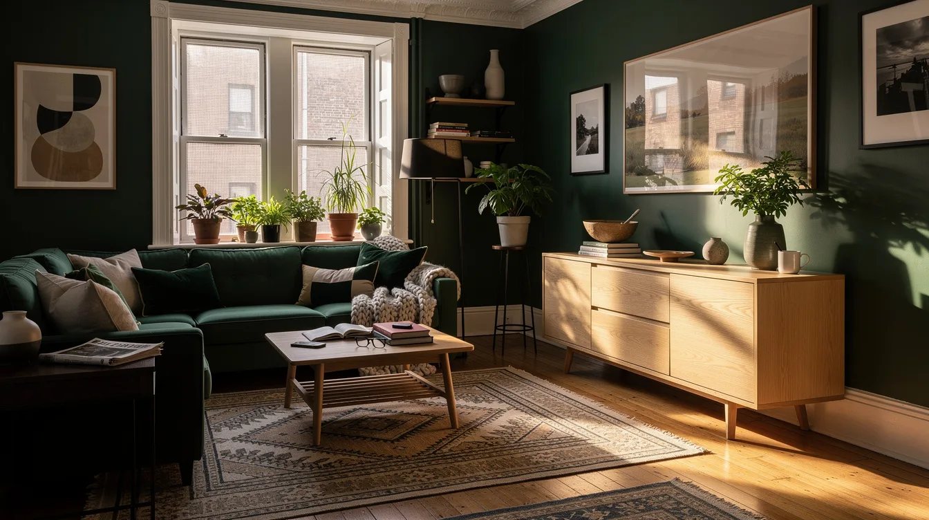
Keep the room to roughly two or three distinct wood finishes, even when the space contains many wooden objects. A useful mix might include white oak, medium walnut, and a small amount of ebonized oak.
Repeat each finish at least twice so every tone feels connected to the room. One walnut table and one walnut frame read as a decision; one walnut table surrounded by unrelated wood can look stranded.
Separate Almost-Matching Woods
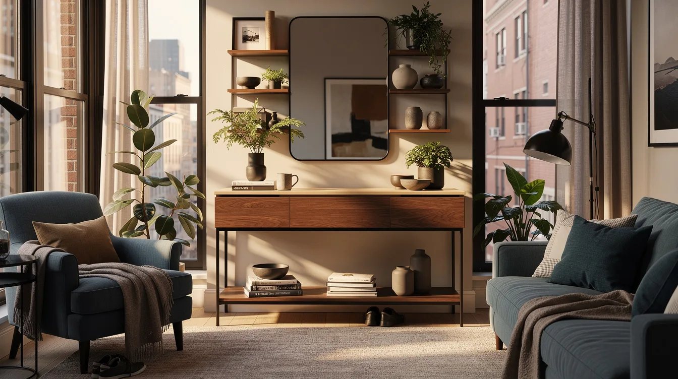
Furniture that is only slightly lighter, redder, or yellower than the floor often looks like a failed matching set. A medium walnut dresser beside a nearly identical brown veneer creates visual tension without adding useful contrast.
Choose a clearly different depth instead. Pair pale oak with dark walnut, or place a black-stained oak bench against a warm floor, then use upholstery or a rug to give the eye a clean stopping point.
Read Undertones Before Choosing Species
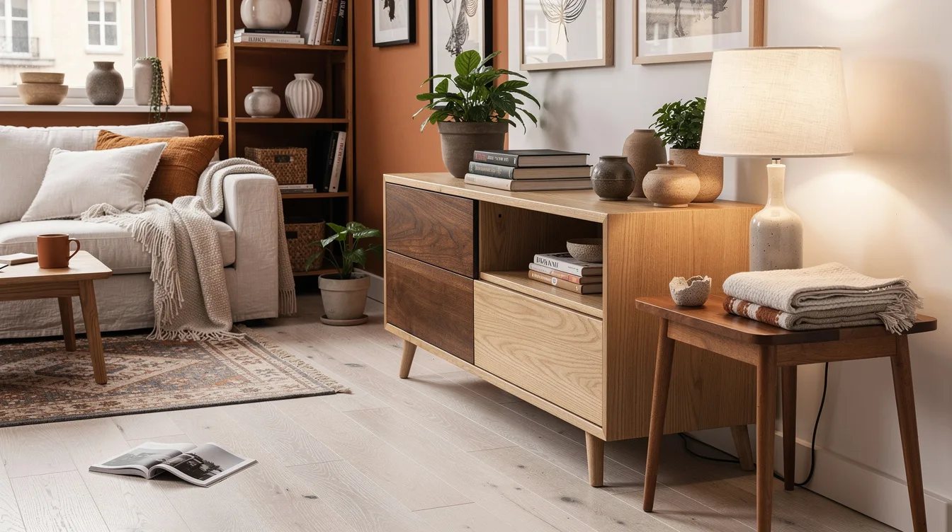
A wood species name does not guarantee one consistent color because stain, topcoat, age, veneer, and lighting all change the result. Check a wood sample in morning daylight, late-afternoon light, and evening lamp light before ordering a major piece.
Most large pieces should lean warm, cool, or neutral in the same direction. Warm orange oak, red mahogany, gray driftwood, and black-brown espresso can compete quickly, so let one contrasting tone act as punctuation.
Apply the 60/30/10 Wood Ratio
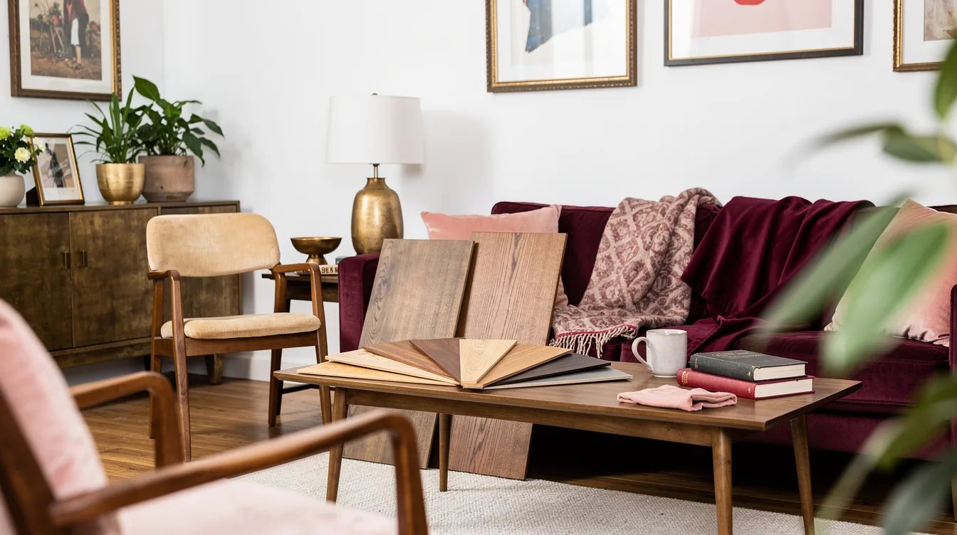
Use the designer rule of thumb of about 60% dominant wood, 30% secondary wood, and 10% accent wood. The floor might carry the largest share, a dark table might provide the secondary layer, and an ebonized-oak tray could supply the small accent.
The percentages are a guide rather than a measuring exercise. Their real purpose is hierarchy: one finish should lead, one should support, and the smallest tone should appear sparingly enough to stay sharp.
Pair White Oak With Walnut
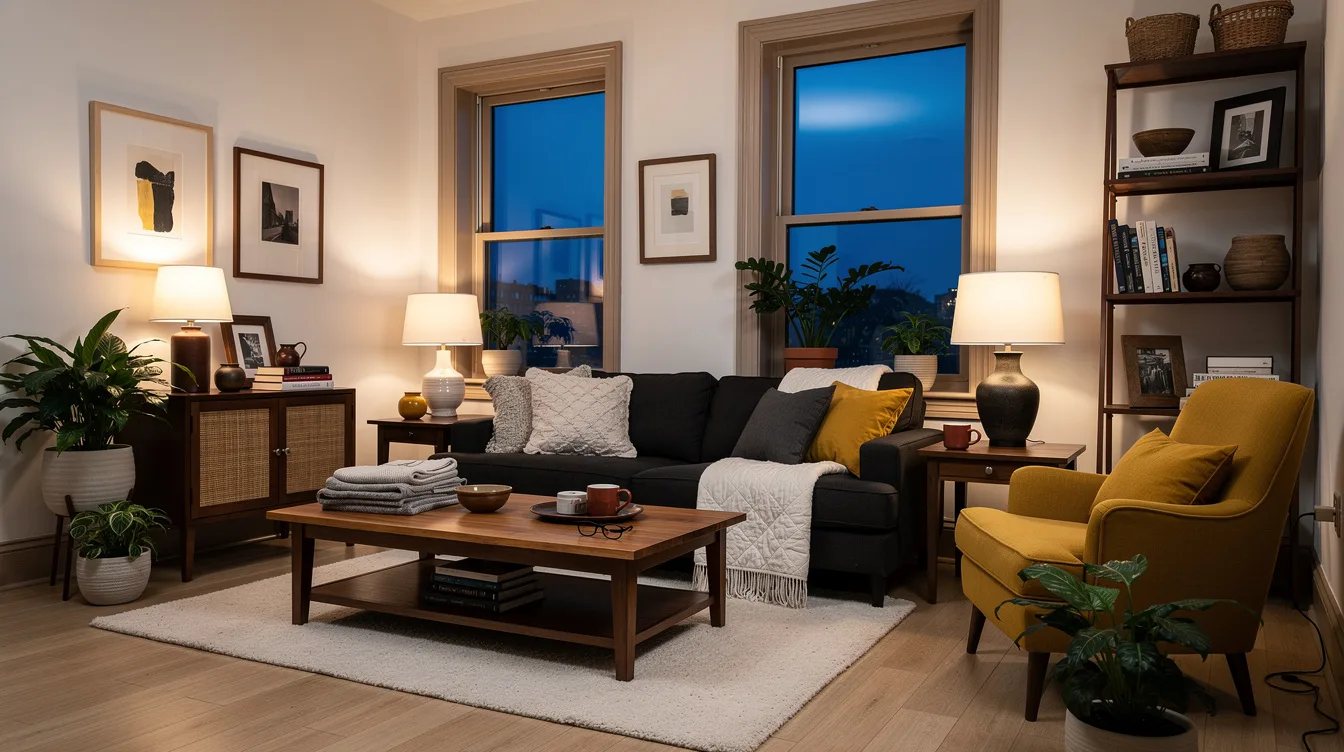
White oak and walnut are among the easiest combinations because the contrast is obvious while both can feel tailored and calm. Use pale oak shelving or flooring with a walnut table, then repeat walnut in a frame, lamp base, or side table.
Keep the surrounding materials quiet so the wood contrast has room to work. Natural linen, soft ivory paint, and a matte black metal detail prevent the pairing from feeling like a showroom display.
Build Around a Warm Oak Floor
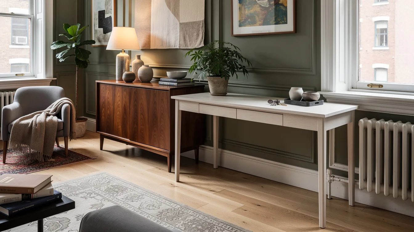
For honey oak or golden parquet, add a deep secondary wood instead of chasing an exact match. A walnut coffee table about 32 to 43 inches wide suits a small-to-medium seating zone, provided its scale leaves comfortable walking space.
Repeat walnut once near eye level, perhaps through a walnut picture frame or lamp base. A neutral rug between the floor and table softens the transition while keeping the warm floor visible as the room’s foundation.
Bridge Reddish Wood With Deep Contrast
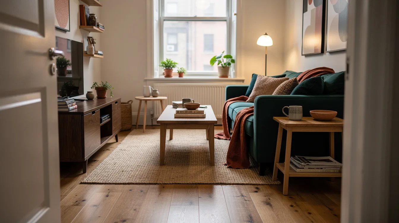
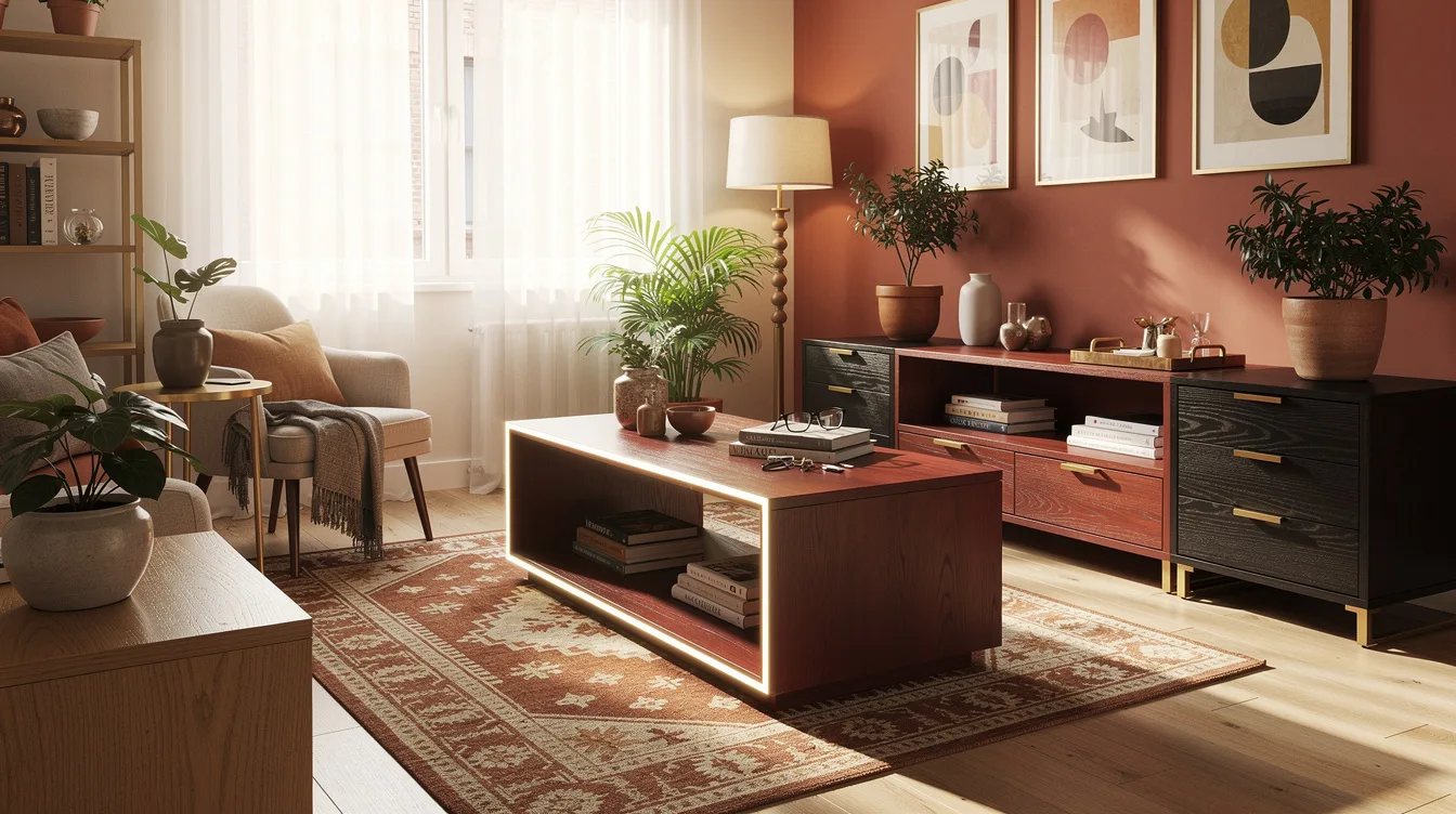
Red oak and reddish cherry need a deliberate partner. Deep walnut, espresso, warm medium oak, or black oak can give the room a stronger visual edge than another reddish-brown finish.
Use a neutral textile to keep the contrast from becoming heavy. A flax-colored linen sofa or oatmeal rug creates enough separation for the red undertone to feel established rather than accidental.
Cool Gray Wood With Pale Materials
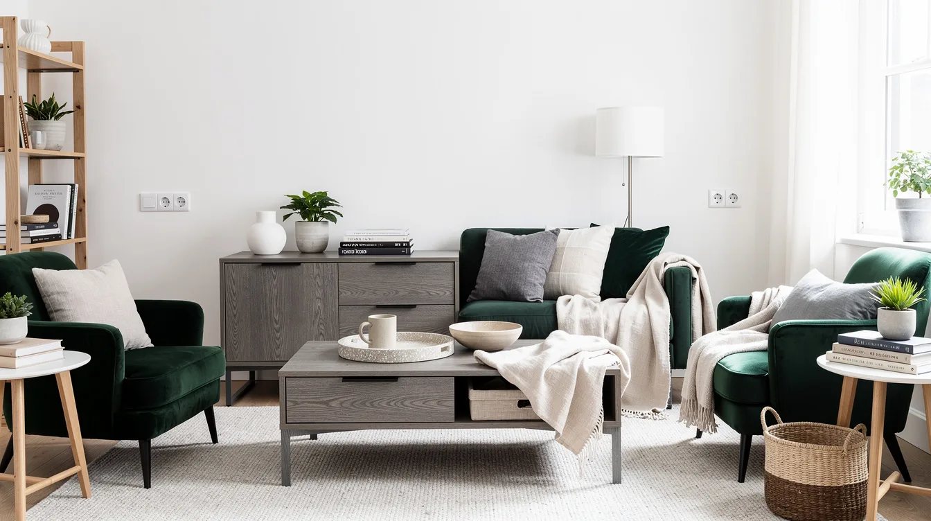
Gray or weathered oak works best with ash, pale maple, black oak, or neutral walnut. A weathered-oak console can look polished beside a pale maple stool, while strong orange oak nearby may make the gray finish look disconnected.
Use a warm-neutral wall color or woven textile as a bridge when the existing floor feels especially cool. This gives the room a middle note without adding another wood tone.
Repeat the Accent Near the Room’s Edges
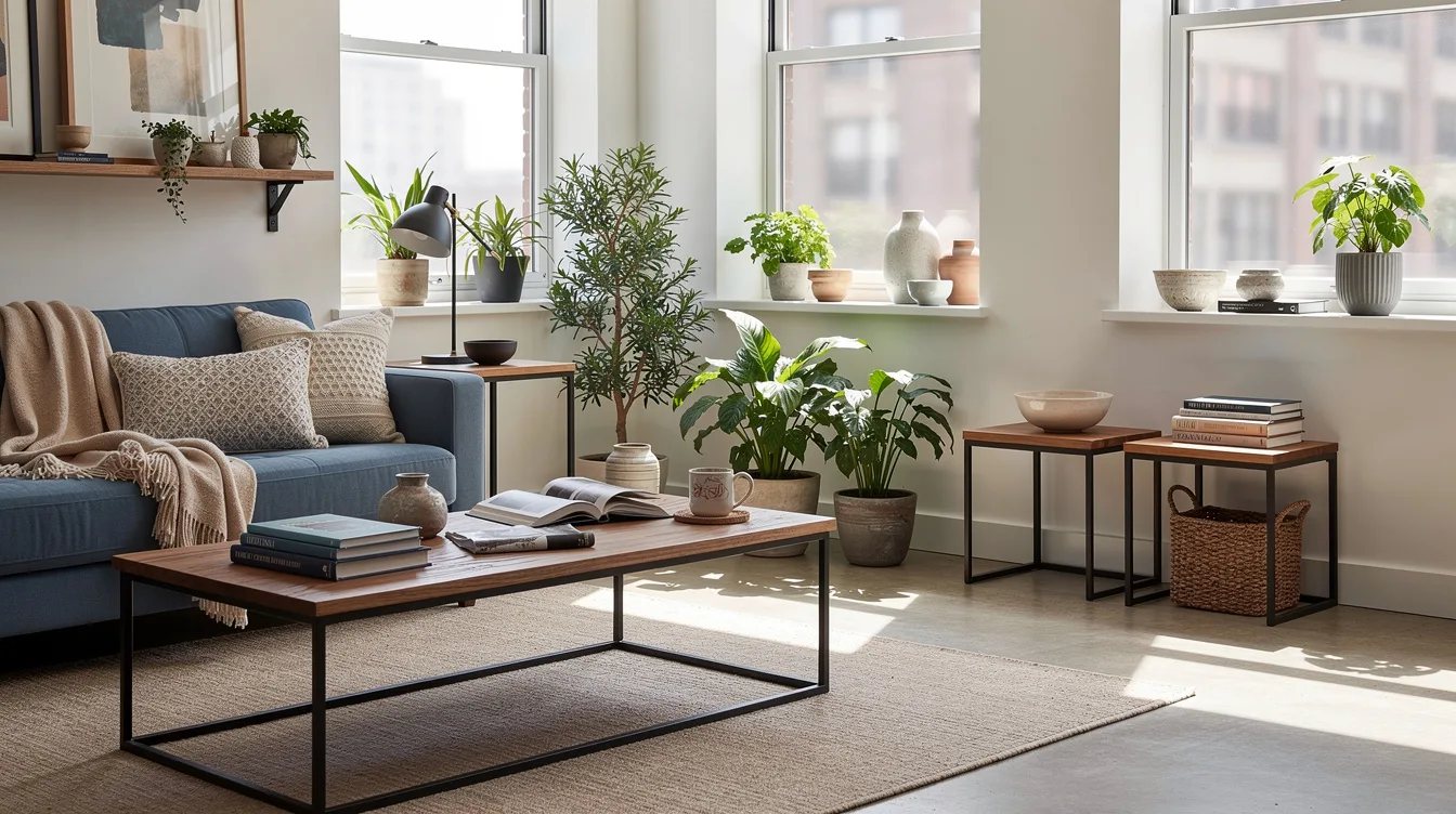
Small accents should travel around the room instead of collecting in one corner. Repeat a black-stained oak tone in a picture frame, shelf, and compact stool so the darkest finish creates a visual rhythm.
Keep the accent limited to a few intentional objects. When every accessory introduces another stain, the eye loses the hierarchy that makes mixed wood feel collected.
Break Up Gloss With Matte Surfaces
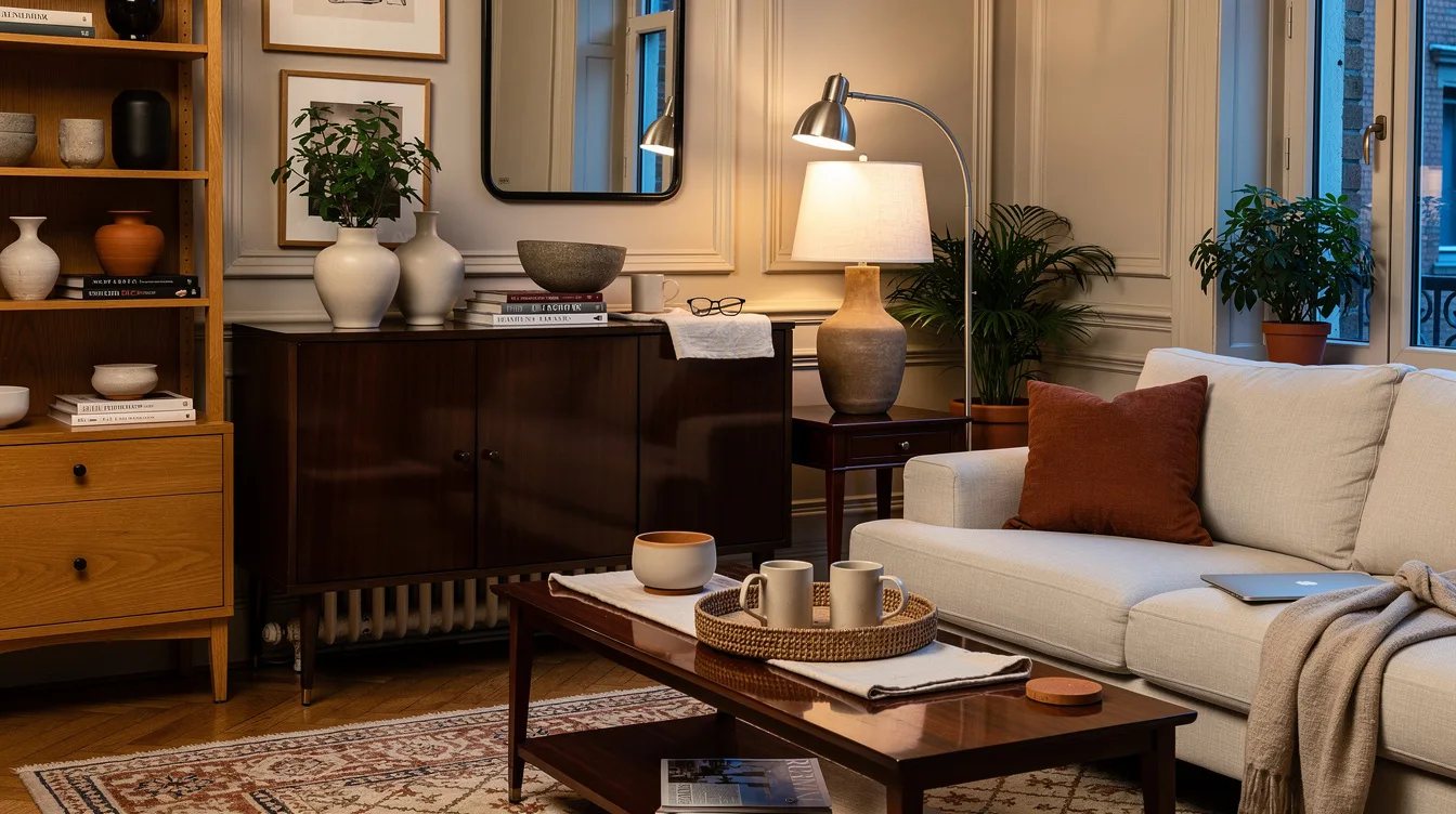
Several glossy wood finishes reflect light in competing ways, especially in a room with strong windows or overhead fixtures. Choose a matte walnut tabletop beside a satin-finished floor, then add brushed metal or painted surfaces to interrupt the reflection.
Aged wood can also help because its variation feels natural rather than manufactured. Skip high-gloss furniture when the room already contains polished floors, lacquered cabinetry, or shiny accessories.
Use Textiles as Visual Separators
Textiles create breathing room between wood tones that sit close together. Place a natural linen rug under a dark coffee table, or use an upholstered bench between a warm floor and a pale oak cabinet.
Painted walls, metal legs, cane, and woven baskets perform the same job. These materials let each wood finish remain visible without forcing two adjacent surfaces to compete for attention.
Keep reading
- 12 Ways To Make a Narrow Victorian Room Feel Less Cramped
- 12 Berlin Altbau Ideas That Make High Ceilings Feel Intentional
- 12 Open Shelving Mistakes Making Your Small Kitchen Feel Cluttered
Before buying anything else, photograph the room in three kinds of light and circle the dominant wood tone. Choose one clearly contrasting secondary finish, repeat it twice, and let every smaller accent earn its place.


