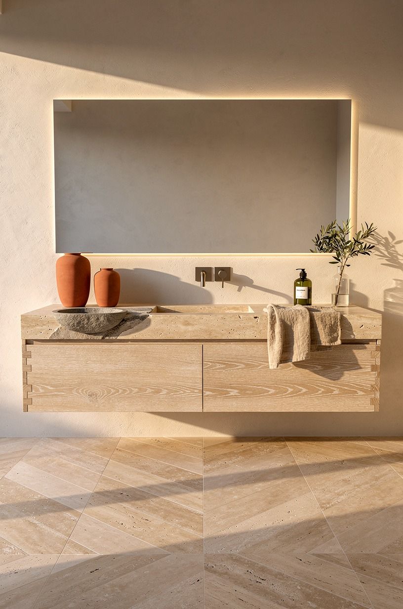
I Tried Modern Travertine Bathroom Ideas, My Space Finally Felt Organic-Luxe
11 july 2026Modern Travertine Bathroom Ideas for an Organic-Luxe Look worked in my own bathroom because warm travertine stone, white oak, and softer light fixed the cold echo faster than another repaint ever could. I did this makeover while sharing one busy hall bath, so every move had to earn its footprint, its cost, and its cleanup. The result surprised me! My plain little room finally felt quiet instead of unfinished.
The Reset Point: Here's what it looked like before
Before I touched anything, the room had the full builder-basic package: shiny beige floor tile, a dark espresso vanity, a clipped rectangle mirror, and chrome that looked bluer every night. The proportions were not terrible, which almost made it worse, because you could tell the room wanted to work.
It just did not. The walls read flat by noon, the laminate countertop felt slick, and every hard surface bounced sound right back at you.
The old chrome faucet and the fluorescent bar light above the mirror both pulled the same cool, dated note.
I kept trying little fixes first. New hand towels.
A candle. One small plant. None of it held. The problem was not decor, it was the shell.
Once I admitted that, you could feel the project simplify. I stopped hunting for cute objects and started rebuilding the surfaces your eye lands on first. If your own bath has been pulling the same quiet surrender, my studio apartment layout notes cover the same logic for any cramped shell you are trying to retune.
- Started With Honed Travertine Floor Tiles
- Wrapped the Shower Walls in Large Slabs
- Chose a Floating White Oak Vanity From IKEA
- What Makes A Vessel Sink Work On Travertine?
- Mounted Wall Faucets Above The Stone
- Added a Frameless Glass Shower Panel
- Why A Slim Shower Niche Beats A Square Cubby
- Kept the Mirror Tall and Arched
- Installed Warm LED Strips Under Vanity
- Why Matte Black Fixtures Beat Polished Chrome Here
- Built a Low Stone Shower Bench
- Why Does Microcement Beat Paint Around The Tub?
- Matched the Soap Ledge to the Floor
- Added One Sculptural Stone Stool
- Hung Ribbed Glass Sconces Beside Mirror
- How Oatmeal Linen Towels Quiet A Stone-Heavy Bath
- Finished With One Oversized Travertine Tray From CB2
1Started With Honed Travertine Floor Tiles
I began with the floor because modern travertine only feels calm when the ground plane sets the tone first. Honed travertine tile changed the room before I installed a single accessory, mostly because the matte finish stopped the glare that glossy ceramic kept throwing back at me.
You see that same softness in wide diagonal layouts, and if you're working with a narrow bath, that angle quietly makes the footprint feel broader. I went with 18-inch square travertine in a warm cream tone, laid on a diagonal bond pattern for movement.
I chose a tile with enough movement to feel alive but not so much contrast that your eye gets stuck. That balance matters.
Too much pitting can read rustic, too little can read fake. Mine landed in the middle, and you could finally walk in barefoot without the room feeling clinically cold.
Keep your vanity height between 32 and 36 in so the floor pattern still gets breathing room underneath. The wider stone logic shows up again in stone outdoor kitchens, where one surface has to carry the whole mood.
2Wrapped the Shower Walls in Large Slabs
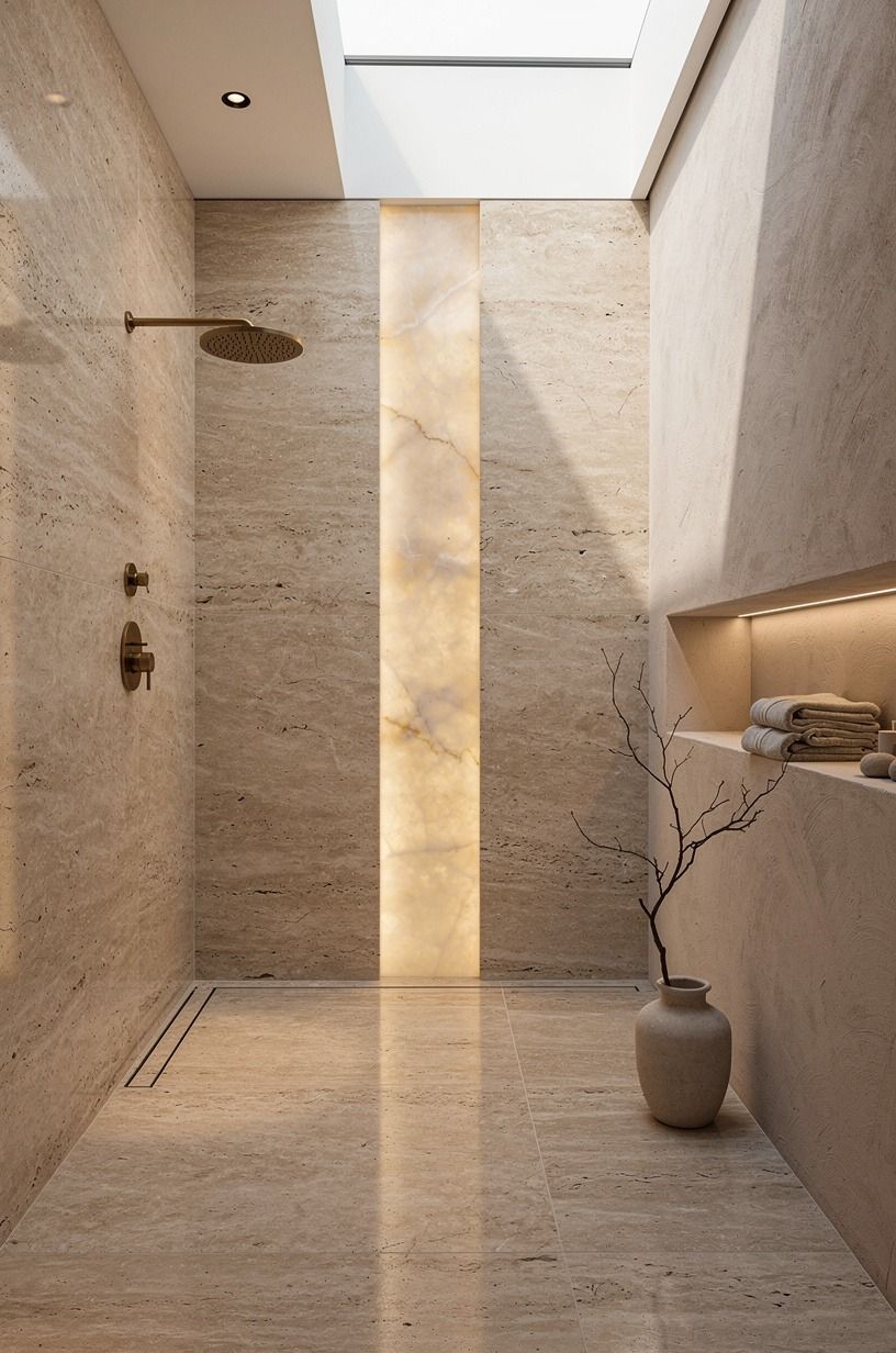
Then I moved to the shower, because grout lines were making the whole room feel busier than it was.
3Chose a Floating White Oak Vanity From IKEA
The floating vanity was the moment the room stopped looking like a standard update and started looking composed. I went with a shallow white oak vanity in a cerused finish, and the open toe space below it did more visual work than any fancy drawer hardware ever could. You get air, shadow, and a cleaner line across the whole wall.
I also kept the depth restrained because deep vanities bully small bathrooms. Mine sits high enough that you can still appreciate the floor tile underneath, and that matters when you've spent real money on stone.
If you want the same effect, keep your storage honest. One drawer for daily stuff, one bin for backups, nothing else.
The slim IKEA GODMORGON oak cabinet gave me the proportions I wanted without the custom markup, paired with Brushed Nickel VOXTORP pulls that read warm against the cerused oak. It sat right against the same wall I refinished for the minimalist bedroom edit.
You'll feel the difference the minute the floor stays visible.
4What Makes A Vessel Sink Work On Travertine?
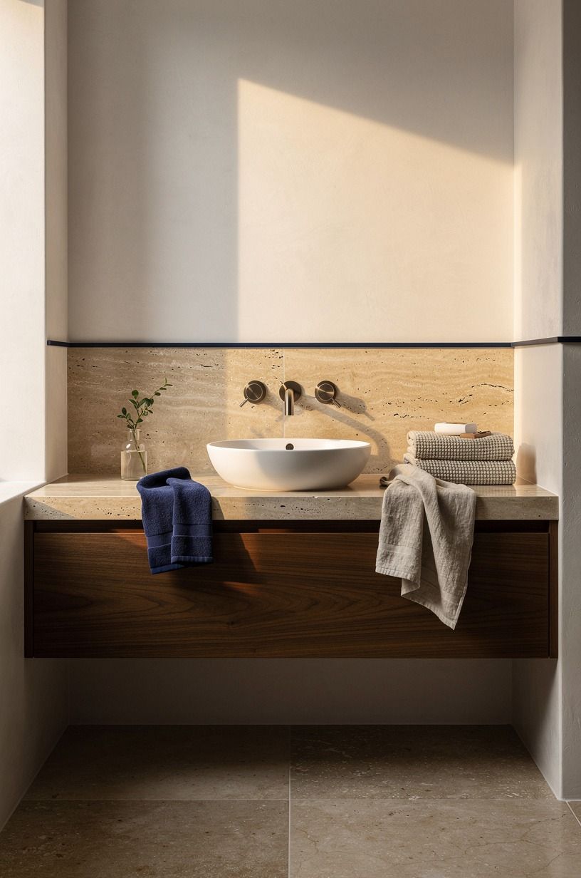
This was the part I argued with myself about. Vessel sinks can look forced if the bowl is too tall or too precious, but set on warm travertine stone they add a little lift that flat undermounts just don't.
The move was scale. I used a low, wide shape so the top still felt architectural instead of spa-themed.
And this is where you save yourself regret: mock the height before you commit. With a 34 in vanity and a raised basin, your faucet reach suddenly matters a lot more. I learned that before ordering, thankfully, because a too-short spout would've splashed water all over the counter edge.
You want the sink to feel grounded, not perched there like it wandered in from another house. If you want a quieter read, pair it with a soft Benjamin Moore White Dove OC-17 on the ceiling so the eye reads upward and forgets the busy counter.
The basin itself was a low stone-composite oval from a small Portuguese pottery maker I found on Etsy.
5Mounted Wall Faucets Above The Stone
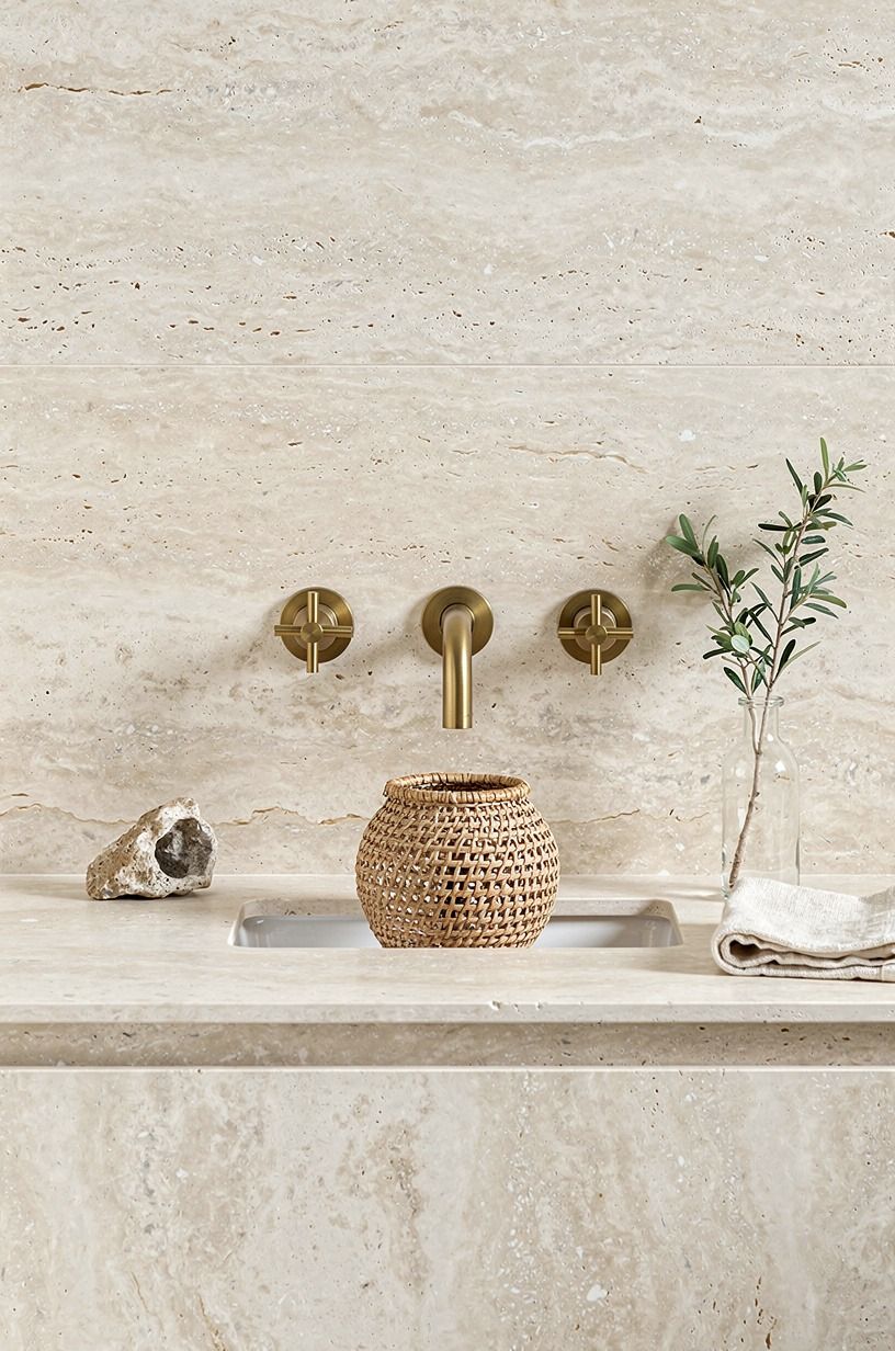
Wall faucets gave me back countertop breathing room and made the stone read cleaner. I picked unlacquered brass faucets from a small American foundry, and that slight patina shift was exactly what the room needed.
Travertine can feel pale if every metal around it is crisp and new. Brass softens that edge without getting sugary.
But placement is everything. I taped the centerline first, lived with it for a day, then moved it up a touch so the proportions felt easier with the vessel sink. That is the boring step nobody brags about, yet it is the reason the whole vignette looks settled now.
If you like contrast, this is where you can nod to classic modernism interior lines without crowding the backsplash. The Waterworks Henry wall-mount in unlacquered brass was the line I landed on, and it was worth every dollar.
The same warm-metal logic shows up on my warm minimalist bedroom edit, where aged brass replaced chrome on the reading sconces.
6Added a Frameless Glass Shower Panel
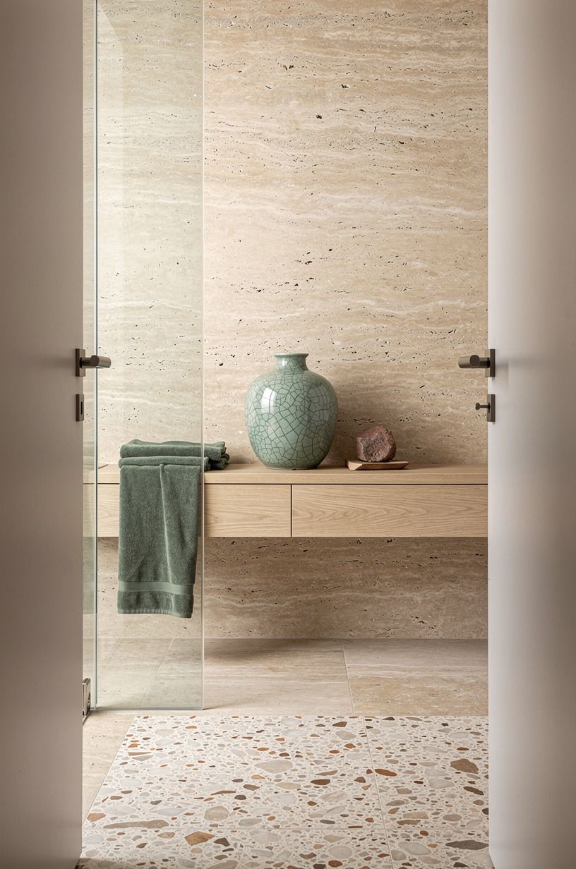
Frameless glass was my answer to visual clutter. A heavy door would've chopped the room in half, while one clean glass panel let the travertine keep reading from the doorway all the way through.
You still know where the shower starts, but your eye doesn't hit a border every two seconds. I went with a 3/8-inch tempered glass panel anchored on a single brass channel at the floor, and that's the move I'd repeat first.
I was tempted by black framing for a minute, and I get why people love it, but in this room it would've turned the shower into a graphic block. I wanted softness, not a grid.
If you're working with terrazzo nearby or another busy surface, plain glass is usually the better call. The same restraint shows up in my cozy minimalist bedroom picks, where I dropped the dark headboard frame for a quieter upholstered edge.
7Why A Slim Shower Niche Beats A Square Cubby
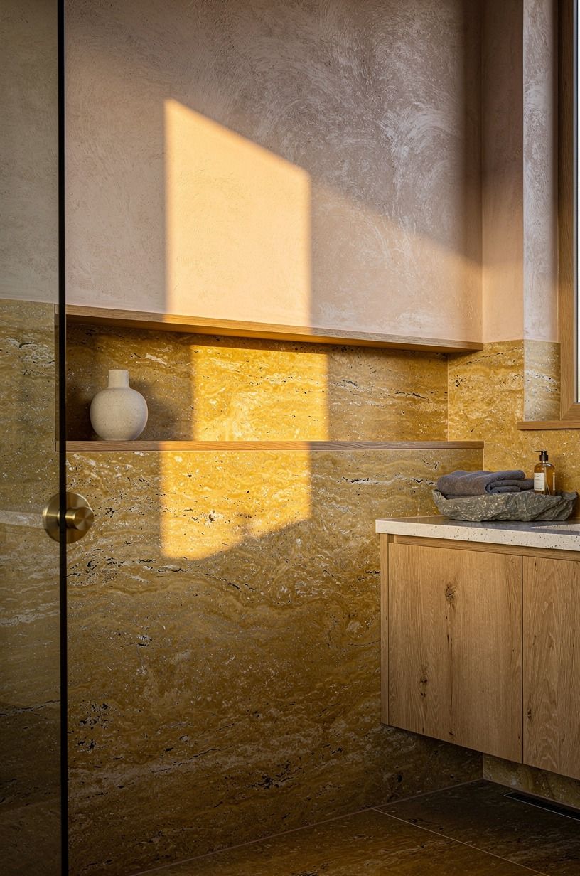
The niche started as a practical move and ended up becoming one of my favorite details. Instead of a square cubby, I ran one slim shower niche straight through the wall line so bottles sit low and horizontal rather than stacked like a convenience store shelf.
That one decision made the shower feel custom. The interior got the same honed travertine as the floor for visual continuity.
I kept it narrow on purpose. A giant niche invites clutter, and clutter is how a pretty bathroom loses its nerve.
My bottles fit, the ledge stays calm, and the long line echoes the stone joints in a way your eye reads as deliberate. The same "one long horizontal line" rule shows up in my outdoor kitchen lighting notes, where I skipped the row of puck lights for one continuous strip.
8Kept the Mirror Tall and Arched
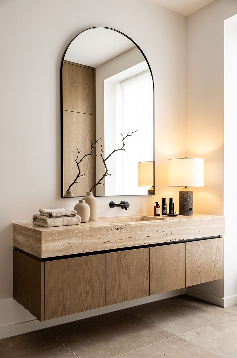
A tall arched mirror brought in the softness the stone needed.
9Installed Warm LED Strips Under Vanity
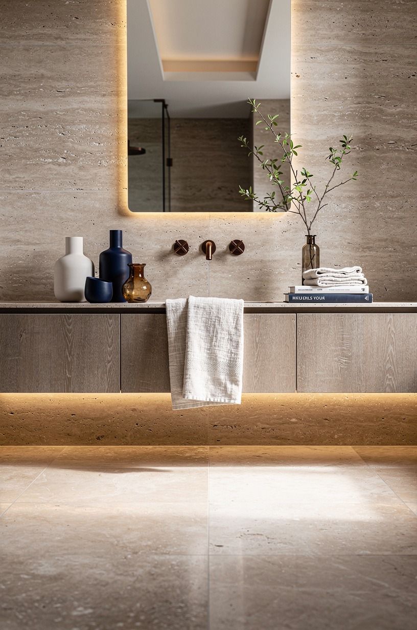
This is my Floor-Glow Rule: if the vanity floats, the light under it has to feel like atmosphere, not airport runway lighting. Warm LED strips tucked underneath gave the stone a low amber edge at night, and suddenly late-evening tooth brushing didn't feel like stage lighting anymore. I used a 2700K warm-white LED tape on a magnetic dimmer so I could pull it down to almost nothing after dinner, and that's where the magic lands.
I stayed in the warm range on purpose and kept the strip fully hidden from standing height. You want glow, not visible dots. And yes, it sounds small, but it changes the room's mood more than another plant ever will.
If your bathroom gets used before sunrise, this move earns itself fast. Mine did on day one!
The same low-glow principle carries into string-light backyard plans, where the lighting hugs the path instead of shouting from above.
10Why Matte Black Fixtures Beat Polished Chrome Here
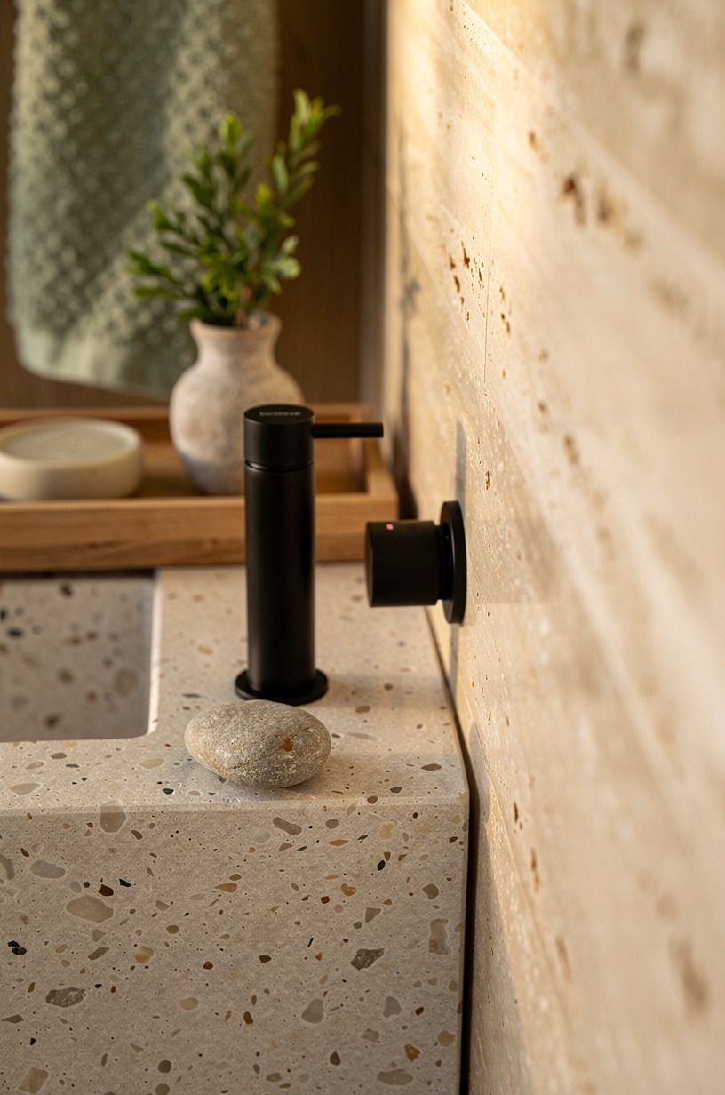
Not every metal in the room needed to match, and that tension helped. I used matte black hardware in a few controlled spots so the travertine didn't dissolve into one long field of beige.
The contrast gave the eye somewhere to land, especially near the poured concrete detail and the sharper edges around the vanity zone. A single Rejuvenation Matte Black Towel Hook did the heavy lifting without going full industrial.
But I kept the black to the supporting cast. If every fitting goes dark, the room starts feeling themed.
One hook, one shower control, one small frame element, then stop. That restraint is what kept the space organic instead of trendy.
The same rule applies to a little Farrow & Ball Hague Blue No.30, which can look rich on a sample card and oppressive in a windowless bath if you spread it everywhere. For deeper greens that hold up in low light, my dark boho bedroom edit shows what works after dusk.
11Built a Low Stone Shower Bench
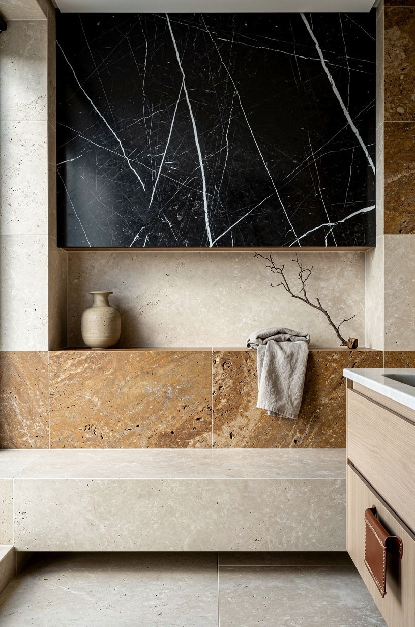
The bench made the shower feel generous, even though the footprint did not grow.
12Why Does Microcement Beat Paint Around The Tub?
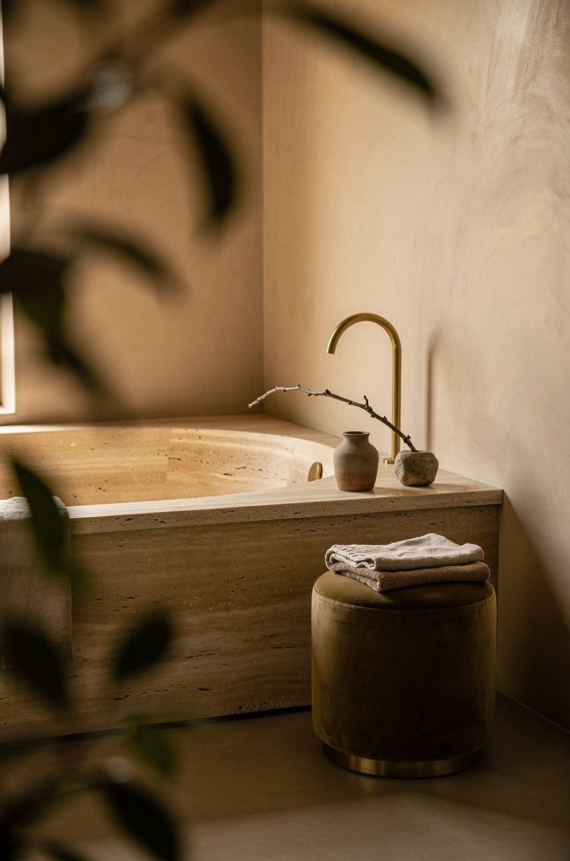
Around the tub, I didn't want more stone fighting for attention, so I switched to microcement. That move kept the palette warm while giving the travertine ledge a cleaner edge.
Texture matters here. A little cloudiness in the finish makes the room feel handled by a person, not machine-perfect.
The installer mixed in a soft sand tint so the surround reads warmer than gray.
My tub is a standard 60x30 in, which meant the surround needed to stay visually slim or the bathing zone would feel stuffed. I tested paint there first and knew within a day it wasn't enough. Microcement has that dry, hushed surface quality that flat paint can't fake.
For an even quieter read on adjacent walls, a soft Sherwin-Williams Accessible Beige SW 7036 can carry the warmth without fighting the stone.
13Matched the Soap Ledge to the Floor
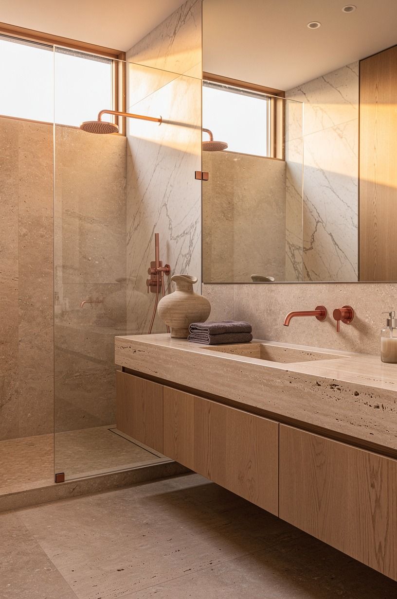
Matching the soap ledge to the floor tile sounds picky until you see it working in person. Repeating the same honed travertine on that small horizontal line made the whole bathroom feel more connected, almost like the surfaces were speaking the same quiet language back and forth. I left a 1/8-inch soft joint between ledge tiles, then filled with color-matched grout so the line stays nearly invisible.
And it solved a styling problem too. Random trays and bright bottles stopped hijacking the sink once the ledge itself looked intentional.
I kept a tiny side note of cool white marble in the room through one Carrara marble accent, but only one. Any more than that and the travertine story would've split in two.
When you're aiming for calm, repetition is usually stronger than variety. The same "one quiet accent" rule shows up in my earthy boho bedroom picks, where I let the rattan lead and let everything else fade back.
14Added One Sculptural Stone Stool
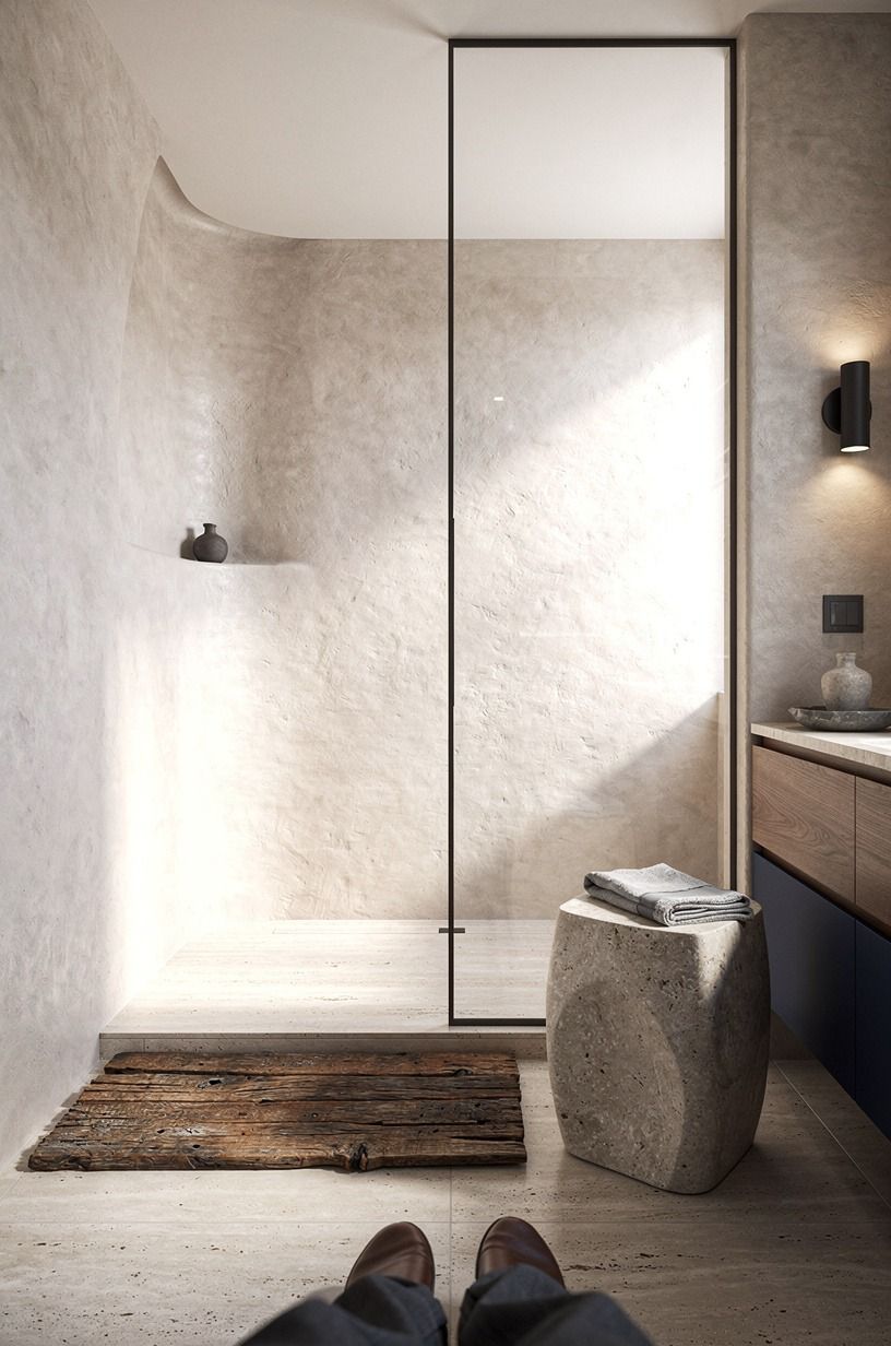
This was my One-Object Rule. I did not want a bench, a basket, and a ladder all competing beside the shower, so I chose one stone stool and let it do the talking. It gives you a landing spot for folded towels or a robe, yet it also makes the room feel collected instead of newly purchased in one weekend.
I found mine after looking at reclaimed wood first, and honestly, the wood option kept pulling the room rustic. That wasn't the mood.
You can feel when one object changes the whole read of a space, and this did! If you're trying to get a modern travertine bathroom to stay luxe, pick one sculptural note and let the rest go quiet.
I sourced mine from a Mexican talavera studio in Tonalá, Jalisco, and the irregularity is exactly why it works. The same instinct guides my vintage-modern bedroom edits, where one ceramic stool replaces a whole basket wall.
15Hung Ribbed Glass Sconces Beside Mirror
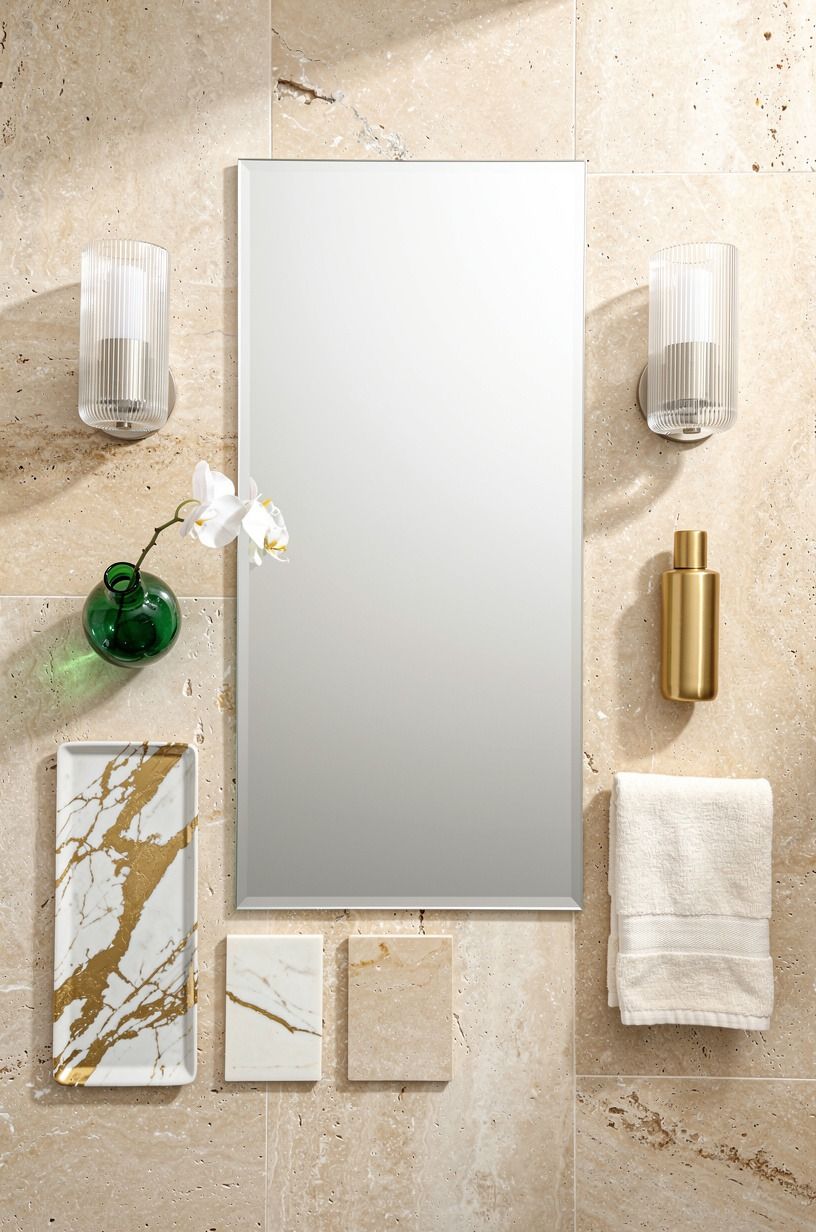
Lighting beside the mirror matters more than overhead lighting ever has in my bathrooms. I hung ribbed glass sconces on both sides so the light skims across your face and stone instead of dropping straight down like a cafeteria fixture.
The ribbing also keeps the glow from feeling flat. The sconces themselves are a Schoolhouse Electric Beaumont ribbed-glass pair in warm brass, and they're worth the splurge.
This is my Three-Height Light Stack: ceiling light for function, sconces for skin tone, under-vanity glow for mood. Once those three levels were in place, the room finally looked finished at 7 a.m. and 10 p.m.
If you're repainting around the mirror, a soft wall like Sherwin-Williams Sea Salt SW 6204 can keep glass and stone from reading too stark together. For evening warmup, a single West Elm alabaster sconce would do the same job, just pricier.
The same layered lighting logic shows up in my cozy backyard lighting roundup.
16How Oatmeal Linen Towels Quiet A Stone-Heavy Bath
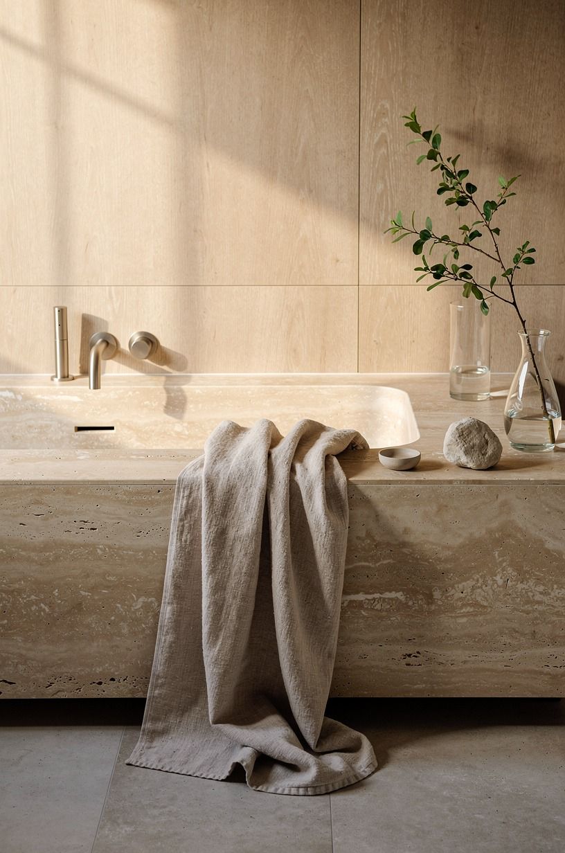
Textiles were the last layer, but they mattered because hard materials need something to absorb them. I switched to oatmeal linen towels instead of bright white terry, and that one change made the room feel less hotel-copy and more lived in.
Linen wrinkles a little. Good.
That looseness is part of the charm. I went with a 600gsm Turkish cotton bath sheet on the hook and a lighter Belgian flax linen hand towel beside the sink.
I stacked them on the oak side in a way that looked easy, not staged to death. Two folded, one draped, done. If you want a warmer read, this is where a forest green or rust hand towel can help, but keep the base neutral first.
Target Threshold Belgian linen sets hit the same look at a friendlier price, and the room still reads organic. The same soft-stack logic carries over to my rustic bedroom edits, where one rumpled throw does more than four matching pillows.
17Finished With One Oversized Travertine Tray From CB2
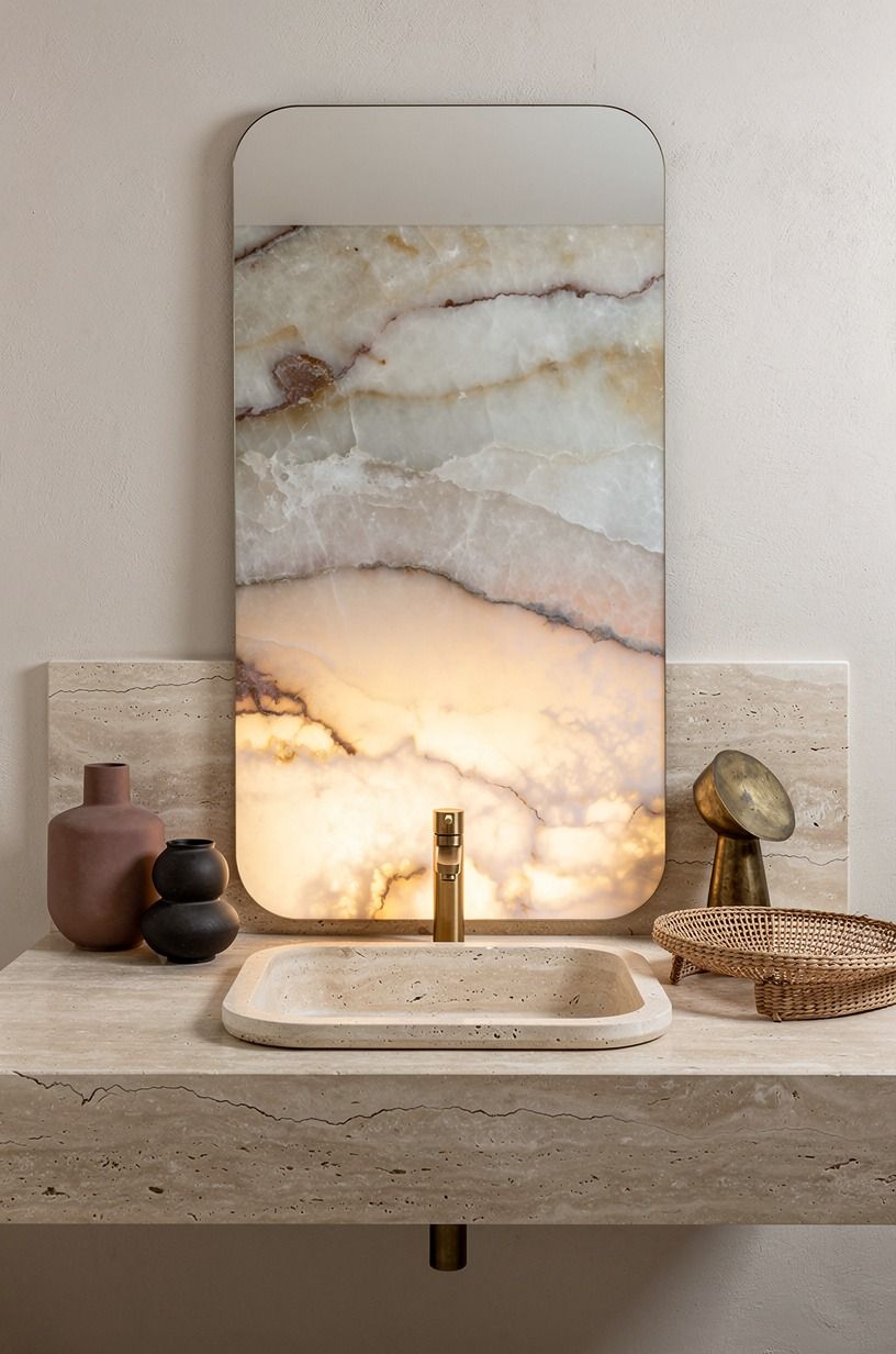
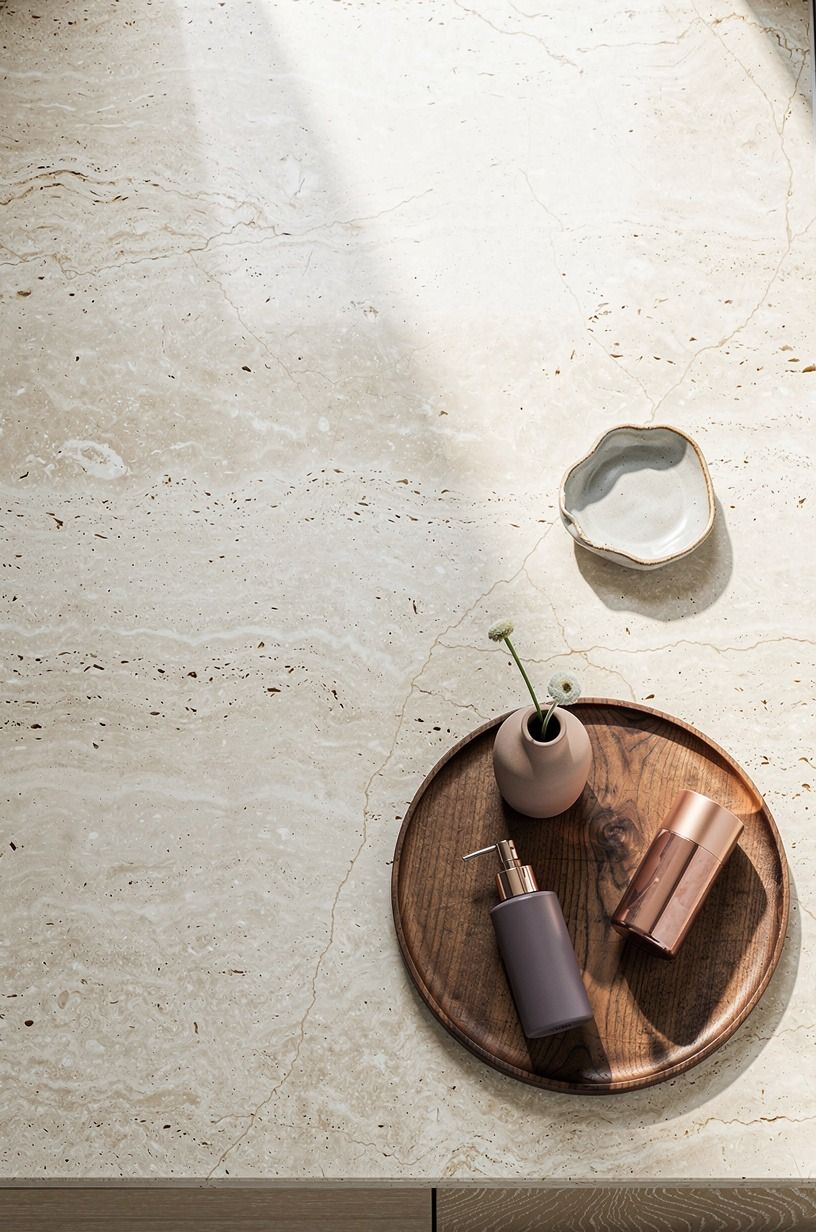
I ended with one oversized travertine tray on the vanity because little containers were making the counter feel busier, not tidier.
Why The Quiet-Stone Mix Finally Worked For Me
What finally clicked wasn't travertine by itself. It was the way the room stopped trying to impress me and started supporting the routines I do half-awake, every day, without thinking. I used to treat bathrooms like tiny utility boxes where style came last because steam, toothpaste, and wet towels would ruin the mood anyway.
That logic sounds practical, but it usually gives you a room that feels resigned. And you feel that resignation more than you'd think.
The shift happened when I started judging every choice by one question: does this make the room quieter to look at and easier to use? That question ruled out a lot.
Busy mosaics. High-contrast fake marble.
Cute storage that only works when nobody has touched it. Travertine won because it has movement without noise.
White oak won because it warms stone without making it heavy. Hidden light won because I do not need my bathroom to perform before coffee. The same logic runs through my minimalist luxury bedroom picks, where quiet is the actual luxury, not the price tag.
I also think people get the organic-luxe look wrong when they chase expensive ingredients instead of controlled tension. You need one pale surface, one warm wood, one softened metal, and one darker note to keep the whole thing from floating away.
More than that, and the room starts auditioning for attention. Less than that, and it can go flat.
My own mistake used to be over-correcting. I'd add another basket, another brass object, another little decorative thing because the room still felt unfinished. It wasn't unfinished.
It was over-explained.
So if you're doing your own version, be a little ruthless. Let the floor carry more visual weight than the accessories.
Let the mirror curve if the vanity is strict. Let one stool, one tray, one towel color do the work of six smaller purchases. That's the part that changed my bathroom from nice enough to somewhere I genuinely linger now. Not because it's flashy.
Because it finally feels settled. The same ruthless edit shows up in my retro bedroom roundup, where I dropped two accent chairs and let one statement stool lead.
If you want the same warm restraint in a kitchen, my modern outdoor kitchen picks follow the exact same logic.
The Calm-Money Split: How much it cost
I tracked the makeover in tiers because your version may stop earlier than mine did, and that's fine. The smartest thing you can do is spend where the shell changes and save where styling can wait.
My own spend landed in the middle because I mixed permanent work with slower upgrades I could stage over time. Here's the second reality check that helped me decide where not to overspend.
The expensive parts were exactly what you'd expect: plumbing changes, big stone surfaces, and fabrication. The cheaper wins were paint, towels, lighting swaps, and pulling visual clutter out of the room.
If you only have room for one substantial move, I'd put the money into the floor or vanity first and style around it after. The same tiered logic runs through my modern outdoor kitchen notes, where most of the spend lands on the shell too.
The Questions I Get Asked Most
What is the best Modern Travertine Bathroom Ideas for an Organic-Luxe Look for a small bathroom?
A floating vanity plus warm under-lighting is the best small-space combo because it gives you visible floor and instant depth. For a shortcut, look at slim oak vanity proportions from IKEA and pair them with one tall arched mirror instead of extra storage furniture. My compact outdoor kitchen roundup walks the same small-space playbook.
Where can I buy Modern Travertine Bathroom Ideas for an Organic-Luxe Look pieces on a budget?
Start with Target and Wayfair for mirrors, sconces, and towels, then check Facebook Marketplace for stone stools or vintage trays. The real budget win is patience. One good secondhand piece mixed with simple new basics usually looks richer than a rushed full-cart order.
How much does a Modern Travertine Bathroom Ideas for an Organic-Luxe Look makeover cost?
A realistic range is about $200 to $1,200 for cosmetic updates and $3,000 to $9,000 once vanity, tile, and lighting enter the plan, with free savings coming from decluttering and reusing what still works. The jump happens when plumbing and slab work start.
Can I create a Modern Travertine Bathroom Ideas for an Organic-Luxe Look on a budget?
Yes, and you don't need a full renovation to get the mood right. Think cheap warmth first.
Oatmeal towels. Better bulbs.
One larger tray instead of five little containers. Paint around the mirror, not every wall, if your budget needs a smaller opening move.
A thrifted CB2 stone tray still anchors a vanity if the rest stays calm.
Is a Modern Travertine Bathroom Ideas for an Organic-Luxe Look worth it in a small space?
Yes, and a small room often shows the payoff faster because every surface is doing more visual work. The biggest worth-it move is keeping the floor visible, so watch your vanity depth and keep at least the 21 in front clearance feeling open instead of crowded. The same payoff shows up in my studio apartment layout notes.
Is Modern Travertine Bathroom Ideas for an Organic-Luxe Look a good idea for a rental?
Yes, if you treat it like a layerable system instead of a demolition plan. Use renter-safe swaps: removable sconces, a tall mirror leaned or securely mounted with landlord approval, linen towels, and a stone-look tray.
You can keep the palette and skip the permanent stonework. For warmer bath-adjacent vibes, my cozy hot tub retreat guide covers similar renter-friendly layering.
The One-Move Rule: Where I'd Start First
If I had to pick one, I'd start with the floor. Travertine changes the light under everything else, and you can't fake that with accessories.
Get the ground plane warm first. Then even simple towels and a plain mirror start looking intentional.


