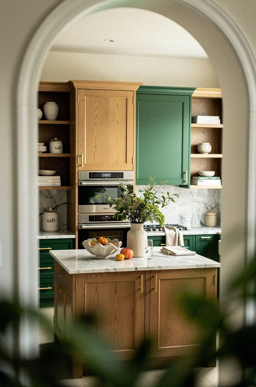
17 Japandi Kitchen Colors That Feel Warm Without Going Yellow
11 july 2026I learned this one the hard way. I painted my first kitchen the color of clean paper, then wondered why it felt like a doctor's office by 6 p.m. every night. Japandi warmth is not the same as yellow walls, and it's definitely not "just add beige." It's a balance between cool Scandinavian restraint and warm Japanese tactility, and getting it wrong by one shade gives you either a fridge aisle or a 1970s rec room. Here's how I'd build it if I were starting over, with seventeen palettes that work in real kitchens under real light.
- ✓ Run the Two-Wood Rule
- ✓ Start With Benjamin Moore White Dove for the Warmest "White"
- ✓ Pull Greige Two Steps Warmer Than You Think
- Run the Two-Wood Rule
- Start With Benjamin Moore White Dove for the Warmest "White"
- Pull Greige Two Steps Warmer Than You Think
- Anchor the Room With Farrow & Ball Studio Green
- Try a Putty Stone for the Quiet Win
- Build Around a Soft Clay for Honest Warmth
- Linen-Toned Walls Read Softer Than Cream
- Paint the Island Farrow & Ball Inchyra Blue for Weight
- Sherwin-Williams Evergreen Fog for a Quiet Sage
- Try a Charcoal That Pulls Brown
- Can Hardware Do the Work Paint Can't?
- Bring In a Soft Black Without the Harsh Edge
- Why Does a Zellige Backsplash Do What Subway Tile Can't?
- Lean Into a Warm Counter Stone for Honest Color
- Add a Quiet Wood Stain Without the Loud Finish
- Paint the Ceiling a Step Warmer Than the Walls
- Use One Accent Color Per Room, Maximum
1Run the Two-Wood Rule
Before you ever pick a paint chip, look at your wood tones against your stone. If your counters are Carrara marble with subtle grey veining and your floor is a cool-toned oak, your cabinet wood should warm the room, not echo the stone.
If you've got a warm walnut island under an emerald, gold and cream palette, anything close to greige on the ceiling will look flat next to it. The Two-Wood Rule says you pick ONE wood to lead (cool or warm), then tilt every paint decision to support it. Most people default to "warm beige" without checking what their floor is doing, and end up with a kitchen that has two different ideas of cozy.
You'll feel the difference the moment morning light hits your cabinets.
2Start With Benjamin Moore White Dove for the Warmest "White"
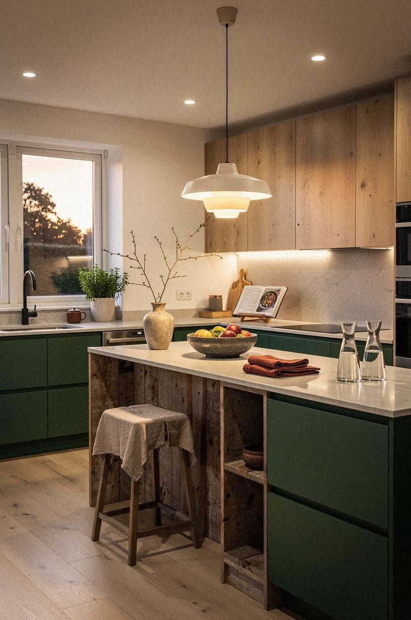
Benjamin Moore White Dove (OC-17) is the warmest off-white you'll find without tipping into cream. It reads as a clean paper white on the chip, then warms up under 2700K bulbs and again in late afternoon sun.
Most "whites" go clinical by 6 p.m.; White Dove keeps a low hum of warmth through dinner. Pair it with reclaimed weathered teak floors or a honed marble counter, and bring in a forest green, rust and natural oak palette through open shelving and bar stools.
You'll get the Japandi cream without the yellow undertone that makes a north-facing room feel sick. I repainted a "Swiss Coffee" bathroom with this and the whole room changed in a weekend.
For renters, the peel-and-stick version does most of the work for under twenty bucks.
3Pull Greige Two Steps Warmer Than You Think
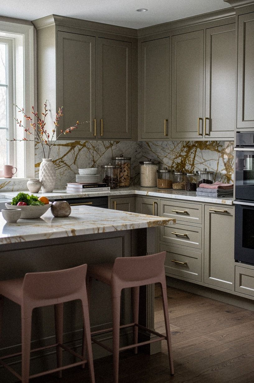
Greige is the default Japandi wall tone, and the easiest to get wrong. The chip that looks right under store lighting will look flat and cold in your kitchen's actual light.
Benjamin Moore Pale Oak (mentioned above) or Sherwin-Williams Accessible Beige (SW 7036) run just warm enough to glow under cabinet lighting and bounce off a Calacatta marble counter with gold veining without shouting. Tape the chip to your wall for two full days, including morning and evening, before committing.
The cool evening hours are where greige shows its true colors, often literally grey. Worth the test, and it saves you a repaint!
For a sharper Japandi lean, skip greige entirely and try a dusty rose, charcoal and brass palette instead.
4Anchor the Room With Farrow & Ball Studio Green
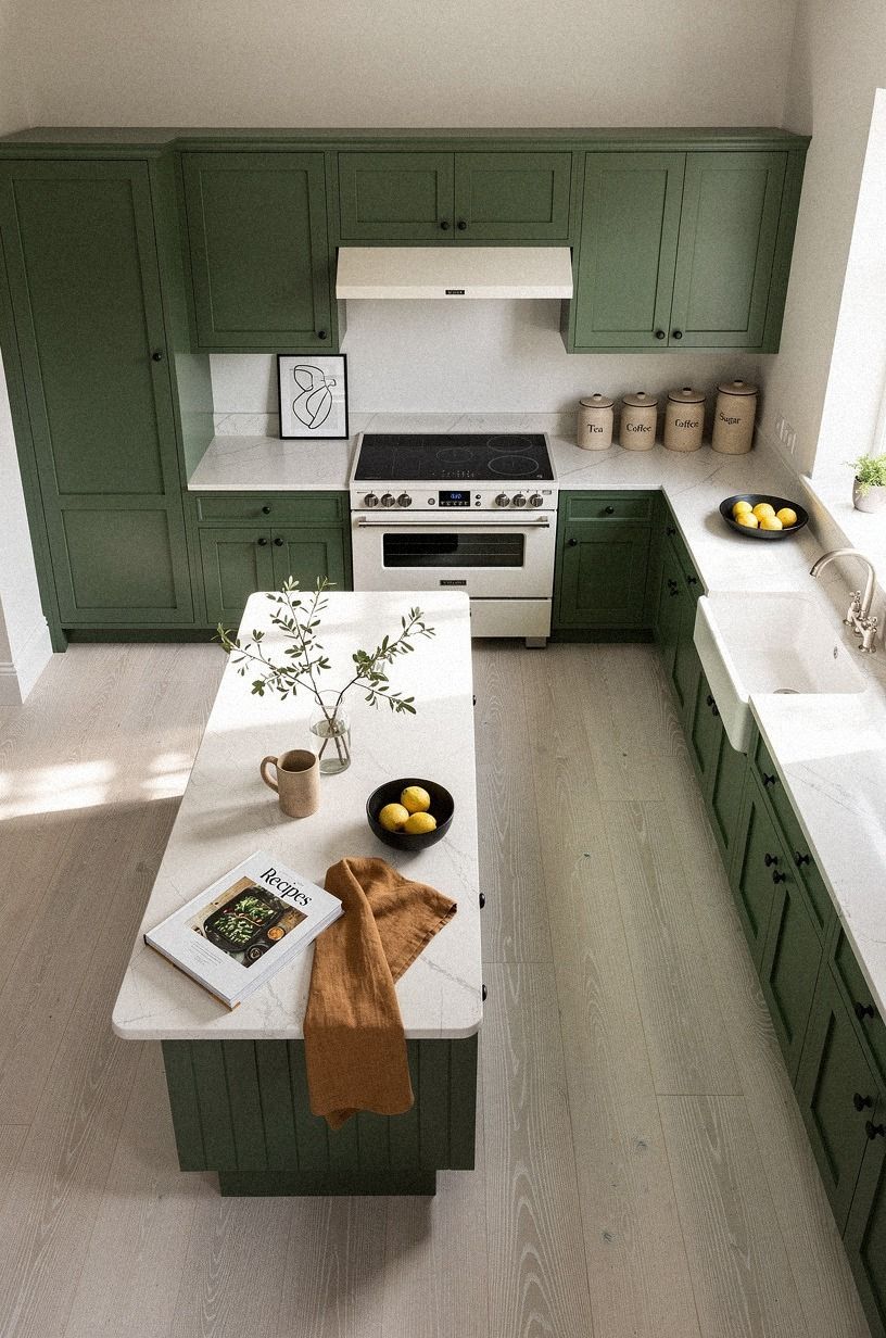
If your kitchen feels a little flat, you don't need more wood. You need one wall with weight.
Farrow & Ball Studio Green (No.93) on the back of an open shelf wall or behind a range hood reads as a deep forest without going black. It's dramatic enough to give your room a focal point but quiet enough that it doesn't fight with cerused white oak floors or a warm white and camel millwork palette with black accents. Pair it with unlacquered brass pulls, and the green will pull a little gold from the metal as it patinas.
Skip the same paint on all four walls; you'll lose the depth that makes Studio Green work. Our most popular kitchen cabinet colors roundup is a good second opinion.
5Try a Putty Stone for the Quiet Win
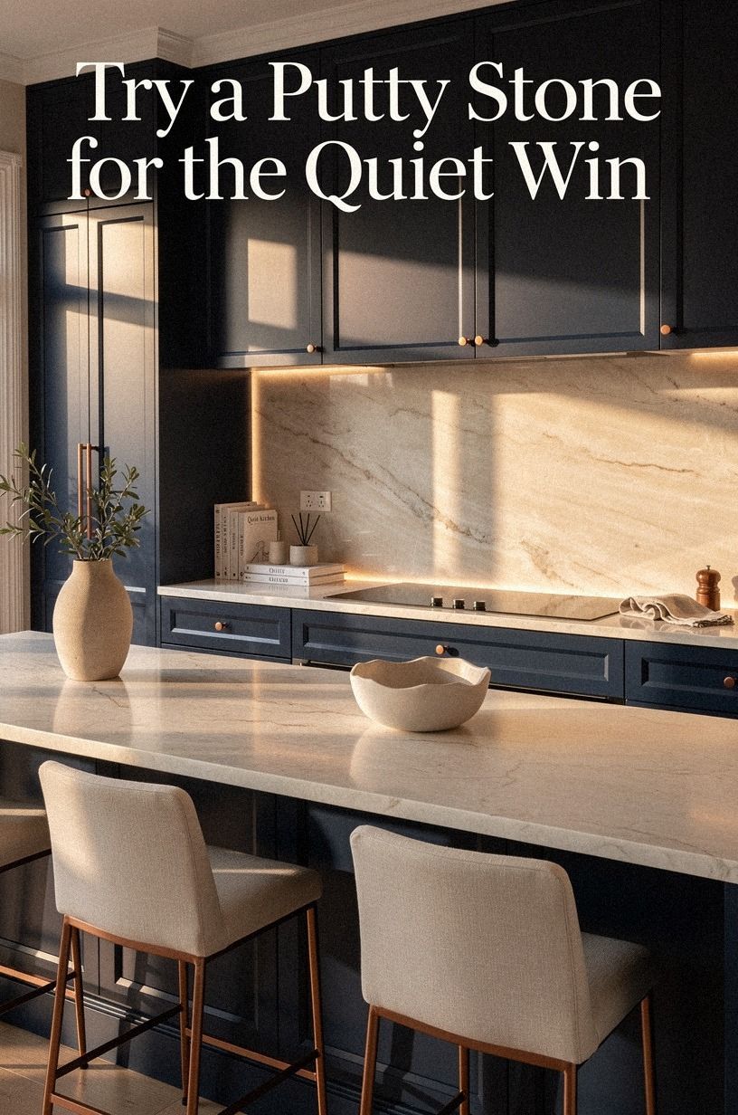
Putty stones are the quiet heroes of Japandi palettes. Benjamin Moore Natural Cream (OC-14) or Farrow & Ball Bone (No.15) read as warm grey until you put them next to actual grey, and then they go distinctly creamy.
They sit between warm and cool without committing to either side. Layer them against a midnight blue island, copper pendants and ivory linen, with a backlit translucent onyx backsplash glowing behind the range, and the putty wall holds the whole palette together without competing.
If your lighting shifts a lot, a putty stone will hold its own all day. For an island color, try putty stone on the base and Pale Oak on the walls. The subtle difference in undertone is what makes the island feel architectural.
Our bedroom paint colors for sleep list uses the same putty logic if you want to carry the move into the next room.
6Build Around a Soft Clay for Honest Warmth
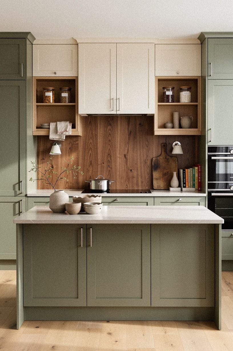
Soft clay has a quieter cousin in sage, and it's the honest-warmth move for kitchens with a lot of white. Farrow & Ball Treron (No.292) reads as a sage green with grey undertones that grounds a cream kitchen without making it feel Tuscan.
Pair it with book-matched walnut cabinetry and warm cream walls, and the wood's grain does the heavy lifting. If Treron feels too saturated, try a softer sage like Benjamin Moore Soft Fern (OC-13) as a more neutral take.
Both pull warmth from natural wood open shelving without competing with it. If you're nervous about color on a wall, start with a small nook behind open shelving and let the sage breathe.
It'll feel intentional, not loud. Our sun-soaked terracotta tile spaces show how the same family plays out underfoot.
7Linen-Toned Walls Read Softer Than Cream
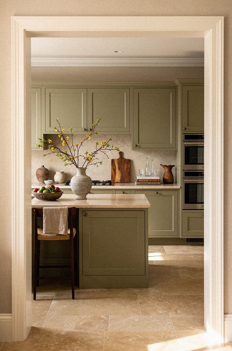
Linen-toned walls are different from cream in a way that's hard to describe until you see them next to a warm travertine floor with terracotta, stone and olive accents. They read softer than cream because they pick up the warmth around them without adding yellow.
Most creams look jaundiced next to travertine; linen-toned walls hold their own. Tape three chips at eye level and watch them shift through morning and evening before you commit.
8Paint the Island Farrow & Ball Inchyra Blue for Weight
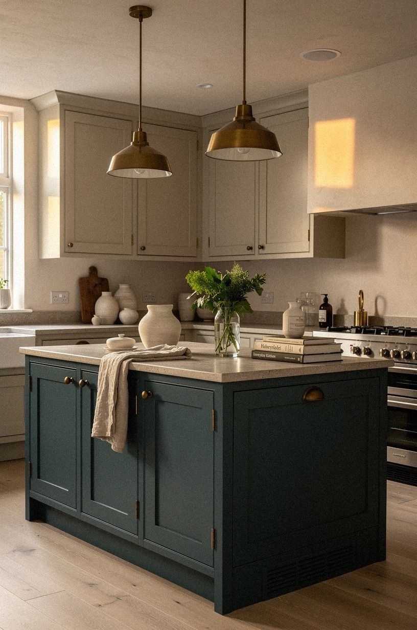
If your cabinets are warm white and your walls are putty, paint the island Farrow & Ball Inchyra Blue (No.289). It's a deep teal-grey that reads almost navy in low light and almost forest in bright light. This sounds risky but reads as confident.
Inchyra Blue gives the island weight, makes it feel like furniture instead of cabinetry, and pulls all the wood tones in the room toward warmer territory. Pair it with aged brass cup pulls and unlacquered brass developing patina, and let clay and linen pieces cluster around the island for a Japandi-meets-old-library feel.
Skip the same color on the uppers or you'll lose the layered effect. Our painted vs stained kitchen cabinets guide has the full breakdown.
9Sherwin-Williams Evergreen Fog for a Quiet Sage
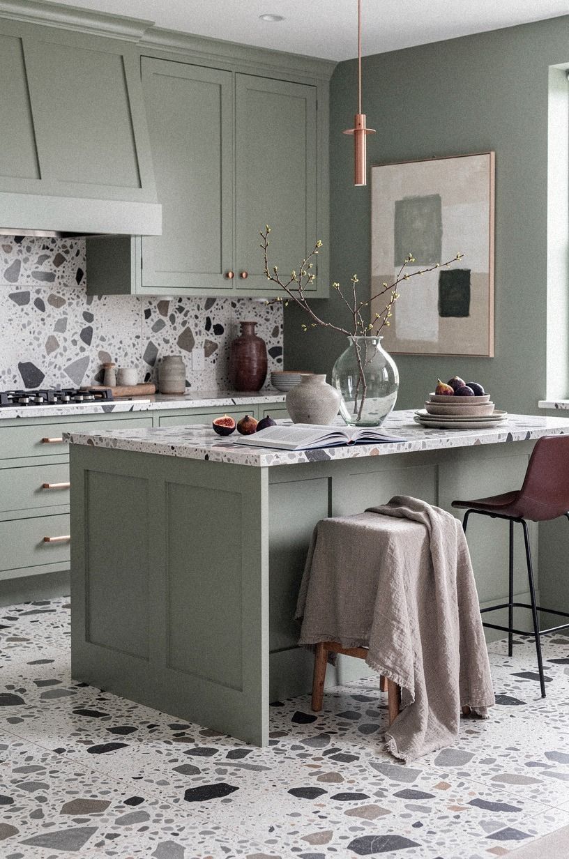
Sage is having a moment, but most sage greens go too grey or too mint under kitchen lighting. Sherwin-Williams Evergreen Fog (SW 9130) sits closer to a true muted sage, with enough grey to keep it sophisticated.
Pair it with oversized-chip terrazzo counters in plum, grey and rose gold, and the green will look intentional, not trendy. Skip the same paint on all four walls; let it show up on the island and let the terrazzo do the visual lifting on the perimeter.
10Try a Charcoal That Pulls Brown
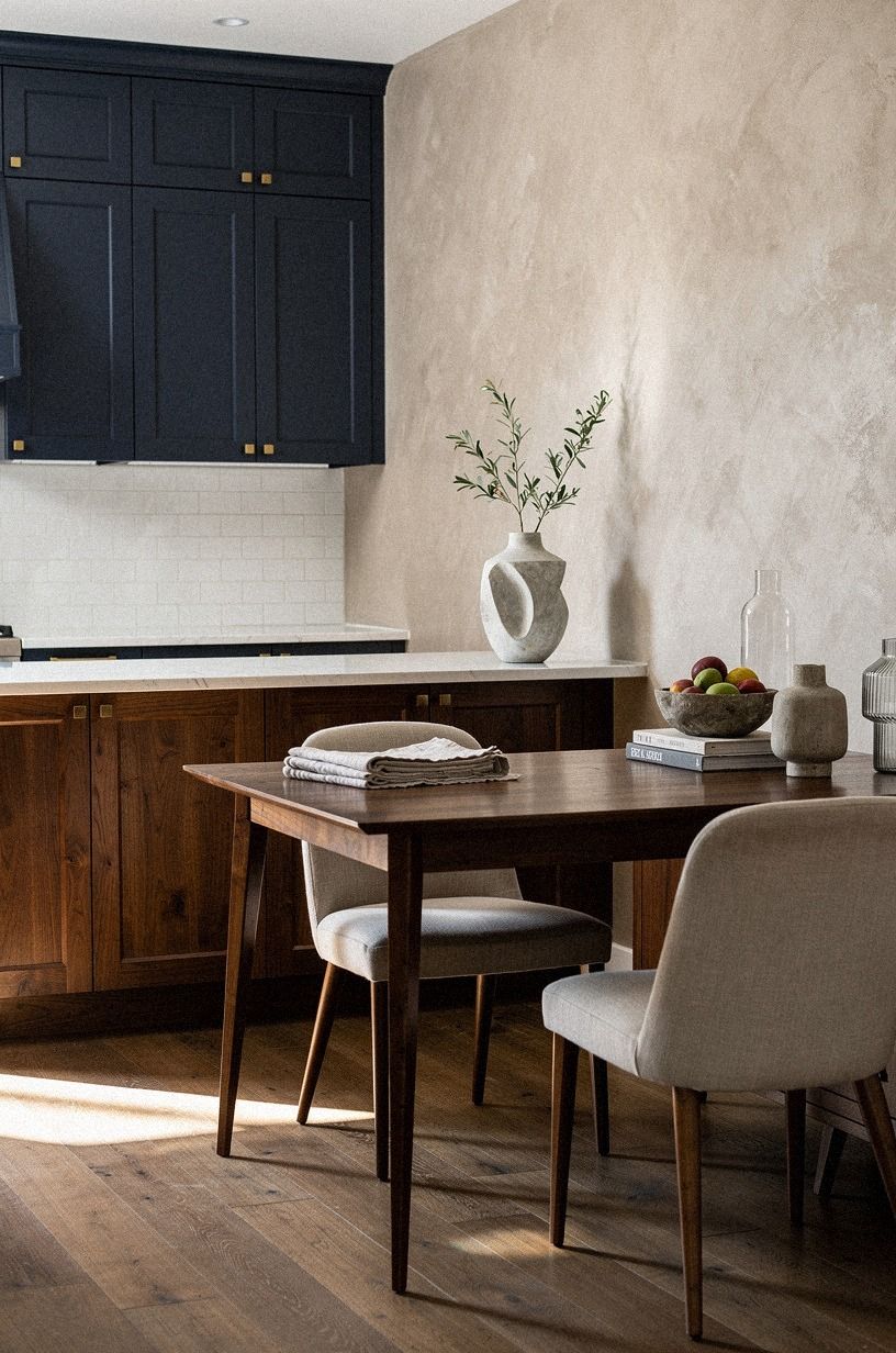
Charcoal doesn't have to read cold. Benjamin Moore Black Forest Green (HC-187) or Sherwin-Williams Urbane Bronze (SW 7048) are dark colors that pull warm undertones, especially next to walnut cabinetry, navy accents and hand-applied Venetian plaster walls.
Use them on a window-frame accent, a pantry wall, or the inside of glass-front cabinets for a moody depth that doesn't feel cave-like. The move with dark colors in a Japandi kitchen is to balance them with a LOT of warm light: under-cabinet LEDs at 2700K, a paper lantern, a walnut and brass pendant.
Skip a single overhead fluorescent and the whole room will lean grey. I painted a window-frame Urbane Bronze last winter and the morning light does something genuinely different with it now, warmer, like the wood is glowing from inside.
11Can Hardware Do the Work Paint Can't?
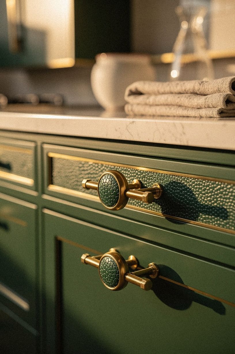
If you're renting or can't commit to a wall color, lean on hardware and texture. Unlacquered brass pulls and knobs develop patina over time, picking up the warm tones of the wood around them.
They cost about $5-$15 per pull and install in minutes. Aged bronze cabinet hardware does the same thing but reads quieter, more architectural.
For an even quieter texture move, shagreen-wrapped drawer pulls bring an emerald, gold and cream palette into the room without a drop of paint, and they age beautifully. The right hardware can warm up a kitchen that's all cool grey without repainting a single wall. Don't mix metals in one room unless you've done it intentionally. Pick brass OR bronze, not both.
Our kitchen cabinet hardware knobs vs pulls guide walks through every option if you're stuck at the cabinet store.
12Bring In a Soft Black Without the Harsh Edge
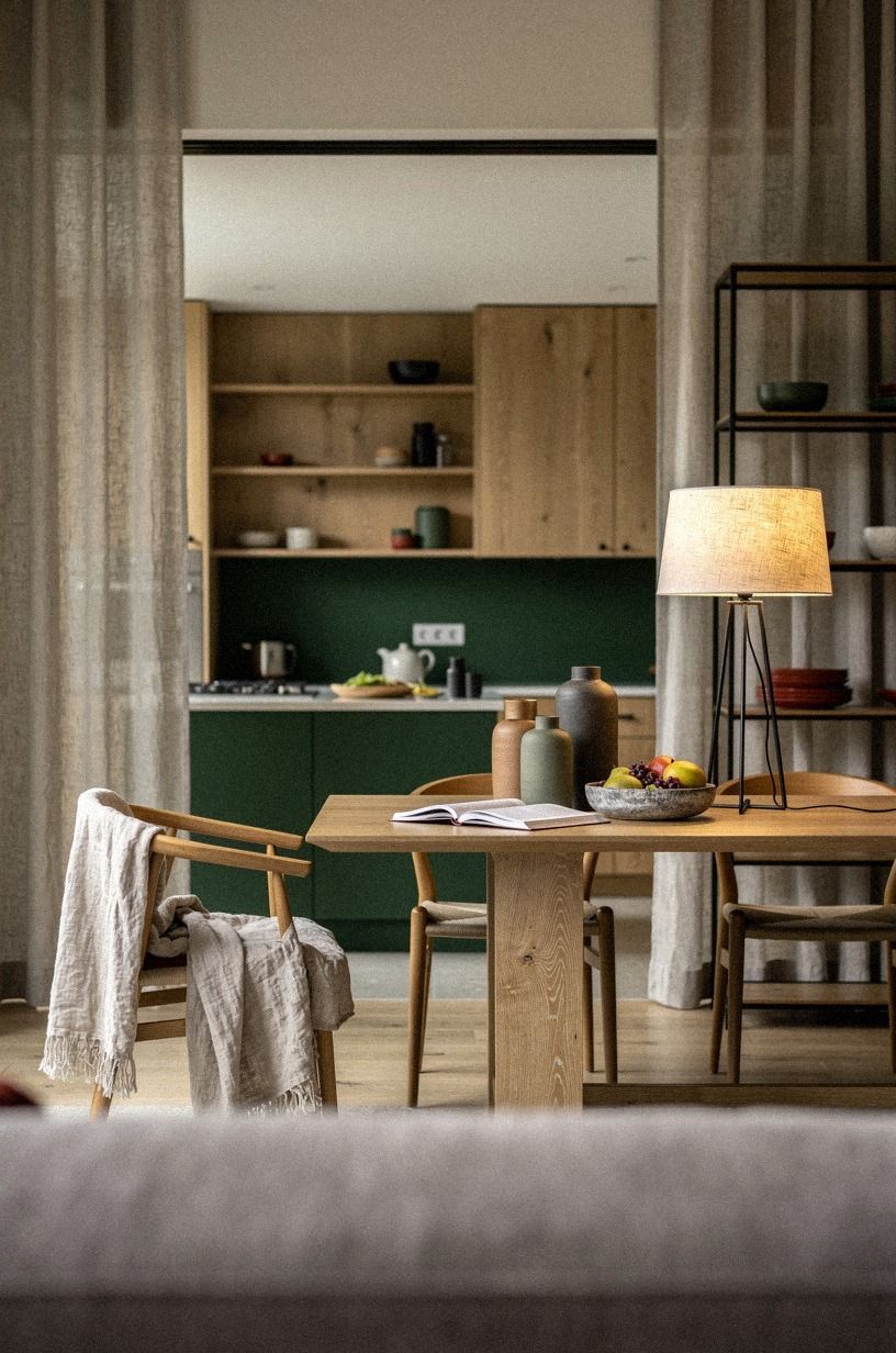
Pure black reads cold in a Japandi kitchen. Benjamin Moore Soot (2133-10) or Farrow & Ball Off-Black (No.57) pull just enough warmth to sit comfortably next to a forest green range wall, rust accessories and natural oak open shelving. Use them on lower cabinets only, with washed Belgian linen Roman shades up top, and the room reads layered instead of heavy.
Skip the same color on the ceiling or you'll lose the Japandi sense of air.
13Why Does a Zellige Backsplash Do What Subway Tile Can't?
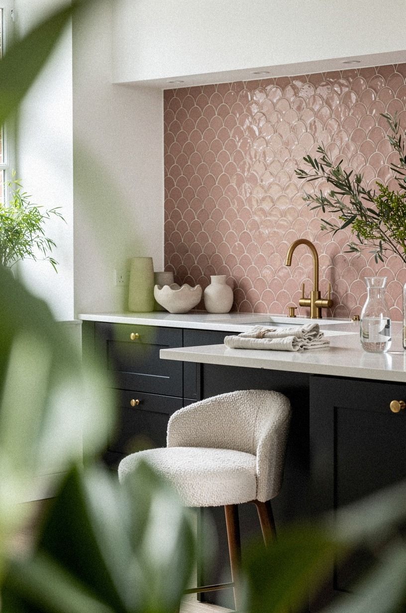
Backsplashes don't have to be loud to do work. Hand-glazed zellige tile in a soft cream, warm white, or pale terracotta adds depth and warmth because each tile catches light differently. Expect to pay about $15-$35 per square foot installed, which is mid-range for a backsplash.
The variation between tiles is what makes zellige feel handmade, not patterned. Pair it with organic bouclé bar stool cushions in dusty rose, a charcoal range and brass pulls, and the kitchen reads tactile in every direction without losing its Japandi hush.
If you're going with a neutral Japandi palette, this is where the texture comes from. Skip the subway tile with dark grout; it reads too industrial for this look. Our tiny cottage kitchens roundup shows zellige doing the heavy lifting.
14Lean Into a Warm Counter Stone for Honest Color
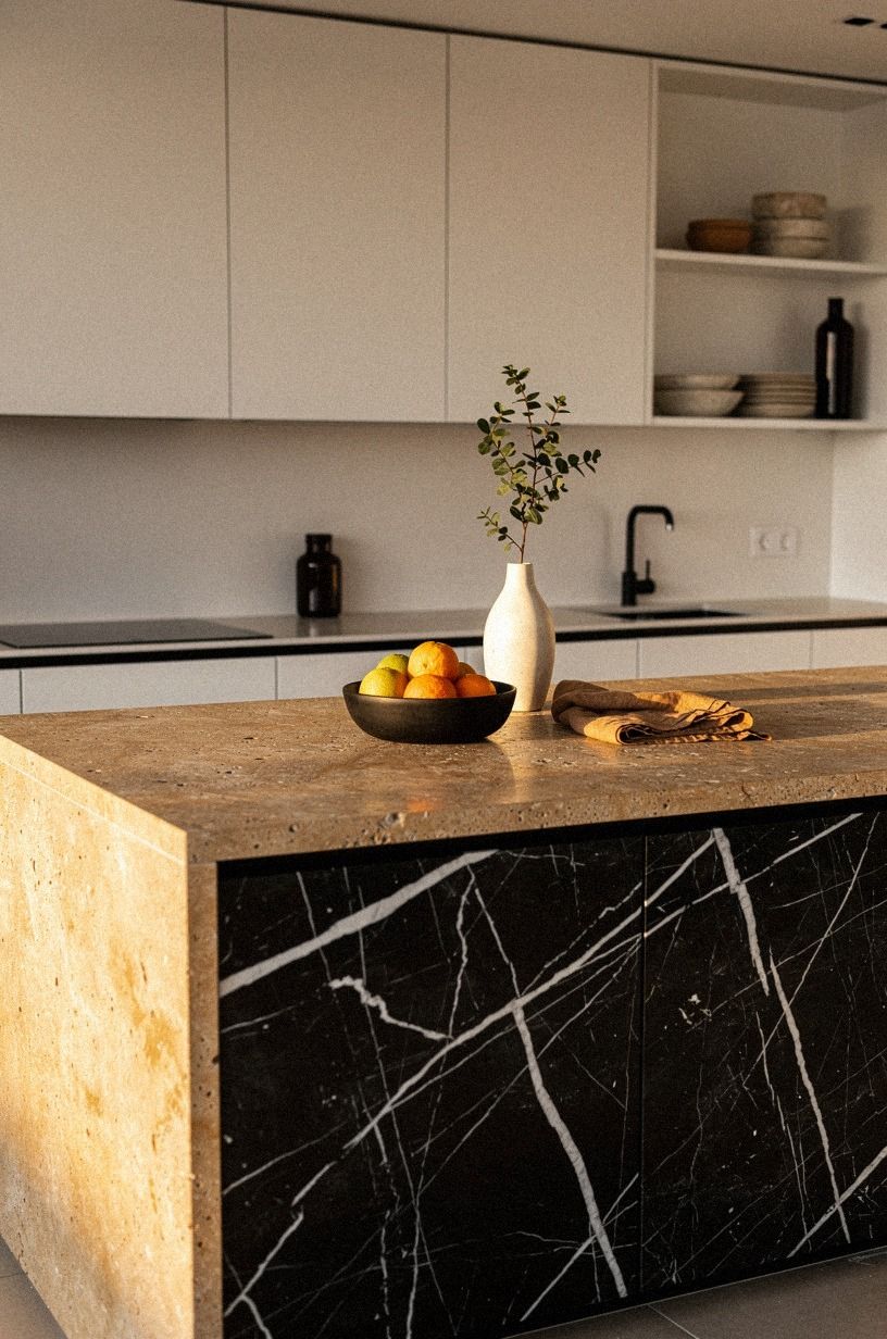
Counter stones make or break a warm palette. Nero Marquina black marble with white veining reads as warm white through its veins and camel through its base, with black accents pulling the room toward honest contrast.
Pair it with warm white uppers and a camel-painted island, and the stone's natural veining does the work a busy quartz pattern can't. Seal it well and expect to live with patina; that's part of the Japandi deal.
15Add a Quiet Wood Stain Without the Loud Finish
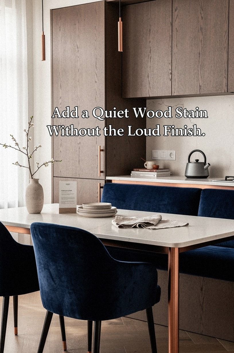
Wood stain in a Japandi kitchen should whisper. Cerused white oak has the grain visible but reads as soft cream.
Pale walnut has warmth without going orange. Bleached ash reads as the lightest wood possible without looking painted. Use these on open shelving, a hood surround, or an island front.
To bring the same hush into the soft furnishings, layer deep-pile mohair velvet in midnight blue, copper-rubbed pulls and ivory linen; the textures do the same quiet work the stain does on the wood. Skip honey oak or dark walnut stains, they read too rustic or too heavy for the Japandi balance. Our white vs wood kitchen cabinets guide makes the stain-vs-paint call easier, and our cabinet door styles guide matches the right stain to the right slab.
16Paint the Ceiling a Step Warmer Than the Walls
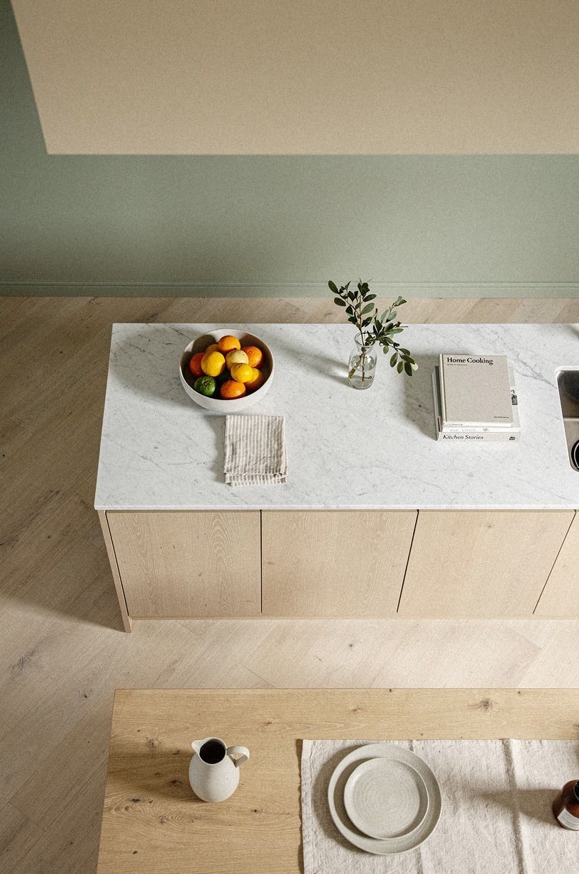
This is the move most people skip, and it changes everything. If your walls are warm cream, paint the ceiling a sage green two steps deeper, something like Farrow & Ball Treron (No.292).
The eye reads it as one continuous warm-to-cool wash, but the ceiling pulls light down instead of bouncing it up harsh. In a kitchen with 36-inch counter height, 30-42 inch uppers, and a Carrara marble with subtle grey veining counter, the ceiling is the largest unbroken surface in the room. It deserves a real color choice, not leftover wall paint, and natural wood open shelving will hold the sage in place.
Our bedroom ceiling guide uses the same approach in Japandi bedrooms. You'd be surprised how often the cheap three is enough!
17Use One Accent Color Per Room, Maximum
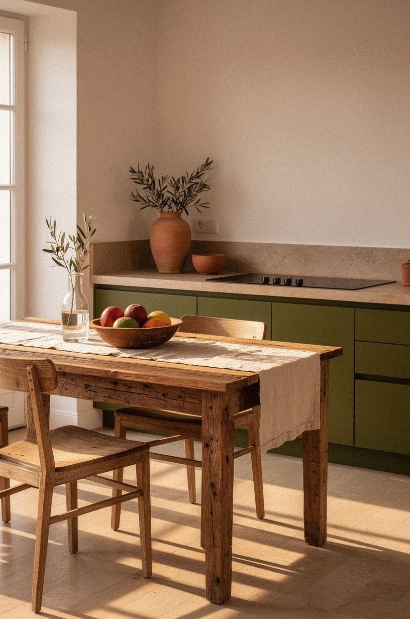
The fastest way to kill a Japandi palette is to over-decorate. Pick one accent color, terracotta, olive, ink blue, deep ochre, and let it show up in three places max.
A ceramic vase, a tea towel, a small piece of art. If your main palette is putty and warm white, a single terracotta piece on a reclaimed weathered teak tray, paired with stoneware and an olive branch, will do more work than five smaller decor moments.
The Japandi balance comes from restraint, not from hitting every color of the trend cycle. One accent, repeated three times, will always feel more intentional than three accents fighting for attention. Our farmhouse breakfast nook roundup shows pieces that work with the same logic.
What This Actually Costs
If you're starting from scratch, here's what a Japandi-warm kitchen refresh typically runs in the US:
The biggest line items are stone counters (about $60-$120 per square foot for quartz) and new cabinet fronts (about $150-$400 per door repainted). Zellige backsplash sits in the $15-$35 per square foot range installed. Paint is the cheapest move with the highest visible impact, a full kitchen in White Dove runs about $80-$150 in materials if you DIY.
If you're on a $500 budget, paint the walls, swap the cabinet hardware, and add a paper lantern. That's 80% of the Japandi warmth for under $300.
Why This Palette Is Having a Moment
The Japandi look took off because people wanted warmth without commitment. All-Scandi felt cold.
All-Japanese felt precious. The blend gives you texture and restraint at the same time. The current shift is away from pure greige toward putty and clay, colors that hold up under a wider range of lighting.
Designers are also pulling more aged bronze and unlacquered brass instead of polished chrome, because metals develop character over time and that fits the Japandi reverence for materials that age well. The takeaway: paint your kitchen for the way you want it to feel in five years, not the way it photographs in a listing.
A Few Things Worth Answering
What is the best Japandi color palette for a small kitchen?
For a small kitchen, start with Benjamin Moore White Dove (OC-17) on walls and ceilings, then add a single moment of depth. A putty island in Farrow & Ball Bone (No.15) or a small accent wall in Sherwin-Williams Evergreen Fog (SW 9130) gives the room a focal point without crowding it.
Small kitchens benefit from Japandi palettes because the warm-neutral tones make tight spaces feel intentional rather than cramped. Our small oak kitchen guide shows similar moves at a smaller scale.
Where can I buy Japandi-style pieces on a budget?
IKEA is the obvious starting point. Their KALLAX birch-effect shelving, HEMNES cabinet fronts, and TONSTAD collections all lean warm-neutral out of the box.
Target's Threshold line under Studio McGee also delivers Japandi tones at lower prices. Facebook Marketplace and thrift stores in older neighborhoods are goldmines for cerused oak and unlacquered brass.
No affiliated links, just where I'd look first.
How much does a Japandi kitchen refresh cost?
A cosmetic refresh (paint, hardware, lighting, peel-and-stick backsplash) runs about $300 to $1,500. A mid-range refresh with repainted cabinet fronts, a new faucet, and a quartz counter lands around $3,000 to $12,000.
Full remodels start at $25,000 and climb fast. Paint, hardware, and lighting are the cheap wins. Stone counters and cabinet replacement are the expensive ones.
Our kitchen cabinet layout guide helps you triage the spend.
Can I create a Japandi palette on a budget?
Yes, and the budget path is more honest than the expensive one. Start with Benjamin Moore White Dove paint (about $80-$150 in materials for a typical kitchen). Swap cabinet hardware to unlacquered brass pulls (around $5-$15 each).
Add a paper lantern or linen shade for warm lighting. If you've got $100, paint a single wall and call it done.
If you've got $500, do paint, hardware, lighting, and one zellige-backed shelf. Our budget cabinet makeover before and after roundup shows what $300-$800 buys.
Is a Japandi palette a good idea for a rental?
Yes, with a few no-damage swaps. Peel-and-stick wallpaper in a warm-putty tone gives you the Japandi wall color without paint commitment.
Tension-rod curtains in Belgian flax linen add warmth to a window without drilling. Removable cabinet liners in cream or putty can shift the tone of ugly existing cabinets. Removable unlacquered brass-look hardware installs in minutes with a screwdriver and comes off cleanly when you move.
You can hit 70% of the look without touching paint.
Where I'd Start First
If I had to pick one, I'd start with the wall color. You can't layer warmth on top of a cold room, the cabinets and lighting will all fight you.
Get Benjamin Moore White Dove on first, then live with it for a week before you choose anything else. Everything else follows, and you'll feel the room change the moment the first coat dries!
Paint your walls for the way you want them to feel in five years, not the way they photograph in a listing.


