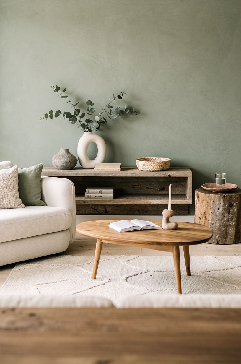
How to Build a Media Wall That Anchors Your Living Room
10 july 2026A short answer up front, because that's what saves you the scroll: building a media wall in a typical US living room runs $300 to $1,200 if you're working with paint, a chunky floating shelf, and a smart TV mount. Once you add a real wood slat wall, a fireplace reface, or a custom cabinet, the same project crosses $2,500 and climbs toward $8,000. Most of the difference between a room that pulls you in and one that just exists comes down to the wall opposite the sofa, and the order you build it. I've spent more weekends staring at blank drywall than I'd like to admit. Here's the 16-step order I'd run again from scratch, and yes, the order is the whole point.
- start with the wall, not the TV
- The Tall Vertical Line rule
- pick the paint color before you mount anything
- The Two-Margin Rule for negative space
- run a real wood mantel or a slim floating shelf
- hide the cords before you do anything else
- layer three sources of light, not one
- build the texture with one wall material
- add one sculptural element that isn't flat
- What kind of art holds its own against the screen?
- warm up the wood tone, not the wall color
- style the lower half with a warm, lived-in rule
- wire in the soundbar, not the speakers
- bring in one plant and call it done
- plan the rug so the sofa doesn't float
- The 9pm lighting test
1start with the wall, not the TV
Most people buy the screen first. That's backwards.
A 65-inch TV takes up roughly 55 by 32 inches of your focal wall, and the wall needs to be designed around that rectangle, not the other way around. Before you measure anything, stand where your sofa sits and look at the wall for thirty seconds.
Where does your eye drift? Where does the window line up?
Where does the door punch through?
The wall you have on hand is rarely the wall you first imagined. I planned a media wall for a spot that turned out to be where the radiator lived.
I planned another around a door arc. Both died on the sketch pad.
Map the room first, then commit. A cheap roll of painter's tape lets you mock the TV outline on the wall in five minutes, and you'll save $400 in mistakes.
Five minutes of taping is cheaper than therapy for buyer's remorse!
2The Tall Vertical Line rule
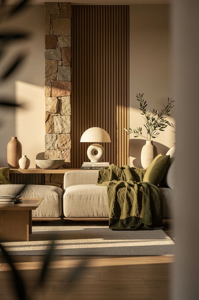
A media wall reads flat if everything sits at sofa-cushion height.
3pick the paint color before you mount anything
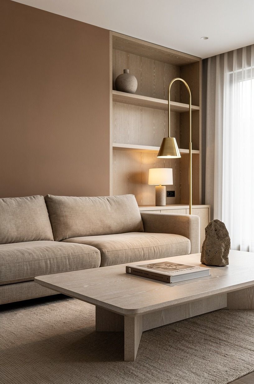
Paint is the cheapest move on this list, and it's the one you'll regret if you put it last. After the TV and shelves go up, you'll have to mask around every bracket, and you'll never quite get into the corners. Paint first, on a weekend with the windows open and a roller in your hand.
Two safe calls for a media wall. Benjamin Moore White Dove (OC-17) if you want the wall to recede so the TV and styling can lead. The other honest option is Farrow & Ball Hague Blue (No.30), which makes the whole corner feel like evening arrived an hour early.
I'd skip the in-between greiges; they photograph gray in low light and beige at noon, and the room never settles into one mood. If you're between two colors, paint a 2 by 2 foot sample on the wall and live with it for three days.
Paint stores sell 8-oz sample pots for about $5, and it's the single cheapest decision-helper in the whole project. For paint ideas that already passed this test, see the most popular kitchen cabinet colors right now for the same warmth-vs-depth logic.
4The Two-Margin Rule for negative space
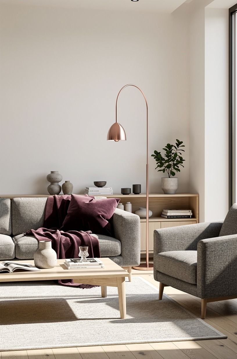
The hole between the TV edge and the side shelving should not be even. It should feel intentional.
Designers call this the Two-Margin Rule: a tight 4 to 6 inch gap on one side, a wider 12 to 18 inch gap on the other, so the wall reads asymmetric and grounded. Equal margins look like a conference room.
If you're running a fluted panel on one side, keep that gap tight (3 to 5 inches) so the panel reads as a frame. If you're running open shelves on both sides, push them wider (10 to 14 inches) so the wall breathes. Mount the TV so the screen center sits roughly 42 to 48 inches off the floor when you're seated.
Eye height when you're watching, not when you're standing. You'll feel the difference in your neck by hour two of movie night.
And if you're styling around the TV, the same logic shows up in how to style the space above your kitchen cabinets; the negative-space rules translate cleanly from kitchen to media wall.
5run a real wood mantel or a slim floating shelf
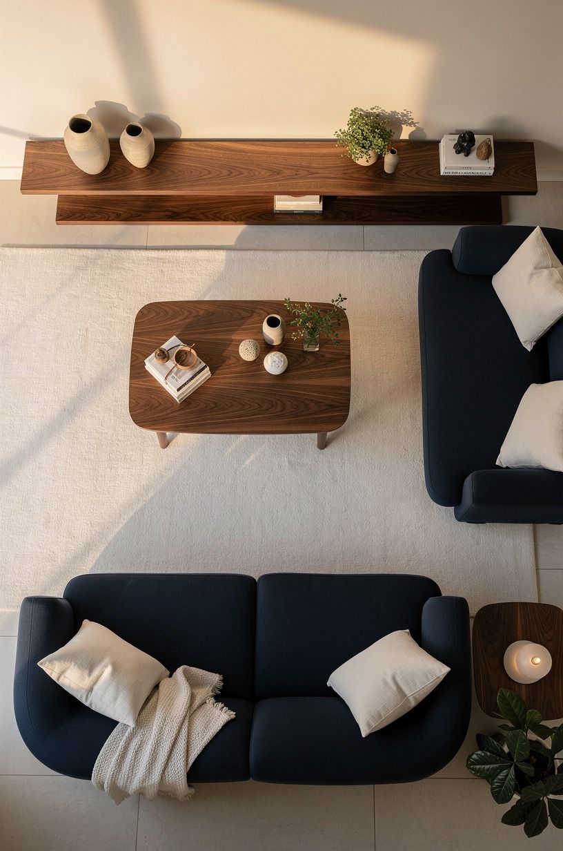
Even if you don't have a fireplace, the horizontal ledge at TV-bottom is the move.
6hide the cords before you do anything else
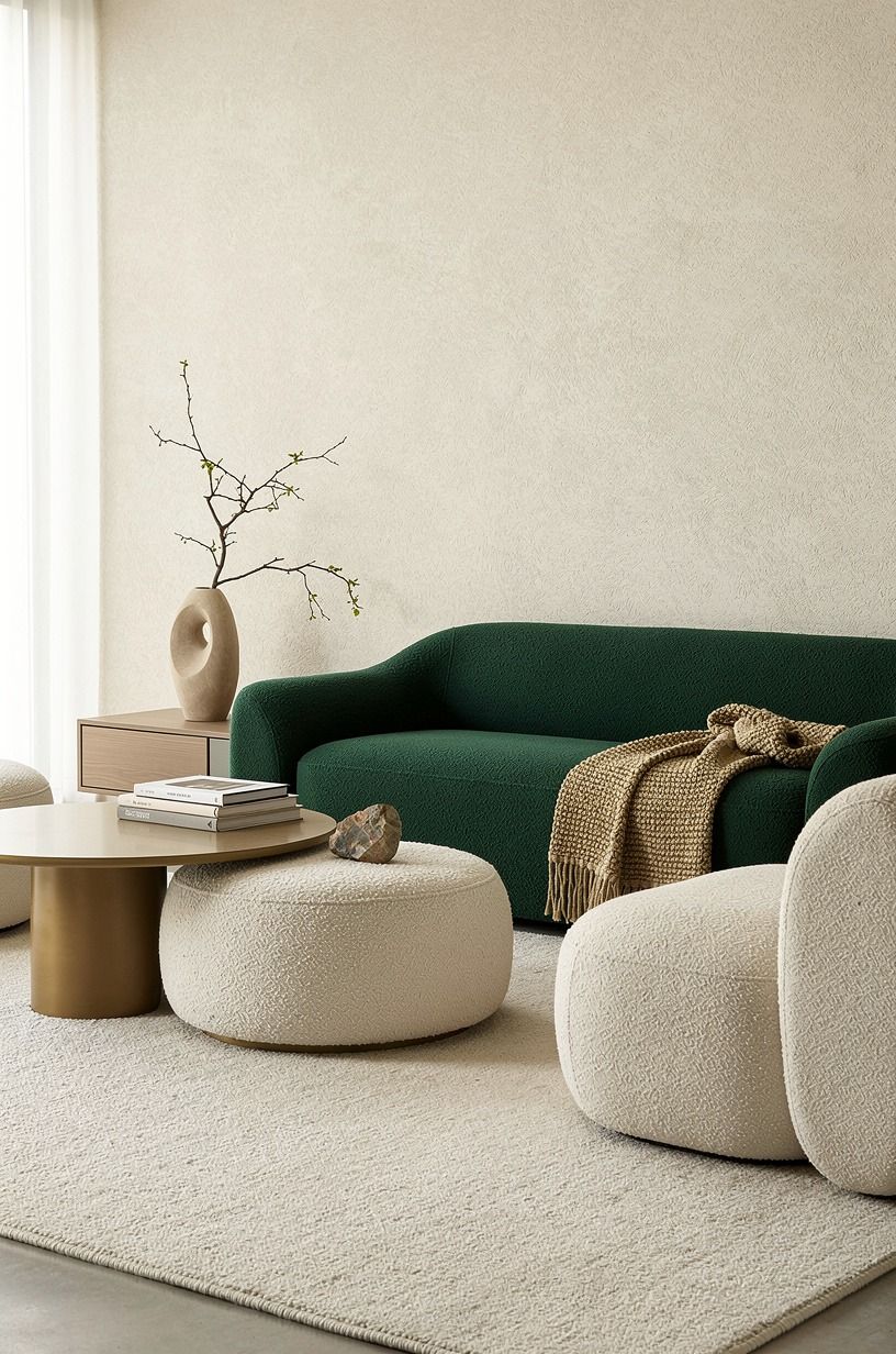
Nothing kills a media wall faster than a black snake of HDMI cables dripping down to the outlet. Plan the cable path before you patch, paint, or mount. Three honest options, no affiliate picks here, just what works.
First, an in-wall power and cable kit ($25 to $40, any hardware store). You cut two holes, drop the cords behind the drywall, and plug into an outlet behind the TV.
Cleanest result, but it does mean cutting drywall and adding a recessed box. Second, a paintable cord cover ($12 to $20) that runs down the wall like a slim raceway.
Renter-friendly, easy to remove. Third, if your TV sits over a mantel, run cords straight down behind the mantel and out the back.
You won't see them unless you're looking from the side. I'd take the in-wall route if you own the place.
The cover is fine for the first 12 months. And if you're renting, you'll thank me when move-out day comes.
7layer three sources of light, not one
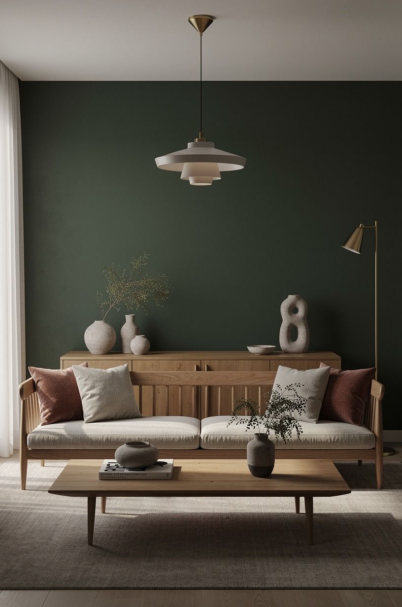
A single overhead light makes any media wall look like a waiting room. You need three layers working together: ambient (the room's general glow), task (light over the seating zone), and accent (light that picks out the wall itself). Here's how I'd stack them, fixture by fixture.
Ambient: a flush-mount ceiling fixture in warm 2700K, dimmable, with a paper or linen shade so it spreads instead of glaring. Task: a swing-arm floor lamp behind the sofa at the reading end, or a slim table lamp on a side console. Accent: a pair of picture lights above the mantel pointing at the styling, or a small uplight tucked behind the TV that grazes the wall texture. Run them all on one dimmer if you can.
You'll find one setting (about 30 percent) that makes the whole room feel like evening even at 4pm. If you want a single shortcut, this is the one: kill the overhead light. Light the wall and the sofa. Leave the ceiling dark.
The room gets bigger, softer, and more expensive-looking in ten seconds. For the rest of the room's lighting math, under-cabinet lighting ideas for kitchens walks through the same layered approach.
8build the texture with one wall material
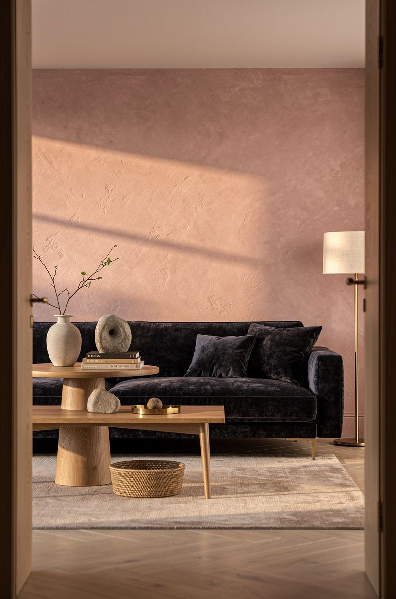
A flat painted wall is fine. A textured media wall is the difference between a refresh and a redo.
You don't need all four materials. You need one, used well, and you need to commit before the paint dries.
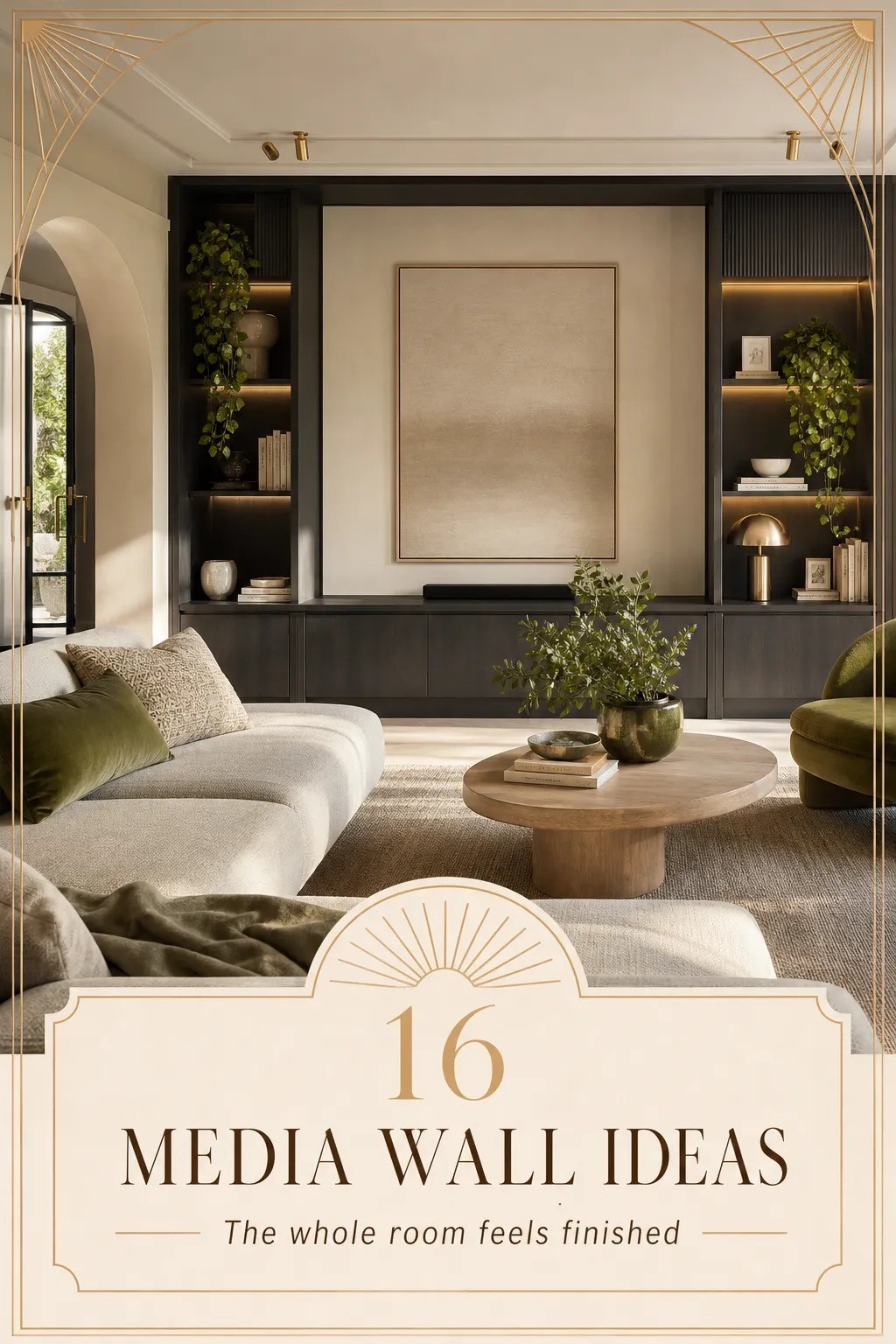
Three choices that read current in 2026. Vertical oak slats in 1 by 2 inch battens, spaced about a half inch apart, running floor to ceiling behind the TV. The grain catches afternoon light and the room warms up without you doing anything.
Limewash in a soft cream over a previously painted wall; the mottled finish reads old-world and forgives every drywall patch. Hand-glazed zellige tile is the move if you're going for the more architectural look and you've got the budget (about $25 to $45 per square foot installed).
I'd skip the peel-and-stick faux-stone panels; they look like exactly what they are by month six. For a deeper dive on painted millwork, the logic lines up with black kitchen cabinet ideas for a bold, moody kitchen.
If you're renting, limewash is the move. It comes off with a weekend of scrubbing and a coat of primer. The wood slats can be mounted on removable command strips rated for 20+ pounds, with one caveat: install the panel with French cleats so the load is shared.
9add one sculptural element that isn't flat
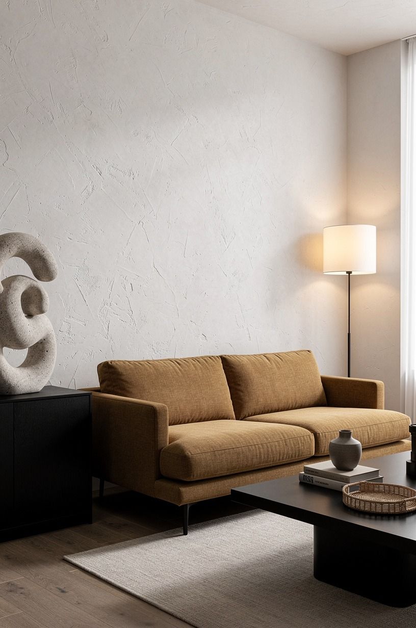
Every media wall needs one object with depth. Not a vase, not a frame, not a candle.
Something that throws a shadow and pulls the eye. A carved stoneware vessel in cream on the mantel.
A wabi-sabi ceramic bowl on the lower shelf. A woven rattan tray leaning against the wall on the side console. Pick one, and let it carry the weight.
I'd skip anything mirrored; it competes with the screen. I'd skip anything high-gloss; the TV already gives you reflection.
Matte, hand-finished, slightly imperfect, in a tone that's a half-step warmer than the wall. The whole wall is doing loud work (TV, textures, lighting).
Your sculptural object is the quiet one. That's why you notice it. For more on quiet-object styling, the same approach shows up in cozy vintage bedrooms that feel collected rather than decorated.
10What kind of art holds its own against the screen?
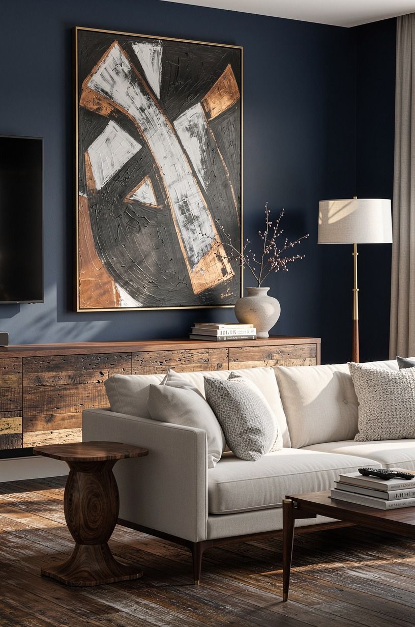
Putting art next to a TV is a fight.
11warm up the wood tone, not the wall color
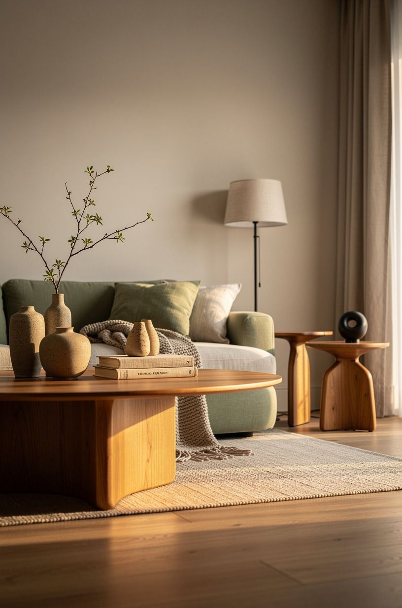
Most media walls fail not on color but on temperature. The wall reads cool, the wood reads warm, the screen reads cool, and the whole room never settles. Pick one direction and commit.
If you've gone with Benjamin Moore White Dove (OC-17) on the wall, lean into warm woods: honey-toned oak, walnut, or rattan. If you've gone with Farrow & Ball Hague Blue, lean into pale woods or even painted millwork.
The third honest option is Sherwin-Williams Evergreen Fog (SW 9130), which sits in between and makes both warm and cool woods work without forcing either. I've used it twice now, and both rooms stopped fighting within a weekend.
Real talk: test your paint against your wood at the same time of day you'll be in the room. North-facing rooms skew cool all day.
South-facing rooms skew warm. If you're north-facing, push warmer woods and a slightly creamier wall. If you're south-facing, you can carry the cool tones without the room feeling cold or flat, and the afternoon sun will do half the styling work for you.
12style the lower half with a warm, lived-in rule
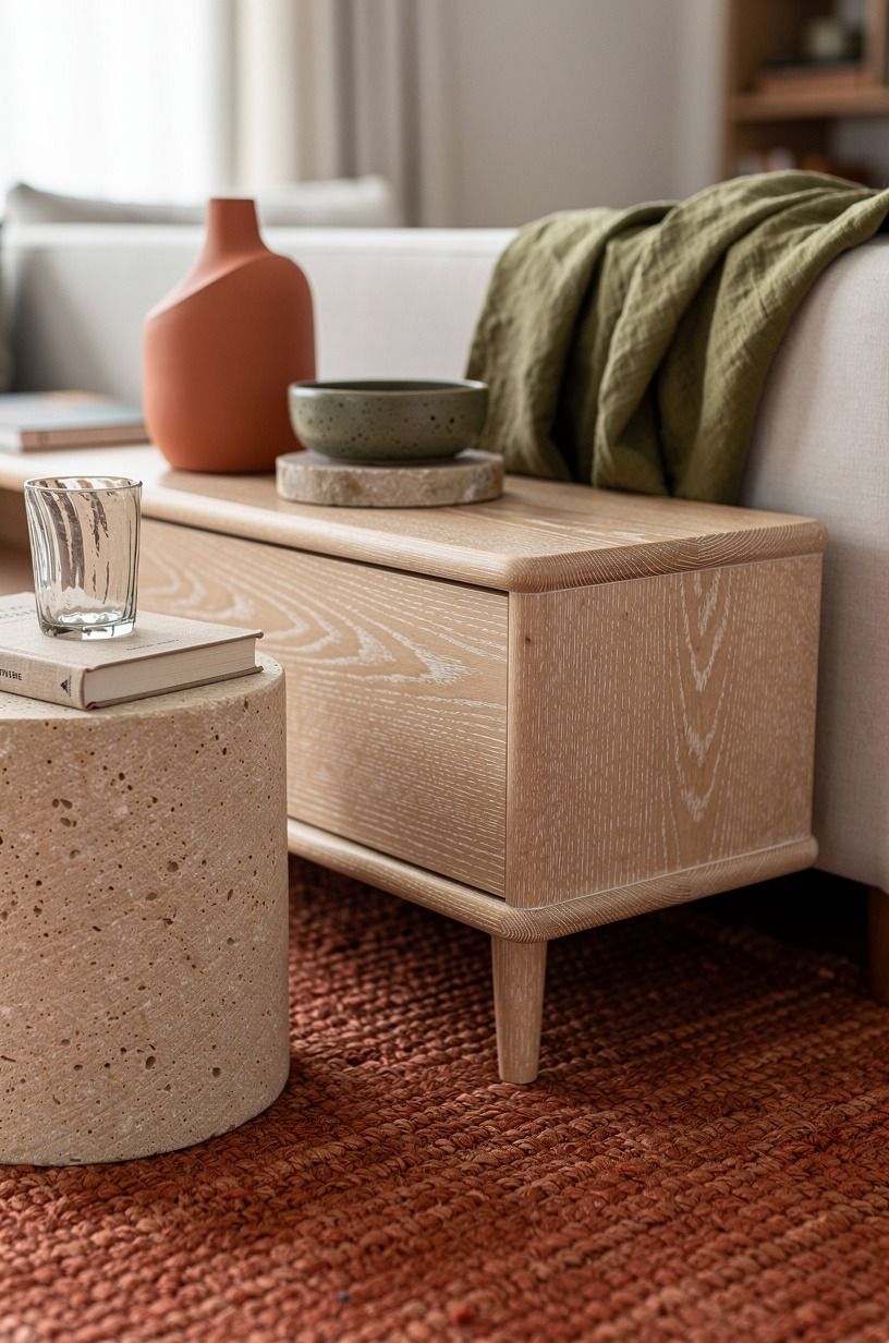
People style the mantel and forget the lower shelf, the cabinet top, the bench.
13wire in the soundbar, not the speakers
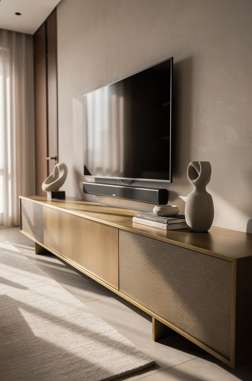
Soundbars used to be a compromise. In 2026 they're not.
A solid $400 to $700 soundbar from Sonos, Bose, or Samsung will outperform most in-wall or bookshelf setups, and it disappears under the TV. Skip the floor speakers unless you're a serious listener; they take up floor space and they fight the rug.
If you want real stereo, mount a pair of wireless bookshelf speakers (Sonos, KEF, Audio Pro) on low floating shelves flanking the TV, about 6 to 8 feet apart and slightly toed in. No speaker wire, no amp, no visible gear.
The wall stays clean and the sound fills the room without dominating it. For the room's other audio-and-ambience decisions, the same dimmer logic from bedroom lighting design choices applies here, just warmer.
I'd skip the subwoofer for a media wall in a smaller room. The room is small enough that you don't need the bass extension, and the subwoofer is the one thing every guest will ask about in the wrong way.
Honest take: save the $500, spend it on a thicker rug instead. The rug does more for the room's overall warmth than the sub does for the bass. For the cables and the console below the TV, clever kitchen microwave cabinet ideas that hide gear in plain sight translate surprisingly well to media cabinets.
14bring in one plant and call it done
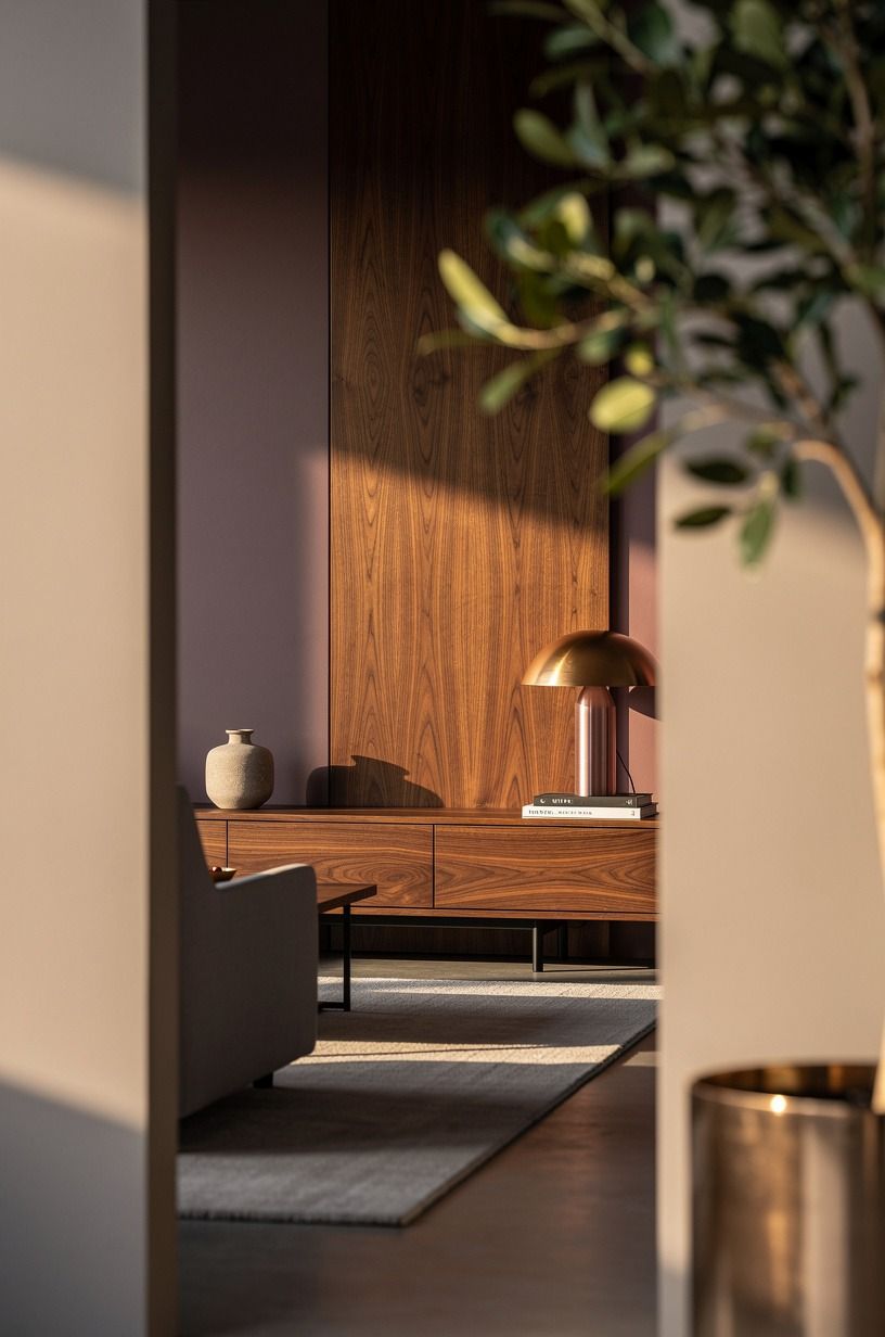
A media wall without greenery looks staged. A media wall with three plants looks like a garden center.
One plant, well placed, is the answer. The spot that works best is the corner opposite the TV, on a tall plant stand or in a floor basket, so its leaves break the hard line of the wall without crowding the screen.
I'd lean toward a fiddle-leaf fig (real or faux; if faux, spend the $120, not the $40) or a bird-of-paradise if your light is good. For low light, a sansevieria or a ZZ plant survives anything and reads modern.
The pot matters more than the plant. A matte terracotta, a soft cream stoneware, or a woven seagrass cover will lift a $20 plant to a peaceful, dignified $200 look. Skip the shiny ceramic.
Skip the plastic saucer on display.
Watering tip nobody tells you: stick a wooden chopstick into the soil. If it comes out dry, water.
If it comes out damp, leave it. Most plant deaths are overwatering, not neglect. A gentle rhythm beats a strict schedule.
15plan the rug so the sofa doesn't float
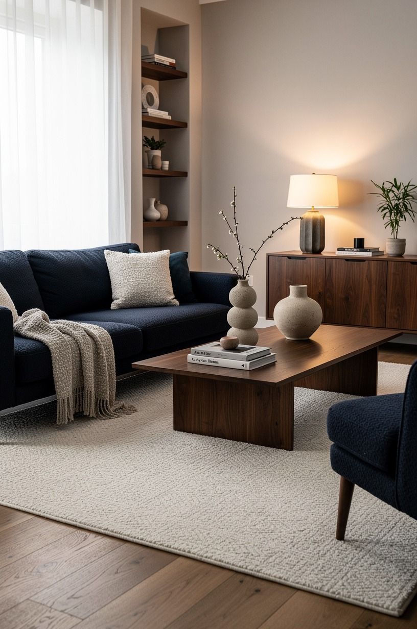
The single biggest tell that a room wasn't designed is a sofa floating in the middle of the floor with a too-small rug under it. The rug is the floor's anchor, and on a media wall, it does more visual work than anything else in the room besides the screen itself.
Size rule from designers that always works: front legs of the sofa on the rug, ideally with 8 to 12 inches of rug showing on the side facing the TV. In a typical 12 by 14 living room, that means a 9 by 12 rug or an 8 by 10 if the room is tight. A 5 by 7 will look like a bath mat.
Go bigger, not smaller.
Material: wool, every time. It wears better than synthetics, it doesn't crush underfoot, and it cleans up spills if you blot fast. A hand-knotted wool rug in a low-contrast pattern (cream and taupe, or a soft sage over bone) reads current without dating the room.
Budget range: $600 to $2,500 for a wool 9x12. Wayfair, Article, and Rugs USA all carry solid entry-level options; for the upgrade, Loloi, Anthropologie, and Revival have held up in the homes I've worked on.
The same warmth logic shows up in terracotta-tile rooms that feel warm underfoot.
16The 9pm lighting test
The last step is the one nobody schedules. Wait until 9pm.
Dim the lights to your evening setting. Sit on the sofa.
Look at the wall. Does the TV dominate, or does the wall hold its own?
Does the mantel glow, or does it vanish? Is the texture readable, or does it disappear into shadow?
You'll know in thirty seconds what's working and what isn't. If the TV dominates, dim the screen's backlight (almost every modern TV has a setting buried in the picture menu) and add one more layer of ambient light behind the screen.
If the mantel vanishes, swap to a higher-lumen picture light or move it closer to the styling. If the texture disappears, add a small accent light grazing the wall from below.
This is the move designers run on install day, and they don't tell clients about it. The room is for evening. Test it in evening.
And once the lighting test passes, you'll know the room is doing its job!
What a media wall costs in 2026
A quick honest breakdown so you can budget before you start. These are typical US ranges based on what I've seen quoted and what I've watched friends spend. Numbers below are honest averages, not aspirational Instagram quotes.
The Budget tier is where most people should start. You'll be surprised how far paint, one good shelf, three styled objects, and warm light will carry the wall.
The Mid tier is where the wall starts reading as architecture. The High tier is what you do when you're renovating the room anyway, not on a whim.
The part nobody respects about building a media wall
Here's what I've learned after enough of these to have a real opinion. The wall is the easiest part. The hard part is stopping yourself from doing everything at once.
A media wall wants to be a built-in cabinet, a fireplace, a record display, a sound system, and a projector setup, all in the same cozy corner. The room can't carry all of it.
The rooms I regret are the ones I tried to do too much in. The rooms I still love are the ones where I picked three moves and let them breathe.
The fluted oak panel that took a Saturday. The floating shelf in solid white oak.
The single oversized art piece. The brass picture lights.
The seagrass basket in the corner. Those are the rooms where guests ask "what did you change?" and you can't quite explain it, because the room reads as itself: warm, quiet, and inviting rather than decorated!
If you build this in the right order, paint first, then the structural pieces (panel, mantel, lighting), then the styling, then the 9pm test, you'll spend less money and get a room that feels intentional instead of decorated. And that's the difference.
Intentional is the goal. Decorated is what happens when you put a wall together without a plan.
One last honest take: your living room doesn't need a media wall. It needs a focal wall that does its job.
Sometimes that's a fireplace. Sometimes it's a big window. Sometimes it's a real piece of art. The TV is the loudest thing in the room, but it doesn't have to be the focal point.
The wall is. Build the wall first, and the screen falls into place. That's the rule I'd stake my reputation on, and it's the rule I've seen hold up across a dozen rooms now.
Saved this for later? Pin it.
What People Always Want to Know
What is the best media wall setup for a small living room?
A small room benefits from a media wall more than a large one, because the wall does the work of three separate zones (TV, art, storage) in one footprint. I'd run a slim floating shelf in solid white oak at TV-bottom height, a single vertical fluted panel in oak on one side, and skip the cabinet entirely.
The floor stays open, the room feels bigger, and you keep about $1,200 in your pocket versus a full built-in. The vertical panel is the move; it's the one element that makes a small wall read as architecture rather than just a TV mount.
For the layout math, the same proportions in 15 small bedroom layouts that make the room feel bigger translate surprisingly well.
Where can I buy media wall pieces on a budget?
Three honest sources. IKEA for the floating shelves (the LACK and EKBY lines), the TV mount, and the KALLAX if you want closed storage below the screen.
Target's Threshold and Studio McGee lines for the styling objects, the lamps, and the baskets. Facebook Marketplace and thrift stores for the art, the mirrors, and the bigger ceramic pieces. The 9pm-test rule applies to thrifted art too: hang it where you'll see it every evening, and if you stop noticing it within a week, rotate it somewhere else.
No commission links here, this site runs on display ads; the brands are mentioned because they're what works.
How much does a media wall makeover cost?
For a typical US living room, plan on $300 to $1,200 if you're doing paint, a real wood mantel or floating shelf, layered lighting, and styling. $2,500 to $8,000 if you're adding a wood slat wall, a real fireplace reface, or a quality soundbar plus wireless speakers. $12,000 and up if you're going custom cabinetry or full millwork. The free version of this project is paint, a thrift-store mirror, a basket, and one good lamp. That's not a consolation prize; it's how some of the best rooms I've worked on got there.
Can I build a media wall on a budget?
Yes, and you'd be surprised how much of the effect comes from free or cheap moves. Free: rearrange the existing furniture so the sofa faces the chosen wall, swap one framed photo from another room, edit the styling down to three objects.
Cheap (under $100): one can of Benjamin Moore White Dove in eggshell, a pack of picture lights from Amazon, a seagrass basket from Target. Mid ($100-$500): a real wood mantel, a slim floating shelf, one quality floor lamp.
The reason this works on a budget is that the wall's whole job is to give the eye somewhere to rest, and a quiet wall reads more expensive than a busy one. Less stuff, better light, and you're most of the way there.
Is a media wall worth it in a small space?
Yes, more than almost any other living room change. A small space can't carry lots of separate zones, so the wall that does three jobs (TV, art, storage) saves you square footage.
The rule is keeping the floor clear and pulling the styling upward. Vertical fluted panel, one tall plant in the corner, a slim shelf instead of a cabinet. The room feels bigger because the eye travels up rather than out.
If you're below 130 square feet, I'd skip the cabinet entirely and let the floor breathe. The same vertical-pull logic plays out in tiny bedroom layouts that stop feeling cramped.
Is a media wall a good idea for a rental?
Yes, with three no-damage swaps. First, mount the TV with a full-motion wall mount that anchors into a single stud (or use a tension-rod TV stand if you truly can't drill). Second, skip the in-wall cable kit and run a paintable cord cover down the wall, which peels off cleanly at move-out.
Third, build the wall texture with limewash paint or removable wallpaper instead of wood slats; both come off in a weekend with a steamer and a putty knife. The mantel can be a floating shelf on rated command strips if the load is light (under 15 pounds).
You give up a little of the architectural feel, but you keep your security deposit and you take the wall with you when you leave.
Where I'd Start First
If I had to pick one step, I'd start with paint. You can't layer warmth on top of a cold room, and everything else you add will fight the wall instead of building on it. Pin this for the weekend.


