I Tried Zen Japandi Kitchen Ideas, My Cook Space Finally Felt Calm
07 july 2026Zen Japandi kitchen ideas finally worked for me when I stopped adding pretty things and started taking visual pressure off the room. I did this reset during a week when my counters were covered in mail, vitamins, and one loud chrome kettle I was weirdly attached to. By the end, the kitchen felt calmer than it had in years.
Worth Pinning First
If you only save one section of this list, save this part. The whole Zen Japandi reset boiled down to one principle for me: protect a quiet surface in every kitchen and let everything else earn its place next to it.
I tried this on a week off, and the room went from noisy to genuinely calm without a single cabinet being replaced. Most of the moves below cost less than dinner out, and none of them require a contractor.
If you want the underlying philosophy, what a Japandi kitchen actually means walks through the warm-minimalist rules I leaned on.
The Kitchen Before the Reset
Before this makeover, my kitchen had the full tug-of-war thing going on. Warm walnut lowers, shiny hardware from a past update, too many objects left out because I wanted the room to feel useful, and not enough empty space for your eye to ever settle.
I kept calling it minimal, but it was not minimal. It was busy in soft colors.
The bones were good, which almost made it more annoying. Benjamin Moore White Dove OC-17 on the walls.
Standard 36 in counter height. A decent island.
Natural light that should have made the whole room feel easier. But every surface was doing too much, so you never got that calm kitchen exhale you want when you walk in at 7 a.m.
I did not need a remodel. I needed restraint.
- Clear the counters into one oak tray
- Swap shiny pulls for slim black handles
- Set pale stone beside warm wood doors
- Tuck the kettle inside a low appliance garage
- Run a limewash backsplash behind open shelves
- Keep one handmade bowl on the island
- Choose flat-front cabinets in soft mushroom
- Line the windowsill with three clay planters
- Hide the sponge in a bamboo sink caddy
- Float two ash shelves above the prep zone
- Place linen cafe curtains over the sink
- Group cutting boards against the quiet corner
- Use ribbed glass on the upper cabinets
- Bring in a low woven runner
- Mount warm under-shelf lights before dusk
- Leave one empty stretch of countertop
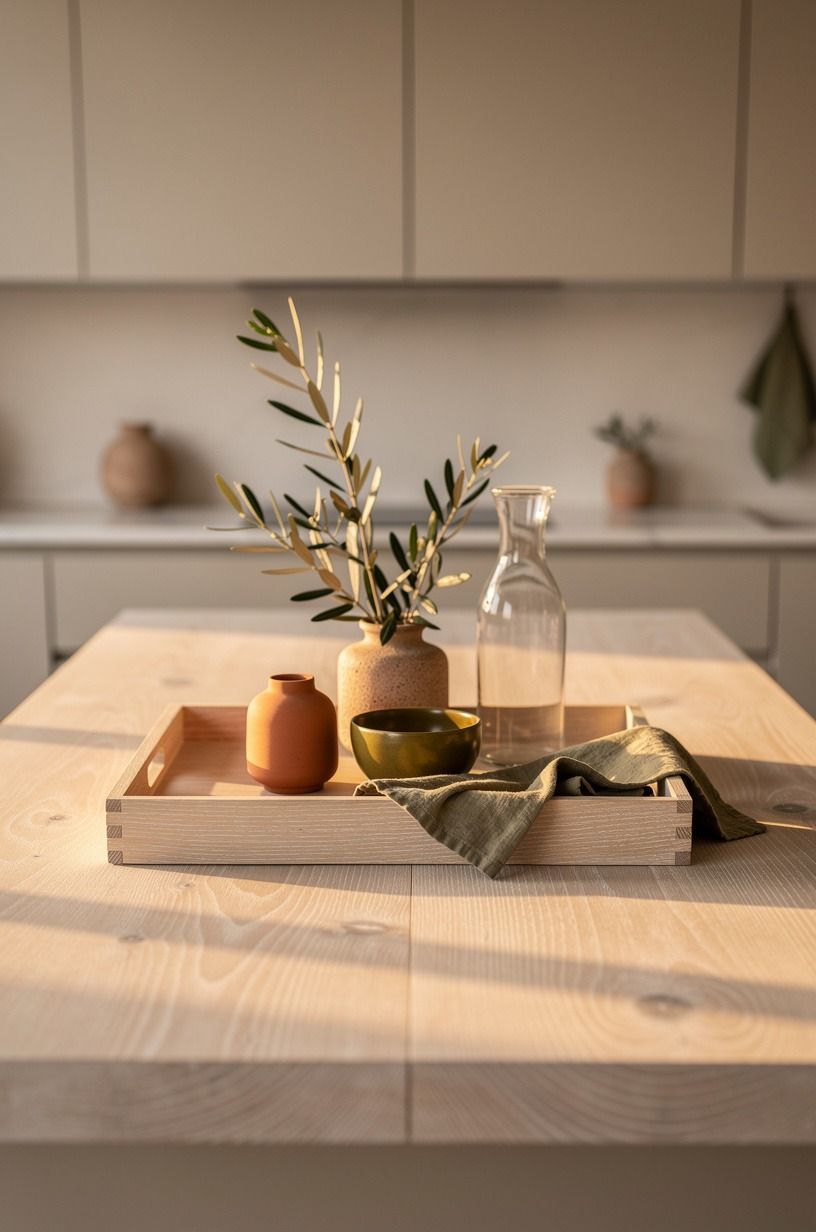
1Clear the counters into one oak tray
This was the first move that made the room stop buzzing. I gathered the soap, salt, oil bottle, and the one candle I kept moving around into a single cerused white oak tray with an exposed dovetail corner, then centered it on the island so your eye had one place to land instead of six. If you want kitchen zen design to read intentional, not empty, you need one contained cluster and a lot of air around it.
I made the mistake of using two trays at first because I thought symmetry would save me. It did not.
Two trays just looked like I had twice the clutter. One tray, about 18 inches wide, was enough to hold the daily stuff while keeping the prep run open for real life. And yes, you should leave breathing room around it.
When you can wipe the island in one sweep and still keep the essentials close, the whole room starts acting calmer too. If your counters always look like a parking lot, kitchen organization ideas that actually work covers the deeper edit.
2Swap shiny pulls for slim black handles
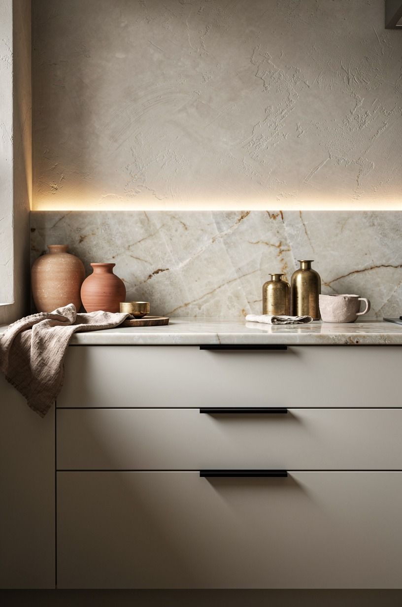
I did not expect hardware to change the mood this fast, but it did. The old polished pulls kept catching light in a sharp, nervous way, especially at night, so every drawer line looked louder than it needed to.
I switched to matte black cabinet handles with a slim profile, and suddenly the pale flat-front drawers looked grounded instead of jumpy. If you're chasing zen kitchen inspiration, the smaller visual rhythm matters more than people admit.
But what helped most was contrast. The black line against soft cabinetry gave the room a cleaner outline, while the old chrome had made everything feel scattered.
I kept the handle length modest so your drawers still read flat from a first-person view walking in. But here is the thing: don't go chunky.
A thick bar starts pulling the kitchen toward industrial, and that was not the brief. You want one crisp mark beside warm materials, not a metal parade.
The full pull versus knob question is laid out in kitchen cabinet hardware ideas if you want the tradeoffs.
3Set pale stone beside warm wood doors
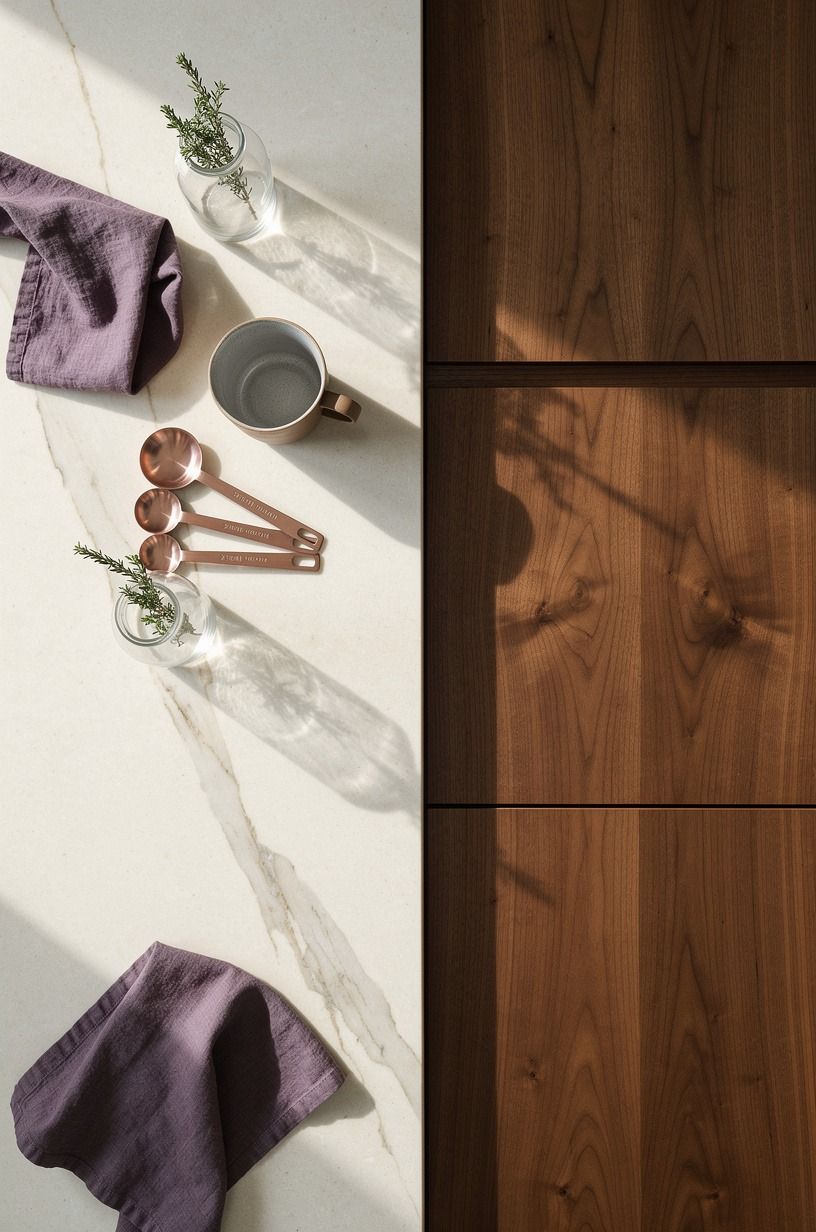
This was where the room finally stopped looking split in half. I leaned into the pale stone counter instead of fighting it, then let the warm book-matched walnut doors do the softening work.
From above, that pairing reads balanced right away: cool, matte surface on one side, richer grain on the other, with enough negative space that you can still see the calm prep zone instead of a styling project. You need both sides if you want a minimalist kitchen that doesn't feel cold.
I used the counter as the quiet plane and treated the wood as the emotional layer. That's the part I had not understood before.
When both surfaces try to perform, the room gets restless. When one surface stays hushed, the other can carry warmth without looking heavy.
I also kept the working zone pushed to one edge so the center stayed visually open. If you're stuck between all-stone and all-wood, I'd choose contrast every time.
The room feels gentler when your materials have distinct jobs. For the matching question on cabinets and counters, how to mix wood and white the right way covers what to balance.
4Tuck the kettle inside a low appliance garage
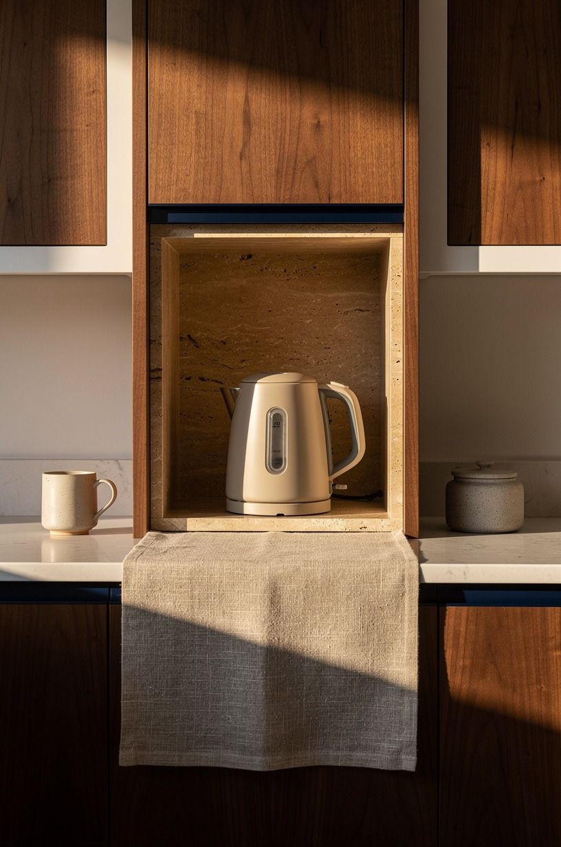
Hiding the kettle changed more than replacing the kettle ever would have. Mine was not ugly, but it was always there, always asking to be noticed, and that constant outline on the counter made the room feel unfinished even when it was clean. I tucked it into a low travertine appliance garage with a simple lift door, and your eye could finally travel across the surface without crashing into a shiny object every morning.
And the scale matters here. A low garage keeps the upper line from getting bulky, which is important if your backsplash gap is around 18 in between the counter and uppers.
I would not build a giant niche unless you truly need the storage. One modest hideaway for the kettle and toaster is enough.
And if you're in a rental, you can fake the same idea with a countertop tambour box in warm travertine-look laminate. The point is not fancy joinery.
It's giving your small appliances an off-stage place to live. The same logic shows up in microwave cabinet ideas to hide it in style, and the principle transfers.
5Run a limewash backsplash behind open shelves
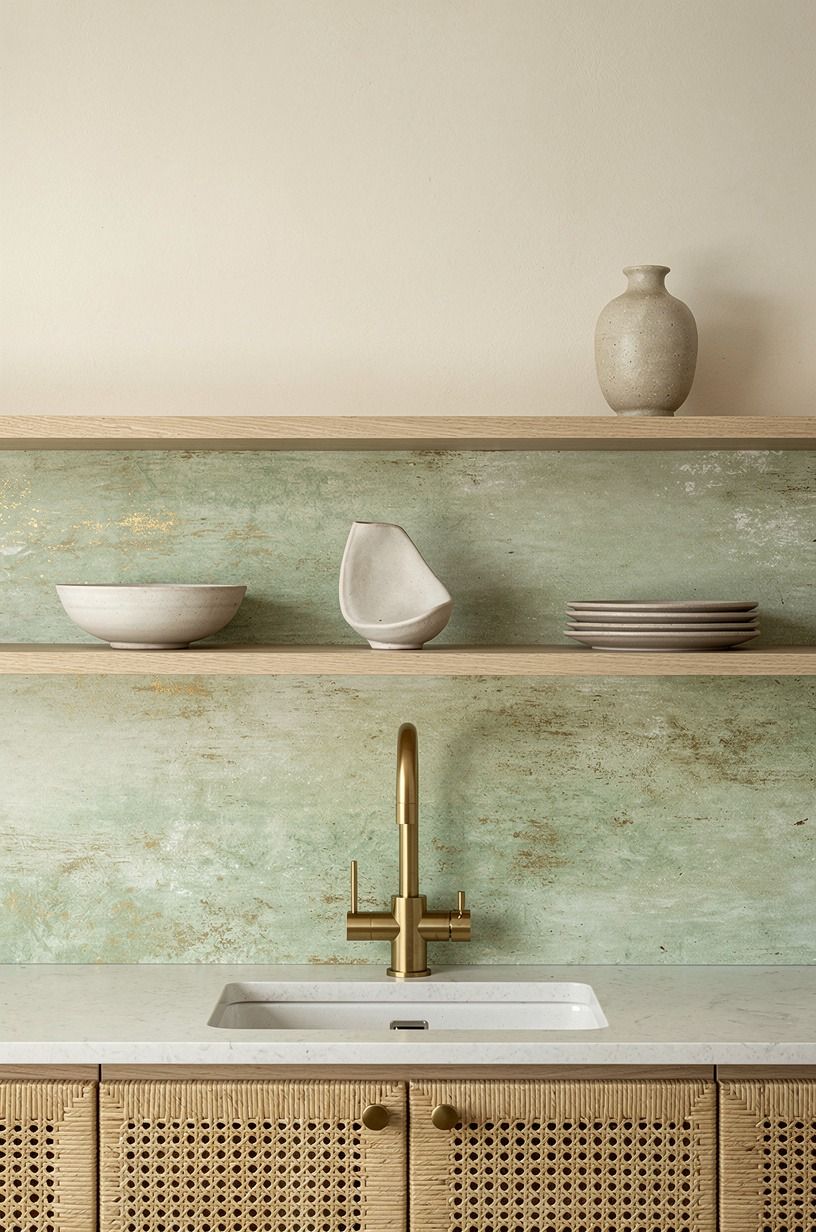
I went back and forth on this one because open shelves can go wrong fast. But once I put a soft limewash backsplash behind them, the shelves stopped feeling exposed and started feeling quiet.
That chalky finish pulled the cream walls, muted emerald accents, and aged wood into one softer field, so the shelf line did not read like a bunch of separate interruptions. It read like atmosphere.
I kept the shelves sparse on purpose. One stack of bowls, one cup group, one little pottery piece.
That's it. You don't need to prove you own dishes. If you want a more grounded green note in the background, Sherwin-Williams Evergreen Fog SW 9130 plays beautifully with limewash because it stays muted instead of going minty.
And honestly, I'd skip glossy tile if your goal is calm. The reflective surface is pretty, sure, but the soft drag of limewash gives your eye somewhere to rest. That difference is bigger than it sounds!
Pair it with open shelving ideas when to skip upper cabinets and you've got the full edit.
6Keep one handmade bowl on the island
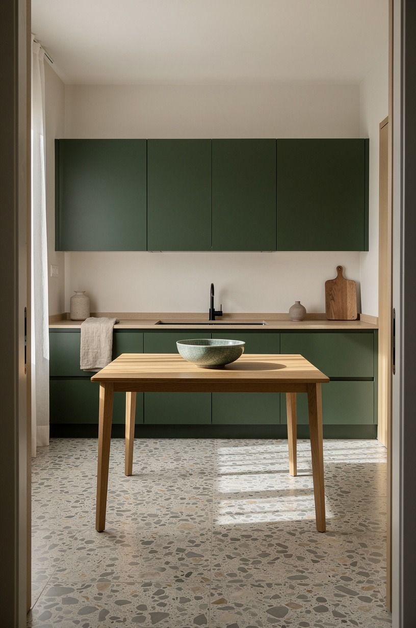
This is the section where I learned that almost-empty beats artfully full. I left one handmade stoneware bowl alone on the island and stopped trying to build a centerpiece around it. Through the doorway, with the cabinetry and sink wall behind it, that single object made the whole room look more considered than any grouped styling ever had.
Why? Because your eye could read the shape, the negative space, and the full kitchen at once.
The bowl I used was not precious. Slightly irregular rim, sandy glaze, low profile. Better that way.
A perfect bowl can feel showroom, and this room needed some hand in it. I also kept the bowl off the exact center by a few inches so the island felt lived with, not staged for a catalog. If you feel nervous leaving so little out, I get it. I did too.
But once you see how much calmer the room feels with one tactile piece instead of five filler objects, you won't want to go back. For a slower hand on the table side, simple kitchen table centerpiece ideas shows the same restraint.
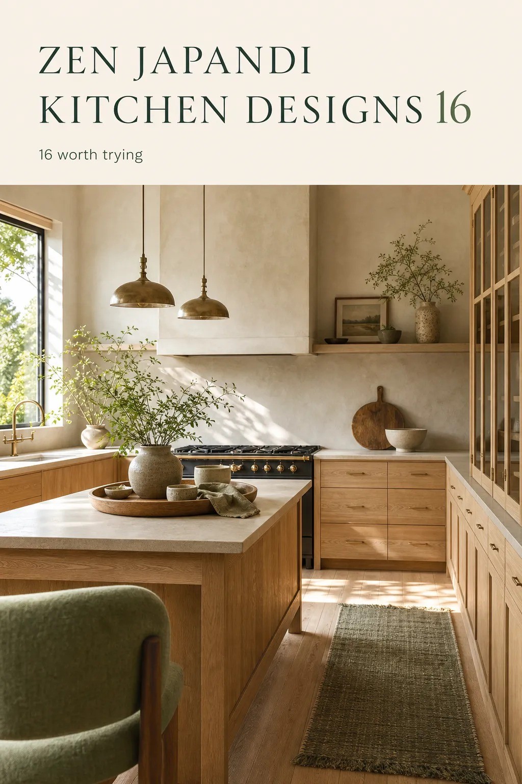
7Choose flat-front cabinets in soft mushroom
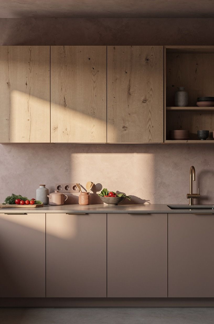
Cabinet fronts do a lot of emotional work, which sounds dramatic until you live with the wrong ones. My old profile had enough bevel and shadow line to make every wall feel busier than it was.
Switching to flat-front cabinets in a soft mushroom paint made the long run of storage look almost architectural, especially with uninterrupted prep space from corner to corner. If you want a calm kitchen, flatter really is kinder on the eyes.
Color mattered just as much as profile. I did not want gray, and I did not want cream pretending to be white.
I wanted that middle tone that softens daylight and still sits well beside walnut. Farrow & Ball Studio Green No.93 was too dark for the main fronts in my room, but a mushroom tone near it looked rich instead of muddy.
And you should test it in morning and late-day light. But if the color goes taupe and sad by 3 p.m., keep looking.
Mushroom should feel warm, not tired. The door profile comparison runs deeper in kitchen cabinet door styles explained.
8Line the windowsill with three clay planters
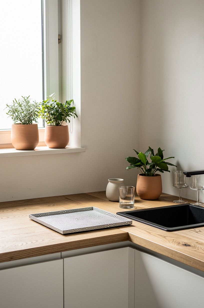
The windowsill had become a random-drop zone for sponge refills, seed packets, and whatever I emptied from my pockets. I replaced all of that with three clay planters in a row above the sink, and the sink wall finally looked deliberate.
You don't need a jungle here. You need repetition.
Three similar silhouettes, slightly varied heights, and enough breathing room between them that the window still reads open.
I used muted clay instead of glossy ceramic because I did not want the sill catching little hard flashes all day. Herbs work well, but so do simple green starters if your light is weaker. Keep the planters narrow enough that they don't fight the faucet line, especially if you're already working with upper cabinets in the 30 to 42 in range and a compact sink wall.
And yes, odd numbers still help. A pair felt too formal in my kitchen. Three looked relaxed, which was the whole point.
9Hide the sponge in a bamboo sink caddy
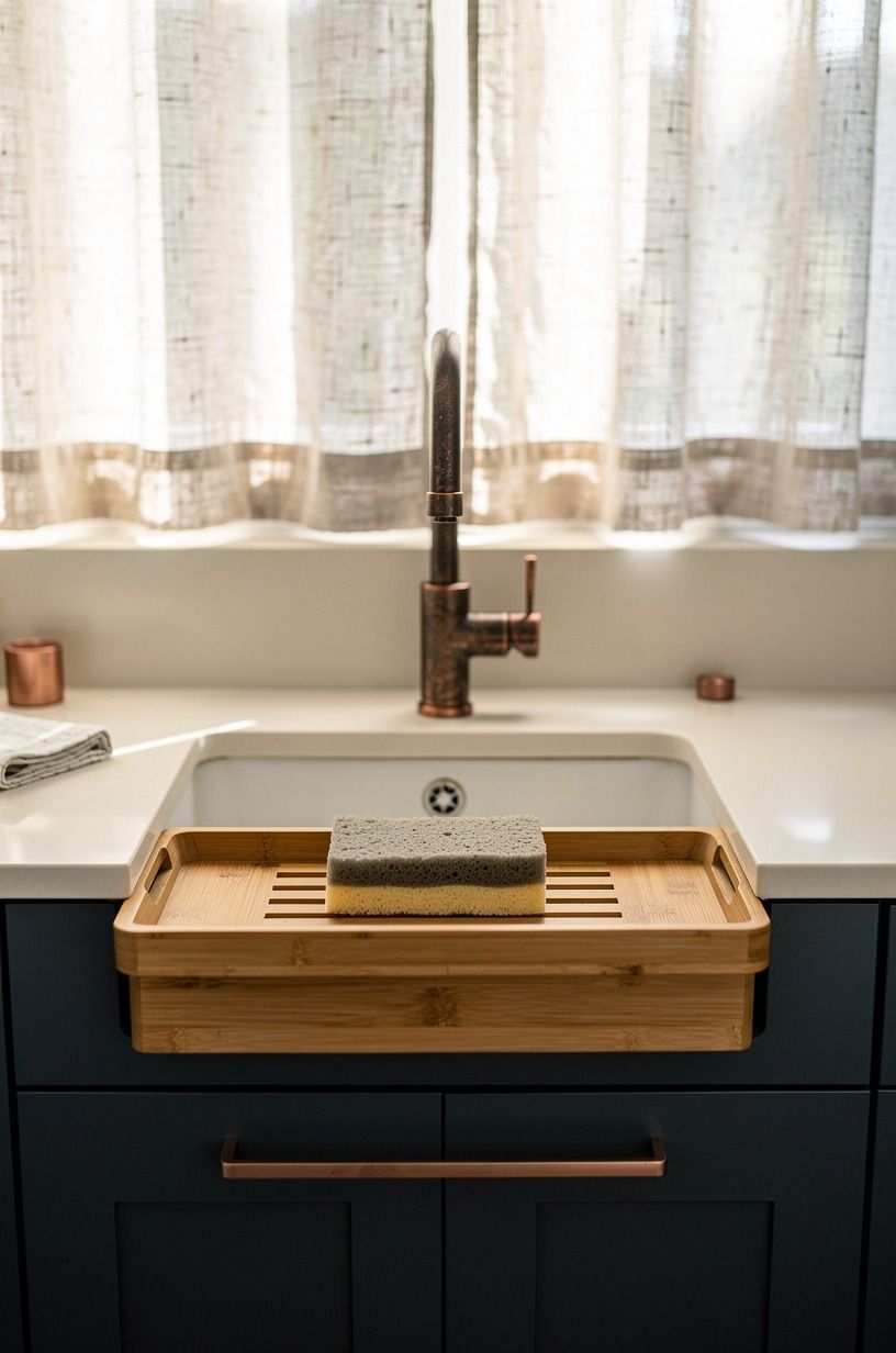
This sounds tiny. It was not. Seeing the sponge all the time was one of those low-level irritations I had stopped noticing, but the room relaxed the minute it disappeared into a bamboo sink caddy with a neater profile.
From a dramatic low angle across the base cabinets, the sink zone finally looked clean all the way down instead of interrupted by one neon rectangle yelling from the edge.
I chose bamboo because it bridges the warmer woods without trying too hard. Chrome felt too slick, and plastic would have killed the mood immediately.
You also want the caddy to drain well, because zen doesn't survive mildew. I kept just the sponge and brush there, nothing else.
But don't turn the caddy into a mini supply station. Once the sink corner starts holding six things, you've rebuilt the same clutter in a prettier container.
The calm comes from editing, not disguising. Under the sink organization walks through the wider cleanup.
10Float two ash shelves above the prep zone
I almost skipped shelves altogether because I did not trust myself not to overfill them. What saved the idea was scale.
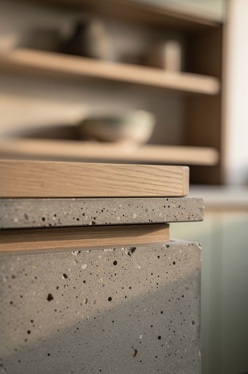
Two ash shelves with slim edges, floating over the concrete prep zone, kept the wall light while still giving me room for the things I use enough to deserve visibility. The poured concrete counter already had visible aggregate and texture, so the smoother ash line above it felt balanced, not bland.
I followed what I now think of as the Two-Breath Shelf Rule: each shelf should still show obvious empty space after you style it. One stack of bowls. One jar.
One low cup group. Done.
You can leave a tiny ceramic piece there if it earns its keep visually, but the shelf should never feel like storage overflow. And if your kitchen already has strong lower cabinetry, keep the upper composition quieter than you think. The whole reason floating shelves work here is that they lighten the wall instead of rebuilding visual weight. For the full styling logic, how to style oak floating shelves is the sister guide.
11Place linen cafe curtains over the sink
I worried this would go twee. It did not.
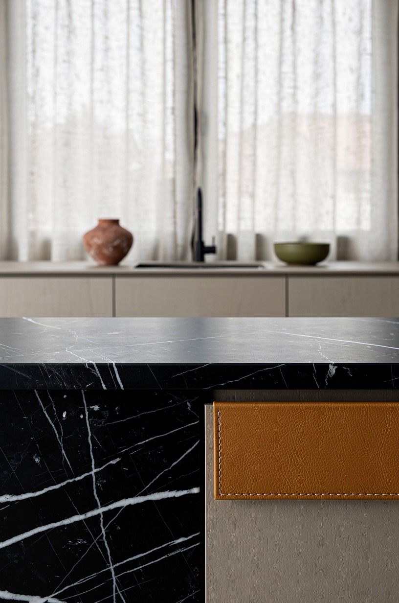
The right linen cafe curtains softened the sink wall without blocking the light, and that little band of cloth made the kitchen feel gentler the second dusk hit. Looking low across a Nero Marquina marble counter with white veining, the fabric took the edge off the darker surface and made the whole corner feel more humane.
If your room has one hard line too many, soft textile near the glass can fix it fast.
But the part that matters is restraint. I used unlined linen with a slightly open weave so the light could still pass through, and I mounted it lower than a full curtain treatment would sit. You should still see window above and wall below.
That's what keeps the look simple. But don't use a stiff cotton that stands there like a school project. Soft collapse matters here.
Once the fabric folds naturally and the counter stays mostly clear, the room starts feeling like it knows how to whisper.
12Group cutting boards against the quiet corner
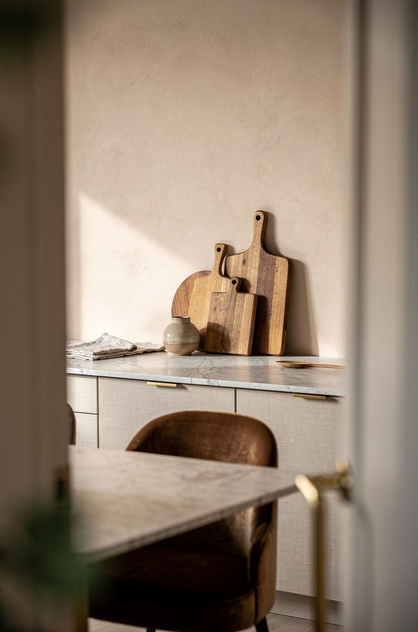
I used to scatter cutting boards wherever there was a gap, which made them feel like leftovers instead of part of the room. Grouping them in one quiet corner changed that instantly. Through a doorway, with a bit of foliage softening the foreground, the boards read as one warm vertical cluster against the wall instead of three unrelated chores.
You want the grain, the handle shapes, and the tonal variation to work as one calm accent.
I mixed one larger white oak board, one medium walnut board, and one slimmer paddle shape so the heights stepped gently without getting fussy. Too many boards look performative, and I say that as someone who owned too many boards.
Keep the group tucked where it won't interfere with prep, and let the corner do the framing for you. And if a board has loud branding on it, hide that side.
The room is calmer when the materials speak louder than the labels. Honestly, this corner turned out to be one of my favorite moments in the room!
13Use ribbed glass on the upper cabinets
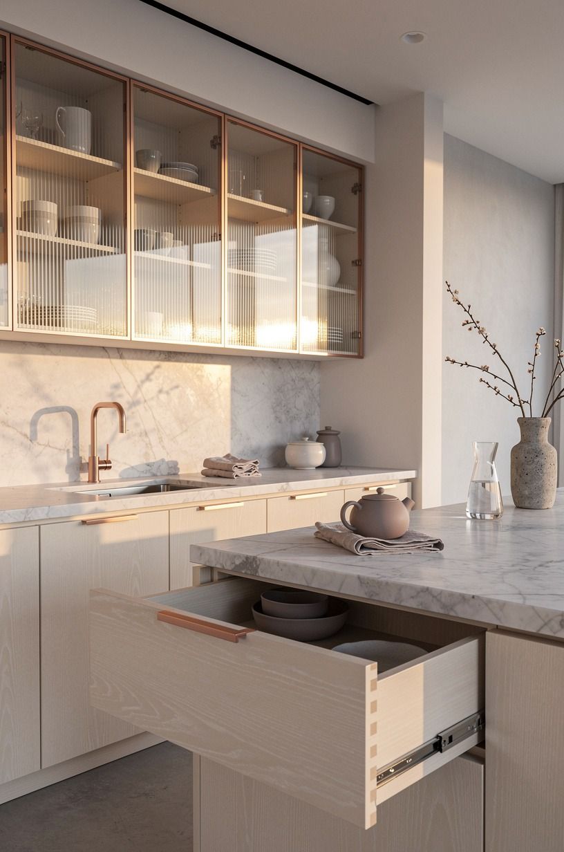
This was one of the smartest swaps because it solved two problems at once. I wanted lighter upper cabinets, but I did not want to see every mug and mismatched bowl on display.
Ribbed glass gave me that hazy in-between. From a diagonal wide view across the island, the cabinet wall felt airier, yet the contents stayed softened enough that the room still looked orderly.
That's a real win in a kitchen where you use everything hard.
I would not do clear glass here. Clear glass asks you to style every shelf like a shop.
Ribbed glass is more forgiving, and forgiveness is a design feature if you cook a lot. You also get a subtle vertical rhythm that pairs nicely with flat fronts below.
If your uppers are tall, especially around 42 in, that texture keeps them from feeling like a blank wall block. And yes, the glass should stay simple.
Fancy muntins or curvy profiles would have broken the whole Japandi spell. See the broader case for glass fronts in glass front kitchen cabinet ideas.
14Bring in a low woven runner
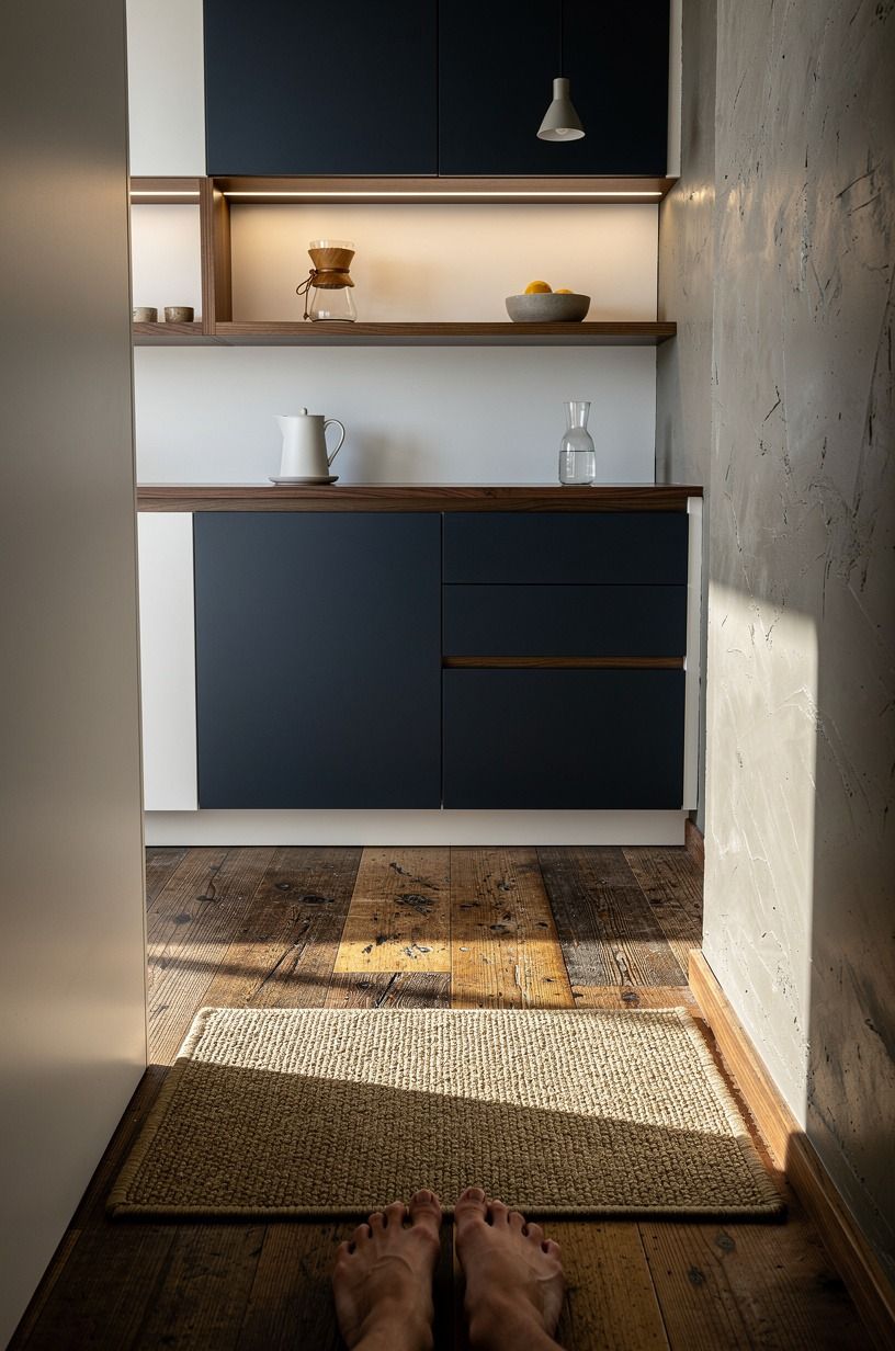
The floor was the last place I thought to fix, and then it turned out to be the mood setter. I brought in a low woven runner along the main aisle over the weathered teak floor, and the kitchen instantly felt quieter underfoot.
From a first-person point of view stepping into the space, that softened path made the room feel guided instead of bare. If you're working with decent island clearance, around 42 to 48 in, a runner can define the route without choking it.
Low pile is nonnegotiable here. Anything plush starts feeling bathroom-adjacent in a kitchen, and you don't want that.
I chose a flat, woven texture in a warm oatmeal tone so crumbs are easy to spot and the wood still gets to read. But don't go too patterned just because the runner is your chance to add personality.
In this kind of room, personality should arrive through weave and wear, not loud print. The best runner almost disappears until you notice how much softer the whole space feels. For the floor underneath, white oak kitchen floors and how to match them is the deeper guide.
15Mount warm under-shelf lights before dusk
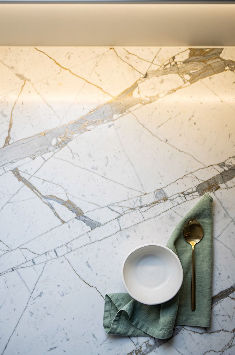
This might have been the most emotional shift of the whole makeover. The kitchen looked fine in daylight, but just okay at night, which is a boring problem a lot of people live with for years.
I mounted warm under-shelf lights above the prep zone, and the moment dusk rolled in, the room changed character. Overhead, the Calacatta marble with gold veining caught a soft wash instead of a glare, and even the little hand-hammered metal cup looked calmer.
You want warm temperature here, not bright-white efficiency. I learned that the hard way. Cooler LEDs made my counters feel clinical, while warmer light made the same materials look edible, touchable, and worth lingering around.
And because the source is tucked under the shelf, the glow lands on the work surface instead of blasting your eyes. If your kitchen only has one upgrade budget left, lighting deserves a serious look.
Hardware changes lines. Light changes how the whole room feels after 6 p.m. That is not a subtle difference at all!
The full breakdown lives in under cabinet lighting ideas.
16Leave one empty stretch of countertop
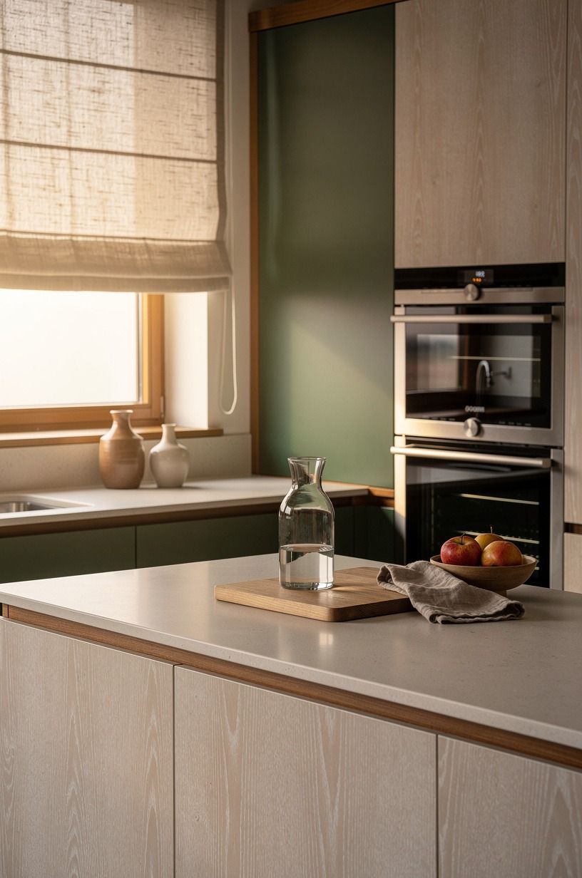
This was the hardest rule for me and the one that made the biggest difference. I left one full stretch of countertop empty on purpose, no utensil crock, no fruit bowl, no backup decor, and the kitchen finally started breathing.
In the classic angled view, with cerused oak cabinetry and a deeper green note nearby, that bare run looked luxurious in a way more styling never had. The emptiness was not missing content. It was the content.
I now think of this as the Quiet Run Rule. Every kitchen needs one place where your eye can travel without interruption.
You still need your daily tools, obviously, but they don't all need stage time. And if you give yourself one uninterrupted work stretch, the room functions better too.
That's the part nobody told me when I was buying little containers and trays and trying to organize my way out of clutter. You can't organize your way into calm if every inch still has something on it.
Why the Quiet Run Rule changed my whole kitchen
The biggest thing I got wrong before this makeover was thinking calm came from matching. Matching containers.
Matching ceramics. Matching wood tones.
Matching hardware. I thought if I just tightened the palette enough, the kitchen would finally settle down.
But the room still felt busy because the problem was not mismatch. It was constant visual interruption.
Every counter edge had a thing on it. Every open spot turned into an excuse for one more object.
Even when the colors were soft, the room was still asking me to process too much.
What finally worked was a principle I wish I'd followed from the start: let one surface go quiet, and the rest of the room doesn't have to beg for control. That's the Quiet Run Rule for me. One empty counter stretch.
One tray holding the everyday mess. One bowl on the island. One appliance garage hiding the kettle.
When I did that, the materials got a chance to matter. The travertine-look surface looked warmer. The cerused white oak cabinetry looked more expensive. The matte black handles looked intentional instead of trendy.
And the light had somewhere to land.
I also learned that Japandi doesn't mean you strip out every human trace. Honestly, that version always feels a little cold to me. The better version keeps a hand in the room.
A clay planter with a thumbed rim. A linen curtain that wrinkles a bit by the sink.
A cutting board that looks used because it is. You still want life.
You just don't want five versions of the same visual note fighting each other.
Would I do this exact kitchen again? Mostly, yes.
I'd skip the temptation to add more shelf styling, and I'd hide the sponge sooner. But the real lesson was emotional. You don't get a calm kitchen by buying calmer objects.
You get it by deciding what doesn't deserve to stay in view. Once I made that decision, the room stopped performing and started helping. If you're chasing the same feeling in a tighter footprint, small oak kitchen ideas for a tiny warm space carries the principle further.
How much it cost
I kept this makeover in the cosmetic lane because the bones were already there, and I wanted the room to feel different before I spent real renovation money. That was the right call. If your cabinets work, your layout functions, and your counters are not falling apart, you can get a lot of calm for far less than a full remodel.
My actual spend landed at $487 and one weekend: black handles $86, oak tray $42, bamboo caddy $18, runner $64, cafe curtain linen and rod $71, under-shelf lighting $58, clay planters $39, one handmade bowl $44, and paint plus sample materials for shelf and backsplash decisions $65. That's why I keep telling you to try the cosmetic pass first.
A quartz countertop can run $60-$120/sq ft, while laminate can sit closer to $10-$40/sq ft. If the calm you're missing is really visual clutter, you may not need the expensive tier at all.
The One-Surface Strategy I'd Repeat
If you want this look without copying every move, protect one surface first. It can be the island, the sink wall, or one prep run, but pick a zone and let it stay calmer than the rest.
That one disciplined choice often tells you what the room needed all along. The rest of the room takes its cue from there!
The Questions I Get Asked Most
What's the cheapest Zen Japandi move that actually works?
Clear one full stretch of counter and group the daily tools onto a single cerused white oak tray about 18 in wide. Most people feel the room shift before they spend a dime, and the only real cost is restraint. IKEA and Target Threshold carry the cleanest silhouettes if you want to buy anything at all.
Can renters pull this off without losing the deposit?
Yes, the style rewards reversible moves. Peel-and-stick limewash panels, a tension rod with linen cafe curtains, plug-in under-shelf lights, and matte adhesive handle covers all give you the look without a single hole. None of it is permanent, and most of it comes off cleanly when you leave.
Do I need a Japandi kitchen to start with a remodel?
No, and I'd argue against one. Almost every move here is cosmetic: paint, hardware, lighting, and one honest edit on the counters. A full remodel runs $25,000-$60,000+, while this kind of reset can land under $500.
The room reads calmer because you removed pressure, not because you replaced anything.
What paint color works behind limewash if I want a soft green?
Sherwin-Williams Evergreen Fog SW 9130 stays muted through the day and doesn't drift minty in afternoon light. It sits right in the warm-minimalist register without going gray or sage-trendy. Test a swatch on the wall that catches the most sun, because limewash shifts the undertone once it dries.
How long does the calm feeling actually last?
In my kitchen, the easy part was the first week, when everything looked new. The harder part was month two, when habits try to fill the empty surfaces back up. The Quiet Run Rule is a maintenance habit as much as a styling choice, and it's the only reason the room still feels calm six months later.
Where I'd Start First
If I had to pick one, I'd start with the empty counter stretch. You can't feel calm in a room where every inch is asking for attention.
Protect one quiet run first. Then the tray, the hardware, and the lighting finally have something clean to build on.


