How to Make Modern Japandi Kitchen Ideas Feel Clean and Functional
06 july 2026Modern Japandi kitchen ideas feel clean and functional when you start with warm oak, pale stone, hidden clutter control, and a layout that keeps every daily move easy. I know that sounds simple. But if your kitchen looks cold by 4 p.m., collects visual noise on every counter, and never quite settles, the fix usually isn't a full remodel. It's a better sequence.
Before You Start: The Two-Wood Rule
Before you buy a single stool or pendant, pick the wood family that will lead the room. In a modern japandi kitchen, I'd keep that leader to cerused white oak or another pale oak with a matte finish, then let every second wood note stay quieter. If you mix three unrelated woods too early, your eye starts working instead of resting, and that's the opposite of what you want in a japandi modern kitchen.
The other part is scale. Standard counters sit at 36 in, island clearance works best at 42 to 48 in, and most awkward kitchens feel bad because somebody kept adding things without protecting those numbers. I learned that the hard way in a narrow rental galley, where one extra cart stole the walkway and the whole room turned fussy.
Keep your path clear first. Styling can wait.
- Start with flat-front white oak cabinets
- Anchor the island with pale concrete counters
- Layer linen roman shades over bare windows
- Hang oversized rice paper pendants above seating
- Build a slatted wood range hood cover
- Swap upper cabinets for oak picture ledges
- Choose a single veined stone backsplash
- Tuck black pulls into recessed cabinet grooves
- Run matte limestone tile under every zone
- Frame the sink with thin black steel
- Style open shelves with handmade stoneware
- Add a built-in breakfast bench in oak
- Soften the pantry wall with ribbed glass
- Ground the room with warm beige plaster
- Install a hidden appliance garage in wood
- Finish with one sculptural ceramic centerpiece
1Start with flat-front white oak cabinets
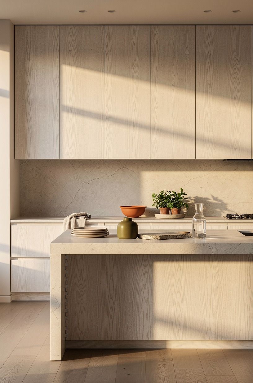
Start with the cabinets because they decide whether your modern kitchen japandi look feels calm or costume-y. Flat fronts in cerused white oak keep the full cabinet wall quiet, and the grain gives you warmth without busy shadow lines. If you're weighing cabinet door styles across the whole house, my scandinavian kitchen ideas breaks down the same flat-front logic in a slightly cooler palette.
If your current doors have deep shaker rails, I'd repaint them before I spent money trying to accessorize around them. You want the room to exhale the second you walk in.
Match the finish to the photo in your head, not the trend cycle. A pale matte wash looks softer than orange stain and cleaner than glossy lacquer, especially when the wall, island, and stone work surface all sit in the same wide shot.
And if you're ordering fronts, ask for grain consistency on long runs. That detail is subtle, but you'll see it every morning with coffee in hand.
2Anchor the island with pale concrete counters
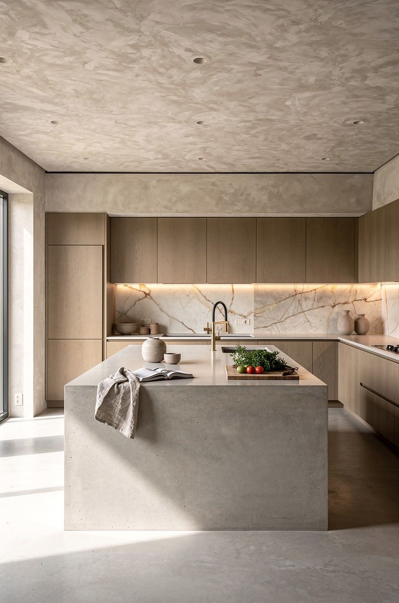
Anchor the island next, because it is usually the first thing your body moves toward. Pale poured concrete or a concrete-look slab gives a modern japandi kitchen the right kind of weight, the kind that feels grounded instead of flashy.
If your galley is too narrow for a full island, my small kitchen storage ideas covers slimmer prep counters that don't steal the walkway. I'd skip loud movement here. A calm top lets the island read as a work zone, not a showroom stunt.
Keep the edges crisp and the color a warm pale gray, then leave enough room to move all the way around it at that 42 to 48 in clearance. That number matters more than one extra drawer bank ever will!
If your island already feels bulky, slim back the overhang and let the counter plane do the visual work. But don't pair pale concrete with shiny chrome.
Matte black steel or aged black hardware will hold it steady.
3Layer linen roman shades over bare windows
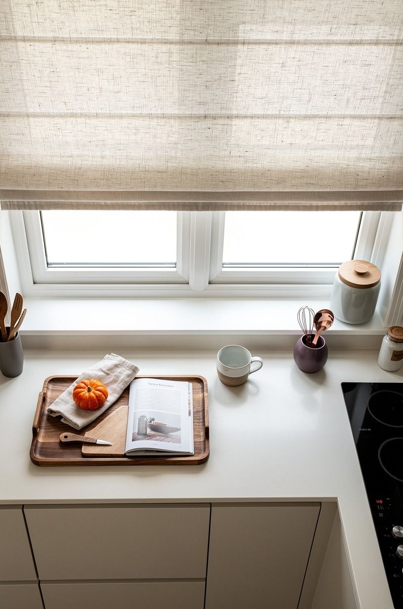
Layer the window area once the heavy surfaces are settled. Belgian flax linen roman shades soften a bare window without turning a prep zone fussy, and the fold line looks right at home in a modern interior design kitchen that wants light, not drama.
I like a warm oatmeal tone here because bright white can go clinical against pale oak and stone. If you're pairing window treatments across an open plan, my linen curtain ideas covers the same fabric family for sliding doors and tall windows.
Mount the shade high enough that the fabric clears the sill and doesn't drop into your sink zone or food prep area. In overhead view, you'll notice how the folds break up the hard lines of the counter and frame. If you rent, a no-drill roman shade on a tension solution can still get close.
And please leave the glass mostly uncovered. You need daylight more than decorative pattern.
4Hang oversized rice paper pendants above seating
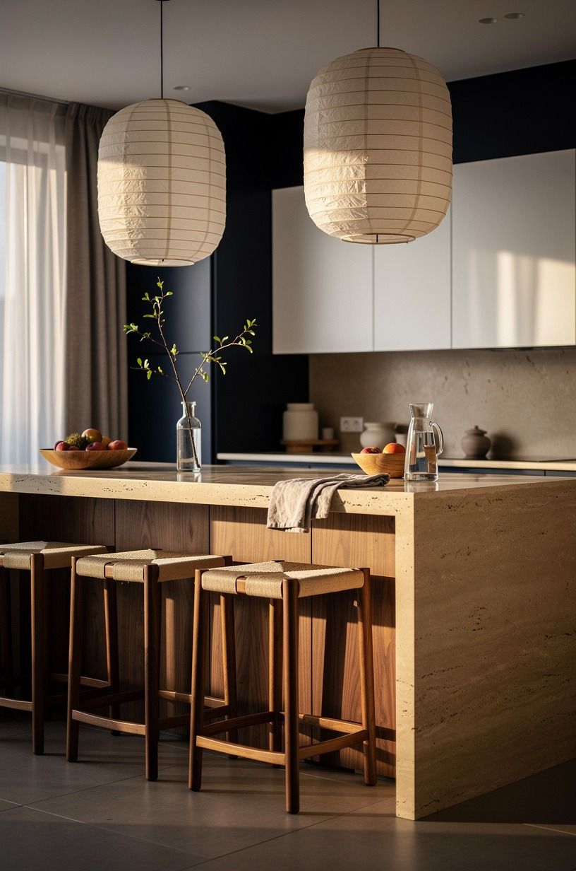
Hang the pendants after the cabinets and counters are set, because lighting should answer to the room, not boss it around. Oversized rice paper pendants above island seating bring in that soft roundness Japandi rooms need, especially when the island stools, travertine edge, and cabinet planes are all very straight. I'd rather go slightly too large than too tiny here.
Keep the bottom of the pendant about 30 to 36 in above the island surface so it feels intimate but still clears sightlines. A pair works well over a long island, while one larger lantern can center a smaller one.
But the key is the glow. Use warm bulbs, nothing icy, and let the paper throw a soft pool instead of a spotlight.
If the ceiling height feels tricky, my warm kitchen lighting ideas shows where to drop pendants vs. add wall sconces instead. That's when the room starts feeling expensive. Every single time!
5Build a slatted wood range hood cover
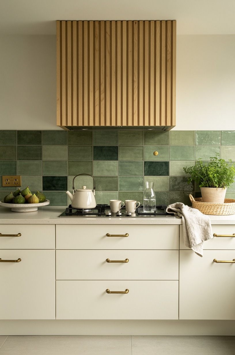
Build the hood cover as one calm architectural move, not as a decorative add-on. A slatted hood in white oak veneer brings texture to the cooking wall while keeping the range centered and quiet.
In a frontal view, those vertical or lightly spaced slats give you depth without the fuss of tile trims, corbels, or random metal bands. For the wall behind the hood, my stone backsplash ideas keeps the same calm-quiet material story.
I wouldn't overdo the spacing. Narrow, even slats look cleaner than chunky cottage grooves, and a concealed insert inside keeps the practical side honest. Leave the hood bottom at the correct clearance for your appliance, then line up the outer edge with the lower cabinet rhythm so the whole wall feels planned.
If your room already has strong flooring and stone, this is enough texture. More won't help.
6Swap upper cabinets for oak picture ledges
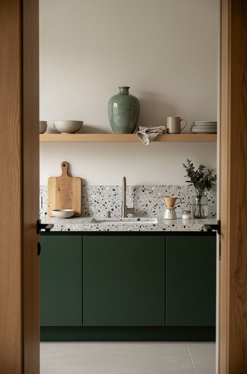
Swap one run of uppers for picture ledges when the room needs air.
7Choose a single veined stone backsplash
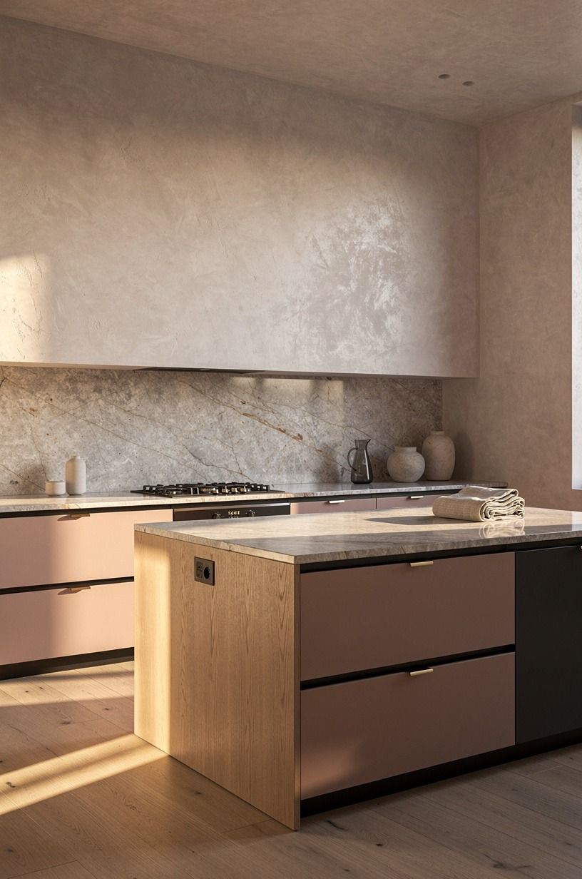
Choose one continuous slab for the backsplash instead of patchworking the wall with small tile. A single veined quartzite or calm stone-look slab running corner to corner gives the cooking wall the cleanest possible backdrop, and in a wide perspective it ties the island, cabinetry, and vent area together at once. You get movement, but it stays broad and readable.
This is where restraint pays. I'd rather use one stone with soft warm veining than mix beadboard, tile, and floating trim in the same zone.
Keep the backsplash field close to that standard 18 in zone between counter and uppers when uppers are present, and let the slab rise higher only where the hood needs it. Why break up a wall that already has enough jobs to do? If you're committing to a slab, my natural stone counter ideas pairs the same stone across island and backsplash for a calmer read.
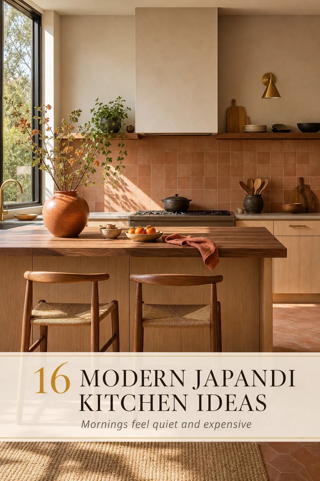
8Tuck black pulls into recessed cabinet grooves
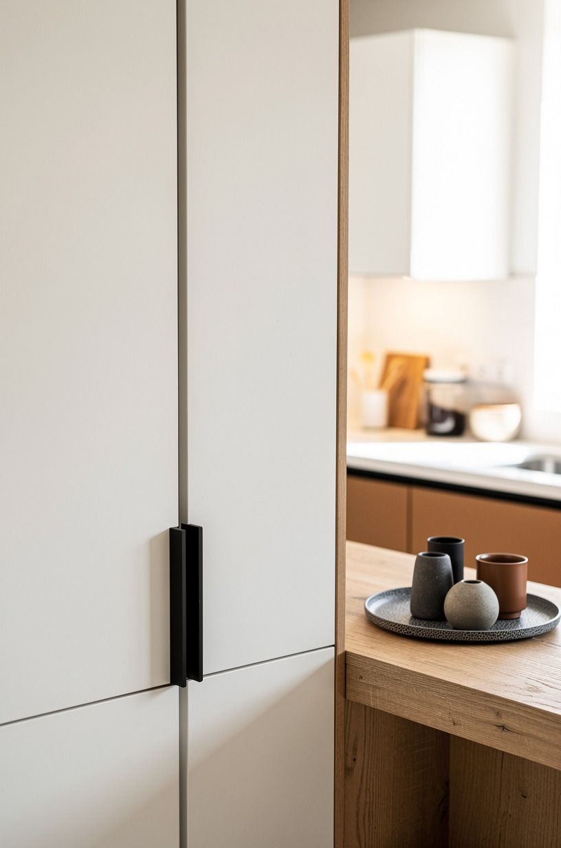
Tuck the hardware into recessed grooves if you want the cabinet run to feel custom and controlled.
9Run matte limestone tile under every zone
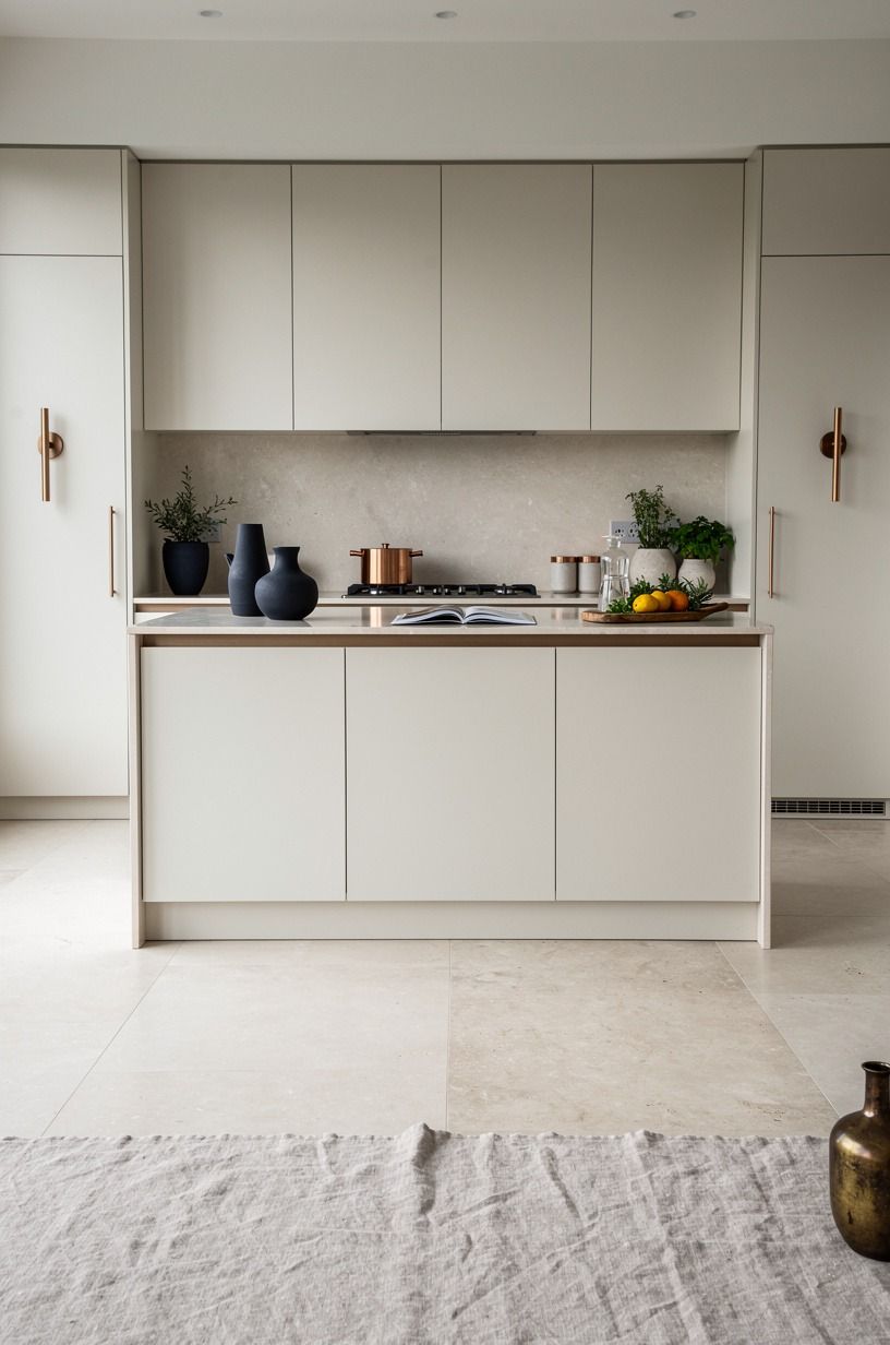
Run the same flooring through the whole kitchen so the room reads as one surface, not a puzzle. Matte limestone tile under the island, cabinet wall, sink run, and breakfast area keeps the eye moving forward, especially from a low floor-level view where chopped materials look the messiest. I'd skip threshold changes unless the house absolutely forces your hand.
Choose a finish with a soft, chalky top layer rather than a polished face. Japandi rooms need texture underfoot, but they don't need shine.
And check your grout color before install, because dark grout will grid out the whole floor. A warm stone-toned grout disappears better.
If you have to patch existing flooring, match undertone first and pattern second. The undertone is what your eye catches.
If you're working with radiant heat under the floor, my kitchen flooring ideas covers the materials that conduct heat without going shiny.
10Frame the sink with thin black steel
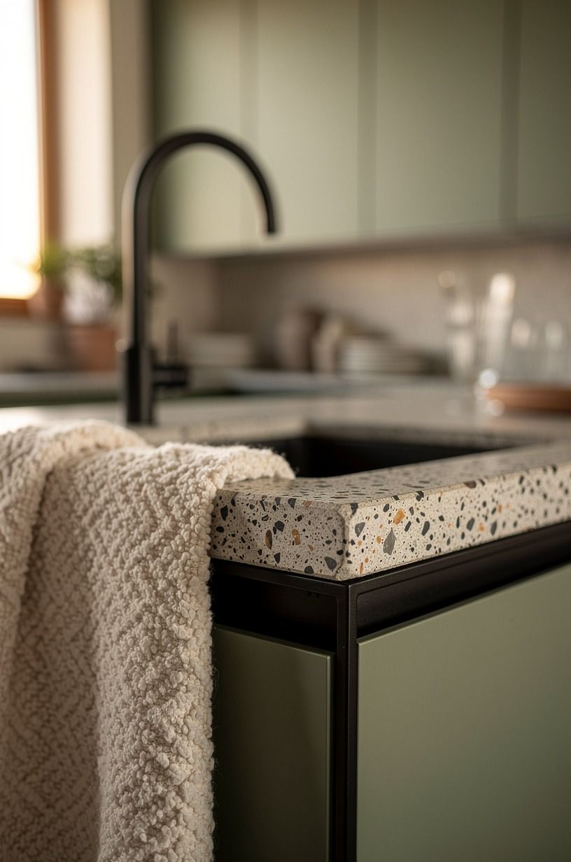
Frame the sink zone with a thin line of black steel so the softer materials around it don't drift. A narrow steel edge at the window frame, shelf bracket, or faucet line brings discipline to poured concrete aggregate and pale oak, especially in a macro close-up where texture can otherwise start looking mushy. This is a small move, but it gives the room backbone.
Keep the profile lean. I mean truly lean, more gallery frame than industrial loft.
Too much black gets bossy, and the point of Japandi is balance. I also like this move when the walls are painted Benjamin Moore White Dove OC-17, because that warm white lets the steel read crisp without harsh contrast.
But don't spread black to every object in the room. One frame line is enough. For the larger wall palette question, my warm white paint colors for kitchens breaks down the Benjamin Moore White Dove OC-17 family against cooler whites that fight oak.
11Style open shelves with handmade stoneware
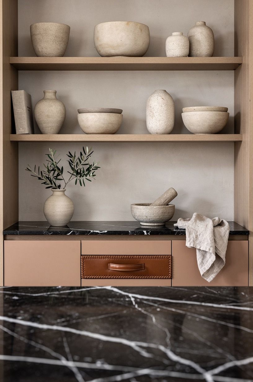
Style the shelves last, and style them sparingly. Handmade stoneware with a slightly sandy glaze keeps an open shelf from looking like a retail display, and in a low shot across the counter it gives the eye one soft, tactile thing to land on.
I always edit shelf styling harder than I think I need to. Then I edit it again.
Keep the palette to creams, clay, charcoal, and pale oat. A stack of bowls. One pitcher. A single lidded jar.
Done! If every shelf object is sculptural, none of them are.
And if the shelf starts holding mail, vitamins, or kids' artwork, close that section off with a cabinet door and save yourself the daily annoyance. Functional beauty still has to function. If you want a tighter rule for what's allowed on the shelf, my minimal kitchen ideas walks through the same edit-twice process.
12Add a built-in breakfast bench in oak
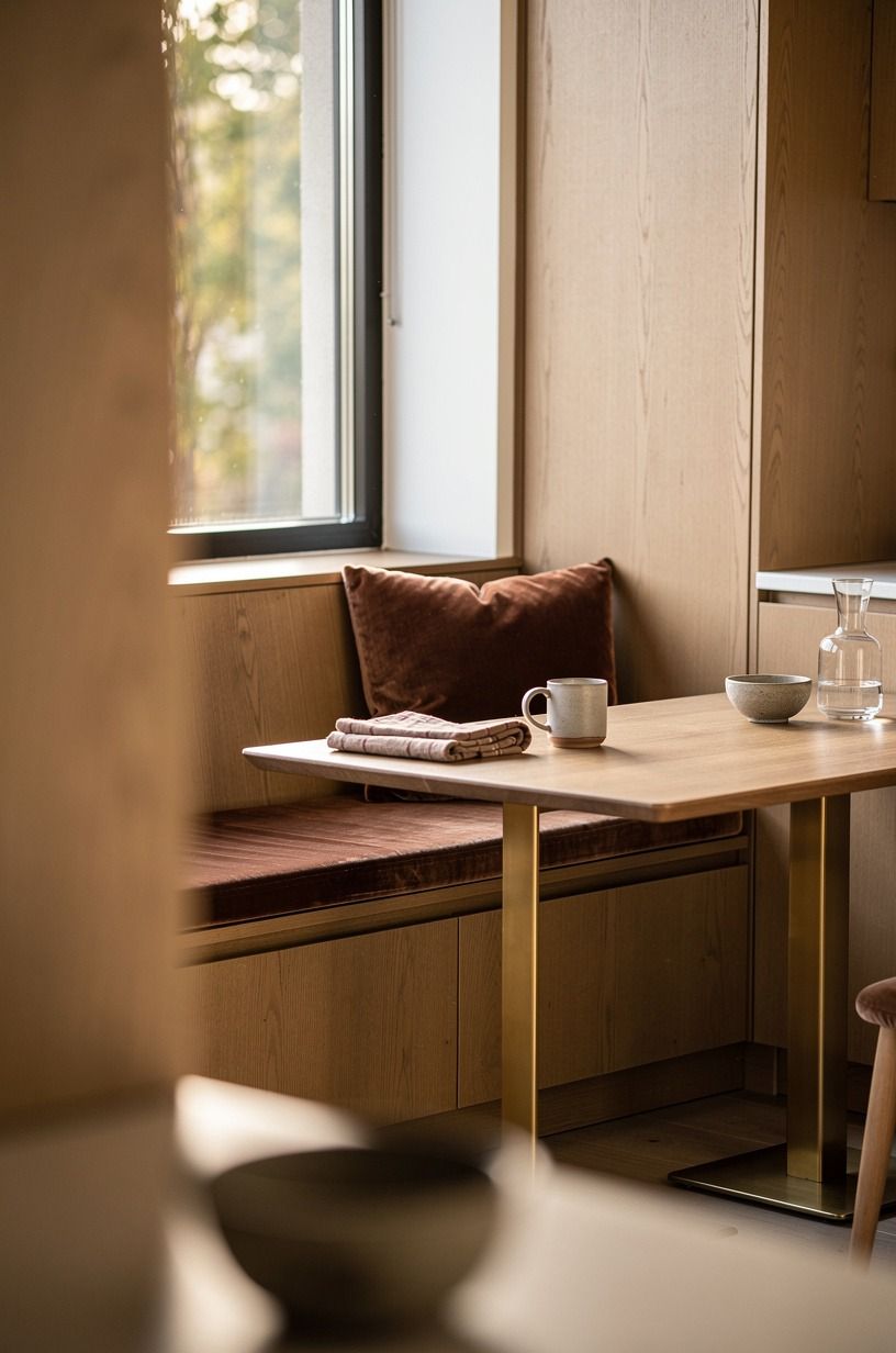
Add the breakfast bench once the main work triangle is solved, not before. A built-in oak banquette under a window gives you a warm landing point that feels quieter than a row of freestanding chairs, and seen through foliage or an opening it helps the kitchen read like a room people linger in, not just a utility box. I'd make the bench simple and low-backed.
Use the same oak tone as the cabinets, then break the hardness with a cushion in Belgian linen or a washable woven stripe. If your table is small, keep the bench depth honest so circulation stays easy.
You still need the walkway, especially near cabinet corners. And if you're debating bench versus extra uppers, I'd take the bench.
Daily comfort wins over theoretical storage every time. If you're fitting a small table nearby, my breakfast nook ideas covers bench depth vs. chair clearance for tight corners.
13Soften the pantry wall with ribbed glass
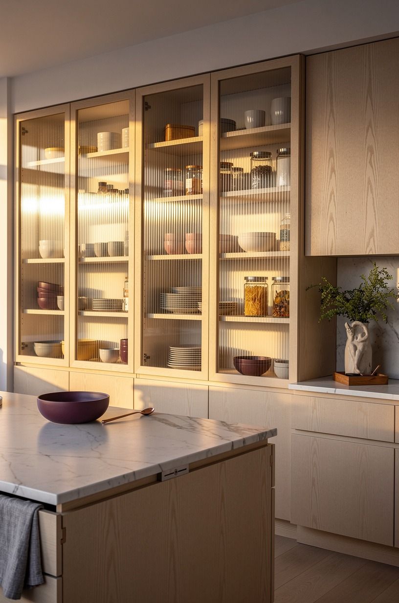
Soften the pantry wall with ribbed glass when you need storage to feel lighter without becoming fully visible.
14Ground the room with warm beige plaster
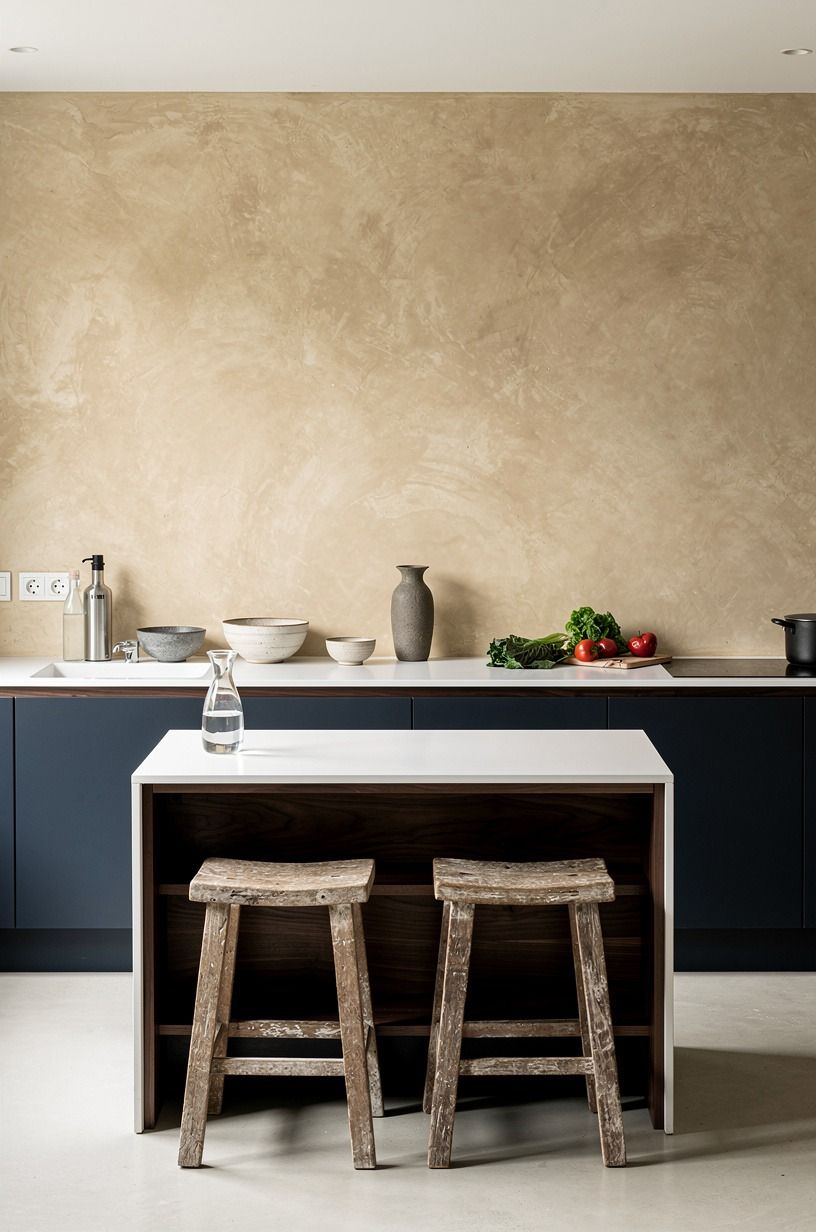
Ground the whole room with warm beige plaster once the hard finishes are chosen. Lime plaster or a plaster-look finish in a beige with a little clay in it makes a symmetrical front-on view feel calmer right away, because the wall stops acting like blank drywall and starts acting like a soft backdrop. This is the point where a modern japandi kitchen starts feeling human.
I'd keep the tone warmer than greige and quieter than peach. Farrow & Ball Studio Green No. 93 is beautiful in the right house, but for this specific palette I'd use it only in a pantry, mudroom, or nearby accent zone, not on the main plaster wall.
You want the plaster to steady the oak and island, not compete with them. But texture matters.
Flat paint doesn't hold the room the same way. For the application side, my plaster wall finish ideas covers limewash vs. tadelakt vs. a plaster-look paint so you can get the texture without a full plaster crew.
15Install a hidden appliance garage in wood
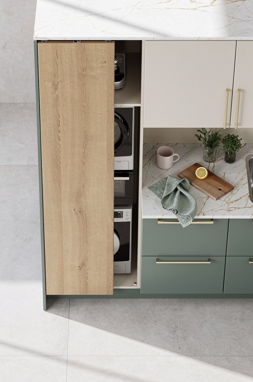
Install the appliance garage before you start buying prettier objects, because clutter is usually the real reason a kitchen never feels clean. A hidden oak tambour or sliding wood door over the toaster, blender, and coffee gear gives you instant visual silence, and in overhead view it keeps the counter reading as one usable prep plane instead of five little stations.
Make sure the garage is deep enough for what you own now, not the fantasy version of your countertop habits. I like measuring the tallest appliance and then adding a little breathing room. If you are in the mid refresh lane, where new fronts, faucet, lighting, and laminate top can run about $3,000 to $12,000, this is still one of the smarter places to spend because You get function and aesthetics in one shot.
If you're budgeting the full refresh, my modern farmhouse kitchen ideas shows where else to skip the cottage trim and keep the calm.
16Finish with one sculptural ceramic centerpiece
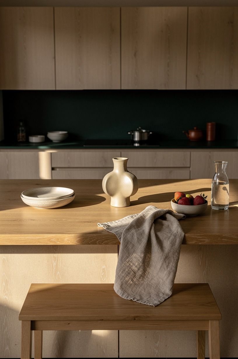
Finish with one object, not seven. A single sculptural ceramic bowl or vessel on the island gives the room a focal point without making the work surface feel staged, and from a 45-degree magazine view it lets the cabinets, counters, and lines stay in charge. I always think people underestimate how powerful one quiet centerpiece can be.
Keep it low, matte, and a little irregular. No fake fruit tower.
No tray full of filler beads. Just one form with enough presence to hold the island when the room is otherwise pared back.
But here's the real test: if you have to move the object three times a day just to cook, it isn't the right object. Beauty that gets in your way never lasts.
If you want the room to feel finished without more objects, my ceramic vase ideas covers the one-form rule across console and shelf.
What Things Cost: The Spend-First Ladder
If you're wondering what this kind of update costs, the short answer is that a clean Japandi look usually comes from cosmetic discipline first, not instant demolition. Spend on the surfaces you see all day. Save on the parts nobody remembers.
If your layout already works, I'd put money into fronts, lighting, and clutter control before I touched plumbing locations. And if you only have a few hundred dollars, paint, hardware, and one better light fixture will stretch much farther than a half-finished remodel.
Why Does the Three-Texture Quiet Rule Work?
The biggest mistake I see in this style is people trying to make every surface say the same thing. They hear "Japandi" and start stripping the room down until it looks careful, expensive, and a little dead.
I don't think that's the point at all. The rooms that stay with you have a calmer logic: one wood texture, one mineral texture, one softening texture.
That's it. In this kitchen, that might be cerused white oak, pale concrete or limestone, and Belgian flax linen. Once those three notes are doing their job, the room doesn't need ten supporting actors.
I learned this while trying to fix a kitchen that looked clean in photos but felt oddly tiring in real life. The cabinets were pale.
The counters were pale. The walls were pale. And somehow none of it felt restful.
The missing piece was tactile contrast. I added a linen shade, switched glossy tile to a matte stone sample, and The room finally stopped sliding around visually. If you want the linen-and-stone pair across the rest of the house, my belgian linen decor ideas keeps the same fabric logic in the living room.
Suddenly the oak looked warmer. The light looked softer.
Even the black hardware made more sense because it had something gentle to push against.
There is also an honesty issue here, and I think you can feel it even if you can't name it. When every surface is pristine and hard, the room starts reading like a concept board instead of a home. But when one finish has grain, one has mineral softness, and one has a little fold or weave, you relax.
You trust the room more. It feels lived in before it feels decorated, which is why this style holds up so well in a real kitchen where people chop, rinse, stack dishes, and leave a mug by the sink.
So if you're stuck, don't ask what new object to buy. Ask which of the three texture jobs is missing.
Wood for warmth. Stone for weight. Fabric or plaster for softness.
That framing has saved me from a lot of expensive mistakes, and it keeps a modern interior design kitchen from turning either sterile or overly styled. If you want the full philosophy underneath this room, my japandi decor guide walks through the wabi-sabi side of the same rule.
The Questions I Get Asked Most
What is the best Modern Japandi Kitchen Ideas for Clean, Functional Beauty for a small kitchen?
The best move for a small kitchen is pale oak lowers with lighter uppers or ledges because that mix gives you visual calm without making the room feel boxed in. If you're working with a galley layout, my kitchen island ideas for small spaces covers the slimmer end of the same cabinet family.
- IKEA SEKTION boxes with flat oak fronts - One wall kept lighter above the counter - Clear walkway kept at 42 in when possible
Where can I buy Modern Japandi Kitchen Ideas for Clean, Functional Beauty pieces on a budget?
I'd start with budget control stores that still offer simple lines, then mix in secondhand finds where texture matters more than brand.
- IKEA, Target Threshold, Wayfair for basics - Facebook Marketplace for stools, benches, and pottery - Local stone yard remnants for smaller slab needs - For the wood tone side, my oak kitchen cabinet ideas shows what to ask for at the lumber yard
How much does a Modern Japandi Kitchen Ideas for Clean, Functional Beauty makeover cost?
Most cosmetic makeovers cost about $300 to $1,500, while a stronger refresh often lands around $3,000 to $12,000 before full cabinet replacement.
- Paint and hardware at the low end - Lighting and laminate in the middle - New cabinets and stone at the high end - For the budget-tier cabinet work, my IKEA kitchen budget look covers what flat-pack can actually carry
Can I create a Modern Japandi Kitchen Ideas for Clean, Functional Beauty on a budget?
Yes, and you can get a lot of the feeling with low-cost restraint if you edit the room harder than you shop for it.
- Remove extra counter clutter for free - Swap hardware to slim black pulls - Add one linen shade or matte lamp
Is a Modern Japandi Kitchen Ideas for Clean, Functional Beauty worth it in a small space?
Yes, it is worth it because a small kitchen benefits most from fewer visual breaks and more hidden storage.
- One flooring material under every zone - One wood tone leading the room - One focal object instead of many accessories
Is Modern Japandi Kitchen Ideas for Clean, Functional Beauty a good idea for a rental?
Yes, a rental can still get the look with reversible upgrades that change mood without risking your deposit.
- Peel-and-stick backsplash panels - Tension or no-drill roman shades - Removable hardware saved for move-out
Why I'd Pick Oak Over Extras
If I had to pick one step, I'd start with the flat-front oak cabinets. They control the whole room's temperature, and every counter, pull, and light either supports that calm or fights it.
Pin this step for later and let the wood set the pace. If you want the deeper principle behind picking one leader wood, my wabi sabi kitchen guide walks through the same idea at a slower pace.


