11+ Classic Bedroom Ideas That Feel Collected, Not Copied
19 may 2026Think your bedroom has to choose between tradition and now? The best new classic bedroom design proves otherwise. It borrows from both worlds, and the result feels less like a style choice and more like a room that just makes sense.
These eleven rooms do it differently. Architectural detail, warm materials, and furniture that earns its place. Here's what's actually worth copying.
Stepped Plaster Panels Done Right
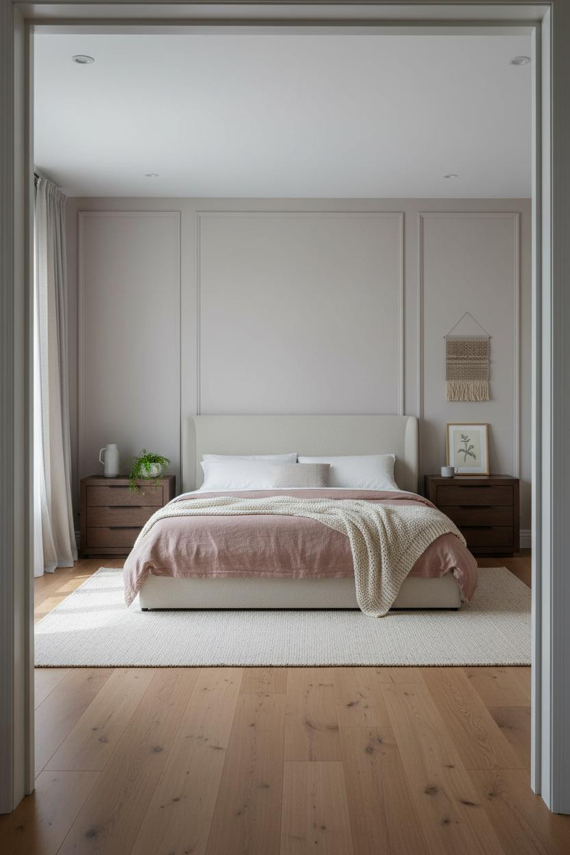

I keep coming back to this one. Something about the proportions feels genuinely resolved.
Why it looks custom: The stepped plaster reveal molding runs floor-to-ceiling, and that verticality is what gives it classical weight without relying on ornament.
Steal this move: Pair pale mushroom walls with warm honey flooring. The tonal gap is small enough to feel cohesive, wide enough to have depth.
What a Real Arched Window Does for a Room
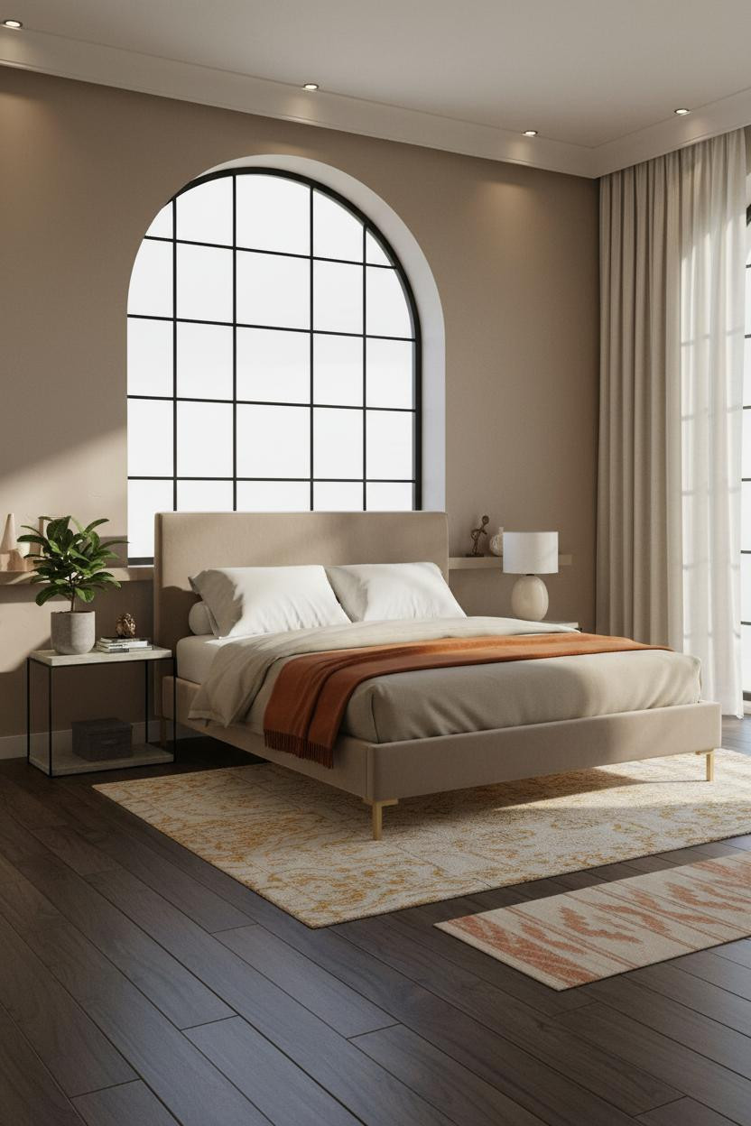


Not every room earns this kind of window wall. This one does.
The black steel muntin grid casts shadow geometry across the taupe plaster, and the room feels measured and grounded because of it, not despite it.
What to borrow: Ground the steel with warm textiles. The burnt orange throw is doing quiet heavy lifting here against a cooler palette.
Avoid this mistake: Don't over-style shelves near architecture this strong. A small bronze sculpture and a couple of ceramic pieces are plenty.
Herringbone Paneling That Earns the Whole Wall
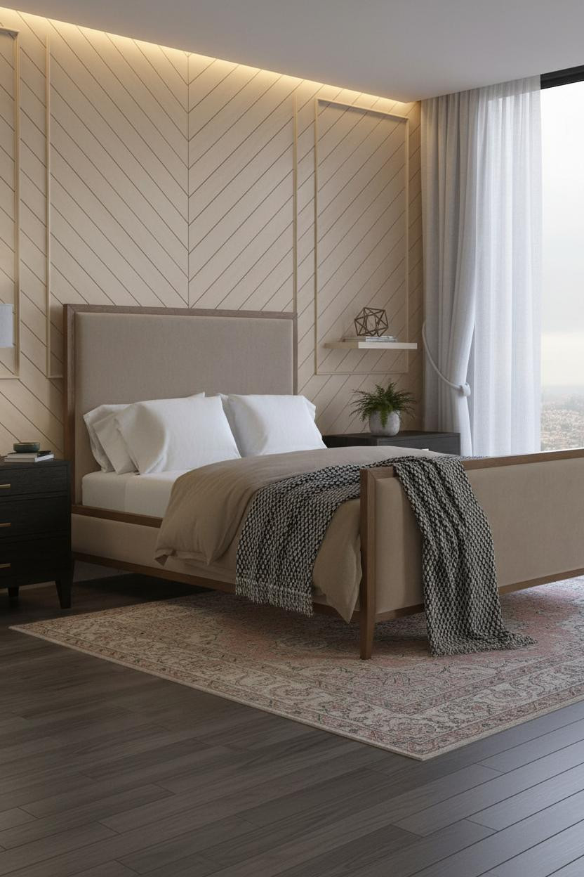

This is the kind of wall treatment people build entire rooms around. Honestly, I understand why.
Why it holds together: Cream lacquer in a herringbone pattern catches cove light differently at every hour, so the wall has movement without a single picture on it.
Layer a faded Persian rug beneath and a graphic black-and-white throw at the foot. Pattern on pattern, but the scale contrast keeps it calm.
Why a Coffered Ceiling Changes the Whole Equation
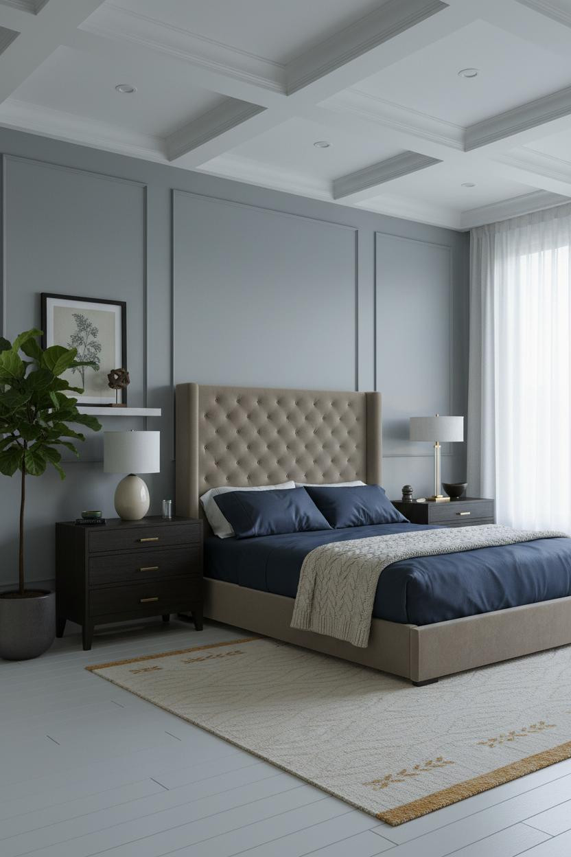

Most rooms invest in the walls. This one puts the money up top, and the room feels taller for it.
What gives it presence: Deep recessed coffered panels in crisp painted plaster create a shadow grid overhead that gives the room classical weight while still feeling airy, especially against the muted blue-grey walls beneath.
The easy win: Navy sateen bedding is the right call here. It echoes the wall color without matching it exactly, which keeps the palette from feeling too considered.
Fluted Pilasters Are Having a Moment
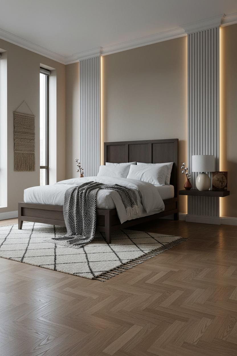
Fair warning: once you see fluted plaster pilasters framing a headwall, flat paint starts feeling unfinished everywhere else.
Why it feels intentional: The shallow ribbed channels catch side light and create vertical rhythm that pulls your eye upward, which makes the ceiling feel higher without touching it.
The herringbone parquet oak floor grounds the vertical energy. Two strong patterns. But the scale difference between them is big enough that neither one fights for attention.
The Wainscoting Room I'd Actually Live In
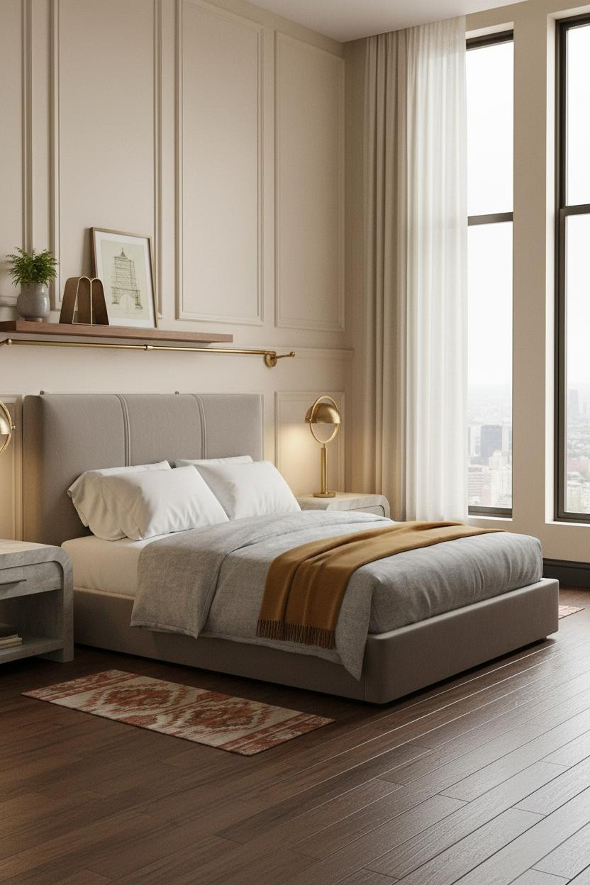

I've pinned a lot of wainscoting rooms. This is the one that made me stop scrolling. The floor-to-ceiling curtains pooling at the baseboard are what got me.
What carries the look: Soft cream paneled wainscoting with brushed brass chair-rail gives the lower half classical structure, while the warm ivory wall above keeps it from feeling too formal. The room feels collected rather than decorated.
Pro move: If you're going full-height curtains, let them touch the floor. That slight pool of fabric is what makes the ceiling feel taller than it probably is.
Crittall Windows Work Harder Than You'd Expect
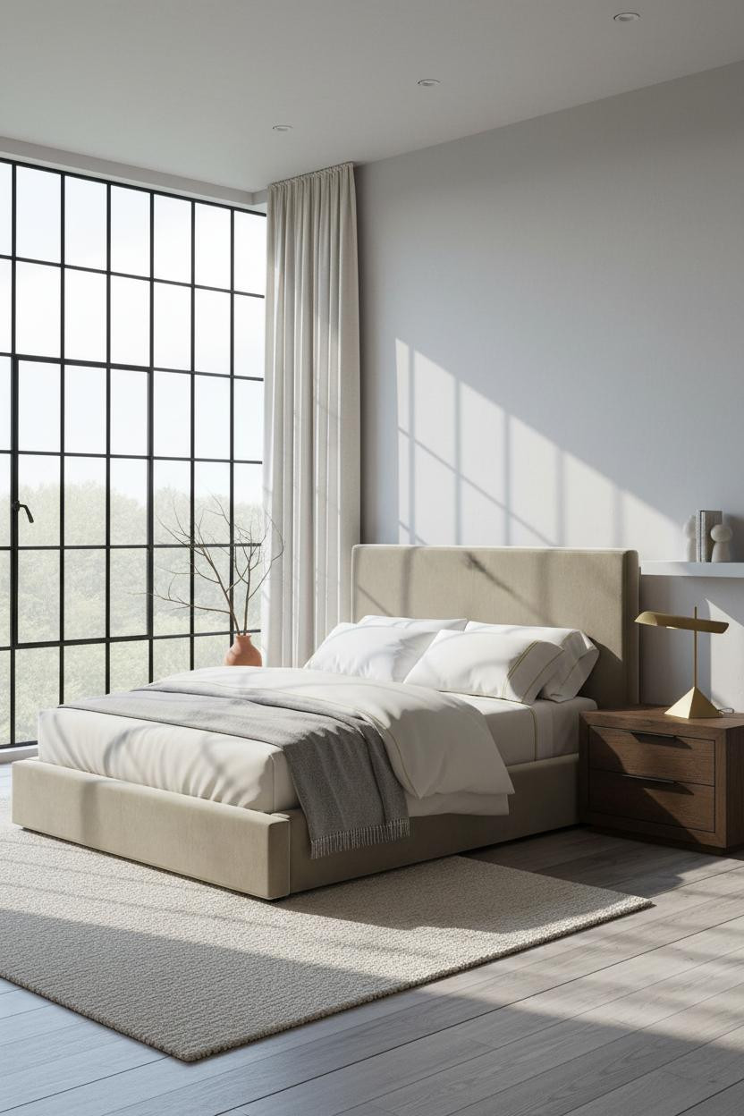

This one is divisive. A full Crittall-style steel grid wall as the headboard backdrop isn't for everyone. But I think it's genuinely one of the most interesting moves in modern classic bedroom design.
Why it lands: The steel geometry casts crisp shadow lines across dove grey plaster, in a way that feels architectural rather than industrial. It's a contemporary material doing classical work.
What not to do: Don't match the bedding to the wall. The stone-washed grey cashmere throw works here because it's softer and slightly warmer than the plaster, not the same.
The Case for Warm Lighting Over Everything Else
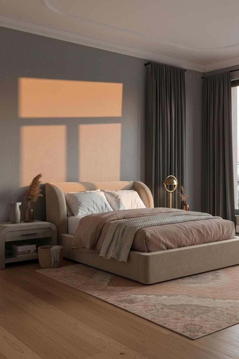

Nothing fancy. Just amber light falling across stone grey walls, and the room feels entirely different from rooms that cost more.
The real strength: A recessed ceiling cove with crown molding runs the full perimeter, and warm light washing down that continuous shadow line is what makes the room feel finished at every corner, not just at the bed.
If you change one thing: Switch your overhead bulbs to a warm tone before spending anything else. The dusty pink linen and terracotta tones in this room only work because the lighting holds them together.
Sage Walls With Built-Ins Feel Like a Whole Renovation
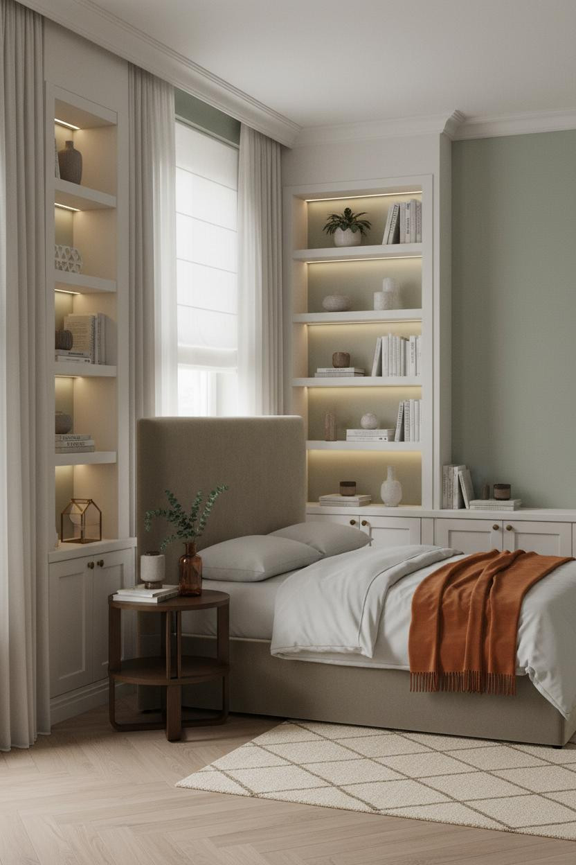

Admittedly, not everyone can build floor-to-ceiling shelving. But the formula here is worth borrowing even if you fake the structure with tall freestanding units.
Why the palette works: Soft sage green walls give the white-trimmed built-ins something to push against, and the contrast reads as intentional rather than decorative. The brass hardware keeps it warm, not cold.
Style the shelves lightly. A geometric bookend, a ceramic vessel, a single eucalyptus stem. Just enough to feel lived-in without tipping into curated.
Board-and-Batten at Chair Rail Height Still Delivers
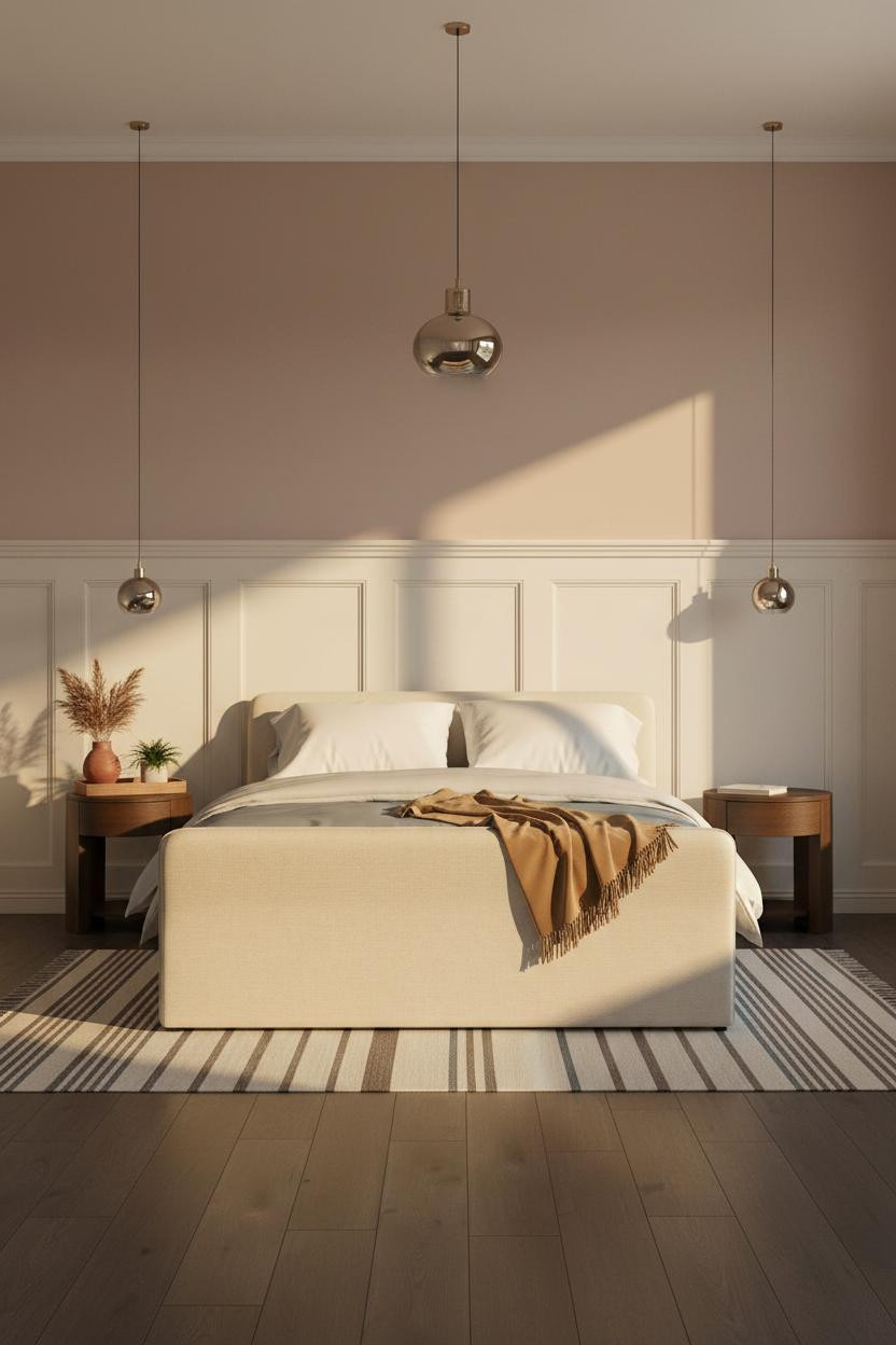

The cream board-and-batten paneling running to chair-rail height catches the golden afternoon light along every vertical strip, and the dusty rose above it somehow feels warmer for the contrast. A small move with a disproportionate return.
The dark walnut flooring grounds everything and keeps the upper half from floating. Worth copying: a camel throw against a slate duvet is the color pairing this room is built on. Neutral, but not flat.
When an Arched Alcove Does All the Work
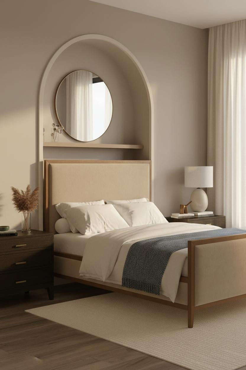
I almost scrolled past this. Glad I didn't.
But what caught me was the scale: the cream-painted arched alcove is sized exactly to the bed frame beneath it, which makes the whole composition feel designed rather than assembled.
Design logic: Warm greige walls keep the arch from feeling too formal. The plaster absorbs first light softly, and the room feels intimate and open at the same time.
The finishing layer: An oversized round mirror above a floating shelf pulls light back into the room without adding another architectural element. One mirror does a lot here.
 Our #1 Pick
Saatva Classic Mattress
America's best-selling online luxury innerspring. 365-night trial, lifetime warranty, free white glove delivery.
Shop Saatva Classic
Our #1 Pick
Saatva Classic Mattress
America's best-selling online luxury innerspring. 365-night trial, lifetime warranty, free white glove delivery.
Shop Saatva Classic
The Foundation Of Every Beautiful Bedroom
All eleven of these rooms get one thing right: the bed is the room. Architecture and wall treatments create context, but everything centers on where you actually sleep.
The Saatva Classic is what I'd put in every one of them. Dual-coil support means the structure holds without sleeping stiff, and the breathable organic cotton cover means it stays comfortable in every season. The Euro pillow top has that hotel softness without losing the support underneath it. It's the kind of mattress you notice the first night and stop thinking about after that (which is exactly how it should work).
Walls get repainted. Throws get swapped out. The mattress stays. Start with the right one.

The rooms people return to are the ones where nothing feels accidental. Good design ages well because it's made well.


