How to Pick a Japandi Kitchen Backsplash for Quiet, Natural Texture
13 july 2026I redid my sister's galley kitchen last spring, and the backsplash is the part everyone asks about. Not the cabinets (white oak fronts from IKEA, repainted in Benjamin Moore White Dove OC-17), not the matte black faucet, not even the quartz countertop that cost a small fortune. The wall behind the stove is what they notice first. It's a single row of handmade zellige in a bone tone, and it does almost nothing visually, which is exactly the point! That's the whole promise of a japandi kitchen backsplash for quiet, natural texture: the room gets calmer, not louder, and you stop noticing the wall the right way.
If your kitchen feels cold or busy and you've been tempted to slap up a glossy subway tile, this is the how-to for the opposite move, and the path runs in 18 quiet steps. If you're starting from the cabinet fronts down and want the bigger picture, my japandi kitchen ideas for small spaces apartments note pairs with this one well.
- Anchor the room in one quiet material before you touch anything else
- Choose Venetian plaster for the softest, most lived-in wall
- Use shagreen-paneled joinery for warmth tile can't fake
- The Limewash Lift: try the cheapest upgrade first
- Keep the painted wall quiet above the tile
- Stick to one color family and let texture do the work
- Grout matters more than you think
- Layer in one accent material, max
- Match the edge profile to a reclaimed teak trim
- Rake the light across the tile from below
- Pick a matte counter to keep the texture honest
- Can one metal carry the whole kitchen? Yes. Pick it and stop.
- Open shelving beats uppers for the airy version
- The Empty Wall Method: why negative space beats more tile
- Plant one quiet thing above the backsplash
- What happens when every light is the same temperature?
- Which material survives how you actually cook?
- The Layered Budget Stack: build the project in three tiers
1Anchor the room in one quiet material before you touch anything else
Pick the backsplash material first, not last. And every other choice (cabinet color, counter, faucet finish) flows from it.
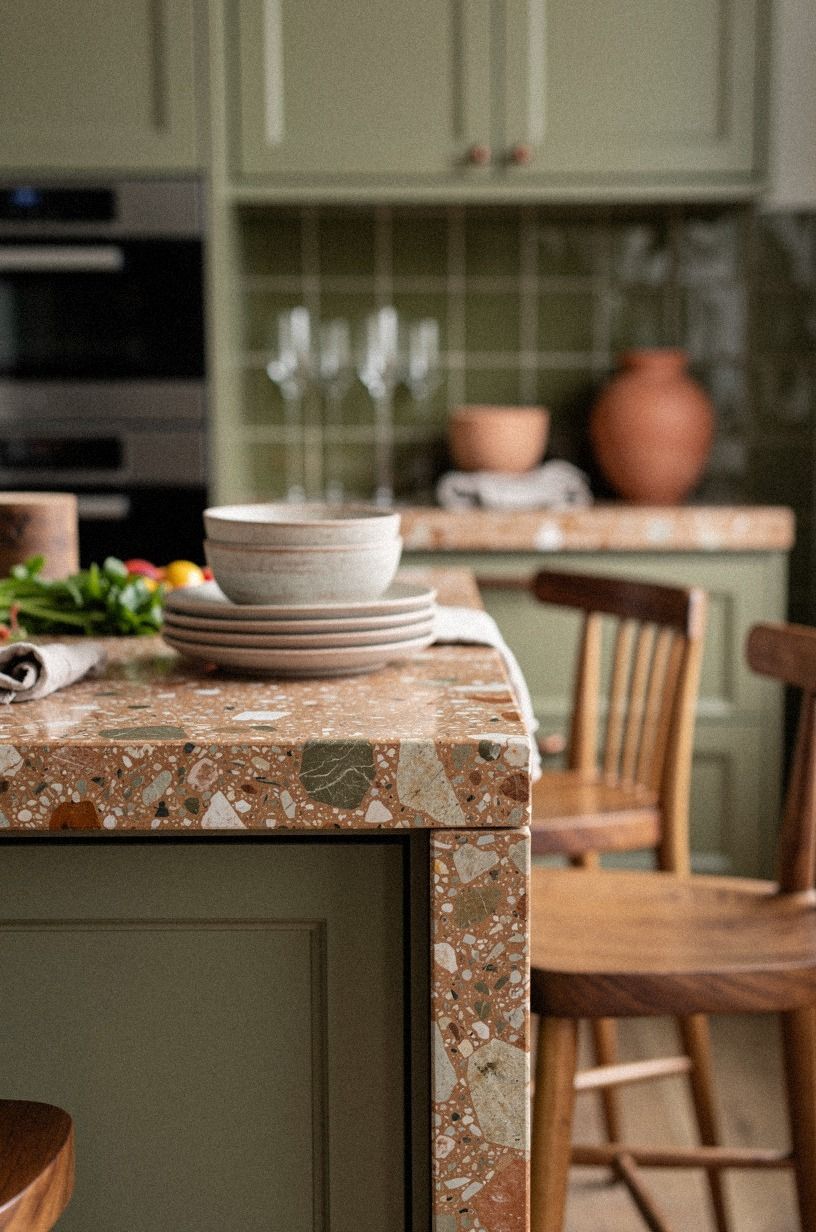
In japandi kitchens, that anchor is almost always one of three things: oversized-chip terrazzo in a warm set, hand-pressed Venetian plaster with the trowel marks left in, or a slab of shagreen-paneled joinery behind the run. The 18 in (46 cm) strip between counter and uppers is small enough that you can afford the good version, and the texture does the work a paint color can't.
Why does that small strip carry so much weight? Because it's the only wall surface in the room that's lit from below and never touched by hands, so it stays honest.
And that's the whole move. Walk the room at dusk once and notice what your eye lands on first; you want your anchor to live in that exact spot, not where you wish you'd put it.
If you're picking across the whole room, the japandi kitchen ideas that blend japanese calm with scandi warmth overview helps frame the rest.
I'd skip the polished porcelain that mimics marble. It's tidy, but a backsplash that reads as tile pretending to be stone fights the calm you're trying to build.
Pick a material that's honest about being what it is, and you'll never second-guess it two winters in. If you're choosing your cabinet color first, the kitchen cabinet color ideas you'll still love in 10 years post is a calm read.
2Choose Venetian plaster for the softest, most lived-in wall
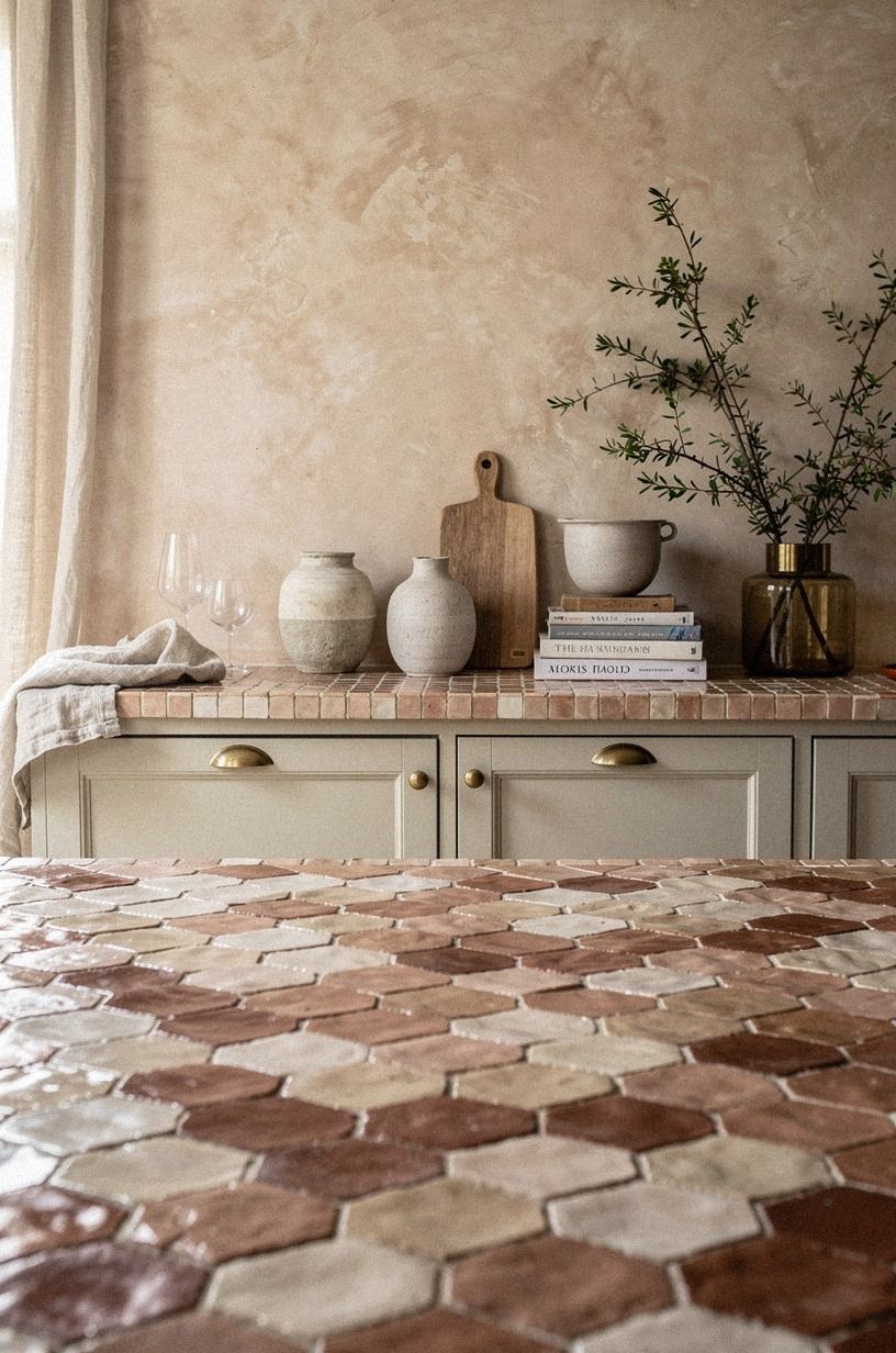
Hand-applied Venetian plaster is the move if you want depth without busyness. Each trowel pass leaves a faint mark, the tone shifts subtly across a single wall, and the corners hold a slightly cooler shadow where the plaster was pressed thinner. From two feet away it reads as soft cloud.
From across the room it looks like a single painted surface. That's the whole draw!
Budget: limewashed plaster runs about $8 to $18 per square foot installed for the genuine troweled version, and the lookalike "venetian plaster" paint kits from big-box stores are flatter and more uniform; if the price feels too good, it really is. Stick to one tone (clay, bone, or a linen-warm white) and let the trowel marks do the styling.
Worth every dollar! If your eye keeps wandering toward the chalky handmade look, the modern japandi kitchen ideas for clean functional beauty roundup shows how the wall sits in the wider room.
3Use shagreen-paneled joinery for warmth tile can't fake
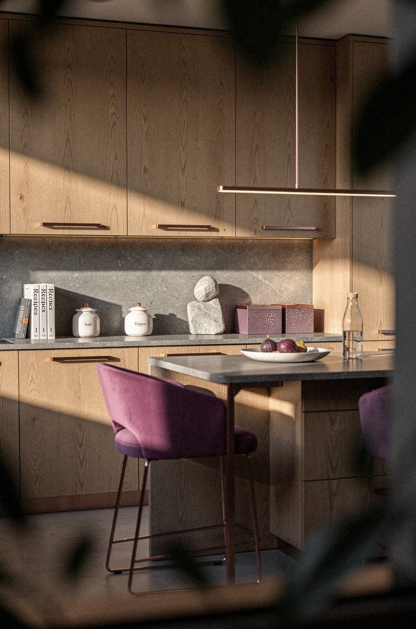
If you want the room to feel warm even in January, run a shagreen-textured panel from counter to upper cabinet line instead of tile. The pebbled faux-skin catches the under-cabinet light, the plum-rose undertone gives it a foggy, plucked-from-a-lounge tone, and you skip the grout lines entirely. It's more like a piece of furniture than a wall.
Owe it to yourself to handle a sample before you commit; the surface reads completely different underhand than in a photo.
This is the move for kitchens where the rest of the joinery is darker and a little jewelled. It's not the move for everything else.
If your cabinets are already oak, you risk the room reading as one big plum-brown moody cabin, which is the opposite of japandi. In that case, go plaster.
The japandi oak kitchen ideas how to get that calm clutter free guide walks through the balance if your cabinetry already leans warm.
4The Limewash Lift: try the cheapest upgrade first
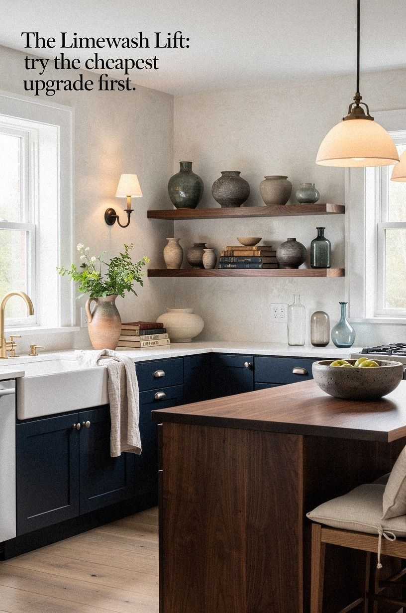
A washed Belgian linen runner draped on the counter, a linen tea towel folded over the oven bar, or a single linen-upholstered stool is the move if you want the texture first and the tile bill later. Limewash is paint, not tile, but applied in three coats over a primed substrate it reads as depth, not flat color; linen reads as lived-in, not decorative.
5Keep the painted wall quiet above the tile
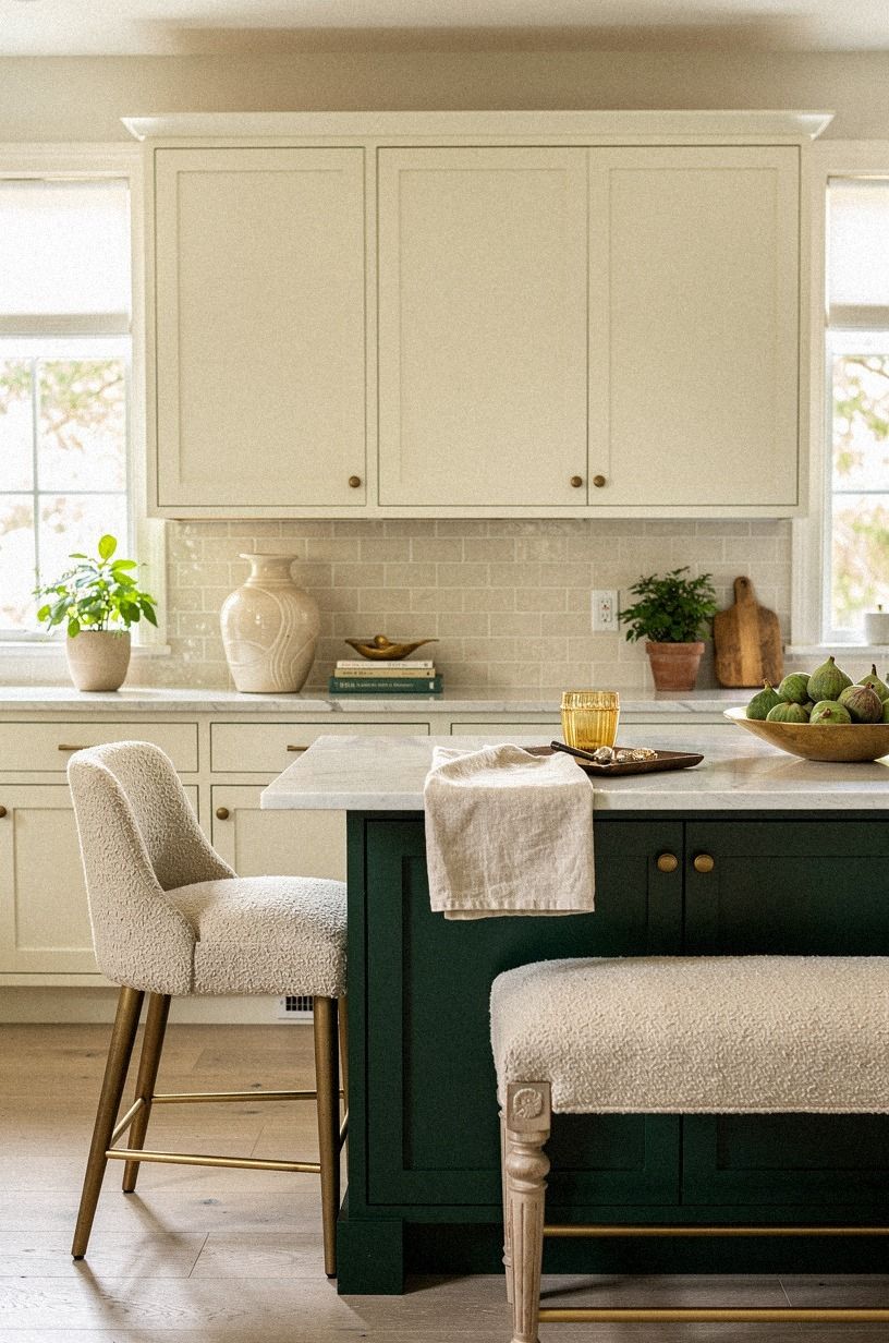
The classic japandi backsplash sits in the 18 in (46 cm) band between counter and uppers, no more. Going all the way to the ceiling with tile is a look, and it's not this look.
The negative space above the backsplash is what makes the kitchen read as quiet. It's the pause in a sentence, and it lets the painted wall above read like a frame — or, if you're going richer, hosts a soft organic bouclé panel that earns its place without raising its voice.
If you have open shelving instead of uppers, run the material up to the underside of the shelf at most, then stop. A continuous slab of texture from counter to ceiling turns the room into a tile showroom, and the eye has nowhere to rest. The white-painted wall space above the backsplash should sit in the same value as the cabinets (a warm white like Benjamin Moore White Dove OC-17), not a stark white; the contrast is what kills the calm.
6Stick to one color family and let texture do the work
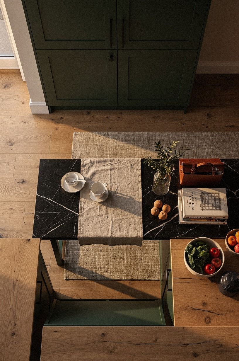
Japandi backsplashes are never multicolor. Pick one family: forest green, rust, natural oak, warm cream, or matte charcoal.
The texture (chips in Nero Marquina marble with its white veining, grain in oak, brushstrokes in limewash) is what creates visual interest. A patterned or two-tone tile competes with the texture and breaks the spell.
My favorite move is to match the backsplash to the counter tone within half a shade. Not exact, not contrast.
That gentle echo is what makes the room feel considered. The Farrow & Ball Studio Green No.93 paint on a nearby island will look calmer if the backsplash picks up the same value.
If you're going sage on the cabinets, the green and oak kitchen ideas the cozy color pairing you'll want post saves you from guessing.
7Grout matters more than you think
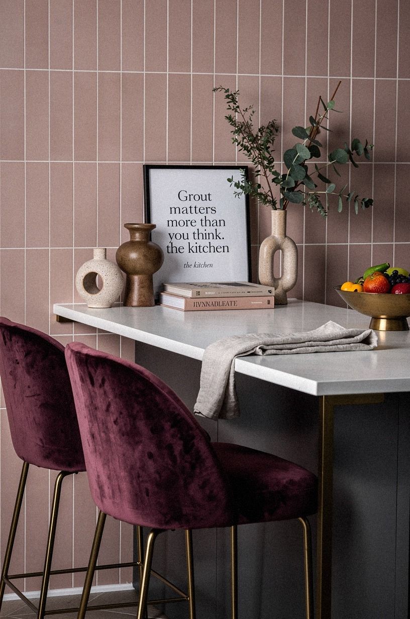
Even on a deep-pile mohair velvet-backed feature strip behind the stove, the joints around any tile tell the truth. For zellige, use a grout that disappears.
Mapei Keracolor U in a tone matched to the tile (bone grout for bone tile) unsanded, applied with a float and wiped within ten minutes. You want the joints to read as soft shadows, not as a grid.
Visible grout lines are a 2010s move, and they make a calm backsplash feel like a chessboard.
For limewash and plaster and upholstered panels there's no grout, which is part of the appeal. If you're choosing between two similar materials and one has visible grout and one doesn't, that should settle it.
The grout is half the tile's surface area, and a high-contrast grout is louder than a high-glaze tile. Pick the no-grout option and you'll save yourself ten hours of cleanup for the rest of your life in this kitchen.
If you're laying the tile yourself, my tile installation mistakes homeowners make roundup catches the grout timing trap before it bites you.
8Layer in one accent material, max
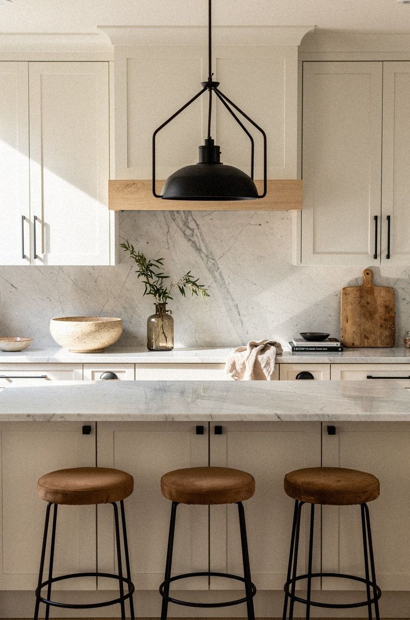
If a single-material backsplash feels too monastic, you get one accent. The cleanest version is a single row of Carrara marble pencil trim along the top edge, where the tile meets the upper cabinet or wall — Carrara's subtle grey veining catches the under-cabinet light without ever shouting. I call this move the Single-Accent Rule: one marble line, in one spot, never both edges.
Skip the full marble slab behind the stove. It dates the kitchen by a decade and competes with the faucet hardware.
A pencil-thin line is restraint; a wide strip is a decision you'll redo in two years. If you want the marble to do more than one job, pair the trim with japandi cabinet hardware the subtle pulls that complete the so the finish matches across the wall and the doors.
9Match the edge profile to a reclaimed teak trim
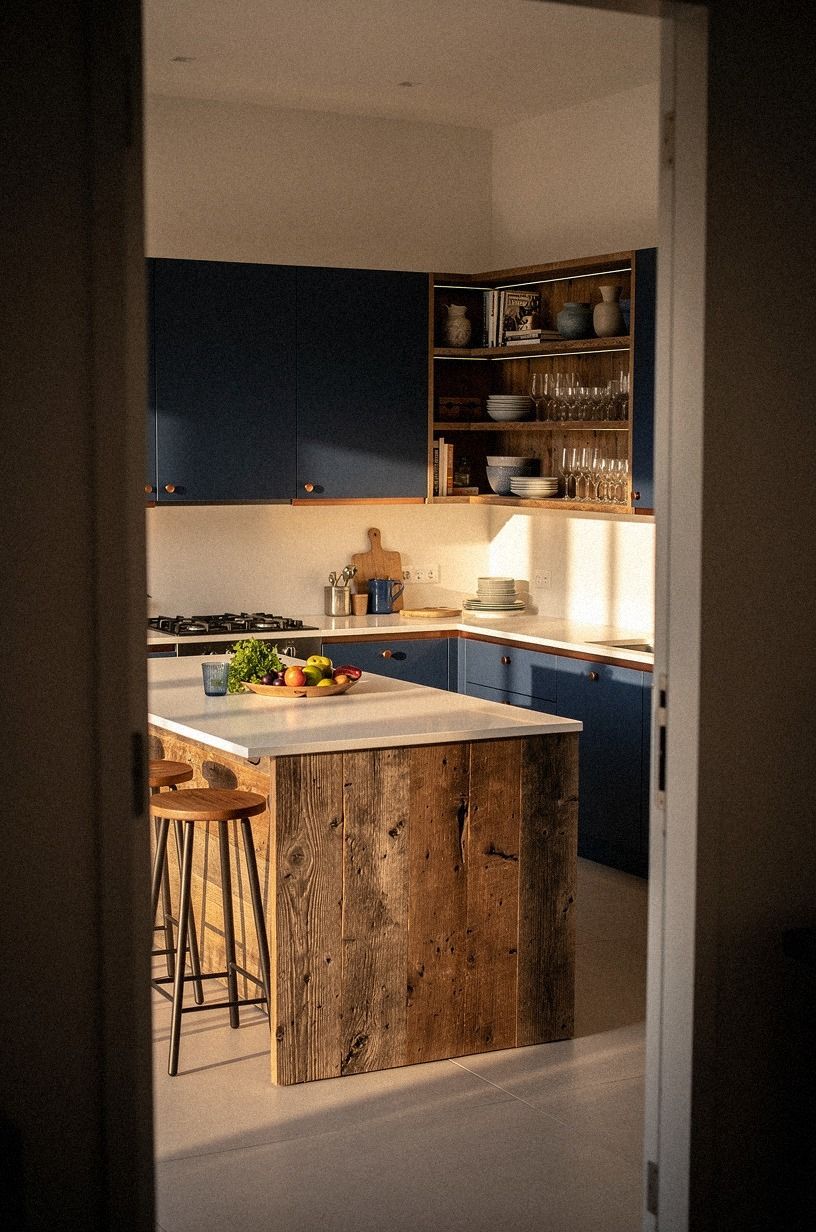
If your cabinets are flat-fronted with no visible hardware (the japandi default), the backsplash edge should be a clean reclaimed weathered teak strip, square-cut and gently hand-planed, not bullnosed or beveled.
10Rake the light across the tile from below
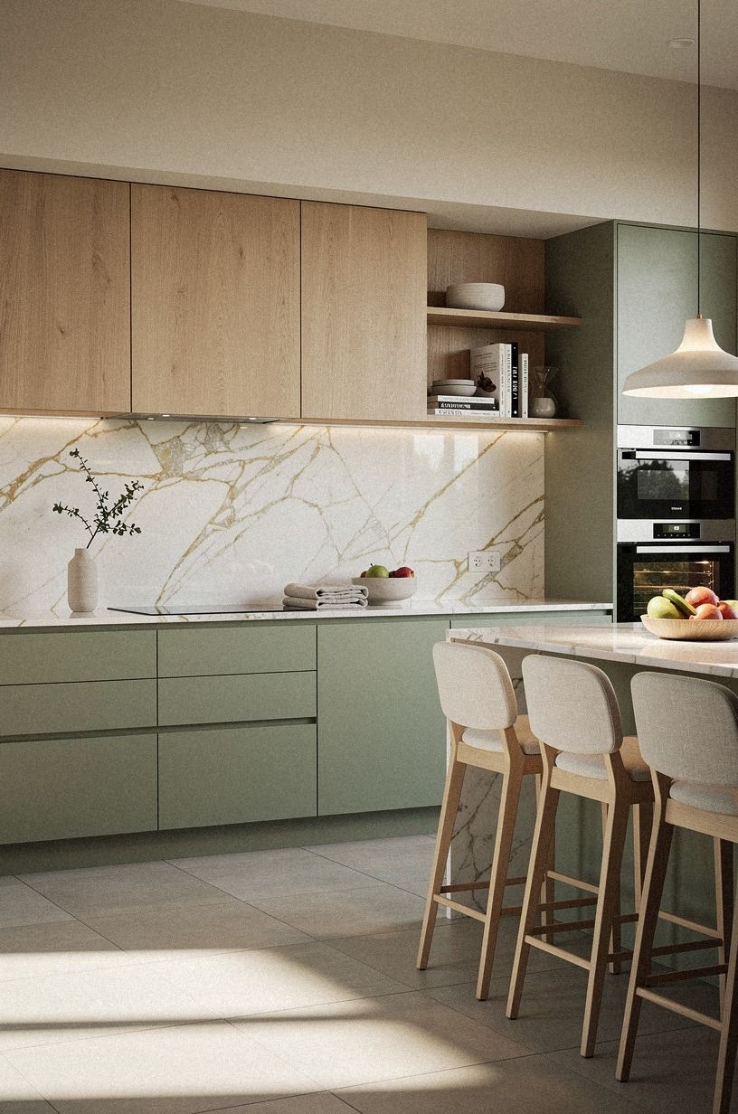
Under-cabinet lighting is what makes a japandi backsplash sing. A 3000K LED strip with a high CRI (90+) tucked behind a 1-inch lip on the underside of the uppers will rake across Calacatta marble with its soft gold veining and pull out the warmth.
Overhead lighting flattens it. That's why showrooms look better than real kitchens: the raking light from below.
Skip the puck lights. They're dated, cast shadows in the wrong direction, and make the counter look like a runway.
A continuous strip is cheaper, more even, and disappears when you're not looking at it. And because it's tucked behind the upper lip, you'll never see the fixture itself, which is what you want when the room is supposed to feel calm.
If you're rewiring from scratch, the under cabinet lighting ideas for a warm kitchen glow post walks through the CRI choices that make a real difference.
11Pick a matte counter to keep the texture honest
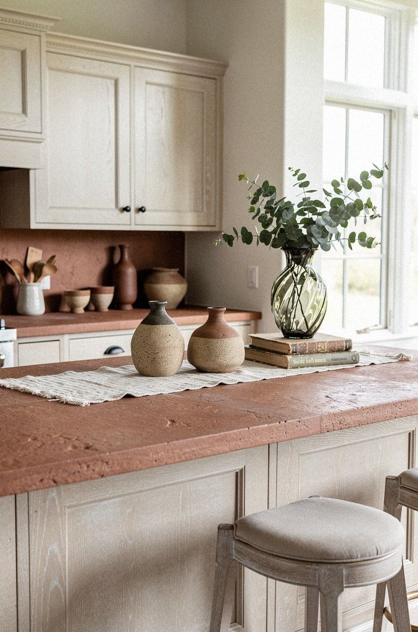
A glossy quartz counter bounces light back at a glossy backsplash and the whole wall vibrates. A matte or honed quartz countertop (or a honed soapstone, my favorite for this look) absorbs the light and lets the cerused white oak backsplash panel be the only textured surface in view. The 36 in (91 cm) standard counter height still applies, and the matte surface continues the calm.
Quartz countertop runs about $60 to $120 per square foot installed. Laminate is $10 to $40 per square foot and modern matte versions look better than they did five years ago.
For rentals and budget builds, a matte laminate is genuinely fine. For a forever kitchen, quartz pays back in resale.
Run a sample of your chosen counter and your chosen backsplash home side by side for a week before you order; you'll catch color drift you'd never see in the showroom.
12Can one metal carry the whole kitchen? Yes. Pick it and stop.
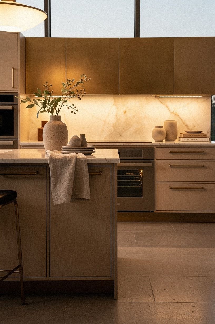
If the backsplash is the texture, the metal is the punctuation. Backlit translucent onyx in an aged-brass channel is the move when you want one quiet glow rather than three finishes shouting at each other.
13Open shelving beats uppers for the airy version
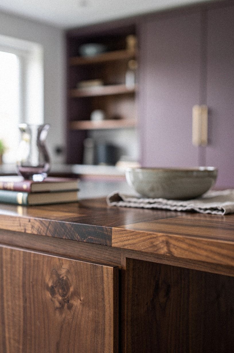
If your kitchen has uppers, leave them. But if you're renovating and you want the room to feel bigger and quieter, swap one run of uppers for book-matched walnut floating shelves — the mirror-image grain turns each shelf into a single piece of furniture rather than a chunk of plank. The eye keeps traveling up past where the cabinet would have stopped, and the backsplash gets more wall to exist on.
It's also the move that makes a 10x10 kitchen feel like a 12x10, and you don't give up a single cabinet on the opposite wall.
The shelves need real support: a 3/8-inch steel rod through the wall or a hidden cleat into studs, not the drywall anchors that come in the box. I've seen four shelves of Le Creuset pull a floating shelf off a plaster wall in slow motion.
It's not a sound you forget, and it's not a wall you fix in a weekend. You'll be glad the day your heaviest Dutch oven is full of stew.
14The Empty Wall Method: why negative space beats more tile
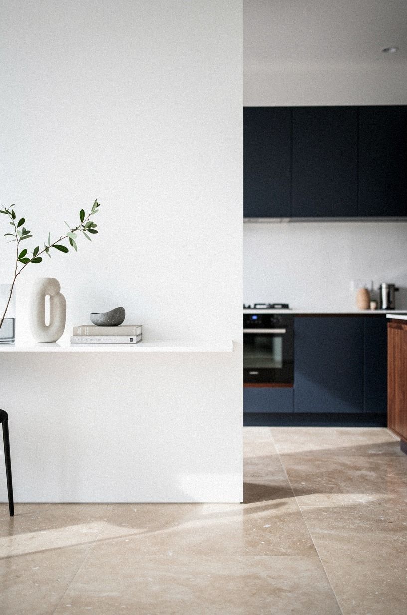
A japandi backsplash has more wall around it than most American kitchens. If you can leave 4 to 6 in of painted wall — or a soft band of warm travertine between counter and uppers — between the end of the tile run and the next cabinet, do it. The break lets the eye rest, and the room reads as deliberate.
Running tile into every corner of every wall is a budget move disguised as a design move.
In a small kitchen, this matters even more. A 42 in (107 cm) clear span between counter and corner gives the workspace a calm no cabinet reorganization will give you.
Island clearance of 42 to 48 in (107 to 122 cm) all around matters too: if your cook can't pivot between sink, stove, and prep without bumping a hip, no backsplash saves the room. If you're planning a tighter layout, the galley kitchen ideas for a sleek narrow layout post shows how negative space works at 8 feet wide.
15Plant one quiet thing above the backsplash
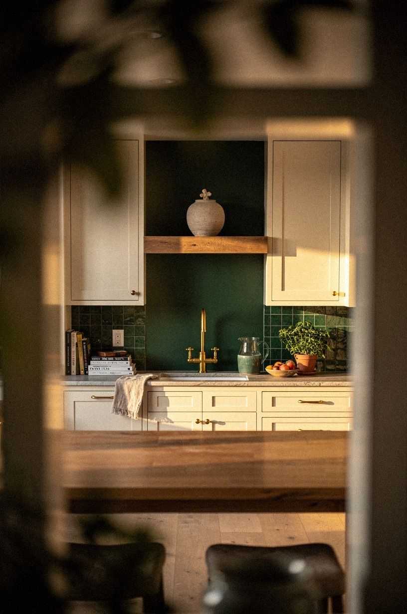
A single stem of dried pampas, a small olive branch cutting in a stoneware bud vase, or one trailing pothos on the shelf above the backsplash is the move — and the warm unlacquered brass developing its slow patina behind it does more for the vignette than another plant would.
16What happens when every light is the same temperature?
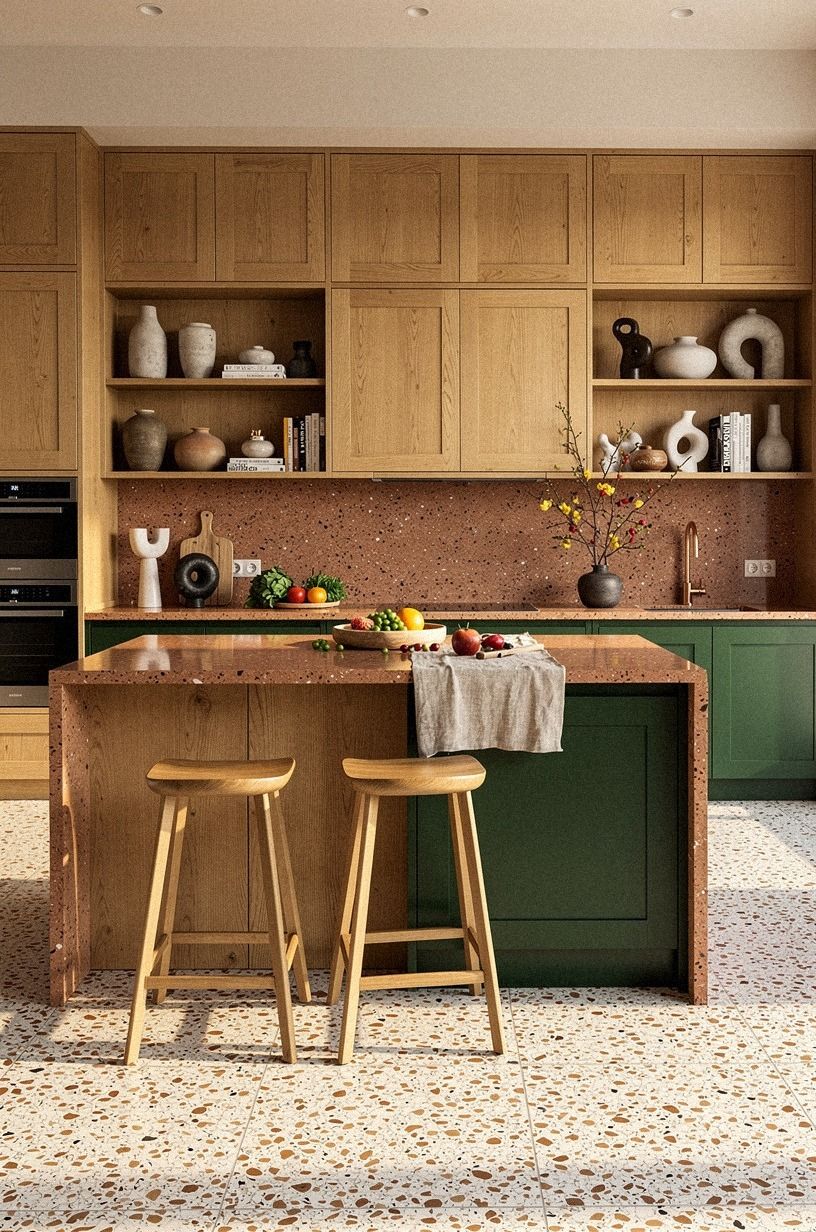
All the light in the kitchen should be the same temperature, within 200K. 2700K for warm and slightly amber. 3000K for clean and modern.
Don't mix them. A 2700K under-cabinet strip with a 4000K overhead fixture makes the oversized-chip terrazzo floor look dirty no matter what it's made of.
If you're starting from scratch, run everything at 2700K. It's forgiving to skin tones, to wood, and to the slight color variation in zellige. 3000K reads more contemporary but colder on food. If you cook a lot and care about how the meal looks before it lands on the table, the warmer side will serve you better.
Spend an evening in your kitchen with the bulbs swapped back and forth; the difference is bigger than you think.
17Which material survives how you actually cook?
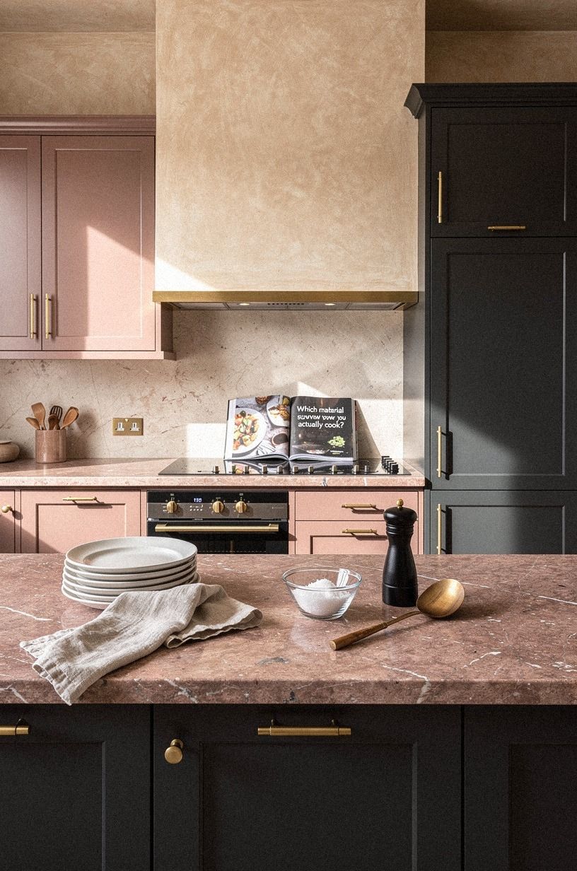
Zellige needs a pH-neutral cleaner (anything acidic etches the glaze over time). Hand-applied Venetian plaster needs a soft cloth, never a scrubber. Mohair velvet on a feature panel needs a lint brush and zero splatter.
If you cook red sauce daily, the velvet is going to suffer. If you rent, the plaster is the move because you can paint over it on move-out.
Match the material to how you live, not how you imagine yourself living on a Sunday morning.
If your kitchen gets daily splatter from your stove, my easy to clean kitchen materials for high traffic cooks post picks the survivors.
18The Layered Budget Stack: build the project in three tiers
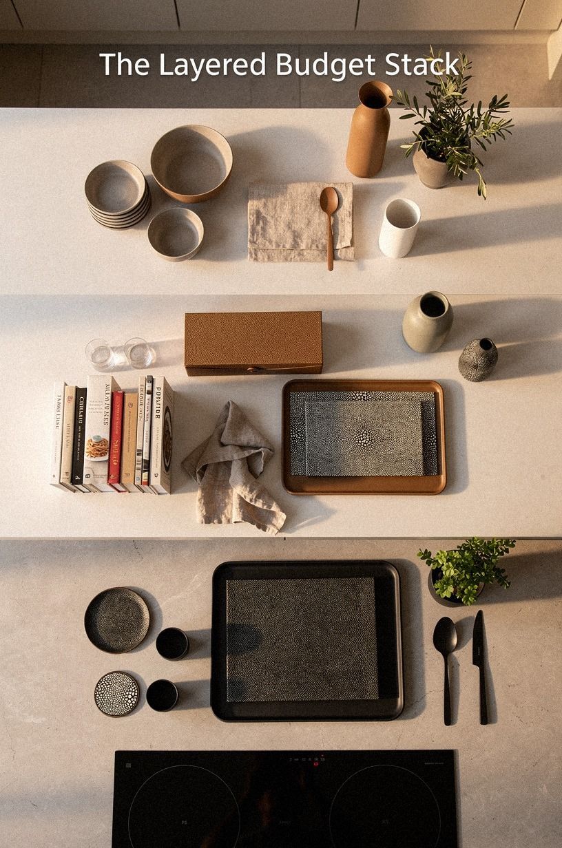
A japandi backsplash project is one decision inside a kitchen budget, and the budget you have is the budget you should plan against. Shagreen-accented panels and book-matched walnut sit at the top tier, limewashed plaster and zellige in the middle, and a clever paint job at the entry level.
What a Japandi Kitchen Backsplash Actually Means
Japandi isn't a brand style. It's the slow overlap of Japanese restraint and Scandinavian warmth, two traditions that arrived at the same answer from opposite directions.
Japanese interiors prize ma (negative space) and the honest aging of materials; Scandinavian interiors prize hygge (the feeling of being held by a room). Cross them and you get a kitchen where a single imperfect tile line, a chalky limewashed wall, or a soft oak panel can hold the whole room together without shouting.
The reason it's having a moment is cyclical. After a decade of all-white subway and high-gloss quartz, the eye is tired of uniform. And the open-plan kitchen puts the cook in view of the living room, which rewards quiet walls.
A loud backsplash turns the chef into a backdrop; a quiet one lets the room be the room, and lets you be the cook in it!
I went back and forth on this for years before I committed to the limewash route in my sister's kitchen, and I'm glad I did. The texture does the work the pattern can't, and you stop noticing the wall six months in, which is exactly when you know it worked. If you're building a bigger japandi room around it, the japandi kitchen dining ideas with a cozy breakfast nook post shows what the open wall looks like past the tile.
The honest upside of this whole style is that you can fake it cheaply and not regret it. A $60 limewash beats a $3,000 tile if the wall is doing its job, and the room doesn't know the difference on a Tuesday morning. The honest downside is that the look lives or dies on material honesty.
Faux marble, high-gloss subway, the prefab "japandi" cabinet kit from a big-box site: they all read as costume, and your eye catches it every morning.
If you go into this with the right tier for your budget and the right material for how you use the room, you'll get the calm your kitchen has been missing, and you'll spend less than a quartz counter to get it. That's the trade. Worth it.
The Questions I Get Asked Most
What is the best Japandi kitchen backsplash for a small kitchen?
For a small kitchen, handmade zellige in a bone or warm white is the move. It reads as texture even in a 10-foot wall run, and the slight imperfection makes a tight space feel intentional instead of cramped.
Pair it with a matte quartz countertop and you're done. If your kitchen is genuinely tiny (under 70 sq ft), skip the full backsplash and run zellige only behind the stove as a feature strip.
For tighter layouts my japandi galley kitchen ideas for a sleek narrow layout note might save you a layout mistake.
Where can I buy japandi backsplash pieces on a budget?
Three real places: IKEA for matte hardware and wood-trim pieces, Wayfair for tile (check the Merola Tile line for affordable zellige lookalikes, but buy a sample first), and Tile Shop if you want genuine handmade zellige with the budget to afford it. For second-hand stone, slate, or wood pieces, Facebook Marketplace and ReStore (Habitat for Humanity) are surprisingly good. I've sourced solid stone slabs for a third of retail from ReStore, and the patina is already there.
How much does a japandi kitchen backsplash makeover cost?
For just the backsplash (materials and install), plan on $200 to $2,000 for most kitchens. A limewash refresh is $50 to $150 in materials if you DIY.
Peel-and-stick zellige-look tile runs about $5 to $12 per square foot. Genuine handmade zellige is $15 to $35 per square foot installed.
The full kitchen refresh tier runs about $300 to $1,500 for cosmetic work and $3,000 to $12,000 for a mid-range redo with new faucet, lighting, and counter.
Can I create a japandi kitchen backsplash on a tight budget?
Yes, and it's the easiest place in the kitchen to fake the look for very little. Three moves: limewash the existing wall in a putty or warm white (about $60 in materials), swap the cabinet hardware for matte black or unlacquered brass pulls from IKEA (about $30 for a full kitchen), and add one stoneware bud vase with a single dried stem above the backsplash (under $20 at a thrift store). That's the whole look for under $150, no contractor required.
Is a japandi backsplash worth it in a small space?
Yes, and small spaces favor the look. A small kitchen can't carry a loud backsplash; it just gets loud everywhere.
A single-material, single-color backsplash gives the eye one thing to land on and lets the rest of the room breathe. The 42 in (107 cm) minimum island clearance matters more in a small kitchen, but a calm backsplash makes that tight zone feel intentional instead of cramped.
Worth it is an understatement.
Is a japandi backsplash a good idea for a rental?
Yes, and limewash is the move. It's paint, not tile, so it comes off cleanly when you leave (check your lease first; some landlords don't allow any wall changes, even paint).
Alternative no-damage option: peel-and-stick zellige-look tile in a matte finish, which holds with proper substrate prep and removes with a hair dryer and a putty knife. Skip real zellige or oak paneling in a rental; the install is invasive and the deposit won't cover the labor to undo it.
Where I'd Start First
If I had to pick one, I'd start with the limewash. You'll know in a weekend whether japandi texture is the look you want to live with, for under a hundred dollars.
Once the wall is right, the rest is obvious. Start with the wall.
Everything else lands.


