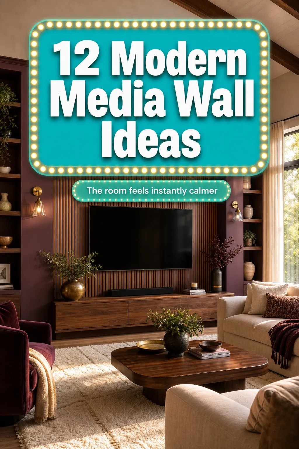
How to Create a Modern Media Wall for a Sleek Built-In Look - 12 Ideas
13 july 2026A modern media wall starts with the wall plane, not the TV, and a smart version usually lands somewhere between $300-$1,200 before you get anywhere near custom millwork. I learned that the expensive way after mounting a screen first, then spending a whole Saturday trying to make the rest of the room catch up. If your living room feels like the TV is floating in space, this is the order that fixes it. And once the wall starts acting like architecture, the whole room settles.
Before you start
You do not need a full renovation to make a modern tv wall look built in, but you do need a sequence. Start with a tape measure, painter's tape, and a stud finder, and take a hard look at where your sofa really sits. For a comfortable watch distance, plan roughly 1.5 to 2.5 times the screen diagonal between the seat and the TV.
A 65-inch screen usually wants you somewhere around 8 to 13 feet back, and that number matters more than whatever the showroom vignette told you.
The other thing you need is a budget lane before you start shopping. If you know you're staying in the Budget tier, you can stop fantasizing about custom walnut joinery and put your money where it counts: the wall finish, the console line, the lighting, and the cable plan. For more focal-wall inspiration before you commit, see living room ideas with a stronger focal wall.
- Start with a floor to ceiling feature panel
- Should the TV sit on a matte black slab or float against the wall?
- Float a long walnut unit below
- What's the smartest way to build slim cabinets around the screen?
- Layer stone veneer behind the display
- Run warm LED strips under shelves
- Hang asymmetrical art beside the TV, and let Benjamin Moore carry the wall
- Why vertical slats beat solid paneling behind open shelving
- Frame the fireplace with matching panels
- Hide cables inside a recessed channel
- Style the console with one IKEA Besta cabinet that beats any West Elm look
- Finish with West Elm sconces flanking the wall
1Start with a floor to ceiling feature panel
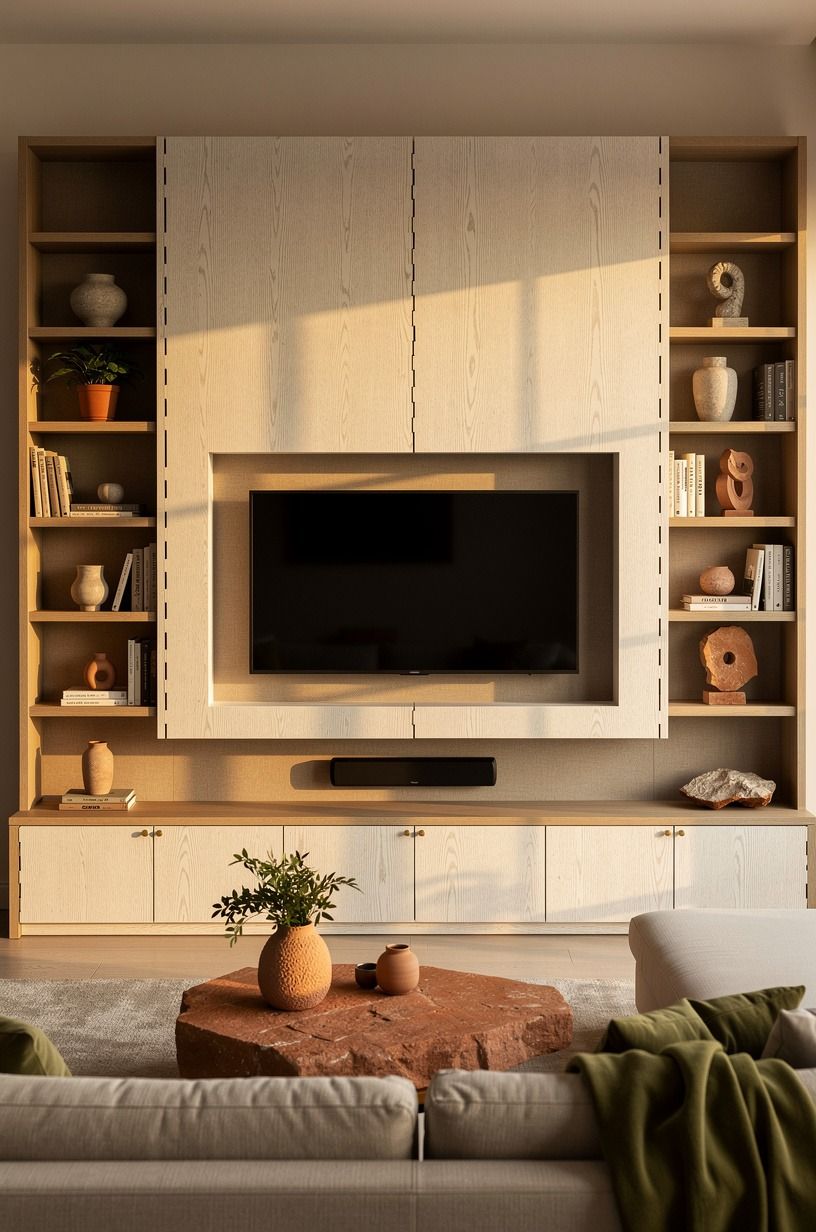
Start with height, because height is what makes a tv unit design modern instead of temporary. A floor-to-ceiling panel gives your screen a frame before the screen even turns on, and that's the move that keeps the wall from reading like a black rectangle on drywall. I like a full sheet of cerused white oak or painted MDF with a 3/4-inch face, centered so the margins feel calm and the room reads symmetrical the second you walk in.
In the photo, the panel works because the palette stays warm and grounded. You can see terracotta stone, olive accents, and a recessed screen sitting inside the panel instead of pasted on top of it.
That's the Full-Height Frame Rule I keep coming back to: if the panel reaches the ceiling, your eye believes the wall was planned with the house. If it stops short, it starts to feel like furniture.
Use painter's tape to block the panel width first, then stand at the sofa and look at it for a full minute. But do not eyeball this.
A 72-inch panel can feel skimpy on a wide wall, while 84 inches often lands better with a 65-inch TV because you still get enough wood showing on both sides. If you like living rooms with that soft, architectural pull, Nancy Meyers living room ideas with quiet structure are worth a look before you pick your finish.
2Should the TV sit on a matte black slab or float against the wall?
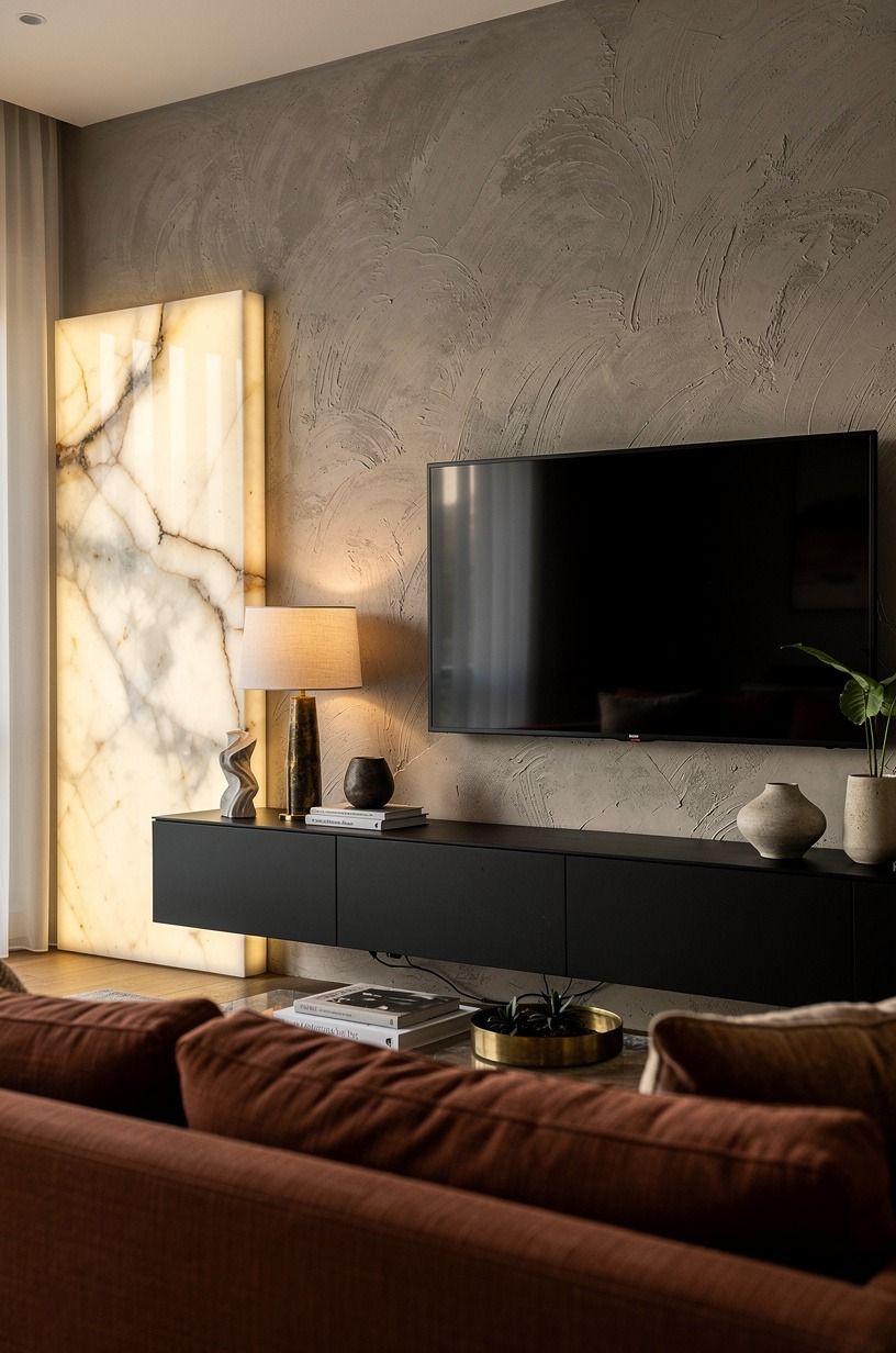
Anchor the screen on something darker than the wall, because black-on-black is one of the cleanest ways to make a modern tv wall disappear in plain sight.
3Float a long walnut unit below
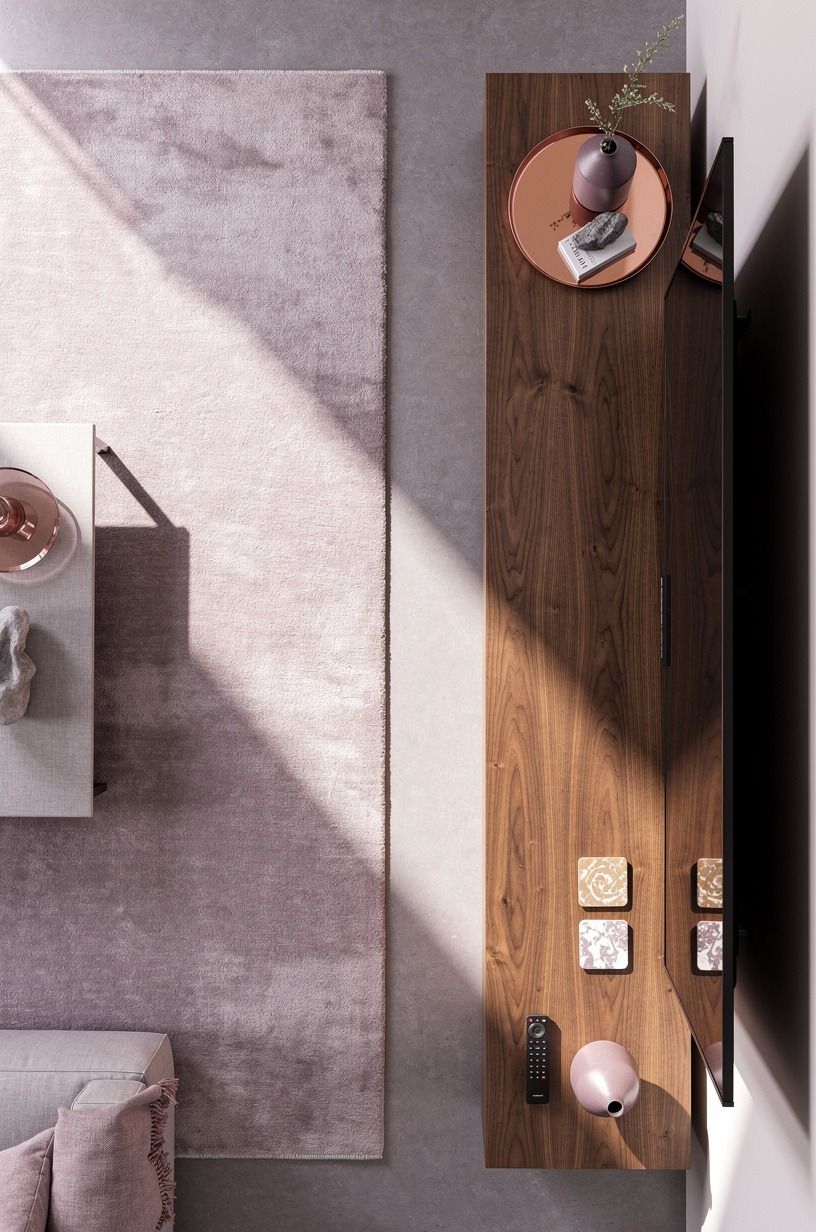
Float the storage instead of dropping a chunky cabinet on the floor. A long, wall-hung unit keeps the lower half light, gives your eye a clean horizontal line, and leaves enough shadow underneath to make the whole modern tv units setup look custom. For this look, I'd choose book-matched walnut veneer with push-latch doors and keep the depth around 15 to 18 inches so it stores gear without bullying the room.
The overhead photo makes the lesson obvious: the console is long, quiet, and slightly off-center, with breathing room around it. You can also see plum gray styling and a hand-hammered copper bowl, which tells you the wall does not need ten objects to feel finished.
That's the Long-Low Line at work. One generous unit.
Very little clutter. The room gets calmer fast.
I made the mistake once of buying a unit that was too short because it looked tidy online. It wasn't tidy in person. It looked apologetic.
Go longer than you think, especially if your sofa is full-size. And if you want more ideas on built-in seating and low horizontal lines, custom breakfast nook layouts built around the same proportion are a surprisingly useful reference.
4What's the smartest way to build slim cabinets around the screen?
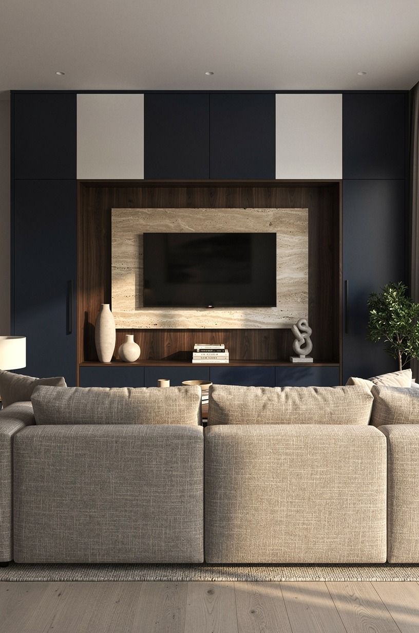
Build storage tight to the screen if you need the wall to earn its keep, but don't crowd the screen with chunky door fronts.
5Layer stone veneer behind the display
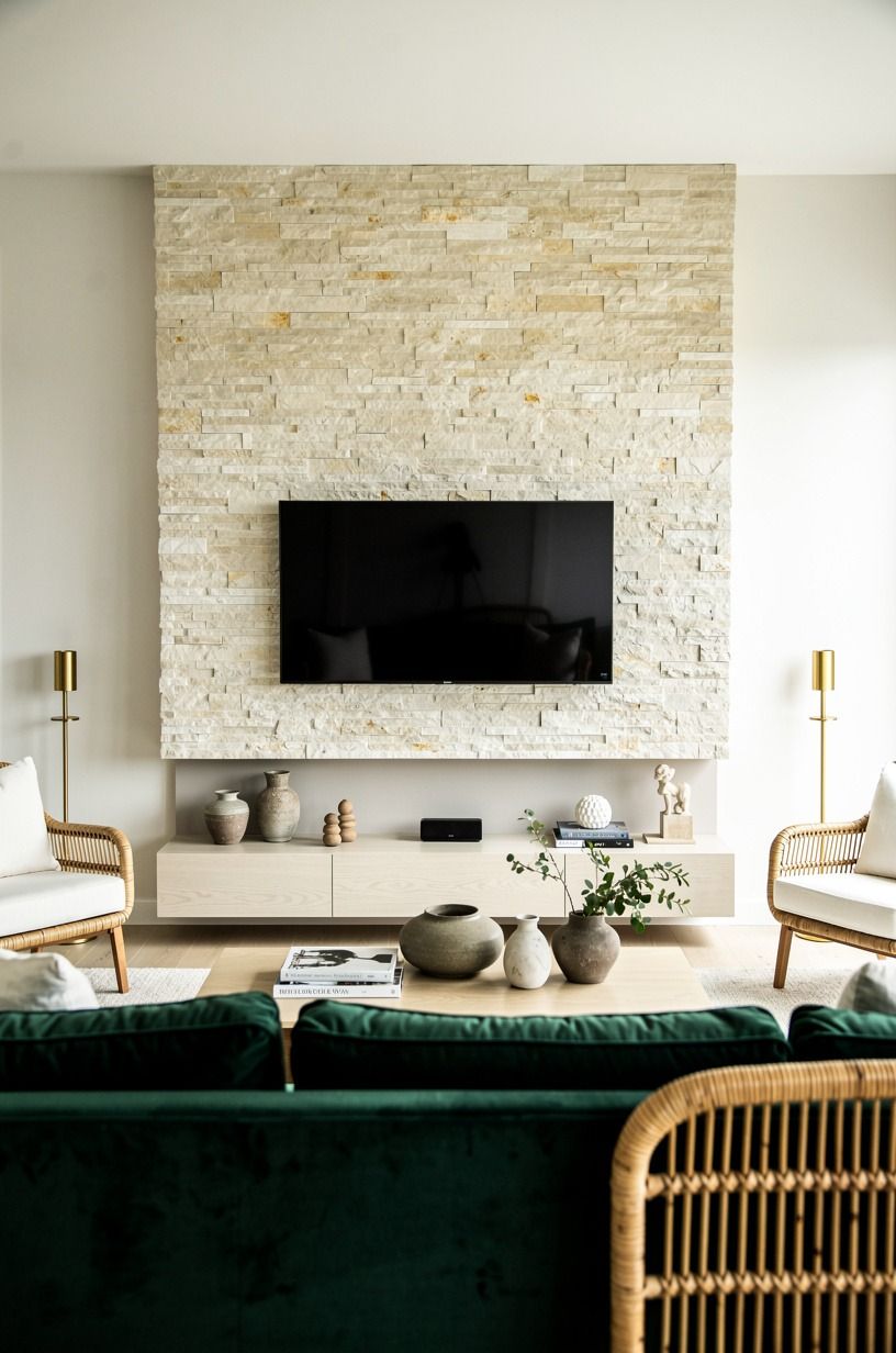
Layer a textured material behind the display when paint alone feels too thin. Stone veneer gives a modern tv design wall warmth, depth, and enough shadow to keep the wall interesting even when the TV is off. I'd rather see cream split-face stone or honed travertine-look veneer here than busy marble, because the screen already brings enough hard contrast.
This image keeps the wall airy by using cream stone with emerald seating, aged gold, and woven rattan. That mix matters. If your stone is pale, your room can still feel warm instead of washed out.
The move is repeating one mellow metal, one deeper color, and one natural fiber so the wall doesn't turn chalky. And yes, unlacquered brass is a good call here because the patina helps the whole setup relax.
Stone veneer also helps if your wall is too wide for the TV alone. It gives the wall a field, not just a mounting spot. But stay selective.
I wouldn't run veneer on every adjoining surface unless you're doing a full renovation. One dedicated background is enough. If you like that light, organic-luxe mix, modern travertine bathrooms with the same material honesty are a good material study.
6Run warm LED strips under shelves
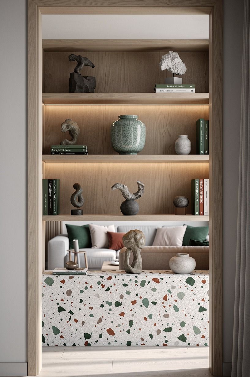
Run your accent lighting low and warm. This is the step that makes modern tv wall ideas feel finished at night, because under-shelf lighting gives the wall a soft line of glow without shouting for attention. Aim for dimmable 2700K strips, tucked into an aluminum channel with a diffuser, and hide the diode dots completely.
If you can see the dots, the job isn't done yet.
The shelf scene in the photo works because the light sits under open shelving, then bounces off forest green, rust, natural oak, and a terrazzo base. A cracked celadon vessel catches just enough of that glow to read expensive without trying. That's the Three-Layer Glow Stack: shelf light, ambient lamp light, and a little daylight left in the room.
One source is bland. Three sources feel lived in.
I wouldn't use cool white LEDs here, even if the package says bright. Bright is not the assignment.
Warm is. And if you want more examples of soft task lighting that disappears into the architecture, Japandi kitchen lighting ideas with paper-soft glow make the same point in a different room.
7Hang asymmetrical art beside the TV, and let Benjamin Moore carry the wall
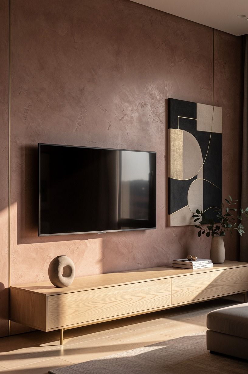
Hang art beside the screen so the wall stops being all electronics. A single off-center composition gives your modern tv wall a human note, especially if the rest of the setup is strict and linear. I like one larger abstract leaning dusty rose or charcoal, plus a smaller companion piece, both with slim aged brass or oak frames that do not fight the screen.
The photo gets this right by letting the TV sit off to one side while art handles the other. You can also see Venetian plaster and visible oak grain, which means the wall already has texture before the frames go up.
That's the One-Off Gallery Rule: keep the art asymmetrical, but keep the palette tied back to the room so it looks intentional instead of random. I'd pair this with a wall finish in Benjamin Moore White Dove OC-17 so the art reads against a quiet ground without competing with the screen.
But this is where people overdo scale. If the art is louder than the TV, the wall starts arguing with itself.
Keep the tallest piece lower than the top of the screen and let some negative space stay empty. Empty space is doing work here!
If you're unsure how much visual weight a side composition can carry, music room ideas that balance art and equipment are a solid reference.
8Why vertical slats beat solid paneling behind open shelving
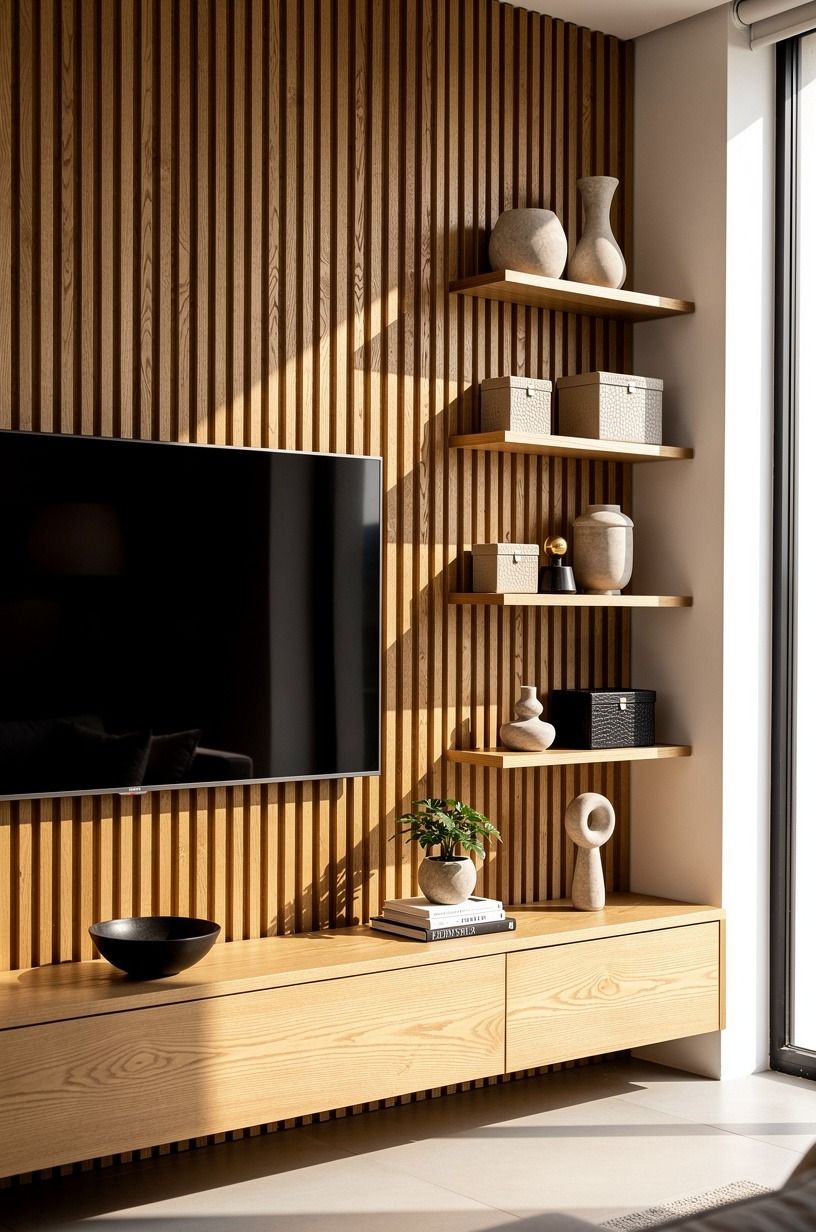
Add slats when you want texture without the heaviness of solid millwork.
9Frame the fireplace with matching panels
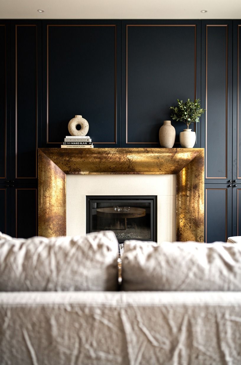
Frame the fireplace and the TV as one composition if they're sharing the same wall. This is where a lot of rooms get clumsy, because the firebox, the screen, and the side panels all act like separate events.
Matching panels pull them together fast. I like midnight blue millwork or walnut-faced panels around a simple fireplace surround, then one repeat metal finish, like aged bronze, so the eye can move without stopping.
The low-angle photo shows why this works. You get matching wall planes, a centered firebox, and that soft ivory-and-copper mix from the Belgian linen and bronze edge detail. That's what makes the wall feel built in instead of assembled.
And the fireplace doesn't have to be huge. Even an electric insert can work if the framing and proportions are disciplined.
If you are choosing between splurging on a wider TV or better wall framing, pick the framing. I mean it. The structure is what makes the room memorable, not the extra inches of screen.
For more ideas on tying fire and seating into one warm focal zone, covered patio fireplace ideas with strong framing are worth a scroll.
10Hide cables inside a recessed channel
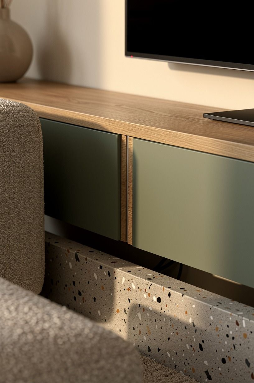
Hide the wires before you style one single object. Visible cords will undo the whole sleek-built-in illusion, even if every other material choice is right.
A recessed channel gives you the cleanest result because the wire path becomes part of the wall instead of a plastic afterthought. I'd cut in a paintable recessed raceway beside the mount and finish it to match Sherwin-Williams Evergreen Fog SW 9130 or whatever cabinet color is already on the wall.
This detail shot shows the seam integrated into sage green, warm cream, and natural wood, with bouclé and concrete nearby. That's exactly how the detail should behave: present, but quiet.
The Invisible Wire Rule is simple. If a guest notices the seam before they notice the room, the detailing is too loud.
And please plan outlet locations before the screen goes up. I once had to pull down a mounted TV because the recessed box landed two inches too low for the bracket.
Annoying. Expensive.
Completely avoidable. If hidden utility is your love language, small bedroom storage ideas that keep surfaces quiet hit the same nerve.
11Style the console with one IKEA Besta cabinet that beats any West Elm look
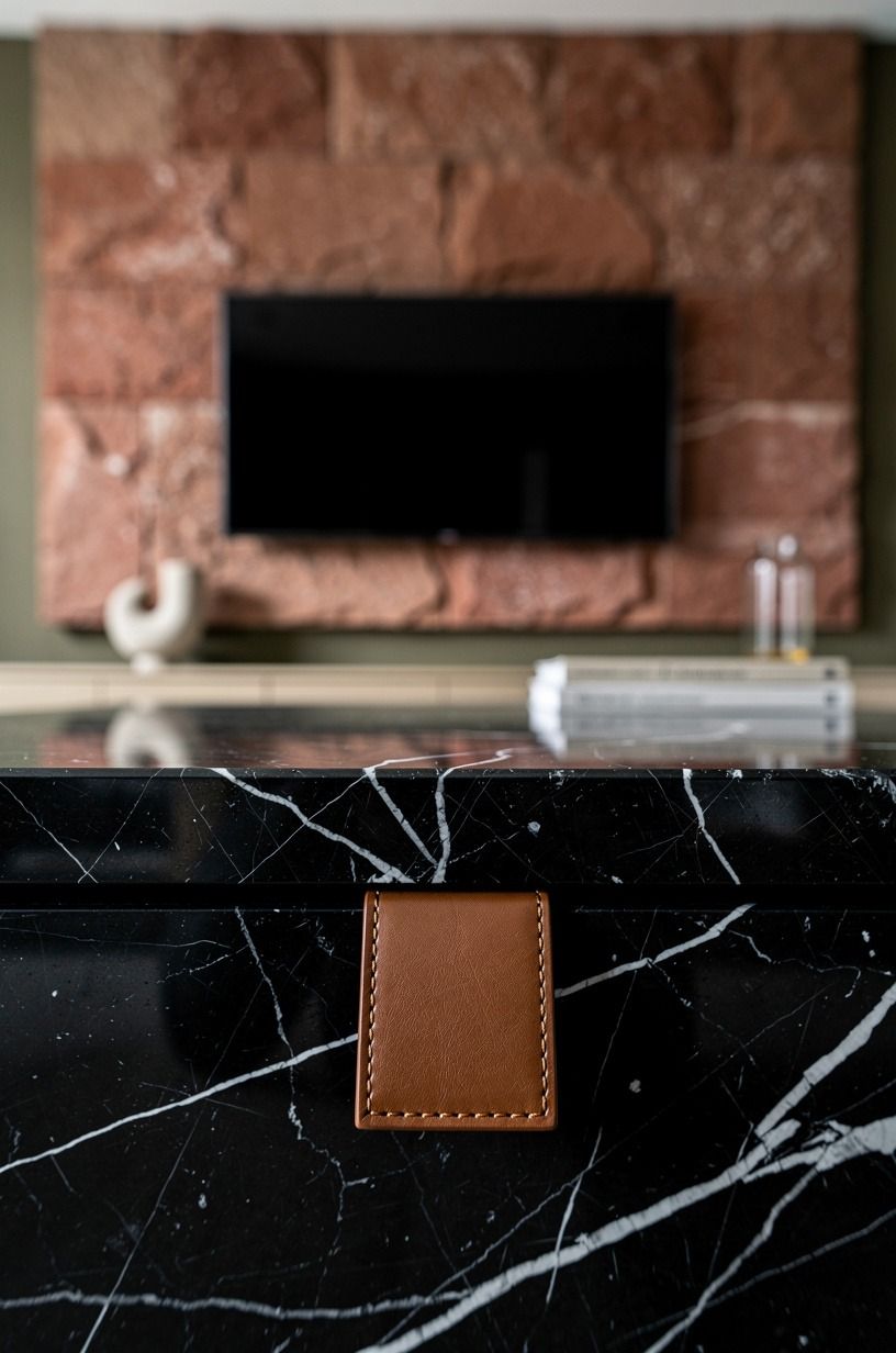
Style the console with objects that stay low, because tall decor fighting the lower edge of the screen looks messy fast.
12Finish with West Elm sconces flanking the wall
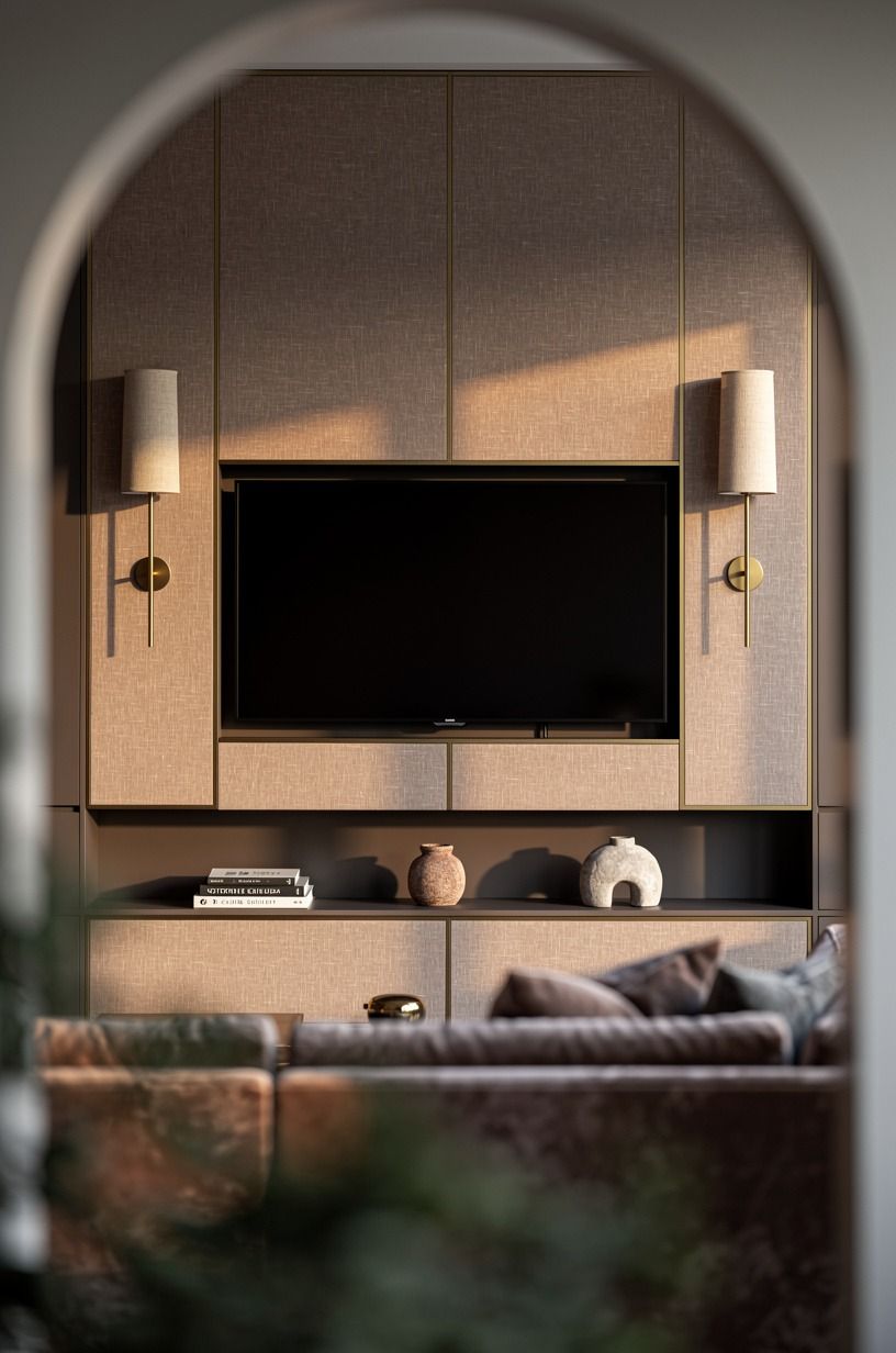
Finish with sconces if the wall still feels a little too flat after everything else is in. Flanking light gives the whole composition a final outline, and that's what often pushes a modern tv wall from nice to memorable. I like slim unlacquered brass sconces from the West Elm Industrial Collection or Schoolhouse Electric pivots with dimmable 2700K bulbs, mounted so the glow lands on the panel and not right into your eyes from the sofa.
The image works because the wall is framed through foliage or an arch, then the sconces carry that clay, linen, and brass mood across the whole corner. The mohair velvet seating helps too.
Soft upholstery plus directional light is one of those combinations that always photographs better than you think it will. But it also lives better.
Evening rooms need side light, not ceiling glare!
If your budget only covers one lighting upgrade, I'd still make it this or the LED strips. Sconces bring shape to the wall even when the TV is off, and that's half the battle. If you want more examples of a room finishing strong with side lighting and soft materials, reading nook bench ideas with evening glow show the same payoff in miniature.
Why some media walls feel custom and others feel stuck there
Here's my honest take after watching people spend wildly different amounts on the same idea. The media wall that feels custom is usually not the one with the biggest budget. It's the one where somebody made three disciplined decisions and didn't flinch.
They picked a wall finish. They picked a storage line.
They picked a lighting plan. Then they stopped adding noise.
I think people get in trouble because the category invites showing off. The wall can hold stone, slats, cabinets, art, a fireplace, speakers, and decor, so your brain starts telling you more equals better.
It doesn't. The wall turns stiff the second every square inch is asked to prove something. You can feel it when you walk in.
The room looks expensive, but it doesn't look easy.
What I keep coming back to is this: the TV is already the loudest object in the room. Your job is not to compete with it.
Your job is to civilize it. That's why I lean toward one strong panel, one long low unit, and one layer of low-glow lighting before anything else.
If the bones are right, the rest of the room can breathe. If the bones are wrong, you'll keep shopping forever and the wall still won't land.
And yes, I have overworked one of these before. I added extra shelves because the wall felt empty. Then I added more objects because the shelves felt empty.
Then the whole thing felt like a store display. I stripped it back to one panel, one floating console, and two sconces, and suddenly the wall made sense again.
That was the room that taught me restraint isn't minimalism for its own sake. It's what lets walnut read rich, travertine read soft, and brass read warm instead of flashy.
So if you're building your own, don't chase complexity first. Chase order.
Put the structure in. Hide the cables.
Light the wall for evening. Then stop and look at it from the sofa (not from two feet away with a drill in your hand).
If the wall already feels calm, you're closer than you think. For more quiet-storage thinking that doesn't depend on a giant budget, hidden pantry ideas with cleaner surfaces make the same case in another room.
What People Always Want to Know
What's the best modern media wall for a small living room?
A floating walnut console plus one full-height panel is the best small-room move because it keeps the floor open and the eye traveling up. I'd skip bulky side cabinets, keep the TV centered, and borrow the low-clutter logic from small oak kitchen ideas that stay airy.
Where can I buy modern media wall pieces on a budget?
Start with IKEA, Target Threshold, and Wayfair for consoles, lamps, and plain-front storage you can customize with paint. Facebook Marketplace is still the best place for secondhand walnut furniture, stone lamps, and art. And if you want hardware ideas before you swap pulls, subtle cabinet hardware upgrades are worth saving.
How much does a modern media wall makeover cost?
A cosmetic version usually runs about $300 to $1,200, while a more built-in mid-range wall tends to fall between $2,500 and $8,000. Custom millwork and a fireplace wall push it much higher. The free win is editing clutter, relocating decor, and changing the light temperature.
Can I create a modern media wall on a budget?
Yes, and you can get surprisingly far with paint, a longer console, and better lighting. Cheap moves: painter's tape mockup, a painted panel in Benjamin Moore Revere Pewter HC-172, warm LED strips, and a Facebook Marketplace unit refinished in walnut stain. You do not need custom joinery on day one!
Is a modern media wall worth it in a small space?
Yes, because a small room benefits most from one wall doing several jobs at once. You get TV zone, storage, and atmosphere without adding extra furniture. Keep the unit floating, keep decor low, and let the viewing distance stay honest so the room doesn't feel crowded.
Is a modern media wall a good idea for a rental?
Yes, if you swap in renter-safe versions. Use a paintable cord cover instead of an in-wall channel, a removable slat panel mounted on a backer, and plug-in sconces instead of hardwire fixtures. The wall can still look clean, and your deposit stays intact.
Where I'd Start First
If I had to pick one step, I'd start with the floor-to-ceiling panel. Without that tall frame, the TV still reads like equipment, and every other dollar has to work harder.
Get the wall plane right first. Everything else lands.


