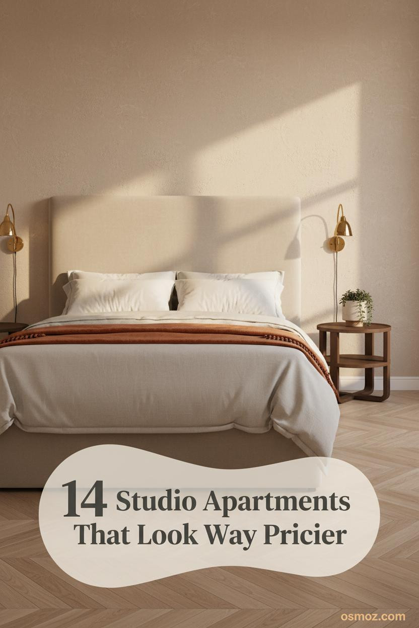
14+ Cozy Studio Apartment Ideas That Make Small Feel Intentional
09 may 2026The first thing you notice in a good cozy studio apartment is that nothing feels like a compromise. Every piece has a reason. Every corner has been considered.
These 14 layouts prove that small can feel intentional, warm, and genuinely worth coming home to.
The Slatted Wood Wall That Makes a Studio Feel Like a Choice
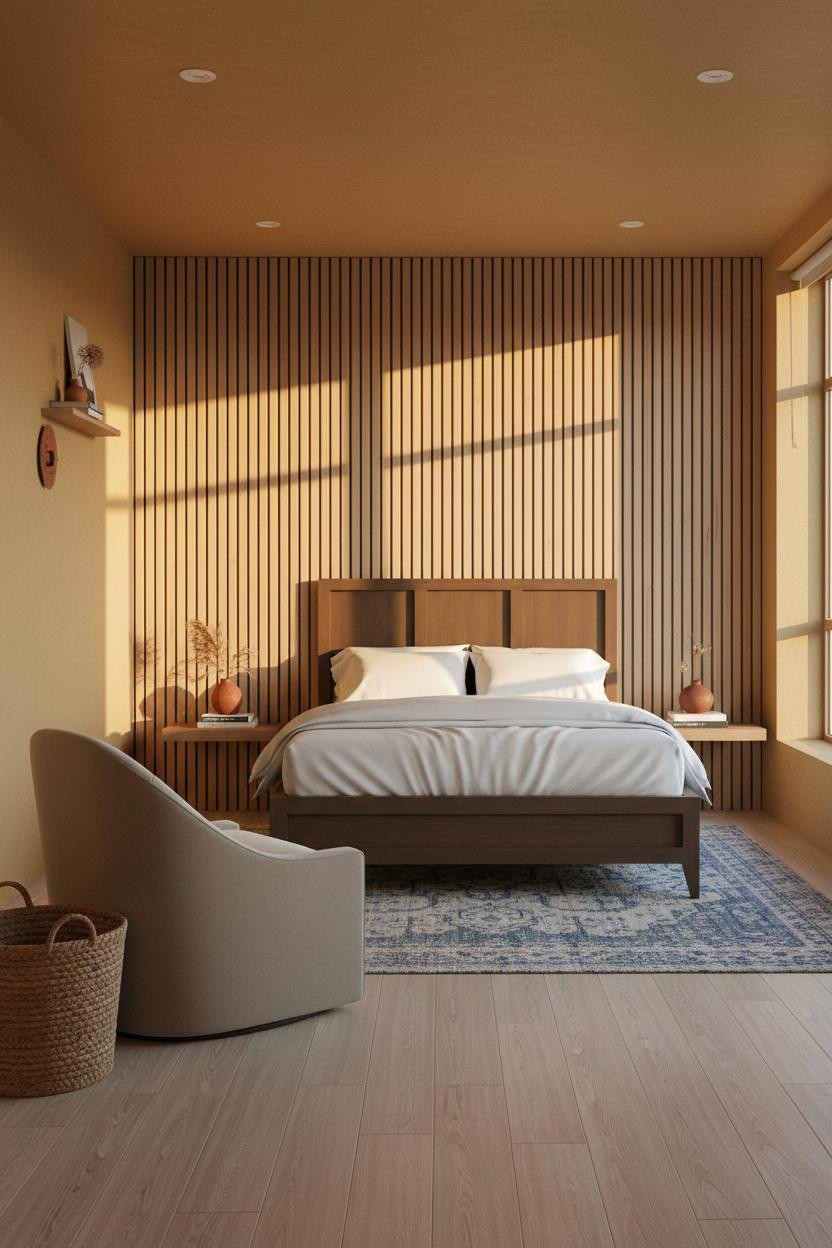
I keep coming back to this one. The whole room feels anchored without a single heavy piece of furniture.
Why it holds together: The floor-to-ceiling slatted ash wall gives the room a vertical rhythm that makes the ceiling feel taller and the footprint feel deliberate. Each shadow channel between slats does more work than any paint color could.
Steal this move: Angle the swivel chair inward toward the bed. It turns a dead corner into a proper reading zone.
Cream Linen Curtains That Double as Architecture
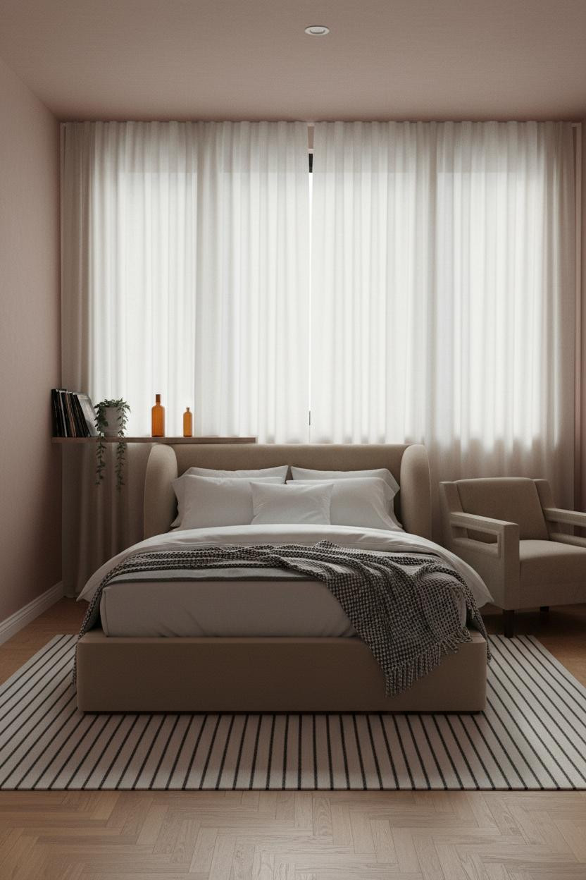

Soft statement. Floor-to-ceiling curtain panels on a single wall quietly outperform any piece of art.
And honestly, the reason this works is simple: full-height cream linen panels compress the color palette down to almost nothing, which makes the warm honey herringbone floor the only thing competing for attention. The room feels calm and cohesive without much effort.
What to borrow: Hang the rod at ceiling height, not window height. That one change buys you a foot of visual space.
When Raw Plaster Does Everything the Furniture Doesn't Have To
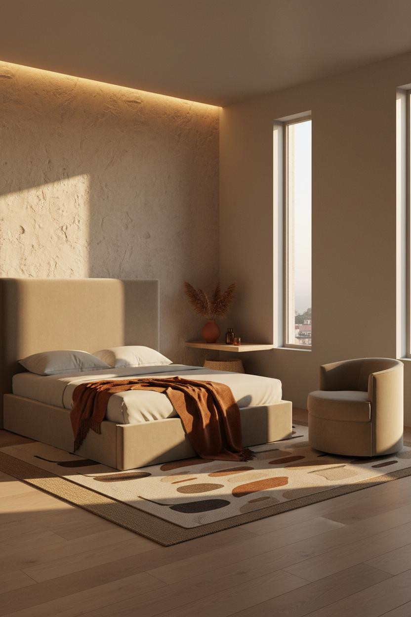

This is the kind of room that makes you want to slow down the second you walk in.
What gives it depth: Hand-troweled raw plaster catches afternoon light differently every hour, so the wall feels alive in a way that painted drywall simply can't replicate.
The finishing layer: A burnt orange throw draped at the foot of the bed ties directly into the plaster's warm sand tones. Nothing matches. Everything connects.
A Steel Grid Window That Turns Natural Light Into Decor
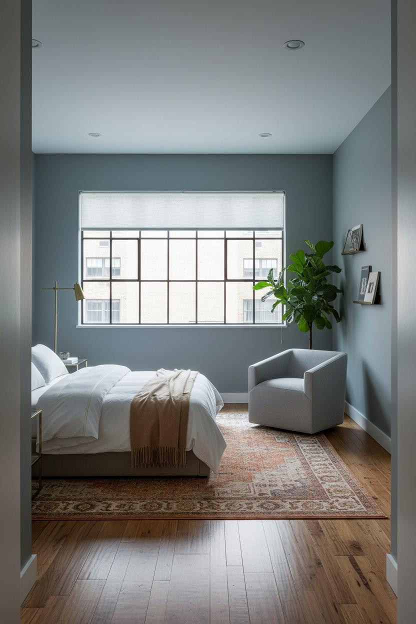


Fair warning. This look is divisive, and it only works if you commit to it fully.
But the studios that lean into Crittall-style steel-grid architecture always feel more considered than the ones that play it safe. The slim black steel frames cast clean geometric shadows across the room at low light, giving a compact space the graphic weight it usually needs three art pieces to achieve.
Avoid this mistake: Don't mix warm wood tones here. Keep the furniture palette in cool neutrals so the steel stays the focal point.
The smarter choice: Reclaimed wood flooring in a warm brown keeps it from tipping into too-industrial territory.
Built-In Birch Shelving as the Organizing Spine
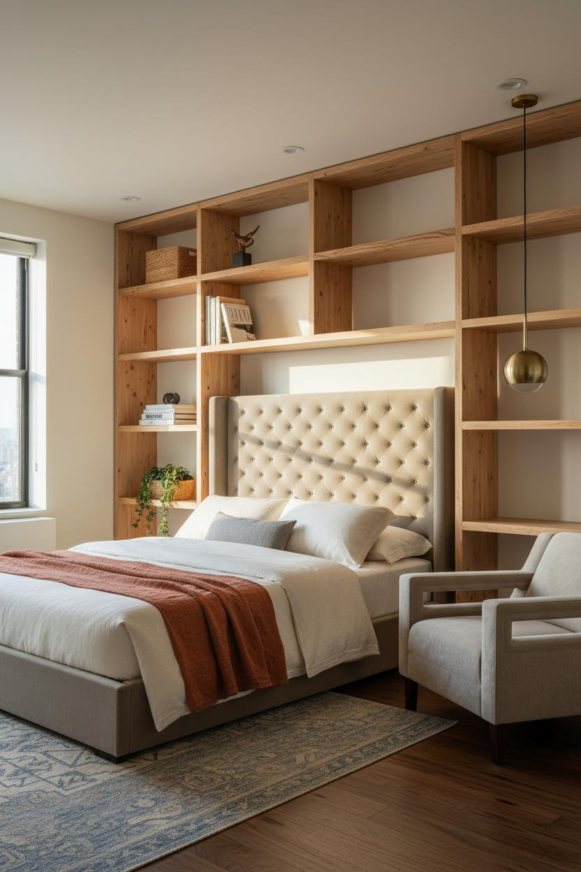

Nothing fancy. That's the point.
Design logic: Floor-to-ceiling natural birch open shelving gives a studio its organizing structure, which means the furniture can stay low and unfussy while the room still reads as intentional. The warm grain does the heavy lifting.
Style the shelves in loose clusters rather than neat rows. A little breathing room between objects makes a packed wall feel collected rather than crowded.
Half-Height Wainscoting That Grounds a Compact Room
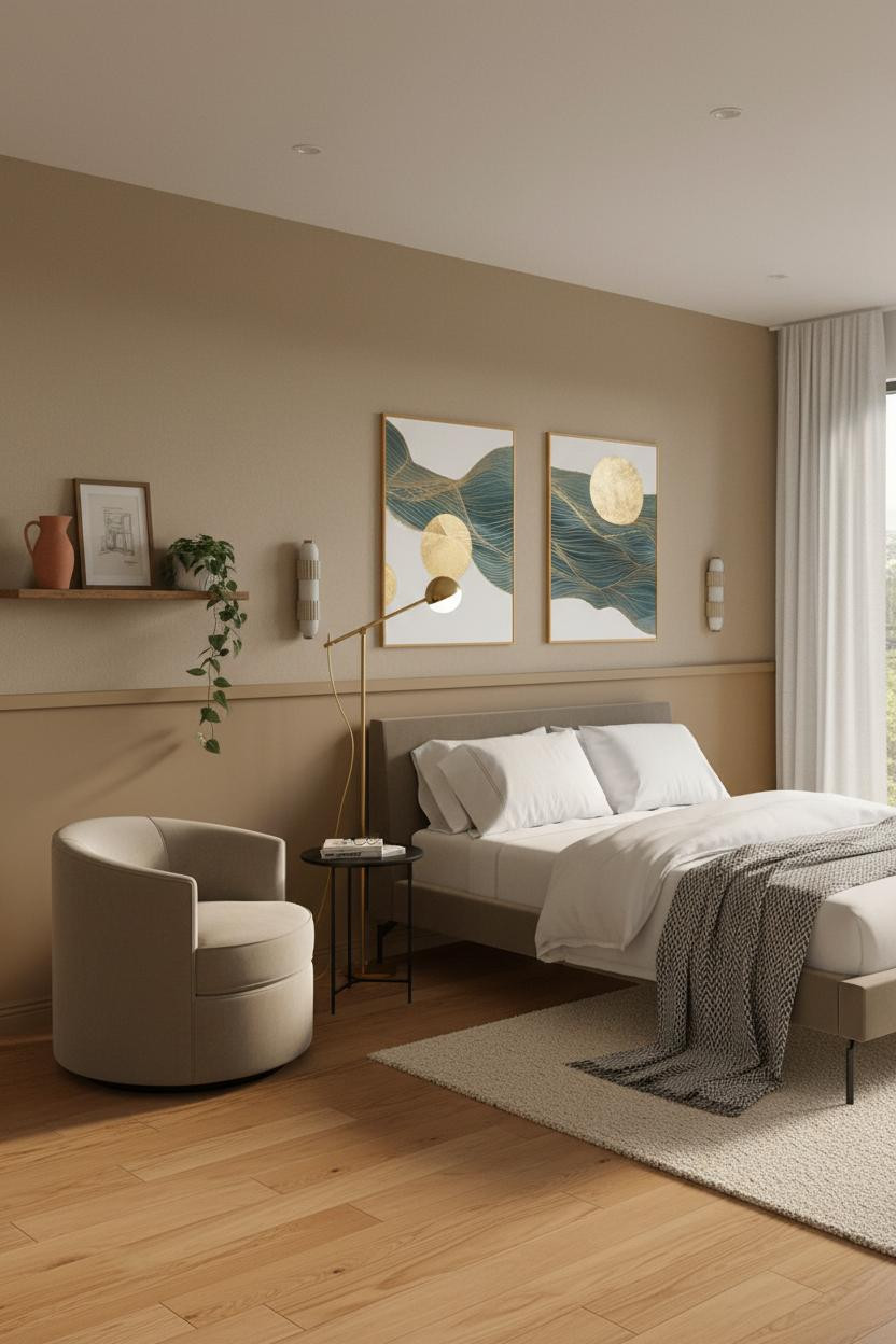

I underestimated this move for years. A slim timber rail at mid-wall height actually changes how the whole room reads.
Why it feels intentional: The matte camel wainscoting creates a horizontal anchor at eye-level while standing, which makes the ceiling feel taller and the furniture feel more considered. It's a quiet architectural detail that costs almost nothing.
What to copy first: Match the wainscoting tone to your flooring. Warm maple floor, warm camel paint. The transition between zones disappears.
The Floating Oak Shelf That Earns Its Place
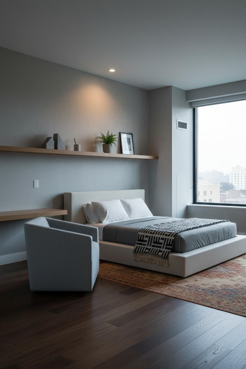
In a studio, every element has to justify the wall space it takes. This one does.
What makes this work: A full-width recessed white oak shelf at just above eye level adds storage and architectural precision in a way that a freestanding bookcase never manages, especially when the matte wall behind it stays bare. The room feels warm and lived-in without feeling full.
Pro move: Keep the shelf to three objects. Concrete bookends, something green, something personal. Resist the urge to fill it.
Terracotta Walls With Staggered Oak Shelves
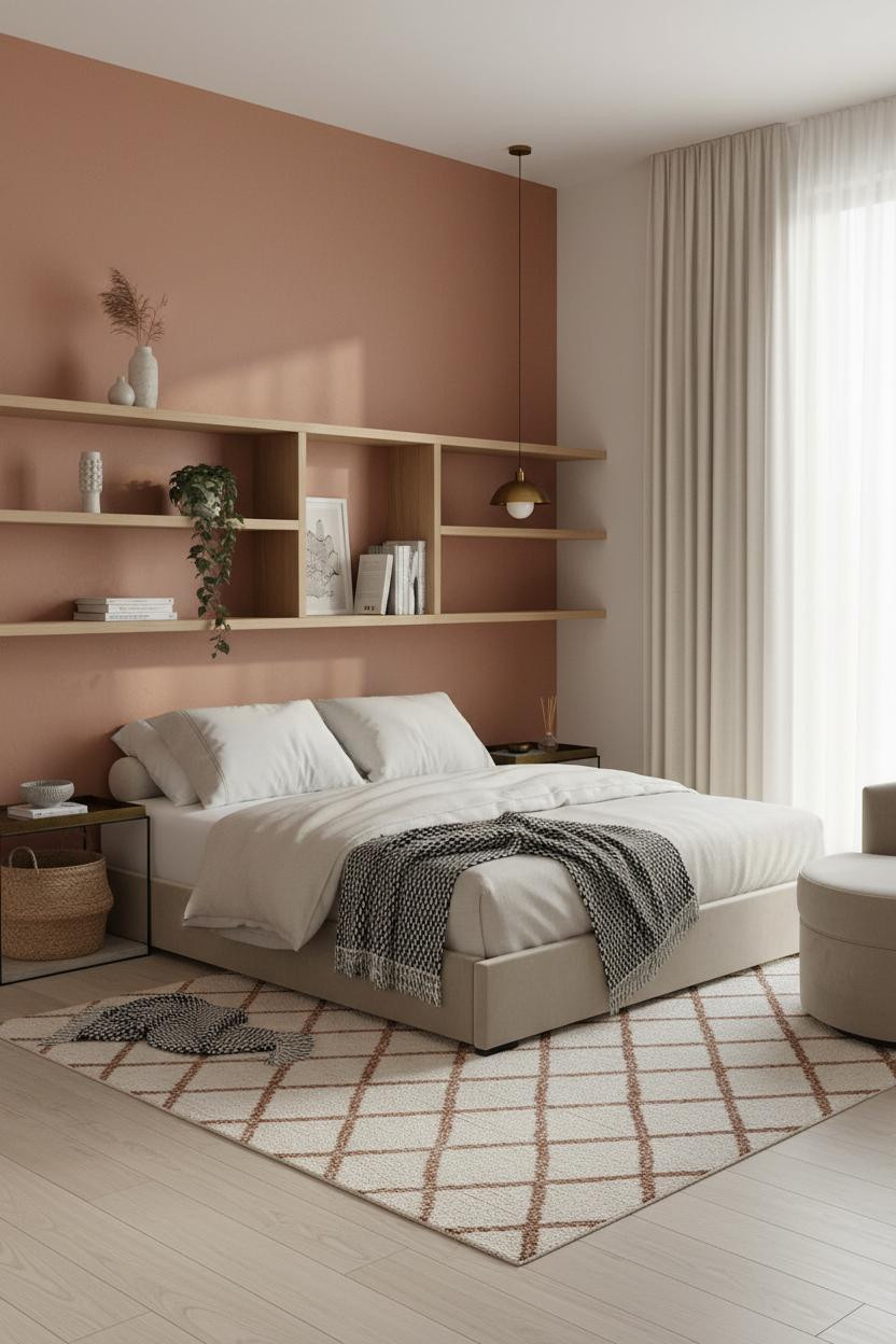

This one surprised me. The combination shouldn't feel as grounded as it does.
Why the palette works: Staggered natural oak shelf tiers against a terracotta plaster wall create enough contrast to read as intentional, while the pale birch floor keeps the warmth from tipping too heavy. It's a small space that somehow feels generous.
Worth copying: Let one shelf overflow slightly. A trailing plant over the lower edge is what makes the whole thing feel inhabited rather than styled.
Dusty Rose Panel Molding That Lifts a Small Room
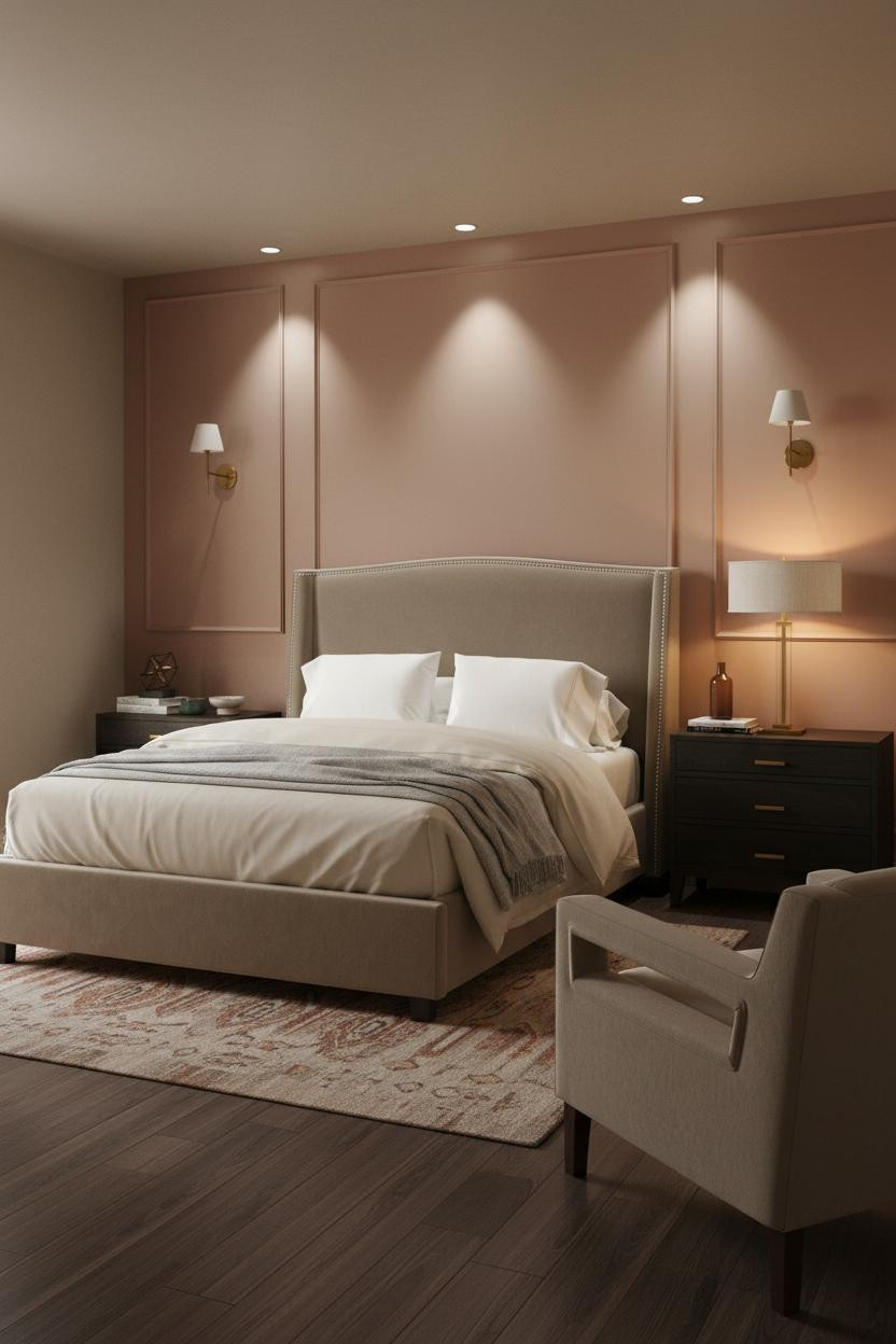
Admittedly, dusty rose panel molding sounds like a risky call. But I've seen this specific combination executed well enough to change my opinion.
Why it looks custom: Vertical panel molding in warm dusty rose catches raking light in its crisp shadow lines, adding architectural depth that a flat painted wall just doesn't have. The shadow does the decorating for you.
Where people go wrong: Don't pair it with anything too pink or too grey. Stay in mushroom and cream on the other walls. The molding needs neutral support to land correctly.
Board-and-Batten in Warm Cream: Small Space, Big Architecture
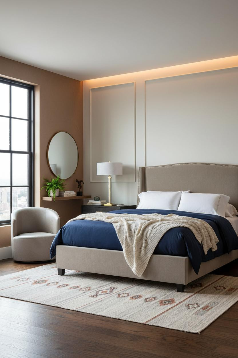
Having a strong architectural element on the sleeping wall changes how you actually use the rest of the room. It takes the pressure off everything else.
The board-and-batten in matte warm cream draws the eye upward with crisp vertical lines, which makes a compact footprint read taller. The real strength here is that the treatment costs far less than wallpaper but reads as just as considered. Pair it with a dark narrow-plank floor and the contrast is immediate.
Walnut Shelving Against Olive Walls: The Botanical Move
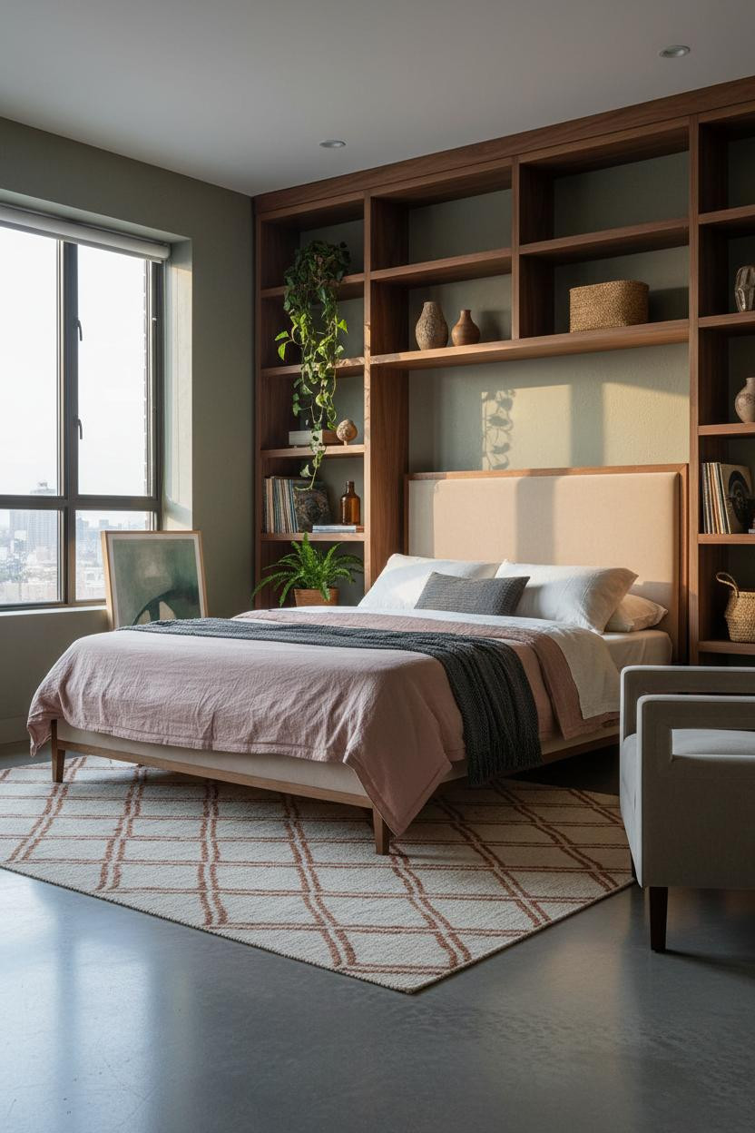

This is the combination I recommend most to people who want their studio to feel like it has a point of view.
Why the materials matter: Floor-to-ceiling walnut shelving against matte olive walls creates the kind of warmth that saturated paint alone can't, because the natural wood grain adds a second layer of texture that the room actually needs. The concrete floor keeps it grounded.
The detail to keep: One slightly overcrowded shelf. A trailing plant spilling past the edge. That small imperfection is what makes the whole wall feel lived-in rather than decorated.
Oak Shutters as the Whole Design Strategy
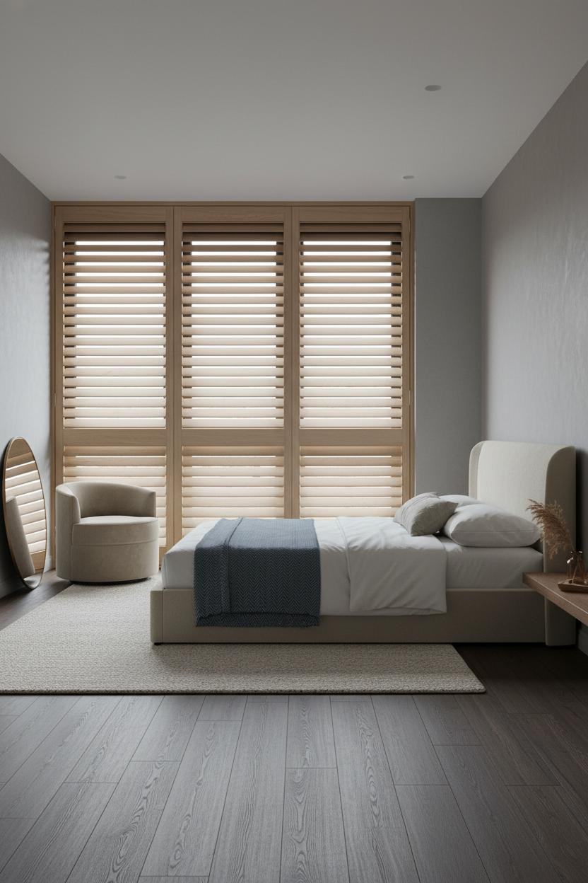

It might seem like a lot to commit a full wall to shutters, but this is exactly the kind of move that makes a studio feel considered instead of just furnished.
Why it feels balanced: Full-height natural oak shutter panels filter light into soft horizontal bands across the floor, which creates rhythm in a room that has almost no architectural detail otherwise. The dark walnut floor pulls it away from beach-house territory.
Skip this: Don't add a second statement piece. The shutters are the room. Let everything else sit quietly around them.
Sage Walls With Ivory Linen Curtains: The Quiet Version
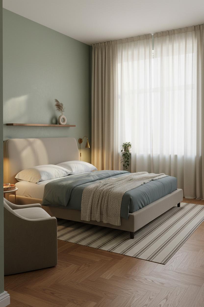
The room feels calm and cohesive in the way that takes people weeks to figure out how to achieve.
Why it lands: Matte sage walls and ivory linen Roman shades work because the two tones sit close enough on the warm spectrum to feel like one decision, while the honey herringbone parquet adds just enough contrast to keep the palette from going flat. Nothing fights. Everything supports.
One smart swap: Paired sconces at the bed instead of a single overhead pendant. Two points of warm light make the sleeping zone feel like its own room within the studio.
Exposed Brick and Golden Light: The Most Forgiving Combo
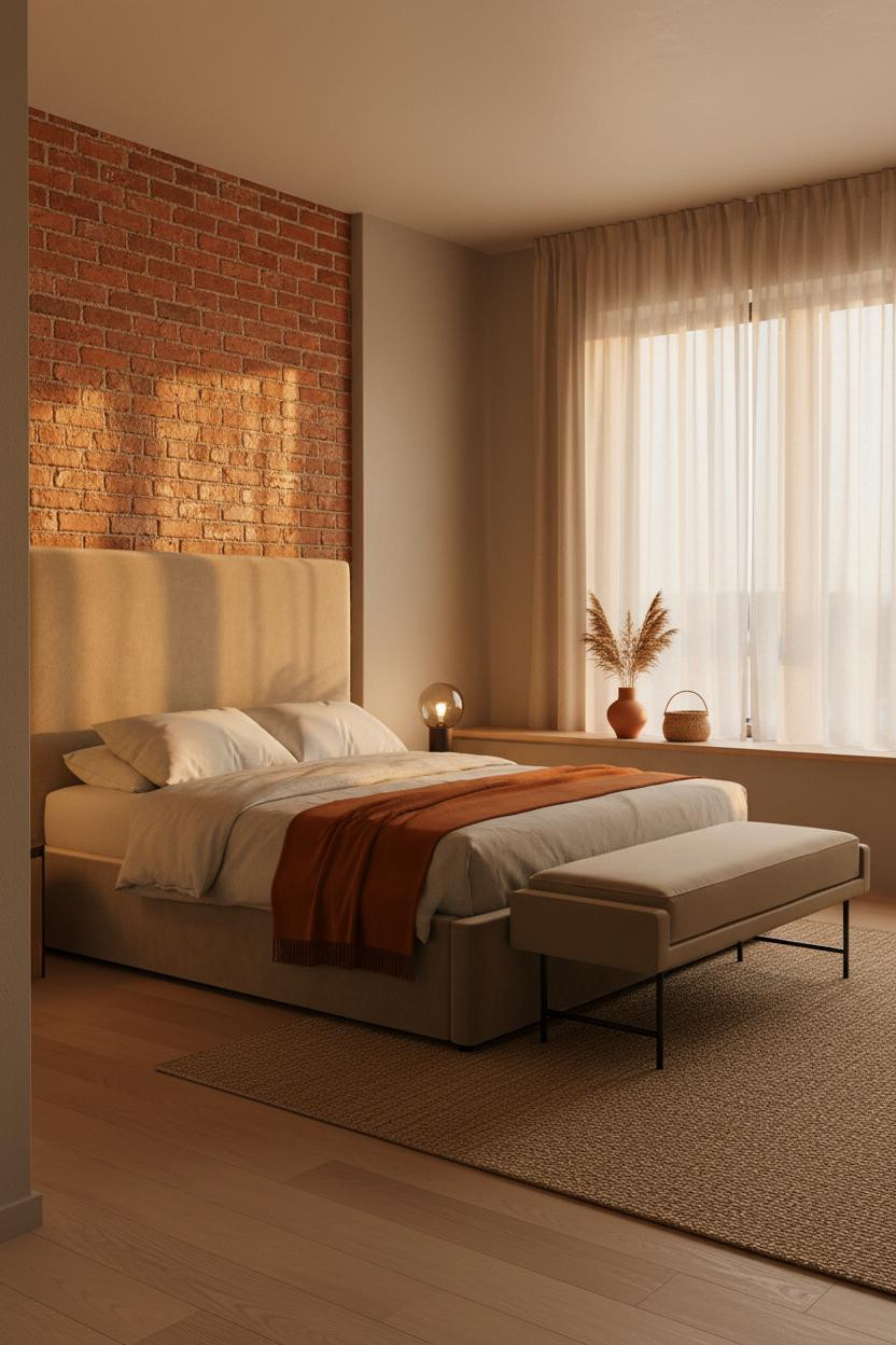
I've never seen an exposed brick wall not work when the light hits it right. It's almost unfair.
What creates the mood: Aged terracotta brick absorbs late afternoon sun in a way that no painted surface can replicate, and the rough mortar lines add micro-texture that makes the room feel warm and intimate without a single additional accessory. A cushioned bench at the foot of the bed solves the morning routine in a studio layout where there's nowhere else to sit and put on shoes.
The easy win: A floor lamp at low wattage in the corner beside the bed. Brick plus warm pooling light is honestly all the atmosphere this kind of space needs.
 Our #1 Pick
Saatva Classic Mattress
America's best-selling online luxury innerspring. 365-night trial, lifetime warranty, free white glove delivery.
Shop Saatva Classic
Our #1 Pick
Saatva Classic Mattress
America's best-selling online luxury innerspring. 365-night trial, lifetime warranty, free white glove delivery.
Shop Saatva Classic
The Foundation Of Every Beautiful Bedroom
Walls get repainted. Linen gets swapped out. The mattress stays. And in a studio apartment especially, the bed isn't just a piece of furniture. It's the room.
The Saatva Classic is what I'd put under every one of these setups. Dual-coil support that holds its shape year after year, breathable organic cotton that doesn't trap heat, and a Euro pillow top that feels right without going too soft. It's the kind of mattress you stop thinking about because it simply works.
Start with the bed. The rest figures itself out.

The rooms people save are the ones where nothing looks accidental. Every layout in this list proves that a small footprint and a considered one are exactly the same thing.


