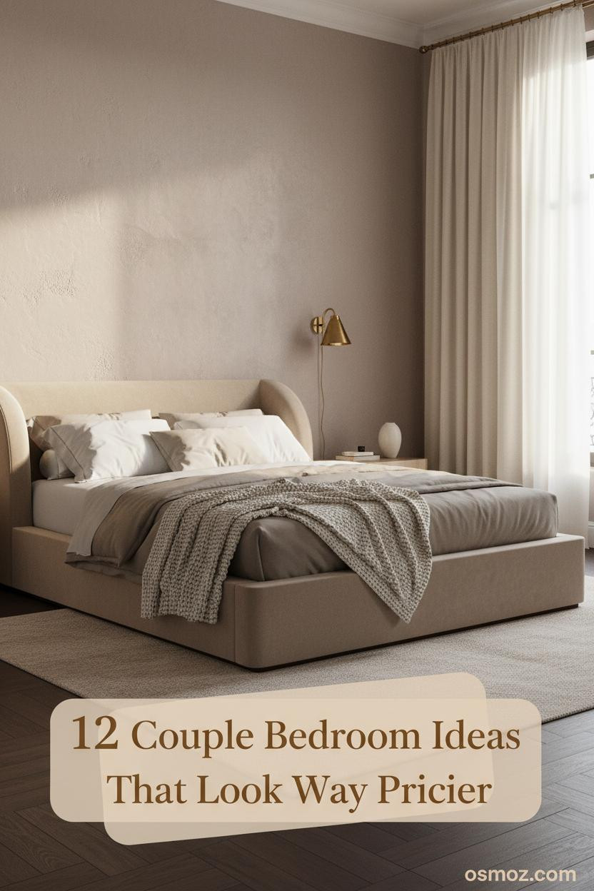
12+ Couple Bedroom Ideas That Actually Feel Like Yours
08 may 2026The best room ideas for couples bedroom don't look designed. They look chosen. Slowly, together, over time.
These 12 rooms prove that a shared space can feel like both of you without trying too hard.
The Gallery Wall That Makes The Room Feel Like Home
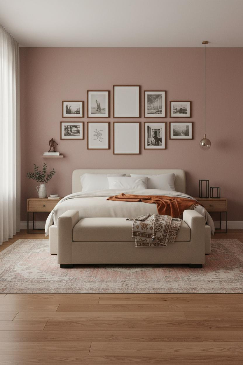

I keep coming back to this one. There's something about a full wall of mismatched frames that feels genuinely shared, like two people's tastes just landed somewhere together.
Why it works: The dusty rose matte plaster is warm enough to tie every frame together while still letting each one read on its own. No single style dominates.
Steal this move: Mix thin black metal and warm wood frames in similar sizes. Nothing too matchy, nothing precious. Let the wall look like it grew.
Oak Paneling That Earns Its Place On The Wall
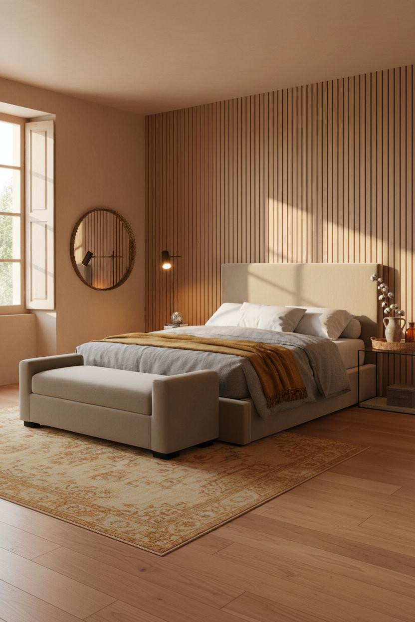

Bold choice. Vertical slatted paneling behind a bed can go wrong fast.
But when it's done in full-height slatted oak with narrow grooves catching side light, the result is honestly one of the best things you can do to a shared bedroom wall.
Why it looks custom: The shadow lines from the grooves give the wall texture that shifts through the day, so the room feels different at noon than at dusk.
The key piece: Pair it with a warm clay wall color on the other three sides. That's what keeps the oak from reading cold.
What A Steel Window Wall Does To A Small Bedroom
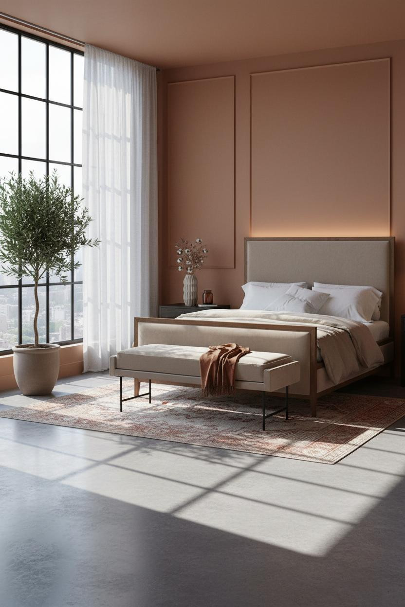

This is the kind of room that makes you want to slow down a morning. And the Crittall-style window wall is doing most of the heavy lifting.
Design logic: Slim black steel grid frames divide the light into geometric panes across warm terracotta walls, giving an apartment bedroom architectural scale it wouldn't otherwise have.
Pro move: Keep the rest of the room quiet. One strong architectural element is enough. Let the walls and bedding stay in the same warm family.
Why Shiplap Works Better Than Any Accent Wall Paint
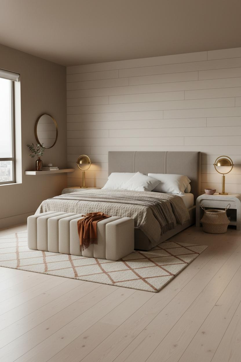

Shiplap tends to read farmhouse. This version doesn't (and that's the point).
The reason it works here: soft cream horizontal boards in the same family as the warm taupe walls keep the texture reading as subtle rhythm, not a statement. The shadow lines do the work quietly.
The easy win: Paint the shiplap one shade lighter than the walls instead of stark white. The room feels layered rather than split.
I Didn't Expect Shelving To Change The Whole Mood
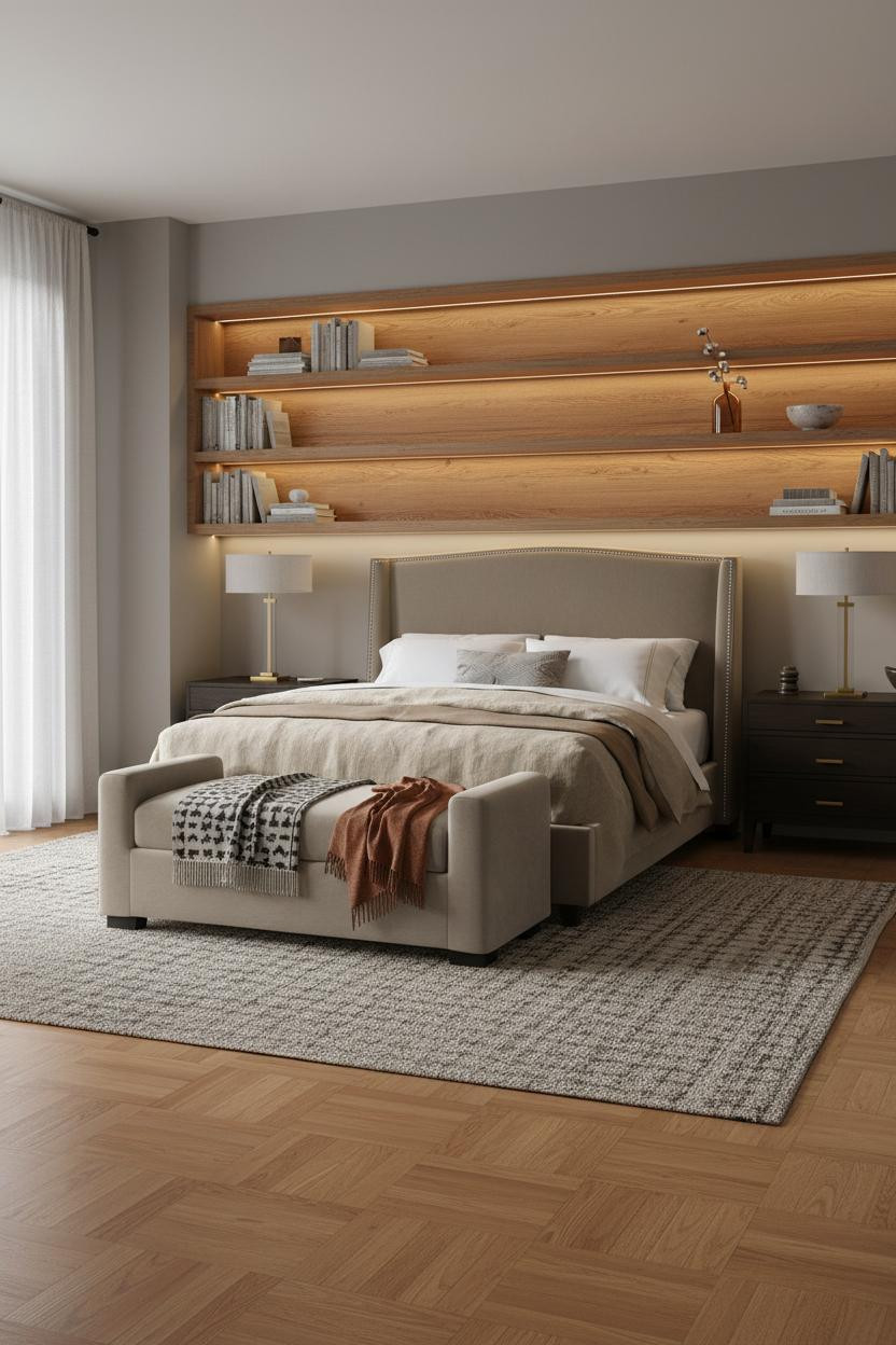
Full-width floating shelving opposite a bed sounds utilitarian. But in warm honey-stained oak against stone grey walls, it actually grounds the whole room in a way a headboard wall can't.
What creates the mood: A warm LED strip under the shelves pools amber light across the grain at night, which is what makes this work better than overhead lighting alone.
Leave negative space between objects on the shelves. A few stacked books, one dried stem, one ceramic bowl. Collected, not filled.
Floor-To-Ceiling Paneling That Feels Calm Not Loud
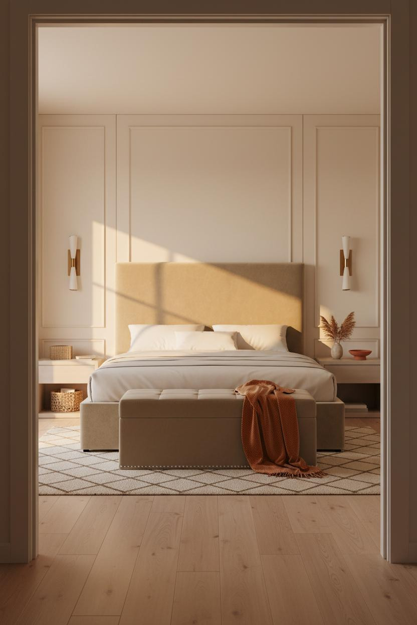

I almost wrote this one off as too formal. Glad I looked longer.
The warm ivory painted timber relief panels read soft rather than architectural, especially when the wall color and the panel color stay within the same creamy family. The horizontal division lines catch morning light without making the room feel stiff.
Avoid this mistake: Don't go stark white. That's where this look tips from calm into clinical. Stay in the warm ivory and oat range and the room feels genuinely relaxed.
Board And Batten That Doesn't Look Like A Pinterest Template
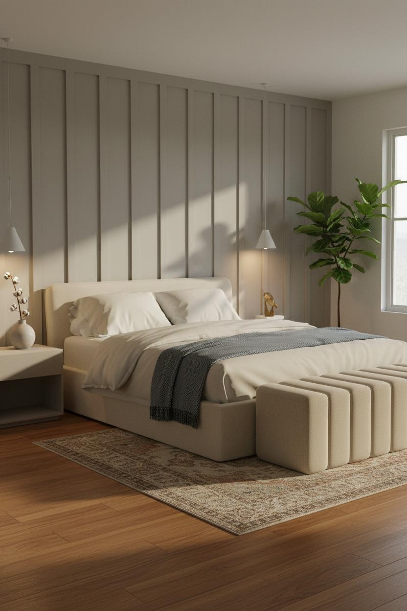
Board and batten gets overused. But the version that avoids feeling like a template is the one where the wall color and trim are the same tone. Here, dove grey boards on a dove grey wall give vertical rhythm without the contrast getting loud.
Why it feels balanced: The warm honey reclaimed wood floor underneath keeps the cool grey from going flat. The two tones hold each other up.
A steel-blue herringbone throw at the foot ties the wall color back into the bedding. Small move. Immediate payoff.
The Blush And Walnut Combination I Keep Recommending
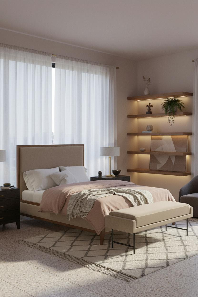
The room feels warm and collected in a way that's hard to pin down at first. Then you notice the floating walnut shelving pulling everything together across the wall.
Why the palette works: Soft blush mauve walls and warm walnut grain sit in the same red-earth family, which is why the combination feels cohesive rather than matchy (a distinction that actually matters).
What to borrow: Keep the shelves sparse. Two objects with breathing room between them beats five objects crowded together every single time.
Sage And Wainscoting: A Quieter Take On The Two-Tone Wall
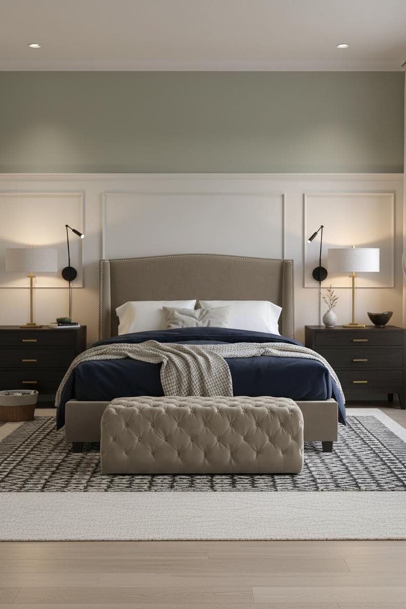
Two-tone walls usually split a room. This one doesn't, and the wainscoting height is why.
What makes it work: Soft white wainscoting kept at waist height lets the sage above breathe, so the room feels like a calm backdrop rather than a design statement competing with itself.
Bedside lamps at low warmth keep this palette from going cold at night. The room feels intimate and easy, especially when the morning light is still pale.
A Forest Green Arch That Actually Works In A Shared Room
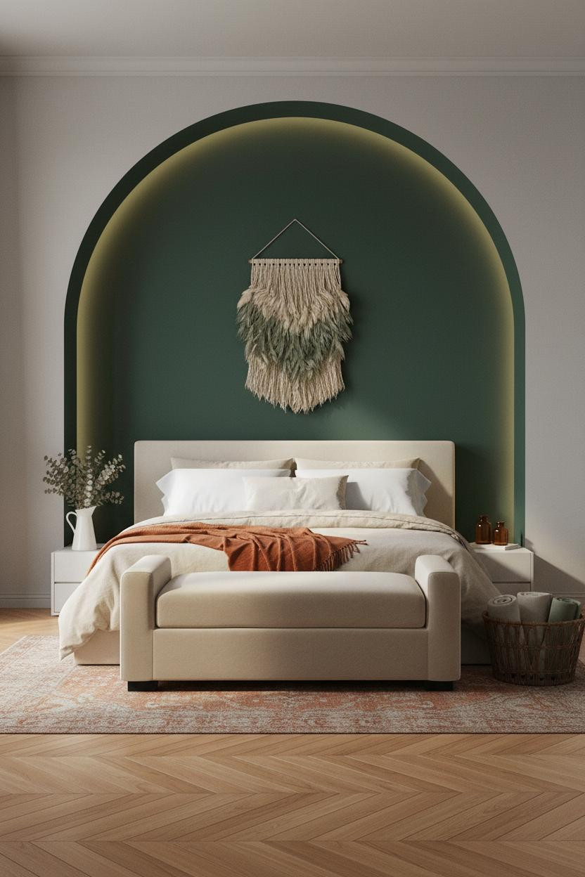
This one is divisive. But the couples who commit to a deep-colored arched niche behind the bed never seem to regret it.
Why it gives the room presence: The curved plaster painted in forest green frames the bed like a piece of architecture, which makes even a plain headboard look considered. The remaining stone grey walls keep it from overwhelming.
Where people go wrong: Painting the arch the same color as the rest of the room. The whole point is contrast. Commit to it.
Dusty Blue Walls With Built-In Shelving: The Combo That Ages Well
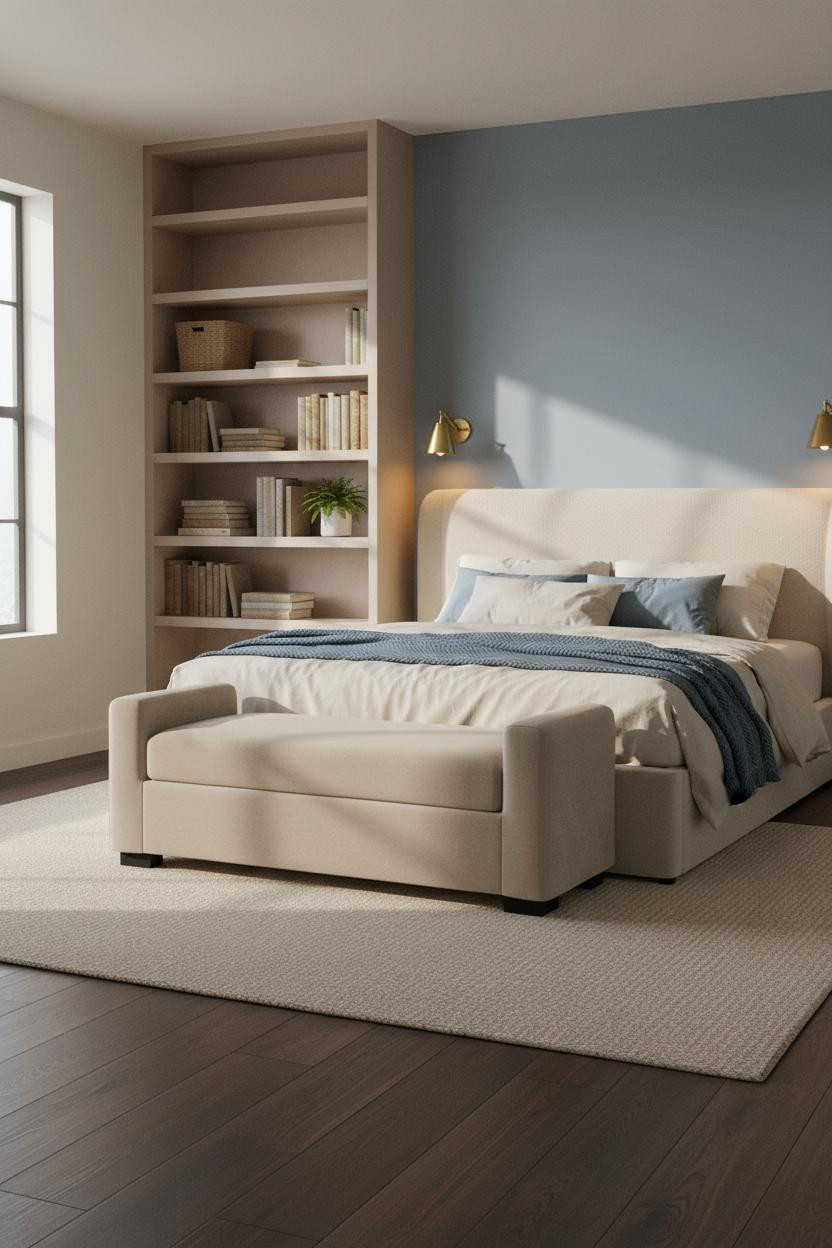

Admittedly, I was skeptical about floor-to-ceiling built-in shelving in a bedroom for two. It can feel like a home office sneaked in. But this version works because the shelves are pale, open, and lightly styled.
The real strength: Dark walnut flooring anchors the cool dusty-blue wall without making the room feel heavy, because the warm wood does the grounding work the pale shelves don't.
Worth copying: Pair warm sconces flanking the headboard against the cool wall. That contrast is what keeps the room feeling lived-in rather than just styled.
Japandi Done In A Way That Feels Like Two People Live There
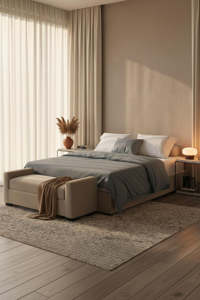

Most Japandi bedrooms look like a showroom. This one doesn't, and the matte mushroom plaster wall catching afternoon light is a big part of why.
What gives it presence: Textured plaster shifts subtly through the day in a way flat paint never does. It keeps a minimal room from feeling empty while still feeling calm and cohesive.
Floor-to-ceiling cream linen curtains do two things: they soften the light and they give the room a sense of scale that shorter panels never achieve. Go full height or skip them.
 Our #1 Pick
Saatva Classic Mattress
America's best-selling online luxury innerspring. 365-night trial, lifetime warranty, free white glove delivery.
Shop Saatva Classic
Our #1 Pick
Saatva Classic Mattress
America's best-selling online luxury innerspring. 365-night trial, lifetime warranty, free white glove delivery.
Shop Saatva Classic
The Foundation Of Every Beautiful Bedroom
Every room in this list works because the design choices are intentional. But a shared bedroom only feels truly right when the bed itself is right for both of you.
The Saatva Classic is built for exactly that. Dual-coil support means two different sleep styles can coexist without compromise. The Euro pillow top has that settled-in softness that holds up, and the breathable organic cotton doesn't trap heat on either side of the bed.
Walls get repainted. Linens get swapped out. The mattress stays. Start with one that's worth keeping.

The rooms in this list that feel the most like a couple actually lives there all share one thing: nothing looks like it was chosen to impress anyone. It was chosen because it worked, and it stayed.
Good design ages well because it's made well.


