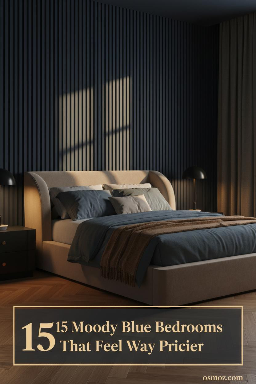
15+ Moody Blue Bedrooms That Are Dark but Still Feel Like Home
20 april 2026Think your walls have to stay pale to feel cozy? The best moody blue bedrooms prove the opposite. Dark can feel deeply livable, and these 15 rooms are the evidence.
From midnight navy to dusty teal, each one holds something worth borrowing. Here's what actually makes them work.
Dark Navy Brick That Makes Amber Light Do Everything
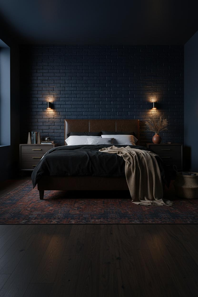

Raw brick painted in midnight petrol blue does something flat plaster simply can't. The mortar lines catch light at an angle, throwing horizontal ridges across the surface that shift every hour.
Why it holds together: The exposed brick texture breaks up the dark saturation, so the room feels consuming without feeling closed in.
Steal this move: A camel wool throw and terracotta vessels are what keep all that deep blue from reading cold.
Color Drenching Through Steel-Frame Windows
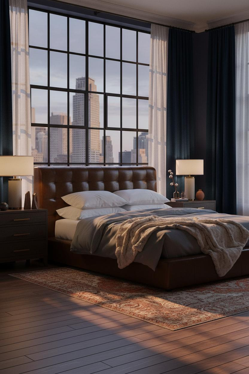

Bold choice. An entire wall of iron-grid Crittall panes behind the bed isn't subtle.
But the geometry does something unexpected. Each pane catches dusk at a different angle, pressing graphic shadow lines across the dusty indigo plaster behind the bed and making the architecture do the decorating.
What to borrow: Floor-to-ceiling midnight-blue velvet curtains on either side keep the steel grid from feeling industrial. The velvet absorbs light where the metal reflects it.
Fluted Plaster That Turns a Wall Into Architecture
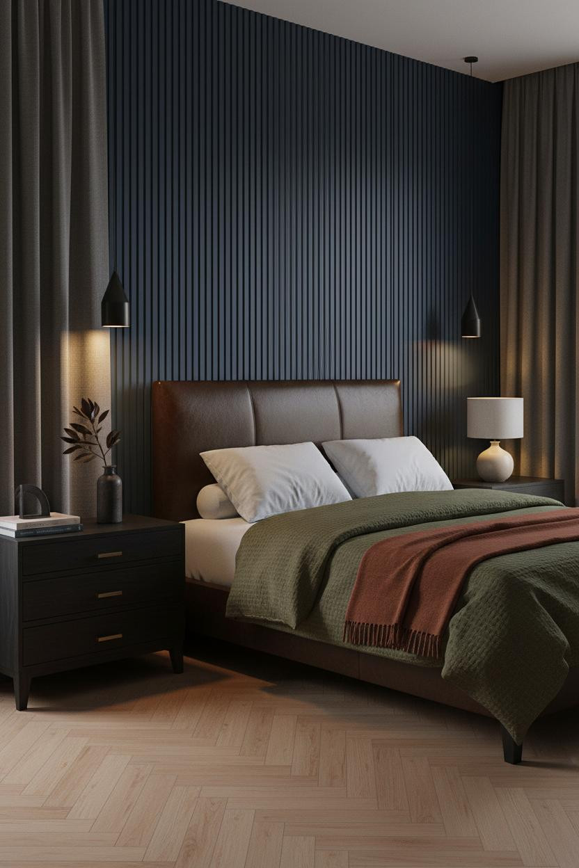
I keep coming back to this one. Something about it feels hushed in a way dark rooms usually don't.
Why it looks custom: Vertical fluted plaster columns on the headboard wall create a rhythm of raised ridges and deep grooves that amber lamplight turns into sculpture. Flat paint would have made this the same room as a hundred others.
The foundation: Pale honey oak herringbone underfoot keeps the Prussian blue from pulling the room into pure drama. Warm floors. Dark walls. That contrast is the whole thing.
Half-Height Wainscoting That Earns Its Keep
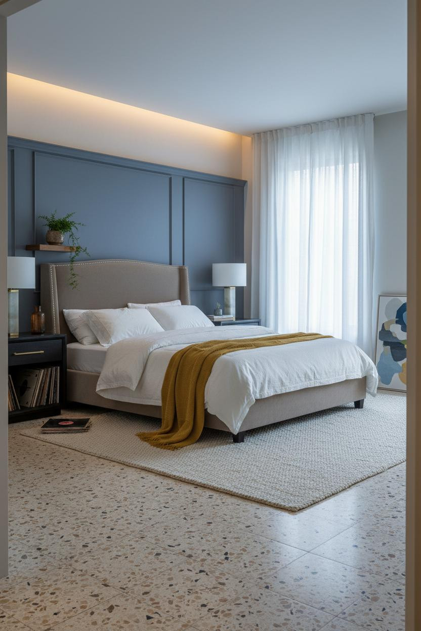
Not everyone wants to commit to full dark walls. This is the honest answer to that.
What makes it work: A Prussian blue-grey matte plaster wainscoting panel runs behind the bed from floor to midpoint, giving the room chromatic weight while warm greige above keeps it from going full cave. The contrast line is where the eye rests.
Pro move: Terrazzo tile with a chunky cream wool rug is smart layering. It keeps the scheme grounded without repeating the dark tone underfoot.
Slate Shiplap That Makes a Bedroom Feel Lived-In
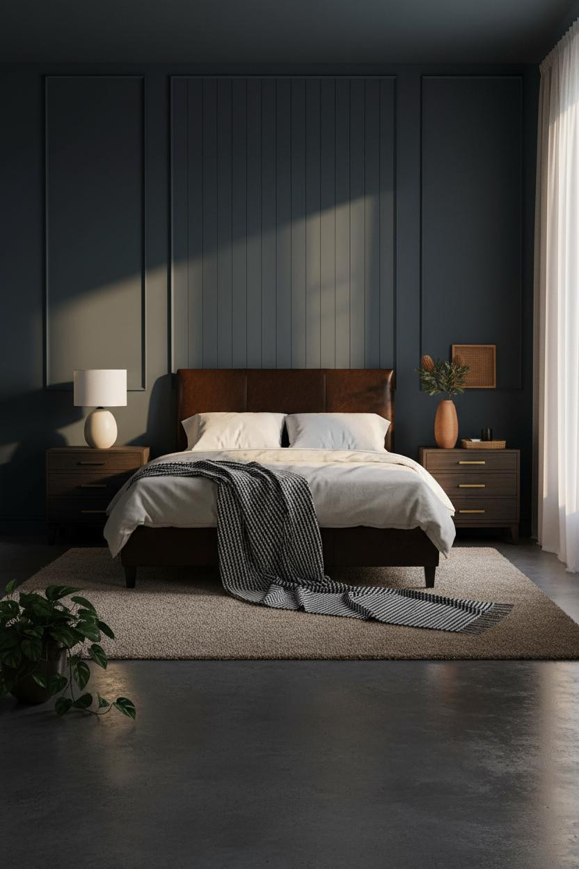
Vertical shiplap painted deep slate blue-grey is one of those moves that looks more expensive than it is. Each board edge catches raking sidelight and throws a thin shadow line down the surface, which means the wall changes character depending on the hour.
Why it feels balanced: Polished concrete underfoot could have made this feel cold, but the oatmeal wool rug anchoring the bed zone absorbs that risk entirely. Room feels warm and cohesive, not industrial.
The easy win: A corner floor lamp at low warmth does more work here than overhead lighting ever could. Aim it up the shiplap, not at the bed.
Teal Walls With a Walnut Panel That Changes Everything
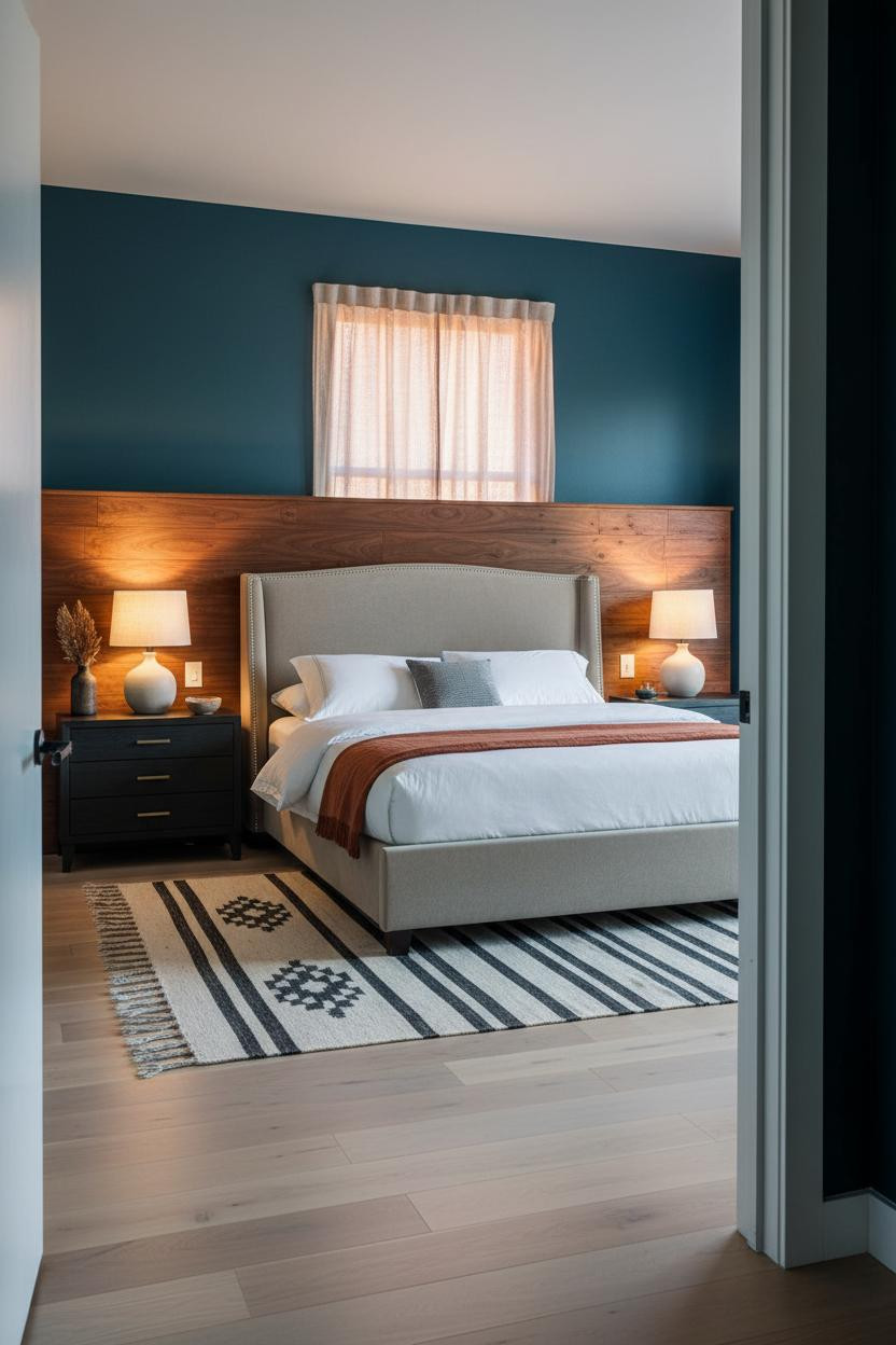
I wasn't sure about teal until I saw it against warm walnut grain. The floating headboard panel sits like a warm stripe against the cool deep blue plaster, and the contrast is immediate. Honestly, it's a smarter move than a leather headboard here.
The easy win: A rust linen throw draped low across the footboard ties the walnut warmth to the bedding without forcing a match. Just enough to keep things connected, while still feeling loose and collected.
Slatted Wood That Makes Navy Feel Warm
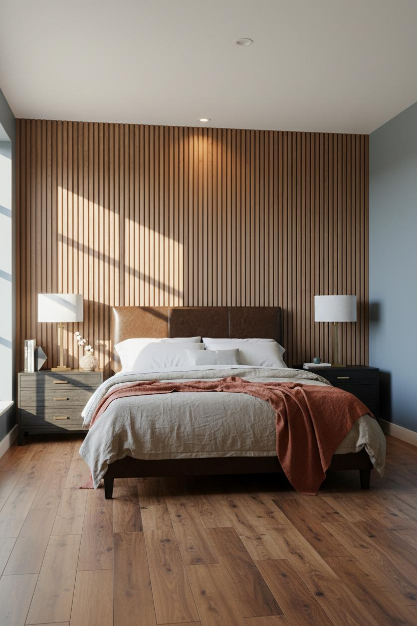
This one surprised me. Walnut-toned vertical slats in front of a matte blue-grey wall create precise shadow lines that shift all morning as the light moves. It shouldn't read as warm. But it does.
Why it feels intentional: The slatted wall gives the headboard zone architectural presence without adding bulk, in a way that feels like the room was designed from the wall outward.
Where to start: Reclaimed wood plank floors in warm amber-brown are what pull the walnut slats into the rest of the room. Skip pale flooring here. It would flatten everything.
The Arched Niche That Frames the Whole Bed
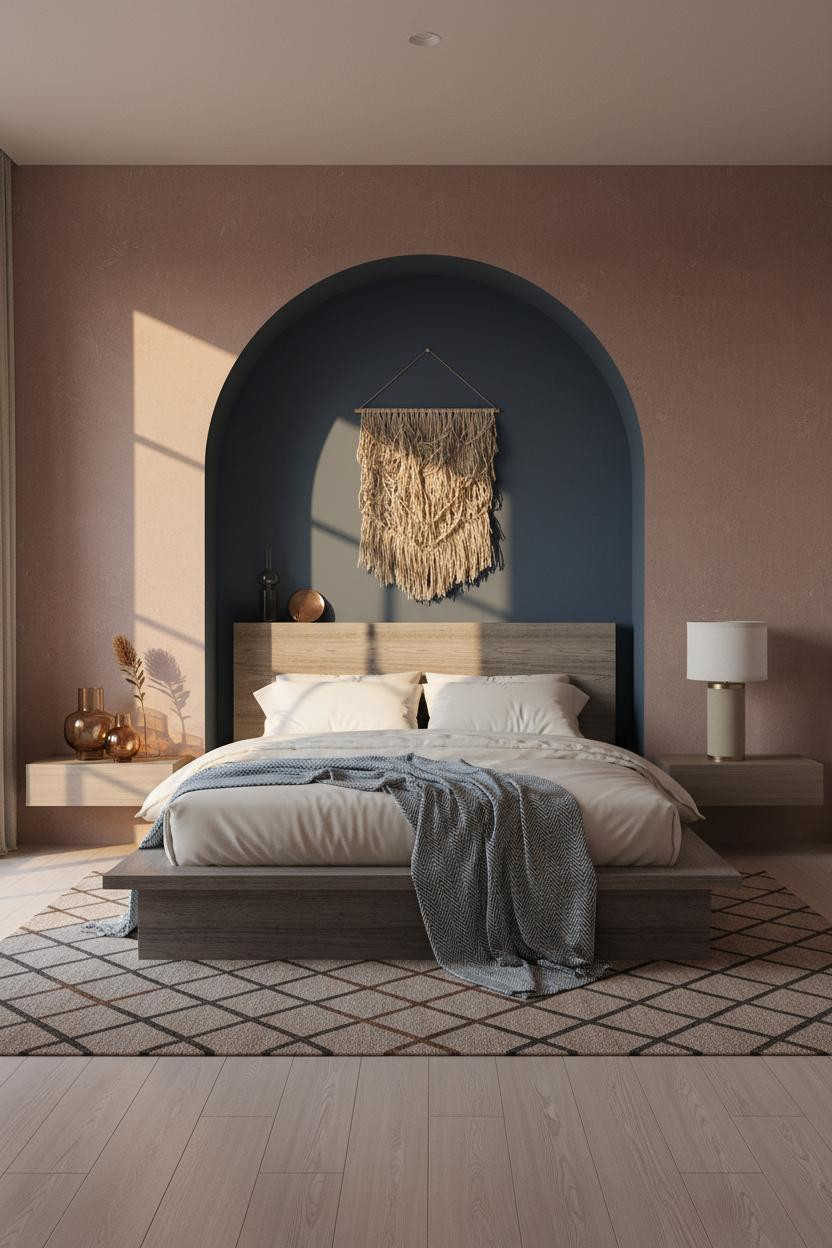

An arched niche carved into the wall behind the bed is the kind of architectural detail that makes a room feel like it was built for this exact purpose. And it doesn't require a renovation if you fake it with plaster.
What gives it presence: The niche interior is painted two shades deeper than the surrounding dusty rose-tinged slate wall, so raking amber light catches the curved plaster rim and casts a clean shadow arc around the bed.
Worth copying: A woven flax wall hanging suspended inside the arch keeps the niche from feeling stark. Just enough texture to keep things interesting.
Faded Denim Shiplap at Dusk
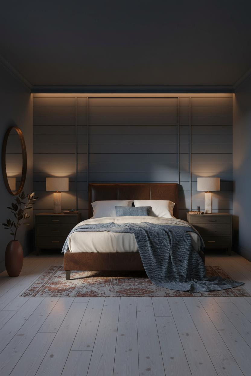
This is the kind of dark bedroom aesthetic that people screenshot and then never actually commit to. Fair warning. It works best if you lean all the way in.
Why it lands: Faded denim blue with a chalky matte finish on horizontal shiplap boards reads softer than navy, which means the room feels intimate rather than heavy. Bedside lamps carve tight amber pools across the surface and the shadows do the rest.
Avoid this mistake: A matte rust ceramic vase and bleached pale birch flooring are what stop this from tipping into monotone. Skip the warm accents and the whole scheme collapses.
The Backlit Headboard Nobody Sees Coming
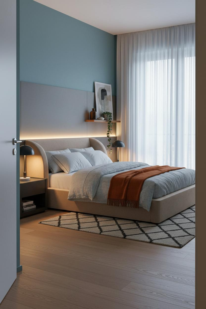

I almost scrolled past this. Glad I didn't.
A full-width panel with hidden LED strips at the baseboard creates a warm glow where the panel edge meets dusty teal-blue plaster, and the halo effect is subtle enough to feel accidental. That's the whole trick. It shouldn't look designed. And it doesn't.
The smarter choice: A burnt orange mohair throw over stone-washed grey bedding keeps the room from feeling like a hotel lobby. Something warm and slightly undone is what makes a dark blue bedroom aesthetic feel like someone actually sleeps there.
Indigo Board-and-Batten That Goes All the Way
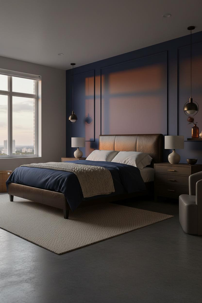
This is divisive. Rich indigo board-and-batten at full wall height isn't a half-commitment kind of room.
What carries the look: Vertical battens on a rich indigo matte surface cast thin shadow lines as warm sidelight rakes across, giving the wall dimensional depth that paint alone would never achieve. The room feels lived-in and intimate, not theatrical.
Don't ruin it with: Overhead lighting only. A sculptural pendant in blackened steel hanging off-center above the reading corner is what makes this feel considered rather than accidental.
Cobalt Plaster With a Pink Linen Duvet Nobody Expected
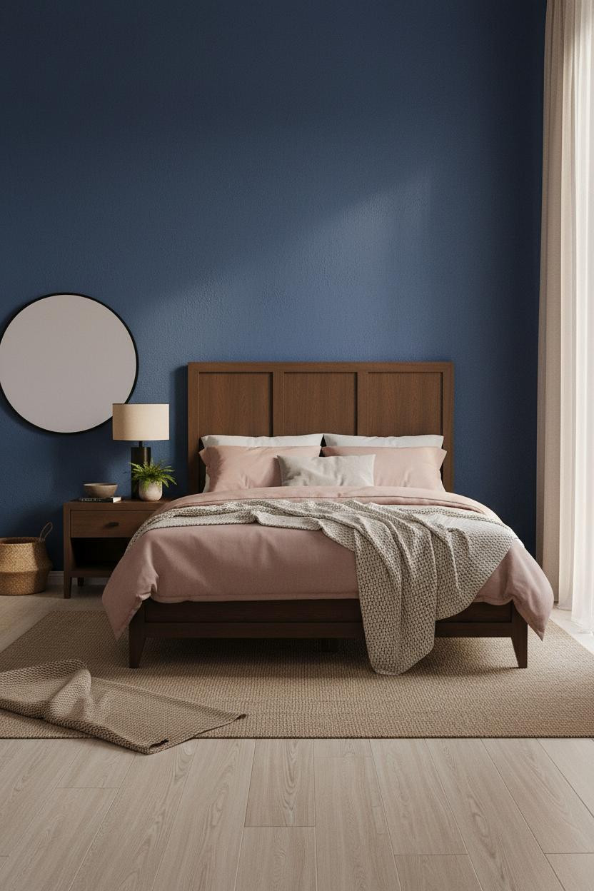
Cobalt matte plaster with a sand-grain finish is a saturated choice that somehow avoids feeling loud. Raking light from a tall side window reveals the mineral depth in the surface, and the room feels calm rather than charged.
The real strength: A dusty pink linen duvet against cobalt walls creates a contrast that shouldn't work but does, because both tones pull toward the same warm grey middle. Nothing too precious or matchy about it.
One smart swap: A large round mirror leaning against the left wall reflects light back into the room in a way that a hung mirror never quite does. Low and leaning keeps it casual.
A Walnut Floating Shelf That Changes How the Wall Works
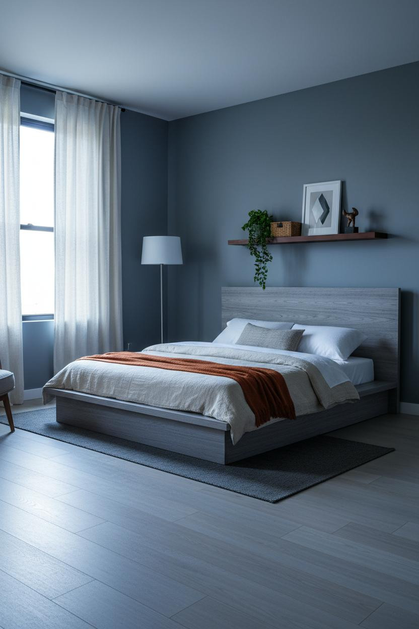
Nothing fancy. That's the point.
What changes the room: A walnut floating shelf above the bed on slate blue-grey matte walls creates a horizontal anchor that grounds the whole headboard zone without any architectural investment. The warm amber grain against cool morning silver light is the entire composition. Honest, quiet, and collected rather than decorated.
The Recessed Brass Niche That Keeps You Looking
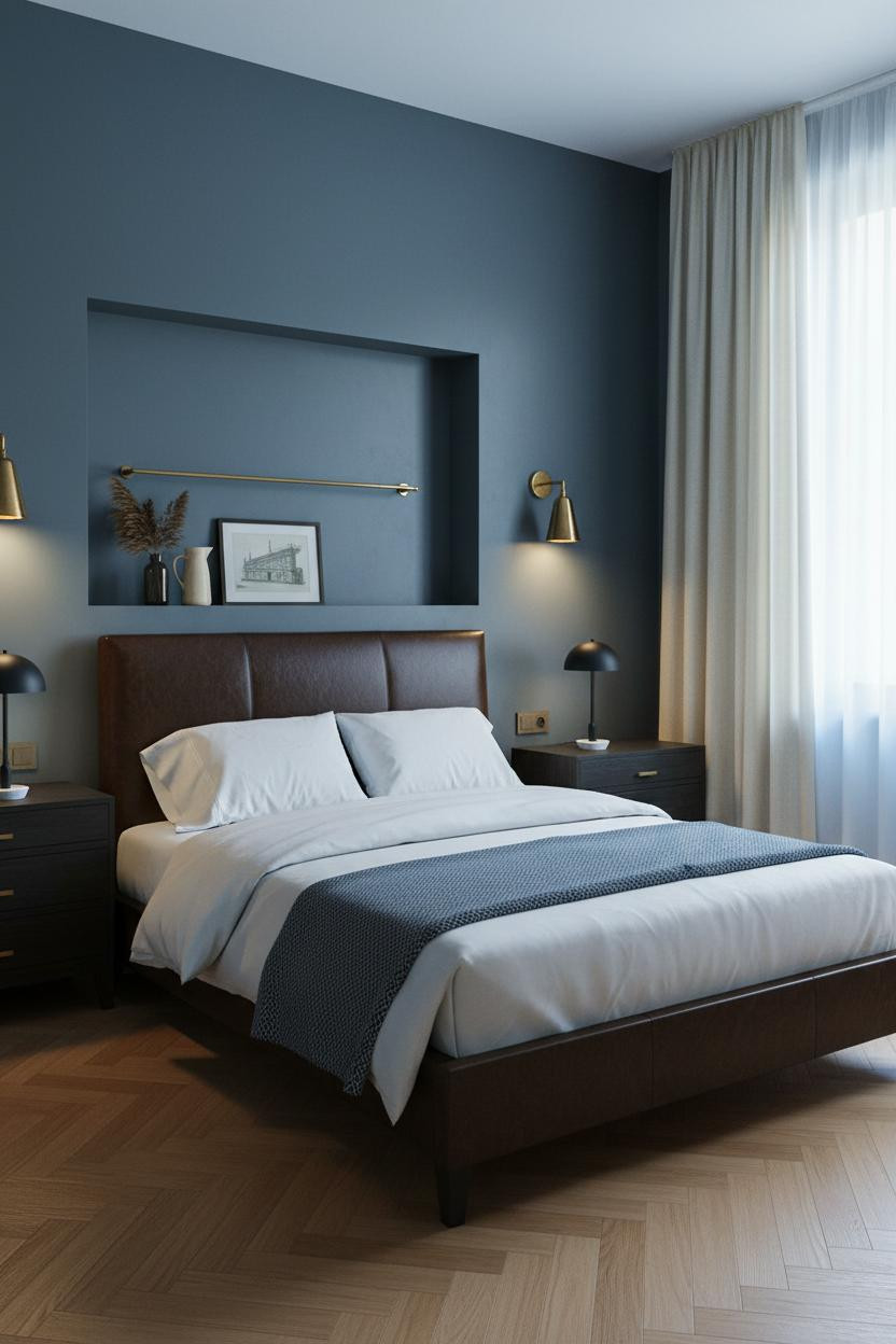
A recessed niche fitted with a slender brass rail above the bed pulls every eye in the room to one place. And on forest blue-grey matte plaster, the filtered overcast light catches that brass with a kind of restraint that warmer rooms can't replicate.
Why the palette works: Cool silver-blue from gauze sheers keeps the honey oak herringbone parquet from reading too warm, and the two tones balance without ever quite meeting. The room feels grounded and still, not heavy.
The finishing layer: Paired sconces flanking the bed cast amber down toward the pillow zone rather than out into the room. That's what makes it intimate instead of just dark.
Full Navy Walls, Warm Lighting, Nothing to Prove
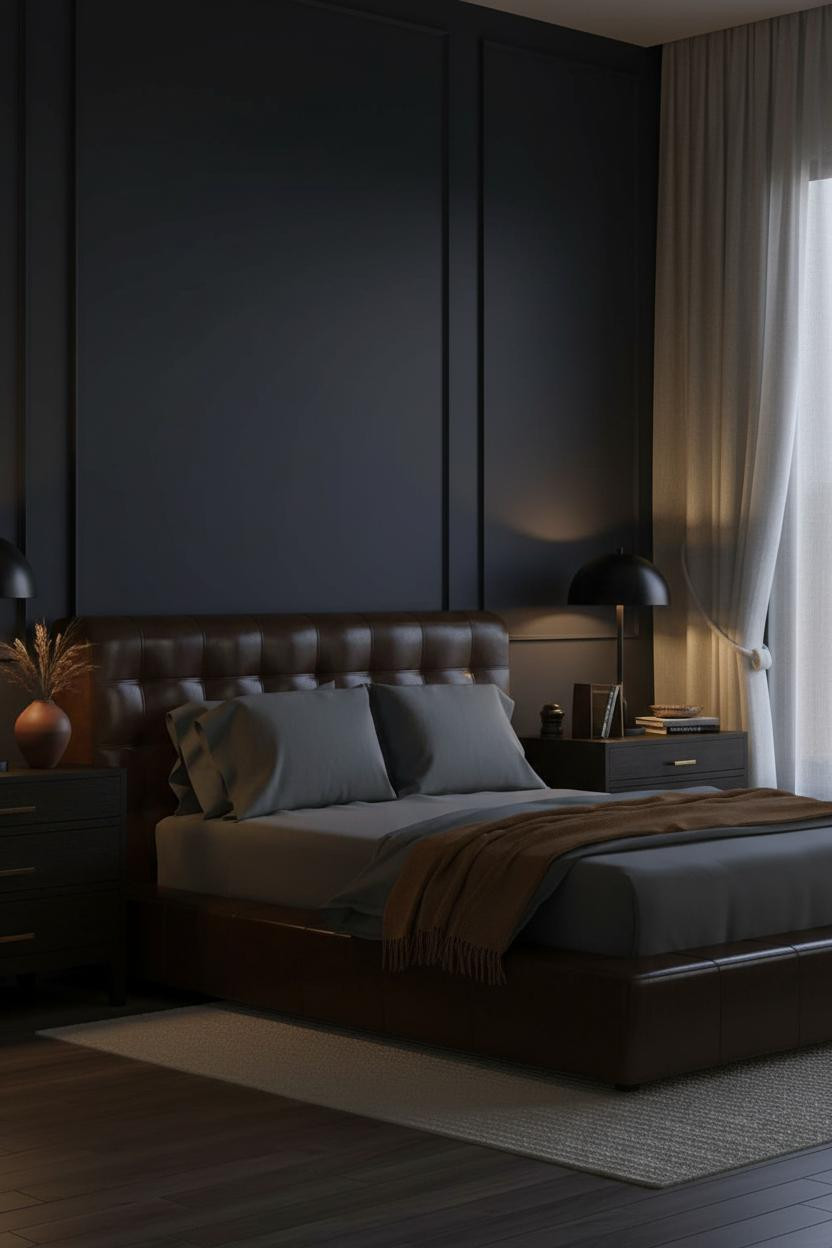
This is the most straightforward version of a dark navy bedroom and somehow the hardest to pull off well. Floor-to-ceiling deep navy matte walls with soft greige flanking surfaces push the blue further into shadow at the edges, and the corners go near-black after dark.
What softens the room: Dark walnut wide-plank hardwood underfoot keeps the navy from feeling airless, because the warm grain gives the eye somewhere to land below all that saturation.
Skip this: Cool-toned bedding. Slate jersey with a camel wool throw is what keeps this from feeling like an office. The warmth in the textiles is what makes moody bedroom paint colors feel livable instead of severe.
 Our #1 Pick
Saatva Classic Mattress
America's best-selling online luxury innerspring. 365-night trial, lifetime warranty, free white glove delivery.
Shop Saatva Classic
Our #1 Pick
Saatva Classic Mattress
America's best-selling online luxury innerspring. 365-night trial, lifetime warranty, free white glove delivery.
Shop Saatva Classic
Why Luxury Bedrooms Always Feel Better
Walls get repainted. Linen gets swapped out. The mattress stays. And in a moody blue bedroom where everything else is already doing heavy visual work, what you sleep on matters more than people admit.
The Saatva Classic holds up where other mattresses eventually don't. The dual-coil support system means your partner can shift at 2am without waking you. The breathable organic cotton cover doesn't trap heat, which matters more in a dark room than you'd think. And the Euro pillow top gives you the softness that actually holds its shape over years, not weeks.

The rooms people save are the ones where nothing looks accidental. But the rooms people actually want to sleep in? Those start with the bed.


