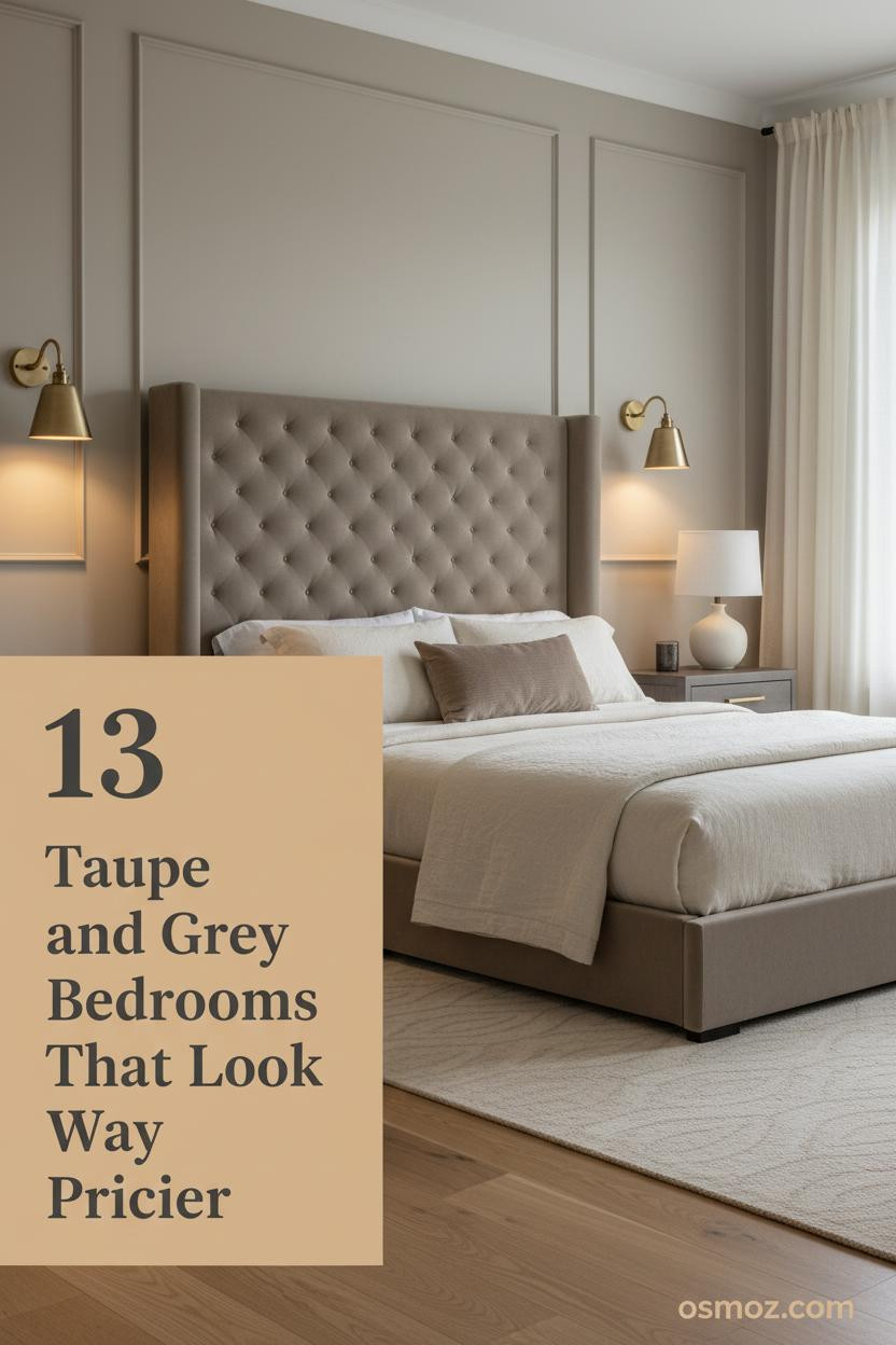
13+ Taupe and Grey Bedrooms That Feel Warm Without Feeling Heavy
16 april 2026The first thing you notice in the best taupe and grey bedroom is that it doesn't feel neutral. It feels intentional. Warm without being heavy, calm without being cold.
These 13 rooms prove the palette works harder than most people expect. Here's how to make it yours.
The Herringbone Wall That Anchors Everything
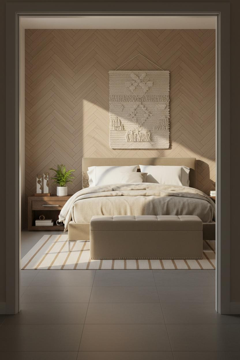

I keep coming back to this one. There's something about a full-height herringbone wood wall that makes the whole room feel resolved.
Why it holds together: The diagonal grain pattern adds geometric interest while the warm taupe tone keeps everything in the same quiet family, so the wall reads as texture rather than contrast.
The part to get right: Pair it with pale clay walls on the flanking sides. Anything cooler and the wood goes flat.
How A Recessed Niche Makes The Whole Room Feel Designed
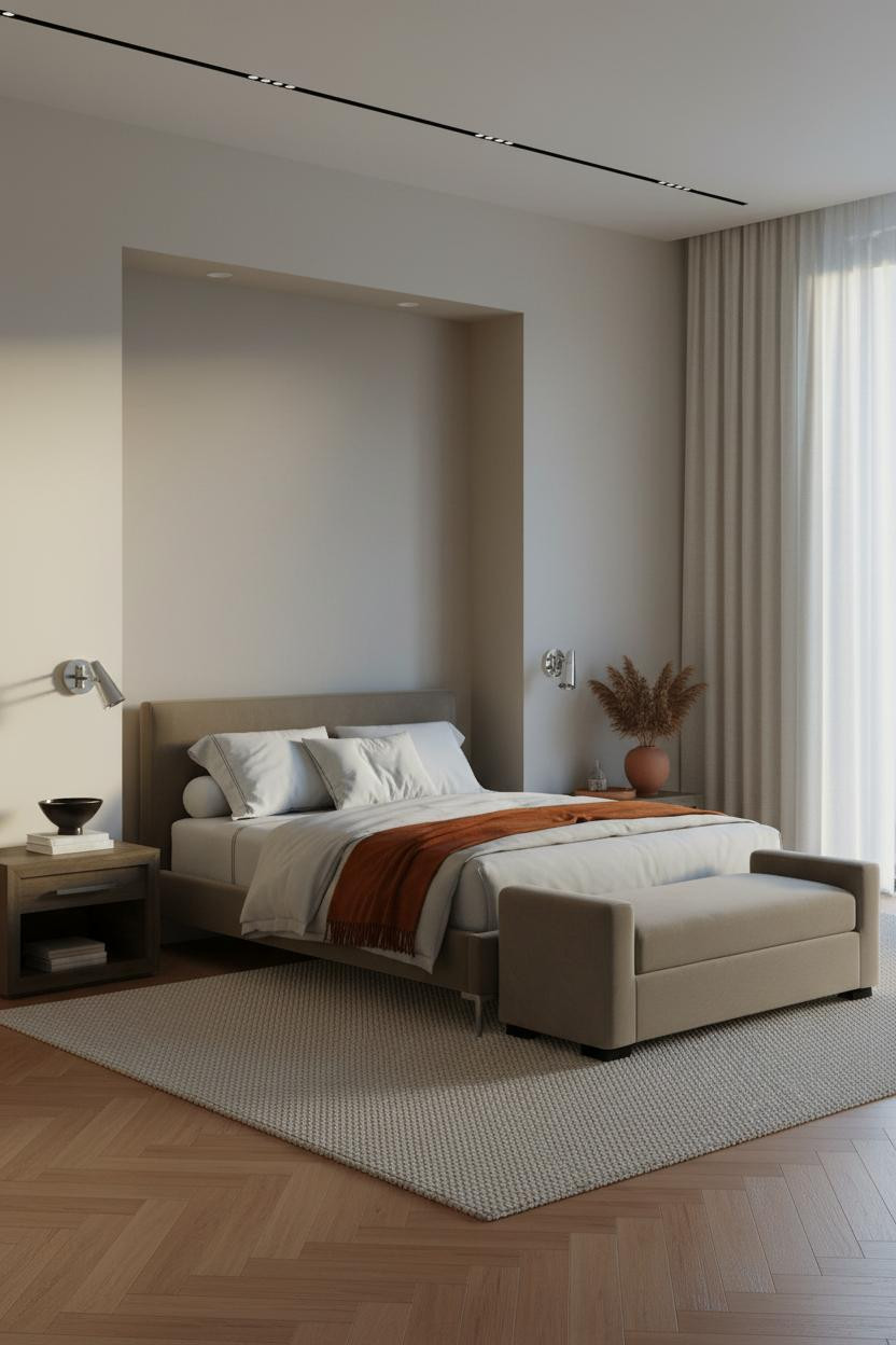
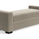
Underrated move. A recessed niche framing the bed does something a headboard alone can't.
The smooth greige plaster inside the recess catches shadow at the crown edge, giving the wall architectural depth without any added material or pattern.
Steal this move: Hang floor-to-ceiling cream linen curtains at the window opposite. The softness balances the hard geometry of the niche, and the room feels intentional from every angle.
I'd Hang A Gallery Wall Here Without Thinking Twice
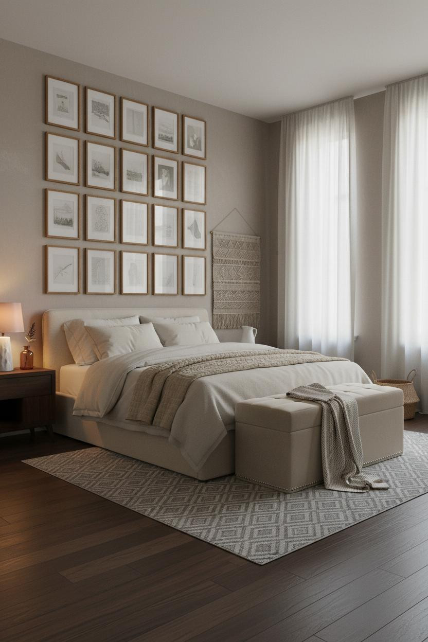

Gallery walls get dismissed as overdone, but this format works because the frames stay uniform.
What carries the look: Evenly spaced slim oak frames floor to ceiling create vertical rhythm that reads as architecture, not decoration. The pale stone taupe wall behind them keeps the whole thing from competing with itself.
If you're going this route, keep every print in the same tonal family. Mixed styles in one neutral room is the fastest way to make it feel unresolved.
The Steel Window Grid That Makes Taupe Feel Modern
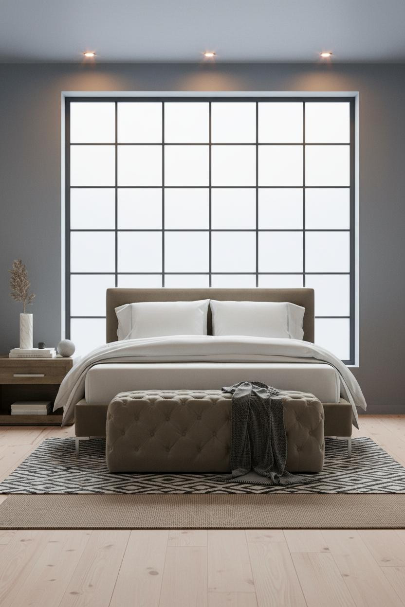
This is the version of grey and beige bedroom ideas that surprises people. The slim black steel window grid does what most feature walls can't: it adds graphic structure without adding any mass to the room.
Design logic: Cool grey-white light floods through the panes and hits the matte blue-grey walls, making the neutrals feel cooler and more contemporary than the usual warm-taupe approach.
Where to start: Ground the bed zone with a charcoal throw over the ottoman. One dark layer ties the window grid to the rest of the room.
Why Coffered Ceilings Work In Neutral Bedrooms
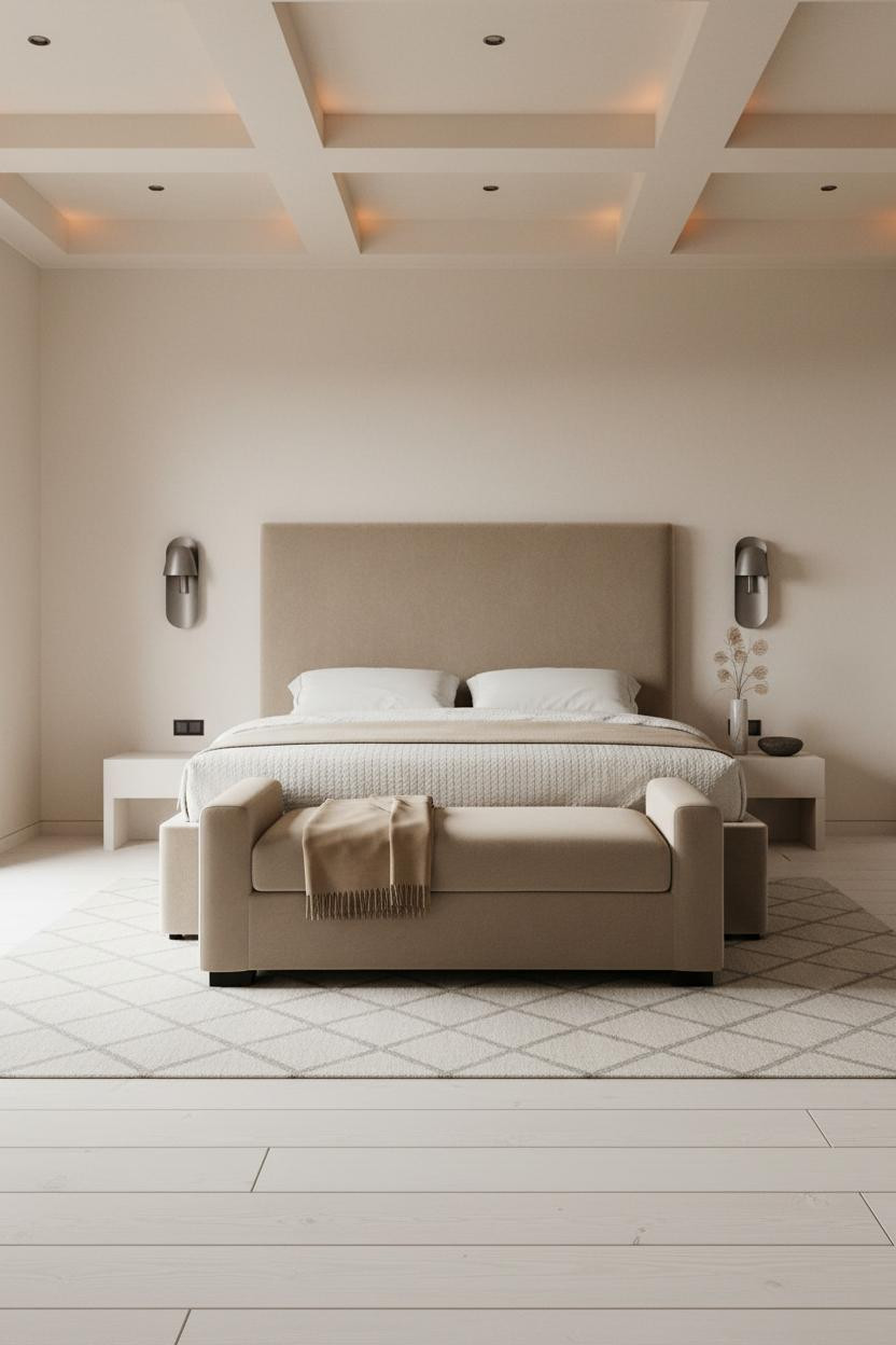
People overlook the ceiling and then wonder why a neutral room feels flat. This one doesn't.
The coffered plaster grid in matte warm cream casts crisp geometric shadows overhead, which gives the room strong architectural rhythm in a way that feels grounded. Honestly, the ceiling is doing as much work as the walls here.
The finishing layer: Paired matte pewter sconces flanking the bed tie the ceiling's shadow lines back down to eye level. Without them, the top half and the bottom half read as two separate rooms.
Vertical Paneling That Feels Custom Without The Cost
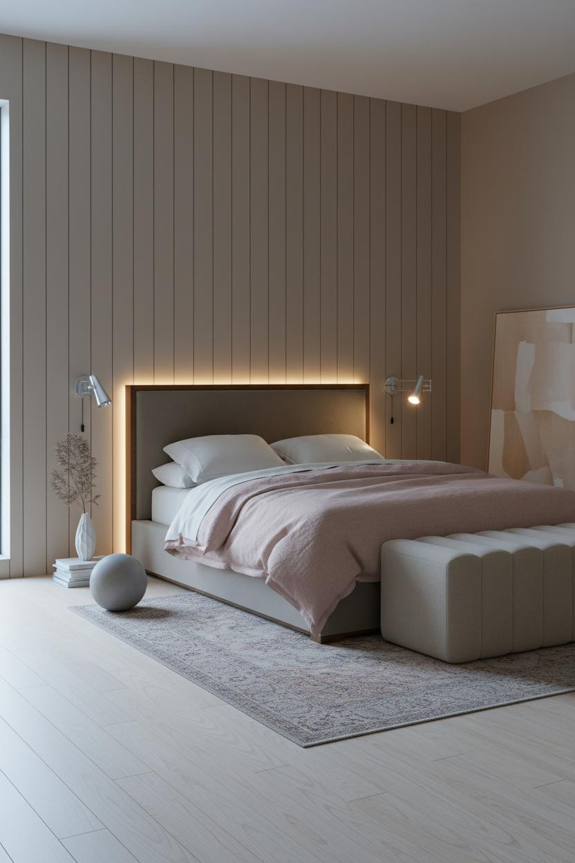
Bold choice. Not for everyone. But the rooms that commit to full-height paneling never look builder-grade again.
Each vertical joint in the matte taupe paneling catches raking light and presses a fine shadow line across the surface, adding rhythm that flat paint simply can't replicate.
Why it looks custom: The key is running it floor to ceiling. Stop at chair rail height and it looks like wainscoting that ran out of budget.
Avoid this mistake: Don't match the panel color exactly to the camel side walls. A slight shift (cooler on the panel, warmer on the flanks) is what makes each surface readable as its own layer.
This Arched Niche Makes The Bed Feel Like A Room Within A Room
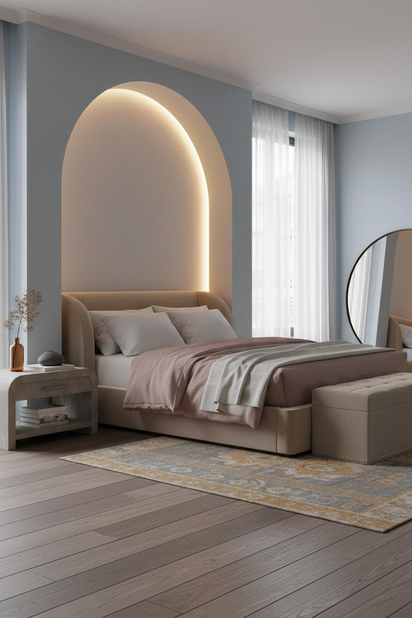

I almost scrolled past this. Glad I didn't.
What creates the mood: The smooth matte stone arch curves gently at the crown, drawing cool window light inward and casting a soft inner shadow that pulls your eye toward the bed. The room feels calm and cohesive because everything else steps back to let the arch lead.
One smart swap: Use a sculptural round mirror in brushed iron on the side wall. It echoes the arch's curve while still feeling collected rather than decorated.
Dove Grey Shiplap For The Modern Farmhouse Version
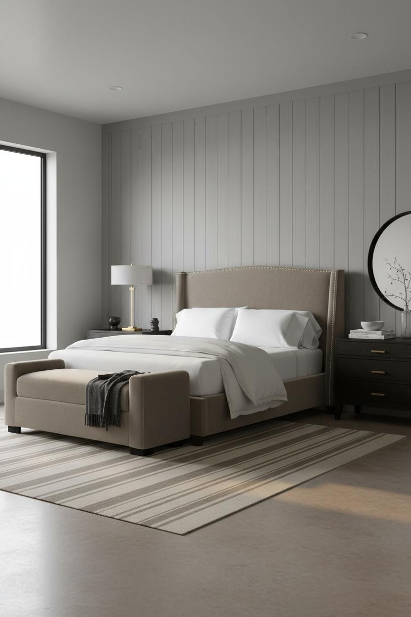
Shiplap gets a bad reputation. Done like this, with muted dove grey planks running floor to ceiling, it's actually quieter than most painted walls.
What softens the room: The fine shadow line between each board reads as texture from a distance, in a way that feels lived-in without tipping into rustic. The greige-beige flanking walls keep it from going too cool.
Admittedly, polished concrete floors feel like a risk here. But they pull the grey from the shiplap straight down to the ground, and the room suddenly feels taller than it is.
The Slatted Wall That Gives A Neutral Room Personality
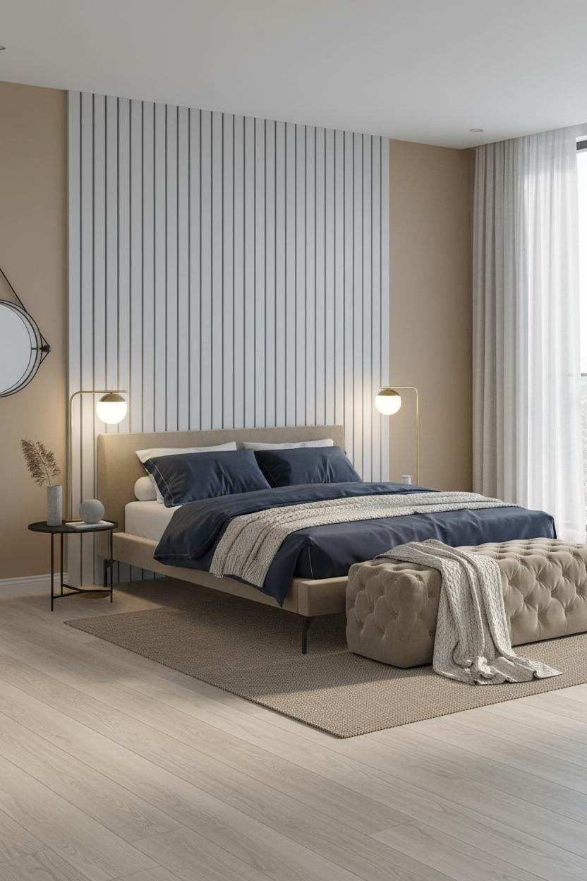

This one surprised me. Vertical slatted timber is usually a Japandi move, but here it reads as coastal, and it works.
The reason it feels open instead of heavy is the pale grey paint on the slats. Each groove presses a fine shadow line across the wall surface, creating just enough texture to keep things interesting while still feeling breathable.
Pro move: Layer a cable-knit cream throw over the ottoman at the foot of the bed. It softens the geometry of the slatted wall without competing with it.
Wainscoting Makes This Palette Look More Considered
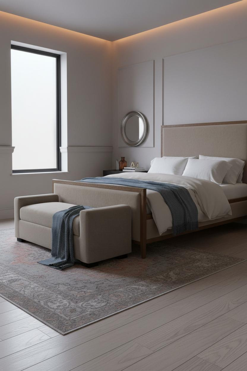

Half-height wainscoting is one of those details that looks like it cost more than it did. Especially in a taupe bedroom colour scheme like this one.
The real strength: The matte pale taupe rail line creates a strong horizontal break at mid-wall, which draws the eye across the room rather than up, making the space feel wider and more grounded.
What to copy first: Use mushroom above the rail and pale taupe below. Two values of the same tone. The shift is subtle, but it's what makes the wall feel deliberate rather than accidental.
Built-In Shelves That Earn Their Place In A Neutral Room
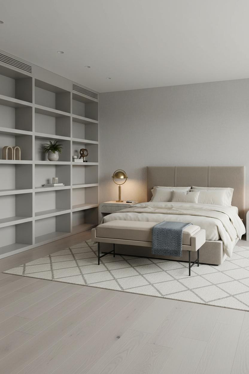

Storage that doubles as a feature wall. It's a practical move that somehow ends up looking considered.
In a soft grey bedroom, a full-width built-in in matte pale grey lacquer disappears into the wall rather than standing out from it. The shallow horizontal shadows from each shelf add quiet rhythm while still feeling like part of the architecture.
Where people go wrong: Over-styling the shelves. A potted fern, a small bronze sculpture, and a few ceramic bookends. That's enough. More than that and the whole wall gets busy.
The Textured Plaster Wall That Makes Everything Else Feel Expensive
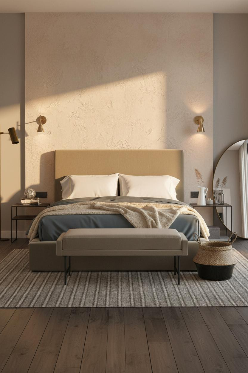

I've seen a lot of Japandi rooms that feel cold. This one doesn't.
Where the luxury comes from: The raw plaster wall behind the bed shifts from pale clay at the edges to warm cream at the center as afternoon light pools across it. The organic surface variation does the work that color or pattern would in a bolder room.
The smarter choice: Dark stained narrow plank floors ground it below while paired sconces push warmth back up. It's a quiet nod to Japandi proportion, while still feeling like a bedroom someone actually sleeps in.
Greige Walls And Board-And-Batten That Feel Like Morning
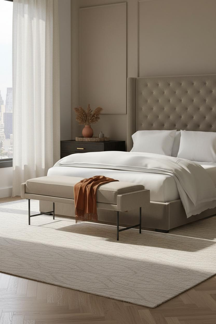

This is the room I'd want to wake up in. The whole thing is built around one good decision: board-and-batten in warm greige running floor to ceiling.
Why the palette works: The raking morning light catches each vertical plank edge and throws fine shadow lines across the wall, adding rhythm without any change in color. It stays warm and cohesive because every surface pulls from the same greige family.
And the floor-to-ceiling cream linen curtains? They frame the window in a way that makes the whole wall feel twice as tall. Nothing too precious. Just proportion done right.
 Our #1 Pick
Saatva Classic Mattress
America's best-selling online luxury innerspring. 365-night trial, lifetime warranty, free white glove delivery.
Shop Saatva Classic
Our #1 Pick
Saatva Classic Mattress
America's best-selling online luxury innerspring. 365-night trial, lifetime warranty, free white glove delivery.
Shop Saatva Classic
The Foundation Of Every Beautiful Bedroom
Every room in this list gets the walls, the textures, and the layering right. But the part that actually determines how the room feels to live in is the bed itself. Specifically, what's inside it.
The Saatva Classic is where I'd start. Dual-coil support means the mattress holds its shape and doesn't transfer every movement across the bed. The breathable organic cotton cover keeps the temperature right, and the Euro pillow top is soft in a way that still has structure. Not the sink-and-disappear kind. The kind that actually holds you.
Walls get repainted. Linen gets swapped out. Get the mattress right first.

The rooms people save are the ones where nothing looks accidental. And the ones that feel genuinely restful? Those start with what you can't see in the photo.


