13+ Studio Apartment Ideas That Actually Make Small Feel Intentional
24 march 2026Think your apartment is too small to feel like anything? Cute studio apartment ideas prove otherwise. The best ones aren't decorated around the limitation. They're designed through it.
Every room in this list lives under 500 square feet. None of them feel cramped.
Moody Indigo Walls That Make a Tiny Room Feel Intentional
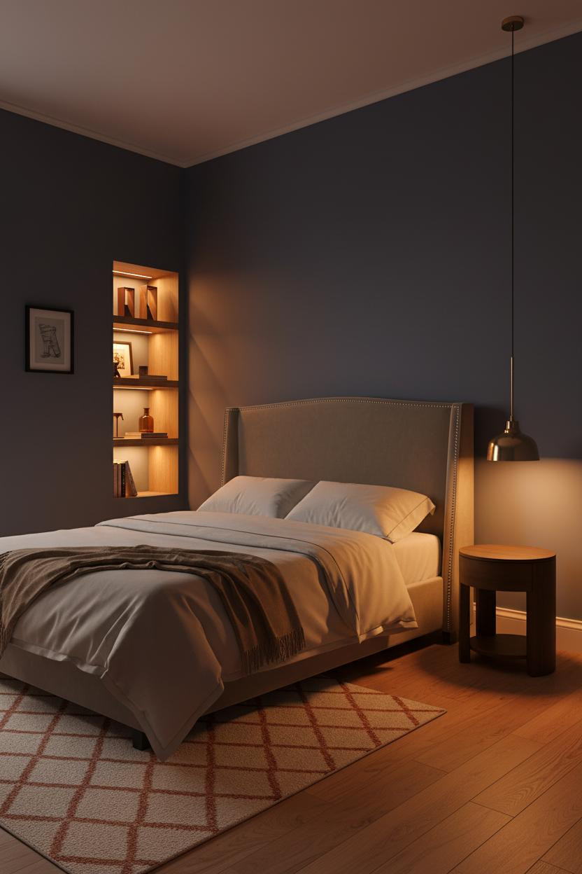
Most people would never go this dark in a small space. This room makes you rethink that.
Why it works: The matte indigo wall absorbs the overhead light and pushes the amber glow from the floor lamp forward, which makes the room feel warm rather than closed-in.
Steal this move: Pair deep wall color with warm-toned lighting and a charcoal shelving unit to keep the palette cohesive without adding visual clutter.
The Floating Shelf That Does All the Work
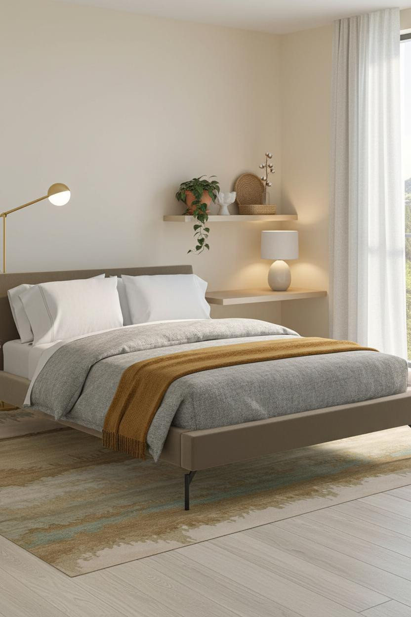


Clean. Bright. Nothing trying too hard.
A single bleached oak floating shelf spans the desk wall and does more for this room than a full bookcase would. It gives the compact zone a horizontal anchor while keeping the wall mostly open, so the north light still floods through.
The easy win: Style the shelf with a trailing pothos in a terracotta pot and one or two ceramic objects. The mix of living plant and still object keeps it from feeling too styled.
A Terracotta Arch Niche That Feels Almost Mediterranean
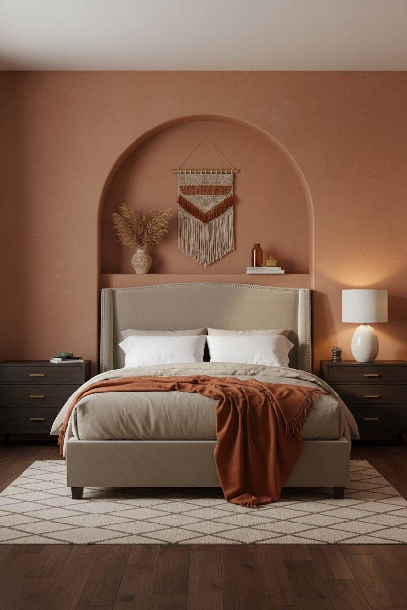
I keep coming back to this one. A carved arch niche in a studio apartment sounds excessive. It genuinely isn't.
The raw plaster arch painted in terracotta sits at headboard height and catches the side lamp light in a way that no flat wall ever could, making a 400-square-foot room feel like it has real architectural history.
Worth copying: If you can't carve a niche, fake the arch with a curved plaster panel or a painted trompe l'oeil outline. The silhouette is what reads.
Wainscoting in a Studio: Divisive But It Works
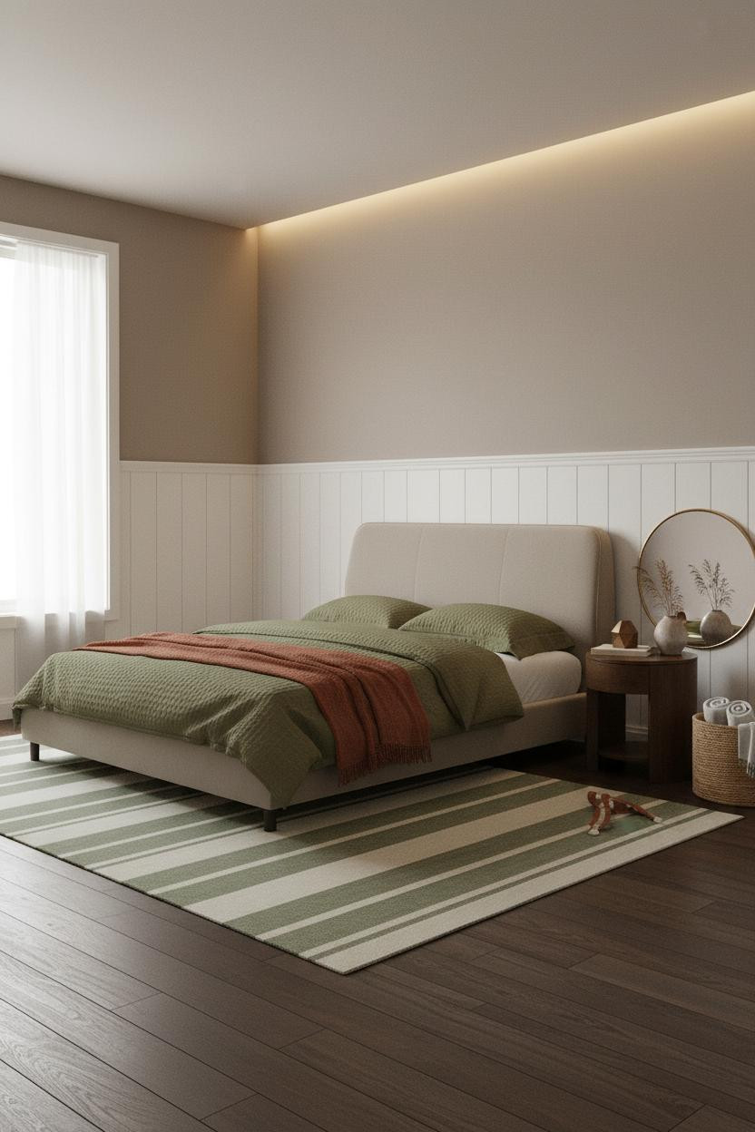
Fair warning. Half-height wainscoting in a compact studio sounds like a move that would chop the walls and shrink the room.
But the horizontal rhythm of painted timber panels actually grounds the sleeping zone in a way that plain mushroom walls can't replicate, especially when the tone above the rail stays soft.
Avoid this mistake: Don't use high-gloss paint on the panels. A matte or eggshell finish keeps the texture reading as architectural detail rather than a DIY project.
Floor-to-Ceiling Corner Shelving That Earns Its Square Footage
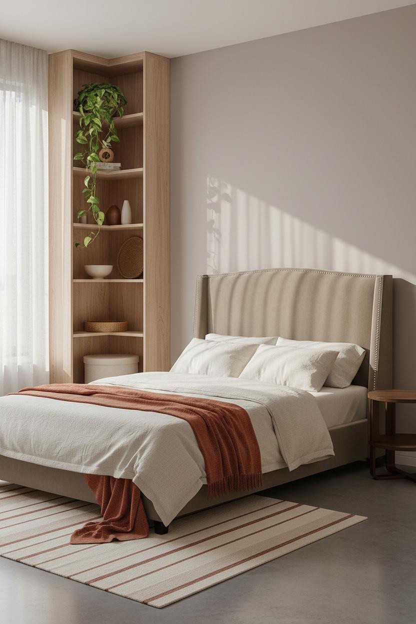

In a space this small, every corner has a job. This one pulls more weight than most furniture twice its size.
What makes it work: A floor-to-ceiling unit in natural birch draws the eye upward, which makes the ceiling feel taller and the footprint feel more considered, especially when the shelves stay loosely styled rather than packed.
The smarter choice: Keep the lower two shelves functional (baskets, trays) and let the upper shelves breathe with plants and a few objects. Mix only. Nothing matchy.
Camel Walls With a Plaster Alcove That Costs Almost Nothing
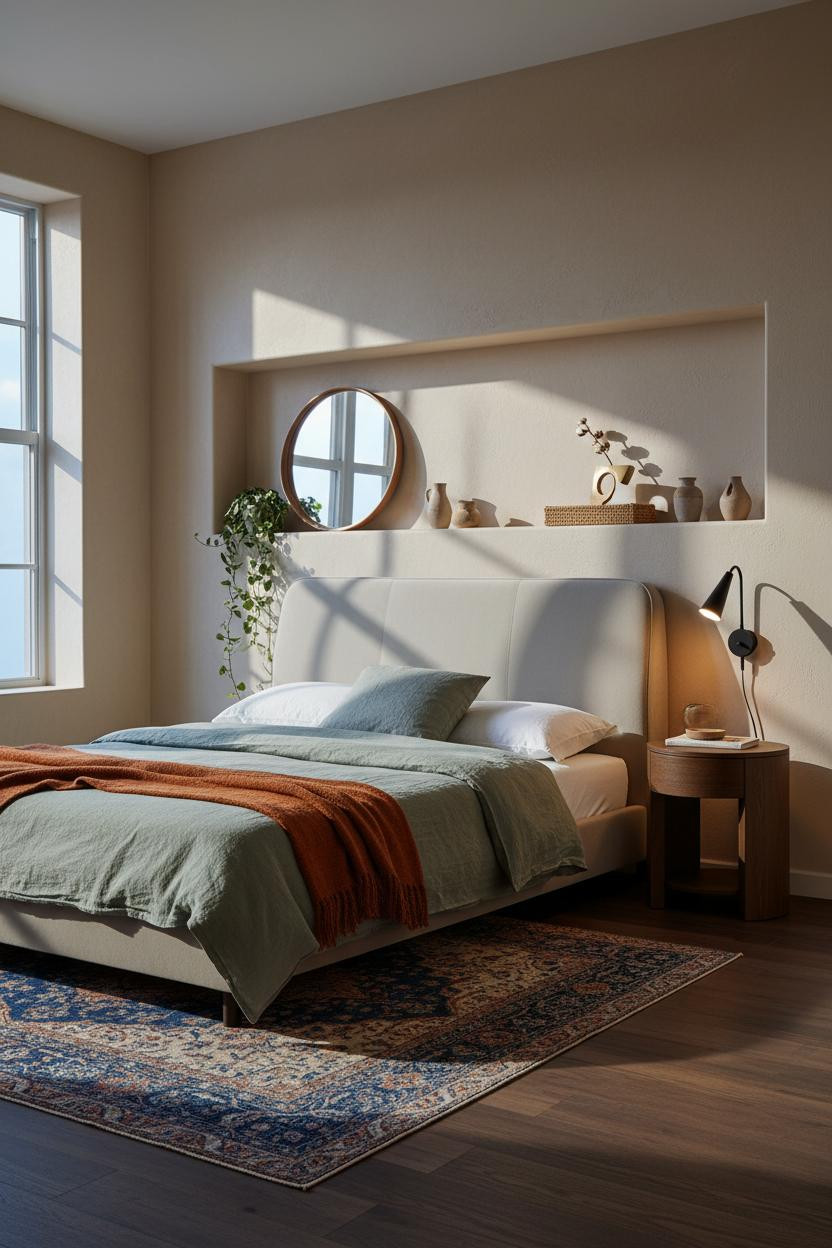
The room feels collected rather than decorated. That's the whole point of this palette.
Muted camel plaster walls absorb morning light softly, while the curved alcove shelf running at waist height gives every small object a home, in a way that feels architectural rather than improvised.
One smart swap: A round leaning mirror beside the alcove doubles the lamp glow and makes a narrow wall read wider. Lean it, don't hang it. The casual angle matters.
The Minimal Studio Room That Somehow Feels Full
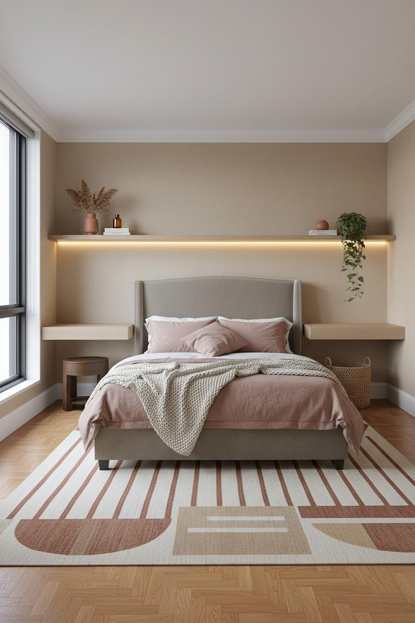
Honestly, minimal rooms in small apartments can feel more like holding cells than homes. This one avoids that by a smart margin.
What gives it warmth: Herringbone parquet flooring introduces a quiet pattern underfoot that carries enough visual texture so the walls can stay plain stone and the room still feels layered.
A slim pale walnut shelf above the desk zone ties the warm wood tones together. Just enough texture to keep things interesting. Nothing more.
Sage Walls With Oak Shelving: The Farmhouse Combo That Actually Translates to City Apartments
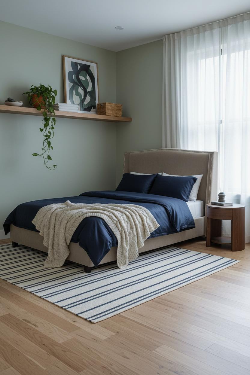
I was skeptical about sage walls in a small space. Too much color, not enough breathing room. I was wrong.
Why the palette works: Soft sage matte paint against raw-grain natural oak shelving creates a warm-cool tension that keeps the room feeling alive while still feeling calm. The colors share the same earthy undertone, so nothing fights.
Pro move: Run the shelf full-width above the bed zone and style it with a trailing plant, one basket, and one abstract print leaning against the back. Horizontal line, clean read.
Corner Shelving That Pulls Double Duty as a Room Divider
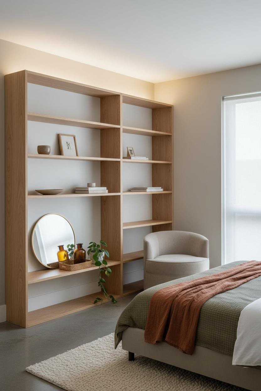

Having a real seating zone in a studio changes how you actually use the room. It stops feeling like a bedroom you also live in.
The real strength: Full-height open shelving built into the corner, with birch shelves against white backing, creates a soft visual boundary between the sleeping and sitting zones without closing off the floor plan.
A swivel chair in the near corner completes the layout. Ideal if you work from home and need a mental shift between zones without moving rooms.
Dusty Rose Walls With a Window Nook That Doubles as Storage
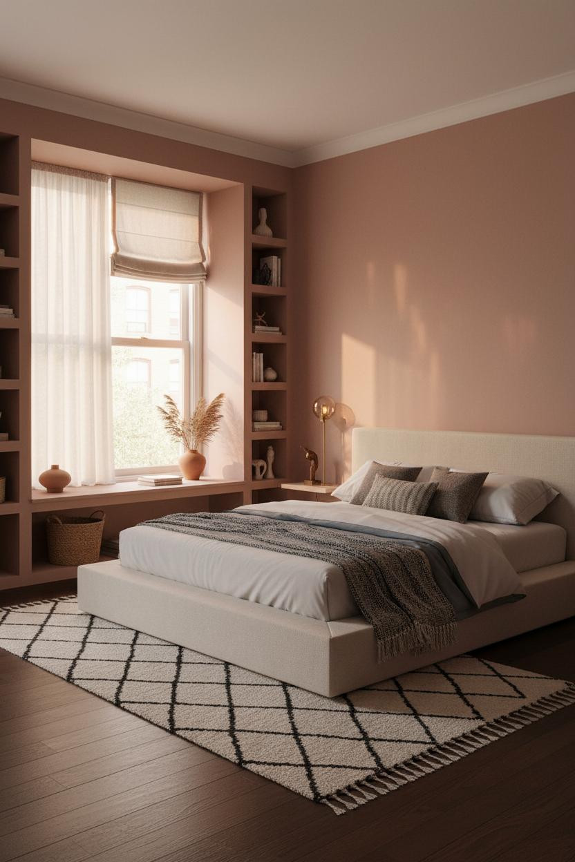
I almost dismissed dusty rose as too sweet for a small apartment. But the right tone, against dark walnut flooring, reads warm and grounded rather than precious.
What changes the room: A deep recessed window nook with carved flanking shelves turns dead wall space into the most-used spot in the apartment, while still feeling open because the light floods through.
Where to start: Place the accent chair at the corner closest to the window nook. The lamp goes there too. That corner becomes the whole room's reason for existing.
Moss Green Walls With a Full-Width Window Wall
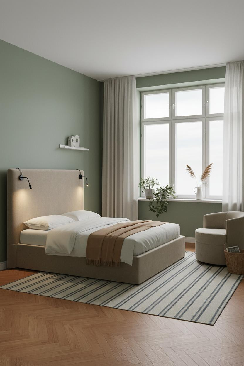

This is the kind of studio that makes you rethink whether you actually need more square footage.
Why it holds together: Soft moss green matte walls absorb the even midday light in a way that makes the room feel calm without going cold, especially when the herringbone parquet floor keeps the warmth anchored underfoot.
What to copy first: Floor-to-ceiling linen curtains flanking the window wall. They add height the room doesn't technically have. The panel pushed slightly aside keeps it from feeling like a hotel.
Board-and-Batten Behind the Bed That Makes a Low Ceiling Behave
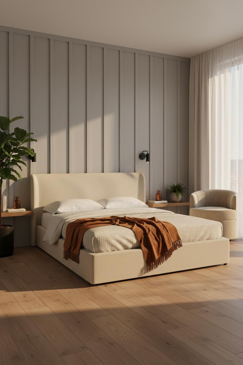

Bold choice. And somehow the most useful wall treatment in the whole collection.
Full-height dove grey board-and-batten uses vertical rhythm to pull the eye upward, which helps balance a low-ceilinged studio in a way that paint color alone can't manage. The afternoon light skimming the batten edges makes the wall feel almost sculptural.
Don't ruin it with: Overhead lighting that kills the shadow lines on the battens. Paired sconces flanking the bed keep the wall reading right. The shadows are the point.
Warm Greige and Bleached Oak That Ages Better Than Trends

Nothing flashy. That's exactly why I like it.
Why it feels expensive: Warm greige smooth matte walls against bleached oak wide-plank floors create a palette so quietly consistent that every object placed in the room looks considered by default, even a stack of books on a side table.
Woven sconces flanking the bed above the headboard replace a nightstand lamp and free up surface space. The part to get right: Keep the sconces at eye level when you're sitting up, not mounted too high.
 Our #1 Pick
Saatva Classic Mattress
America's best-selling online luxury innerspring. 365-night trial, lifetime warranty, free white glove delivery.
Shop Saatva Classic
Our #1 Pick
Saatva Classic Mattress
America's best-selling online luxury innerspring. 365-night trial, lifetime warranty, free white glove delivery.
Shop Saatva Classic
The Foundation Of Every Beautiful Bedroom
Walls get repainted. Linen gets swapped. The mattress stays. And in a studio apartment, the bed is the room, so what's underneath the duvet matters more here than anywhere else.
The Saatva Classic has dual-coil support that holds up year after year, a cotton cover that breathes through warm nights, and a Euro pillow top that's soft without losing structure. It's the kind of bed that makes every layer of bedding on top look better than it is.

The rooms people actually live in well are the ones where every object, including the one you sleep on, was chosen on purpose. Start with the bed. The rest figures itself out.


