18 Best Paint Colors to Go With Oak Cabinets for Walls and Trim That Feel Fresh
19 november 2026The best paint colors to go with oak cabinets are soft whites, muted greens, and warm blue-grays that respect the wood’s golden undertone. I once painted a kitchen icy white and regretted it by sunset. Your oak needs a color with warmth, not a fight. These 18 ideas will help you choose with confidence!
- Paint Benjamin Moore White Dove for a Soft Reset
- Layer Sherwin-Williams Evergreen Fog for Calm Kitchen Design
- What Makes Farrow & Ball Studio Green Work?
- Build the Two-Wood Rule Around Warm Neutrals
- Benjamin Moore Simply White: A Cleaner Trim Frame
- Swap Beige Walls for Sherwin-Williams Accessible Beige
- Can the Undertone Ladder Save a Bad Sample?
- Frame Oak Cabinets With Farrow & Ball Joa’s White
- Hang Soft Blue-Gray Above Golden Oak
- Creamy Above, Warmth Below: When Should You Paint the Ceiling?
- Try Benjamin Moore White Heron for Clean Trim Contrast
- Why Does Sherwin-Williams Urbane Bronze Work Near the Pantry?
- Float Benjamin Moore Pale Oak Around the Cabinets
- Paint the Island Black Forest Green
- Mix Cream Walls With a Terracotta Accent
- Anchor the Room With the Three-Height Light Stack
- Compare the Honest Cost Before You Repaint
- Paint Trim to Match for a Calm Kitchen Design
1Paint Benjamin Moore White Dove for a Soft Reset
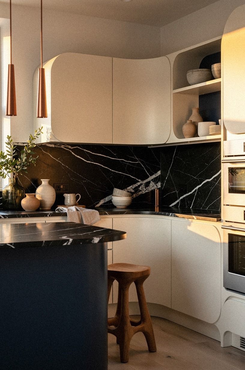
Benjamin Moore White Dove OC-17 is my safest first pick for oak cabinets because it doesn’t turn the wood orange or make the room feel gray. You’ll get a warm, airy kitchen with enough contrast around the cabinet doors. If your counters are Nero Marquina black marble with white veins, this white can quiet the whole room without making you replace anything.
Test it beside your cabinet finish in morning and evening light. You’ll notice the creamy base after the sun moves behind the house, and that’s exactly why it works better than a stark gallery white.
I’d skip cool white here. It makes golden oak look louder, while White Dove lets your eye settle.
A slim copper-toned shelf bracket can echo the cabinets without creating a matching-wall effect. If you’re comparing warm neutrals in a small room, keep a note of how each sample behaves beside your existing trim and subtle color combinations that lasted through real wear.
2Layer Sherwin-Williams Evergreen Fog for Calm Kitchen Design
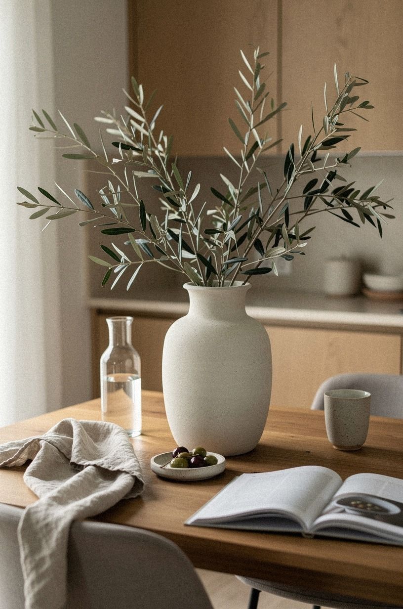
Sherwin-Williams Evergreen Fog SW 9130 gives oak cabinets a muted green backdrop that feels calm rather than country-themed. You’ll see the cabinet grain soften against the gray-green wall, especially in a kitchen with north-facing light. I like this color because it adds personality without demanding a full renovation.
Use it on the walls and keep the trim one shade lighter, or paint the trim the same color in a satin finish. You’ll want the cabinet doors to remain the strongest wood note. A sage wall, aged bronze pulls, and a deep-pile mohair velvet cushion near the window create a gentle, earthy mix that won’t feel staged.
I tested a similar green beside orange-toned oak, and the first sample looked muddy. The fix was simple: choose a green with a gray base, not a yellow one. You don’t need to repaint every surface to get a fresh result, and you’ll save yourself a long weekend!
For another restrained color reference, compare the mood of these subtle color combinations before committing to a full wall.
3What Makes Farrow & Ball Studio Green Work?
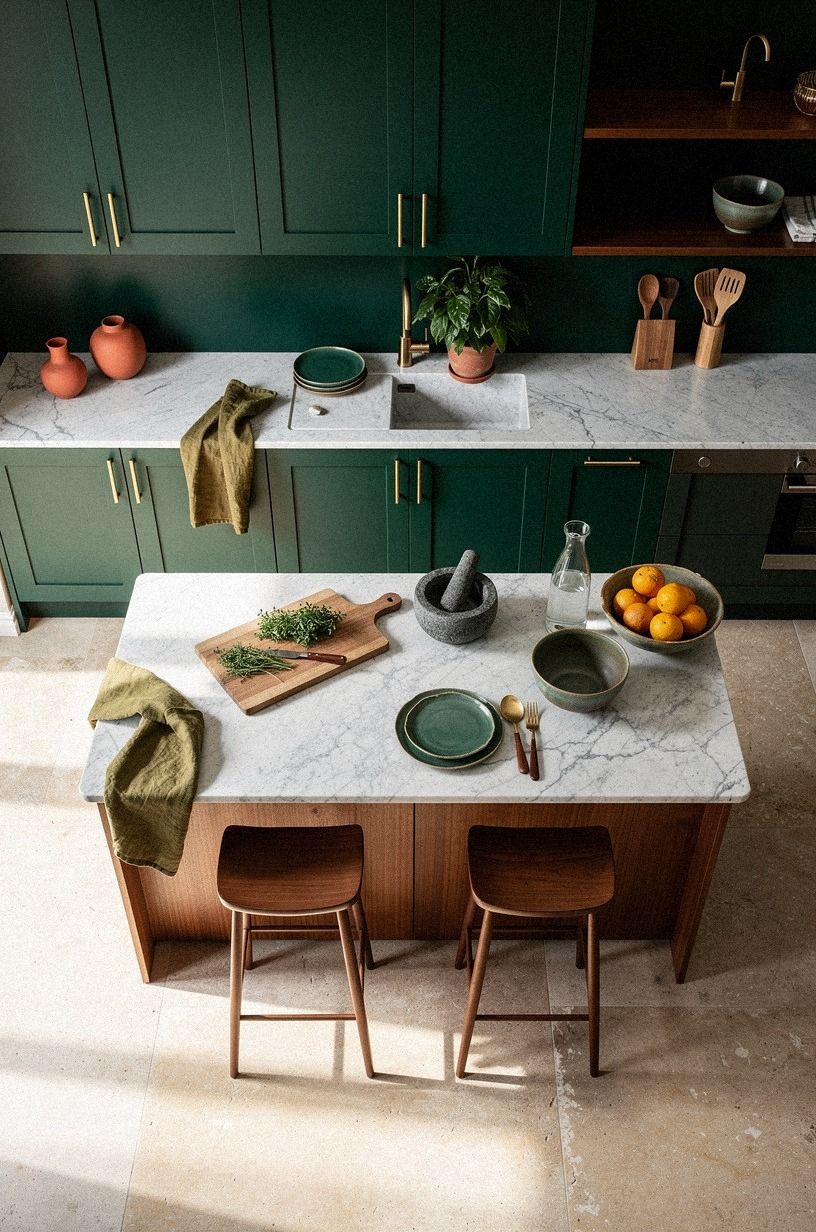
Use it on one pantry wall, the island, or a dining nook instead of covering every surface.
4Build the Two-Wood Rule Around Warm Neutrals
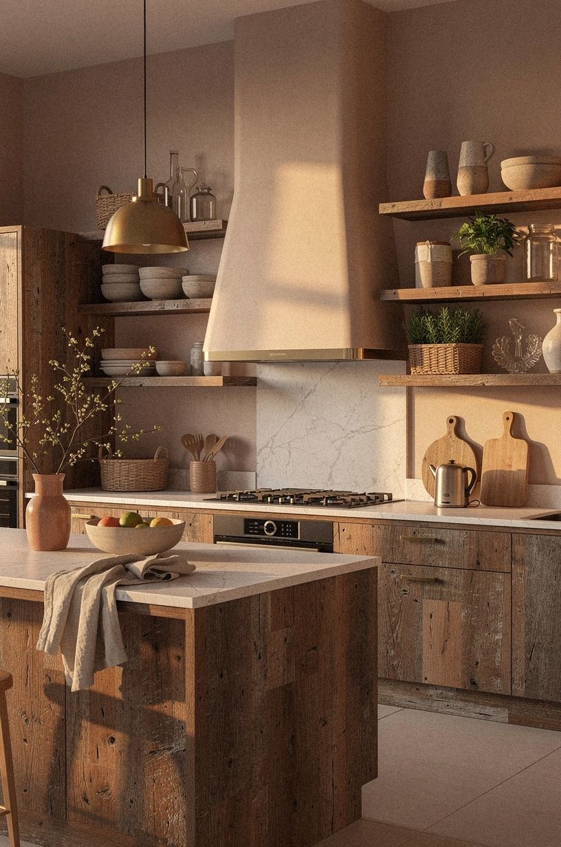
The Two-Wood Rule keeps your kitchen from becoming a pile of competing brown tones. You’ll use the existing oak cabinets as the first wood, then choose one supporting wood with a different value, such as a dark walnut stool or pale ash shelf.
Stop there. Three wood finishes usually make the room feel accidental.
I like reclaimed weathered teak for a simple dining piece, but you’ll want to keep it away from a cabinet color that’s nearly identical. Matching almost perfectly looks more awkward than choosing a clear contrast. Your second wood should either be noticeably lighter or noticeably deeper.
For walls, choose a warm putty such as Benjamin Moore Pale Oak OC-20. It won’t compete with the grain, and it gives your flooring room to breathe. Add a washed linen runner for texture, because a soft surface keeps the wood-heavy room from sounding and looking hard.
A quiet palette can still have range. Use one lighter finish, one deeper finish, and a wall color that connects them without copying either one.
5Benjamin Moore Simply White: A Cleaner Trim Frame
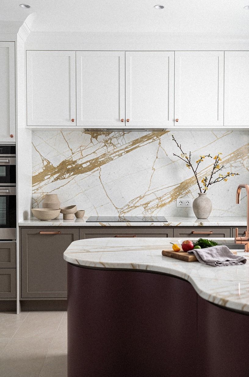
Benjamin Moore Simply White OC-117 can make oak cabinets feel cleaner without the sharp edge of a blue-based trim color. You’ll get a bright perimeter around the room, but the cabinet finish will still read warm. I’d use it when your counters are Calacatta marble with gold veining and your backsplash has plum, gray, or rose-gold movement.
Paint a sample board rather than brushing the color directly onto your trim. You’ll see how the white changes beside the cabinet doors, floor, and backsplash. If your kitchen has little natural light, Simply White may look warmer than expected, which is often helpful.
Your trim doesn’t need to be the brightest surface in the room. Calacatta marble with gold veining can carry the light more gently. And if you’re unsure whether the wall or trim should be lighter, keep the trim only one small step brighter so your kitchen feels connected instead of outlined.
Before choosing a crisp trim, notice how other dark tones change the perceived strength of surrounding colors.
6Swap Beige Walls for Sherwin-Williams Accessible Beige
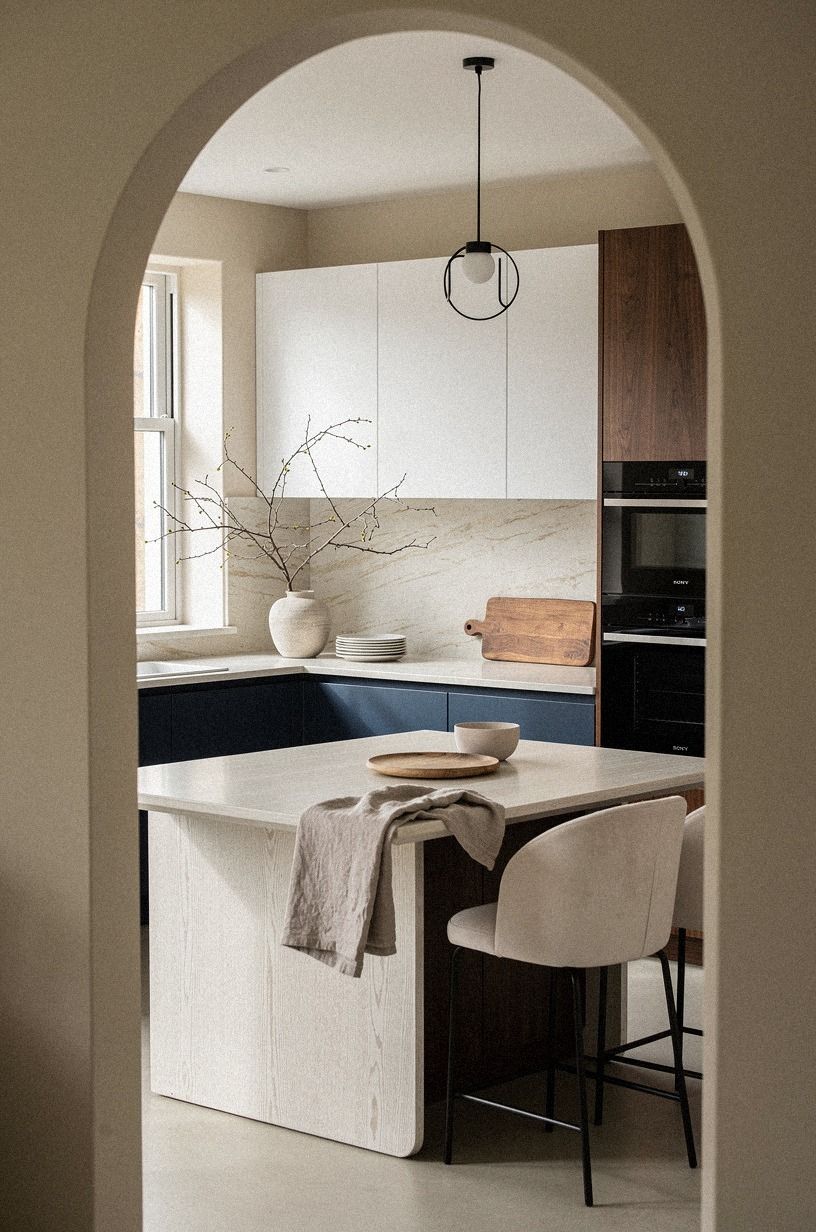
Sherwin-Williams Accessible Beige SW 7036 is a reliable bridge between oak cabinets and dated beige tile. You’ll get a warm greige that feels grounded, not yellow. This is one of my favorite kitchen ideas for light colors when the existing finishes can’t all be replaced at once.
The color works especially well with cerused white oak, navy accents, and cream textiles. I’d skip a pink beige here because it can pull strange peach tones from the oak. Accessible Beige gives you a quieter backdrop and lets the cabinet grain remain visible.
Paint the wall above the backsplash first and watch it for a full day. You’ll see the color shift from soft taupe in the morning to a warmer gray at night. If you’re using a dark floor, your walls need this little lift so you don’t feel boxed in.
Keep a record of the sample in changing light, just as you would with subtle color combinations that shift across the day.
7Can the Undertone Ladder Save a Bad Sample?
The Undertone Ladder is a quick way to judge paint without trusting a tiny paper chip.
8Frame Oak Cabinets With Farrow & Ball Joa’s White
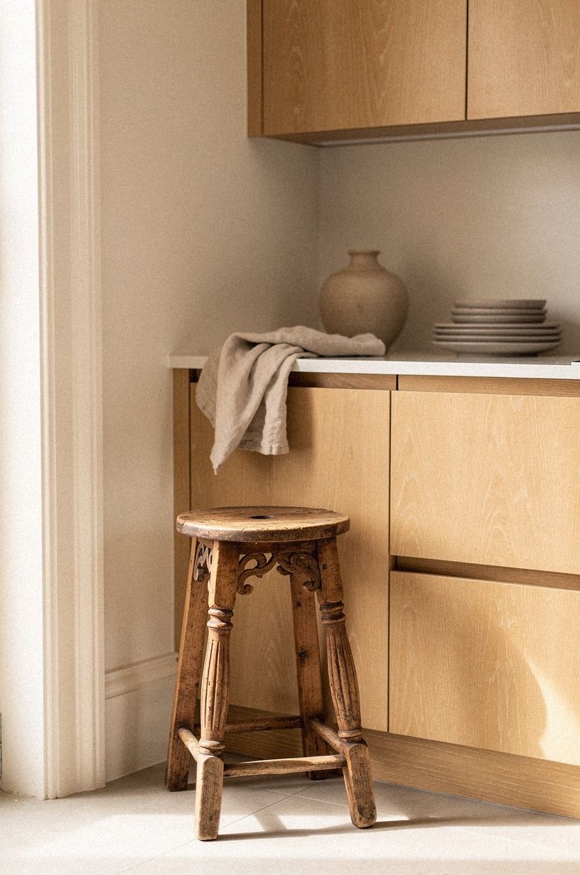
Farrow & Ball Joa’s White No. 226 is a soft, aged neutral that makes oak cabinets feel collected instead of stuck in another decade. You’ll notice a gentle warmth in the wall color, especially beside book-matched walnut or a counter with warm movement. I’d choose it when bright white feels too severe.
Keep your trim and walls in the same family, then create contrast with hardware. Aged bronze pulls will look richer than shiny chrome, and a dark woven runner will give the room some visual weight. Your oak won’t disappear, but it won’t dominate every other finish either.
A small kitchen can handle this color because it doesn’t create a hard border at the ceiling. You’ll get a continuous, peaceful background. If you’re styling a rental, use removable art and a tension rod rather than permanent changes, then keep your best color notes beside dark tones that create a lengthening visual effect.
9Hang Soft Blue-Gray Above Golden Oak
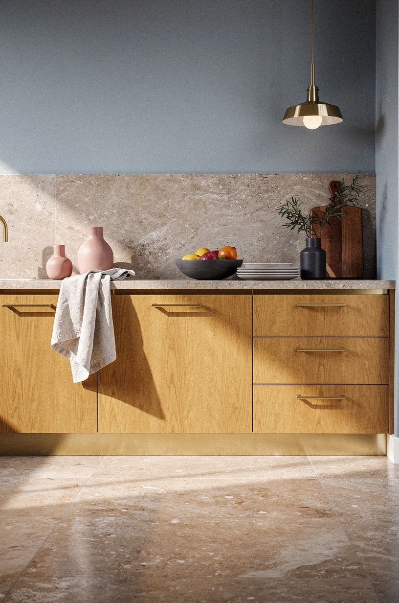
A soft blue-gray can balance orange oak beautifully, but you’ll need one with a warm or neutral base. Think muted storm cloud, not icy nursery blue. You’ll get a calm kitchen design with enough contrast to make the wood appear more golden and deliberate.
Use the color on walls above warm travertine, then repeat it in one small object such as a ceramic lamp or seat cushion. A charcoal accent with brass details gives the blue-gray a warmer companion. I’d avoid repeating blue across every accessory because the kitchen may start to feel themed.
Your sample should sit against the cabinet for at least one full afternoon. In low light, blue-gray can look much darker than expected. If it turns lavender, don’t force it.
You’ll be happier with a neutral gray-green that responds to the oak instead of competing with it.
A restrained color story usually ages better than a room built around one loud accent, as these subtle color combinations also suggest.
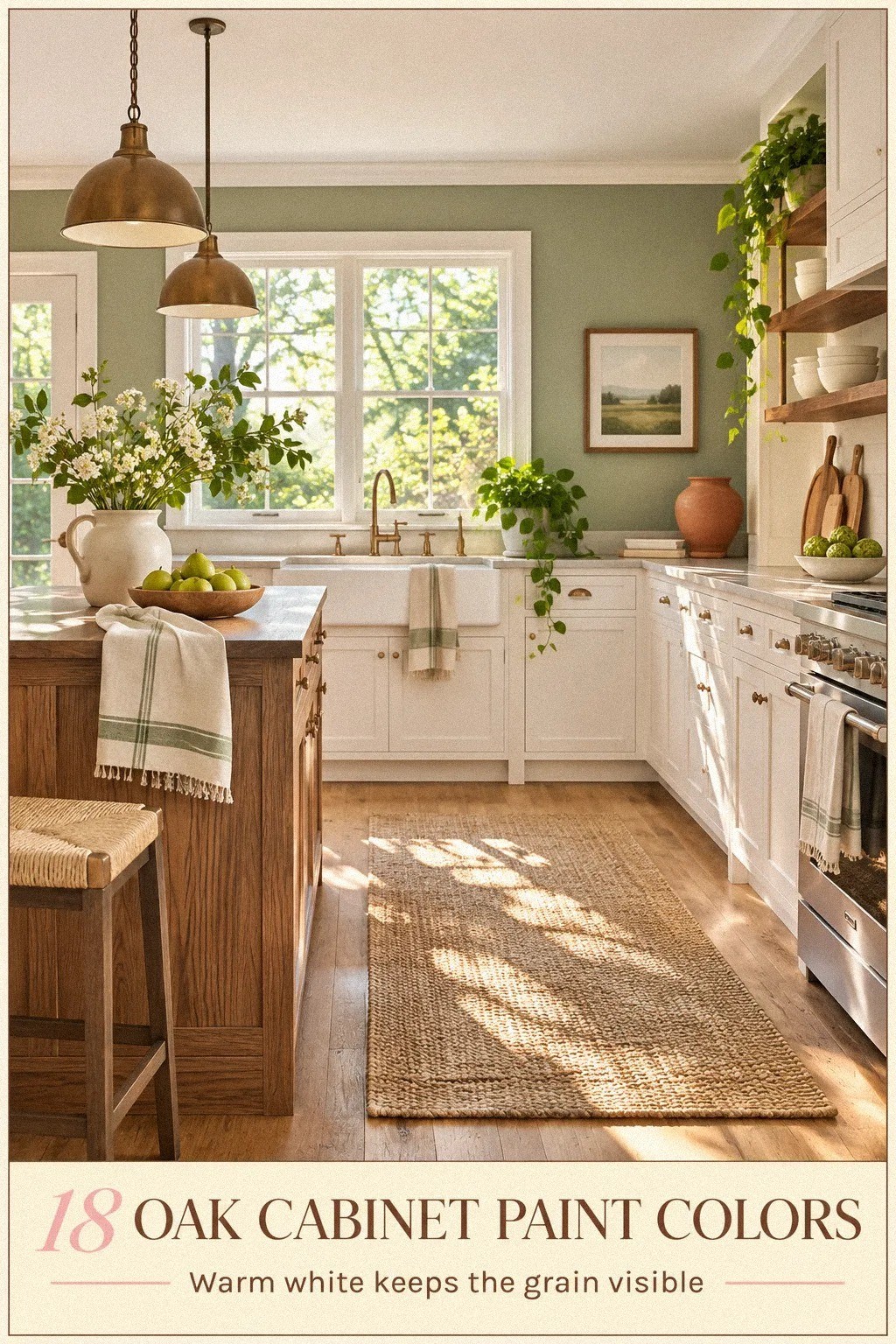
10Creamy Above, Warmth Below: When Should You Paint the Ceiling?
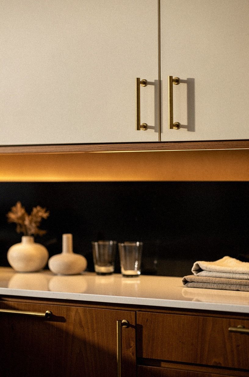
Painting the ceiling and trim in the same warm family reduces visual breaks.
11Try Benjamin Moore White Heron for Clean Trim Contrast
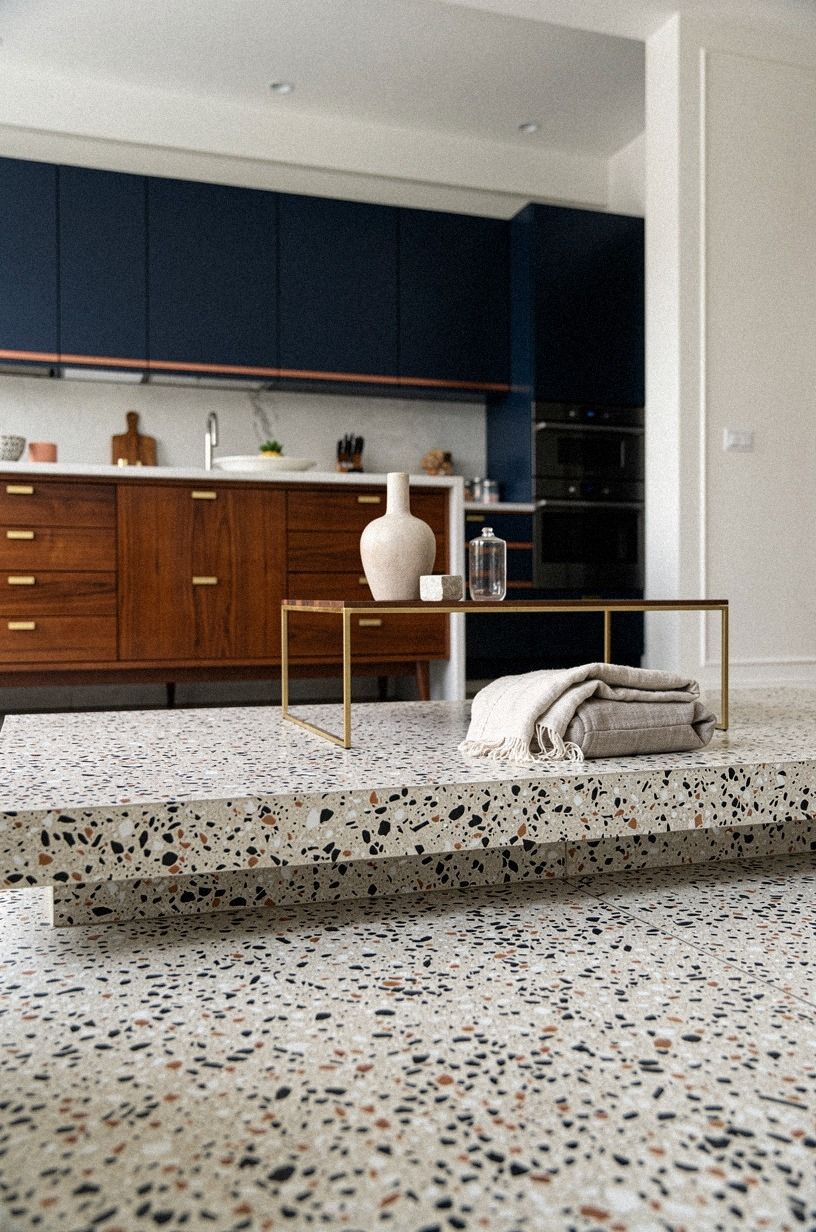
Benjamin Moore White Heron OC-57 is a cleaner white that can work on trim when your oak cabinets are medium-toned rather than deeply orange. You’ll get a sharper edge around the room, so use it only if your counters and backsplash can support that clarity.
Pair it with walls in a soft sand color, not another bright white. Oversized-chip terrazzo with warm movement can connect the trim and oak through its varied surface. If your counter is already busy, keep the backsplash quiet and let the wood provide the pattern.
Your kitchen should have one clear focal point. I’d choose the oak grain over a loud wall color because it has more texture and history. And if White Heron makes your cabinet doors look too yellow, you’ll know immediately that a softer trim color is the better call.
A gentler supporting palette may be easier to live with than a hard contrast, much like these subtle color combinations show in a smaller format.
12Why Does Sherwin-Williams Urbane Bronze Work Near the Pantry?
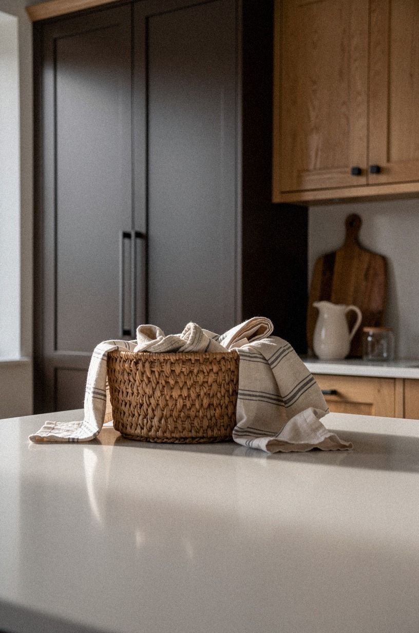
Use it where you want the room to slow down visually.
13Float Benjamin Moore Pale Oak Around the Cabinets
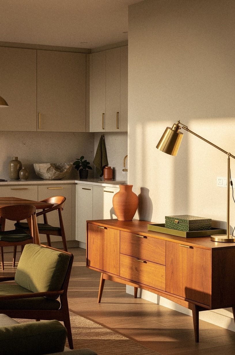
Benjamin Moore Pale Oak OC-20 creates a nearly seamless background for oak cabinets, but the result won’t feel bland if you add texture. You’ll get a light neutral that works in small kitchens and open plans because it doesn’t stop the eye at every corner.
Choose shagreen accents for a nearby seat or window cushion, then add a rough ceramic vase and one dark cutting board. Your room needs a few surfaces that absorb light so the pale paint doesn’t look washed out. I’d avoid pairing Pale Oak with too much glossy white.
The standard counter height is 36 inches, so anything below that line should feel sturdy and tactile. You’ll notice how the warm wall color makes the lower half of the room feel connected. If you’re styling a narrow kitchen, keep your accessories low and let the wall color create the breathing room.
For another quiet approach to color shifts, compare the room beside these subtle combinations.
14Paint the Island Black Forest Green
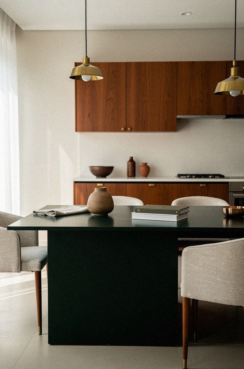
Benjamin Moore Black Forest Green HC-187 gives you a sophisticated contrast when the oak cabinets run around the perimeter. You’ll have a clear focal point, but the dark green still relates to natural wood. I’d use it on the island or a freestanding cabinet rather than every lower door.
Use clay-toned walls, aged brass hardware, and washed Belgian linen. Your eye will read the green as a grounded accent, then move to the oak and up to the lighter walls. This is bold, but it’s not loud!
Leave 42 to 48 inches of clearance around the island if you’re planning a new layout. You’ll need that space for doors, people, and the everyday shuffle of a kitchen. Paint can refresh the room, but it won’t fix a cramped work path.
That’s why I’d solve the clearance before buying new stools.
A deep island can supply the drama while the rest of the palette stays calm, just as these dark tones demonstrate through contrast.
15Mix Cream Walls With a Terracotta Accent
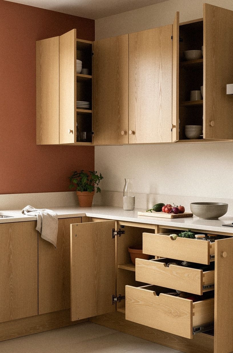
Terracotta can make oak cabinets feel warm and inviting, but a full terracotta kitchen may become too orange. You’ll get a better result by using a muted clay color on one wall, inside open shelving, or behind a breakfast table.
Pair it with organic bouclé in a muted neutral, especially if the fabric has a soft, nubby texture. Your oak already provides warm movement, so the upholstery needs an imperfect surface rather than another high-gloss statement. I’d skip bright turquoise because it turns the palette into a theme.
A cream wall around the cabinets will keep the room balanced. You’ll notice the terracotta most when sunlight hits it, and the color will soften after dark. If you’re worried about commitment, paint a removable panel and live with it for a week before touching the wall.
Keep the accent controlled, as you would with other subtle color combinations.
16Anchor the Room With the Three-Height Light Stack
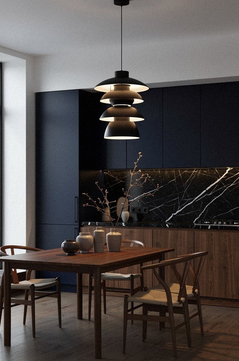
The Three-Height Light Stack uses a ceiling fixture, under-cabinet glow, and one low light source to make oak cabinets look richer. You’ll see the grain at eye level, the backsplash below, and the floor at night. Paint matters, but light decides whether the color feels warm or dull.
Use a warm bulb, a small lamp on a counter, and West Elm Slope counter stools below the island. Your eyes need more than one bright point, especially if the oak has a strong finish. I’d turn off the overhead light while you test samples because that’s when wall undertones become obvious.
Keep the backsplash gap near the standard 18 inches between the counter and upper cabinets if you’re updating the wall. You’ll have enough vertical space for a narrow strip of paint or tile, and your under-cabinet lighting won’t feel crowded. This small adjustment can make the entire palette read more calmly.
Light can make a neutral appear deeper or softer, so compare it with these dark tonal ideas only after testing your actual bulbs.
17Compare the Honest Cost Before You Repaint
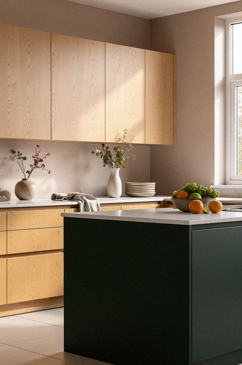
Paint is the least expensive part of a kitchen refresh, but you’ll want to compare it with the cost of hardware, lighting, and counters before choosing a larger plan. A cosmetic color change can be enough when your cabinets are solid and your layout works. You don’t need to spend remodel money to get a fresher room.
Here are typical US ranges for common kitchen updates:
You’ll get the most visible change from wall paint, better bulbs, and hardware that doesn’t fight the oak. Laminate countertop runs about $10-$40 per square foot, while quartz can run $60-$120 per square foot. I’d paint first and wait before replacing a surface that may look fine once the walls settle.
A modest budget can still support a thoughtful palette. Use subtle color combinations as a reminder that restraint often makes a change feel more intentional.
18Paint Trim to Match for a Calm Kitchen Design
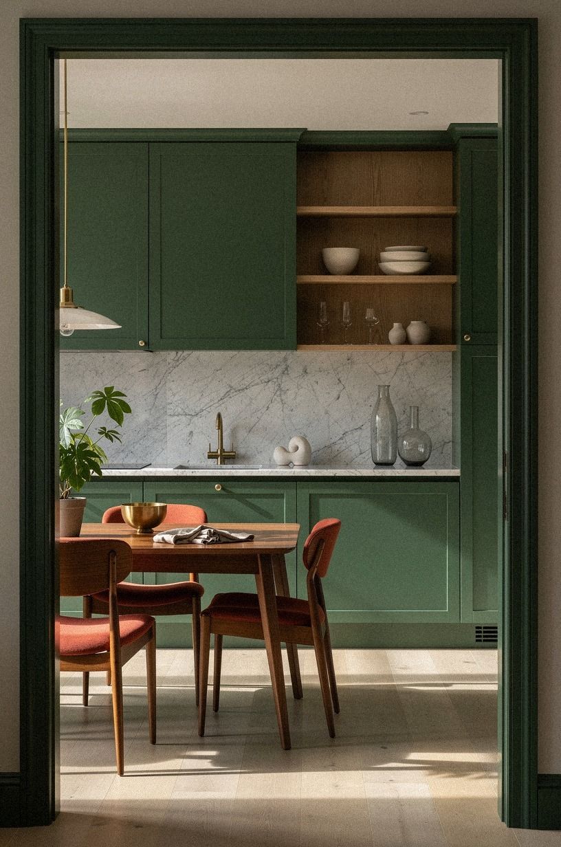
Painting the trim the same color as the walls can make oak cabinets feel less boxed in. You’ll create a quiet envelope around the kitchen, especially if the room has several doors, windows, and narrow wall sections. This works best with a warm neutral such as White Dove, Joa’s White, or Pale Oak.
Use different sheens instead of different colors. Your wall can be eggshell, while the trim gets satin, so the light changes gently across the surfaces. Benjamin Moore White Dove is especially useful here because it has enough warmth to sit beside oak without looking yellow.
I’d avoid bright white trim if your cabinets have a honey finish and your floor is also warm. The contrast can make every orange note stand out. You’ll get a more relaxed result by keeping the palette close, then adding interest through a woven runner, ceramic pieces, and one darker wood accent.
If you’re unsure how much contrast the trim needs, compare the surrounding effect with these dark tones before finalizing the sheen.
The Paint Decision I’d Make in My Own Kitchen
I’ve painted around oak cabinets more than once, and my first instinct used to be simple: make everything white and hope the room feels newer. That approach failed me.
The cabinets looked more orange, the counters looked dirtier, and every cool light bulb made the kitchen feel vaguely blue. I learned that oak isn’t a blank surface.
It carries a golden undertone, visible grain, and a warmth that needs a partner.
Now I start with the cabinet door, not the paint fan. I hold samples beside the hinges, the floor, and the counter, then I move them around the room.
One sample might look soft near the window and green beside the refrigerator. That information matters more than a designer’s room under controlled lighting.
You’re not choosing a color in isolation. You’re choosing how your existing finishes will speak to one another every morning.
My strongest opinion is to skip the cold white unless your oak is unusually pale and your room gets warm southern light. A cream white, muted green, or gentle greige usually gives you more room to work. I’d choose White Dove for a light reset, Evergreen Fog for character, and Studio Green only when you want the cabinets to feel like part of a moodier composition.
The best paint decision also respects your budget. If the layout works, you may not need new cabinets or stone.
Spend first on large sample boards, decent lighting, and the color that makes you stop noticing the orange cast. That’s the win.
Your kitchen should feel like your home, not like a showroom trying to erase its history.
The Questions I Get Asked Most
What is the best paint color to go with oak cabinets in a small kitchen?
Benjamin Moore White Dove and Sherwin-Williams Evergreen Fog are strong small-kitchen choices because they give you warm contrast without visual clutter. Use White Dove for a lighter room or Evergreen Fog when you want more personality. Keep trim close in value so your walls don’t look chopped up.
Where can I buy paint and kitchen pieces on a budget?
You can find paint at a local hardware store, IKEA, Target, or Wayfair, while Facebook Marketplace and thrift shops can cover stools and lighting. Secondhand wood pieces save money when you check measurements, finish, and stability before bringing them home.
How much does an oak cabinet paint makeover cost?
A cosmetic kitchen refresh typically costs about $300-$1,500 in the US, depending on paint, hardware, lighting, and backsplash materials. Paint and rearranging what you own can be free or inexpensive, while counters and cabinet fronts raise the budget quickly.
Can I create a fresh oak cabinet kitchen on a budget?
Yes, and you can start with sample boards, new bulbs, and rearranged accessories. A $300-$1,500 cosmetic range can cover meaningful changes when you paint the walls, update pulls, and use peel-and-stick backsplash material instead of replacing cabinets.
Is painting around oak cabinets worth it in a small space?
Yes, because a small kitchen shows color relationships clearly and needs fewer gallons of paint. A carefully chosen warm neutral can make the room feel larger when you keep the trim close to the wall color and avoid too many competing patterns.
Is this paint approach a good idea for a rental?
Yes. Use removable wallpaper or peel-and-stick backsplash panels, tension rods, freestanding furniture, and renter-safe lighting. No-damage changes still give you color control, and you can take every piece with you when the lease ends.
Where I’d Start First
If I had to pick one, I’d start with Benjamin Moore White Dove. It quiets orange oak without making the kitchen flat, and every later choice, from hardware to tile, has more room to work. Pin this guide for later and test the color beside your cabinets before buying a gallon!