12 Green and Red Christmas Tables That Skip the Cliche, Here Is What to Copy
25 october 2026The best green and red Christmas tables use restraint, texture, and one unexpected material instead of piles of matching decor. I learned that after covering a table in shiny ribbon and plastic holly. It looked loud, not festive. These twelve ideas feel warmer, more personal, and easier to copy. Start with the green linen foundation, then choose one accent from the modern red-over-green approach.
- Layer tartan under glossy red glass
- Build the Three-Height Light Stack
- Green linen, red accents
- Frame each place setting with rosemary
- What Should the Backdrop Do?
- The Two-Wood Rule
- Where Should Art Land Above the Table?
- Red lacquer meets soft green velvet
- Why Choose Candles Over a Giant Centerpiece?
- Red over green for a modern table
- Make the Three-Plate Rule feel collected
- Finish with a quiet red-and-green dessert table
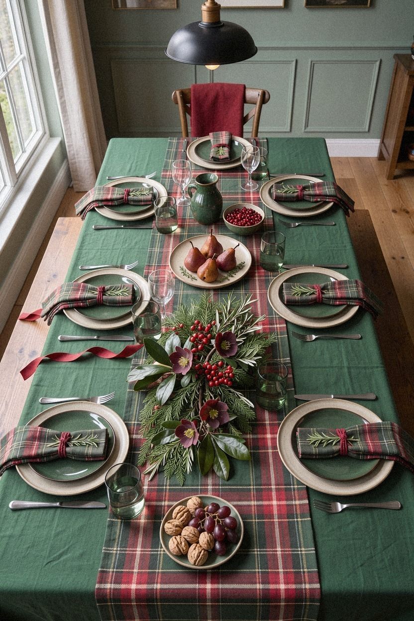
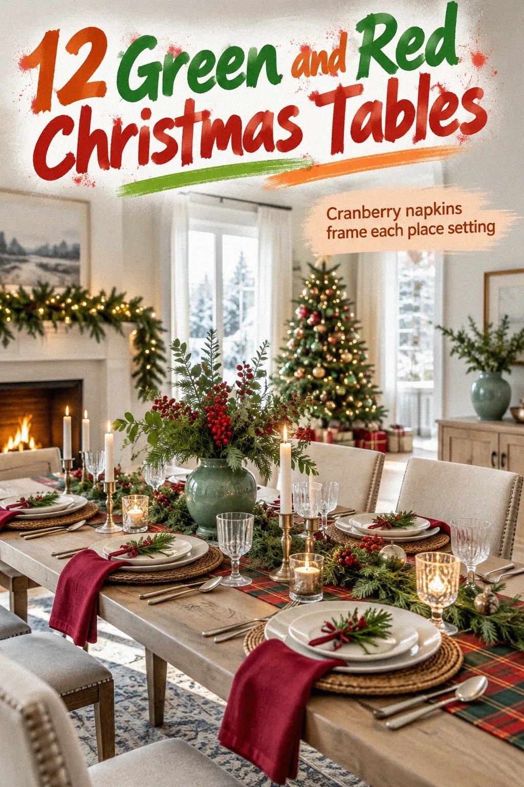
1Layer tartan under glossy red glass
Start with a muted emerald tartan runner, then let red appear in small, glossy doses. Add a little brushed gold so the table stays close to the cream, green, and metallic balance. I’d skip a bright red tablecloth here because it swallows every other detail and makes your plates feel stranded.
Use white stoneware, clear wine glasses, and low red tumblers. A few cranberry glass votives will catch candlelight without blocking conversation. If you’re setting a long table, keep the centerpieces below eye level so your guests can see one another.
- Emerald tartan runner - White ceramic plates - Red glass votives - Backlit translucent onyx serving slab
Your budget version can use a scarf as the runner and thrifted red glasses. The pattern doesn’t need to match perfectly. In fact, slight differences make your green Christmas tablescape feel gathered rather than staged!
For an especially inviting finish, repeat the runner’s green once in the glassware or napkins. The three-height lighting idea can then add glow without introducing another competing color.
2Build the Three-Height Light Stack
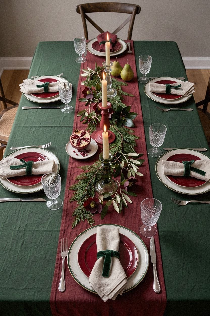
Three light levels make a red and green table feel intimate after sunset. Combine taper candles, short votives, and one hanging fixture or nearby lamp. You’ll notice the difference before dessert, when overhead lighting usually turns every plate a little gray.
I like a low book-matched walnut tray beneath the candles because its grain gives the glow somewhere warm to land. Pair it with deep forest-green tapers and rust-colored berries. You don’t need a dramatic floral arrangement when the light is doing the visual work.
Keep each flame safely away from napkins and greenery. A narrow table needs more breathing room, so use two holders rather than six. For your wider dining table, repeat the heights in three loose clusters instead of creating one solid line.
And don’t forget the room beyond the table. Three sources per room, overhead, task, and ambient, keep the dinner area from looking like a bright island surrounded by darkness. That’s a small adjustment, but it changes the whole evening!
If you prefer a quieter look, pair the lighting with the green linen and red accent combination. The result feels luminous without looking theatrical.
3Green linen, red accents
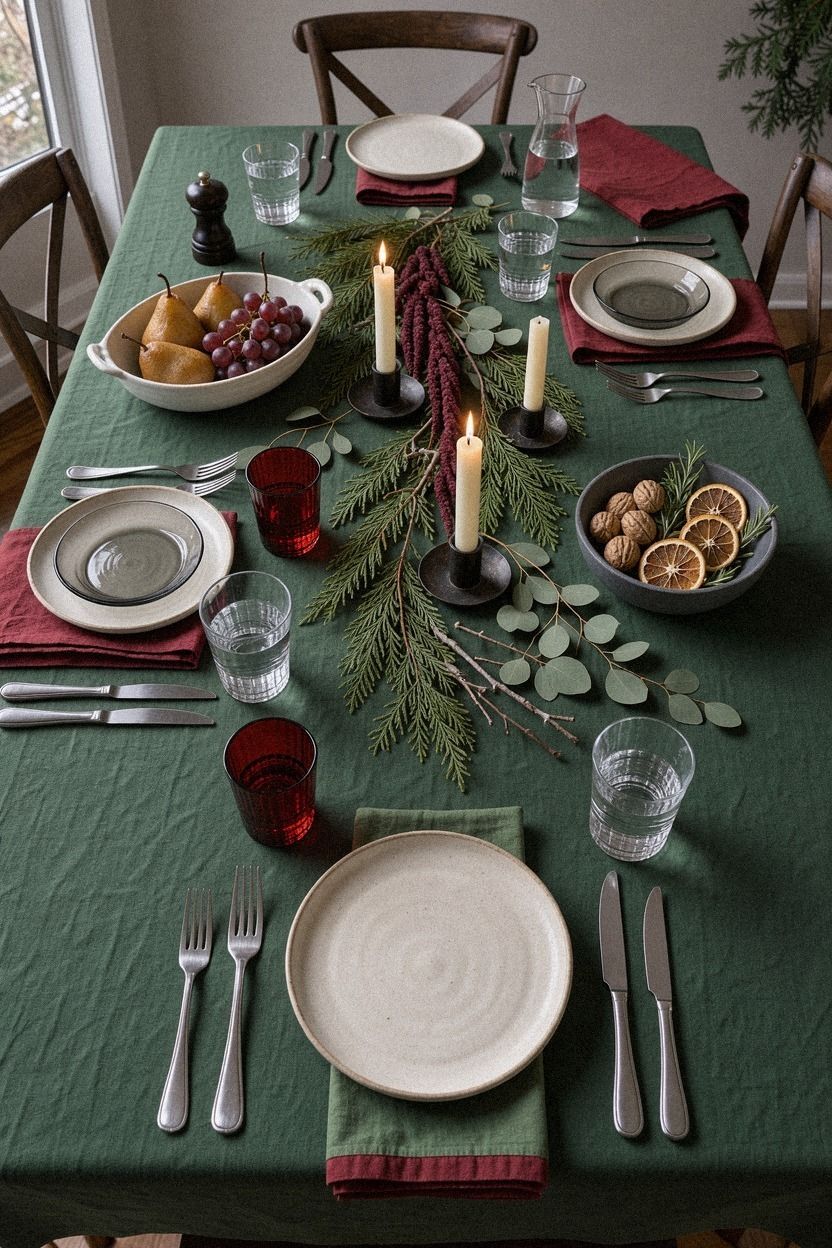
A washed dusty rose linen cloth gives darker accents somewhere quiet to land. Choose an imperfect texture instead of crisp polyester. The wrinkles are useful because they soften the color and keep your setting from feeling too formal.
Belgian flax linen in dusty rose works especially well with warm white plates. Add charcoal cotton napkins, but don’t fold them into elaborate shapes. A loose knot beside each plate looks relaxed, and you’ll save yourself twenty minutes before guests arrive.
A warm travertine serving tile is a better partner than a stark blue-white ceramic tray. It keeps the setting gentle while darker textiles bring the energy. I tested a cooler stone once, and the softer colors looked flat by candlelight.
If you’re renting, use a removable table runner rather than changing the room around the table. Your table should carry the seasonal color, while your walls stay useful for the rest of the year.
This is also the easiest base for the rosemary place-setting idea. The fabric handles the broad color, leaving the smaller details free to feel charming.
4Frame each place setting with rosemary
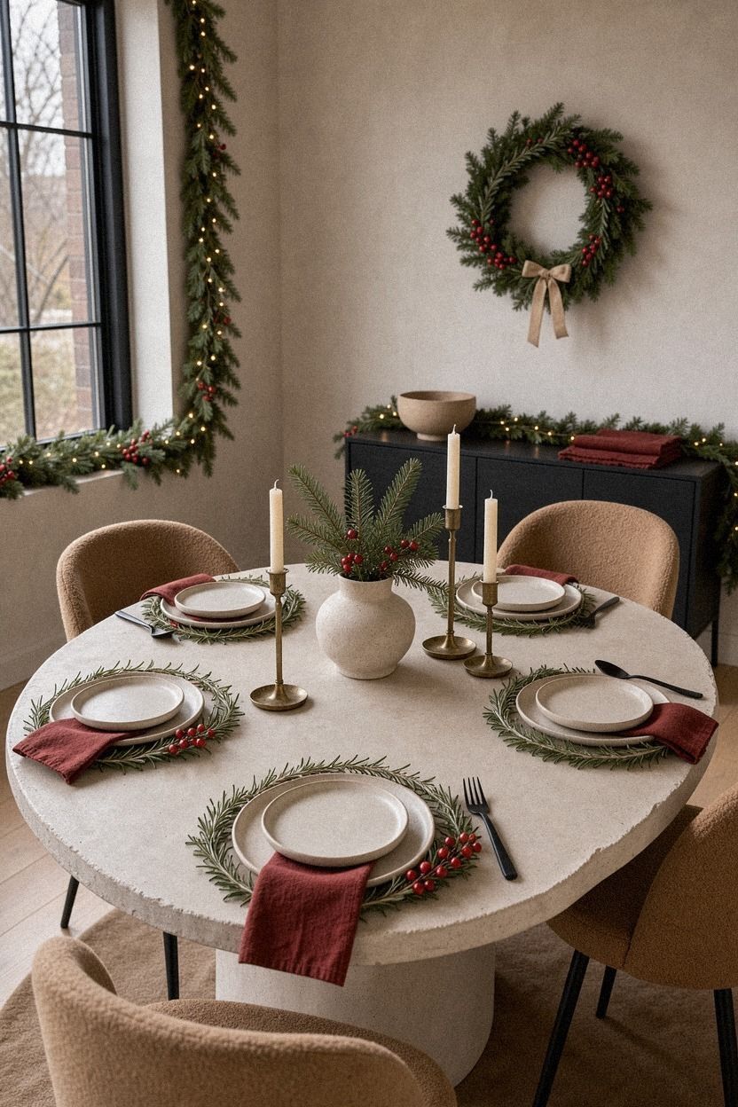
Fresh rosemary gives you color, scent, and structure in one inexpensive layer. Slip a small sprig beneath each napkin or tie it with cotton twine. When your guests sit down, the piney fragrance feels festive without competing with the food.
I’d choose camel linen napkins with visible weave rather than satin. Satin reflects every light source and can make a casual dinner feel theatrical. Linen absorbs the glow, and you’ll get a richer neutral beside the green herbs.
Use warm white plates with a narrow rim, then add a small place card written in black ink. You don’t need a full centerpiece when each setting carries a little detail. The table will feel generous, not crowded.
Your rosemary can sit in a low unlacquered brass bowl between the plates. Add a few walnuts or dried orange slices if you want another earthy note. And if the herbs start to shed, place them on a tiny scrap of paper first.
This approach works beautifully with a painted dining backdrop, especially when the wall color is softer than the table linens. The whole arrangement feels personal and quietly festive.
5What Should the Backdrop Do?
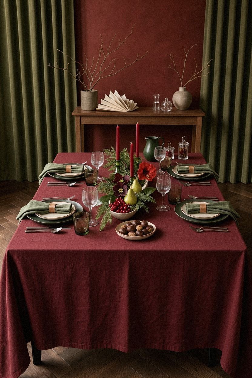
A small midnight blue painted backdrop can make your table feel intentional without turning the season into a permanent theme. Bring in copper, ivory ceramics, or an oversized-chip terrazzo serving surface to give the arrangement more texture.
6The Two-Wood Rule
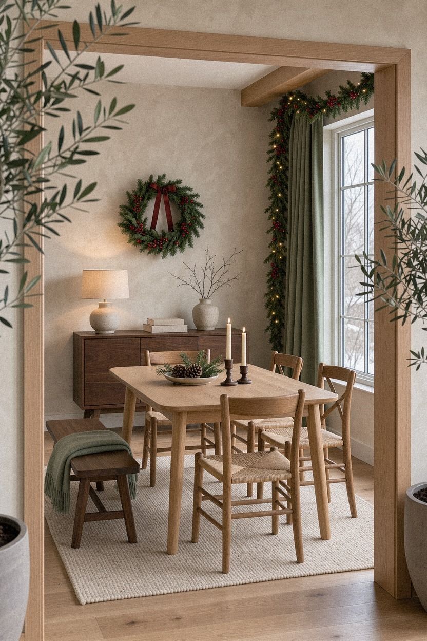
Use two wood tones, not five. A warm natural oak serving board and lighter wood utensils create enough contrast while keeping the table organic. I’ve tried mixing every wood I owned, and the setting looked accidental rather than collected.
Let the green come from foliage and the warm cream come from ceramics. A bowl of pears, folded linen, and one hand-applied Venetian plaster wall or tray surface supply enough variation without adding another loud accent.
For a budget table, pair a thrifted oak tray with your everyday cutting board. Don’t worry if one has scratches. Those marks make the surface feel lived-in, and your guests won’t mistake it for a showroom prop.
If your dining chairs are pale, a Target Threshold ladder-back chair or another warm wood seat can bridge the table and room. Keep the furniture simple so the seasonal details don’t have to fight for attention.
The wood rule is especially useful when you want to hang something above the table. Keep the frame material in conversation with the table, then follow this guide to hang art at the right height.
7Where Should Art Land Above the Table?
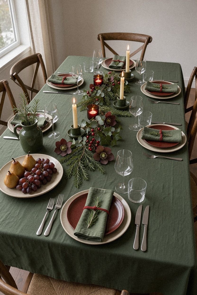
Green and red tablescapes need a vertical layer, especially when the table itself is narrow. Hang a botanical print or winter landscape with its center about 57 to 60 inches from the floor. That height keeps the art comfortable to view while standing or sitting.
Choose a print with one muted terracotta detail, such as a berry branch or roofline. A shagreen frame will add quiet texture, but I’d avoid a bright gold frame if your table already has warm metal accents.
The art doesn’t need to show Christmas. An olive landscape can stay up all winter, which means you’ll get more use from the purchase. Your seasonal color can come from the table rather than every surface in the room.
And if you’re using a rental-friendly hook, check the weight before hanging glass or a heavy frame. A lightweight paper print in a stone-toned frame gives you the same visual height with less risk.
When the wall is doing this much work, keep the centerpiece low. That leaves room for the candle-focused arrangement to add atmosphere without blocking the artwork.
8Red lacquer meets soft green velvet
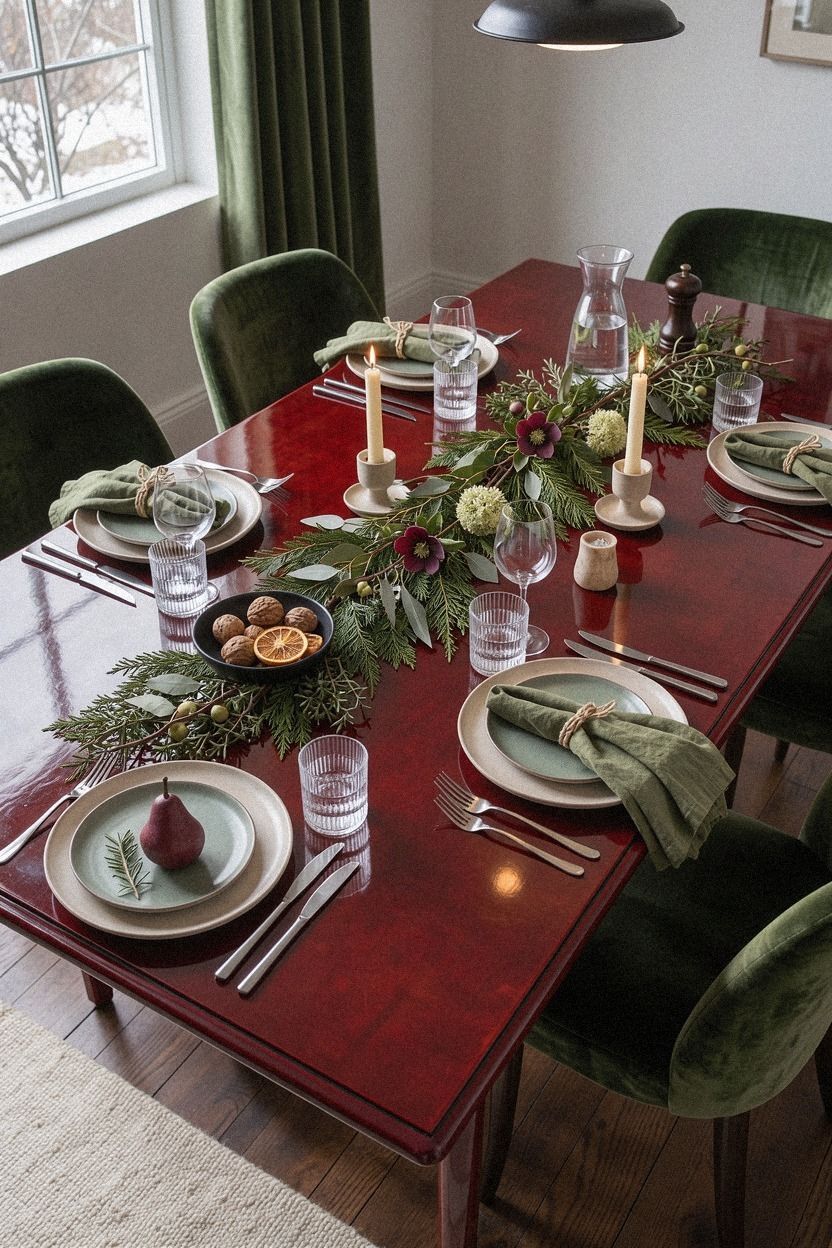
Glossy clay-red and soft natural textures create the strongest contrast in this list, so use both with discipline. A clay-red lacquered bowl or glass vase can carry the red, while washed Belgian linen appears on the dining chairs or nearby bench.
The linen softens the lacquer and works especially well when your room has warm wood. Add one piece of aged brass rather than several shiny metallic objects. You’ll want only one or two strong accents, not a full seasonal furniture suite.
Add cream plates and a neutral runner to stop the setting from becoming theatrical. A small red bowl for salt or cranberry sauce is enough to connect the food to the palette.
For a less expensive version, use a washed linen ribbon around napkins instead of buying new upholstery. That tiny strip gives you the texture without committing to a seasonal chair. Worth it!
Keep the tabletop quiet and let the materials provide the drama. A restrained place setting, such as the three-plate rule, will make the lacquer and brass feel deliberate.
9Why Choose Candles Over a Giant Centerpiece?
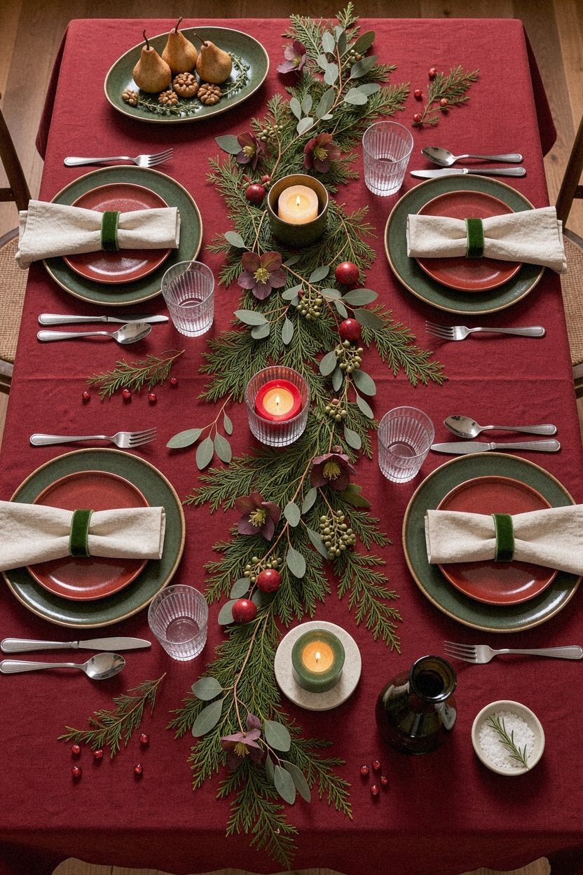
A long row of low candles can make your table feel warmer than one oversized arrangement. Use plum candles, grey holders, and one small rose-gold detail; an organic bouclé seat nearby can supply softness without crowding the food.
10Red over green for a modern table
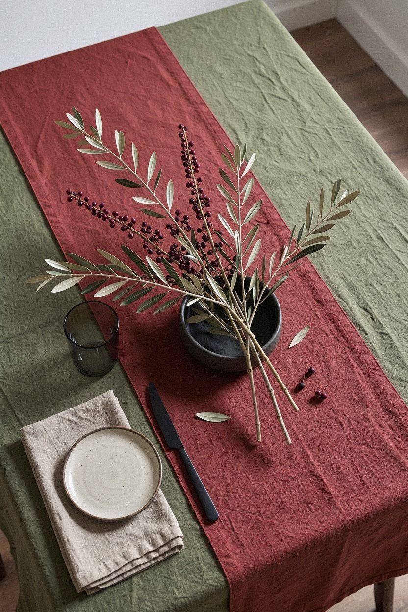
Red over green works when you want the setting to feel graphic and modern. For a quieter version, start with navy plates or a deep navy runner, then add white napkins, walnut serving pieces, and one restrained accent.
I’d avoid combining too many saturated colors unless your room has strong natural light. A Nero Marquina black marble board with white veins can ground the contrast and give the table a sharper, more architectural finish.
Choose forms with clean edges, such as square napkin folds, slim candlesticks, and a round walnut bowl. Your shapes should do some of the styling, so you won’t need layers of themed ornaments.
A walnut dining chair nearby can bring in warmth without adding another competing color. The table will still feel welcoming, but it won’t read as traditional. That balance is the reason I’d choose this approach for a contemporary dining room.
For a softer version, swap deep navy for ink blue or a smoky blue-gray. The composition stays vivid, but the mood becomes more forgiving.
11Make the Three-Plate Rule feel collected
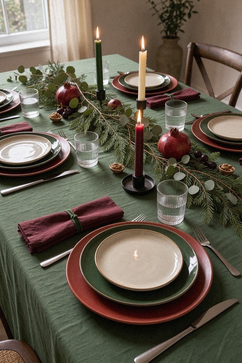
Set three plates only when you’re serving a relaxed meal: dinner plate, salad plate, and a small bread or dessert plate. Varying shape or rim color gives your setting character without requiring a full matching collection.
Use cream stoneware as the quiet base, then bring in gold through a smaller plate or shallow bowl. Emerald glassware can sit beside it, but keep the rest of the setting neutral. You’ll get color in layers rather than one loud block.
If you own mismatched dishes, this is your invitation to use them. A gold rim, an emerald glaze, and one plain cream plate can look deliberate when the napkins repeat one color.
Your table doesn’t need a new service for twelve people. Start with what you have, then add one useful piece. I’d spend money on a good serving bowl before buying seasonal chargers that sit in a closet for eleven months.
The collected feeling comes from repetition, not sameness. Repeat one gold detail, one green detail, and one warm material, then let the plates retain their individual character. A deep-pile mohair velvet cushion nearby can add softness without crowding the setting.
12Finish with a quiet red-and-green dessert table
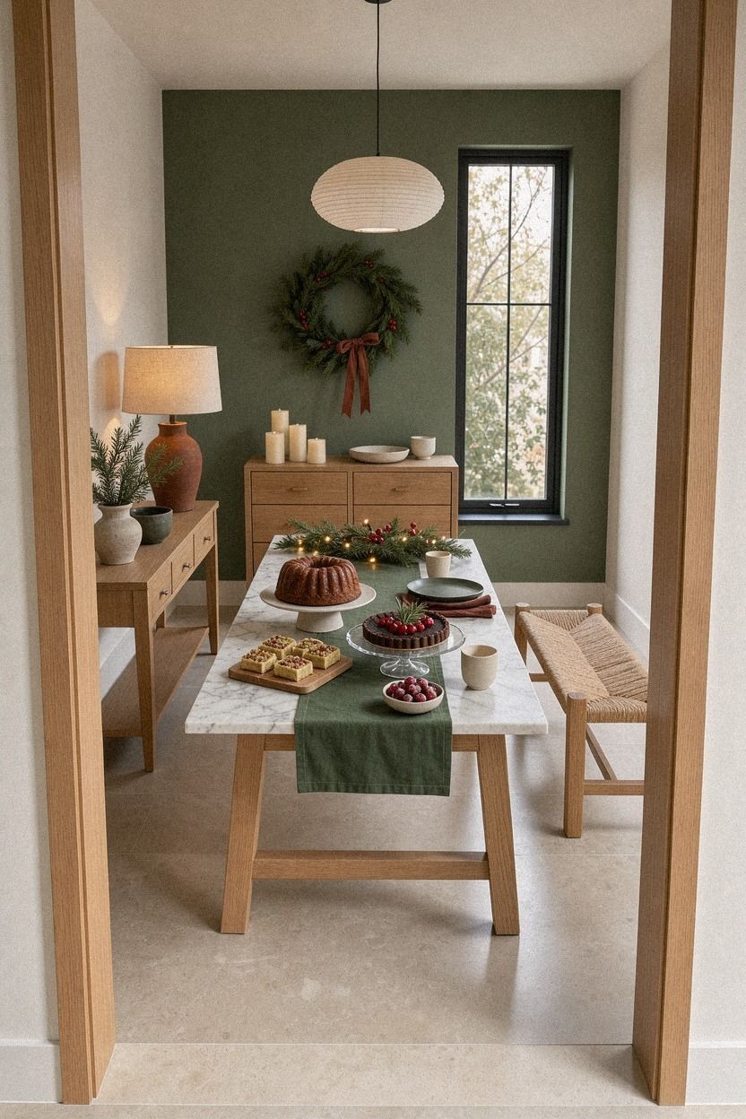
A dessert table gives you permission to use more color because the food becomes part of the arrangement. Set the desserts on a natural oak board, then add forest green napkins, rust-toned fruit, and a Carrara marble stand with subtle gray veining.
What These Tables Get Right
The most successful green and red Christmas tables don’t rely on more decorations. They rely on repetition with interruption. Green appears twice or three times, red appears in smaller doses, and one material keeps the whole setting grounded.
I’ve learned to choose the surface before the accessories. A washed linen cloth, rough oak board, or softly glazed plate gives you a foundation that plastic ornaments can’t provide. When the material has texture, you don’t need to keep adding objects to make the table feel finished.
The other decision is scale. A narrow table needs low vessels and slim candles.
A large table can carry a bowl, a tray, and three light clusters, but you’ll still want empty space between them. Your eye needs a pause.
Paint matters, too. Farrow & Ball Pigeon No.25 supports muted greens, while Benjamin Moore White Dove OC-17 keeps stronger reds from becoming harsh. If you already have warm gray walls, you may not need to change them at all.
And the palette should serve the meal. Deep green with red berries feels woodland and familiar.
Green glass with lacquered red feels more modern. You can choose either direction, but mixing every Christmas reference at once will make the table noisy.
What Things Cost
These are typical US room and furnishing ranges, not a promise for one table. Your existing linens, dishes, and branches can bring the cost down quickly.
For a tablescape, you can stay near the lower end by using your everyday plates and buying only one strong textile. A Turkish cotton napkin set can work for Christmas, birthdays, and ordinary Sunday dinners, so your money keeps working after the season.
If you’re deciding between a new centerpiece and better lighting, choose the lighting. Your candles, food, and people will all look better under a warm, layered glow.
For a smaller investment, begin with the rosemary setting and add one beautiful textile later. That sequence gives you a visible improvement without committing to a full room update.
Why I’d Skip the Matching Christmas Set
I’ve bought matching holiday pieces before, and the table looked finished in five minutes, then flat for the rest of the night. Everything had the same shine, the same scale, and the same idea. There was nowhere for your eye to wander.
A table feels personal when one thing doesn’t quite belong but still makes sense. That might be a thrifted red goblet beside plain white plates, or a vintage brass candlestick beside green glass. You’ll remember those odd pieces because they carry a story.
This doesn’t mean your setting should look random. Repeat one color, one texture, and one shape.
Then interrupt the pattern with something handmade or inherited. The contrast gives your table a pulse.
But don’t force a rustic look if your room is sleek. A glossy red bowl and smoked green glass will suit your space better than pinecones and burlap. The best choice is the one that respects the room you already have.
If you want variety without visual chaos, combine this principle with the Three-Plate Rule. Mismatched dishes look far more intentional when their shapes and colors have a clear relationship.
A Few Things Worth Answering
What is the best green and red Christmas table for a small dining room?
A green linen runner with red napkins and low candles is the best small-space choice. You’ll keep the table open while still getting strong color contrast. An IKEA wood tray can hold greenery without taking over the center.
Where can I buy green and red Christmas table pieces on a budget?
Look at IKEA, Target, Wayfair, Facebook Marketplace, and local thrift shops. You’ll often find useful secondhand pieces such as red glassware, brass holders, and wood trays. I’d search for materials first, then color, because quality matters more than a perfect match.
How much does a green and red Christmas tablescape cost?
A small refresh can cost about $100 to $300 when you reuse dishes and gather branches for free. A broader room update may fall within the typical $200-$800 budget tier, especially if paint, textiles, and art are included.
Can I create this look on a budget?
Yes, and you can start without buying anything. Use a scarf as a runner, clip rosemary from the grocery bundle, and group your existing red or green dishes. A single linen napkin set can then give the table a more finished texture.
Is a green and red tablescape worth it in a small space?
Yes, because a small table needs fewer pieces to make an impression. Keep the centerpiece low, repeat one red accent, and leave clear serving space. Your room will feel more inviting when the table supports movement instead of crowding it.
Is a green and red tablescape a good idea for a rental?
Yes. Use a removable runner, tension-rod curtains, peel-and-stick art hooks, and tabletop decor instead of permanent changes. Removable styling lets you bring in color for the season without repainting walls or drilling into the dining area.
Where I’d Start First
If I had to pick one, I’d start with the green linen runner. It gives every red accent a calmer background, and you can reuse it for winter dinners long after Christmas. Pin this idea for later, then build the rest from pieces you already own.