17 Romantic Bedroom Paint Colors to Pick Your Perfect Palette
12 october 2026Romantic bedroom paint colors work best when they soften the room without making it sugary. I once chose a blush that looked gentle on the sample card and fluorescent by bedtime. Your bedroom needs a color that changes well from morning sun to lamplight. These palettes do that with warm neutrals, earthy pinks, blue greens, and careful contrast. Start with the soft canopy approach if you want the room to feel intimate without buying anything new.
- Paint the Ceiling for a Soft Canopy Effect
- Layer Benjamin Moore Pale Oak with Creamy Textures
- Follow the Two-Temperature Rule
- Choose Dusty Rose with a Brown Undertone
- Anchor the Room with Hague Blue
- Use Tonal White for a Quiet Romantic Bedroom
- Swap Cool Gray for Accessible Beige
- Frame the Bed with a Muted Clay Wall
- Float a Picture Rail in a Pale Green
- Build the Three-Height Light Stack
- Mix the Two Woods Carefully
- Warm the Palette with Terracotta Details
- Should You Paint the Trim Too?
- Pair Dark Walls with Pale Bedding
- Create a Color-Drenched Reading Corner
- Choose Paint Over a Busy Accent Wall
- Finish with the 60-30-10 Palette Balance
1Paint the Ceiling for a Soft Canopy Effect
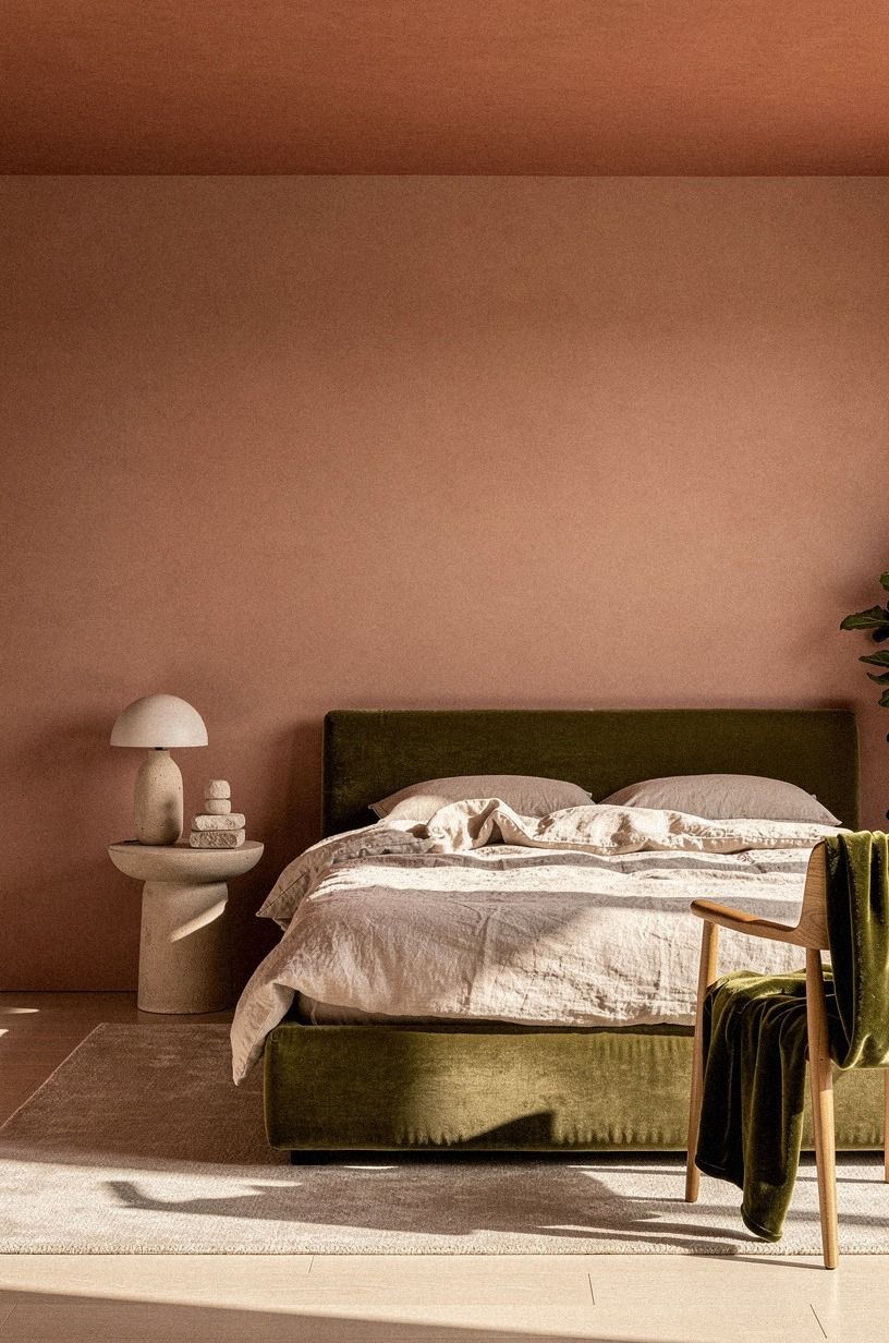
A painted ceiling can make your bedroom feel intimate without adding another piece of furniture. Try a muted terracotta on the walls and carry a diluted version onto the ceiling.
The earthy warmth stays gentle in daylight, while the ceiling color keeps the room from feeling boxed in after sunset. If you're painting a queen room, keep the 60x80 inch bed visually centered so the canopy effect feels intentional.
You don't need a complicated treatment here. Your ceiling, walls, and trim can sit within the same warm family, but I'd skip bright white trim because it creates a hard outline.
A matte finish on the ceiling and an eggshell finish on the walls will catch light differently. That small shift gives you depth without making the palette busy.
Use deep-pile mohair velvet on the headboard or bench, then add stone-colored bedding with a narrow olive accent. And if your room has low light, test the paint beside your lamp before committing.
The color may look terracotta at noon and more muted at night, which is exactly why samples matter. That tiny test can save an entire weekend!
2Layer Benjamin Moore Pale Oak with Creamy Textures
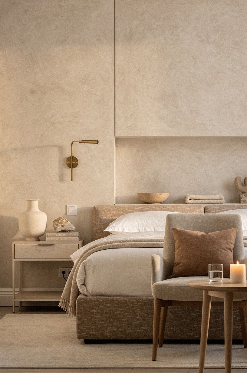
Benjamin Moore Pale Oak OC-20 is a calm choice when you want romantic bedroom colors that don't turn pink or gray. Pair it with clay tones and hand-applied Venetian plaster so the room feels warm without becoming heavy. I've used pale greige walls with a queen bed, and the room felt airy without losing its softness.
Your best supporting materials are quiet ones. Think washed-linen bedding, a woven bench, and a wall finished with hand-applied Venetian plaster. You can bring in a touch of color with faded clay pillow covers, but don't match every surface.
A room becomes more inviting when the textures shift while the palette stays related.
But I wouldn't pair Pale Oak with icy silver hardware. Your bedroom will look flatter, especially under cool bulbs.
Choose aged brass instead, then repeat that finish on the nightstands and small decorative details. The result is gentle, refined, and easy to live with through changing seasons.
For a nearly monochromatic version, compare this with tonal white layering.
3Follow the Two-Temperature Rule
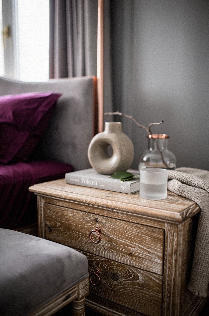
The Two-Temperature Rule means pairing a warm wall color with a cooler accent that still has enough gray to feel settled. Try plum walls, then introduce a soft gray on the back of a bookcase or the inside of a closet door. You're creating a quiet tension, not a color clash.
Your room will feel more layered if the cooler gray appears in at least three places. A gray ceramic lamp base, a small lumbar pillow, and a painted stool can repeat the tone without turning the bedroom into a theme.
I'd skip a full gray accent wall if your room already has heavy furniture. The color can feel dense, while a smaller dose stays earthy and calming.
What would you rather wake up to, a room with one loud wall or a room where color travels gently across the details? Reclaimed weathered teak furniture will soften the plum, especially when the grain catches early light.
Add a small rose-gold detail for warmth, and keep the bedding plain because the wall and wood already provide enough movement. If you prefer a stronger focal point, a muted clay backdrop gives the same sense of definition with more warmth.
4Choose Dusty Rose with a Brown Undertone
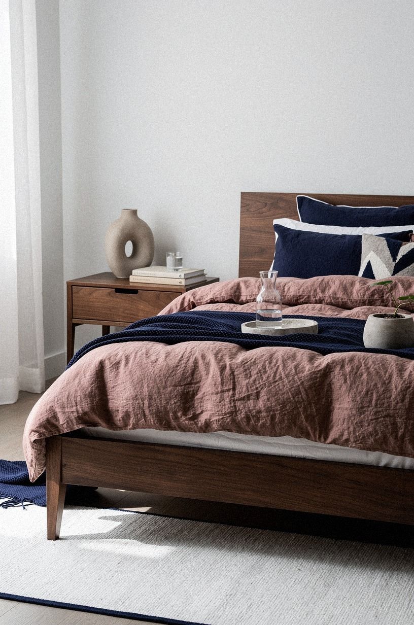
Dusty rose works beautifully when it leans brown instead of candy pink. To keep it grown-up, balance it with navy, white, and walnut rather than adding more blush. Your room will feel warm and intimate without becoming childish.
I made the mistake of choosing a rose paint with too much blue once. It looked charming on the card and cold beside our lamps.
If you're testing this palette, place the sample near your headboard, curtains, and floor, not just against an empty wall. The surrounding materials change what your eye sees.
Use washed Belgian linen on the bedding or upholstered bench to keep the walls from feeling overly smooth. Your supporting pieces can stay white, ivory, or walnut. But don't add bright metallic accessories everywhere.
They sharpen the contrast and take away the lived-in softness that makes dusty rose work.
If pink still feels too sweet, borrow the grounding logic from terracotta details. Navy and walnut give the palette its grown-up quality.
5Anchor the Room with Hague Blue
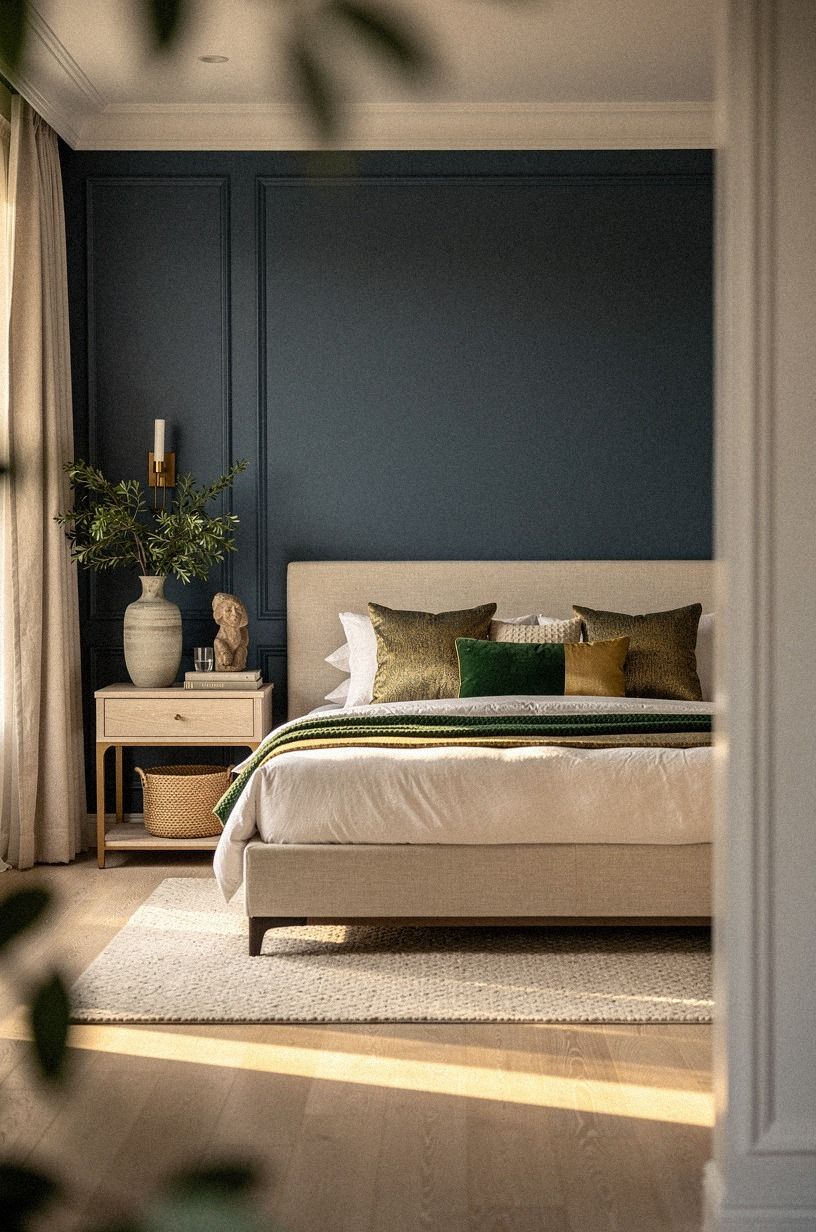
Emerald green can feel romantic when warm gold and cream keep it from feeling heavy. Add cerused white oak nearby to soften the contrast and give the palette a natural foundation.
6Use Tonal White for a Quiet Romantic Bedroom
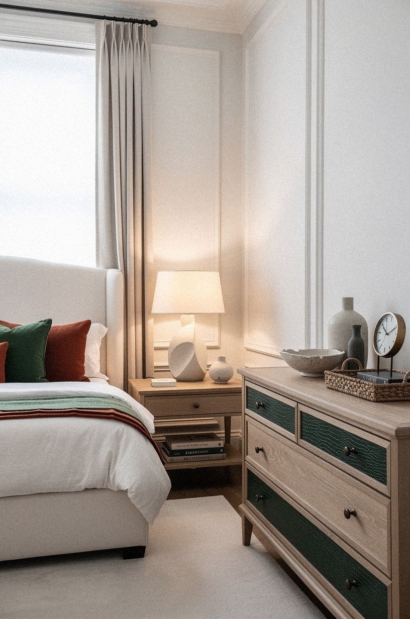
A tonal white bedroom isn't plain when the whites have different undertones and finishes. Start with a forest green wall, then bring in rust textiles and natural oak so the room feels grounded rather than stark. Your room will feel serene because the materials have warmth, not because everything is identical.
Use shagreen accents on a small tray, lamp base, or bedside detail when you want subtle texture. Add a headboard in a quiet neutral fabric and let the rust appear in one or two places. The material matters more here than a loud accent color, so don't buy a pile of small accessories just to fill empty surfaces.
But you shouldn't use bright optic white beside a deep forest green wall. The contrast can make the room feel sharper than intended.
Your better move is to repeat the natural oak in the rug, lampshade, or bedside table. A single rust textile will add romance without breaking the peaceful palette.
The tonal approach is especially useful in a small bedroom. It gives you room for contrast through a muted clay wall, a natural oak piece, or the three-height lighting stack.
7Swap Cool Gray for Accessible Beige
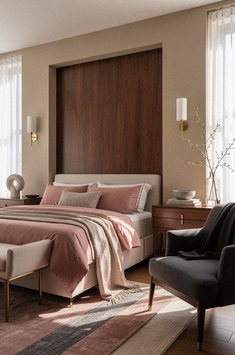
Sherwin-Williams Accessible Beige SW 7036 is a strong choice when your bedroom feels cold but you don't want obvious color. It reads as a soft neutral with enough warmth to support romantic details. I've seen it work especially well with charcoal accents, cream upholstery, and woven shades.
Your walls can handle a little contrast, so bring in a headboard or bedside piece in book-matched walnut. The figured wood adds depth without making the room overly sweet. I'd skip cool gray furniture, which pulls the beige toward dullness.
And you don't need to repaint every trim surface. Keep existing white trim if it has a warm cast, then test one wall before buying the full amount. Add a restrained brass detail near the bed, so the practical details support the romantic feeling.
Accessible Beige also gives you a flexible base for dark walls with pale bedding in an adjoining dressing area. The two spaces can feel connected without using the same paint everywhere.
8Frame the Bed with a Muted Clay Wall
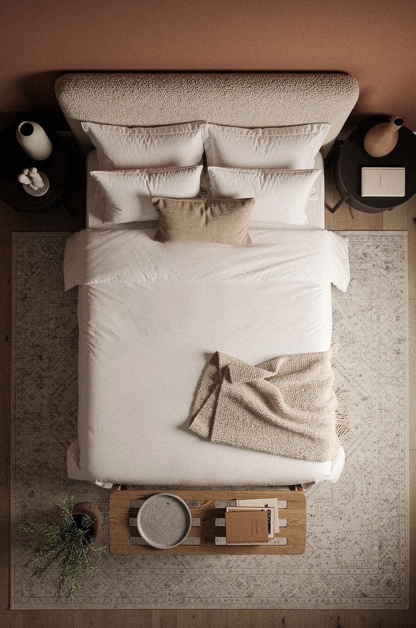
A warm white wall can give your bed the visual weight of a painted backdrop while leaving room for camel and black accents. Add an organic bouclé headboard or bench to keep the surface soft and tactile.
9Float a Picture Rail in a Pale Green
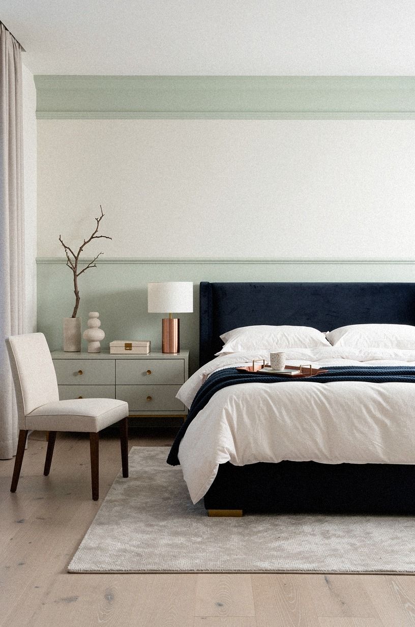
A picture rail creates a useful stopping point for color. Paint the wall below it a deep midnight blue, keep the upper section ivory, and hang art so the two zones feel connected. Your room gets architectural interest without a full renovation.
Use unlacquered brass developing a natural patina on a small decorative object or lamp base. The changing finish will echo the blue wall and catch little flashes of warmth. You don't need matching artwork, but you do need one repeated copper note or ivory textile.
I'd skip a stark black rail in a small bedroom. It draws a heavy line across the room and makes the ceiling feel lower. Your better option is a copper-toned rail or one painted a shade deeper than the lower wall.
And if you're working with rental walls, a removable molding strip can give you a similar effect.
The upper ivory section can follow the logic of tonal white, while the lower blue can echo the contrast in the two-temperature rule. That keeps the color story intentional.
10Build the Three-Height Light Stack
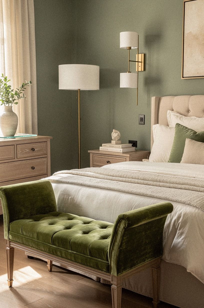
Paint matters more when your lighting has layers. The Three-Height Light Stack uses a low bedside lamp, a middle wall light, and a higher ceiling or pendant source. Pair those layers with a sage green wall and warm cream textiles, and your bedroom won't rely on one harsh overhead fixture.
Add natural wood near the bed, then use a deep-pile mohair velvet cushion or bench to soften the harder surfaces. A linen shade at the bedside, a dimmable sconce near the headboard, and a pendant with a soft diffuser will give the room useful variation.
But don't choose blue-white bulbs for a romantic palette. They drain warmth from sage paint and make cream bedding look gray.
A natural wood pendant will filter the light gently, while a small warm-metal sconce adds a pinpoint glow. You'll notice the difference the first evening you turn everything on!
Aim for bulbs around 2700K to 3000K, then use dimmers where possible. The wall color should still look attractive at its lowest useful light level, not only in bright daylight.
11Mix the Two Woods Carefully
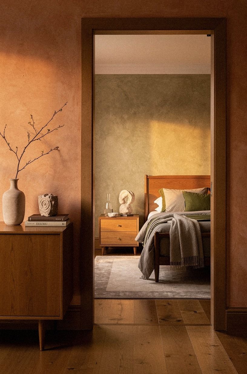
The Two-Wood Rule keeps a romantic bedroom from feeling like a showroom set.
12Warm the Palette with Terracotta Details
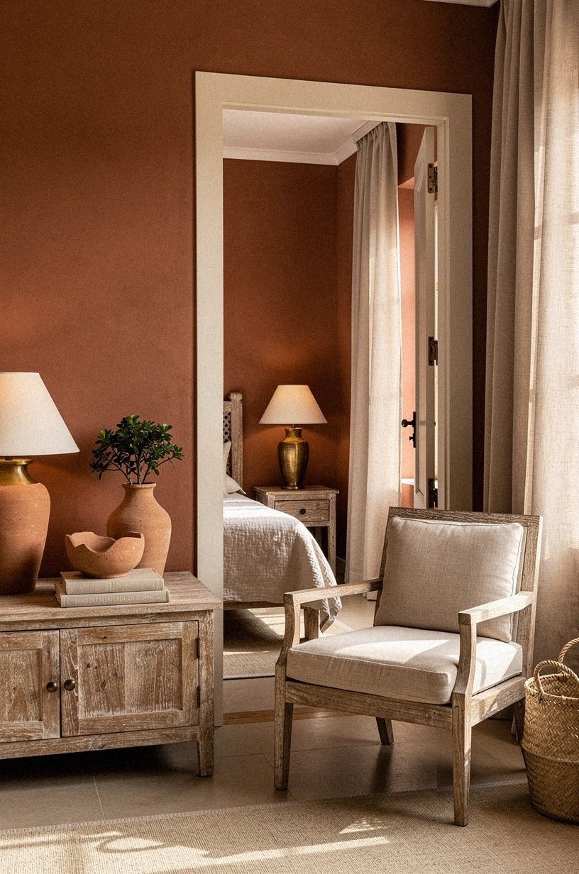
Terracotta is a color family, not one exact orange. In a bedroom, choose a softened clay version that looks warm and settled. Use it on a lamp, a narrow stripe, or the inside of a wardrobe rather than coating every wall.
Your main wall can be clay, with washed linen bedding and an aged brass lamp nearby. Add a piece of reclaimed weathered teak for contrast. The combination feels earthy and welcoming because the colors are muted, not because they match perfectly.
And you can make this palette renter-friendly. A removable clay mural behind the bed gives you the same focal point without committing to paint.
I'd skip glossy orange accessories, since they reflect too much light and make the room feel loud. Your best terracotta pieces should look slightly imperfect and handmade.
If the room already has a pink wall, use terracotta in small doses instead of adding another large color block. A brass lamp, linen cushion, or teak side table is enough to warm the scheme.
13Should You Paint the Trim Too?
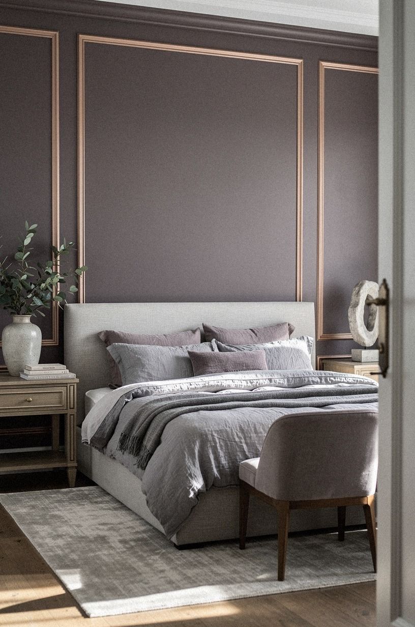
Yes, painting the trim can make romantic bedroom colors feel more enveloping, but the trim should usually be a softened version of the wall. Try a plum wall with gray trim, then introduce rose gold in a lamp or small hardware detail.
Your doors and baseboards carry more visual area than you might expect. If the room is small, matching them to the wall can reduce the chopped-up effect.
I'd skip high-contrast black trim unless the rest of your furniture is light and simple. It can turn a gentle palette into a graphic one.
Use a plum wall with a related gray shade on the trim if you want subtle definition. Add washed Belgian linen at the bed so the color remains soft. You don't need a professional painter for this, but you do need careful prep around the floor.
A clean edge makes the color feel deliberate, while a messy edge distracts from every other detail.
Good news! You can test this treatment on one door casing before committing to the whole room. If the change feels too enveloping, keep the ceiling and window trim lighter.
14Pair Dark Walls with Pale Bedding
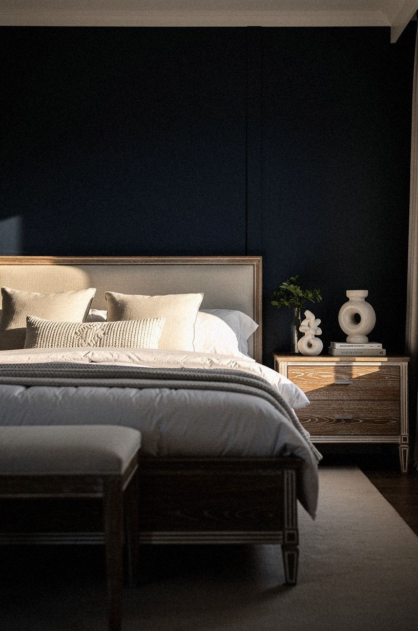
Dark walls don't automatically make a bedroom feel smaller. They can create a cocoon, especially when the bedding stays white and the furniture is walnut. Try a deep navy behind the bed, then add pale bedding and cerused white oak nearby.
Your room needs reflective points so the dark color doesn't absorb everything. A mirror, warm lamp, and pale ceramic vase can do that without making the space shiny.
I'd skip dark bedding on dark walls unless your room has generous daylight. The result can feel dense rather than restful.
Choose white bedding in a soft weave and let it wrinkle a little. The texture breaks up the solid wall color and gives your eye somewhere to land.
And if you're nervous about the commitment, paint only the wall behind the headboard first. You'll know quickly whether the mood feels comforting or too heavy.
A deep navy wall also makes a useful backdrop for walnut, cerused oak, and a small white accent. Keep the number of finishes limited so the room feels atmospheric rather than crowded. For a lighter version of this mood, return to Accessible Beige and introduce the darker color through furniture.
15Create a Color-Drenched Reading Corner
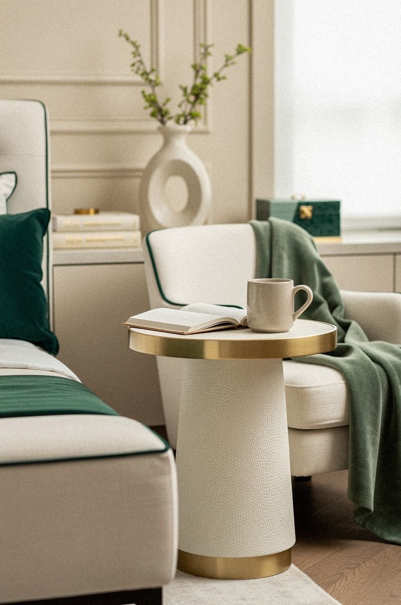
Color drenching means carrying one paint color across the wall, trim, door, and sometimes a built-in shelf. Use emerald green in a reading corner, then balance it with gold and cream so the space feels rich without becoming theatrical. Your room gains a small destination without needing a separate accent wall.
A chair with shagreen accents or a compact upholstered seat will make the corner feel intentional. Add a floor lamp with a cream shade and a small side table with a restrained gold finish. You don't need a large chair if the space is tight, and your reading corner shouldn't block the path around the bed.
For planning costs, use these typical US ranges as a starting point:
If you're working with a rental, create the same feeling with a removable panel, a fabric screen, or a painted piece of furniture. The corner should feel like a destination, not a second full bedroom.
16Choose Paint Over a Busy Accent Wall
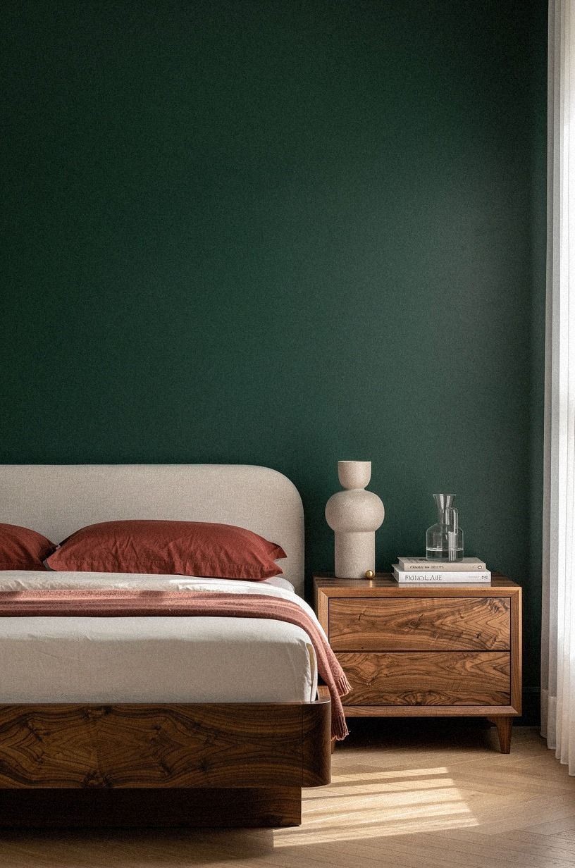
A single painted accent wall can be romantic, but a busy printed wall often dates faster than a solid color. Choose forest green, muted rust, or a warm natural shade, then let your artwork and bedding provide the pattern. Your bedroom will feel calmer and easier to update.
I'd choose forest green over a loud botanical mural when the room already has patterned curtains. The color has enough character to create a focal point, but it won't compete with the rest of your furniture. Add one rust textile for a softer reference.
But don't make every other surface beige. Your room needs contrast, even if it's subtle.
A book-matched walnut piece, a natural oak detail, and one warm textile finish will keep the palette from disappearing. If you're decorating on a small budget, repainting is usually more flexible than replacing a headboard.
A solid wall also gives you freedom to change the room seasonally. Add heavier curtains in winter, lighter bedding in summer, or a new lamp without having to negotiate with a complicated mural.
17Finish with the 60-30-10 Palette Balance
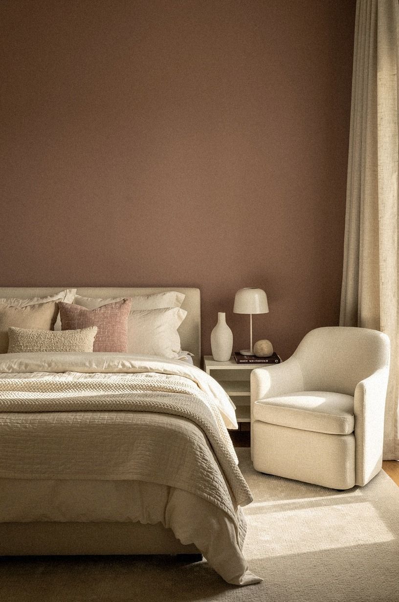
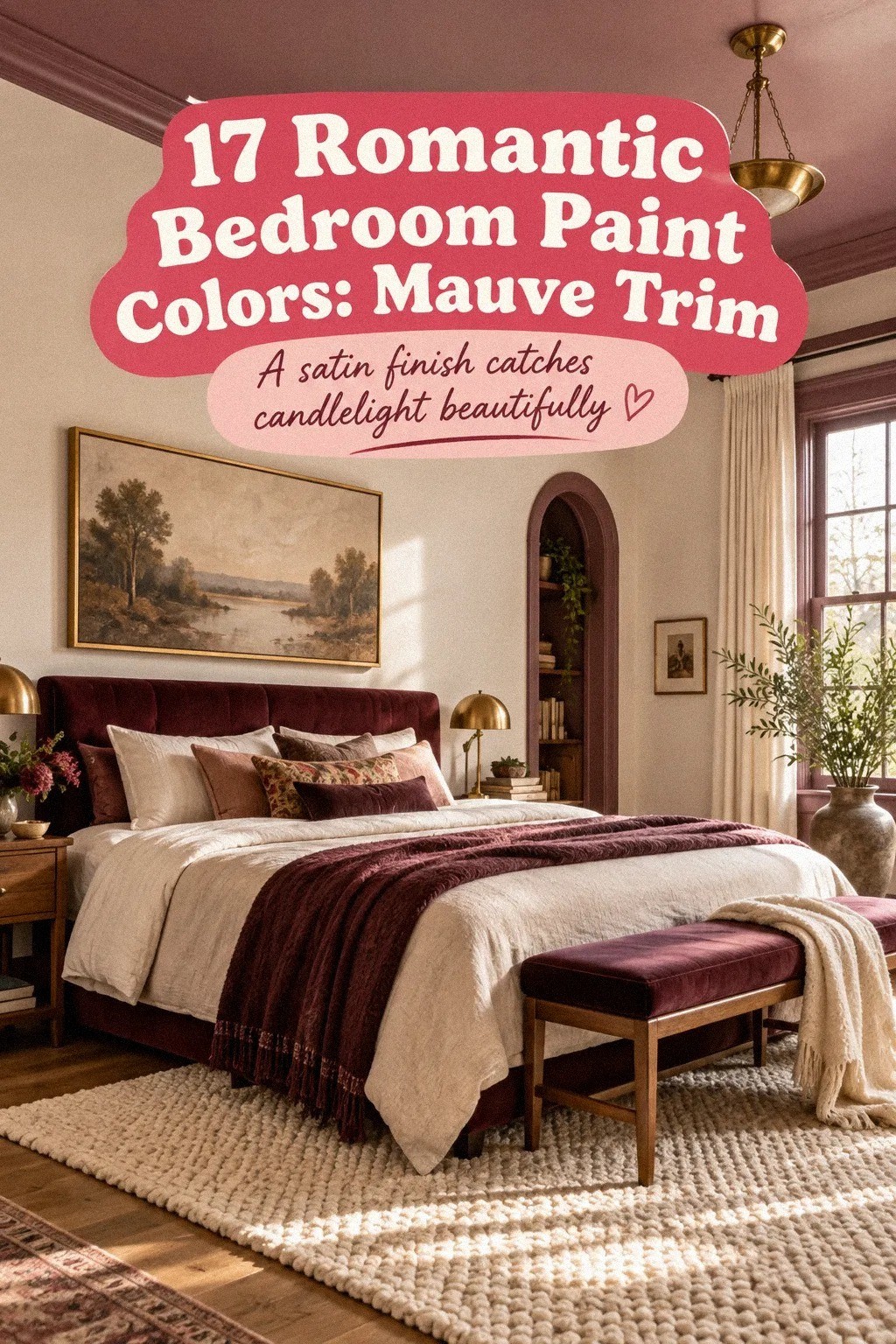
The 60-30-10 balance gives your romantic bedroom colors a clear hierarchy. Use dusty rose for the main mood, charcoal for weight, and brass for small points of warmth. An organic bouclé bench or headboard can soften the contrast without adding another color.
The Palette Rule I Trust After Painting Too Many Bedrooms
I used to choose bedroom paint by asking whether I liked the color on a small card. That question was too shallow.
A bedroom color has to survive morning glare, gray weather, lamp light, wood tones, bedding, and the particular mood you bring home at night. I once painted a room a pale pink that looked delicate at the store.
Under warm bulbs, it turned peachy and made every white textile look yellow. I lived with it longer than I should have because repainting felt like admitting defeat.
Now I make the decision differently. I look at the wall beside the bed, not an empty corner, because that is where the paint will meet fabric, shadow, and your face at the end of the day.
I test the color at several points, then leave the samples up long enough to see them in sun and darkness. Your bedroom isn't a showroom, so the right palette needs to work when the laundry basket is visible too.
I also believe romantic doesn't mean pink. It can mean deep blue with cream, warm beige with walnut, muted green with brass, or clay with pale linen.
The common thread is softness in the way the colors meet. Hard contrast can be dramatic, but it isn't always restful.
If you're unsure, choose the color that makes your largest surface feel quieter, then let texture provide the emotion.
The expensive mistake is rarely the paint itself. It's choosing a color that forces you to fight every other decision in the room. Spend your attention on undertone, light, and the materials already in your home.
A restrained wall with honest texture will outlast a fashionable shade that only works in one room.
The Questions Worth Answering First
What is the best Romantic Bedroom Paint Colors: How to Pick the Perfect Palette for a small bedroom?
Warm white, Pale Oak, and muted green are strong choices because they keep light moving. Benjamin Moore Pale Oak OC-20 works with an IKEA KALLAX birch-effect piece, linen bedding, and pale wood without making your room feel empty.
Where can I buy Romantic Bedroom Paint Colors: How to Pick the Perfect Palette pieces on a budget?
Look at IKEA, Wayfair, and Target for lamps, bedding, and small furniture. Facebook Marketplace and thrift stores can also offer solid wood nightstands and mirrors for less, especially when you're willing to repaint or change the hardware.
How much does a Romantic Bedroom Paint Colors: How to Pick the Perfect Palette makeover cost?
A small refresh can cost about $100 to $300 when you keep your bed and use paint, rearranging, and existing textiles. Free changes include editing surfaces, moving lamps, washing bedding, and restyling artwork before buying anything new.
Can I create a Romantic Bedroom Paint Colors: How to Pick the Perfect Palette on a budget?
Yes, and you can start with paint, better lamp placement, and textiles you already own. Cheap improvements include a thrifted frame, a removable wall treatment, and new pillow covers instead of replacing the whole bed.
Is a Romantic Bedroom Paint Colors: How to Pick the Perfect Palette worth it in a small space?
Yes, because a small room gives color more impact. A single strong wall behind the bed can create depth without using much paint. Keep the rug partially under the bed and choose slim nightstands so the walking path stays clear.
Is a Romantic Bedroom Paint Colors: How to Pick the Perfect Palette a good idea for a rental?
Yes. Use removable wallpaper, tension rods, peel-and-stick trim, and removable hooks to bring in color without permanent changes. A painted-looking focal wall can come from a temporary panel placed behind the bed and removed when your lease ends.
Where I'd Start First
If I had to pick one, I'd start with Benjamin Moore Pale Oak. It won't fight your wood, bedding, or changing daylight, so you can build warmth with texture instead of repainting around a demanding undertone.
Pin this palette for later and test it beside your bed before buying the full gallon. Worth it!


