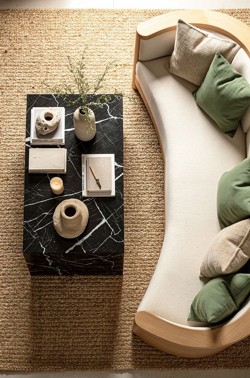
Cozy Nancy Meyers Color Palette: Best Warm Neutral Paint Colors for Calm Homes
30 august 2026The Nancy Meyers color palette works because warm neutrals make a home feel calm without looking flat. I used to paint every wall bright white, then wondered why my rooms felt chilly by 4 p.m. You don’t need a movie-set kitchen. You need softer undertones, wood with grain, and light that lands gently.
- Paint the shade-first backdrop with Benjamin Moore White Dove
- Let Farrow & Ball Pigeon carry the quiet drama
- Use The Buttered-Toast Rule for undertones
- Build an off white living room furniture mix
- Why does a warm room need one cool note?
- Layer wood tones with The Two-Wood Rule
- Skip greige when your house interior living room colors need life
- Hang art at 57 to 60 inches, then loosen up
- Frame windows with floor-length flax linen
- Make the Three-Height Light Stack work after sunset
- Choose a wool rug that lets furniture overlap
- Spend by layers, not by room
- Bring in the kitchen-table green
- Put unlacquered brass where hands can find it
- Choose timeless and elegant furniture with imperfect edges
- Mix open shelves with one closed cabinet
- Pick warm white over bright white in a rental
- Can one painted ceiling make a room feel calmer?
- Use the Sunday-Dinner Test before buying decor
1Paint the shade-first backdrop with Benjamin Moore White Dove
Start with Benjamin Moore White Dove OC-17 if you want your walls to feel creamy rather than yellow. You’ll get a soft, inviting backdrop that handles walnut, oak, and worn brass without making your furniture look orange. I’d skip a stark blue-white here, because it turns a warm room into a showroom.
Try it on walls beside Belgian flax linen curtains, natural wood, and a touch of Nero Marquina black marble. Your eye gets a quiet place to rest, while the grain and fabric do the talking. It’s a calming choice for a shaded white living room.
2Let Farrow & Ball Pigeon carry the quiet drama
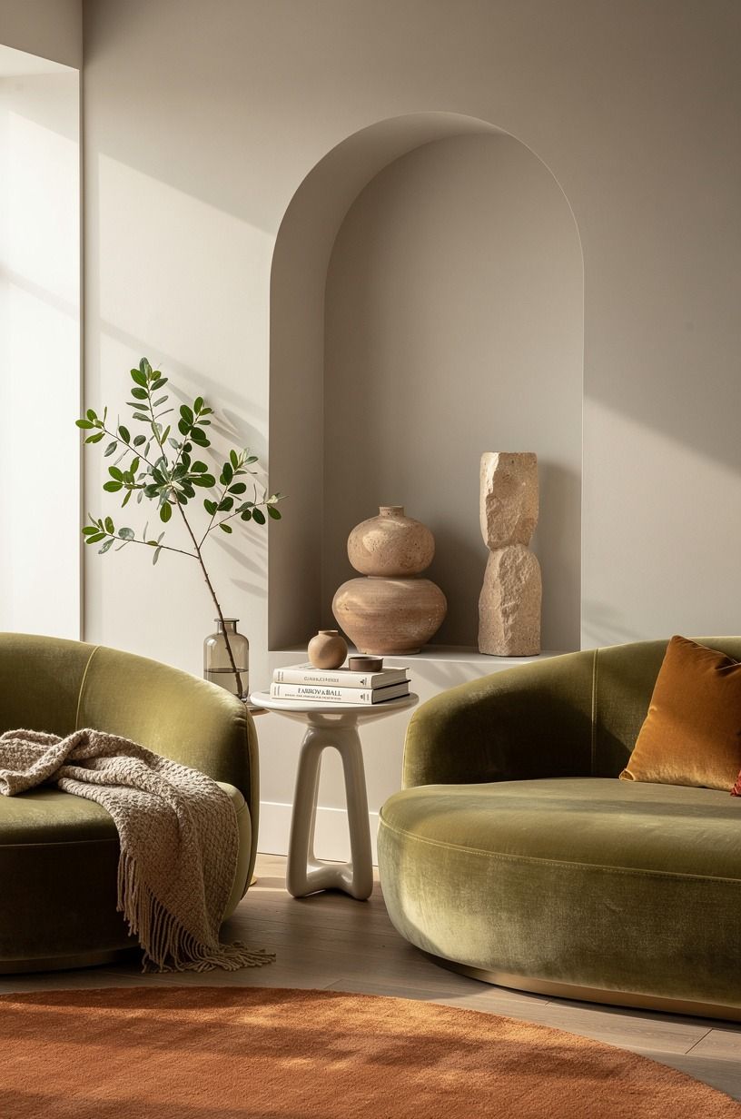
For cabinets, a mudroom, or a back hall, Farrow & Ball Pigeon No. 25 brings quiet drama without making the room feel dark. Pair it with terracotta, olive, and stone tones, then add a deep-pile mohair velvet cushion for softness.
3Use The Buttered-Toast Rule for undertones
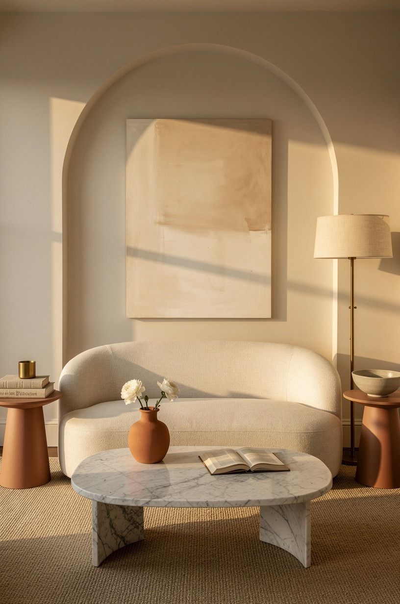
The Buttered-Toast Rule is simple: if your paint makes a slice of toast look pink or gray, it’s fighting the room. Test your samples beside your flooring, your sofa, and the wood trim you’re keeping. You’ll spot the wrong undertone fast.
Choose Sherwin-Williams Agreeable Gray SW 7029 only when your fabrics bring in warmth through linen, clay, and aged brass. Your walls shouldn’t compete with the things you’ve collected. Warm neutral doesn’t mean beige everywhere.
4Build an off white living room furniture mix
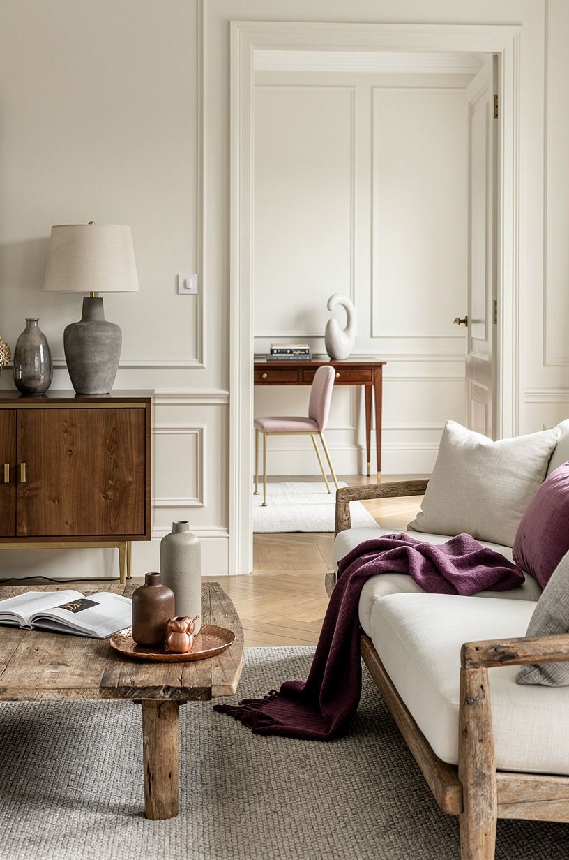
Your off white living room furniture needs texture, or it’ll look like a rental listing. Bring in plum, soft gray, and rose-gold accents around a reclaimed weathered teak table so the pale pieces feel considered rather than blank.
5Why does a warm room need one cool note?
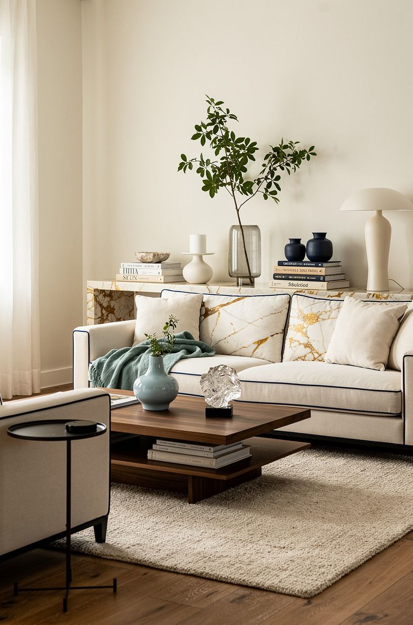
Yes, your warm room needs one cool note, usually green, blue-gray, or old pewter. Without it, every surface can blur into one buttery cloud. You can bring that contrast in through Farrow & Ball Pigeon No. 25, a framed landscape, or a worn ceramic bowl.
Keep the cool element small. Your cream upholstery and Calacatta marble with gold veining should still lead. Why make everything match when a little tension is what makes a room memorable?
6Layer wood tones with The Two-Wood Rule
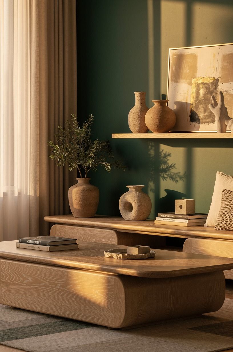
The Two-Wood Rule asks you to choose two main wood families and repeat them. Cerused white oak works beautifully with a deeper walnut or aged oak, especially when emerald, gold, and cream keep the mix feeling warm.
7Skip greige when your house interior living room colors need life
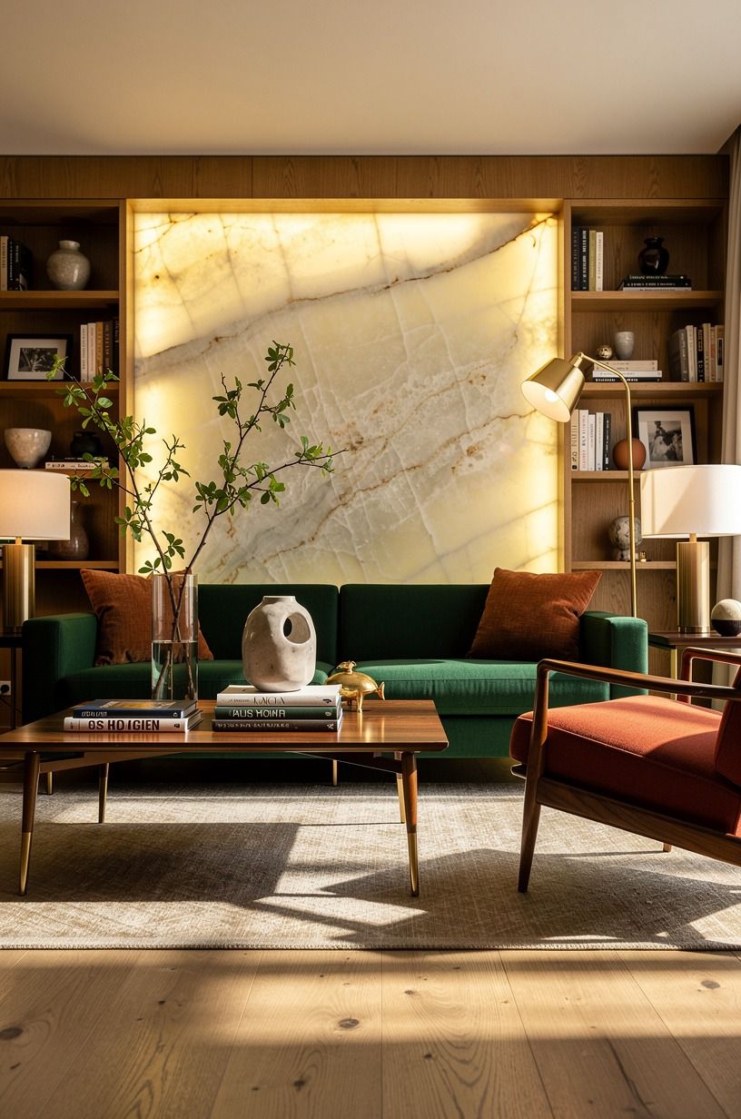
Greige can work, but I’d skip the cold, purple versions when your house interior living room colors already include honey oak or brick. They make the wood look tired. Instead, pull warmth from Benjamin Moore White Dove OC-17 or a muted clay textile.
You can set a Target Threshold woven pillow beside a rust linen lumbar cover and see the difference immediately. Your room doesn’t need more gray. It needs a warmer conversation between the walls and the things you already own.
8Hang art at 57 to 60 inches, then loosen up
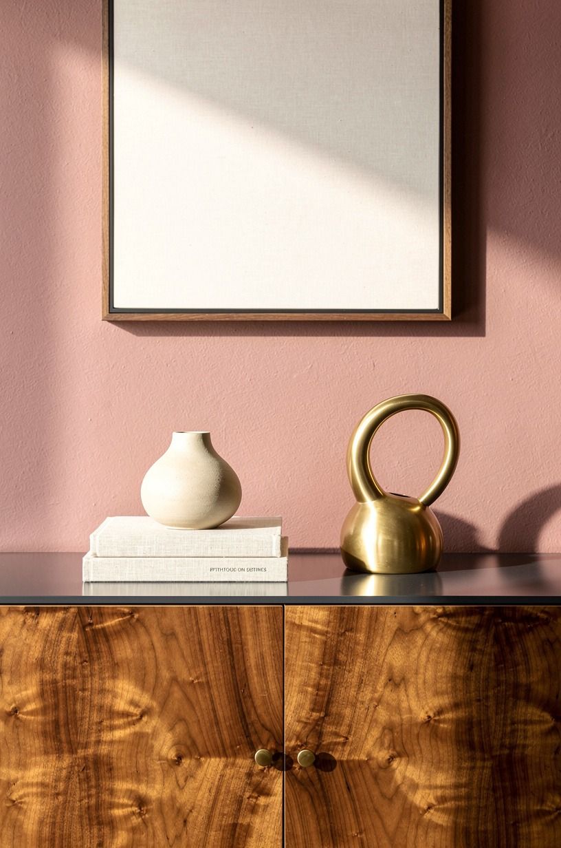
Hang the center of your art about 57 to 60 inches from the floor. That measurement keeps a gallery wall from floating too high over your sofa or sideboard. Then loosen it up with one smaller piece leaned against the wall.
A gilt wood frame beside a matte black landscape print gives your room some history without looking formal. You don’t need museum spacing.
You need art that feels like you found it over time. And yes, mismatched frames are better here!
9Frame windows with floor-length flax linen
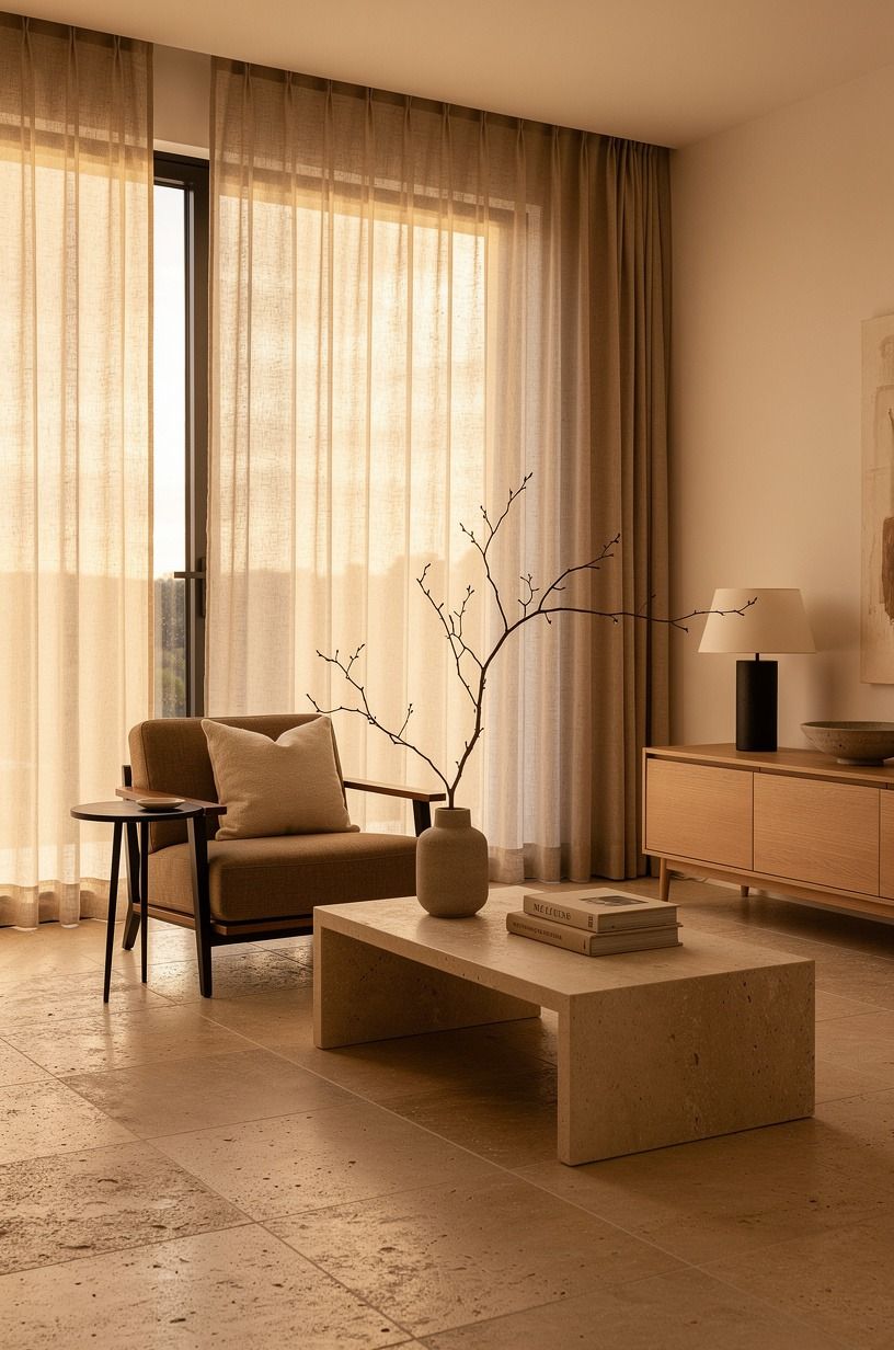
Mount your curtain rod 4 to 6 inches above the window frame and take the panels all the way to the floor. Your ceiling will look taller, and the light will feel softer as it passes through Belgian flax linen drapes. Short curtains are the fastest way to make a generous room feel pinched.
Choose a warm ivory rather than optic white. I’d avoid shiny polyester because it catches light like a party dress. Add warm travertine or camel accents nearby for a quiet, relaxed edge.
10Make the Three-Height Light Stack work after sunset
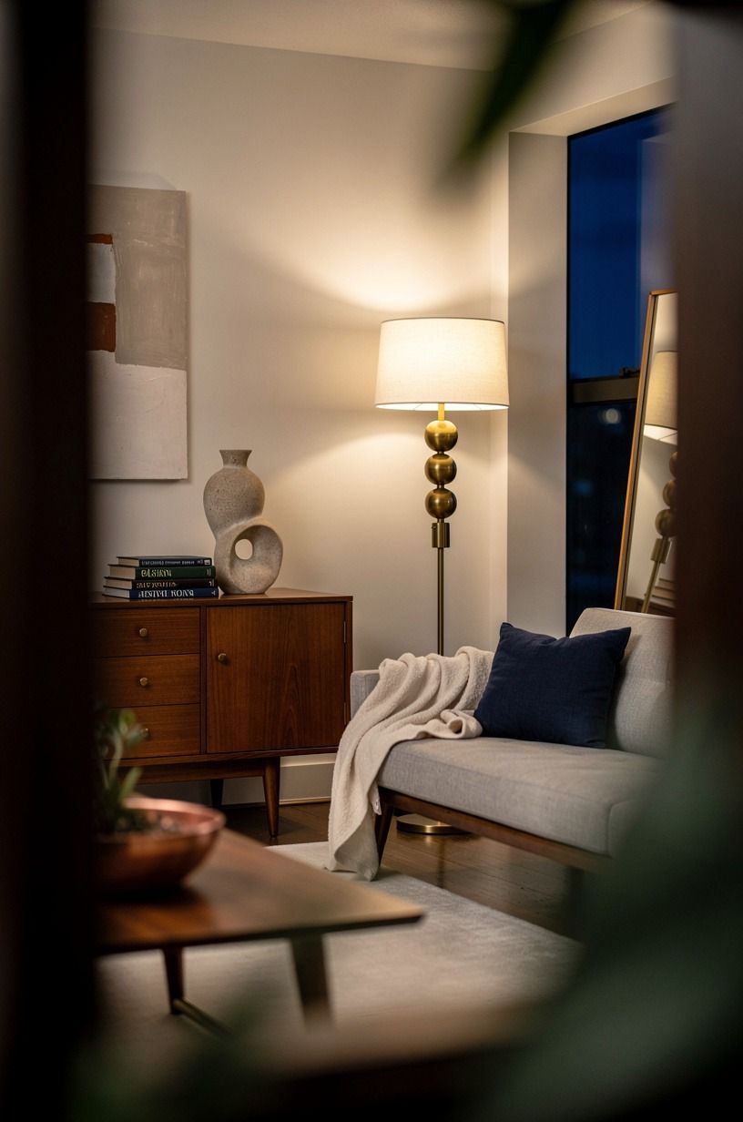
Use three sources of light in every room: overhead, task, and ambient. A linen drum pendant, a reading lamp, and a low unlacquered brass table lamp give you enough layers to turn off the harsh ceiling fixture. Your evenings will look warmer before you buy a single new pillow.
Put the ambient lamp near a rug edge, where it throws a pool of amber rather than lighting every corner. But don’t use cool bulbs. They flatten skin, food, and every creamy paint color you worked hard to choose.
11Choose a wool rug that lets furniture overlap
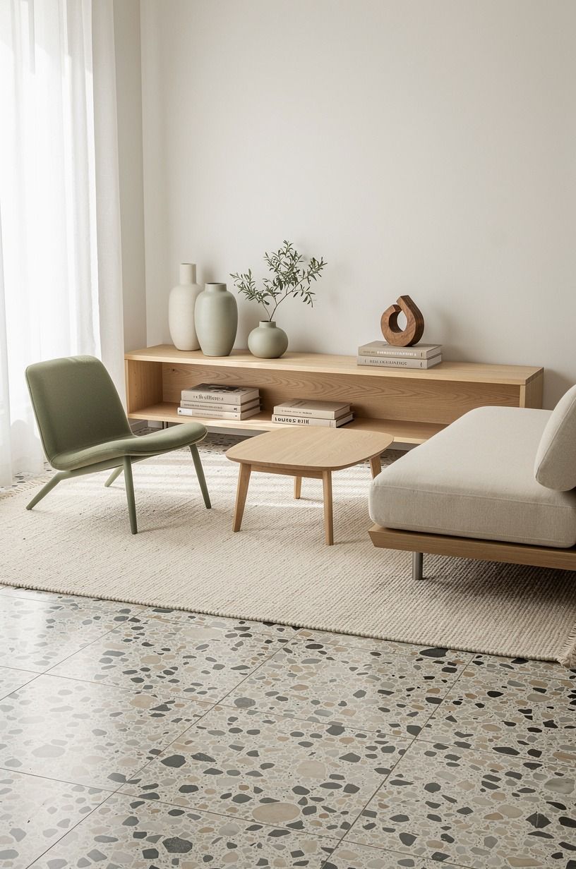
Your rug should be large enough for the furniture to overlap it. A wool rug with sage, warm cream, and natural wood nearby will feel grounded beside an oversized-chip terrazzo floor or hearth.
12Spend by layers, not by room
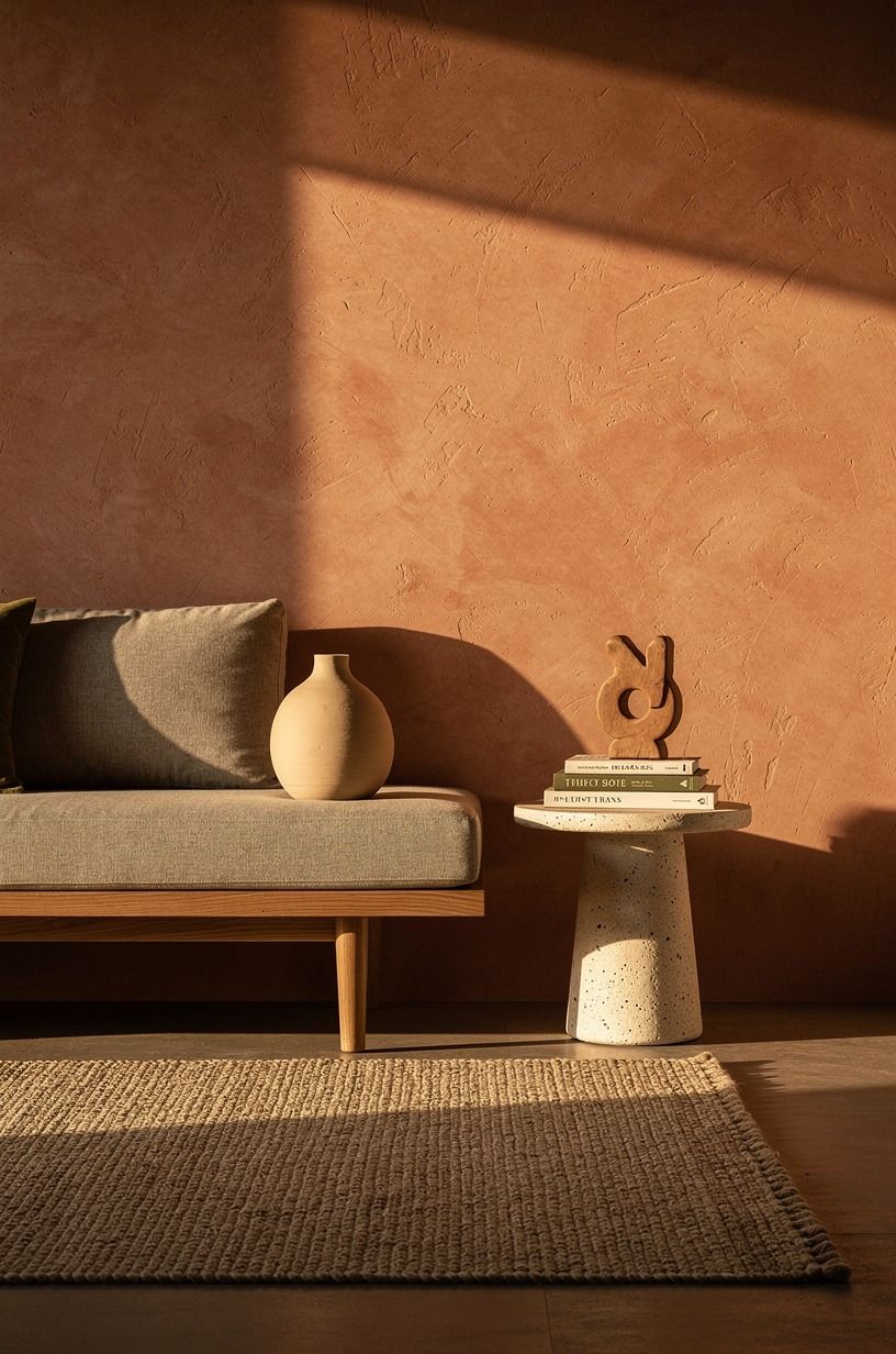
You don’t have to renovate everything at once. Spend first on paint, textiles, and the pieces your hands touch each day, then save the larger furniture decisions for later. Your home will feel more intentional if you let it grow.
A budget refresh of $200 to $800 can change more than people expect. Paint, linen drapes, and a wool rug do more visual work than a random cart full of decor. Venetian plaster is a beautiful later-layer upgrade when the basics already work.
Start there!
13Bring in the kitchen-table green
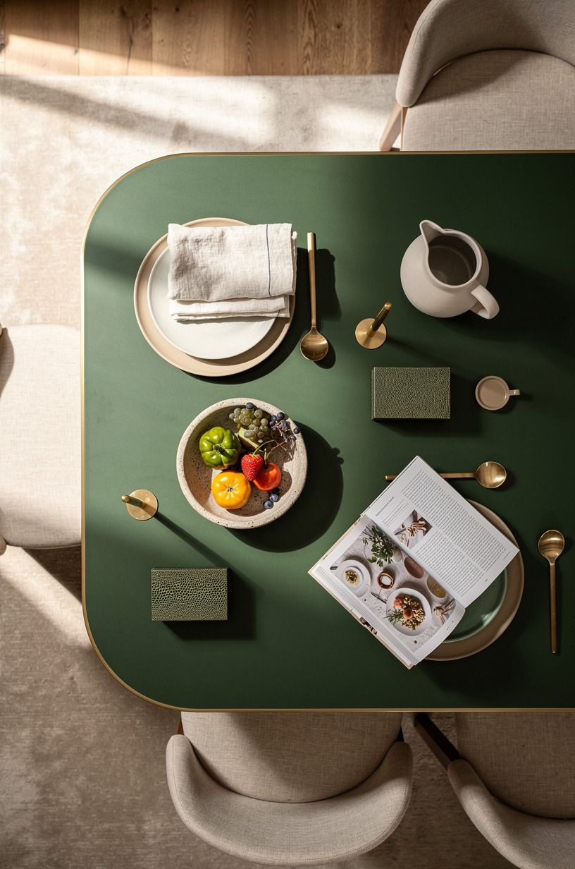
A muted green gives warm neutral rooms their Nancy Meyers ease. Pair clay, linen, and aged brass with a small shagreen tray or lamp base so the color feels useful, not precious.
14Put unlacquered brass where hands can find it
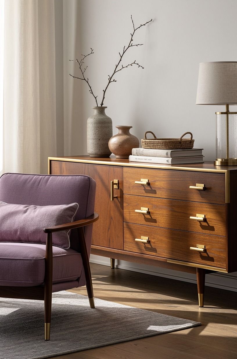
Use unlacquered brass cabinet pulls where your hands touch them every day: drawers, pantry doors, and a small tray on the entry table. It will darken and spot over time. That’s the point.
Your room needs some material that admits it has been used. Washed Belgian linen keeps the brass from feeling too polished beside old wood. Let the brass gather fingerprints, soften, and develop its own small history.
15Choose timeless and elegant furniture with imperfect edges
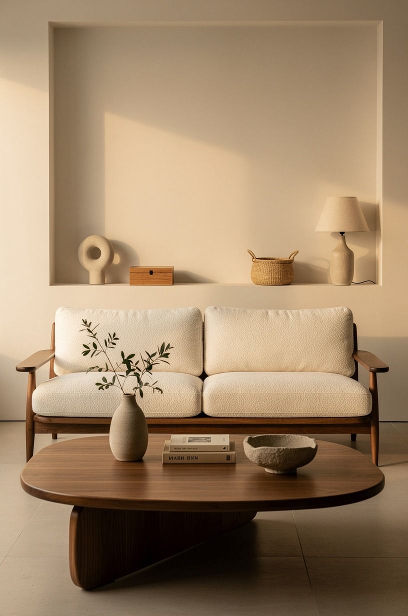
Timeless and elegant doesn’t mean matching furniture sets. Look for a Pottery Barn Toscana dining table with visible grain, then mix in chairs with woven seats or faded upholstery. You can make the room feel collected without making it busy.
A cane webbing side chair and an organic bouclé cushion bring two kinds of texture to the same table. I’d skip glossy dining chairs because they reflect too much light. Your eye wants surfaces that absorb it.
16Mix open shelves with one closed cabinet
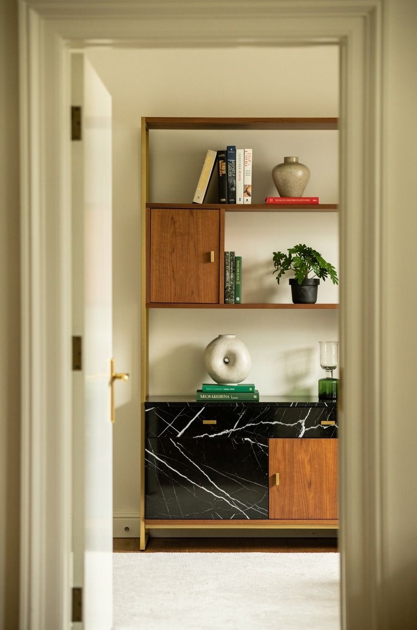
Open shelving is useful only when you give it limits. Put your everyday plates, cookbooks, and one useful bowl on display, then hide the plastic bags and cords behind IKEA KALLAX birch-effect doors. You’ll keep the room warm instead of cluttered.
Try three shelf heights: a stack of cookbooks, a medium ceramic lamp, and a low Nero Marquina black marble bowl. Your shelves should show life, not stage a store display.
Small messes happen. You just don’t need to frame them.
17Pick warm white over bright white in a rental
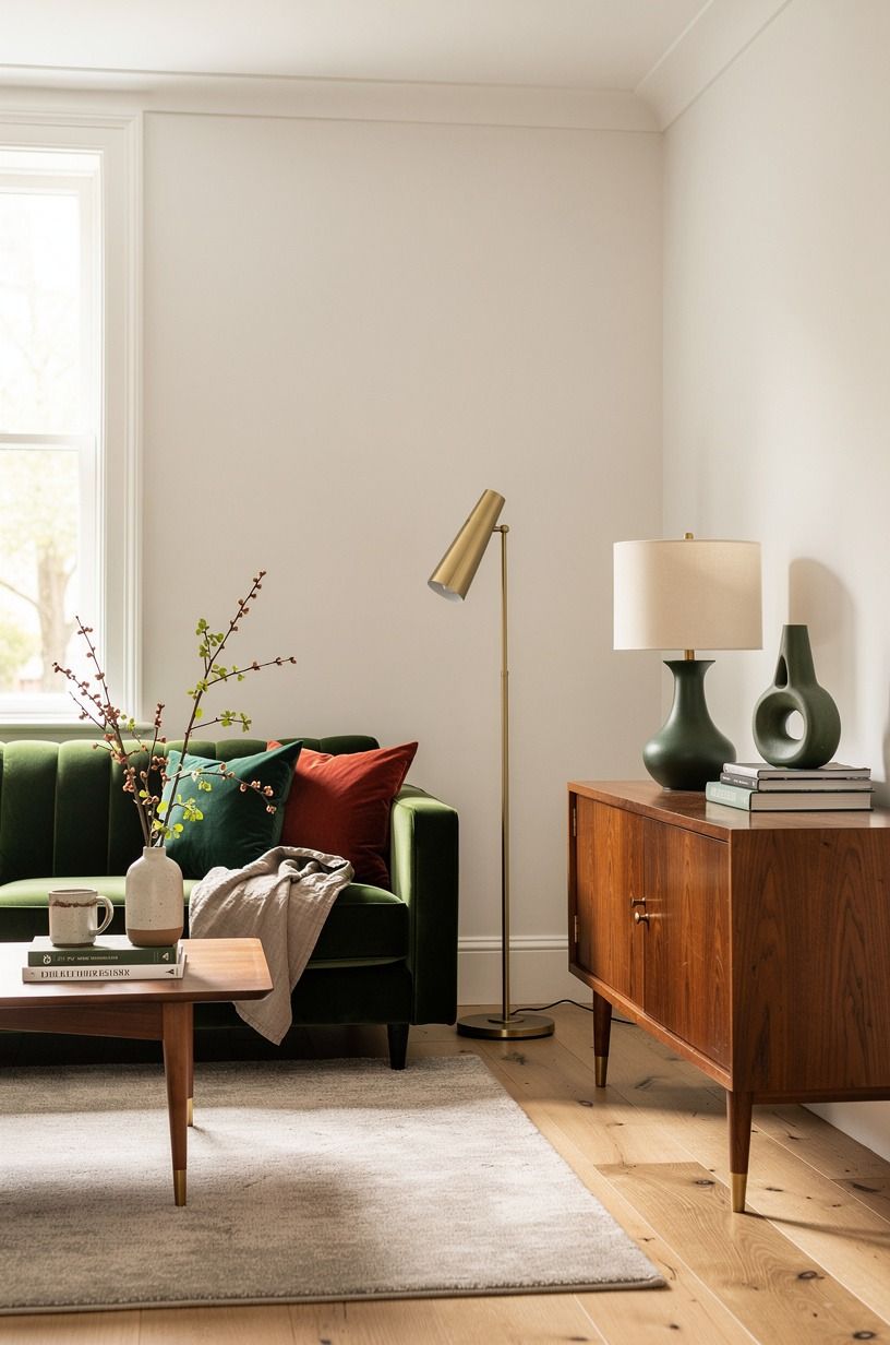
Warm white is the rental-friendly answer when you can’t overhaul the kitchen or floors. Use removable art, peel-and-stick grasscloth, and cream textile panels on tension rods. Your room gets softness without risking your deposit.
A Target Studio McGee table lamp can add a gentle glow with no wiring at all. But avoid removable decals that imitate marble or concrete. They tend to look flat from three feet away, and your home deserves better.
18Can one painted ceiling make a room feel calmer?
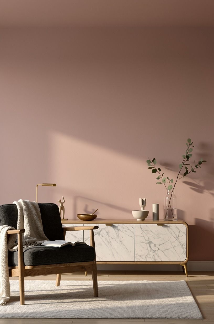
Yes, a painted ceiling can make a room feel calmer, especially if your walls are already white. Choose a dusty rose, charcoal, or brass-adjacent note with pale Carrara marble and soft upholstery to make the color feel grounded.
19Use the Sunday-Dinner Test before buying decor
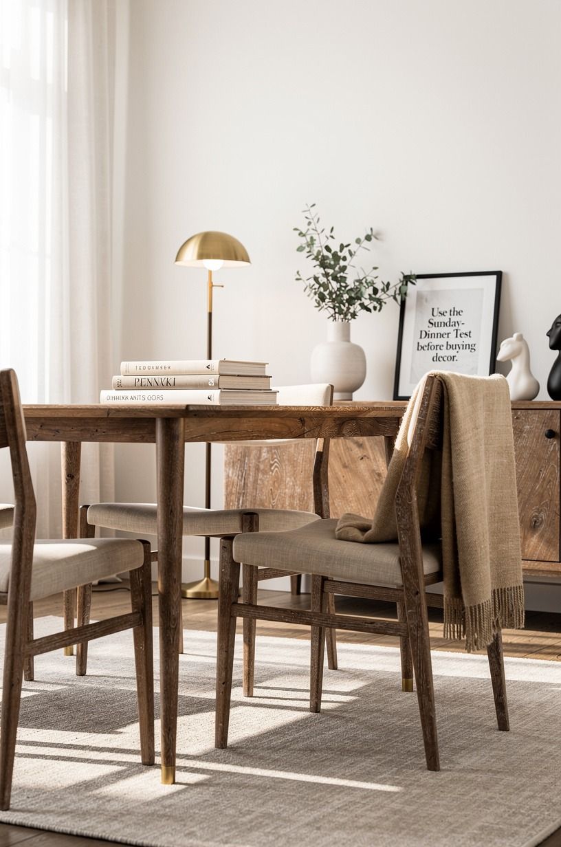
Before you buy a decor object, ask whether it would still belong on the table during a long Sunday dinner. If the answer is no, leave it. Your room needs useful beauty: a hand-blown amber glass pitcher, a linen runner, a bowl that holds fruit.
This test keeps you from filling shelves with tiny, generic objects. I’ve done that, and dusting them became a personal insult.
Choose fewer pieces with weight, texture, or a job. Your home will feel more peaceful for it.
Why This Palette Feels Right Right Now
I think the return to warm neutrals is partly a reaction to years of rooms designed for screens. Gray photographed cleanly.
Bright white made every listing look larger. But neither choice always felt good to live with after dark, when you’re carrying a mug through the kitchen or folding laundry under one tired ceiling light.
A home isn’t a thumbnail. It has mornings, shadows, crumbs, wet coats, and the slightly melancholy hour around five.
I learned this while repainting a room that looked fine online but felt unsettled in person. I chose a pale gray because I thought it would make the space more sophisticated. It made my oak floors look orange and my cream sofa look dingy.
I repainted it with Benjamin Moore White Dove OC-17, and the whole room exhaled. Not because the color was dramatic.
Because it stopped arguing with everything else.
That’s my real rule for this palette: let the paint support the life already happening in your home. You don’t need every surface to be beige, and you shouldn’t buy a fake vintage object just because it photographs well.
Keep the old wooden chair if it’s solid. Use the inherited bowl if you reach for it. Add a lamp where the room goes dark.
The most appealing homes aren’t frozen in time. They’re warm because they’re allowed to be used.
What People Always Want to Know
What is the best warm neutral paint color for a small Nancy Meyers-style room?
Benjamin Moore White Dove OC-17 is my first pick for a small room because it reflects light without going icy. You can add an IKEA TONSTAD piece and a woven lamp, then keep your largest furniture in soft cream.
Where can I buy Nancy Meyers-style pieces on a budget?
Start with IKEA, Target Threshold, and Wayfair for useful basics, then look at Facebook Marketplace or thrift stores for wood pieces. Your best budget finds are usually lamps, framed art, and solid chairs with questionable fabric.
How much does a Nancy Meyers color palette makeover cost?
A small update usually costs about $200 to $800 if you focus on paint, textiles, and lighting. DIY paint and secondhand furniture keep your total lower, while a wool rug or custom drapes move it upward.
Can I create this look on a budget?
Yes, and your cheapest moves are often the best ones. Warm paint, rearranged furniture, and better lamp placement cost little or nothing. Add one linen panel, one thrifted wood frame, and a bowl you’ll use.
Is a Nancy Meyers color palette worth it in a small space?
Yes, it’s worth it because warm neutrals make small spaces feel connected rather than chopped into zones. One repeated wall color helps your eye move through the room. Keep the rug large enough for furniture overlap.
Is this palette a good idea for a rental?
Yes, because you can get the feeling without permanent work. Removable window treatments and peel-and-stick texture make a difference fast. Use tension rods, plug-in lamps, and art instead of changing fixtures.
Where I’d Start First
If I had to pick one, I’d start with Benjamin Moore White Dove OC-17. You can’t layer warmth over a wall color that makes your oak look orange and your linens look gray. Pin this paint choice for later and let everything else build from it.


