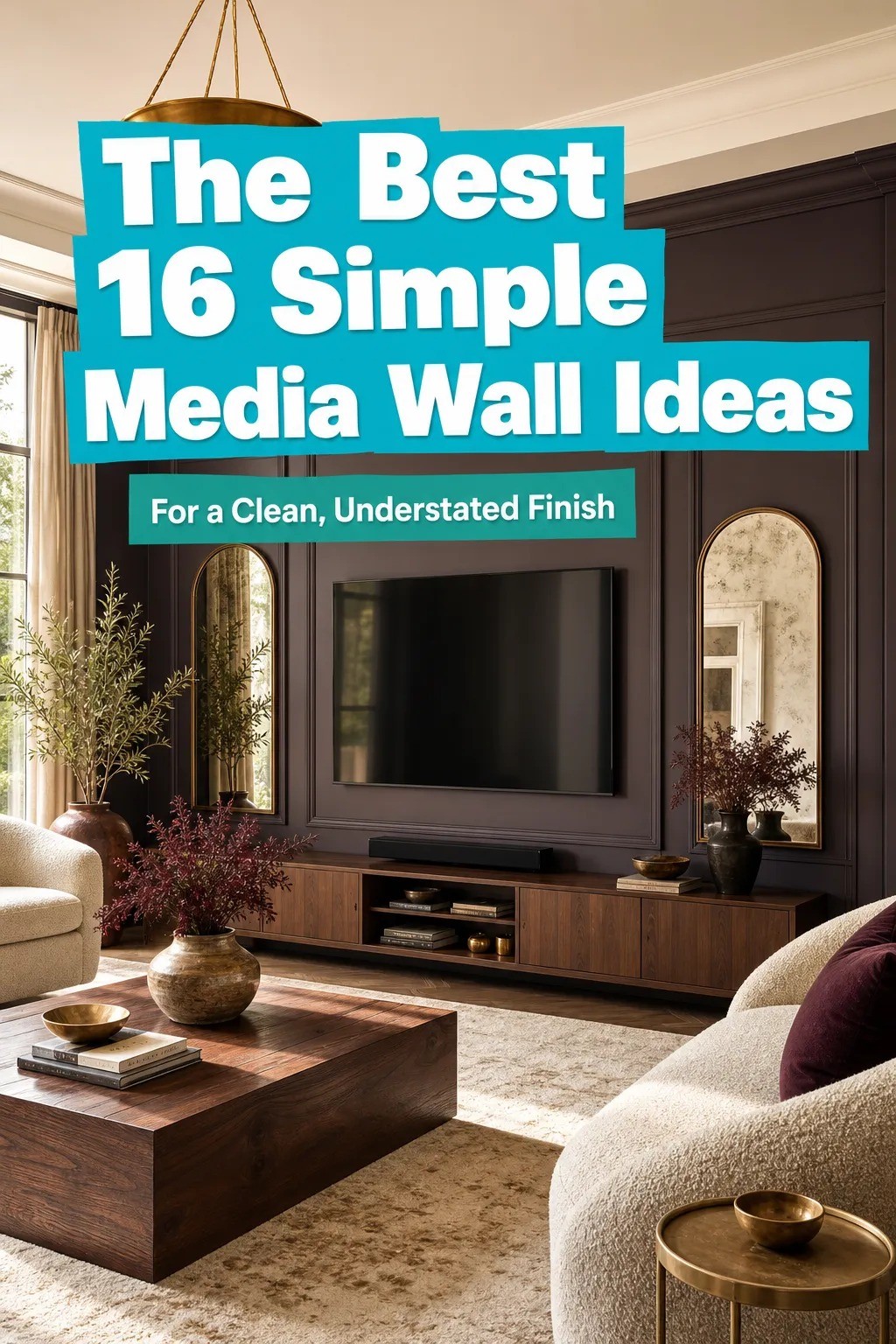
I Went Simple With My Media Wall, and the Clean Understated Finish Finally Landed
19 july 2026A typical media wall refresh lands between $300 and $1,200 for the budget tier (paint, paneling, ledge, styling), $2,500 to $8,000 for the mid tier (custom millwork, stone veneer, layered lighting), and $12,000 to $40,000+ when you start pulling walls apart. I did mine for the price of a used console and a Saturday with a borrowed miter saw, and that's the version I'll show you here. None of these 16 ideas require a contractor. Most don't even require a drill bit bigger than a quarter inch.
When we moved into the house, the living room wall behind the TV was the saddest thing in it. Two coats of flat off-white over builder-grade drywall, a black plastic TV mount, a power strip drooping on a white cord, and a tangle of HDMI cables taped to the baseboard.
We lived with it for two winters because I didn't know where to start. Then I stopped trying to renovate it and started editing it, and the whole room changed.
These are the 16 ideas that took our cold, cluttered wall to the calmest focal point in the house.
Here's What It Looked Like Before
The full 2005 starter-home package. Forty-six inches of black glass hung a little too high, the cord trailing down to a white outlet at ankle height.
A lone floating shelf of MDF pretending to be wood, holding a fake succulent and a soundbar that didn't match anything. The wall behind was that specific shade of off-white that doesn't read warm or cool, just tired.
Two art prints were leaning on the floor because the previous tenants couldn't find the studs. It was the kind of wall you stop seeing, which is the opposite of what a media wall should do.
I measured the wall before I touched it. Sixty-eight inches wide between the door frame and the corner, nine feet from floor to ceiling, with the outlet dead center at fourteen inches.
That outlet dictated everything that came after. If you're staring at the same blank wall, measure first.
The geometry decides the design, not Pinterest.
- Anchor the TV With a Centered Panel Wall
- Frame the Screen in Raw Oak Planks
- Run a Slim Ledge Beneath the Screen
- Hide the Cords Inside a Recessed Channel
- Float the Console Below in Matching Wood
- Stagger Two Art Prints Beside the Screen
- Stain the Back Panel One Shade Deeper Than the Wall
- Set a Single Tall Plant in the Corner
- Should You Add Sconces That Flank the TV Evenly?
- Mount the Shelf Lower Than Eye Level
- Cable Box Behind a Louvered Door Instead of an Open Shelf
- Hang a Woven Basket Below the Ledge
- Line the Lower Shelf With Old Paperbacks
- Lean a Vintage Mirror Against the Panel
- Sherwin-Williams Creamy SW 7012 Behind the TV
- Cap the Panel With a Thin Picture Light
1Anchor the TV With a Centered Panel Wall
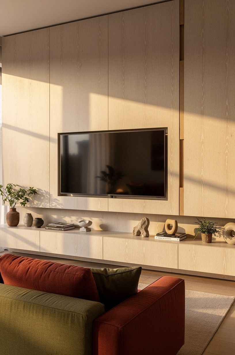
A single white oak veneer panel running floor to ceiling behind the TV is the move that holds the whole wall together. We did ours in cerused white oak, which means the grain is open and the white settles into the soft grain, leaving the dark harder wood showing through.
The dovetail joint is visible at the seam. That detail is the whole point.
A flat panel reads like a wall; a panel with a real joint reads like carpentry.
If you're weighing options for the room around it, our Nancy Meyers living room roundup pairs panel walls with the same warm discipline, and the terracotta sofa edit gives you a sofa that lives well against a quiet panel.
Zero cost: paint the existing drywall in a tone two shades deeper than the rest of the room and call it the panel. Budget fix ($200-500): a single 4x8 sheet of birch plywood ripped to width, primed, and mounted with French cleats in an afternoon.
Worth the splurge ($1,200+): real rift-sawn white oak with a book-matched grain and a satin conversion varnish. We went middle and saved the splurge for the console.
If you only do one thing on this list, do this. The panel is what makes every other decision in the room easier to read. Our accent wall bedroom guide walks through the same single-shade logic if you want a deeper dive.
2Frame the Screen in Raw Oak Planks
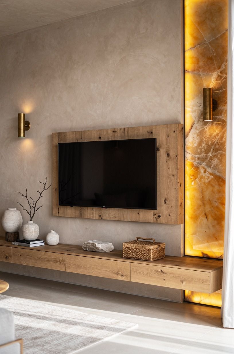
This is the move if you don't want to commit to a full panel. Frame the TV in raw oak planks, like a picture frame, with a 3 to 4 inch reveal around the screen. We used the same cerused oak for continuity, but you can mix species if the wall color is calm enough.
The frame pushes the eye toward the screen without shouting at it. The visible grain does the heavy lifting; no paint, no stain, just oil.
The move that matters: pre-finish the planks before mounting. We learned this after the second plank and a lot of tape.
Raw oak splinters when you cut it flush against a wall, and the dust gets into places you'll find for years. Cut outside, oil all four sides, let it cure a week, then mount.
3Run a Slim Ledge Beneath the Screen
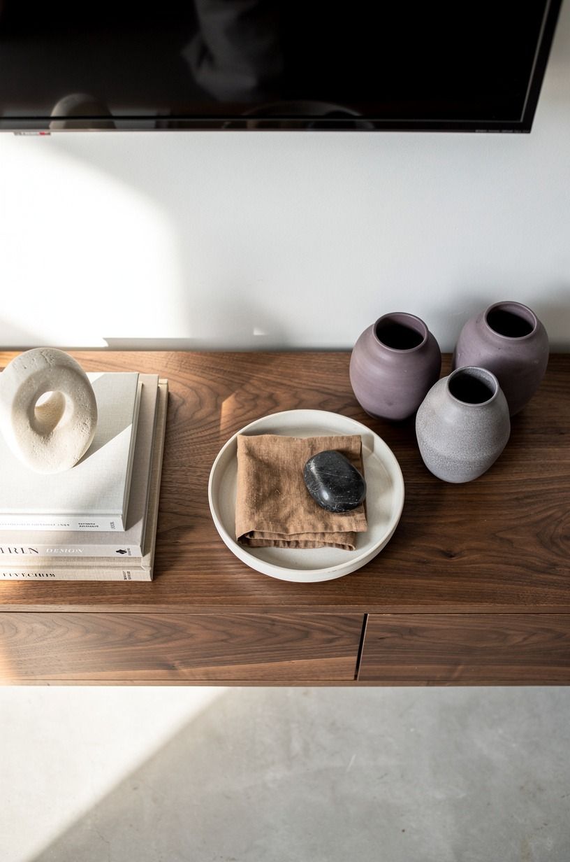
A single 3-inch walnut ledge running the full width of the panel, mounted about 6 inches below the screen, gives you a place for one object without inviting clutter. We put a small hand-hammered copper bowl on it and nothing else. The ledge is the visual base for the whole composition.
Above it, the screen. Below it, the console.
The wall stops feeling like a TV on drywall and starts feeling like a built-in. Our open shelving kitchen guide covers the same "slim ledge, one object, nothing else" rule at counter height.
If your room has any morning light, orient the bowl toward the window. Copper catches the first ray of sun and throws a moving reflection across the panel for about twenty minutes.
Free ambient lighting every single morning, no fixture required. And if you decide to layer the rest of the room from there, our breakfast nook lighting guide covers the same warm-bulb logic for the seating side of the house!
4Hide the Cords Inside a Recessed Channel
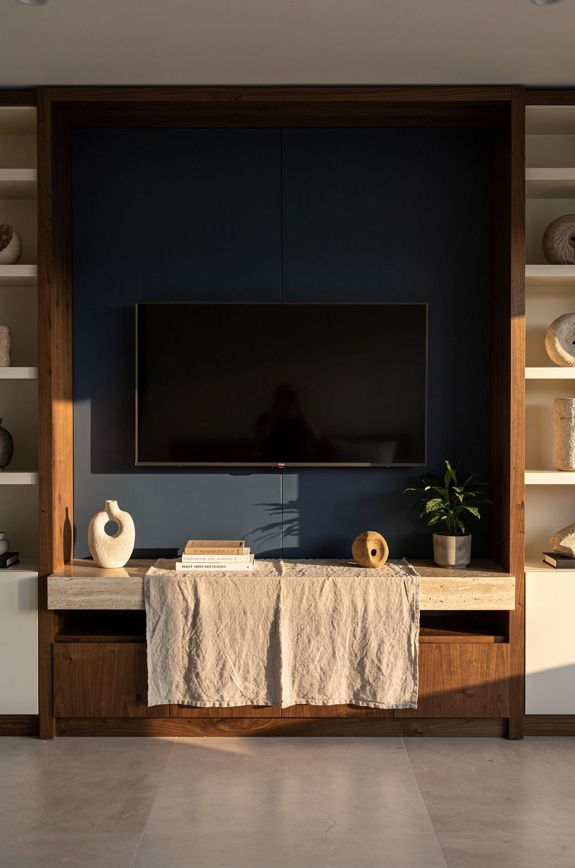
Cords are the thing that ruins most media walls the moment you finish them.
5Float the Console Below in Matching Wood
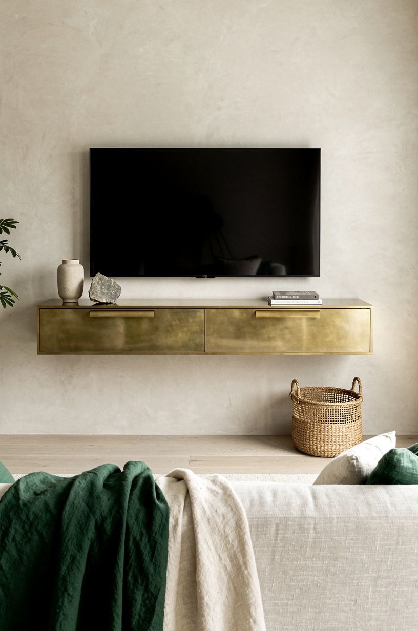
A floating walnut console in unlacquered brass hardware sits six inches below the ledge, deep enough for a record player, shallow enough to read as a shelf. We chose unlacquered brass because it develops a soft patina over the first six months.
By month three, ours had darkened at the handle from the oils in our hands. That's the goal.
Polished brass looks brand new forever, which is the wrong vibe for a room you're actually living in.
The depth matters. A console deeper than 16 inches pushes the sofa too far from the wall and makes the whole room feel staged.
Stay at 14 to 16 inches, leave the front open so light can pass underneath, and float it 8 to 10 inches above the floor. Eye reads it as furniture, not as a plinth.
If you're working with a tighter footprint, our futon vs sofa bed comparison covers the seating side of the same problem.
6Stagger Two Art Prints Beside the Screen
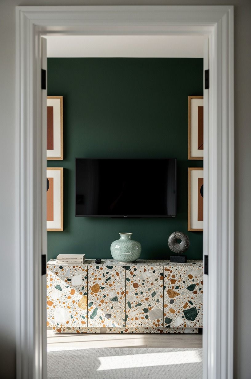
Two staggered art prints on one side of the screen, in rust-toned oak frames, break the symmetry just enough to keep the wall from feeling like a TV showroom. We hung them at different heights, one at eye level and one six inches lower, both leaning toward the screen. The lower one is a vintage architectural drawing of a Danish summerhouse; the upper is a moody photograph of light through a hand-thrown ceramic.
Asymmetric styling reads as collected. Symmetric styling reads as a catalog page.
If you want your living room to feel like someone lives there, you need the asymmetry. Our bar tray styling guide covers the same principle in a different corner of the room, and it's the rule that translates.
7Stain the Back Panel One Shade Deeper Than the Wall
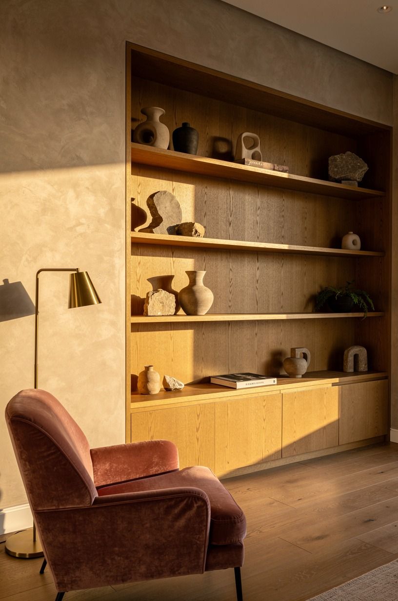
The cleanest move on this list, and the one that costs the least, is staining (or painting) the panel one shade deeper than the surrounding wall.
8Set a Single Tall Plant in the Corner
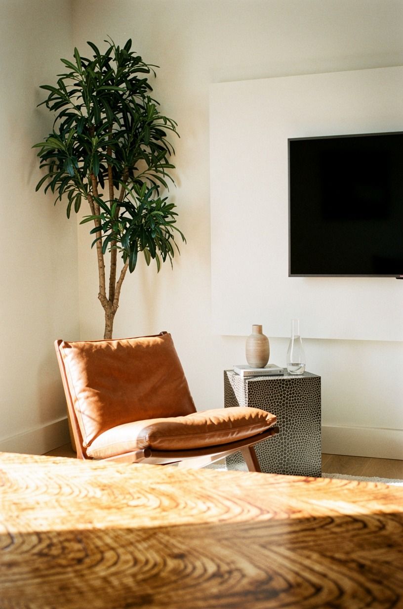
A single fiddle leaf fig in a terracotta planter, set in the corner beside the panel, breaks the rectangle of the wall with a living curve. We waited six months before adding ours because the wall wasn't ready.
The plant needs the panel to be quiet behind it; otherwise the two fight. For a similar move on the opposite side of the room, our outdoor patio fireplace edit covers the same "one tall element, one calm background" logic outside.
Water it once a week and rotate the pot a quarter turn so it grows straight toward the window. That's the whole plant-care protocol. Anything more complicated and you'll kill it in a month and live with a sad empty corner for two years (speaking from experience with our first attempt, which was a Boston fern in a brass cachepot that did not survive February).
9Should You Add Sconces That Flank the TV Evenly?
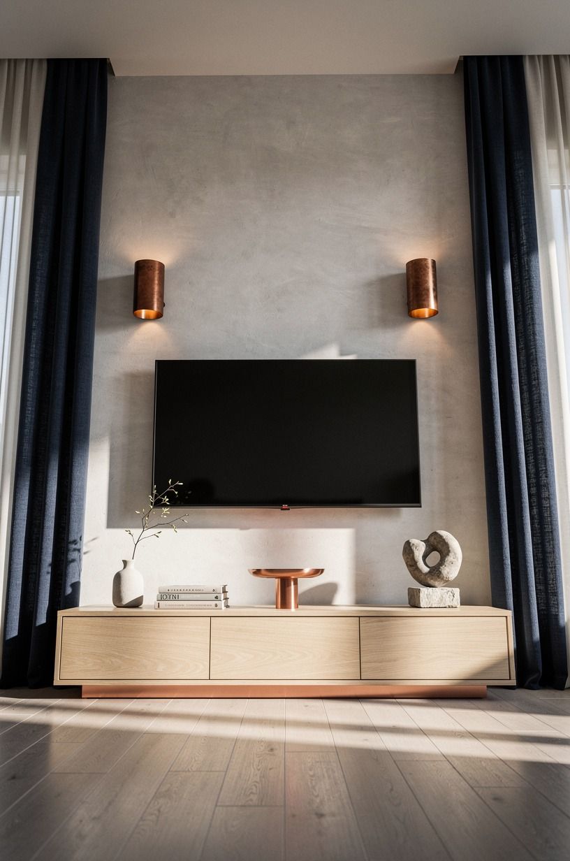
Two aged bronze sconces mounted 8 inches outside the panel, at the same height as the center of the screen, give you the warm evening light that no overhead fixture can.
10Mount the Shelf Lower Than Eye Level
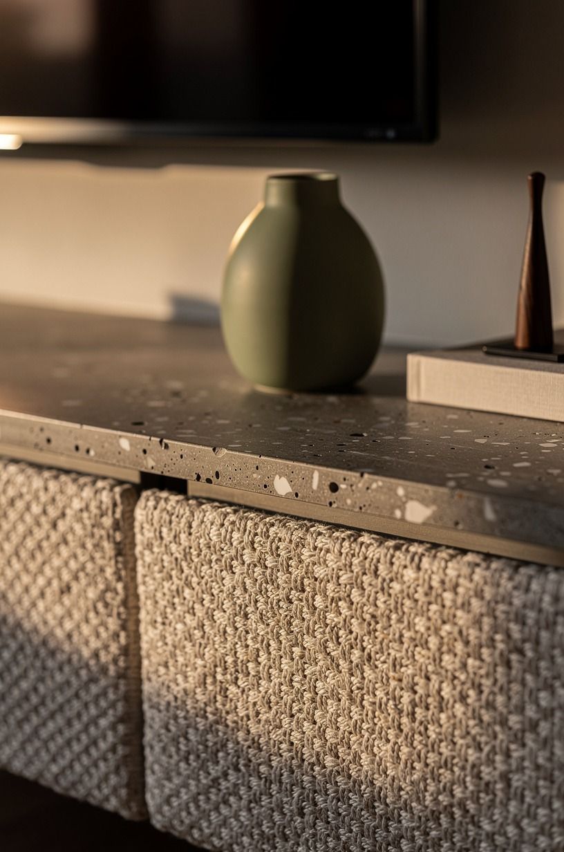
We made the mistake of mounting our first floating shelf at eye level, which is the wrong height for a media wall shelf. Eye level for a TV shelf is about 12 inches below the average seated eye line, which is roughly 44 to 48 inches off the floor. Mount it there and the shelf disappears into the composition instead of competing with the screen.
This is also the height that lets you rest a hand on the shelf without looking up. The "ergonomic eye line" is a real thing in interior styling and almost no one talks about it. The shelf at the wrong height is the move that makes a media wall feel like a retail display, even when everything else is right.
11Cable Box Behind a Louvered Door Instead of an Open Shelf
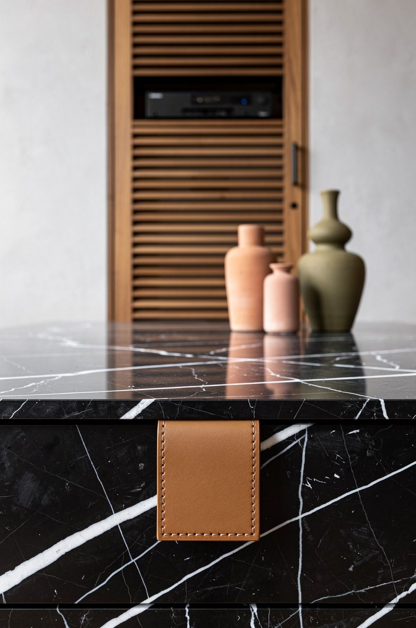
Cable boxes are ugly. They're getting less ugly every year (the Apple TV is a black puck the size of a drink coaster), but if you still have a chunky box, the cleanest hiding spot is a louvered teak door in a built-in below the console.
The louvers let the infrared signal through to the remote, so you don't have to open the door every time you want to watch something. Our built-in breakfast nook edit covers the same "hidden storage with breathable doors" principle in a different corner of the house!
If you don't have a built-in, a woven rattan basket with a lid works almost as well, and you can move it when you rearrange. The discipline here is to make sure the box has two inches of clearance on every side for ventilation. A cable box that runs hot inside a closed basket is a fire risk, and not the kind that looks cozy.
12Hang a Woven Basket Below the Ledge
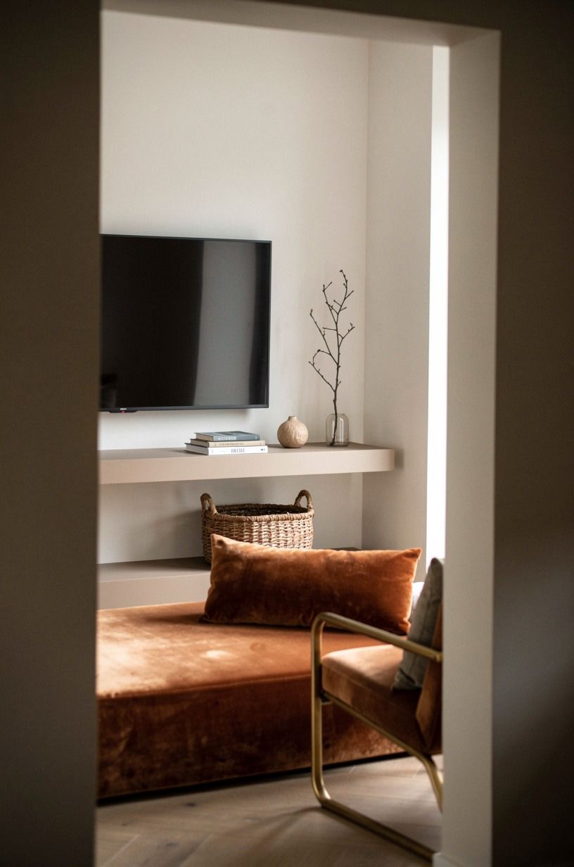
A woven seagrass basket tucked beneath the ledge holds the four remotes, the two charging cables, and the one stray HDMI adapter that always ends up on the floor. Woven materials warm up a panel wall the same way a linen curtain warms up a window: texture over color. Our boutique hotel pillow guide covers a related principle about texture density in a different part of the house, and the logic carries.
We rotate between a seagrass basket in summer and a brushed jute basket in winter. Same size, different warmth. The basket is the move that solves the "where do the controllers live" problem without inviting a basket of clutter that you have to edit every week.
13Line the Lower Shelf With Old Paperbacks
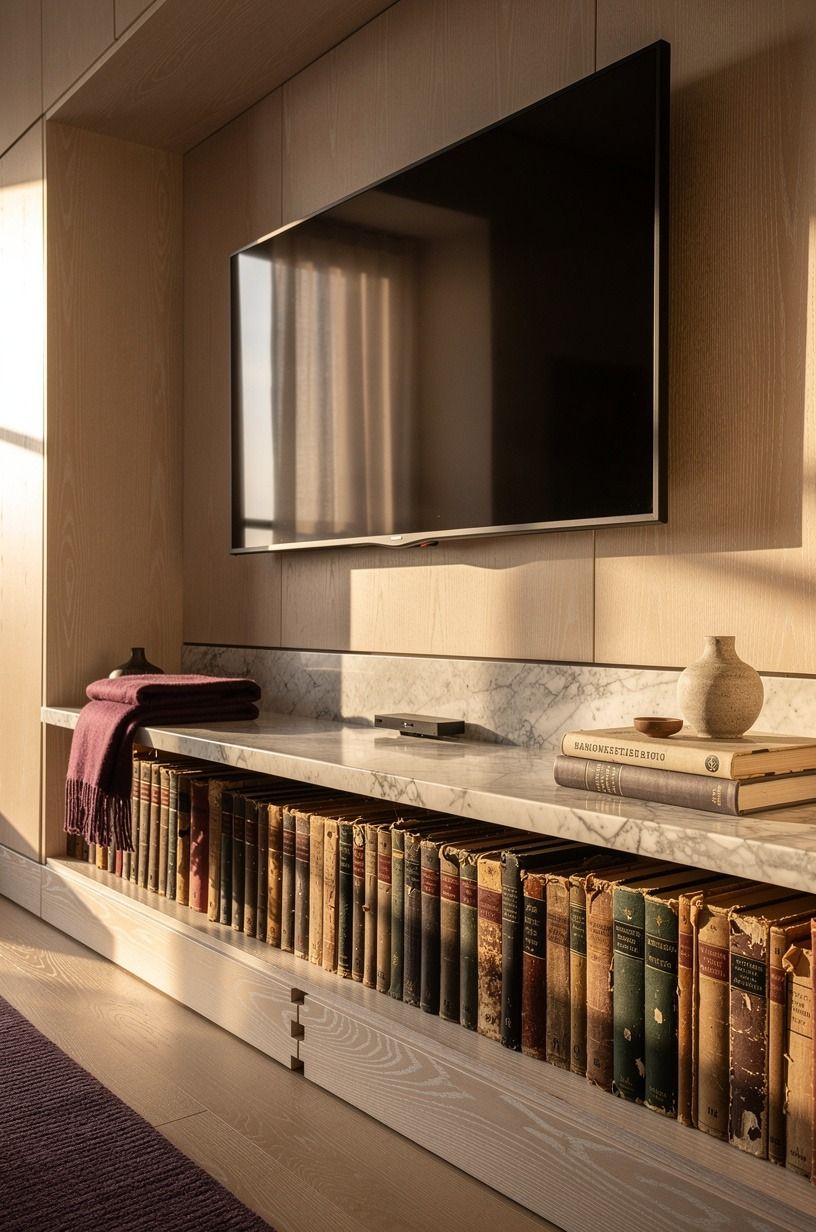
A row of old paperbacks on the lower shelf, spines out, mixed with one small ceramic vessel and one framed photo, makes the wall feel like someone reads. We spent four dollars at a library book sale and stacked them horizontally in groups of three.
Books laid horizontally read as a casual edit. Books stood vertically with no theme read as a yard sale.
If you want more low-cost styling ideas for the rest of the shelves, our bar tray styling guide translates the same "edit to three" principle to a different surface, and our kitchens with built-in breakfast nook roundup shows how the panel-and-shelf composition reads at a larger scale.
The discipline is to keep the colors within two shades of each other. We pulled all the oranges, browns, and creams and left the bright spines for another shelf. That visual discipline is what makes a row of paperbacks look like styling instead of storage.
14Lean a Vintage Mirror Against the Panel
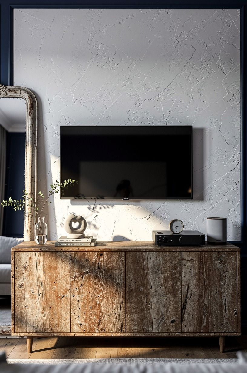
A vintage mirror with a thin brass frame, leaned against the panel on the side opposite the plant, doubles the wall's perceived depth and bounces lamplight into the corner. We found ours at a flea market for forty-five dollars, and the foxing on the mirror (those soft brown spots that come with age) is the detail that makes it work.
A perfect mirror reads like new construction. A foxed mirror reads like a room with a past.
Lean, don't hang. A leaning mirror is a styling choice; a hung mirror is a wall covering.
We use ours to bounce the copper bowl light from across the room in the evening, and the effect is like having a second sconce that only shows up after dark. If you want to extend the same mirror-bouncing move to the dining side of the room, our breakfast nook wall decor guide covers the principle at table height, and our under-cabinet lighting roundup shows the same move for counter-reflective surfaces.
15Sherwin-Williams Creamy SW 7012 Behind the TV
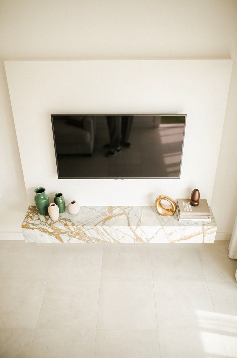
If you do nothing else on this list, do this: paint the wall behind the TV in a warm white with real undertones. We used Sherwin-Williams Creamy SW 7012, which reads creamy against the panel's cooler white.
A flat off-white behind a TV is what makes most walls feel like a clearance aisle. A warm white with depth is what makes the same wall feel intentional.
The color choice is more important than the brand. Cool whites (anything with gray or blue undertones) read as institutional behind a screen.
Warm whites (yellow, cream, ivory, soft beige undertones) read as calm. The screen reflects both.
Pick the calm one. Worth it!
16Cap the Panel With a Thin Picture Light
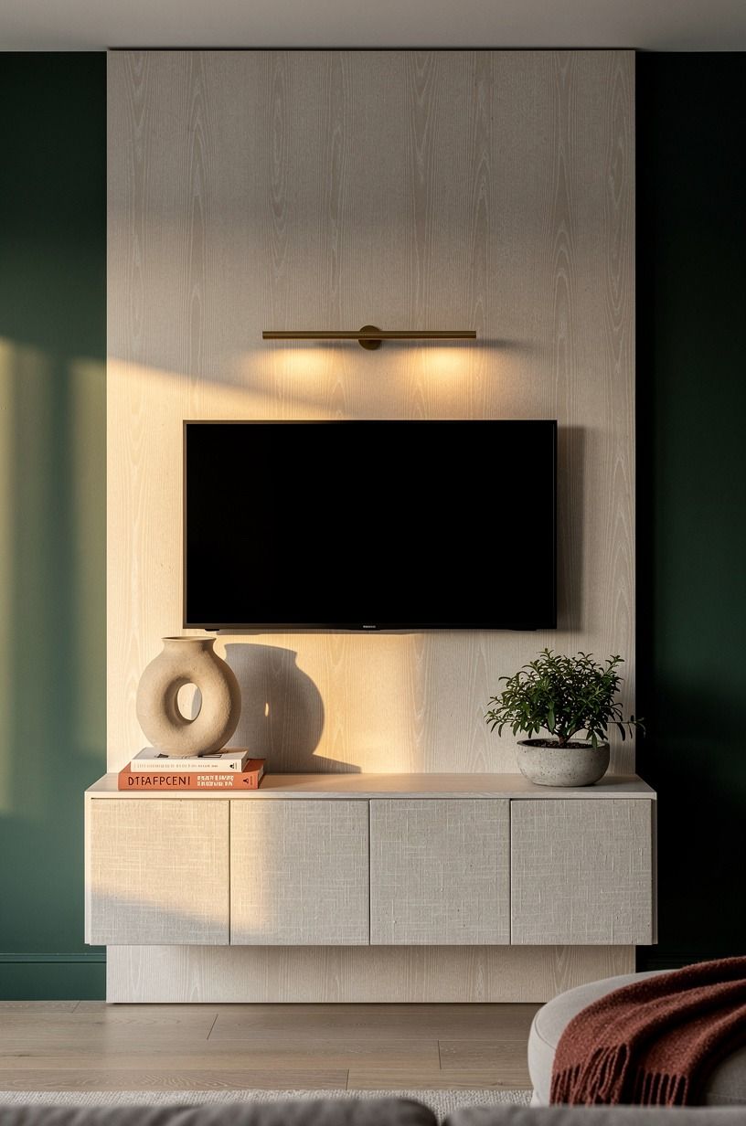
A single thin brass picture light mounted 4 inches above the top of the panel washes the wall in warm downlight without lighting the screen. We chose unlacquered brass to match the console hardware, and we wired it on a separate dimmer from the sconces. The picture light is what we turn on at 7pm when the room needs to feel like evening.
The sconces are what we turn on when someone is reading. That's the split, and it does more than any single fixture could.
Total move for the room's mood (and your electricity bill, since you're only running one dim circuit at a time).
Two circuits, two moods, one switch panel. That small bit of electrical planning is what makes the wall feel like a designed room instead of a TV corner with stuff on it.
If you're not comfortable wiring a second switch, the battery-operated picture lights from the big home stores have gotten genuinely good. Rechargeable via USB, twelve hours of warm light per charge, no electrician.
How Much It Cost (Honest Numbers)
Here are the real numbers from our install, line by line. We did the work over two weekends, and we already owned the drill and the miter saw.
The high end of the range ($2,590) covers custom millwork and real rift-sawn oak. The low end ($767) is the paint-and-shop-the-house version. The middle ($1,197) is what a real weekend with a borrowed miter saw gets you.
What I'd Skip if I Did It Again
Three things. The louvered teak door (we ended up just tucking the cable box behind a stack of books on the lower shelf). The second sconce circuit (one dimmer on both sconces is fine for a living room this size).
And the brass picture light: a rechargeable battery version does 90% of the job for 30% of the cost. Save the electrician fee for the sconces, which actually need to be wired.
I'd also spend more on the console. The $320 version has held up fine, but a $500 version in real reclaimed teak would have aged into the room instead of just sitting in it.
Furniture is the place to spend. Lighting is the place to save.
The Honest Truth About Going Simple
I've styled a lot of media walls, and the cleanest ones never come from adding more. They come from editing harder. Most people overspend on the panel and underspend on the styling.
Most people put too many objects on the ledge. Most people pick a warm white that's a cool gray in disguise and then wonder why the wall still feels clinical.
The simple look is harder than the layered look, not easier, because there's nowhere for a mistake to hide.
The other thing nobody tells you: the simple finish rewards patience. The first two weeks, the wall will feel bare.
By week three, your eye has adjusted and you stop noticing what's missing. By month two, you walk past and feel your shoulders drop a little.
That's the whole point. A media wall that asks nothing of you is doing exactly what it should.
The panel should recede, the screen should be functional, the styling should feel inevitable. If any element of the wall is competing for your attention, it doesn't belong there.
Worth it, every single time!
And honestly? The best compliment I've gotten on this wall is "I didn't even notice it." That's the goal. The room should feel calm.
The TV should work. The cords should be invisible.
Everything else is decoration, and decoration is optional.
If you're building out the rest of the room around the wall, our Nancy Meyers living room guide covers the same discipline in the seating zone, and our terracotta sofa roundup pairs well with the warm whites we used here. For lighting across the whole room (the other half of the equation), the breakfast nook lighting ideas translate surprisingly well to a media wall corner, since the principle is the same: warm bulbs, dimmable circuits, no overhead.
What People Always Want to Know
What is the best simple media wall finish for a small living room?
A single painted panel in a warm white one shade deeper than the surrounding wall, with the TV centered and a slim walnut ledge below. Skip the framed planks and the floating console in a room under 12x12.
The simpler the panel, the bigger the room reads. The IKEA BESTÅ in a white oak effect works as the console in tight spaces and floats cleanly off the floor.
Pair it with one aged bronze sconce on the side where the outlet lives.
Where can I buy simple media wall pieces on a budget?
Three places worth checking. IKEA for the BESTÅ console and the MOSJÖ picture light (under twenty dollars, battery operated, surprisingly good).
Target for the Threshold aged bronze sconces and the woven seagrass baskets. Facebook Marketplace for the brass-frame mirror and the walnut ledge, both of which show up for under fifty dollars in most metro areas. We spent about twenty percent of our total at the library book sale and a flea market.
Thrift is the move for the styling layer.
How much does a simple media wall makeover cost?
About $300 to $1,200 for the budget tier (paint, panel from plywood, ledge, styling, no electrical work). $2,500 to $8,000 for the mid tier (custom millwork, real stone veneer, two sconce circuits). $12,000 to $40,000+ if you're pulling the wall apart and doing real built-in cabinetry. Most people can land in the budget tier in a weekend for under $1,200. The splurge is in the panel material and the console, not in the styling layer.
Can I create a simple media wall on a tight budget?
Yes, and most of the work is free. Paint the existing wall one shade deeper than the room (about $50 for the paint and a roller).
Move the existing console or shelf instead of buying a new one. Reuse the picture frames you already own by repainting them in a single finish.
The biggest spend should be the light bulbs (under $20 for the whole room) and the cord cover (about $12). That's a media wall refresh for about $100 and a Saturday.
Is a simple media wall worth it in a small space?
Worth it, more than almost any other living room change. A simple panel wall makes a small room feel bigger because it gives the eye one focal point instead of asking it to track a screen on drywall.
The wall reads as architectural instead of functional, which is the difference between a room that feels designed and a room that feels like furniture was dropped into it. If your living room is under 200 square feet, skip the floating console and use a low IKEA LACK TV bench in walnut effect instead.
Same composition, smaller footprint.
Is a simple media wall a good idea for a rental?
Yes, with three swaps that leave no damage. Use peel-and-stick wood-look panels (the ones from the big home stores have gotten genuinely good) instead of real plywood.
Mount the TV on a freestanding TV stand instead of a wall mount. Use a cord cover with removable 3M strips instead of screws.
The wall will look built-in, your deposit will survive, and you'll take the styling with you when you move. If you want to test the layout before committing, our accent wall bedroom guide covers the same principle for renters.
Where I'd Start First
If I had to pick one, I'd start with the paint. It costs under fifty dollars and a Saturday, and it's the foundation every other decision builds on.
Get the color wrong and you'll fight it for years. Pin this list for your next weekend.


