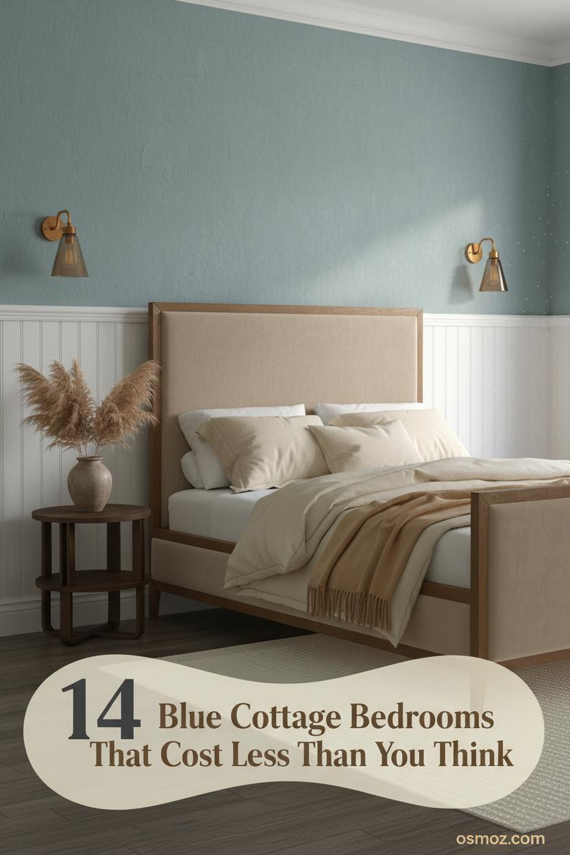
14+ Blue Cottage Bedrooms That Feel Warm Without Trying Too Hard
25 may 2026The first thing you notice in the best blue cottage bedroom is that nothing looks like it's trying. The color just sits there, quiet and sure of itself, and the whole room follows.
These 14 rooms do that. Different blues, different textures, but the same unhurried feeling throughout.
Indigo Walls That Make Cream Feel Expensive
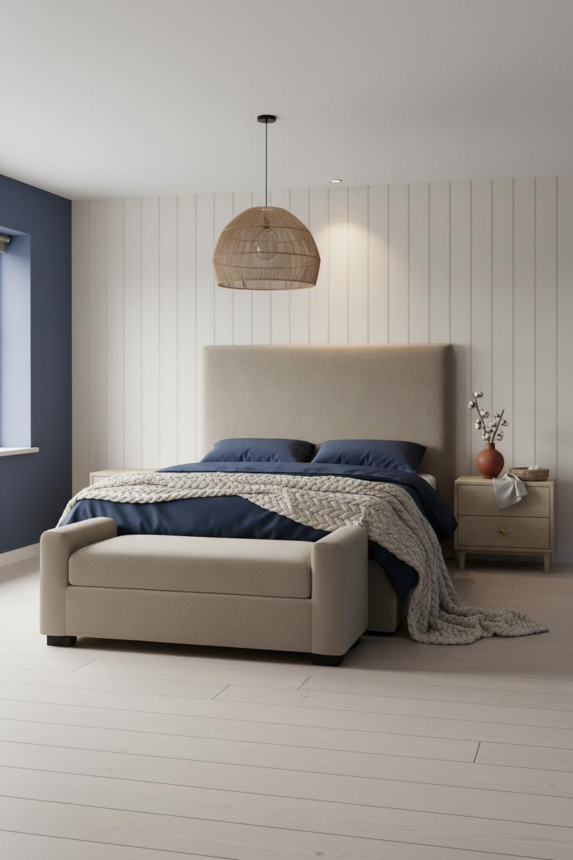

I keep coming back to this combination. Indigo and cream shouldn't feel this restful, but it does.
Why it works: The chalky cream board-and-batten breaks up the indigo wall in a way that adds architectural weight without splitting the color story in two.
Steal this move: Keep the bedding in the same cream family as the batten. The layering reads as intentional rather than accidental.
Teal Walls Look Different When the Light Is Warm
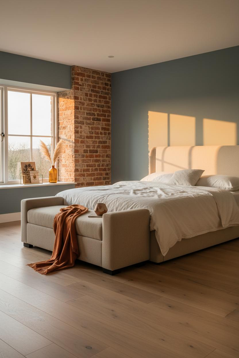

Most teal rooms feel cold. This one doesn't, and the reason is the light source.
What changes the room: Warm amber light raking across a matte plaster finish pulls the green out of teal and turns a cool wall into something that honestly feels like a weekend farmhouse.
The easy win: Swap overhead cool bulbs for warmer ones. It costs nothing and it's the difference between clinical and cozy.
Duck-Egg Walls With a Weathered Beam Overhead
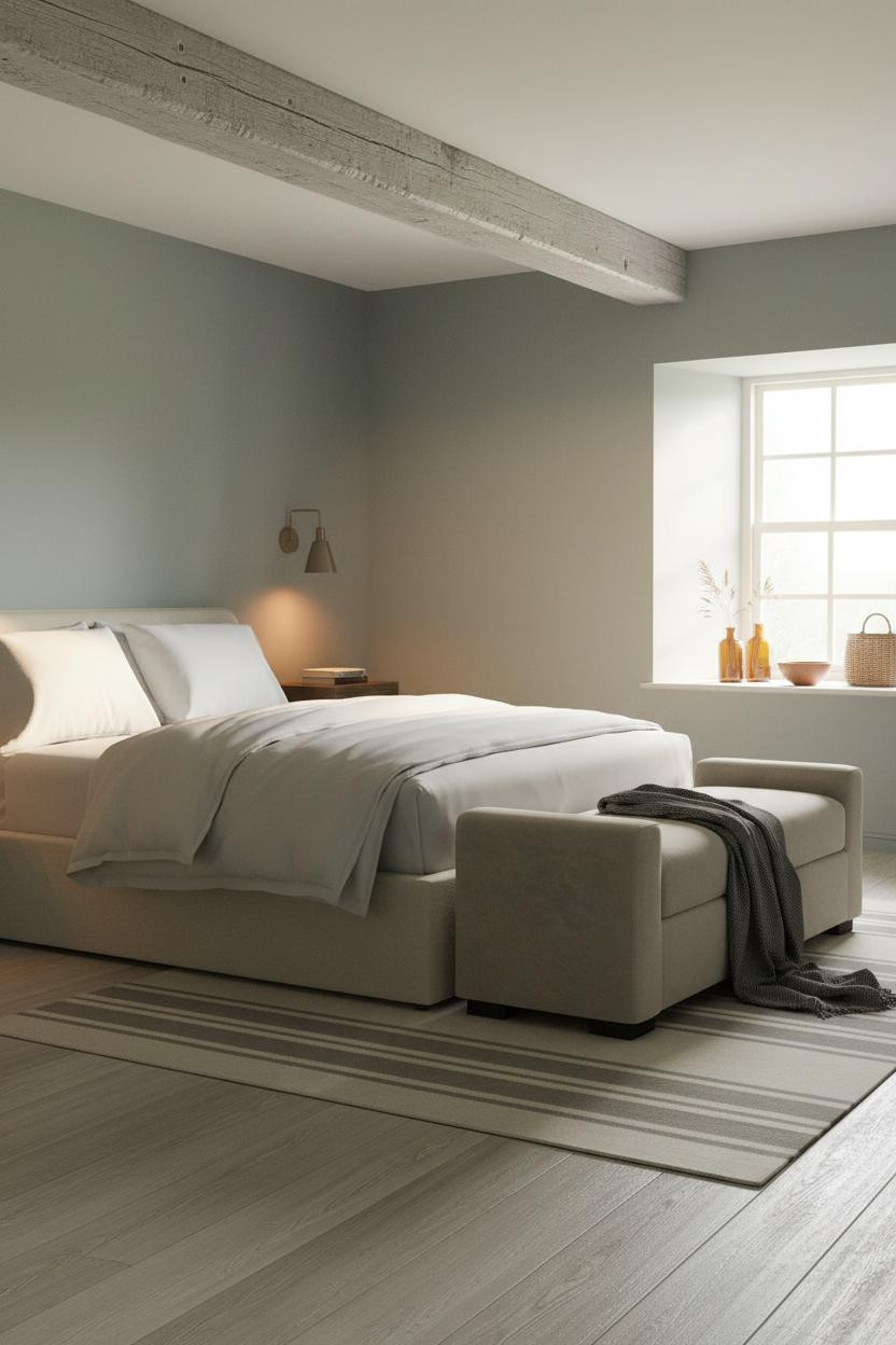

This is the room that convinced me duck-egg works in any season. The walls shift depending on the light.
In morning cool, they read blue. By midday, they pull greyer. The rough-sawn timber ceiling beam anchors all of it, keeping the softness from tipping into something too pretty.
The part to get right: The beam needs age. A new, clean beam in this color scheme would flatten the whole thing. Reclaimed or nothing.
How a Plaster Arch Earns Its Place Around the Bed
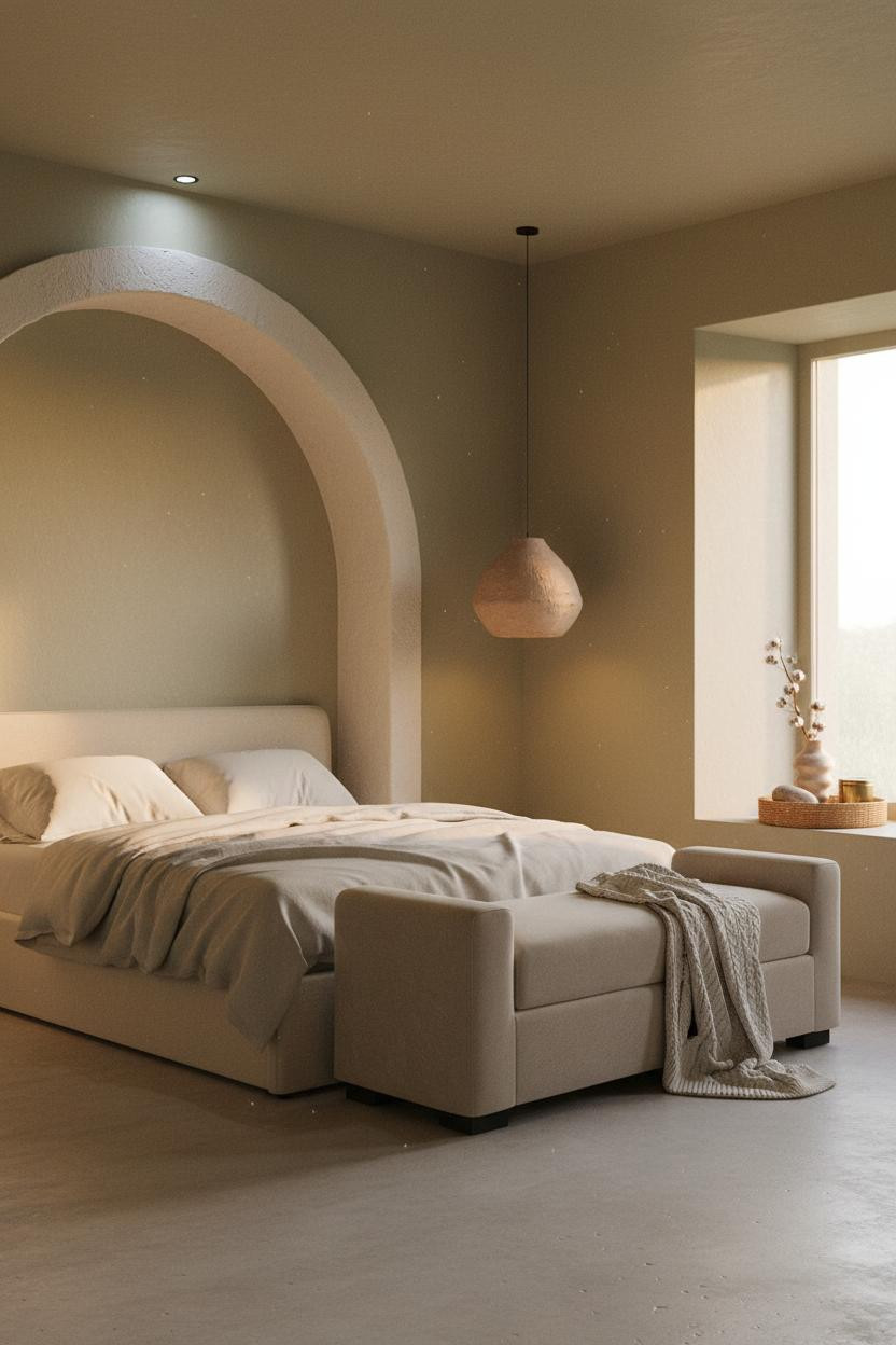
Plaster arches are polarizing. But this one works because it's thick-edged and hand-trowelled rather than sharp and perfect.
Why it looks custom: The raw plaster arch frames the bed without requiring any furniture to work harder. The curved interior catches shadow and the sage walls behind sit quietly inside it.
Avoid this mistake: Don't arch-wash the room. One arch, centered on the bed wall. More than that and it stops feeling intentional.
The English Cottage Combination Nobody Talks About Enough
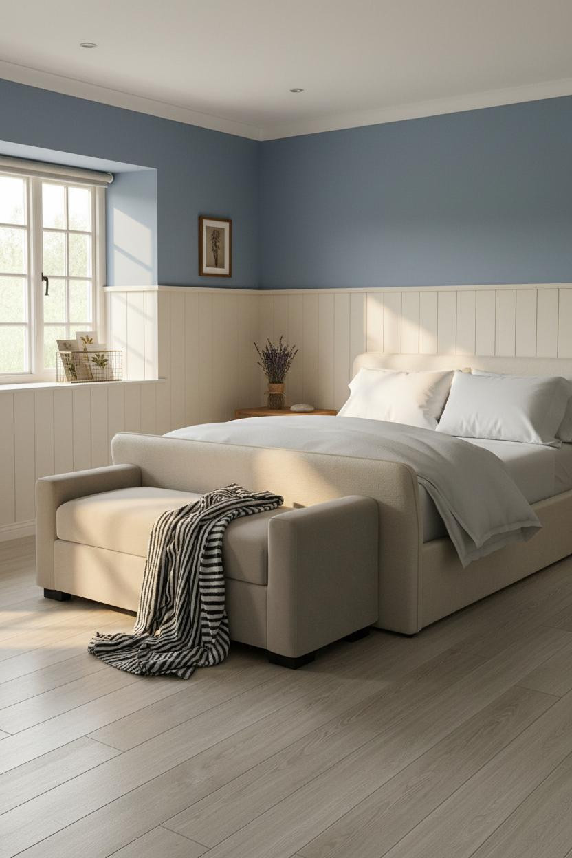
Dusty cornflower over cream wainscoting. That's it. That's the whole recipe for a proper English cottage bedroom.
Why the palette works: The matte cream wainscoting panels stop the cornflower from feeling heavy, while the visible brushstroke texture in both surfaces keeps the room feeling hand-made rather than showroom.
Pro move: Hang one frame slightly off-level on the wainscoting. Sounds counterintuitive, but it's what makes the room feel lived-in rather than staged.
Navy Walls With White Shiplap Feel Grounded, Not Cold
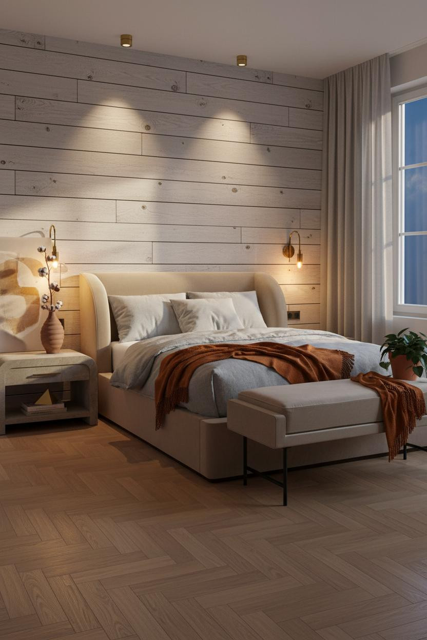

Fair warning. Navy this deep can go wrong fast. But the weathered white shiplap behind the bed is what keeps the whole thing from getting oppressive.
Design logic: The horizontal shiplap seams catch raking light and create rhythm across the headboard wall, which stops the navy flanking walls from flattening the room into a dark box.
Worth copying: Add a burnt orange mohair throw at the foot. The contrast is immediate and it warms the whole scheme without touching the walls.
Periwinkle and Raw Timber: Surprisingly Easy to Pull Off
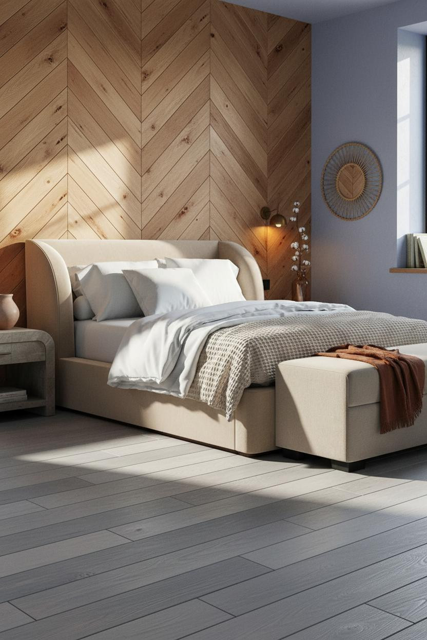
I almost scrolled past this one. Glad I didn't.
What gives it presence: A herringbone timber feature wall behind the bed adds grain direction and depth that flat plaster never could, and the periwinkle on the flanking walls sits warm against the amber knots in the wood.
Layer a rust linen throw across the foot bench. Just enough warmth to keep things interesting while still feeling relaxed.
Built-In Teal Shelving That Doubles as a Headboard Wall
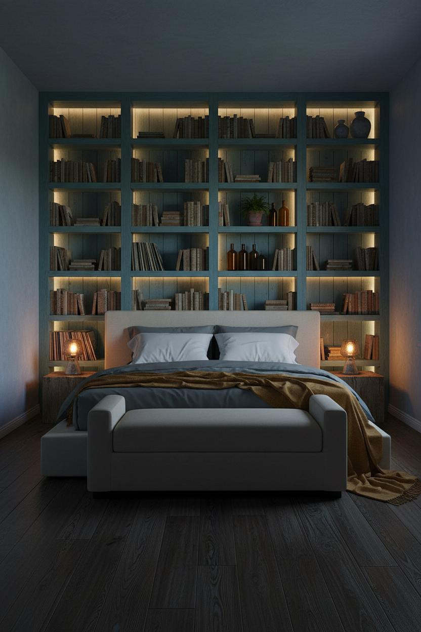
This one is divisive. Floor-to-ceiling shelving behind the bed either looks brilliant or chaotic, and there's not much in between.
What makes this work: Painting the raw timber shelves in dusty teal unifies the whole wall so it reads as architecture rather than storage. The backlit gaps between shelf spans glow amber and give the room its mood.
Skip this: Don't fill every shelf. The negative space in this kind of installation is doing real work. Overcrowding it kills the effect.
Rough Limestone and Cobalt Blue: An Unlikely Pairing That Lands
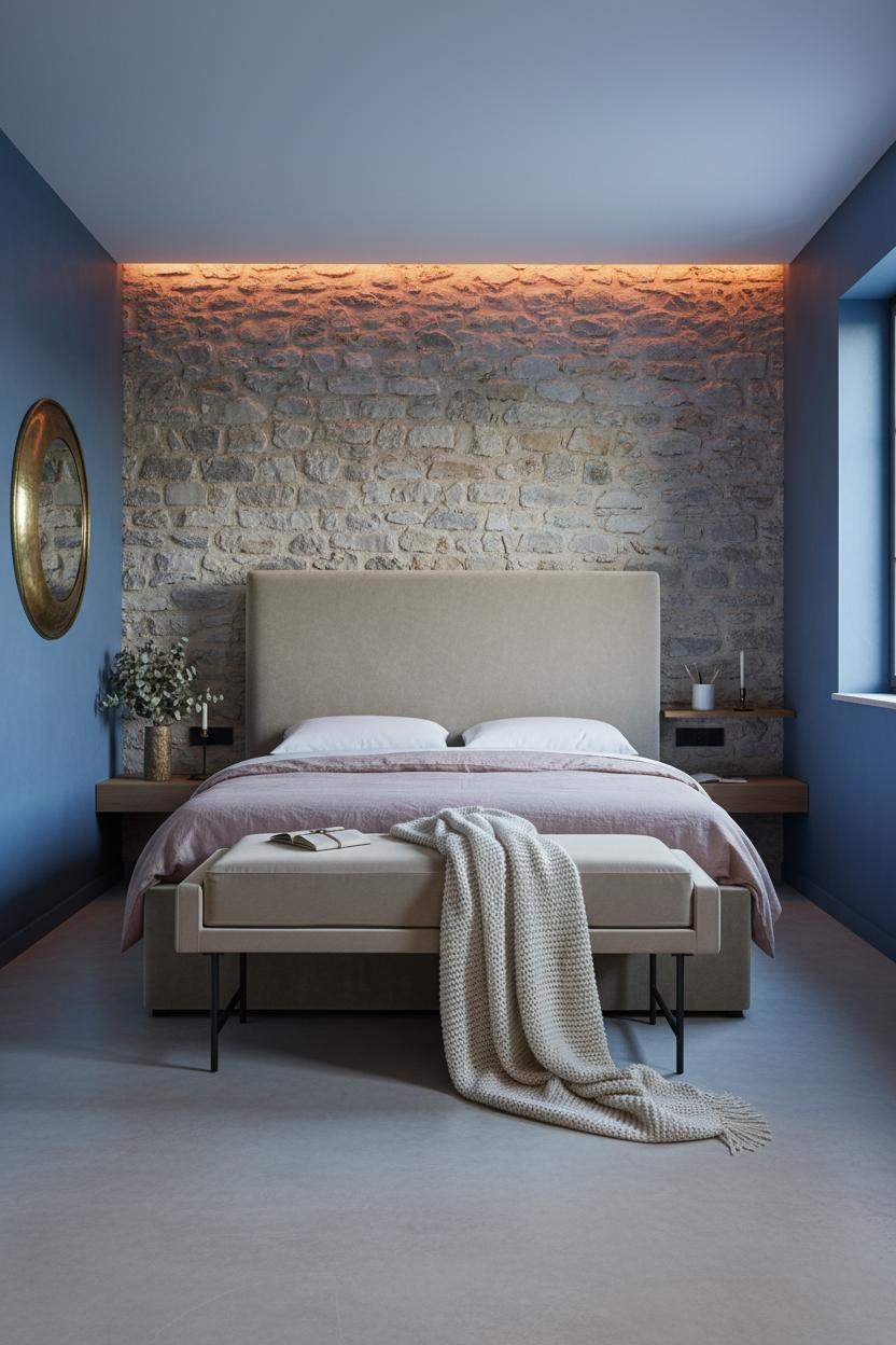
It shouldn't work. Cobalt-washed indigo plaster against rough limestone blocks sounds like a mood board argument waiting to happen.
But the exposed limestone feature wall has so much natural warmth in the grey-cream mortar joints that the cobalt reads almost soft beside it. Ancient material, modern color. The room feels calm and cohesive.
What to borrow: The hammered brass convex mirror above the bench. It pulls the stone's warmth into the blue side of the room, which helps balance the two very different surfaces.
Powder Blue Walls With a Deep-Set Cottage Window
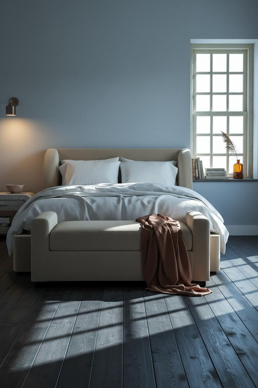
Nothing fancy. That's the point.
What carries the look: The deep-set multi-pane window frame in worn cream paint casts geometric shadow bars across the floorboards at morning light, and those bars do more decorative work than any art print could. The powder blue walls with warm grey depth let it happen without competing.
The smarter choice: Keep the rug out entirely. The dark stained planks underneath need room to breathe, and a rug here would muffle the whole composition.
French Blue Farmhouse With an Exposed Brick Chimney Breast
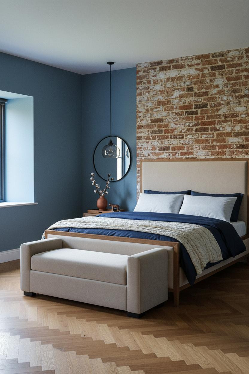

This is one of my favorite French blue bedroom pairings in the whole round-up. The brick does something the walls alone can't.
Why it feels balanced: The terracotta brick chimney breast rising behind the bed introduces warmth that French blue walls on their own would never generate. The matte plaster finish on the flanking walls softens the transition between both surfaces.
One smart swap: Pull the navy sateen bedding in a shade or two lighter than the walls. Too close a match and the bed disappears into the room.
Slate Blue Walls and Floor-to-Ceiling Linen Curtains
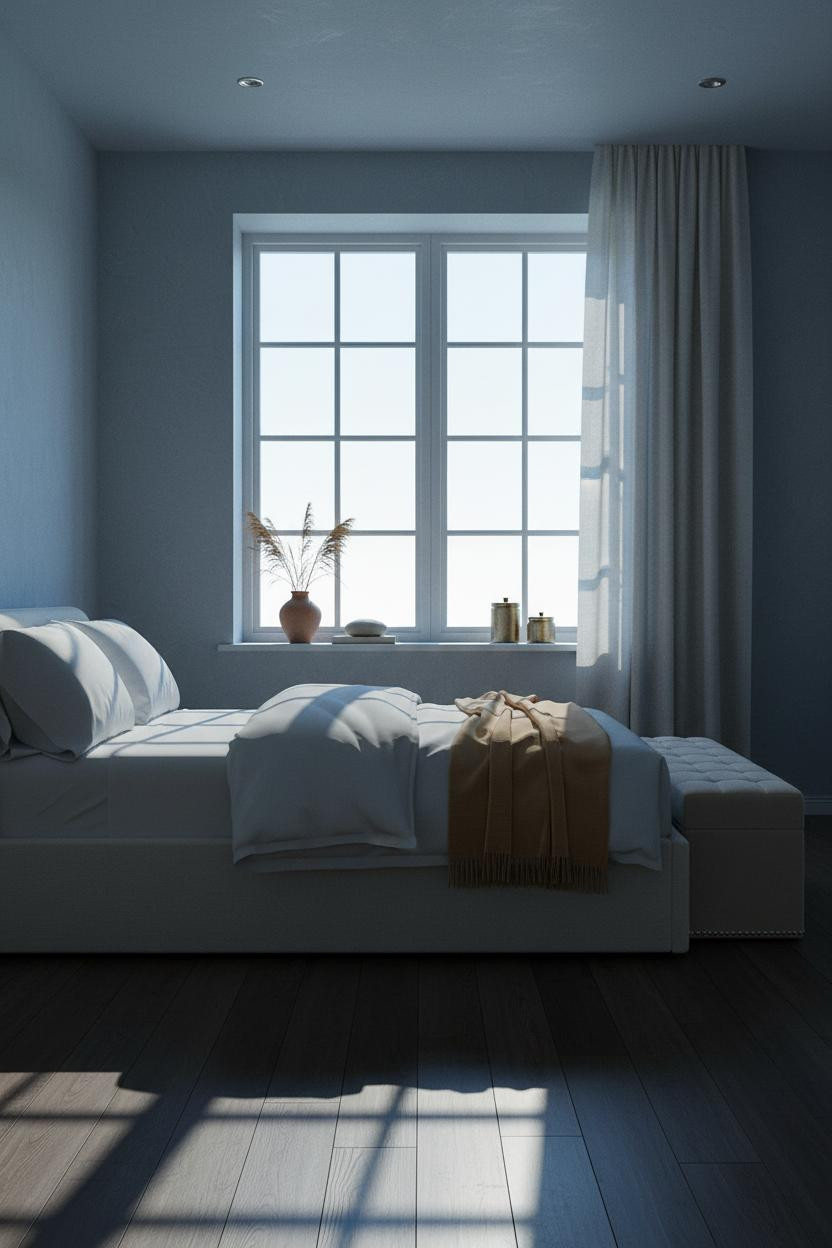
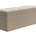
The room feels lived-in and intimate even before you look at the furniture. It's all down to the curtain height.
In a small cottage bedroom, the smarter choice is always floor-to-ceiling pale stone linen curtains rather than something shorter and more fitted. They make the six-pane window look twice its size and soften the hard geometry of the casement bars, while still letting the slate blue walls read clearly behind them.
The finishing layer: A camel wool throw across the foot bench. It's the warmest tone in the room and it keeps the slate from feeling flat.
Periwinkle and Tongue-and-Groove Paneling for a Coastal Cottage
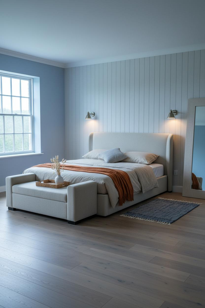
This is actually my favorite cozy cottage bedroom format for smaller rooms. The paneling does a lot of the heavy lifting.
What softens the room: Full-height tongue-and-groove paneling behind the bed draws the eye upward and stops periwinkle walls from feeling low or cramped. The vertical shadow lines between each board create rhythm in a way that flat plaster simply doesn't.
Where to start: Add the kilim runner in muted indigo and cream before you change anything else. It ties the bleached oak floor into the wall color without forcing a match.
Beadboard Wainscoting in the Warmest English Cottage Shade
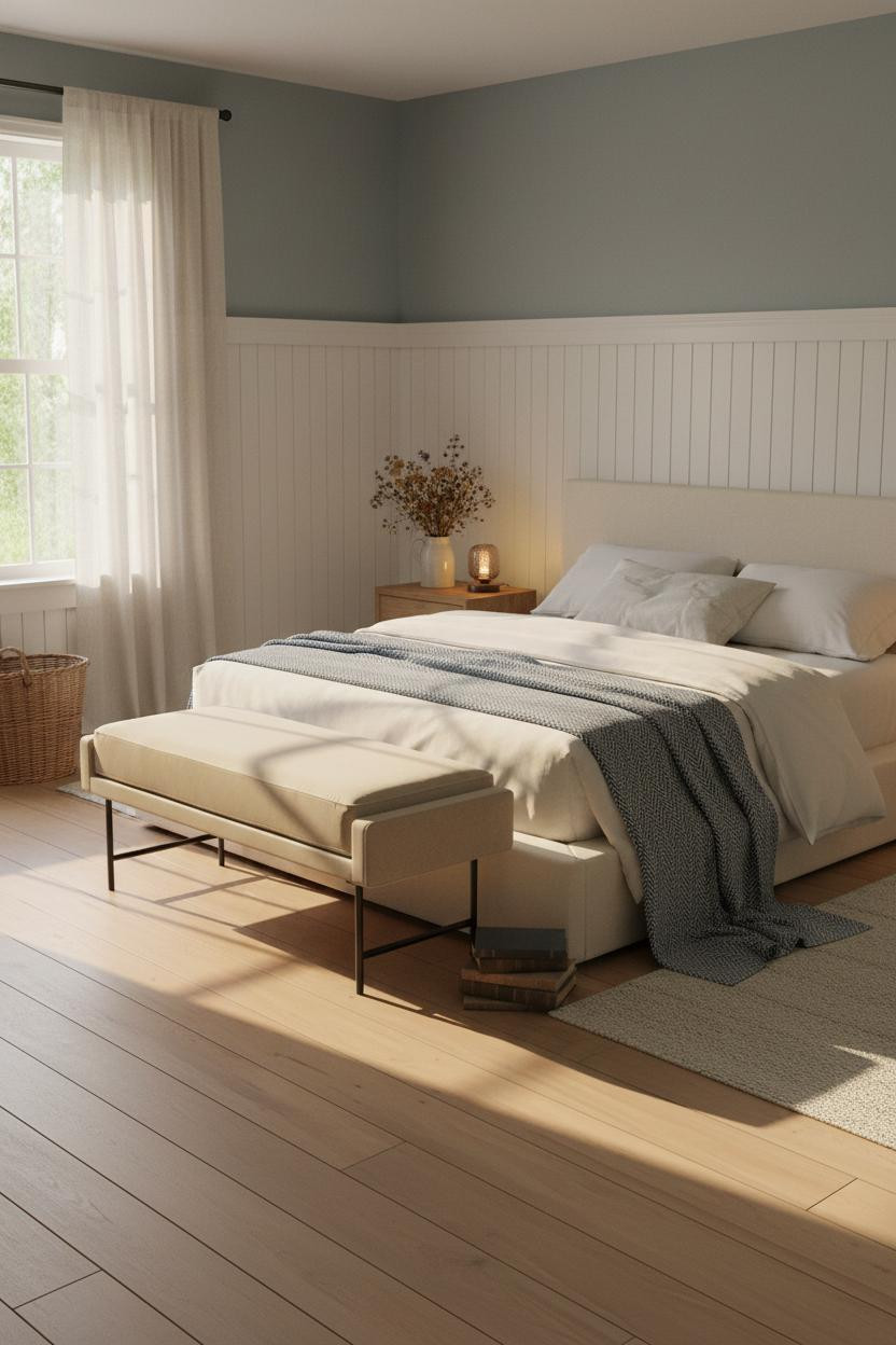
Quiet rooms like this one don't happen by accident. They take restraint.
The whitewashed beadboard wainscoting running three-quarters up the wall catches the late afternoon light across its horizontal ridges, showing aged patina in the grooves. And the dusty blue plaster above it, with its faint sage quality, keeps the room from tipping too cool.
The detail to keep: A ceramic pitcher of dried wildflowers on the nightstand. It's the kind of thing that makes a room feel vintage and personal rather than put together from a mood board.
 Our #1 Pick
Saatva Classic Mattress
America's best-selling online luxury innerspring. 365-night trial, lifetime warranty, free white glove delivery.
Shop Saatva Classic
Our #1 Pick
Saatva Classic Mattress
America's best-selling online luxury innerspring. 365-night trial, lifetime warranty, free white glove delivery.
Shop Saatva Classic
The Foundation Of Every Beautiful Bedroom
Walls get repainted. Throws get swapped out. The mattress stays. And in a blue cottage bedroom where the whole point is feeling genuinely at rest, what you sleep on matters more than any surface treatment in the room.
The Saatva Classic has dual-coil support that holds without going stiff, a breathable organic cotton cover that doesn't trap heat on warm nights, and a Euro pillow top that's soft without losing its shape over time. It feels right years in, not just the first week.
Start with the bed. The rest figures itself out.

The rooms people save are the ones where nothing looks borrowed from somewhere else. Pick a blue that actually suits the light in your room, commit to one wall treatment, and let the rest settle around it. That's the whole formula.


