12 Media Wall Design Rules for Better Layout, Proportions, and What to Avoid
16 july 2026How to design a media wall starts with proportion, not gadgets. The short answer is simple: frame the TV calmly, make the cabinet wider than the screen, and protect the sightline from the sofa. I learned that after planning one around the TV first, then wondering why the room felt top-heavy. These rules keep the result warm, built-in, and calm.
Start here: Sketch the sofa, rug, screen, fireplace, and cabinet as five shapes before you choose a finish. You’ll catch proportion problems while they’re still pencil marks, and your living room will feel more serene before a single board is cut.
- Frame the TV with slim plasterboard returns
- Recess the screen into a shadow gap
- Center the fireplace below the sightline
- Build drywall niches around hidden speakers
- Float cabinetry under the full wall span
- Wrap shelves around one asymmetrical recess
- Step the plasterboard forward in shallow layers
- Balance tall storage with open display bays
- Size the TV to the sofa distance
- Paint the recess darker than the wall
- Run vertical fluting beside the screen
- Leave breathing space above every component
- Where should the soundbar sit?
- Fireplace vs Feature Wall: Pick One Leader
- Choose a finish that can age well
- The One-Lead Finish Strategy
- Can a rental use a media wall plan?
- Edit the wall before adding another feature
1Frame the TV with slim plasterboard returns
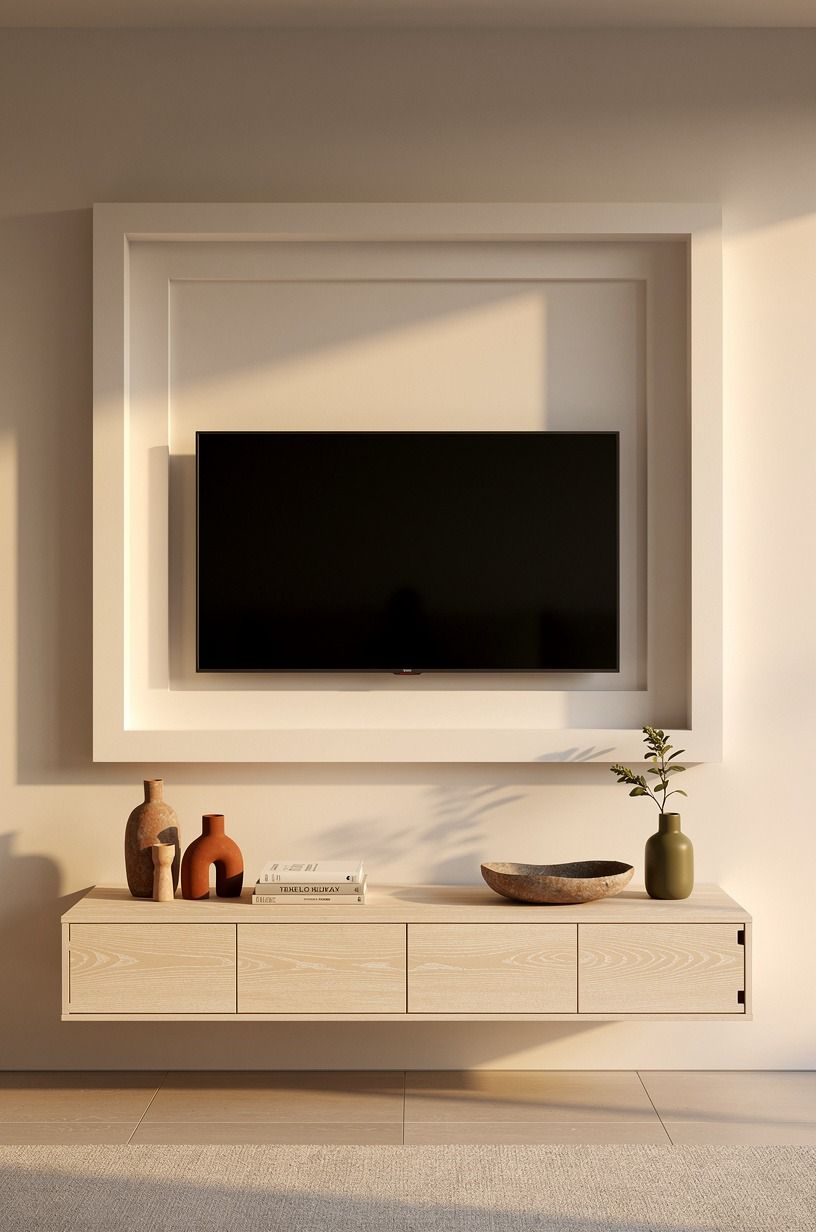
Start with the outer edge, not the screen. Slim plasterboard returns make the TV read as part of the architecture, and you don't need a chunky frame for the effect to land.
A stepped edge catches side light and gives your wall a refined, calming outline. If you're planning the elevation yourself, you'll want to draw the return before you draw the screen.
If you're building around cerused white oak cabinetry, keep the returns lighter than the base below. You’ll want enough margin around the screen for the wall to feel airy rather than packaged.
See this Nancy Meyers living room reference for the kind of warm restraint that works. I've found that the frame feels more inviting when its outer edge isn't shouting for attention.
For a budget version, paint the return and let the shadow do the work. Benjamin Moore White Dove OC-17 keeps a small room bright, while a taupe reveal adds subtle depth. I’d skip chunky trim because your eye will tire of it, and you won't gain enough structure to justify the bulk.
2Recess the screen into a shadow gap
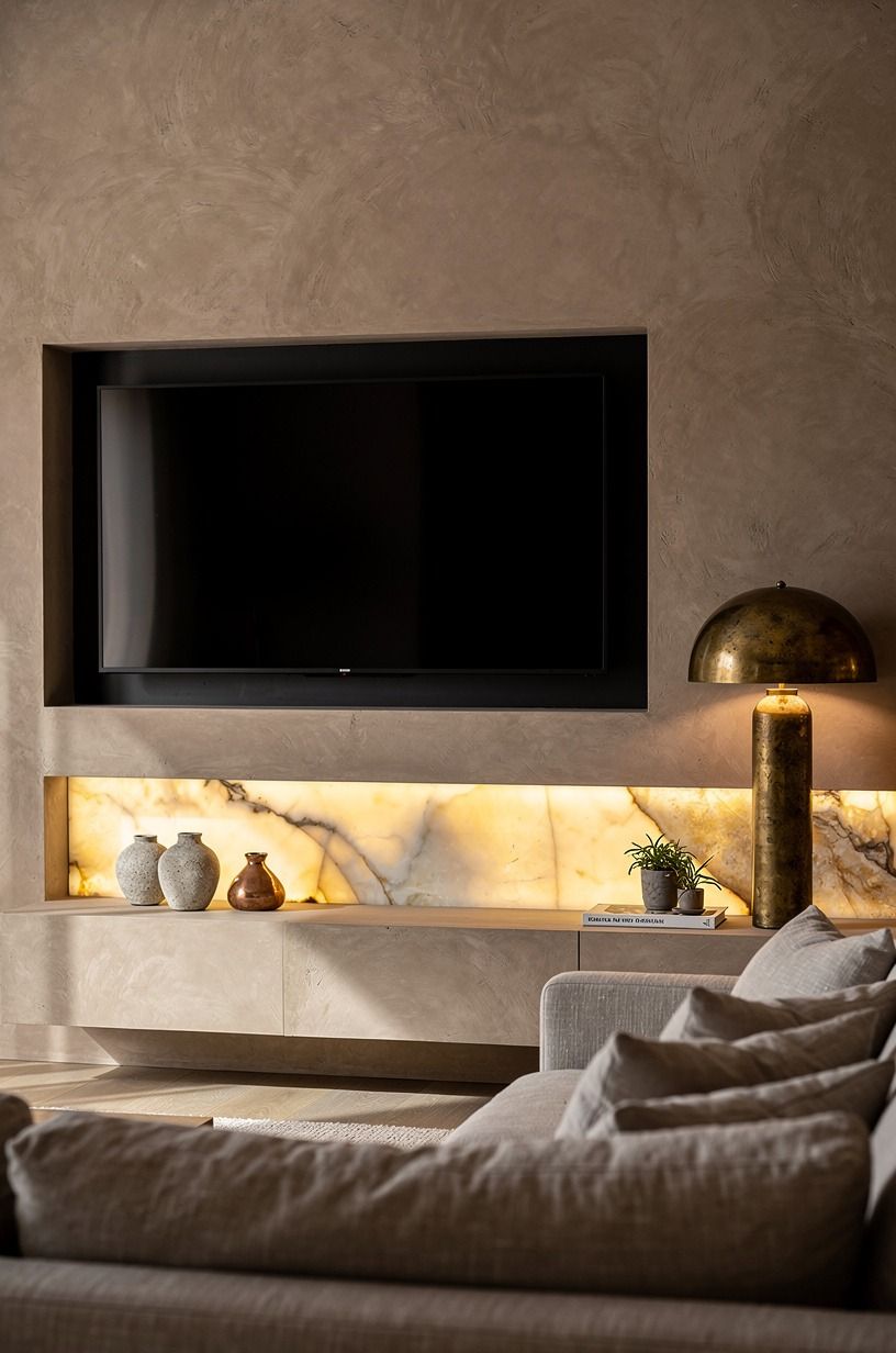
A recessed media wall works when the shadow line is precise. Set the screen back and leave a narrow dark reveal so the edge disappears when the room is dim. You’ll notice the plaster texture first, and the whole composition feels quieter, more sophisticated, and more inviting.
I wouldn't paint the reveal the same cream as the face. It flattens the wall.
A crisp darker gap gives you gentle contrast, especially beside indirect light and hand-troweled plaster. This Venetian plaster guide is a useful material reference.
I’m happiest when the gap is visible only after you start looking for it.
Use a hidden wash at 2700K if you want an intimate evening glow. Farrow & Ball Down Pipe can make the recess moody without making it harsh. I’d avoid blue light because your room won’t feel relaxing once the screen is off, and you don't need another hard edge in the composition!
A recess this restrained can be surprisingly affordable. A sample board, a careful reveal, and one warm dimmer will often do more for your room than an elaborate lighting system. You’ll see the plaster breathe when the glow is low, and you won't be distracted by equipment after the movie ends.
3Center the fireplace below the sightline
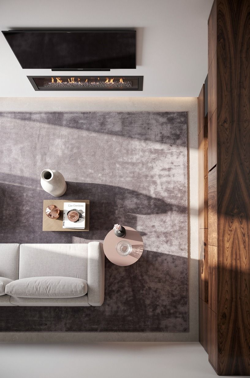
If you have a TV and fireplace, align them as one vertical composition. Your fire opening should sit below the screen, centered on the same axis, so your sofa and rug have one obvious focal line. The room feels more inviting when the eye doesn’t have to choose between two centers, and you’ll notice the difference from every seat.
The numbers matter. A typical sofa depth is 35 to 40 inches, a coffee table often sits at 16 to 18 inches, and an 8x10 or 9x12 rug should hold the front legs.
This covered patio fireplace article shows how one fire element can anchor a larger layout. I’ve used the same alignment test with tape on the floor, and it saves an expensive wrong turn.
I prefer honed travertine with natural pitting over glossy stone here. It catches warm light in a soft, earthy way, while a polished surface can feel cold beside a moving flame.
If you’re working around code clearances, comfort wins over perfect alignment. Your room will feel calmer when the firebox is safe and the sightline is easy.
4Build drywall niches around hidden speakers
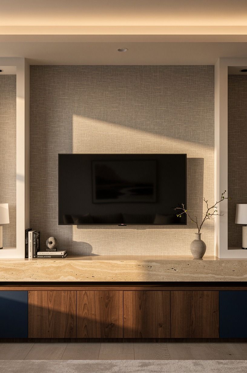
The neatest media walls don't pretend sound equipment doesn't exist.
5Float cabinetry under the full wall span
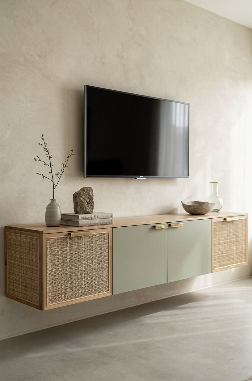
Run the base farther than you think. A long floating cabinet beneath the media wall makes the whole setup feel custom, while a short unit under a wide TV makes your room feel pinched. The lower line should anchor the wall, not merely hold a remote, and you’ll feel that balance each time you sit down.
One slim unlacquered brass pull can add warmth without taking over. A budget IKEA BESTA run can work beautifully when you float it properly and keep the toe shadow clean. If storage is your main issue, start with these small kitchen cabinet ideas for the same discipline.
I've tried crowded bases, and they make a refined wall feel fussy.
Aim for at least 12 inches beyond each side of the screen when your wall allows it. Add 3/4-inch solid white oak trim for a refined, organic edge. I made the mistake of stopping a cabinet at screen width once.
I won’t do that again, and you won't either once you see how much wider the room feels.
6Wrap shelves around one asymmetrical recess
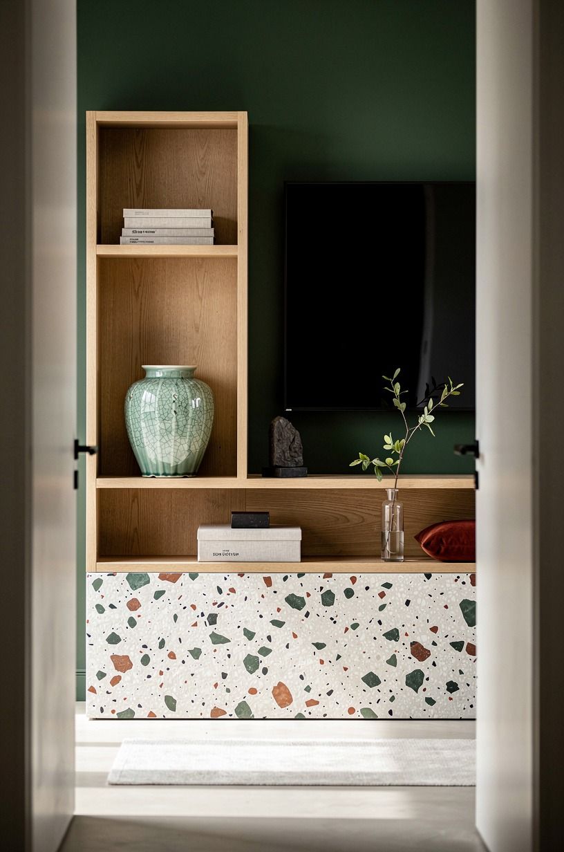
Perfect symmetry isn't the only way to make a drywall media wall feel expensive. An offset recess with oak shelves on one side gives your eye movement while the screen stays calm. Your room will feel more charming when one side carries the personality and the other side rests, and you'll have more freedom to vary the styling.
Keep the styling edited: a few books, one vessel, and one framed print. This breakfast nook wall decor collection is a helpful reminder that a blank wall needs a point of view, not a pile of objects. I’ve learned that one empty shelf often looks more intentional than three full ones.
Try white oak veneer with a wire-brushed finish so the shelves catch light without turning orange. Leave about 10 inches beside the screen where possible. I’d keep one shelf empty because negative space makes the display feel sophisticated, and you won't spend every weekend dusting tiny objects.
7Step the plasterboard forward in shallow layers
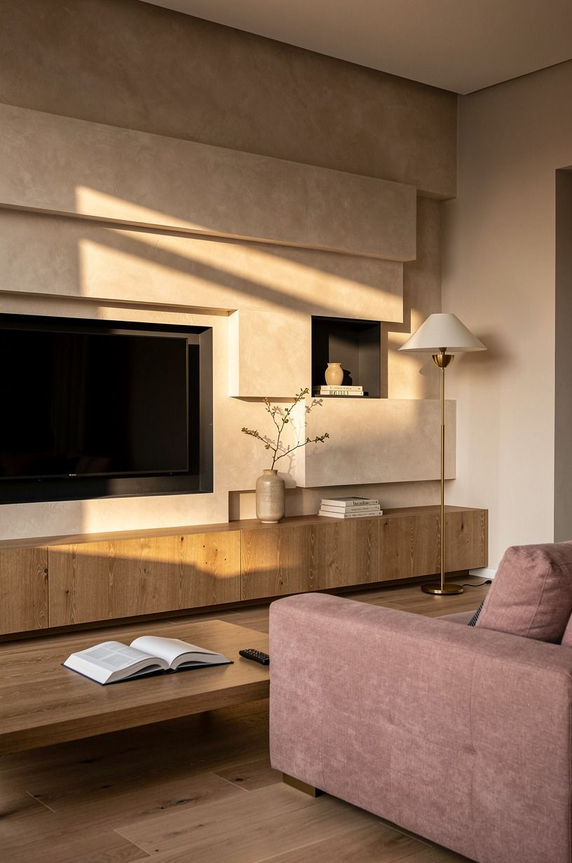
A TV wall gets depth from small moves, not giant projections.
8Balance tall storage with open display bays
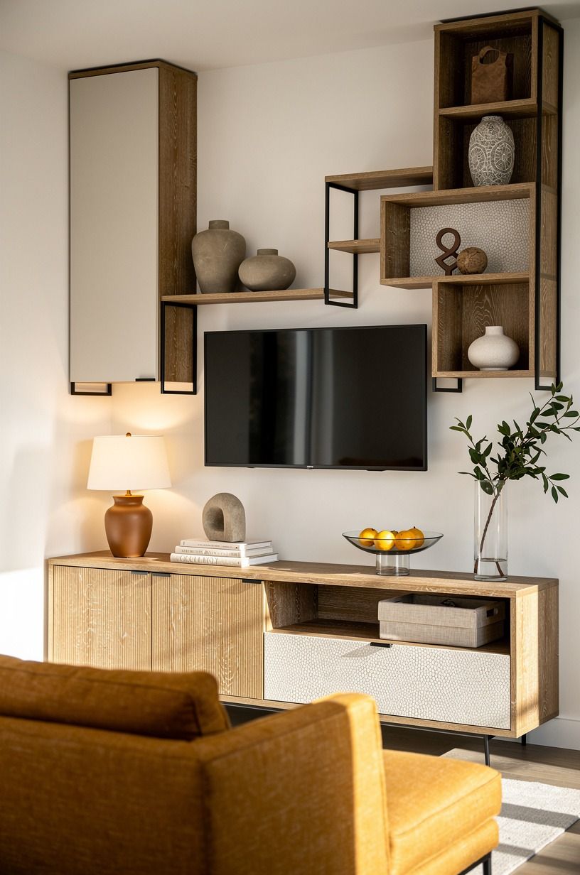
If one side needs real storage, own it and balance it. A tall closed column paired with lower open bays gives your eye one vertical anchor and one lighter place to rest. You’ll get a more welcoming room than you would from making every compartment open, and your daily clutter won't become part of the composition.
Use the closed section for routers, games, and cables. Keep the open bays to one ceramic vessel or linen-bound books. This hidden storage guide for small spaces follows the same useful rule: clutter should have a home before styling begins.
I've found that closed doors make your calm pieces look more special.
A tall IKEA KALLAX birch-effect section can work with a proper side panel and solid plinth, but don’t expose every grid. CB2 is a better scale reference for generous bays. I’d choose one warm, organic object over six tiny accents, and you won't have to fight the wall every time you dust.
9Size the TV to the sofa distance
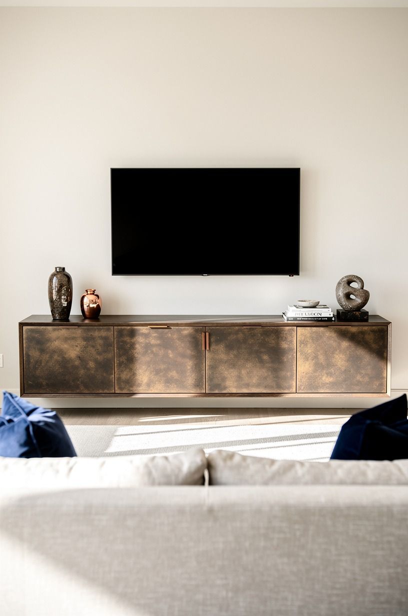
Bigger isn't automatically better. The safest viewing rule is about 1.5 to 2.5 times the screen diagonal, depending on the display and your comfort.
If your sofa sits too close, a large TV takes over the room and the media wall stops feeling relaxing. You’ll enjoy the room more when the image sits comfortably inside your view.
A coffee table at about two-thirds of the sofa length and a rug at 8x10 or 9x12 help the pieces feel connected. If you watch from a deep sofa, this TV watching comfort guide is a useful reminder that your body matters as much as the screen. I’ve measured this badly before, and I wouldn't repeat it.
If you’re replacing the sofa, use an Article Sven silhouette as a compact scale reference. I’d rather see you choose a smaller screen and a better rug than force the biggest screen your wall can hold. Order matters, and you’ll feel the payoff every evening!
If you can't move the sofa, resize the screen instead of trying to make the wall compensate. A room that feels comfortable from the first minute will always beat a dramatic installation that makes your eyes work. You’ll have more room for conversation, too, and that matters when the TV is off.
10Paint the recess darker than the wall
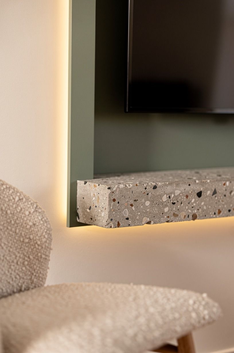
Contrast makes the screen disappear. A darker recess pulls the black frame inward, while a lighter surrounding wall keeps the room bright. Your walls can do this work without expensive construction, which makes the result feel smart, calming, and quietly luxurious.
I like Sherwin-Williams Evergreen Fog SW 9130 inside the recess against a warm cream field. For a deeper room, Farrow & Ball Hague Blue No.30 adds an intimate, moody note.
Compare the way named colour changes a room in these bedroom paint colours. I’m drawn to the green when you want your screen to feel less dominant.
Sample the paint on two walls and watch it from morning through lamplight. Benjamin Moore Black Forest Green HC-187 can feel dramatic, but it may swallow detail in a dim room. I’d choose Evergreen Fog for a family room and Hague Blue for a quieter evening space, because you won't have to fight either colour with your furniture.
11Run vertical fluting beside the screen
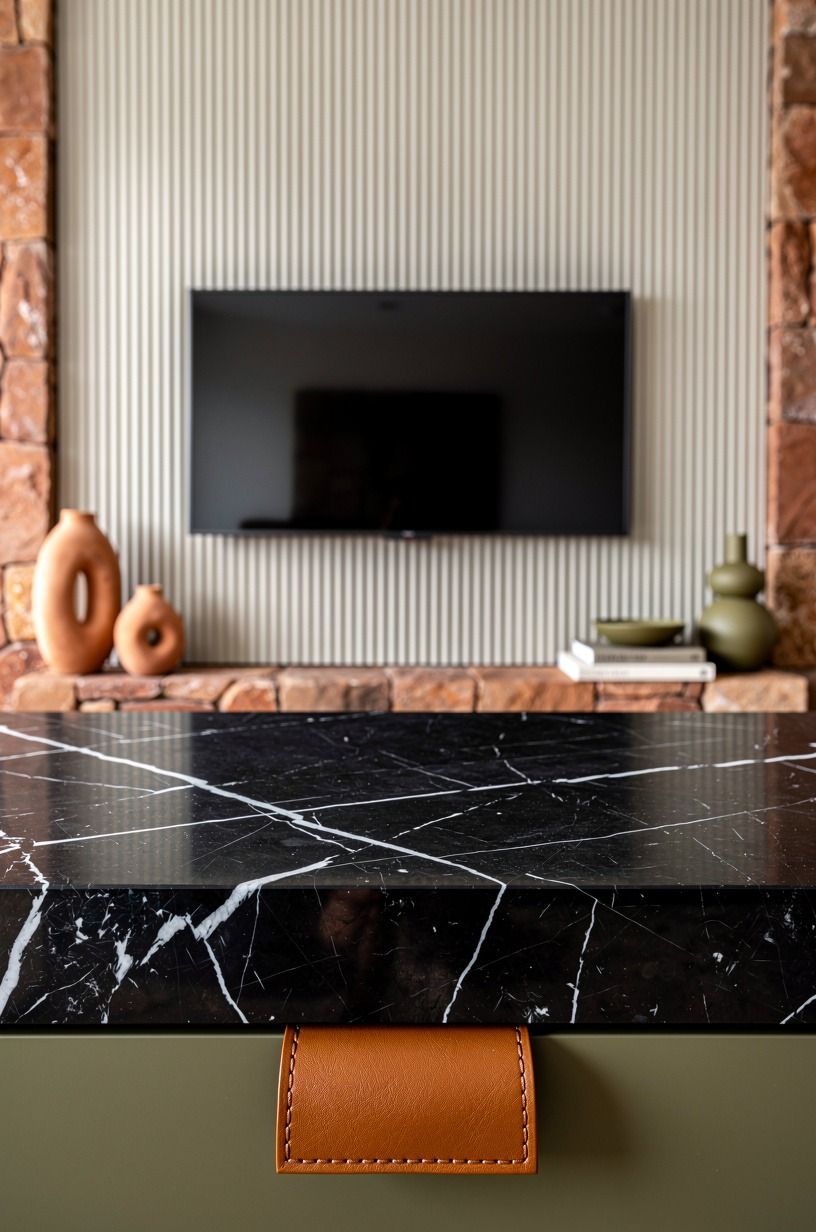
Vertical fluting gives the media wall movement without putting texture behind the picture. Place it beside the screen so the grooves frame the composition. You’ll get a taller, more refined wall while the image remains easy to watch, and your room won't feel cluttered.
Ground the vertical lines with a Nero Marquina marble plinth or another dark horizontal base. The material logic is similar to these rugged stone kitchen ideas: one strong tactile element needs a calm neighbour. I’ve seen fluting look nervous when there isn't a solid horizontal line beneath it.
Use 3/4-inch oak fluted panels for visible grain, or painted MDF for a budget route. Farrow & Ball Railings can make pale plaster feel softer by comparison. I’d skip a second pattern because your room will feel more serene with one clear texture, and you’ll appreciate that restraint after the novelty fades.
12Leave breathing space above every component
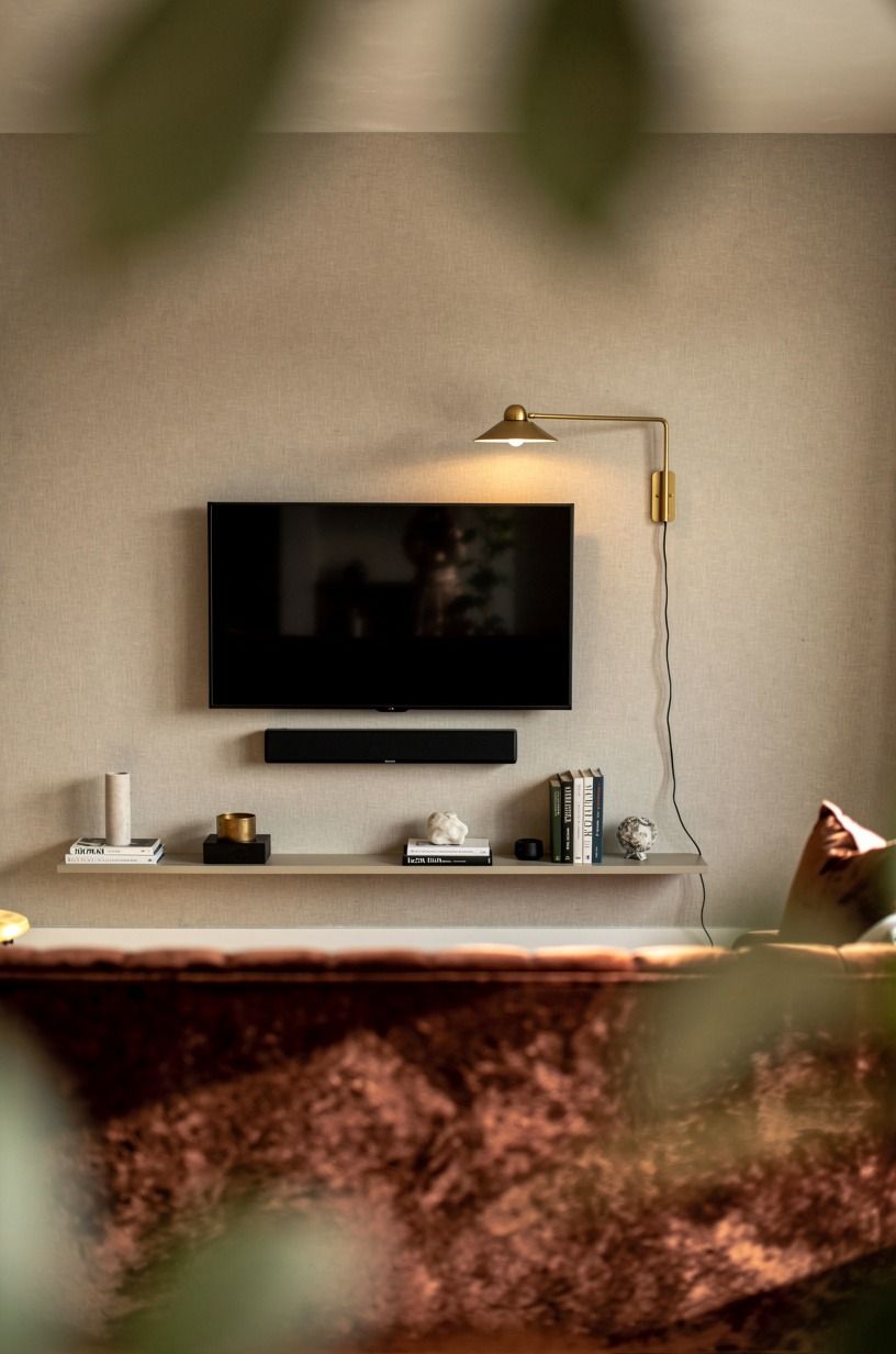
The best media wall layout usually comes down to what you don't fill. Leave air above the TV, soundbar, shelves, and sconces.
That negative space keeps an off-center arrangement from feeling accidental, and your room will look more airy and sophisticated. You’ll notice the calm before you know which gap created it.
As a practical guide, leave about 6 to 10 inches above the soundbar when equipment clearances allow it. The spacing principles in this bedroom furniture spacing guide translate well here because circulation matters in every room. I’ve learned that an extra inch of breathing room can save your eye from visual fatigue.
A single West Elm style picture light can occupy the side zone, but keep it separate from the screen. I’d rather see one beautiful gap than three clever accessories fighting for attention, and you won't miss the extra object once the whole wall feels lighter.
13Where should the soundbar sit?
Your soundbar should sit close enough to the screen to feel connected, but it shouldn’t crowd the fireplace or cabinet line.
14Fireplace vs Feature Wall: Pick One Leader
A fireplace and a feature wall can share a composition, but one needs to lead. If the fire has expressive stone, keep the TV surround soft. If the wall has bold fluting, let the hearth stay simple.
Your room feels more harmonious when the eye knows where to land, and you'll enjoy the result more than a room with six competing statements.
Choose honed limestone for a quiet hearth or a plain plaster face around a more dramatic firebox. The same decision-making appears in this fire pit versus fireplace comparison, where use and atmosphere have to agree. I’m always happier when the material choice follows how you actually sit in the room.
I’d skip a stone wall, fluted panels, brass trim, and patterned tile in one elevation. It may sound luxurious, but the result won’t feel relaxing. One leader, two supporting materials, and open space is a stronger formula, and your room will stay bright enough for daily life.
15Choose a finish that can age well
The finish you choose should look good in daylight, lamplight, and five years of family use.
16The One-Lead Finish Strategy
The One-Lead Finish Strategy is simple: let one surface carry the visual weight, then repeat its temperature elsewhere. A deep green recess can echo in a vase. Oak cabinetry can echo in a frame.
Your room will feel connected without looking overly matched, and you'll have more freedom to change the smaller pieces.
A two-tone cabinet colour approach shows how a second colour can add depth when the proportions are clear. Use the same restraint on a media wall. You’ll want variation, but not five unrelated finishes, because your eye needs a quiet place to land.
My favourite combination is a soft cream field, a moody green recess, and cerused white oak below. I’d avoid choosing the wall colour last.
It controls the mood of every material around it, so choose it while you’re still measuring. I've seen a good cabinet look flat simply because the surrounding paint was too cold.
17Can a rental use a media wall plan?
Yes, if you keep every change reversible. Paint, freestanding cabinets, removable sconces, and careful furniture placement can create most of the effect without deep framing. Your rental can feel warm and sophisticated even when the walls are off limits, and you’ll keep your deposit safer.
Use a long Article Sven style console or modular IKEA BESTA pieces, then let art and lighting create the vertical rhythm. These neutral bedroom decor ideas show how texture can carry a room when construction is limited. I’d borrow the palette, not copy the whole arrangement.
I’d skip drilling for hidden wiring unless your lease allows it. Route cords behind a low cabinet, add a woven basket for equipment, and keep the screen at a comfortable height. You’ll get a calmer layout without risking your deposit, and your room won't feel like a temporary storage zone.
18Edit the wall before adding another feature
Before you add another shelf, light, panel, or object, remove one thing.
Why the Best Media Walls Feel Quiet in Person
Media walls go wrong when every surface has to prove something. A little millwork, a little fluting, a dramatic paint colour, heavy stone, oversized hardware, and hidden lights can all sound good on a sample board.
In a real living room, they compete. I’ve overbuilt a wall before, and it never felt as good at 9 p.m. as it did in the showroom.
What works is restraint with one strong decision. Maybe it’s the slim return.
Maybe it’s the darker recess. Maybe it’s the full-span cabinet that makes the room feel custom for less.
You need one leader and a few supporting notes. If the architecture is calm, your sofa, rug, and lamp choices get to matter more.
I’ve learned to leave a plan overnight before ordering the finish. In the morning, the loudest part is usually obvious.
If it’s the marble, the colour, the lighting, or the hardware, remove that element and see whether the room gets better. Sometimes the answer is a plain cabinet and one warm lamp.
That isn’t boring. It’s confident.
The best media wall isn’t the one with the most features. It’s the one that makes you want to sit down, lower the lights, and stay through the credits. You’ll know the proportions are right when the room feels generous around the screen.
That feeling matters more than a photograph full of expensive materials.
The budget question is part of this philosophy. If your first pass is under $1,200, spend it on paint, a longer cabinet, and better cable planning before you buy a high-cost stone.
If you have $8,000, make the sofa, rug, and lighting feel settled before you upgrade the wall. You’ll gain more comfort per dollar, and the architecture will have a real room to support.
The Questions I Get Asked Most
What is the best media wall layout for a small living room?
A slimmer recessed wall with a floating base and edited storage usually works best. A long low cabinet keeps the wall wide without making it bulky, and an IKEA BESTA run can handle equipment neatly. I’d keep the finish warm and the screen modest.
Where can I buy media wall pieces on a budget?
Start with IKEA, Target Threshold, and Wayfair for cabinets, lighting, and shelves. Facebook Marketplace can be useful for solid wood consoles. Cleaner spacing and a can of paint will beat cheap clutter every time, and you’ll get a more inviting room by editing first.
How much does a media wall makeover cost?
A cosmetic makeover usually lands around $300 to $1,200, while a more furnished living room update can reach $2,500 to $8,000. Custom millwork and fireplaces push projects toward $12,000+. I’d price the cabinet, electrical work, and clearances before choosing decorative finishes.
Can I create a media wall on a budget?
Yes. Better layout is free, and darker recess paint, a longer floating cabinet, and fewer display objects can change the wall quickly. You’ll see the biggest improvement when the TV distance and cabinet width are right, so measure before buying another panel.
Is a media wall worth it in a small space?
Yes, if the proportions stay light. One clear focal wall simplifies the room, while shallow storage keeps circulation open. Keep the TV scaled to your sofa distance and let the cabinet run wider rather than taller.
I’d choose warm light over extra shelving, and you’ll notice how much more serene the room feels.
Is a media wall a good idea for a rental?
Yes, when the changes stay reversible. Paint, removable sconces, and freestanding cabinetry create much of the effect without deep construction. Route cords behind a low unit, avoid unsafe drilling, and let texture bring the warmth until you own the walls.
You’ll still get a polished, comfortable room.
What should I avoid when designing a media wall?
Avoid an oversized screen, a cabinet that stops at the TV width, glossy fluting, and too many competing finishes. Breathing room is the least expensive upgrade you can make. I’d also avoid hiding ventilation or forcing a fireplace into an unsafe position, because your room should feel safe before it feels dramatic.
Where I'd Start First
If I had to pick one, I'd start with sizing the TV to the sofa distance. An oversized screen makes every other choice fight uphill. Measure first, save this guide, and let the cabinet and recess follow the way you live.
{ "title": "12 Media Wall Design Rules for Better Layout, Proportions, and What to Avoid",


