10+ Mens Bedroom Colors That Actually Make the Room Feel Intentional
23 may 2026Think your bedroom is too bare to feel intentional? Mens bedroom colors are the fastest way to fix that. The right wall color does more work than any furniture piece you'll buy.
These ten rooms prove it. Each one commits to a palette and doesn't apologize for it.
Stone Grey Walls That Actually Feel Warm
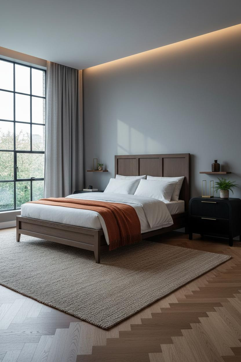
Grey walls get a bad reputation for feeling cold, but this one doesn't.
Why it works: The herringbone parquet in warm oak pulls enough amber into the room to keep the stone grey from reading flat or clinical.
Steal this move: Pair cool walls with warm flooring and a jute rug. The contrast is what gives the room its depth.
Exposed Brick Is Divisive. This Version Wins.
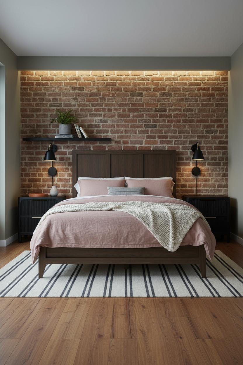
Bold choice. But when the material is this good, it earns the room.
Raw burnt sienna brick against muted khaki walls keeps the palette from tipping into full industrial. The mortar lines do the texture work, so you don't need much else.
The practical move: Keep bedding soft and light here. Dusty pink linen or cream works. Anything too dark and the brick takes over.
The Sage Green Room I Keep Coming Back To
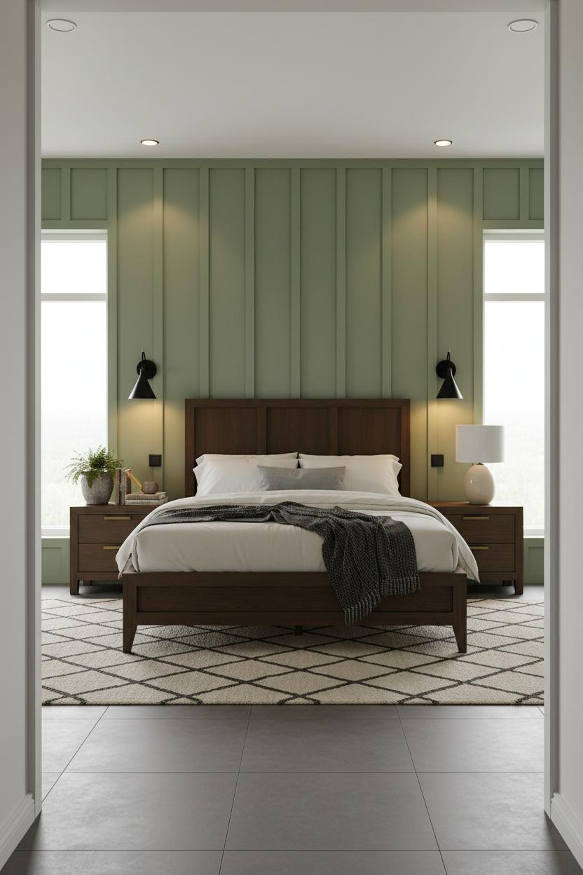

I keep coming back to this one. Sage reads masculine here in a way that surprises me every time.
Why it holds together: Floor-to-ceiling board-and-batten paneling in sage green adds vertical rhythm that plain walls can't replicate. The grey tile floor keeps it grounded.
Worth copying: Run the paneling all the way to the ceiling. Stopping it halfway is the detail that cheapens this look.
Burgundy Walls Take Commitment. It Pays Off.
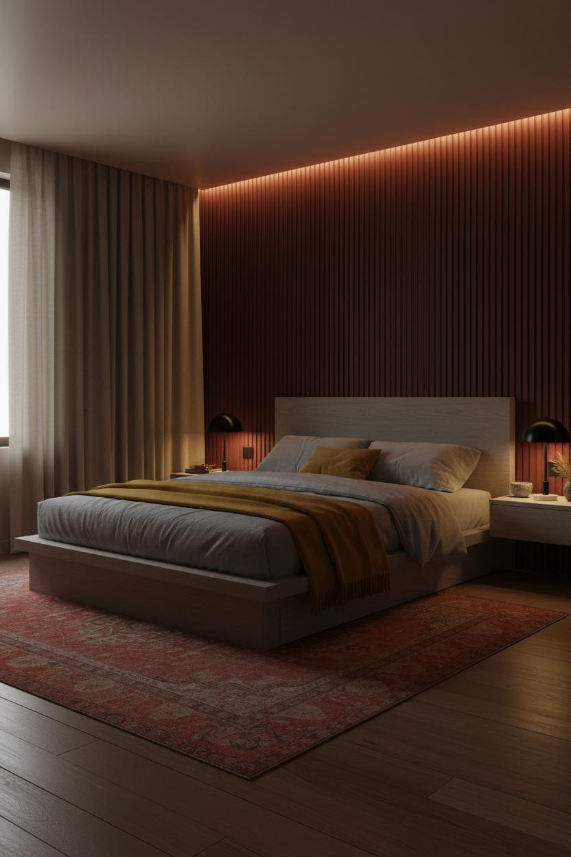

This is one of the more opinionated rooms in this list. And honestly, that's the point.
What gives it presence: Vertical fluted paneling in deep burgundy catches warm lamp light in a way smooth walls simply don't. Each groove adds shadow, which makes the color feel richer than it is on a paint chip.
Don't ruin it with: Cool lighting. The whole mood here depends on amber warmth at 2700K. Cool overhead light flattens burgundy completely.
How Ochre Shiplap Changes a Neutral Room
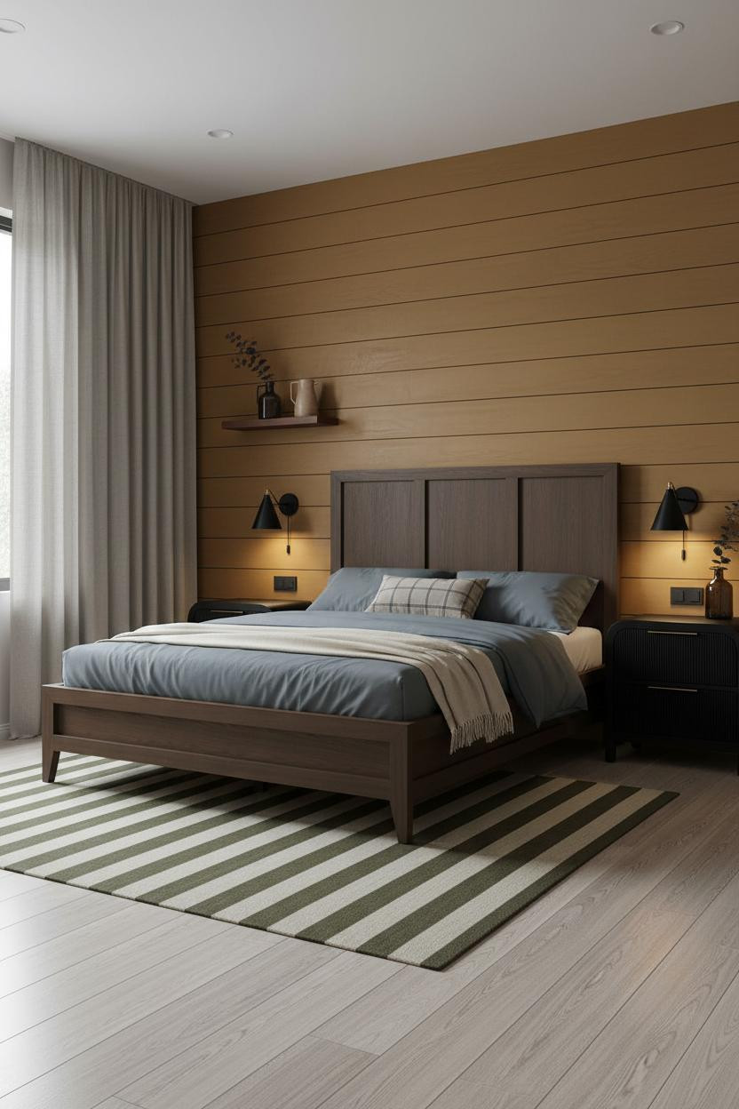
Nothing fancy. That's exactly what makes this work.
The warm ochre shiplap does what a gallery wall tries to do but rarely achieves: it gives the room a focal point without demanding attention. Soft camel on the remaining walls keeps things cohesive, while slate grey bedding prevents the palette from reading too warm.
Forest Green Is the New Navy
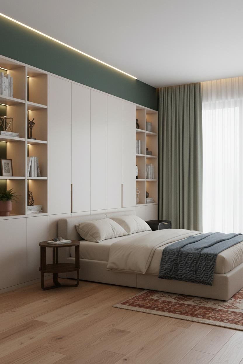

I'd honestly pick forest green over navy in a small room almost every time. It reads richer without the heaviness.
What carries the look: Warm maple flooring stops deep green from feeling cold, and the full-height built-in cabinetry in warm white keeps the room feeling structured rather than moody.
The easy win: Hang sage curtains wide past the window frame. The color echo between curtains and walls is subtle, in a way that feels completely intentional.
Navy and Walnut Is a Formula Worth Trusting
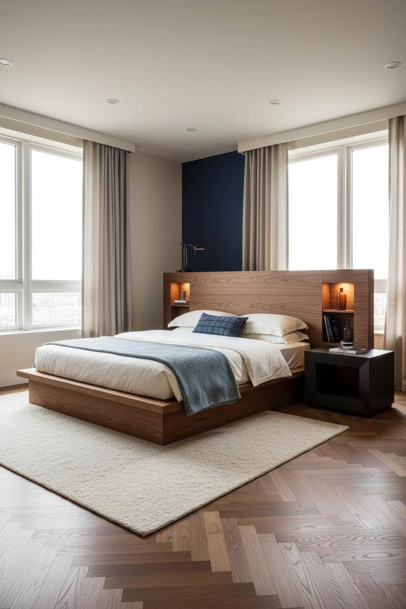

This combination has been popular for a while. But this version earns it.
Why it feels expensive: A floating walnut platform headwall with integrated open shelving gives the navy accent wall something to work against. The wood grain running horizontally echoes the herringbone parquet below, which ties the whole room together without anything matching exactly.
Keep the shelving sparse. The smarter choice here is fewer objects with more breathing room between them.
Grey and Terracotta Is Harder Than It Looks
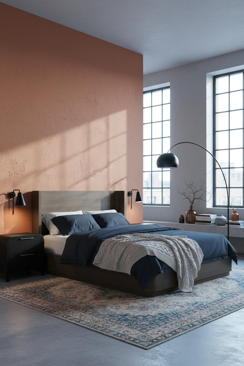
Fair warning: this palette punishes careless styling. But get the proportions right and the room feels genuinely collected.
What makes this one different: The rough aggregate terracotta plaster reads as texture first and color second. That's why it doesn't fight with the stone grey. One is a surface, the other is a wall.
Where people go wrong: Too many warm accents. Let the terracotta wall do the work and keep everything else cool or neutral.
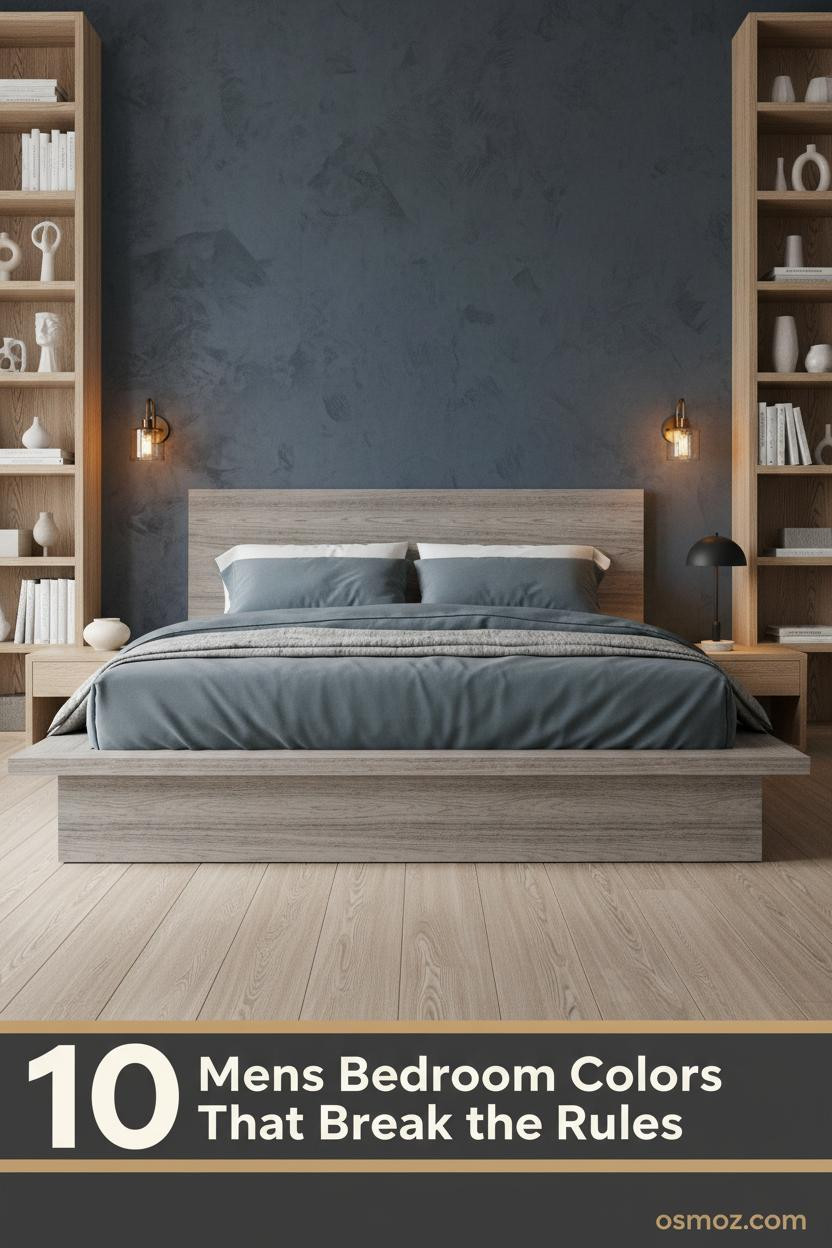
Slate Blue and Oak: Calm Without Being Quiet
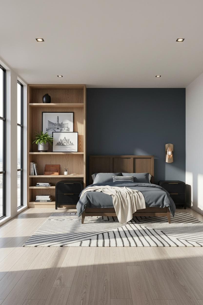
The room feels calm and cohesive without ever feeling bare. That's not easy to pull off.
The real strength: Floor-to-ceiling natural oak shelving on the left wall balances the deep slate blue accent wall opposite, while the bleached oak flooring keeps both from pulling the room in opposite directions. It's a small move in terms of color, but the proportions are everything.
Pro move: Leave some shelf compartments empty. The negative space is what makes the styled ones read as intentional rather than cluttered.
Charcoal Shiplap for the Committed Minimalist
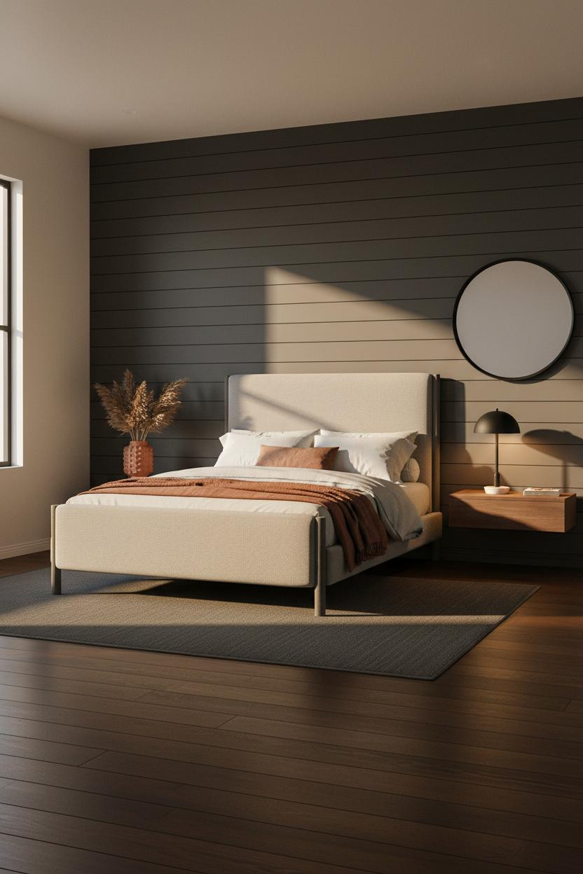
This one is for people who mean it.
But the warm charcoal shiplap earns every bit of that commitment. Each horizontal board edge catches late-afternoon light and casts a fine shadow line, which gives the wall architectural weight that paint alone never gets to. The dark walnut flooring echoes the warmth in the grey, while soft white on the remaining walls stops the room from feeling compressed.
What to copy first: The rust linen throw draped asymmetrically across oatmeal cotton bedding. Nothing matches exactly. That's the whole trick.
 Our #1 Pick
Saatva Classic Mattress
America's best-selling online luxury innerspring. 365-night trial, lifetime warranty, free white glove delivery.
Shop Saatva Classic
Our #1 Pick
Saatva Classic Mattress
America's best-selling online luxury innerspring. 365-night trial, lifetime warranty, free white glove delivery.
Shop Saatva Classic
The Foundation Of Every Beautiful Bedroom
Walls get repainted. Rugs get swapped. The mattress stays. And if you're going to commit to a room that looks this considered, what you sleep on should hold up to the same standard.
The Saatva Classic is built around dual-coil support that holds its shape over years, not just seasons. The breathable cotton cover doesn't trap heat, and the Euro pillow top has enough give to feel genuinely comfortable without losing structure underneath. I've slept on a lot of mattresses that looked the part. This one actually does it.

Start with the bed. The rest figures itself out.


