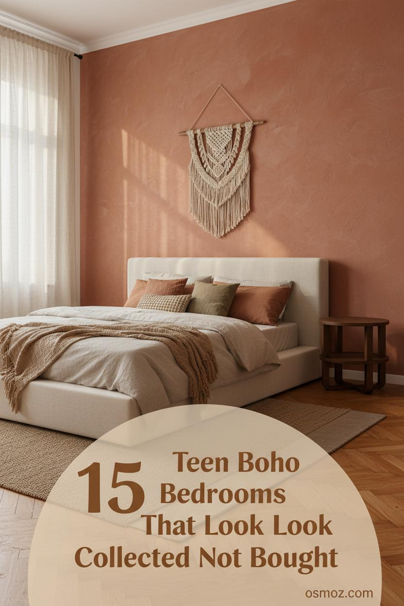
15+ Teen Boho Bedroom Ideas That Feel Collected, Not Decorated
13 may 2026Think your room can't feel collected and personal at the same time? The best teen boho bedroom ideas prove otherwise. They look like years of finding, not hours of shopping.
This roundup covers 15+ real setups, each with a different wall treatment, textile story, and layout. Find the one that actually fits your space.
The Herringbone Wall That Makes Everything Feel Handmade
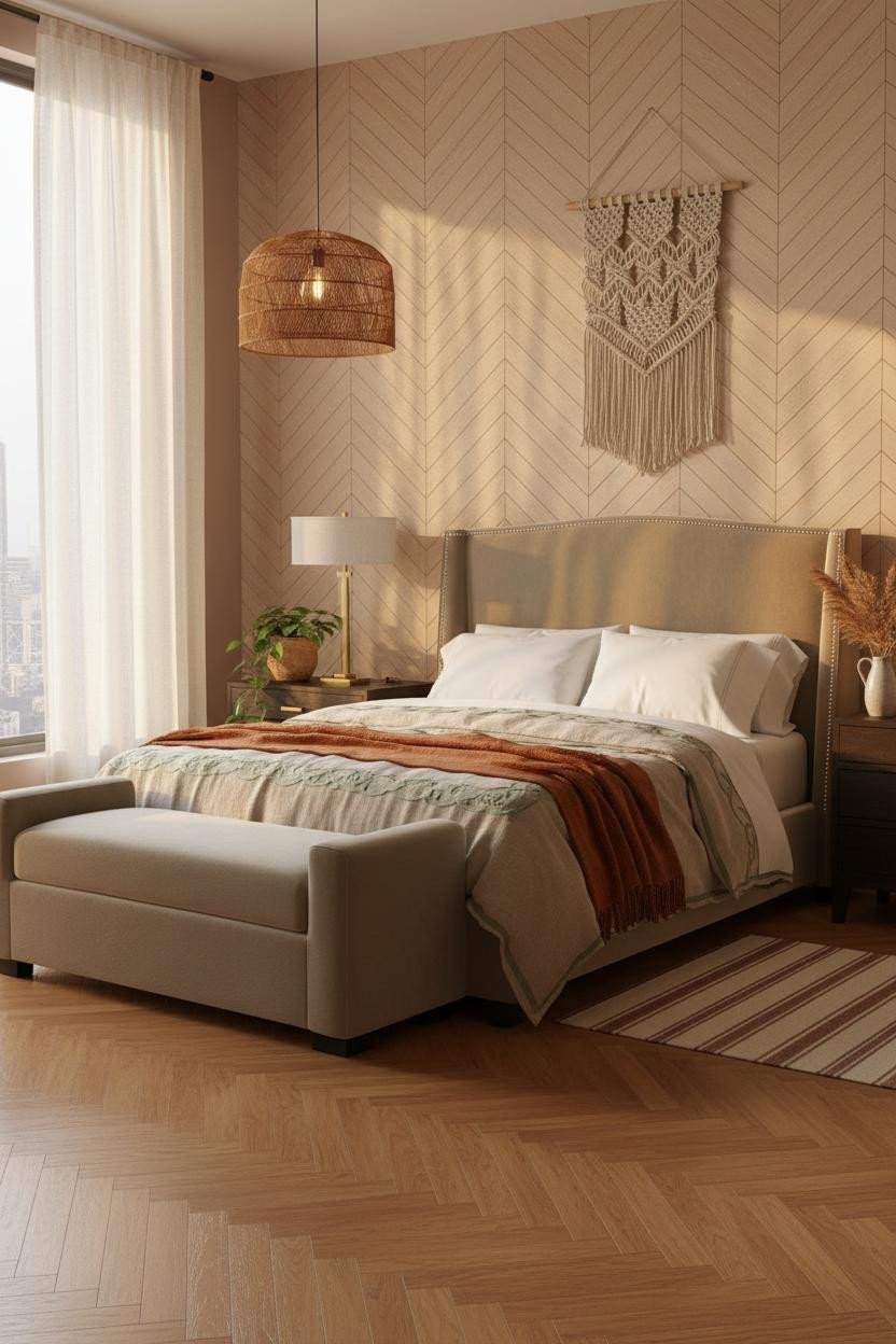
I keep coming back to this one. There's something about morning light on pale ash herringbone planks that no painted wall can replicate.
Why it feels handmade: The chevron grain catches raking light and throws soft shadow ladders across the surface, which makes the whole wall feel tactile without adding a single object to it.
Steal this move: Layer a woven macramé piece in front of it rather than competing with it. The oatmeal cotton bedding keeps the warmth from tipping too heavy.
Celadon Slats With a Free-Spirited Energy
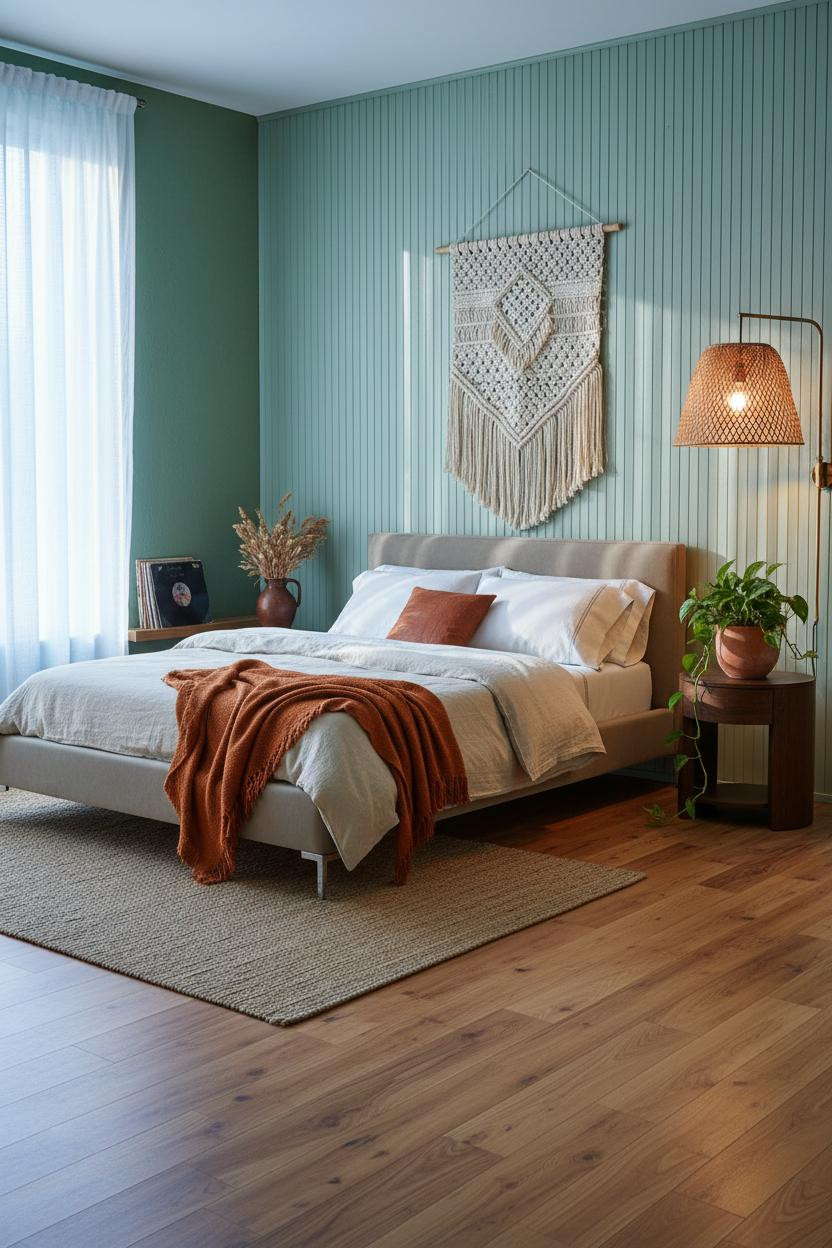

This one surprised me. Pale celadon reads almost neutral in flat photos, but in person the color has a life to it.
Vertical slatted bamboo panels painted in that soft green cast fine parallel shadow lines across the wall, which gives the surface an organic rhythm that flat paint can't match. The forest green flanking walls keep it grounded.
What to borrow: Lean a stack of vinyl records against the baseboard. It costs nothing and does more for a boho room than any accessory you'd actually buy.
Whitewashed Shiplap for the Farmhouse Girl
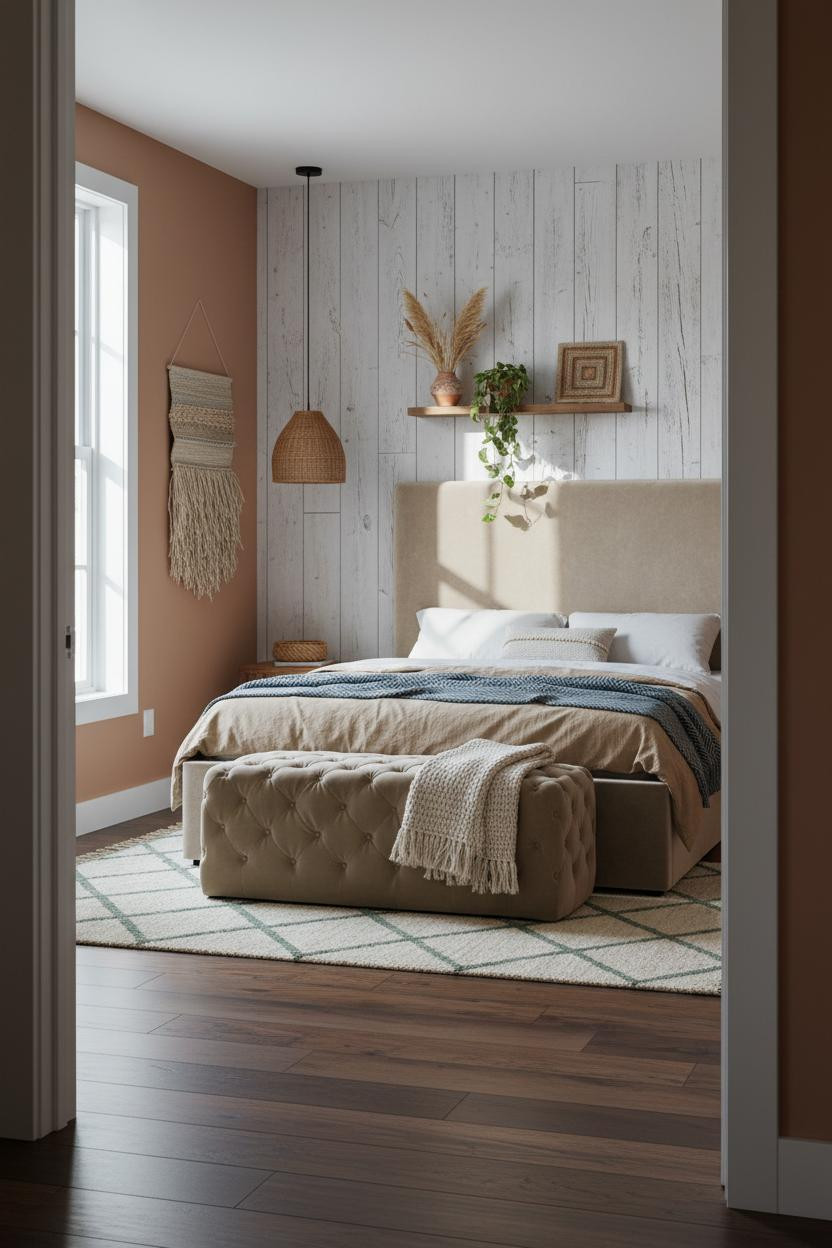

Nothing fancy. That's the whole point.
Floor-to-ceiling whitewashed shiplap with visible knots and weathered ridges makes the room feel like it was built over time, not assembled in a weekend. The dark walnut flooring underneath gives it enough contrast to stay interesting.
Pro move: Drape a slate blue herringbone throw at the foot and add a jute wall hanging with long fringe. The rough-smooth tension is what makes this look work at all.
The Blush Zellige Alcove Nobody Expects
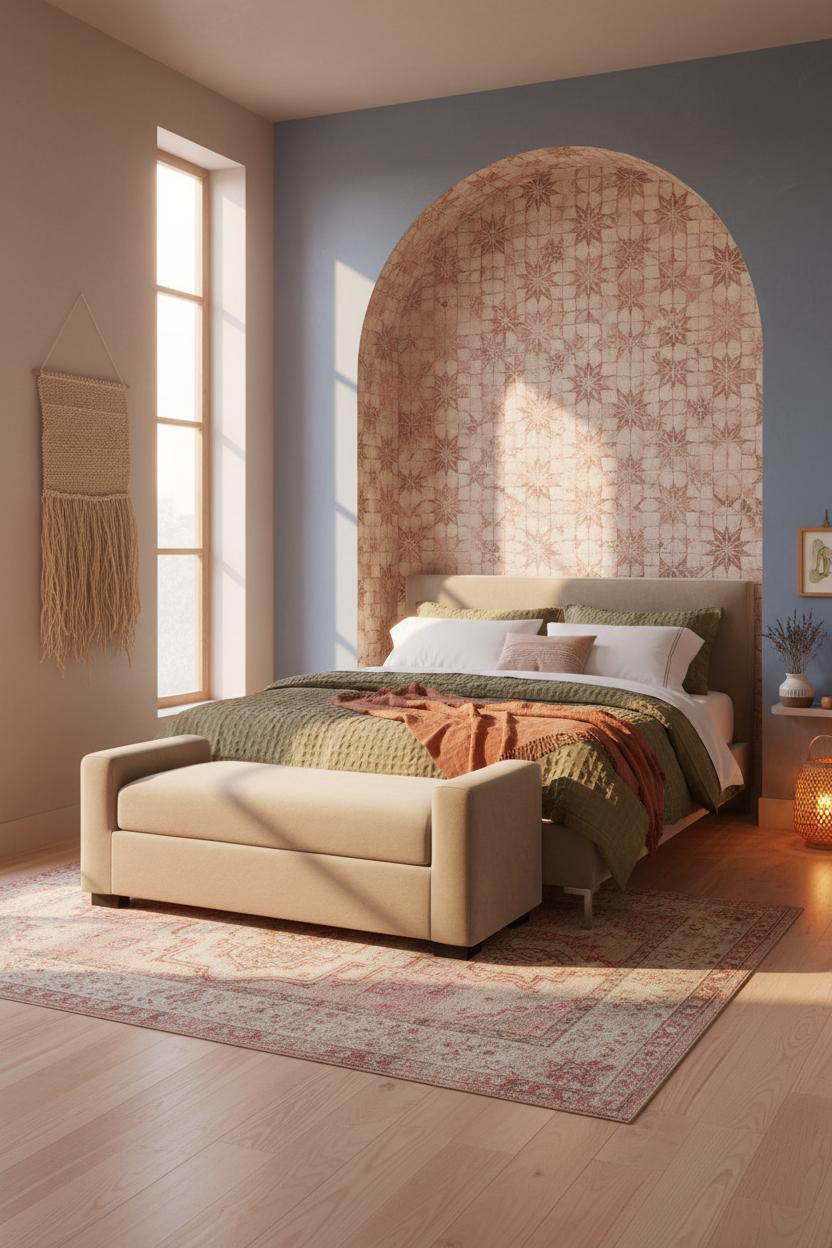
This is the kind of room that makes you stop mid-scroll.
What creates the mood: Hand-set blush and cream zellige tiles in a star pattern fill a recessed arch at headboard height, and the rough grout lines catch soft noon light in a way that makes every tile look slightly different. Each one is.
The detail to keep: Let the faded denim blue plaster walls flank it quietly. Too much pattern on the sides and the alcove loses all its drama.
Raw Plaster That Actually Does Something
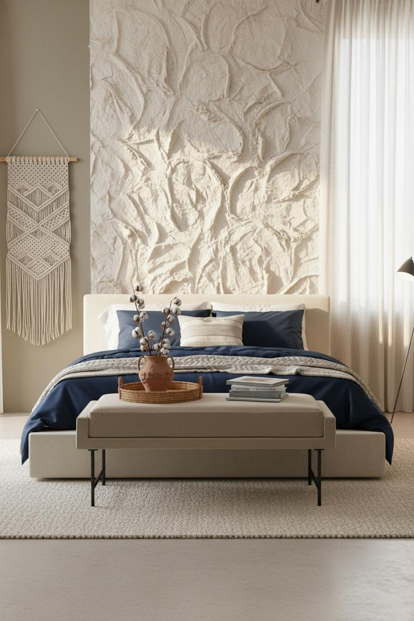
Hand-applied sand-white plaster with deep trowel grooves looks like an artisan canvas. And honestly, it functions like one too.
Why it holds together: The chunky cream wool rug on pale concrete flooring matches the plaster's texture family, which keeps the room feeling cohesive without being matchy.
Put a geometric macramé hanging on the side wall, not the plaster wall. Leave the plaster alone. It's already the statement.
Lime Plaster With Slow Living Energy
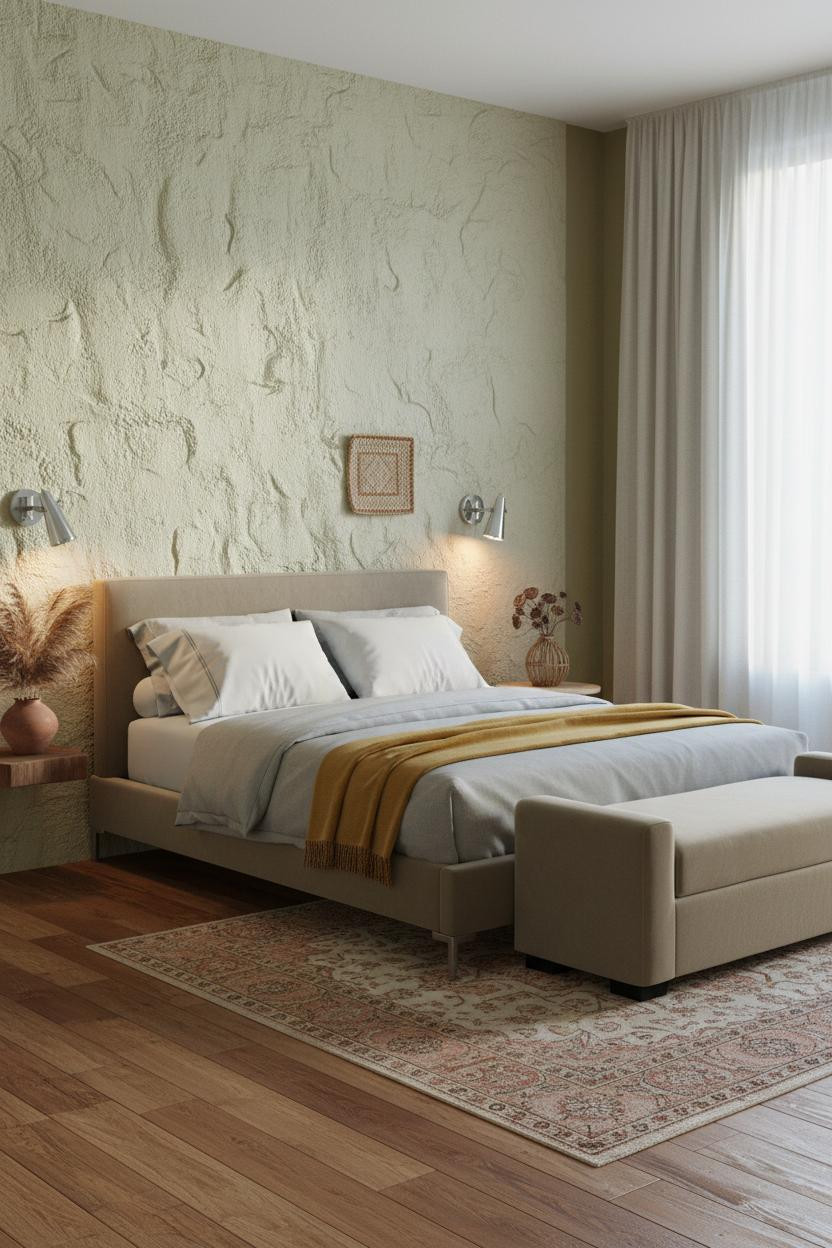
The room feels lived-in and intimate in a way that staged rooms never do.
What carries the look: Rough-troweled lime plaster catches overcast light differently depending on the time of day, which makes the wall feel like it changes without you touching it. Pair it with warm olive walls for depth.
The finishing layer: Dramatic floor-to-ceiling cream linen curtains pooling slightly on reclaimed amber floors. One panel off-center. That small imperfection does a lot of work.
Mustard Walls and Open Shelving That Earns Its Place
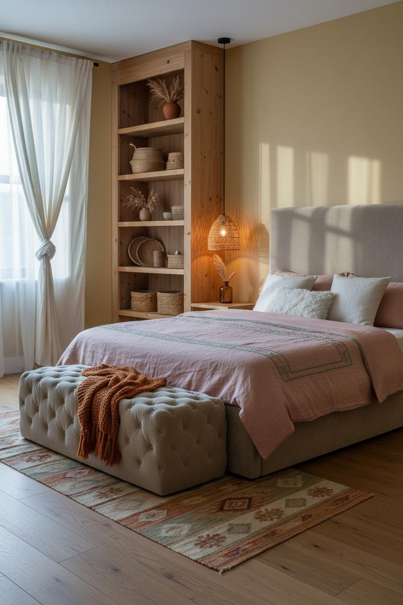
Most open shelving looks chaotic. This one looks intentional because the objects are doing actual editorial work.
Why the palette works: Soft mustard yellow walls against natural pine shelves create enough warmth contrast that the woven baskets and dried botanicals read as a collection, not clutter. The kilim runner below ties the rust tones together.
Avoid this mistake: Don't style every shelf equally. Let one feel sparse. It makes the full ones look curated rather than crowded.
Raw Concrete Meets Woven Softness
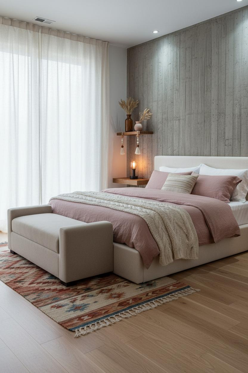
Fair warning. Board-formed raw concrete isn't for everyone, and I say that as someone who genuinely loves it.
The vertical pour lines in the concrete accent wall catch raking afternoon light to reveal deep mineral texture, which makes the contrast with a dusty pink linen duvet feel intentional rather than accidental. Stone grey flanking walls keep things from going too industrial.
The smarter choice: Skip the fringe garland and keep the floating shelf spare. Two objects max. The wall already has enough going on.
Dusty Rose and Wainscoting for a Softer Take
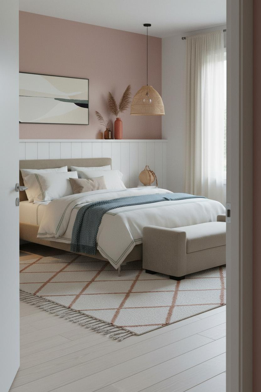
This is the one I'd actually do in a small bedroom. The proportions work even when the room doesn't cooperate.
Why it feels balanced: White tongue-and-groove wainscoting creates a strong horizontal anchor at chair-rail height, so the dusty rose upper walls get to be the color without overwhelming the room. The Moroccan diamond rug below grounds the whole lower half.
Worth copying: Style the wainscoting ledge with a terracotta vase, one amber glass bottle, and nothing else. Restraint here does more than abundance would.
Board-and-Batten With a Moody Indigo Contrast
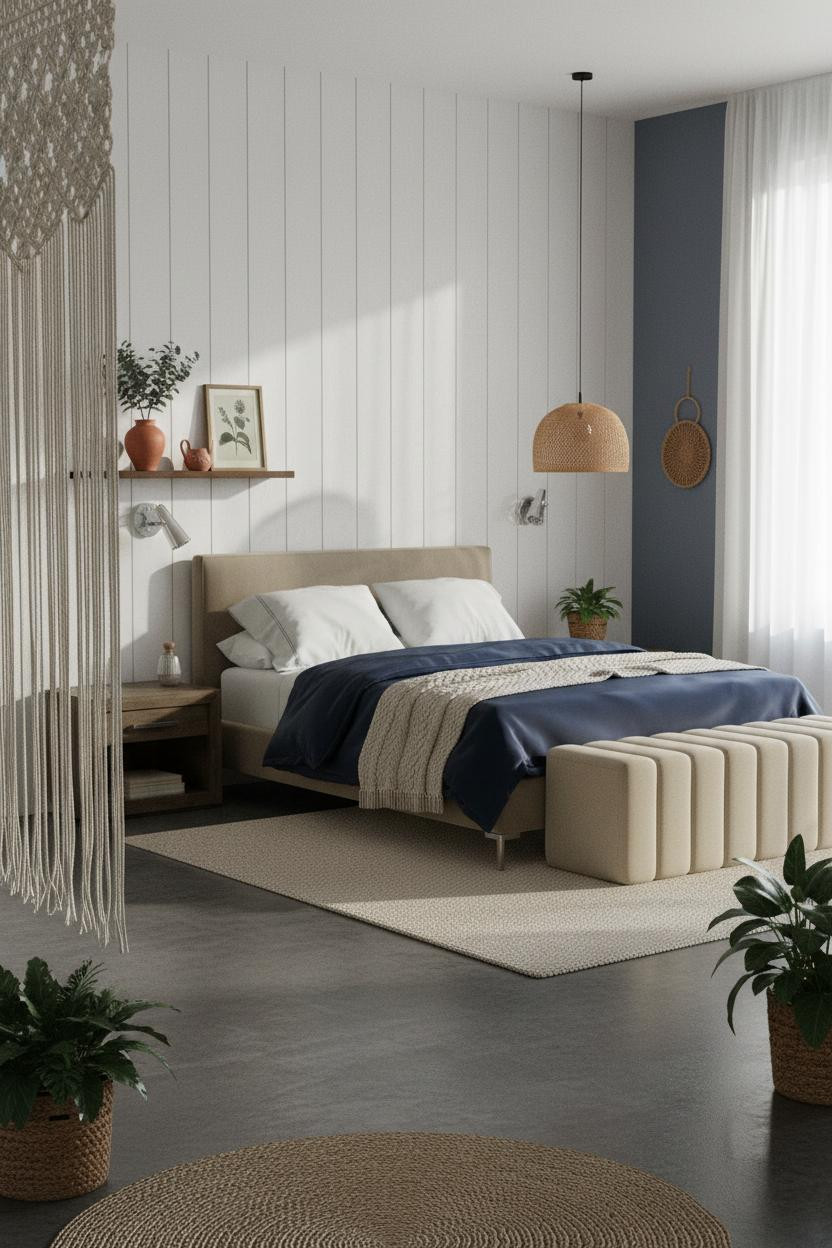
The reason this feels dramatic instead of heavy is the white. Raw white-painted board-and-batten timber planks against muted indigo side walls create a contrast that pulls your eye straight to the bed without any extra effort.
What sharpens the room: Each vertical batten casts a linear shadow that plays against the organic macramé curtain in the corner, which helps balance the structure with just enough softness.
The easy win: Navy sateen bedding with a cream cable-knit throw. The sheen-to-texture contrast does all the heavy lifting.
When a Moroccan Tile Niche Becomes the Whole Room
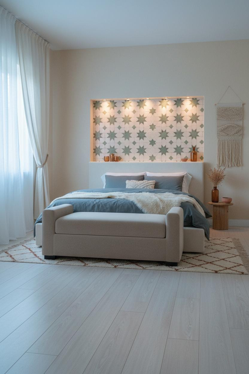
I almost dismissed this as too fussy. But the backlit cream and sage zellige tile niche at headboard height earns every bit of attention it demands.
What gives it presence: The warm amber glow from inside the recessed niche plays off cool north-facing window light, and the slight irregularity of each hand-set tile means no two moments of light look the same.
Don't ruin it with: A busy duvet. Slate jersey with a simple cream faux fur throw is the right call. Let the tile be the pattern.
Full-Wall Jute Panels That Make a Room Feel Bali-Warm
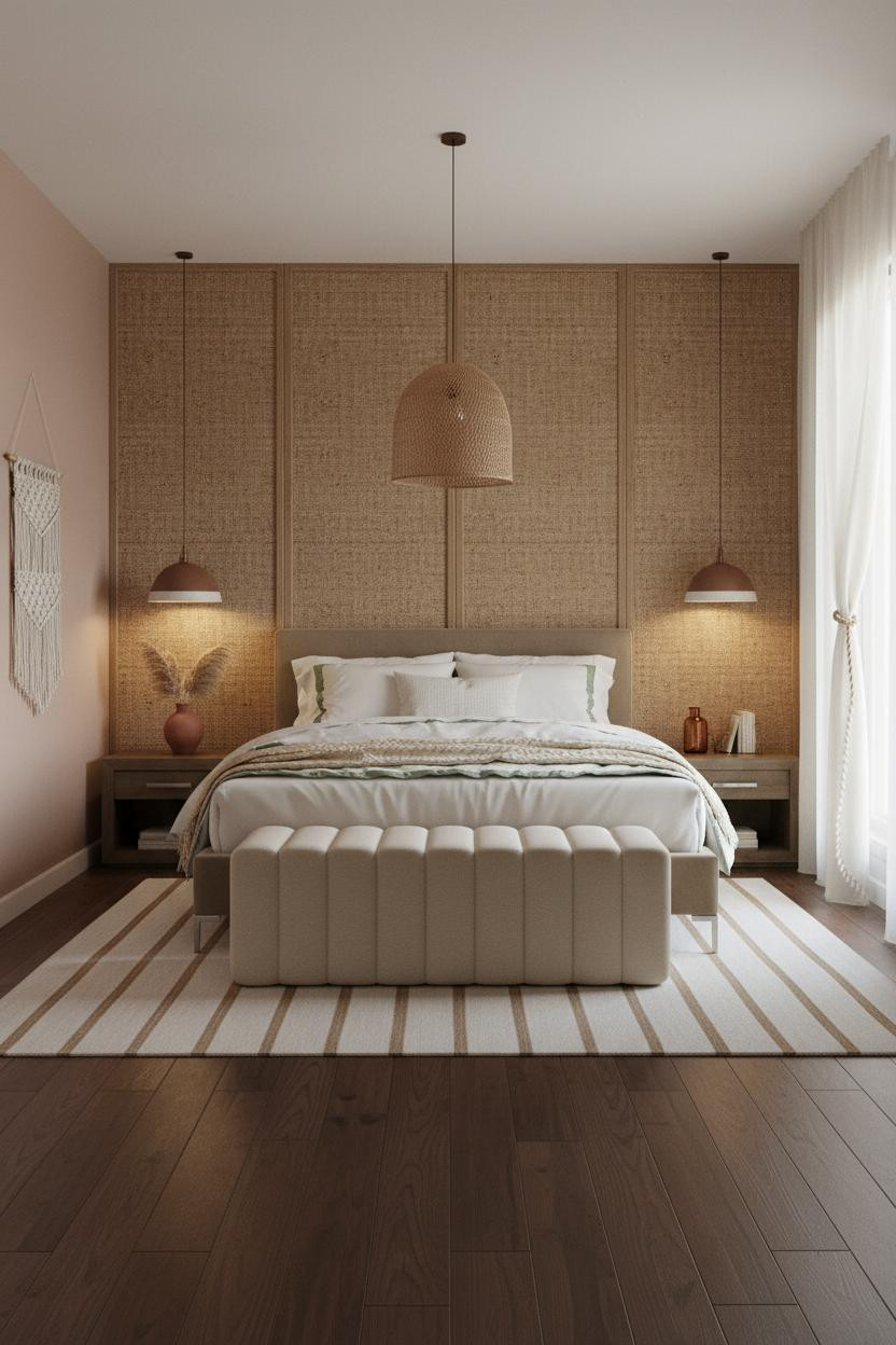
Floor-to-ceiling woven jute wall panels in natural tan look bold in photos and feel quiet in person. That combination is harder to pull off than it sounds.
Why it lands: The organic grid of the jute casts soft dappled shadows across warm dusty blush walls, which keeps the room feeling calm rather than busy, even with this much texture happening on one surface.
One smart swap: Trade any printed duvet for ivory cotton percale with sage embroidered trim. Nothing too precious. Just enough contrast to keep it readable.
The Arched Zellige Alcove With a Soulful Quiet
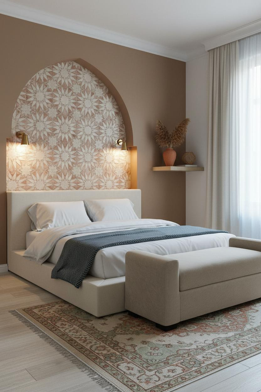
Slow down on this one. It's not trying to be loud.
Hand-set cream and dusty blush Moroccan star-pattern tiles inside a recessed arch catch overcast light differently than a backlit niche does. The effect is quieter. More intimate. Paired sconces flanking the alcove at warm amber keep it from ever feeling cold.
The foundation: Bleached oak wide-plank flooring with a faded Persian rug. That combination under warm mushroom walls is what makes the tiled alcove feel found rather than installed.
Rattan Wall Panels With Sage Walls That Just Work
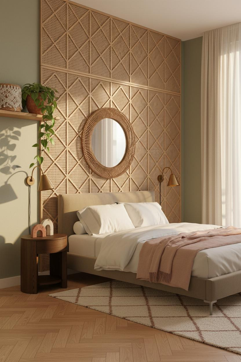
Late afternoon light through sheer cream curtains on woven rattan wall panels creates repeating diamond shadow patterns across the floor. It changes every hour and you never get tired of it.
Why the materials matter: Natural tan rattan against soft sage green walls sits in the same warm-earthy tone family, which is why the room feels calm rather than busy despite the heavy texture. The herringbone parquet below locks the warmth in.
The key piece: An oversized round mirror with a rattan frame. It bounces that afternoon light back into the room while still feeling like it belongs there.
Terracotta and Macramé for the Warmest Room in the House
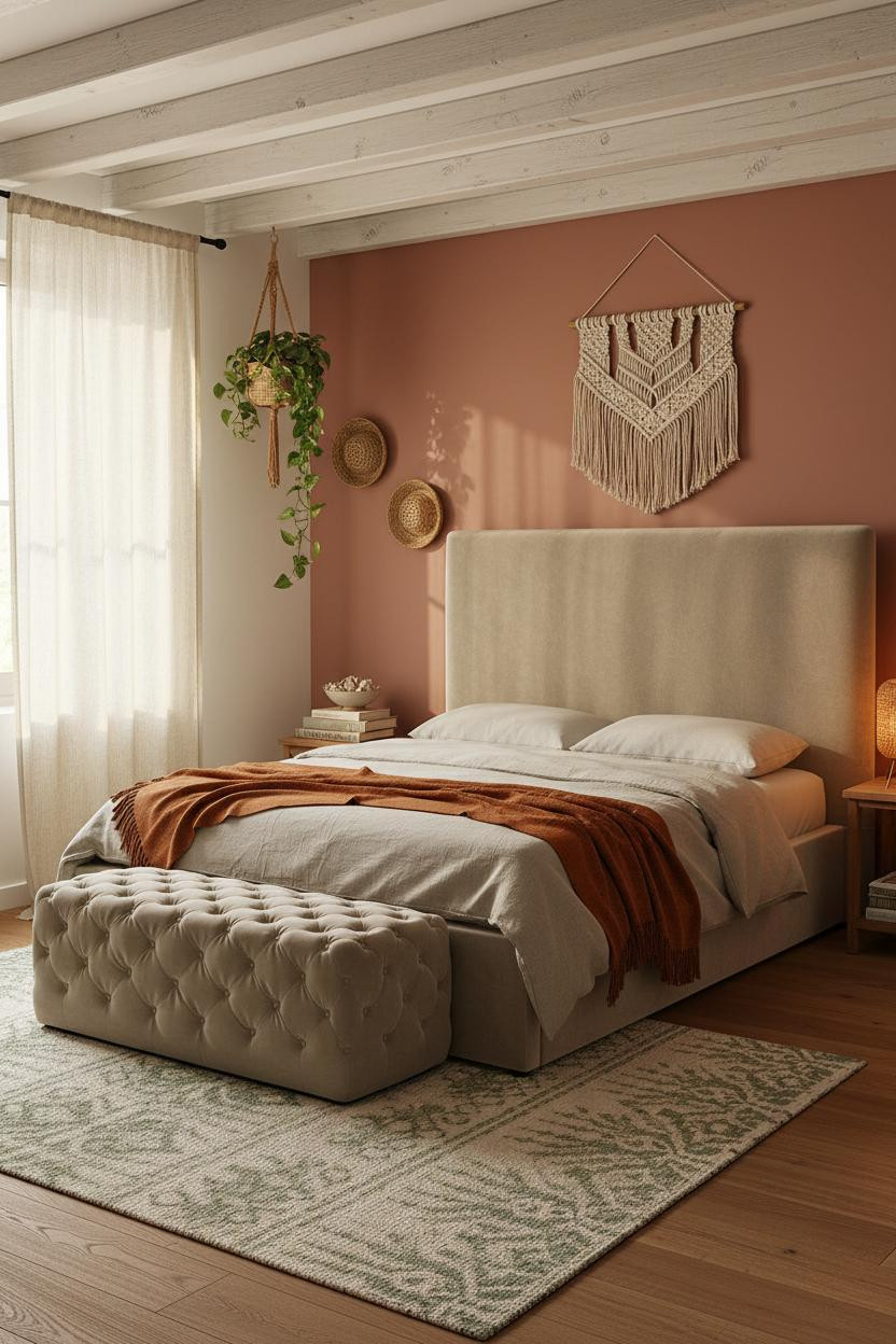
Morning light through cream linen sheers on a dusty terracotta wall turns everything honey-gold. And a large macramé wall hanging above the bed means there's always something interesting to look at without anything shouting for attention.
What softens the room: Whitewashed wooden ceiling beams with rough-sawn texture anchor the space at the top, which keeps all that warm color from feeling like it's closing in. The cream and sage jute rug below ties it to the floor.
The part to get right: A burnt orange mohair throw draped asymmetrically at the foot. Folded neatly, it kills the whole vibe. Let it sit loose.
 Our #1 Pick
Saatva Classic Mattress
America's best-selling online luxury innerspring. 365-night trial, lifetime warranty, free white glove delivery.
Shop Saatva Classic
Our #1 Pick
Saatva Classic Mattress
America's best-selling online luxury innerspring. 365-night trial, lifetime warranty, free white glove delivery.
Shop Saatva Classic
The Foundation Of Every Beautiful Bedroom
Every wall treatment in this list is worth doing. But walls get repainted. Throws get swapped. The mattress stays, and it's the thing you feel every single night.
The Saatva Classic is what I'd put under all of it. Dual-coil support that doesn't transfer movement, a breathable organic cotton cover that doesn't trap heat, and a Euro pillow top that feels like the right kind of soft without losing any structure. It holds up the same way in year four as it did in week one.
Good design ages well because it's made well. Start with the bed.

The rooms people save are the ones where nothing looks accidental. Pick your wall treatment, commit to one textile story, and let the rest build from there.


