15+ Couple Bedroom Ideas That Actually Feel Like Yours
14 april 2026The first thing I notice in the best adult bedroom ideas for couples is that nothing tries too hard. No matching sets. No perfectly staged symmetry. Just two people's taste landing somewhere that actually makes sense together.
These 15 rooms get that right. Some are dramatic. Some are dead simple. All of them feel lived-in.
The Paneled Wall That Makes Everything Else Look Intentional
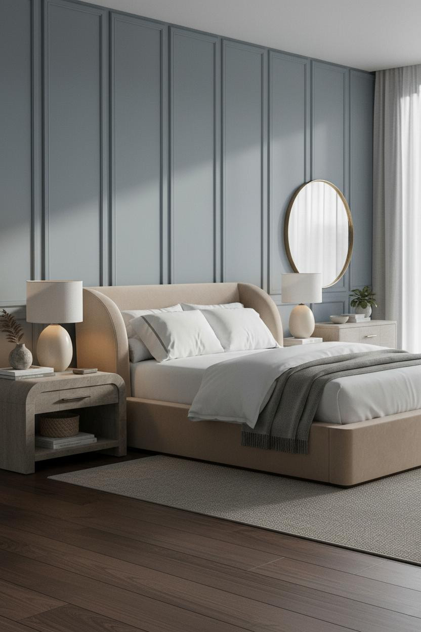

This room earns its calm. Nothing is loud, but nothing feels forgotten either.
Why it holds together: The muted blue-grey paneling runs floor to ceiling, and the deep vertical grooves catch just enough light to give the wall actual texture without a single decorative object.
Steal this move: Pair full-height paneling with warm bedside lighting so the wall reads architectural, not cold.
A Burgundy Alcove That Actually Works For Two
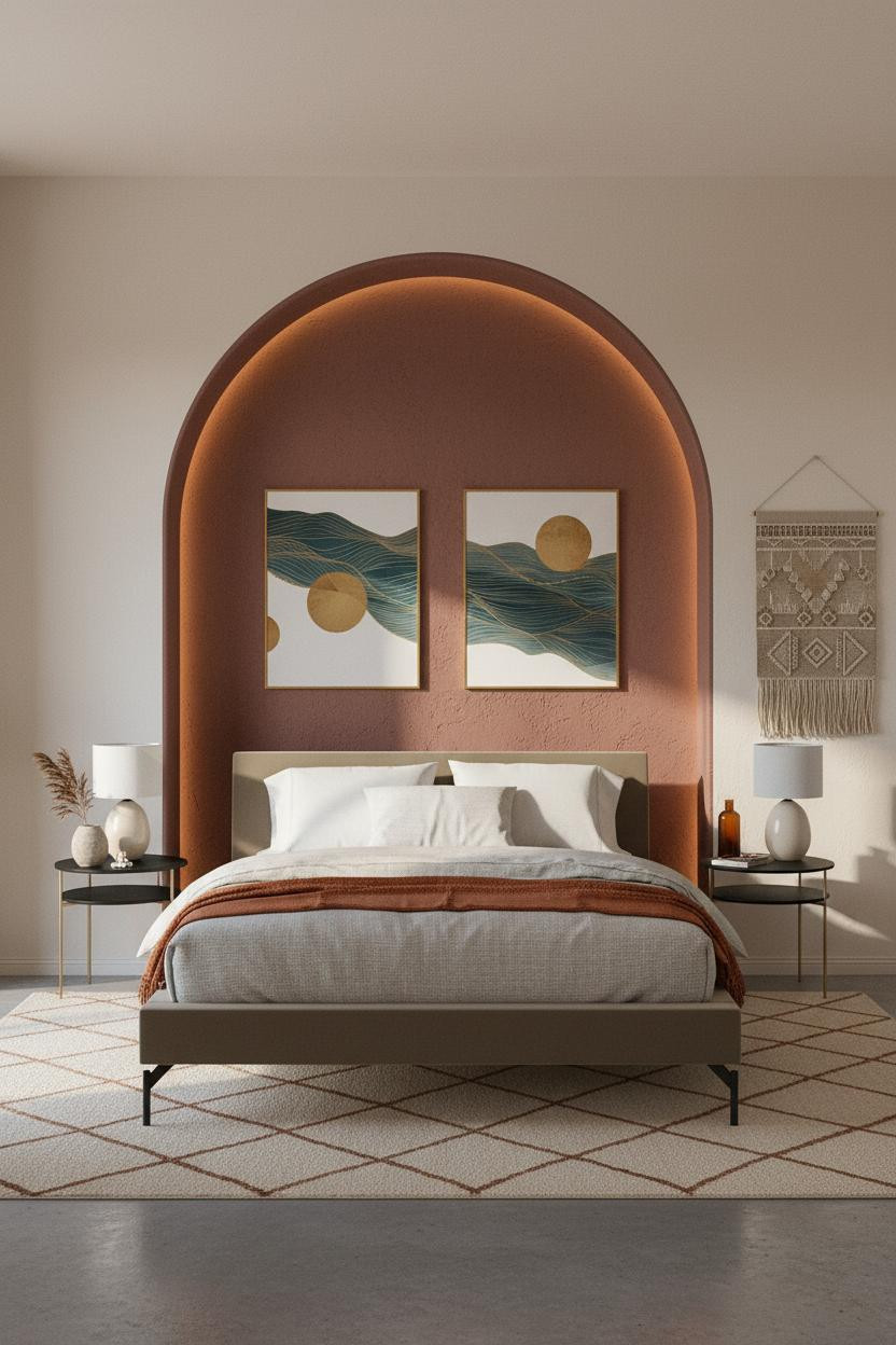

Bold choice. Genuinely not for everyone.
But the couples who go all-in on a dramatic wall color like this never seem to regret it.
Why it lands: A full-height arched alcove in textured burgundy plaster frames the bed the way a fireplace frames a sitting room. It's containment, not decoration.
The smarter choice: Keep the rest of the room warm white so the alcove reads as a focal point, not an accident.
Slate Walls And A Steel Window Grid That Somehow Agree
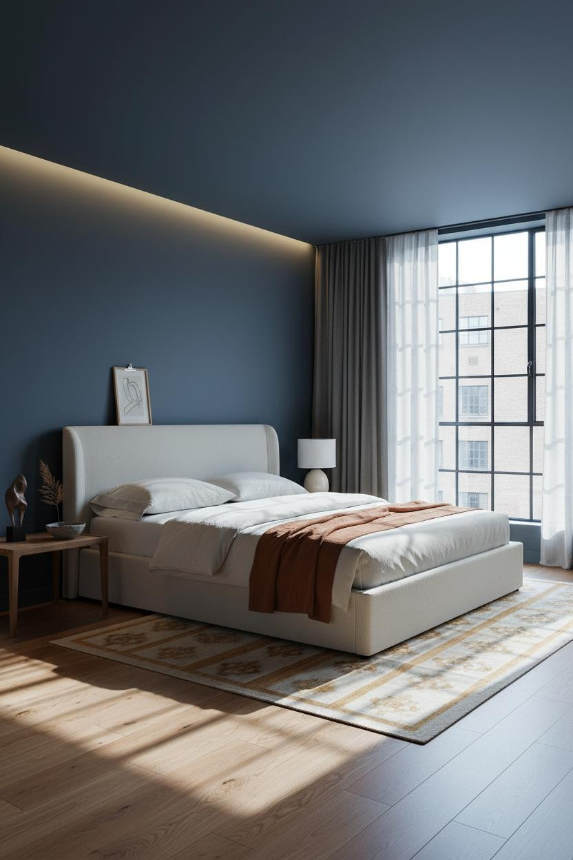

I keep coming back to this one. The proportions are generous, and the room feels calm without trying to be a retreat.
What gives it presence: Slate blue-grey matte plaster on the walls combined with a Crittall-style steel window grid creates two strong elements that share the same visual weight. Neither fights for attention.
Pro move: Hang floor-to-ceiling charcoal linen curtains to frame the window and keep the room from feeling like a showroom.
The Curved Plaster Niche Couples Keep Pinning
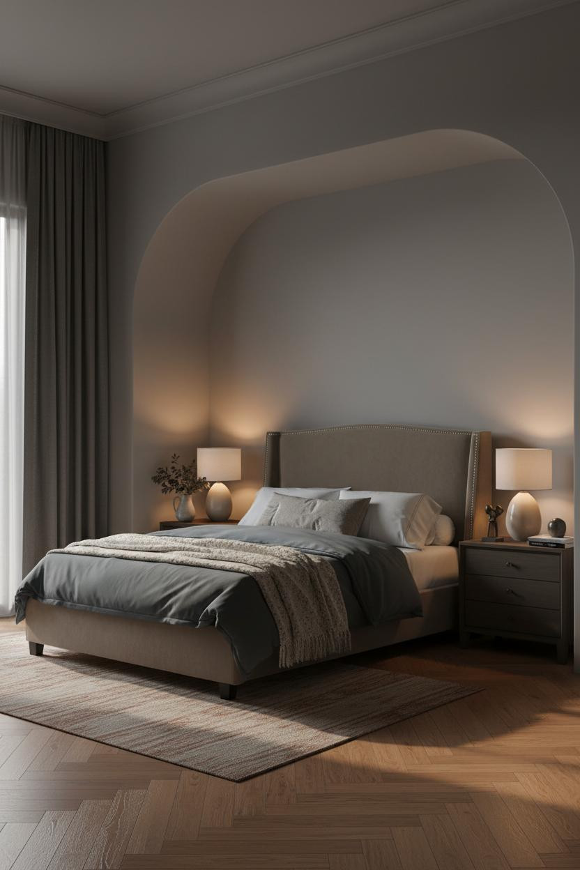
The curved plaster niche framing the bed is the kind of architectural detail that makes everything else feel intentional by comparison.
In a room this moody, the real strength is the dove grey matte plaster surface. Warm lamp light hits the curved edges and shifts to cooler shadow at the ceiling, which keeps the room from feeling like a cave.
What to borrow: Lay herringbone parquet in reclaimed wood and let it run the full length of the room. It adds warmth the walls deliberately hold back.
Backlit Glass That Turns Off The Overhead Lights For Good
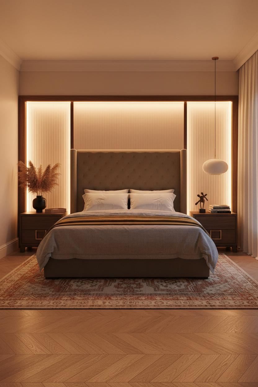

Having a backlit wall panel like this changes the way you actually wind down together at night.
Why the palette works: The frosted reeded glass set into a dark walnut frame glows with a diffused amber halo that dissolves into camel matte plaster walls. The light source disappears. Only the warmth stays.
Avoid this mistake: Don't pair a warm backlit wall with cool-toned bedding. Stay in the same family of ochre, stone, and grey.
Sage And Cream That Somehow Doesn't Feel Like A Guest Room
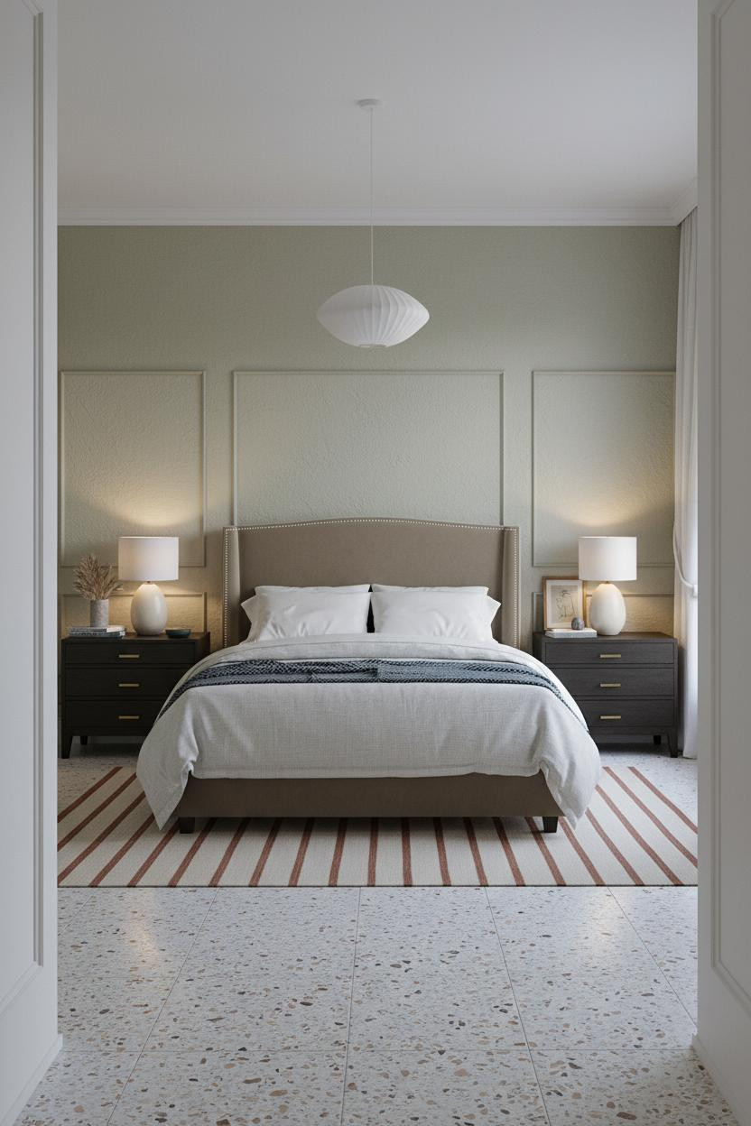
Sage green bedrooms can tip into a spa brochure fast. This one doesn't, and honestly the wainscoting is why.
What carries the look: The horizontal seam between cream wainscoting panels below and warm sage plaster above creates a strong visual line that grounds the whole room. It prevents the color from floating.
Warm amber from each bedside lamp does the rest. Two sources of light, not one. That detail alone changes the mood entirely.
Clay Plaster And Board-And-Batten For A Room That Feels Genuinely Warm
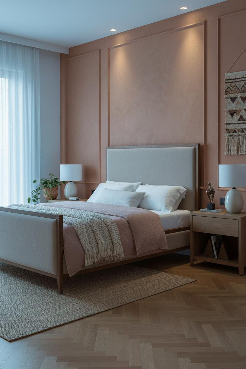

The room feels lived-in and intimate in a way that takes some effort to actually pull off.
Why it looks custom: Board-and-batten in warm clay plaster gives each vertical batten a fine shadow line that adds depth flat paint never could. It's the texture that makes the wall feel hand-done.
The finishing layer: A dusty pink linen duvet against clay walls keeps things warm without tipping into terracotta overload. Just enough contrast.
Exposed Brick That Reads Cozy, Not Unfinished
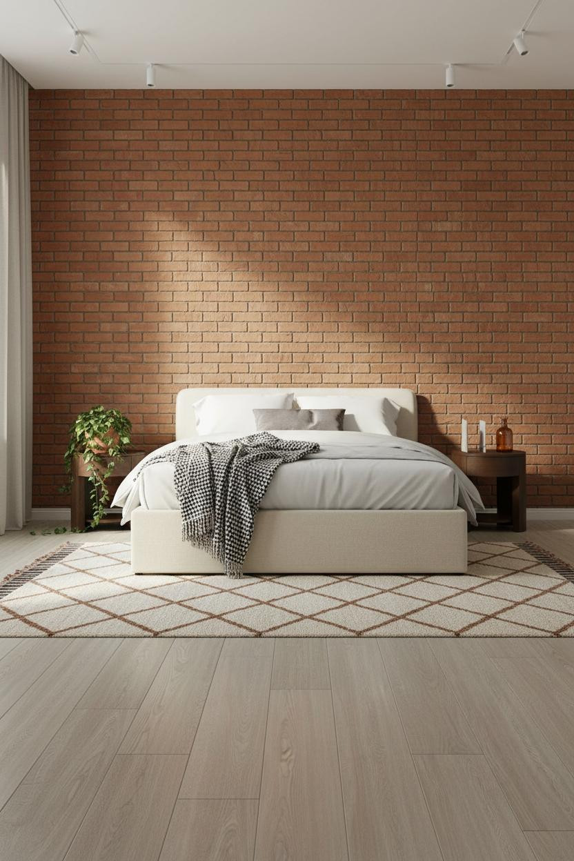

Exposed brick only works here because the rest of the room is extremely quiet. Neutral bedding, matching nightstands, nothing competing.
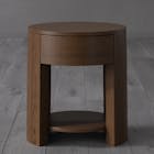
What makes this work is proportion. The terracotta brick wall sealed in matte finish becomes texture rather than statement, while symmetric nightstand styling on both sides keeps the shared space feeling balanced rather than chaotic.
Where to start: Seal exposed brick with a flat finish so it reads warm, not raw. Gloss makes it look industrial. Matte makes it look intentional.
An Indigo Room With A Living Thing In The Corner
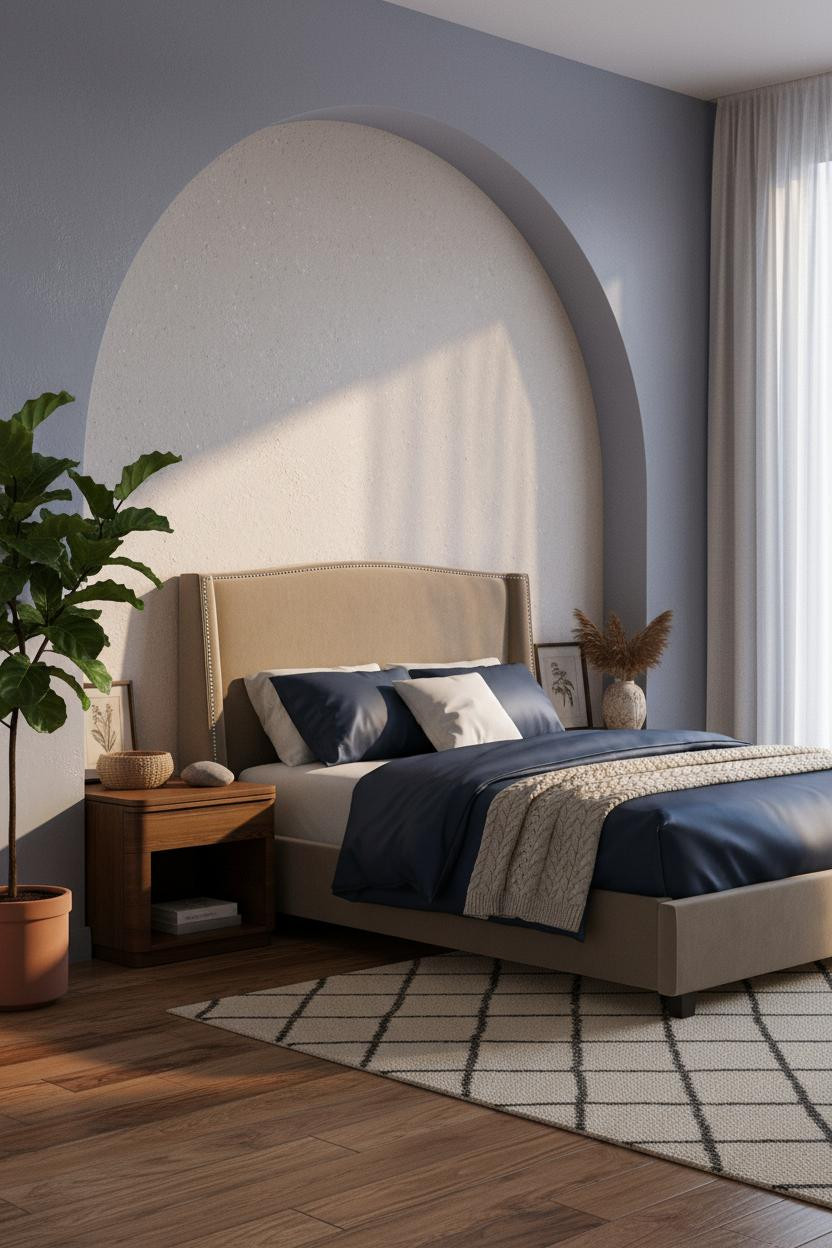
I almost scrolled past this. Glad I didn't.
What creates the mood: Soft indigo matte plaster walls in a dark bedroom make a fiddle-leaf fig in the corner feel like punctuation, not decor. The plant adds life while the arched niche adds architecture. Together they stop the room from feeling stark.
Worth copying: Navy bedding here works precisely because the walls are already saturated. You don't need contrast. You need layered texture instead.
A Walnut Floating Shelf That Does The Work Of Three Nightstands
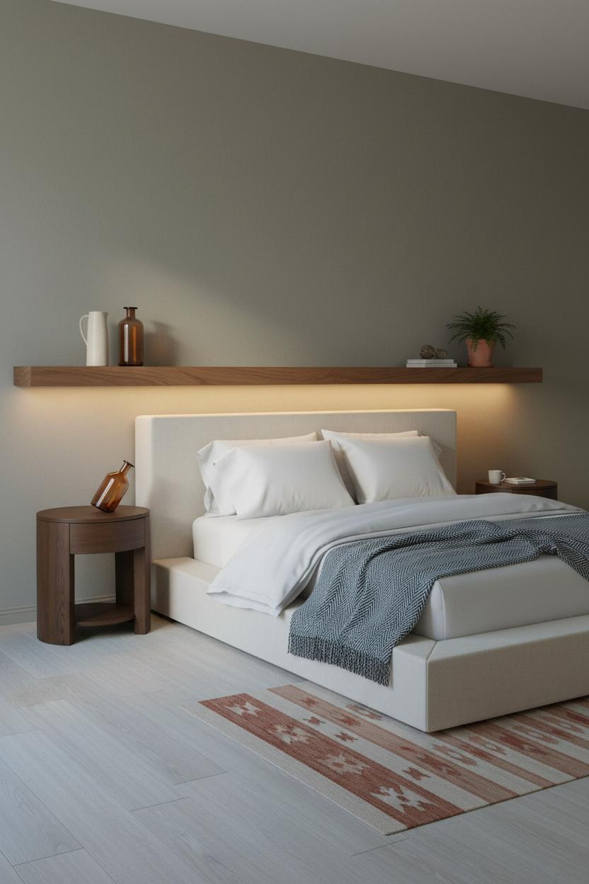
Nothing fancy. That's the point.
The real strength: A full-width walnut floating shelf running the entire headboard wall solves the nightstand problem for both people at once, while still feeling like a design choice rather than a storage fix. Integrated shelf lighting keeps it warm after dark.
What not to do: Don't overstyle the shelf. Three objects max per side, spaced deliberately, or the whole thing reads cluttered.
Sage Ribbed Plaster That Earns Its Place On A Feature Wall

This is the kind of room that makes you want to cancel your Saturday plans and just stay in it.
Why it feels intentional: Shallow vertical grooves in sage ribbed plaster catch the late afternoon light along each ridge, dropping fine shadow lines that give the wall actual dimension. It's a quiet move with a big visual payoff.
The easy win: Set the dark walnut flooring against cream linen curtains pooling at the floor. The contrast grounds the room without adding a single piece of art.
Pale Ash Slats And The Case For Going Lighter On The Feature Wall
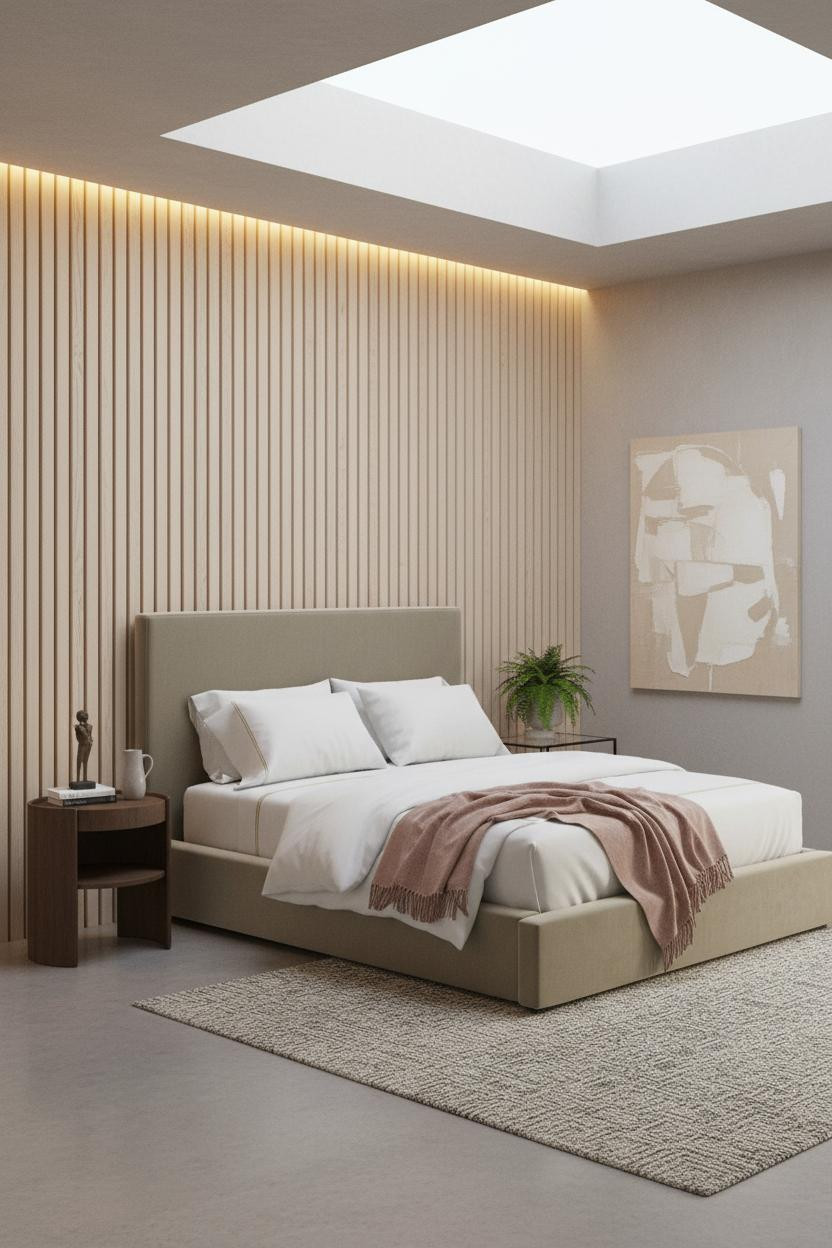

Most slatted wood walls go dark. This one goes pale, and the room feels twice the size because of it.
The reason it feels open instead of heavy is the pale ash timber slat wall. Grain catches light edge-on and throws fine parallel shadows across the surface, which creates texture while still keeping the room airy. A chunky undyed wool rug underneath anchors it so nothing floats.
Best for: Couples who want the architectural interest of a feature wall without the commitment of a dark color.
Moss Green Built-Ins That Make The Whole Room Feel Considered
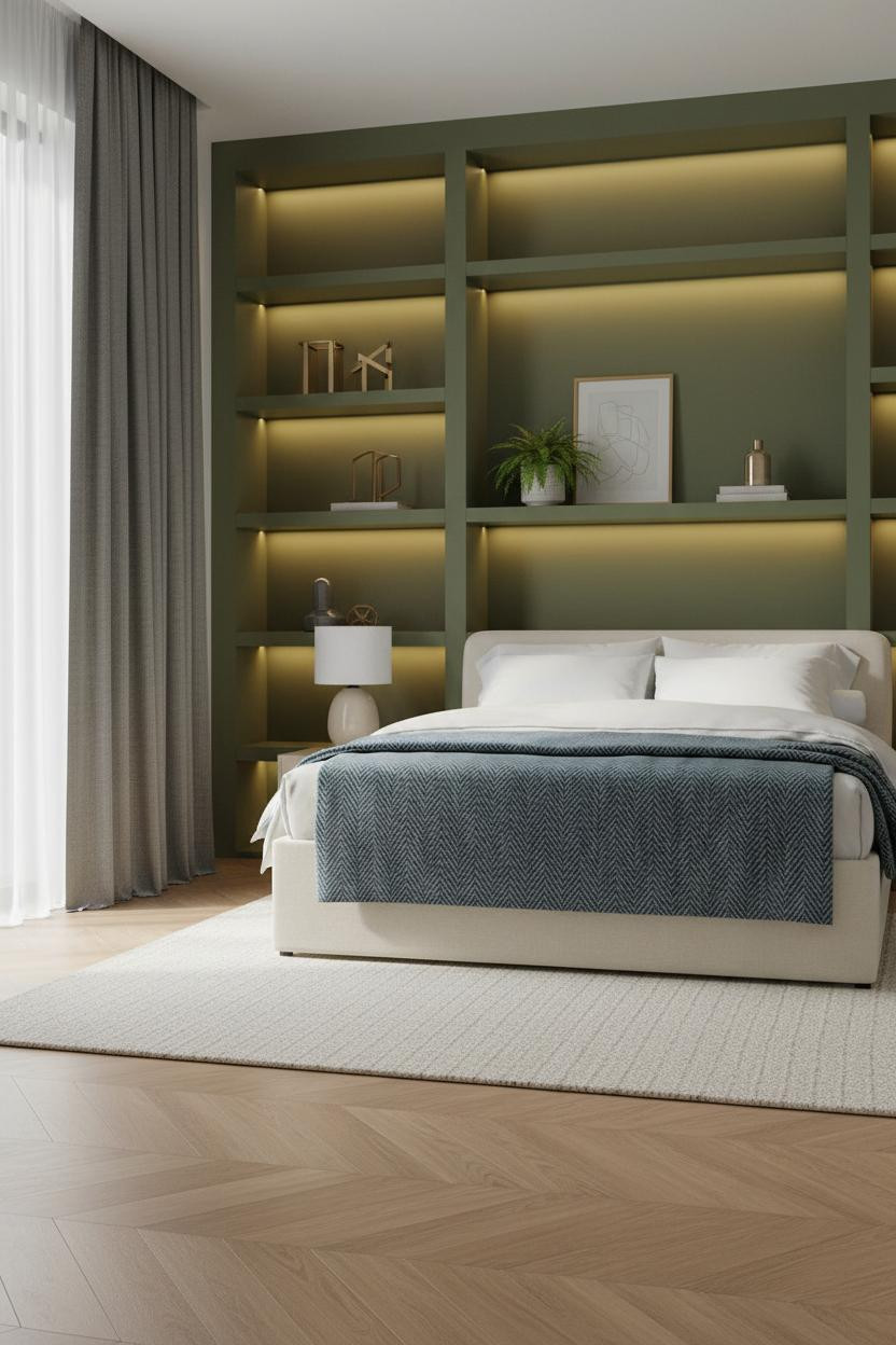
Built-in shelving painted the same color as the wall is one of those moves that looks expensive but isn't necessarily.
Why it looks custom: Painting floor-to-ceiling open cubbies in warm moss green makes the shelving disappear into the wall while the objects on it pop forward. The shelves stop being storage and start being architecture.
The common miss: Overcrowding the shelves. Negative space between objects is what makes this his and her bedroom styling feel collected rather than stuffed.
Dusty Rose Walls And Paired Pendants That Feel Like A Boutique Hotel
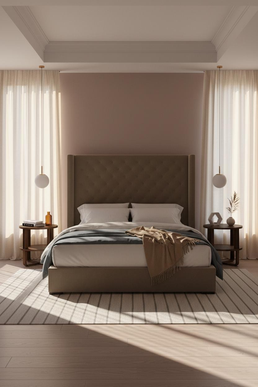
Dusty rose walls sound risky. They aren't, especially when the rest of the room is this restrained.
What softens the room: Paired pendants hung symmetrically above each nightstand pull the bleached oak floor and the dusty rose matte plaster into a single cohesive layer. The ceiling tray detail frames all of it from above without adding visual weight.
One smart swap: Replace a central ceiling fixture with pendant lights hung low on each side. The room immediately reads more intimate and more intentional.
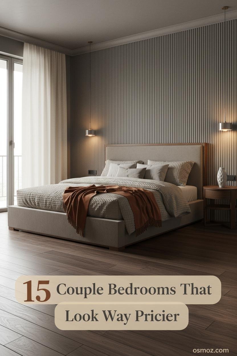
Greige Paneling For A Japandi Master That Actually Feels Shared
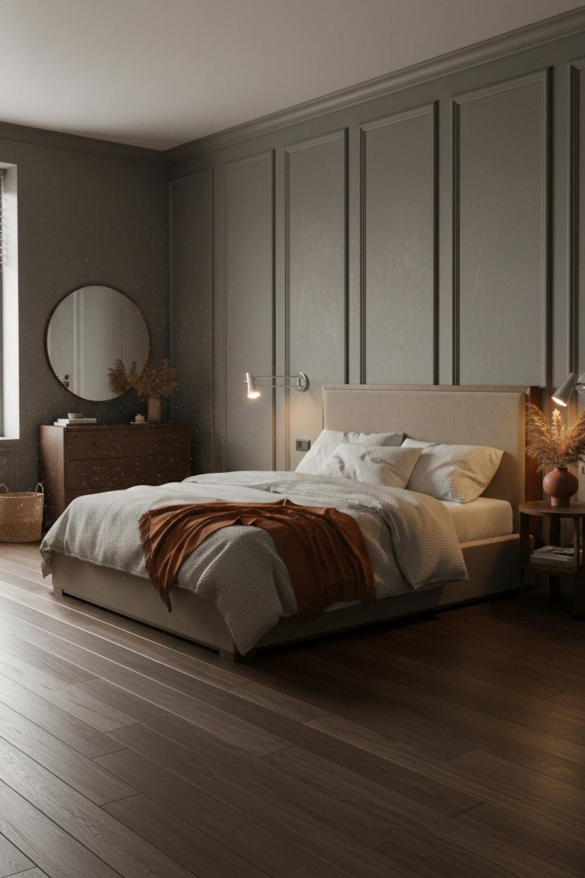
I appreciate a Japandi bedroom that doesn't feel like a meditation retreat. This one actually feels like two people live there.
Why it feels balanced: Floor-to-ceiling deep greige paneling with subtle plaster texture catches morning light along each vertical panel edge, creating quiet architectural rhythm that goes unnoticed until you're looking for it. That's the point.
Dark walnut floors, oatmeal waffle-weave bedding, a burnt orange mohair throw. Nothing matchy. Just warm. And an oversized round mirror above the dresser that reflects the whole room back at you in the best possible way.
 Our #1 Pick
Saatva Classic Mattress
America's best-selling online luxury innerspring. 365-night trial, lifetime warranty, free white glove delivery.
Shop Saatva Classic
Our #1 Pick
Saatva Classic Mattress
America's best-selling online luxury innerspring. 365-night trial, lifetime warranty, free white glove delivery.
Shop Saatva Classic
The Foundation Of Every Beautiful Bedroom
Every room in this list gets the walls and the lighting right. But the bed is where it either works or it doesn't, especially for two people sharing the same mattress every night.
The Saatva Classic is the one I'd put in any of these rooms. Dual-coil support means motion on one side stays on that side. The Euro pillow top has actual substance to it, not that marshmallow softness that collapses in six months. And the breathable organic cotton cover doesn't trap heat, which matters more than most people think until it's 3am.
Walls get repainted. Linen gets swapped out. The mattress stays. Start with the one that holds up.

The rooms people save are the ones where nothing looks accidental. And the ones people actually want to sleep in are the ones that got the bed right first.


