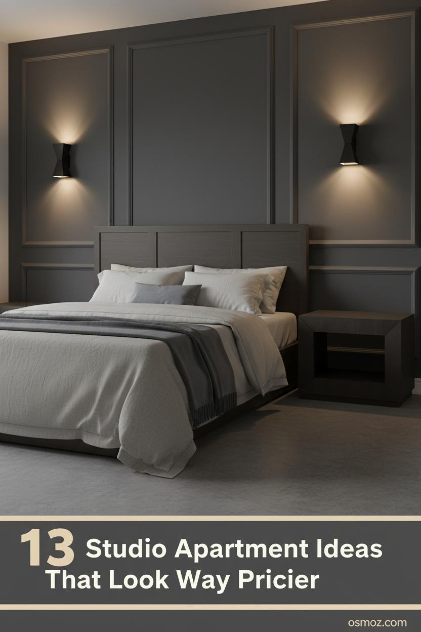
13+ Studio Apartment Ideas That Actually Feel Like a Real Home
08 april 2026The best studio apartment ideas for men don't look like they came from a mood board. They look like someone actually thought about how they live.
Thirteen rooms. All different. But every single one has something worth stealing.
The Dusty Rose Wall That Somehow Works
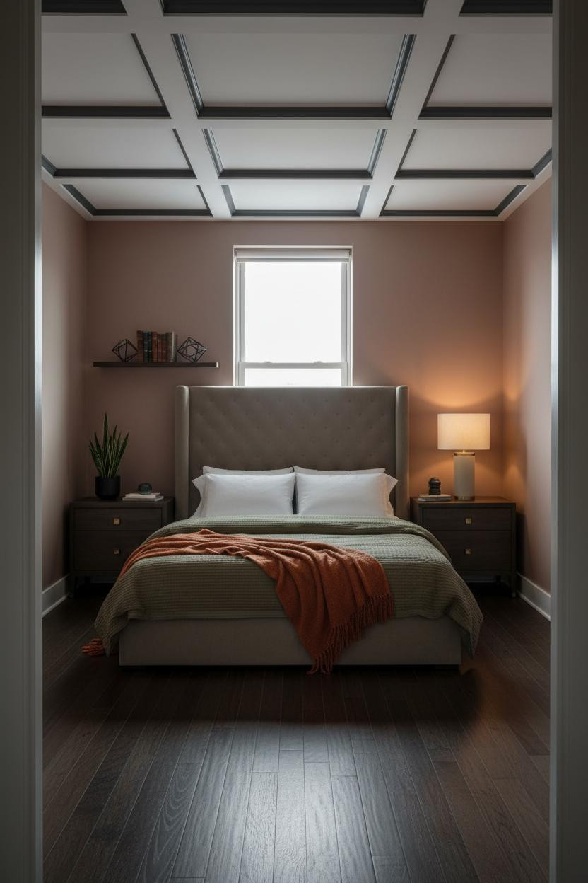


Counterintuitive. But dusty rose in a bachelor studio is one of those calls that pays off when the rest of the room is grounded.
Why it holds together: The coffered ceiling does the heavy lifting here. It adds architectural weight that keeps the warm wall from reading as soft or accidental.
Steal this move: Dark flooring plus a warm unexpected wall color plus one strong ceiling detail. That's the whole formula.
Charcoal Paneling Is the Easiest Way to Look Like You Tried


This is the room that makes you want to rethink every beige wall you've ever lived with.
Why it looks custom: Raised rectangular panel molding in deep matte charcoal creates shadow relief across the surface, which gives a flat wall something to say at any hour of the day.
The easy win: Pair the paneled wall with polished concrete floors and an oatmeal duvet. The contrast does the work for you.
What Full-Height Walnut Shelving Does to a Small Room
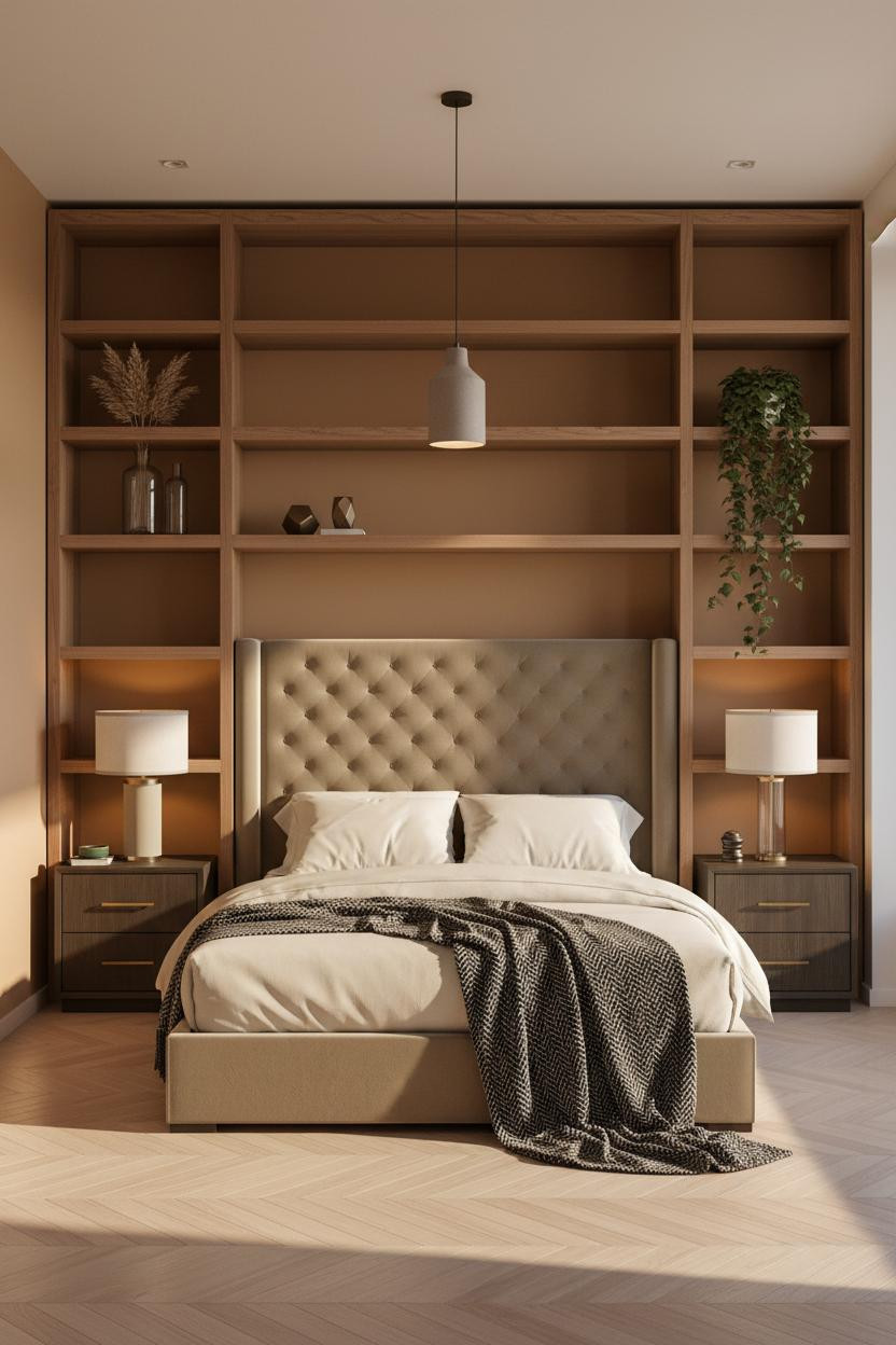
I keep coming back to this one. The shelving wall above the bed is the kind of move that makes a tiny studio feel intentional rather than cramped.
A floating walnut shelving unit spanning the full wall draws the eye upward and adds horizontal rhythm, which helps balance a low ceiling without fighting it.
Worth copying: Warm caramel plaster walls plus pale bleached herringbone floors plus open walnut grain. Three materials, one warm family. Done.
I Didn't Expect the Alcove Niche to Be This Good
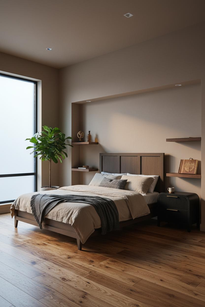
A recessed wall niche is one of those details that looks expensive but is mostly just patient planning.
What creates the mood: The shadow pooling inside a smooth matte plaster recess gives the headboard wall real depth, while the flanking walnut shelves keep it functional.
Pro move: Skip the area rug and let reclaimed wide-plank flooring carry the warmth instead. The room feels less cluttered for it.
Sage Walls With a Plaster Arch: Commit or Go Home
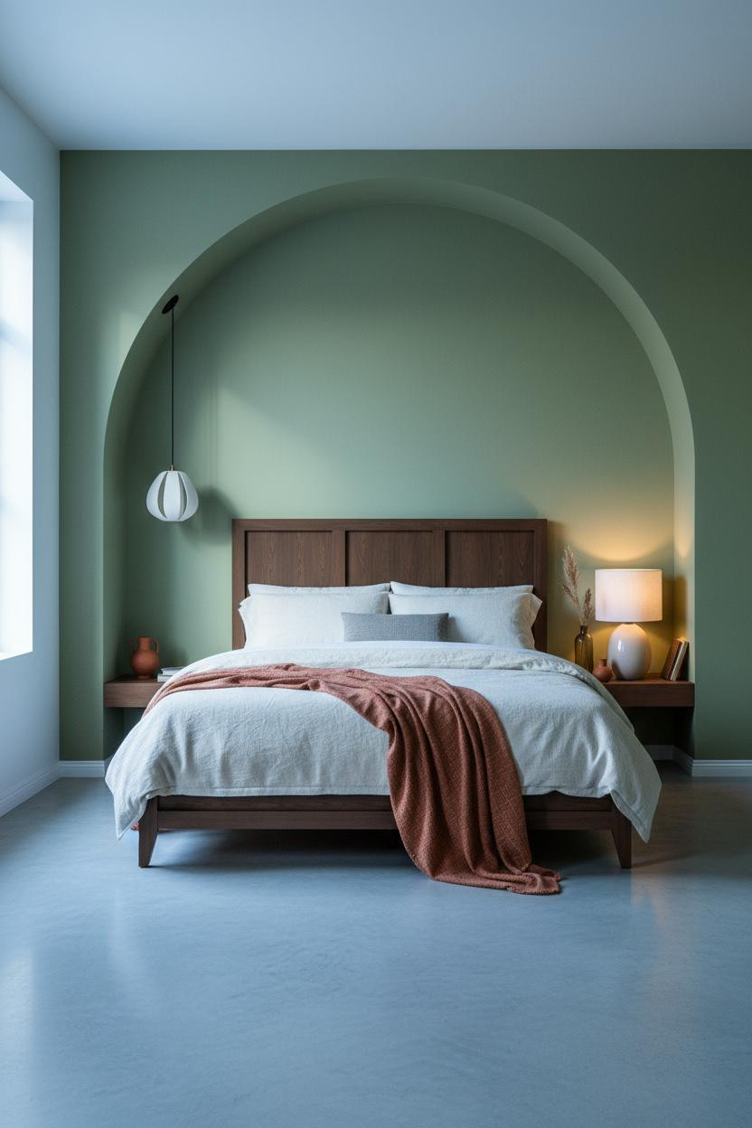
Bold choice. Honestly, not every studio can pull this off. But when the proportions are right, a full-height arched plaster niche changes everything about how the room reads.
The curved lip of the arch catches morning light while shadow pools deep in the recess. Warm sage plaster keeps it from feeling too stark, which matters in a small space.
The smarter choice: Polished concrete floors over hardwood here. The cool surface balances the warmth of the sage and lets the arch be the statement.
Avoid this mistake: Don't fill the arch with too much. One terracotta vessel and a dried grass bundle. That's enough.
MCM Geometry Still Hits in a Studio Layout
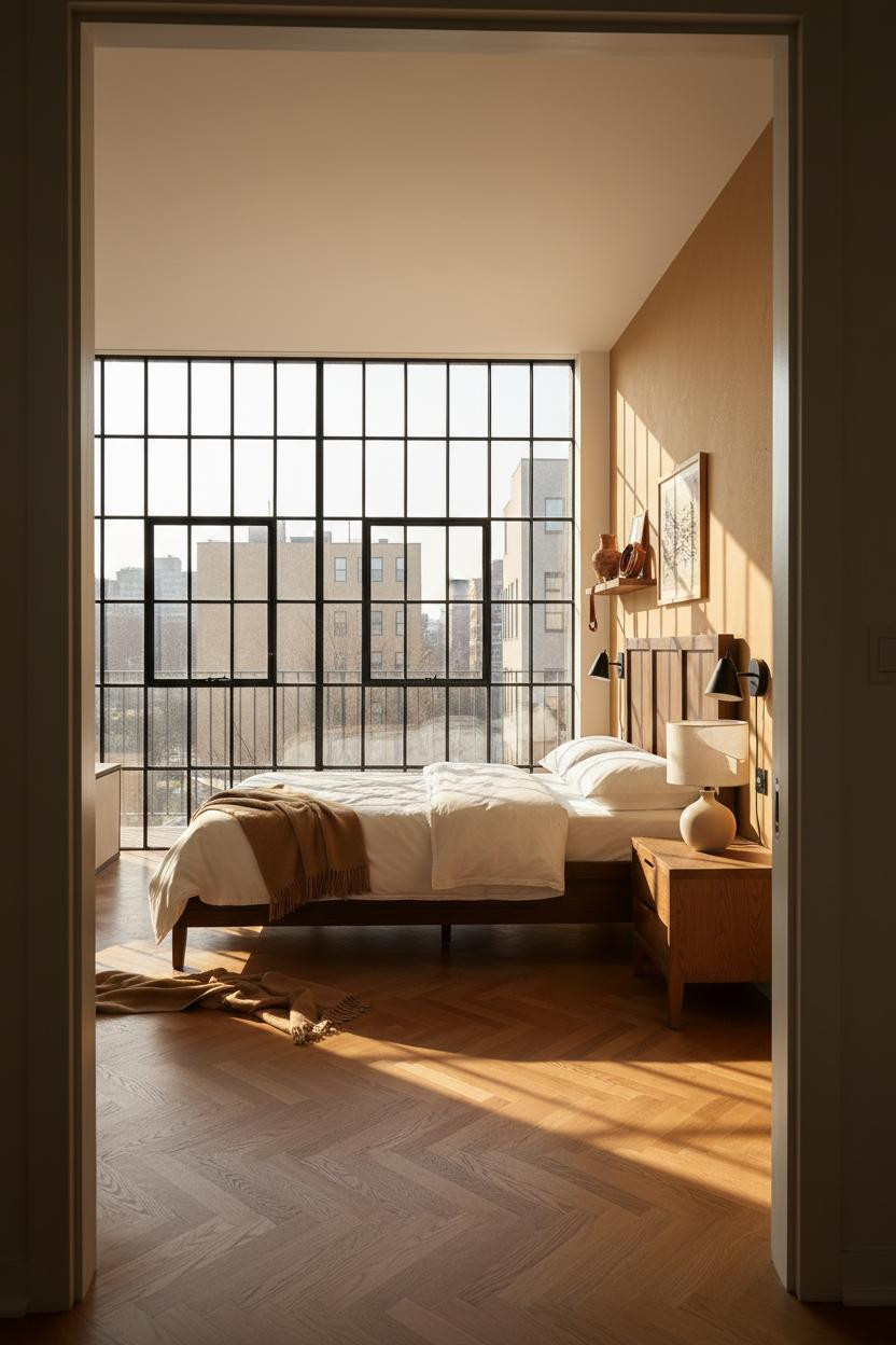

Floor-to-ceiling Crittall-style windows are the kind of architectural detail you can't fake, and honestly you shouldn't try to replicate with curtains.
Why the materials matter: The matte black steel grid casts sharp geometric shadow lines across honey plaster walls throughout the day, which means the room has something going on without needing any art.
One smart swap: Swap overhead lighting for paired matte black geometric sconces flanking the bed. Keeps the MCM geometry consistent from floor to ceiling.
The Japandi Approach to a Tiny Footprint
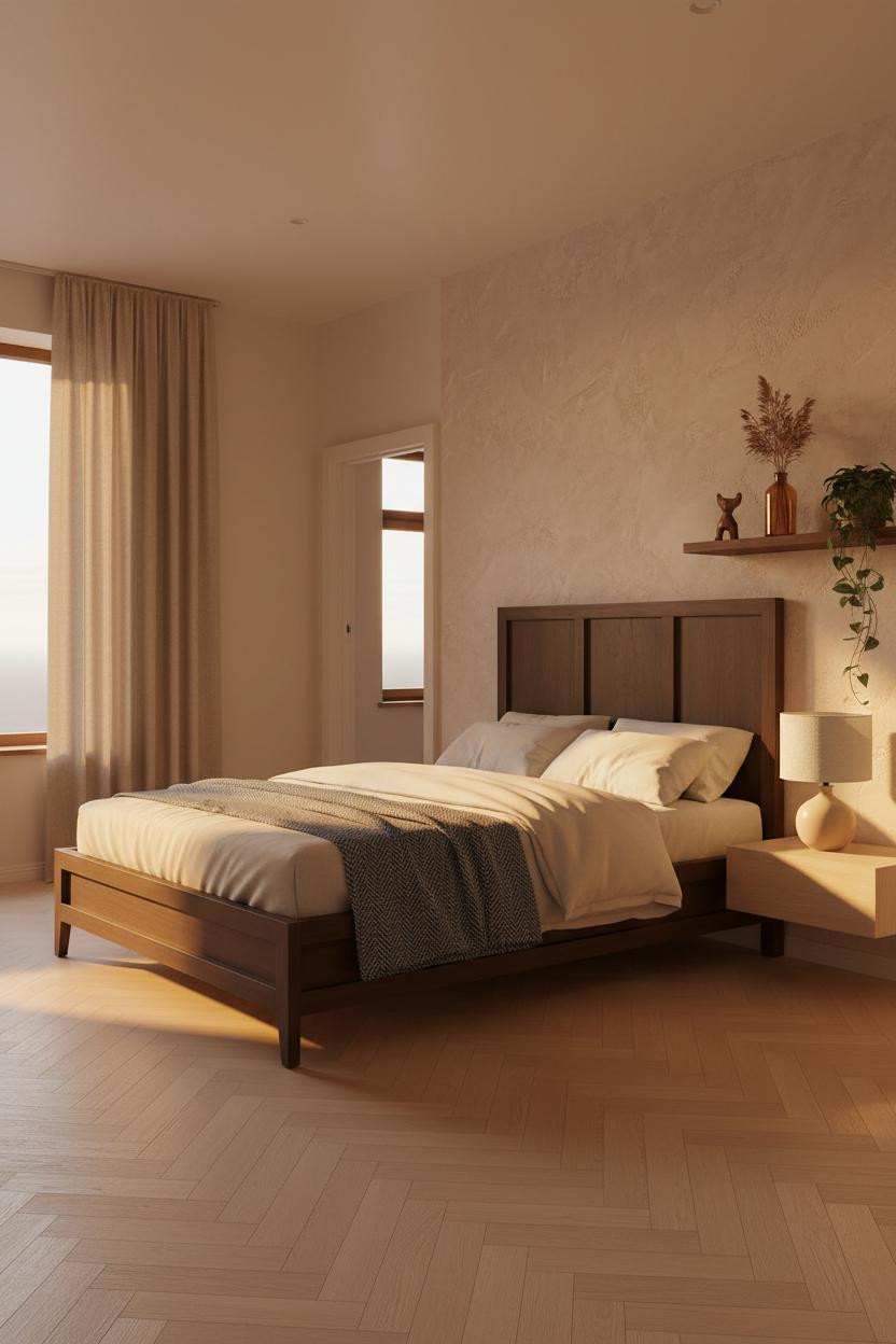
The room feels calm and cohesive in a way that takes actual restraint to pull off.
What gives it presence: A hand-applied clay plaster wall with faint trowel marks catches raking light and creates texture that painted walls simply can't replicate.
The finishing layer: Floor-to-ceiling curtains in dusty sand pooling at the floor. It's a small move that adds height while still feeling grounded.
Board-and-Batten in a Bachelor Studio? Yes, Actually
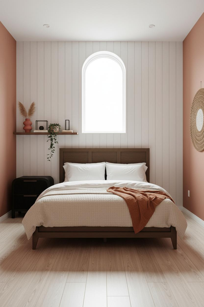
I'll admit I didn't think this would work in a male apartment context. But the terracotta flanking walls save it from feeling too farmhouse-Pinterest.
In a small studio, the smarter choice is a floor-to-ceiling board-and-batten headboard wall over a painted accent. The vertical groove lines add rhythm without adding visual weight. And the terracotta keeps the white from going cold.
Where to start: Get the wall treatment right first. The furniture decisions become much easier once that wall has a personality.
Muted Blue Walls With Floating Walnut Shelving
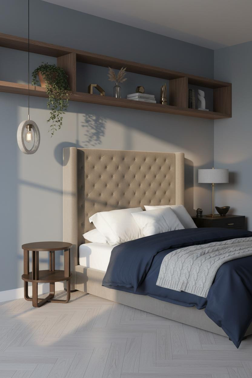

This one is quieter than most in this list. And that's sort of the point.
What carries the look: Muted blue-grey walls make the walnut grain read warmer than it would against white, which pulls the whole room toward something collected rather than decorated.
Pair warm sconce light with pale ash herringbone floors. Cool wall, warm floor, warm light. The balance is easy to repeat in any size studio.
Olive Shelving Is the Detail I Keep Recommending
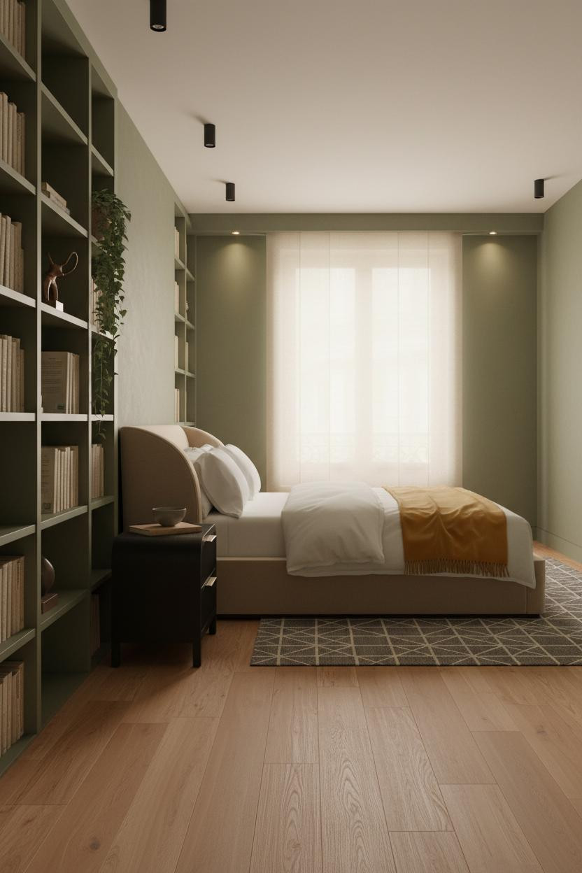

A floor-to-ceiling bookshelf wall in matte olive green is one of those choices that looks deeply considered without being difficult to execute. Paint. Build shelves. Done.
Why it feels intentional: The olive reads as a neutral against warm maple flooring, which means you can layer in earth-toned books and objects in a way that feels natural rather than styled.
What to borrow: A charcoal and cream wool rug under the bed. It grounds the whole room without competing with the shelving wall.
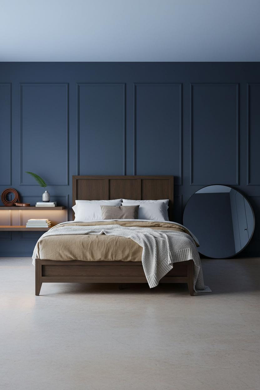
Slate Blue Board-and-Batten With Natural Oak Floors
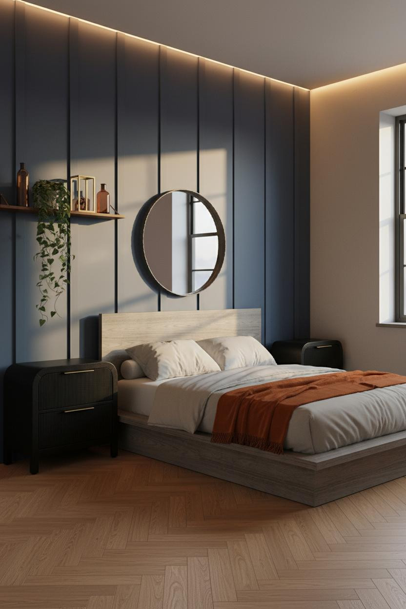

This is the one I'd actually do in my own place. Deep slate blue board-and-batten, warm greige on the flanking walls, natural oak herringbone on the floor.
What sharpens the room: The crisp vertical grooves of the board-and-batten panel cast rhythmic shadow lines that give the narrow wall serious geometry, especially when side light rakes across it in the afternoon.
The detail to keep: An oversized round raw-steel mirror above the bed. It reflects the oak floor and keeps the dark wall from closing the room in.
Industrial Windows Do the Decorating For You
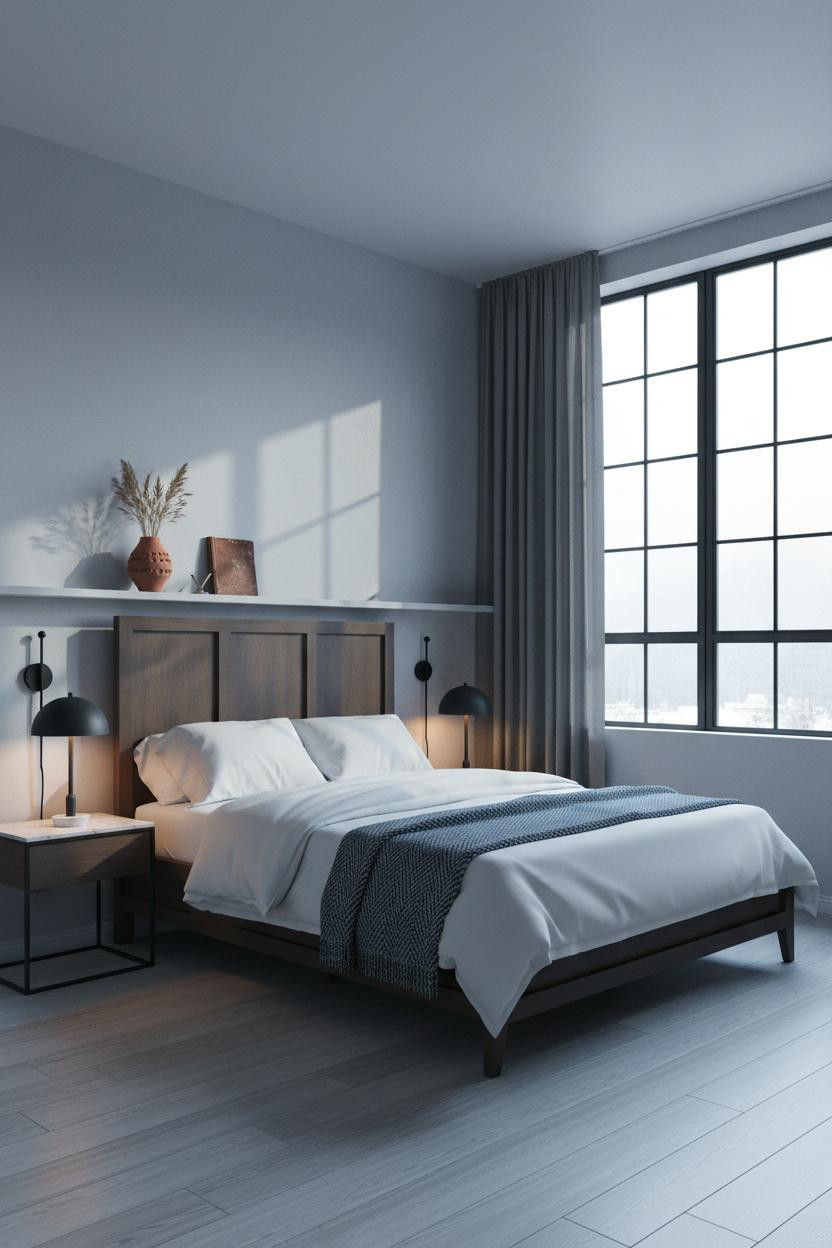
Nothing fancy. That's exactly the point here.
Why it holds together: Floor-to-ceiling steel-framed industrial windows project clean geometry onto stone grey plaster all day long, which means the walls earn their keep without a single piece of art. And the charcoal linen curtains pooling at the floor add just enough softness to keep it from feeling cold.
Exposed Brick Still Earns Its Place in a Studio
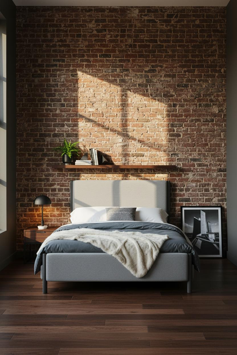

Fair warning: exposed brick gets overused. But a full-width wall of raw clay brick with deep charcoal mortar is a different thing entirely from a partial-wall accent treatment.
The reason this one feels lived-in rather than staged is the dark walnut flooring running beneath it. Raw brick texture plus warm wood grain absorbs afternoon light in a way that makes the room feel grounded rather than cold.
What not to do: Don't lean a large mirror against the brick. It fights the texture. A single architectural print leaning low keeps the raw quality intact.
 Our #1 Pick
Saatva Classic Mattress
America's best-selling online luxury innerspring. 365-night trial, lifetime warranty, free white glove delivery.
Shop Saatva Classic
Our #1 Pick
Saatva Classic Mattress
America's best-selling online luxury innerspring. 365-night trial, lifetime warranty, free white glove delivery.
Shop Saatva Classic
The Foundation Of Every Beautiful Bedroom
Every room in this list has something worth copying. But none of it lands the way it should if the bed itself is wrong. That's where the Saatva Classic comes in.
Dual-coil support means the mattress holds its shape over time in a way that cheaper options don't. The breathable organic cotton cover keeps things cooler than it looks. And the Euro pillow top is soft without losing the structure that actually helps you sleep.
Walls get repainted. Linen gets swapped out. The mattress stays. Start there.

Good design ages well because it's made well. The rooms in this list prove that a small footprint isn't a limitation. It's just a different kind of editing problem. And that's the part that's actually fun to solve.


