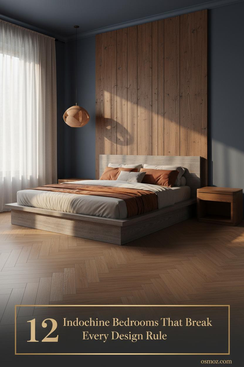
This Indochine Bedroom Somehow Feels Calmer Than Anywhere Else (12+ Looks)
28 march 2026The first time I saved an Indochine bedroom image, I couldn't explain why it felt so different. Something about the layered materials, the colonial bones, the way handcraft and stillness sit together in the same room.
These 12 rooms do that. Each one lands somewhere between asian interior design and lived-in warmth, and none of them feel like a hotel lobby.
A Copper Panel That Stops The Room Cold
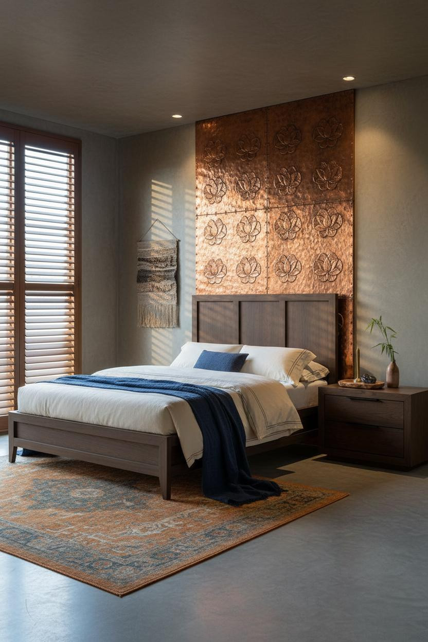

Bold choice. Not subtle. But I keep coming back to it.
But what makes it work is the hand-hammered copper repoussé panel behind the bed: the lotus reliefs catch the cool window light and throw warm reflections onto aged plaster, so the metal reads alive rather than cold.
Steal this move: Pair any warm metallic surface with matte plaster walls and the contrast does all the heavy lifting.
Why A Water Hyacinth Wall Feels This Quiet
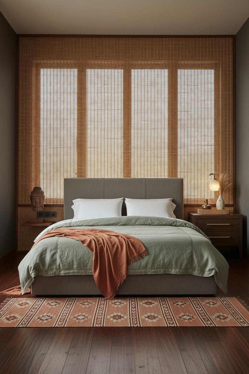


This one surprised me. The material choice is so quiet it almost disappears, and somehow that's the whole point.
What gives it depth: The woven water hyacinth panel casts an intricate shadow lattice in sidelight, so the surface reads as texture rather than decor. That's different from a headboard. It's architectural.
Try this: Keep flanking walls in deep charcoal grey to let the honey-tan fibre read against contrast rather than disappear into warmth.
Teak Battens That Make The Wall Do All The Work
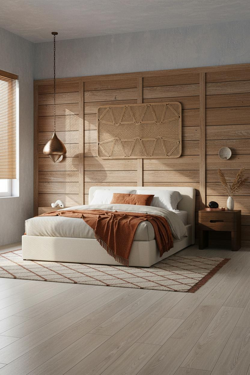


Nothing fancy. That's the point.
The horizontal battened teak panel behind the bed has deep shadow channels between each plank that multiply in raking light, making a flat wall look like it has real mass. Faded denim-blue plaster on either side keeps it from reading too rustic.
The easy win: Source hand-oiled teak over painted batten board. The raw grain is what holds the room together in tropical light.
When Board-And-Batten Teak Gets Colonial Scale Right
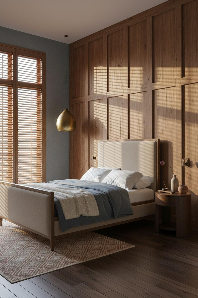

I was skeptical this would work at full height. It does.
Why it looks custom: Deeply recessed vertical channels in the aged teak board-and-batten wall collect shadow in every groove, so the surface reads as warm geometry rather than just wood cladding.
Avoid this mistake: Don't stop the paneling at headboard height. Full-wall or nothing. Anything in between just looks like wainscoting.
The Rattan Partition Trick I Haven't Seen Enough
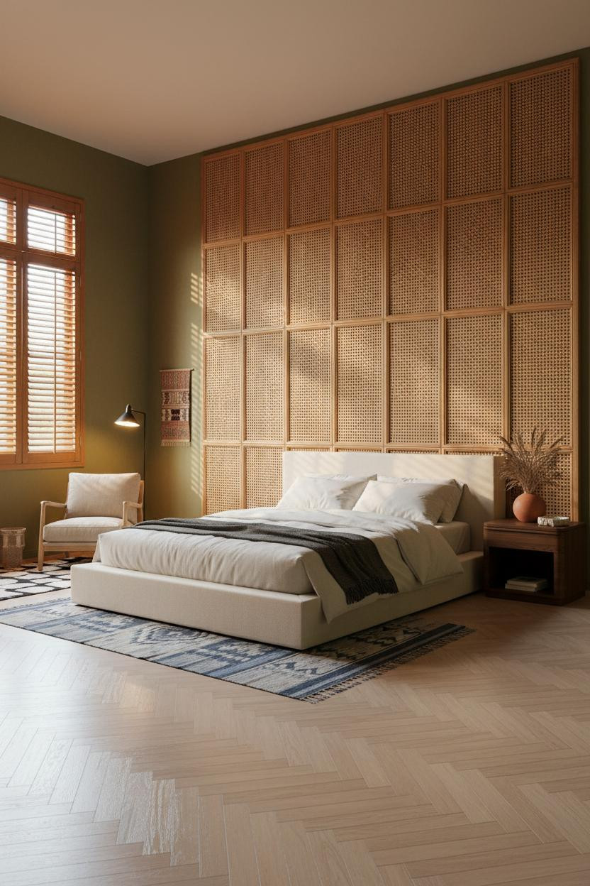


The room feels collected rather than decorated, and the floor-to-ceiling diamond lattice rattan partition is why. Light shifts through its open weave and drops a moving grid of shadows across the moss-green plaster, in a way that feels genuinely alive.
Worth copying: Use a faded indigo kilim on pale teak herringbone parquet beneath. The shadow geometry above needs something grounded below, or it tips into busy.
Herringbone Teak That Actually Changes The Geometry
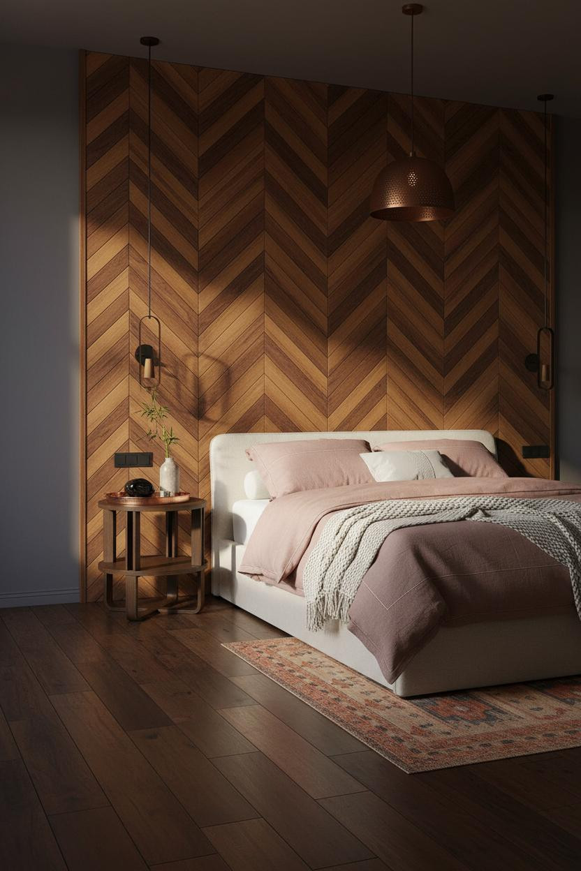

I keep coming back to this one. The chevron pattern on a wall is divisive, admittedly. But on herringbone teak parquet at this scale, the geometry reads as craft rather than trend.
The reason it feels warm instead of busy is the indigo-slate plaster on flanking walls. It pulls the honey and dark walnut tones together while still keeping the room from going heavy.
The smarter choice: Pair with a faded amber kilim, not a patterned rug. Two geometric surfaces compete.
What A Stone Accent Wall Gets Right That Tiles Never Do
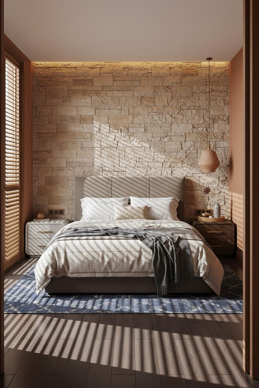
Stacked honey-toned ashlar stone with deep-raked mortar joints does something tiles can't: it reads as structural. The mineral grain catches warm diffused light differently at every hour, so the wall shifts from pale ochre to near-amber as the day moves.
And the terracotta-ochre flanking walls keep it grounded in an earthy Balinese palette rather than slipping into something cold and industrial.
Where to start: Mount a hand-thrown clay pendant above the bed, not a brass lantern. The stone already has metal tones. Keep lighting matte and organic.
Exposed Brick In A Tropical Room: Yes Or No?
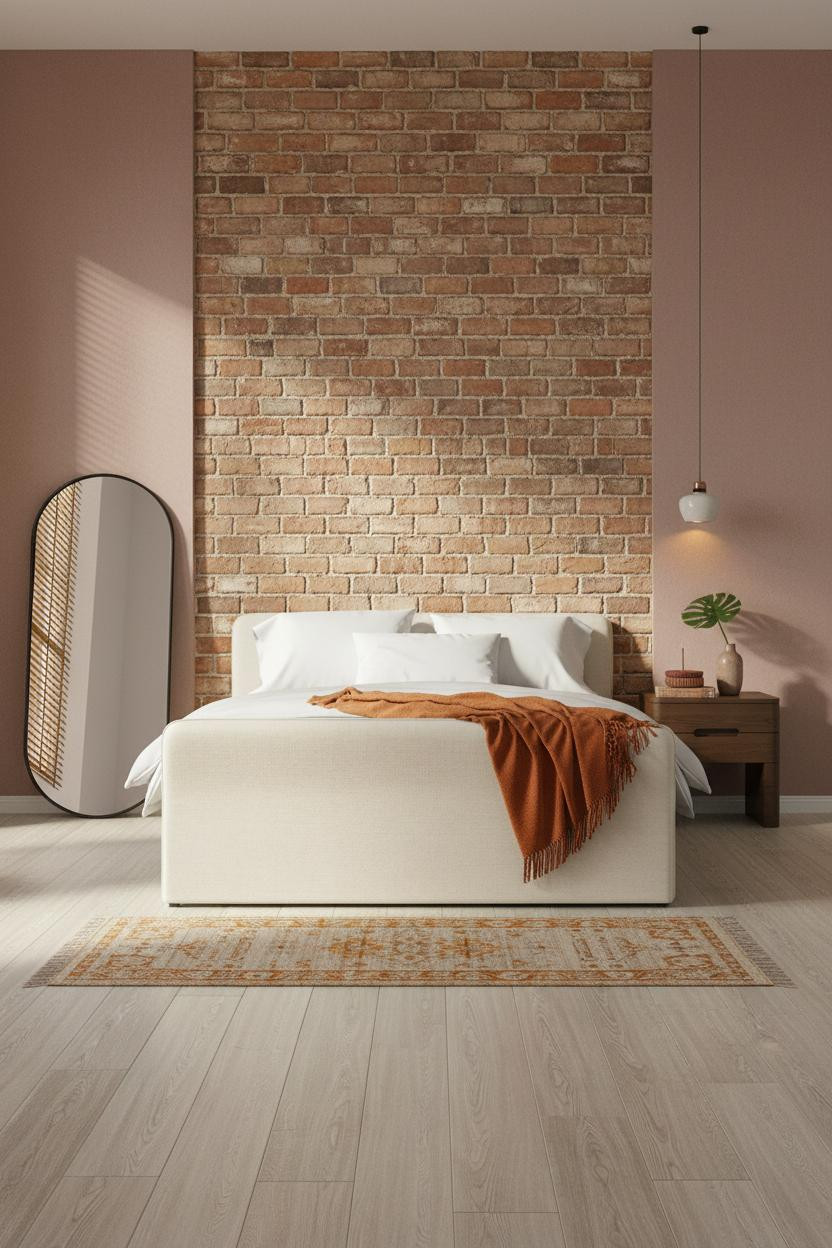
Honestly, I thought exposed brick would feel wrong in this context. Too heavy. Too loft-apartment.
But aged terracotta brick in running bond with recessed mortar raked by sidelight reads completely differently against dusty rose plaster. The warmth is earned. Not applied.
What not to do: Don't pair exposed brick with chrome or cool grey linens. The ochre tones in the brick need something warm across from them. Burnt orange mohair. Oatmeal cotton. That's the direction.
Azulejo Tiles That Shouldn't Work In A Bedroom (But Do)
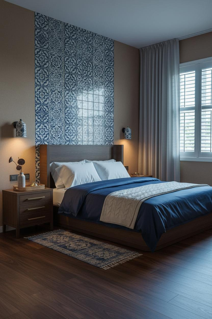

This is the kind of room that makes you want to rethink everything you thought you knew about Indochine style architecture and its limits.
Why it lands: Full-height hand-painted cobalt and white azulejo tiles hold the colonial reference without tipping into Portuguese pastiche. The tile relief catches raking light along each edge, so the pattern reads as dimensional, not flat.
The detail to keep: Floor-to-ceiling unbleached linen curtains hanging from a ceiling track soften what could read as cold and graphic. The tiles need fabric weight across from them.
How A Colonial Library Wall Becomes A Bedroom Anchor
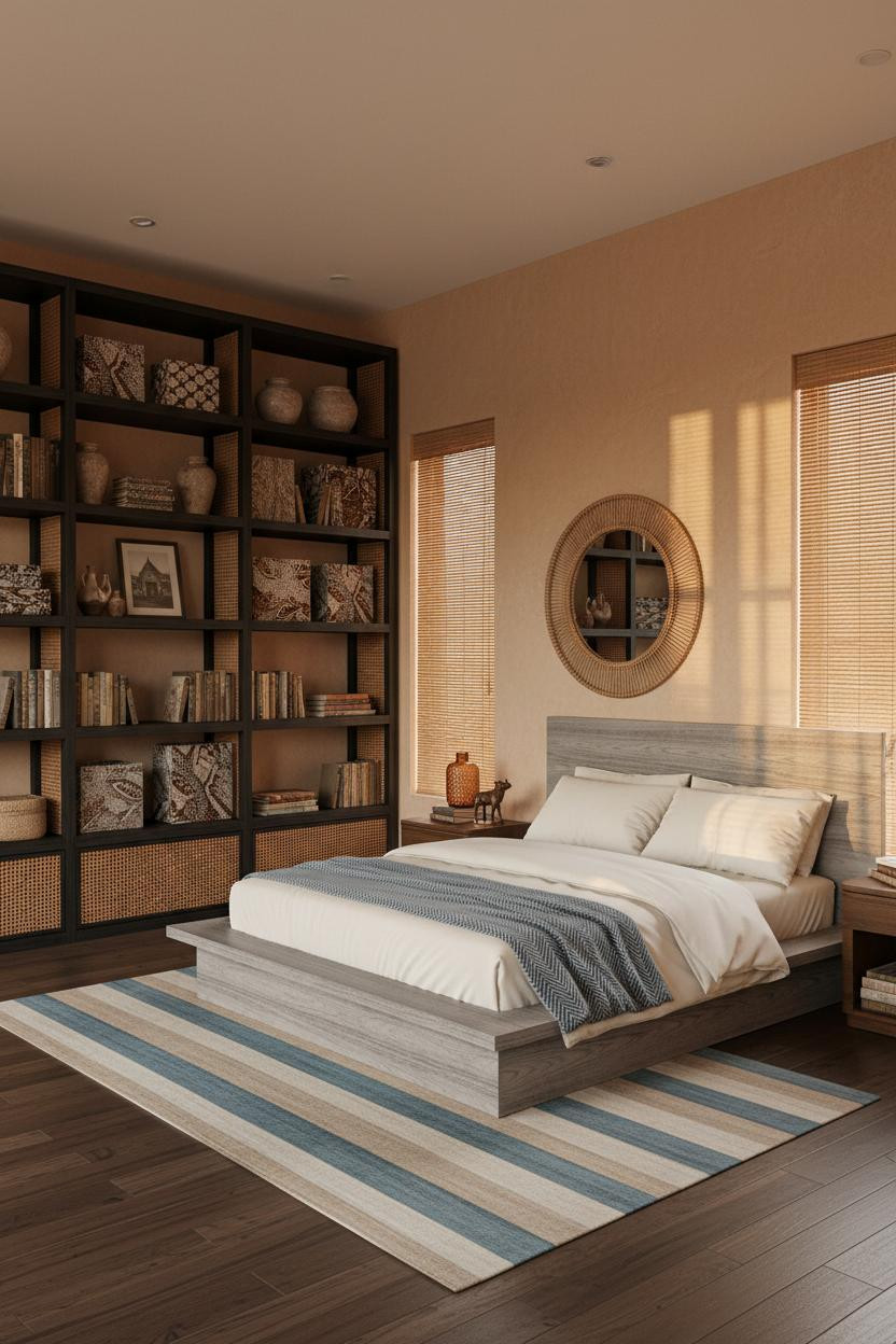

The room feels lived-in and intimate. Not styled.
What carries the look: A full-height built-in shelf wall in darkened rattan and lacquered ebony timber gives the room colonial-library weight while the clay plaster walls keep it from feeling too serious. Batik textiles folded on shelves do more than art.
And the oversized round rattan mirror above the nightstand grounds the right side without competing with the shelf wall. Proportions matter here more than anywhere else in the room.
I Never Expected An Arched Alcove To Feel This Serene
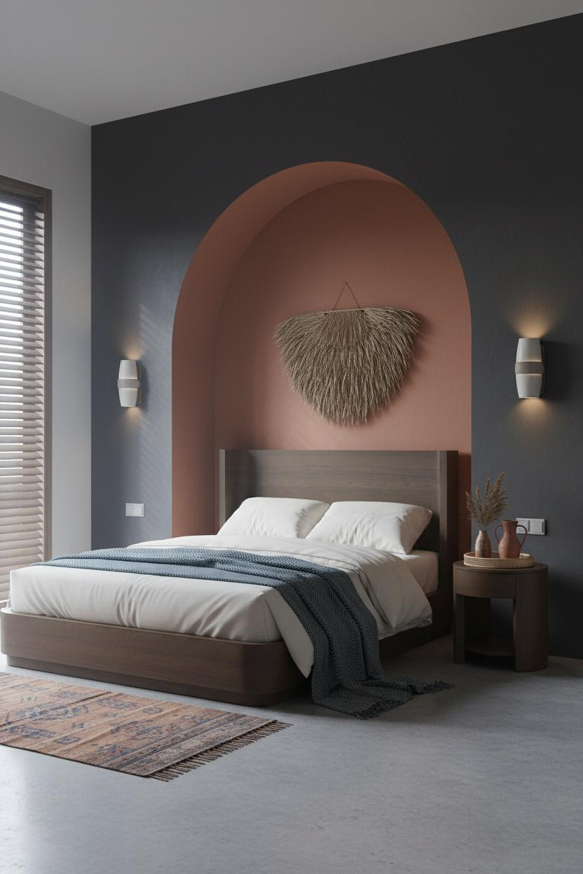
It shouldn't feel this calm. Deep charcoal walls, overcast light, a heavy arched form. But the terracotta-lined arched alcove niche carved directly into the plaster catches that warm interior glow and the crescent shadow it casts over the sleeping zone makes the whole room feel protected.
Best for a modern Chinese bedroom or Balinese-inspired space where the architecture itself is the statement. Just don't fill the alcove with accessories. The shadow is the feature.
A Teak Lattice Screen That Turns Late Light Into Decor
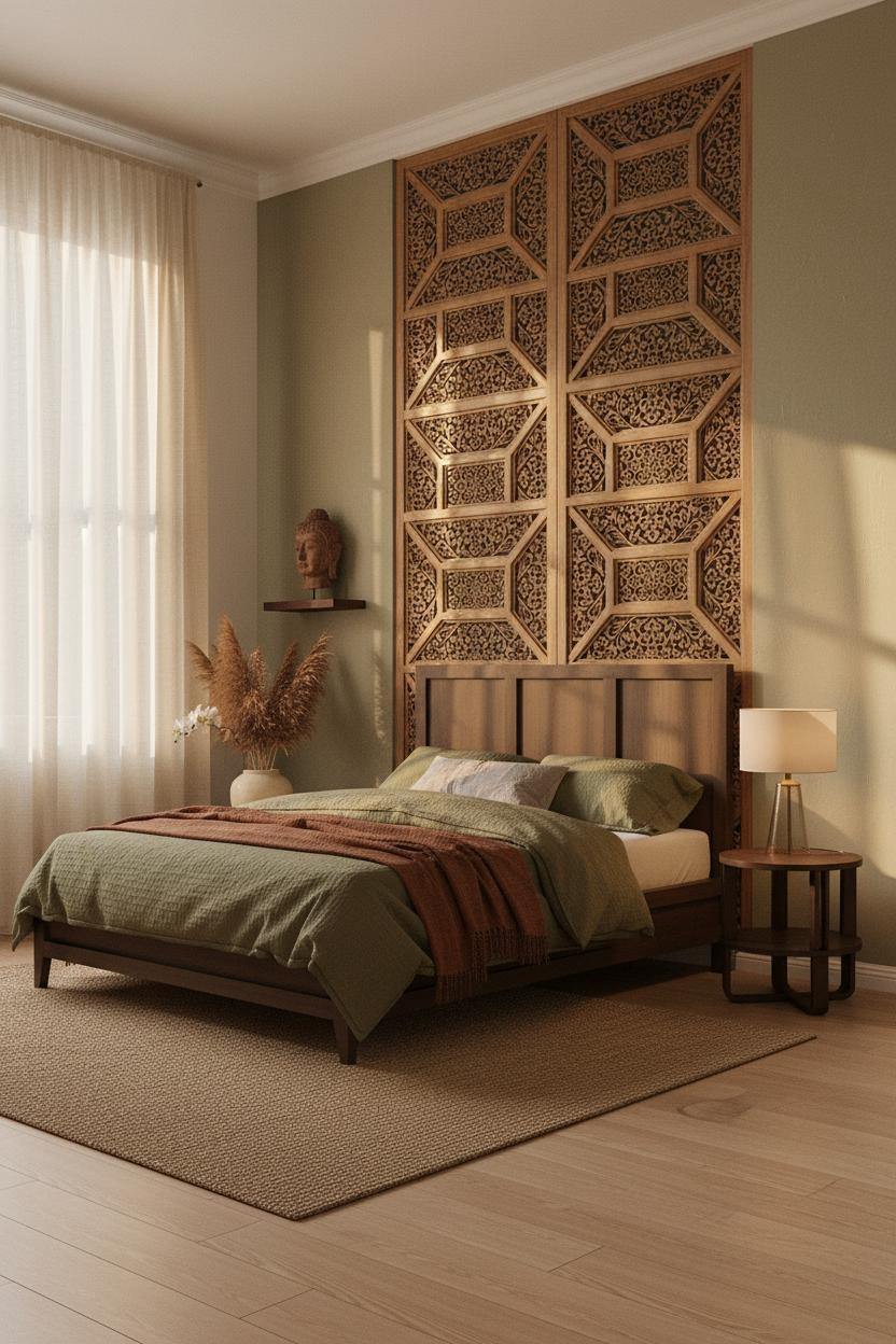
Late afternoon light through a carved teak geometric lattice screen throws an intricate grid of shadows across the sage green accent wall behind the bed. The surface changes as the sun moves. The wall earns its place all day.
Pro move: Let cream linen curtains pool slightly on honey-toned wide-plank flooring (a small move, real difference). The pooled fabric softens what would otherwise feel too precise. Just enough looseness to feel inhabitated rather than staged.
 Our #1 Pick
Saatva Classic Mattress
America's best-selling online luxury innerspring. 365-night trial, lifetime warranty, free white glove delivery.
Shop Saatva Classic
Our #1 Pick
Saatva Classic Mattress
America's best-selling online luxury innerspring. 365-night trial, lifetime warranty, free white glove delivery.
Shop Saatva Classic
The Foundation Of Every Beautiful Bedroom
Every room in this list is built from walls outward. But walls age well only if what's underneath them does too. And what's underneath you matters more than any panel or partition.
The Saatva Classic is where I'd start. Dual-coil support that holds structure over years, not just months. A cotton cover that breathes through humid nights. And a Euro pillow top that's soft in the way good hotel beds are soft: not squishy, just right.
Walls get repainted. Linen gets swapped. The mattress stays.

The rooms that actually stay with you are the ones where every layer was considered, including the one you can't see. Good design ages well because it's made well.


