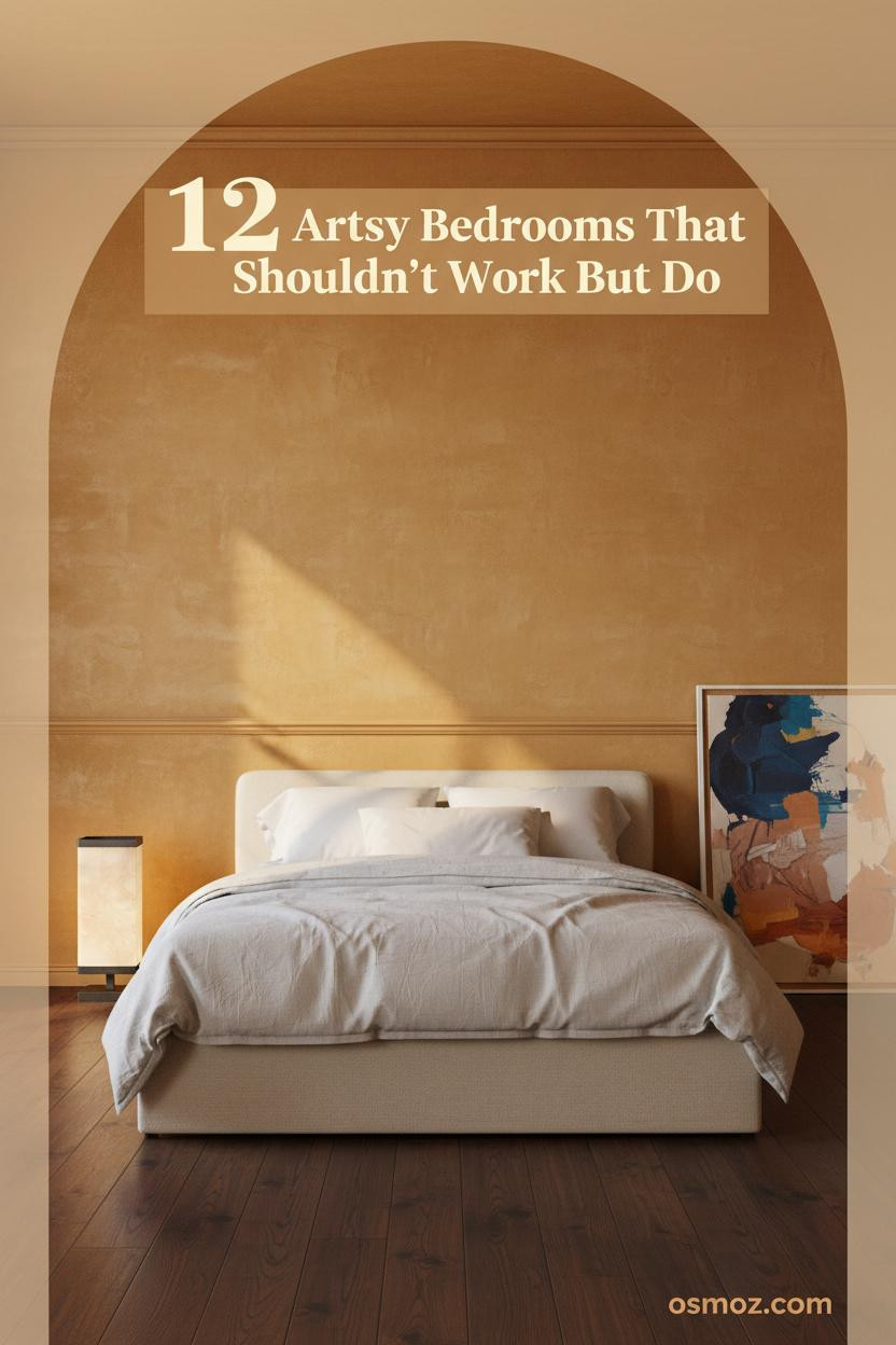
12+ Artsy Bedroom Ideas That Feel Collected Rather Than Decorated
23 march 2026The first thing you notice in the best artsy bedroom ideas is that nothing looks purchased all at once. Things accumulated. Things stayed.
That's the quality that separates a collected room from a decorated one. This list has 12 of them, all leaning into the vintage-bedroom-aesthetic that feels genuinely personal rather than styled for a photo.
Walnut Slatted Walls That Make Morning Light Do the Work
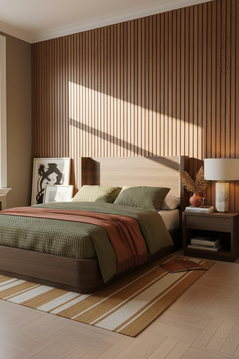
I keep coming back to this one. The vertical walnut slat paneling creates a rhythm that flat paint genuinely cannot replicate.
Why it lands: Each slat catches morning light at a slightly different angle, which means the wall is always doing something interesting without any art on it.
The finishing layer: A flat-weave ochre rug pulls the warmth out of the walnut grain. Skip anything too plush here. The texture contrast is the whole point.
Coffered Ceilings Are Having a Moment for Good Reason
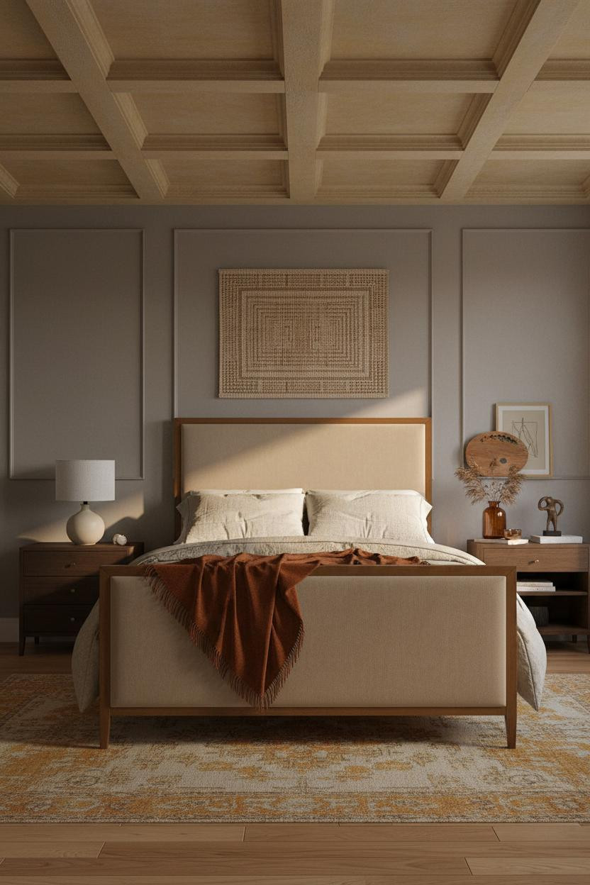

Honest confession: coffered ceilings sound expensive and fussy. But in a room this quiet, the aged plaster geometry does something no single piece of furniture can.
The deep square bays in warm plaster pull the eye upward first, then settle it back down onto the bed. The room feels twice as considered without any extra objects on the walls.
Where to start: Keep the walls muted stone-grey. A busy wall color competes with the ceiling geometry instead of letting it lead.
Board and Batten Done the Eclectic Way
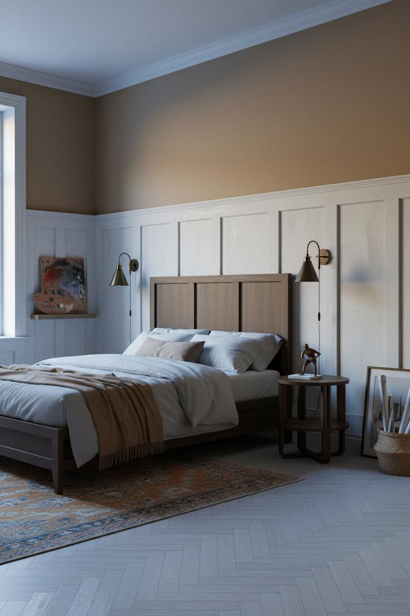
Most board-and-batten rooms play it safe. This one doesn't.
The chalky cream wainscoting reads worn in the best possible way, especially where the panel caps have gone soft with age. Pair it with camel walls above and the whole thing feels like a Paris apartment that nobody staged.
Don't ruin it with: Bright white paint. The slightly aged finish is the point. Fresh white makes the whole thing look like a renovation instead of a discovery.
Forest Green and a Shelf Full of Obsessions
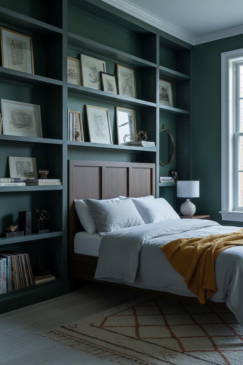
This is the kind of eclectic bedroom aesthetic that takes real commitment. But when it works, it really works.
What gives it presence: A full-width charcoal built-in spanning floor to near-ceiling turns personal obsessions (propped canvases, stacked vinyl, ink drawings) into deliberate design. The forest green walls make the whole thing feel like a private library rather than a bedroom with too much stuff.
The smarter choice: Match the shelving paint to the walls exactly. One continuous dark tone reads intentional. Two different darks reads unfinished.
The Vintage Library Shelf Nobody Buys New
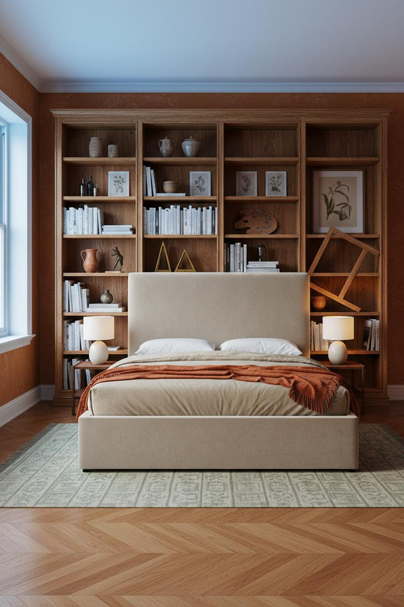
Nothing fancy. That's the point.
A weathered walnut library unit loaded with horizontally stacked art books, ceramic vessels, and a propped wooden palette creates a backdrop that no amount of decorator-sourced shelving can replicate. The patina is what makes it. And you can't buy patina at retail.
What to copy first: Rust-ochre walls with hand-applied plaster texture behind the shelving unit. The rough wall surface makes the vintage grain of the wood glow instead of flatten.
An Oak Bookcase That Pulls the Whole Room Into Focus
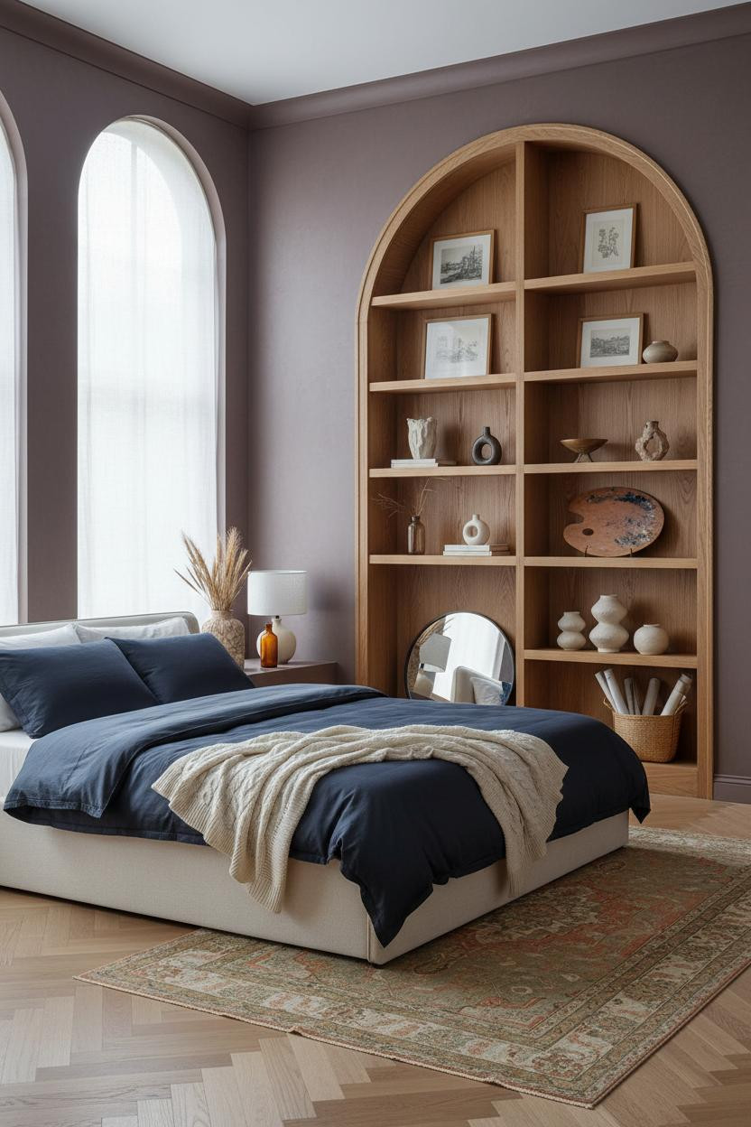

I almost scrolled past this. Glad I didn't.
The natural oak arched bookcase against warm charcoal-plum walls is a combination that shouldn't feel calm, but somehow it does. The arch softens the geometry just enough, and the visible grain keeps it from feeling too polished.
Pro move: Lean an oversized round mirror against the bookcase base instead of hanging it. The angle makes the room feel gathered rather than arranged.
When the Plaster Wall Is the Art
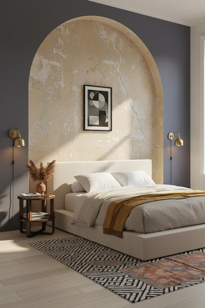
This one is divisive. But for people who lean into artsy bedroom ideas, it's exactly right.
Why it feels intentional: A nine-foot arched alcove in layered ochre plaster, with hairline cracks left intact, gives the wall more character than any canvas hanging on it could. The room feels like it has history because it actually does.
Avoid this mistake: Don't fill the alcove with floating shelves. The bare plaster surface needs room to breathe. One frame, slightly askew. That's all it needs.
Dusty Rose Walls and the Case for Floating Oak Shelves
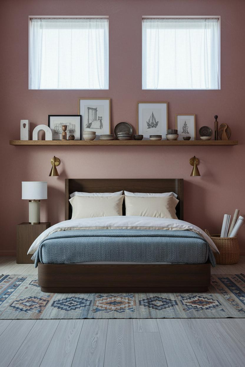
The combination of dusty rose plaster walls and natural oak floating shelves is softer than it sounds. And more interesting than most gallery walls I've seen.
What makes this one different: The shelves carry objects at varying heights (stacked ceramics, framed ink drawings, a geometric bookend pair), which means the eye moves rather than stops. It reads like a gallery installation rather than storage.
Mix things with different vertical heights on each shelf. No matching sets. The point is the accumulation.
Ochre Plaster and a Picture Rail Worth Keeping
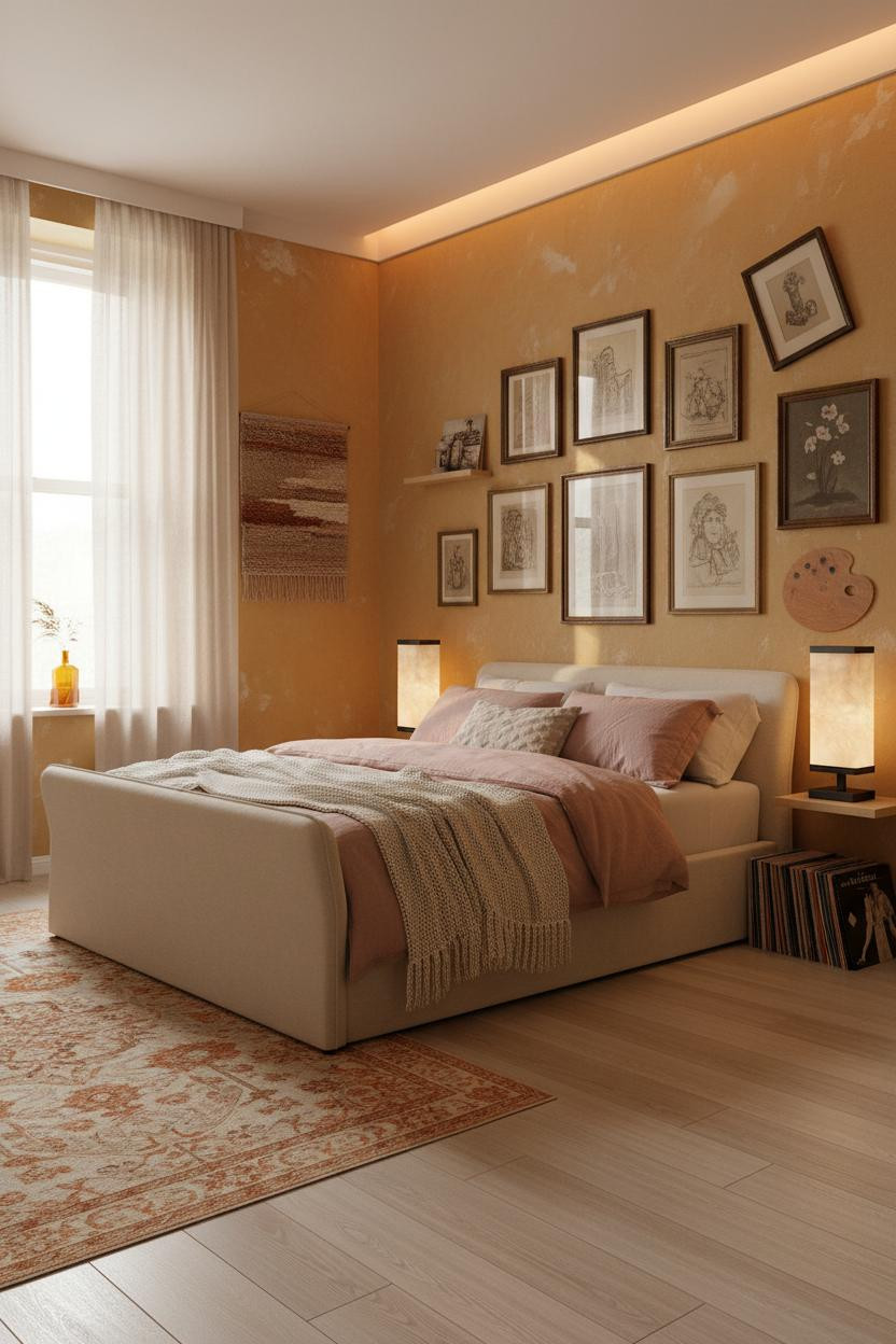
Most people remove picture rails during renovations. Big mistake.
A wide rail running eight feet across a mustard-ochre plaster wall gives you a place to hang art at staggered heights without putting a single hole in the wall. The room feels warm and lived-in, especially when the patina in the plaster catches raking light along the upper zone.
The easy win: Hang prints and ink drawings at genuinely different heights. Forget the rule about keeping bottom edges aligned. Uneven is what makes it feel personal.
Deep Teal Walls and Crown Molding That Earns Its Keep
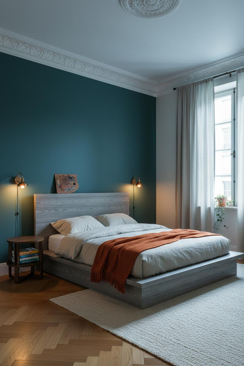
A ten-foot ceiling with original ornamental crown molding is the kind of architectural detail that changes what the whole room is capable of. Paint those walls a deep teal and suddenly the molding feels intentional instead of incidental.
What carries the look: The graduated shadow the cornice casts down the wall creates a natural zone between ceiling and color. It's a small architectural effect that makes the room feel formal and relaxed at the same time.
Where people go wrong: Painting the molding the same color as the wall. Keep it cream. The contrast is what lets the architecture read.
Sage Shiplap That Actually Feels Warm
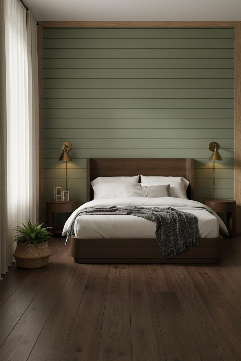
Admittedly, shiplap has been overused. But warm sage shiplap against dark walnut floors is a different conversation than the white farmhouse version everyone is tired of.
Why the palette works: The horizontal plank lines catch diffused light in a way that creates organic texture on a surface that's technically just paint on wood. The warmth comes from the color, while the grain keeps things from feeling too flat.
A floor-to-ceiling aged linen curtain panel to one side adds the vertical contrast the shiplap geometry needs. Just one. Not a pair.
Exposed Brick With a Gallery Wall That Doesn't Try Too Hard
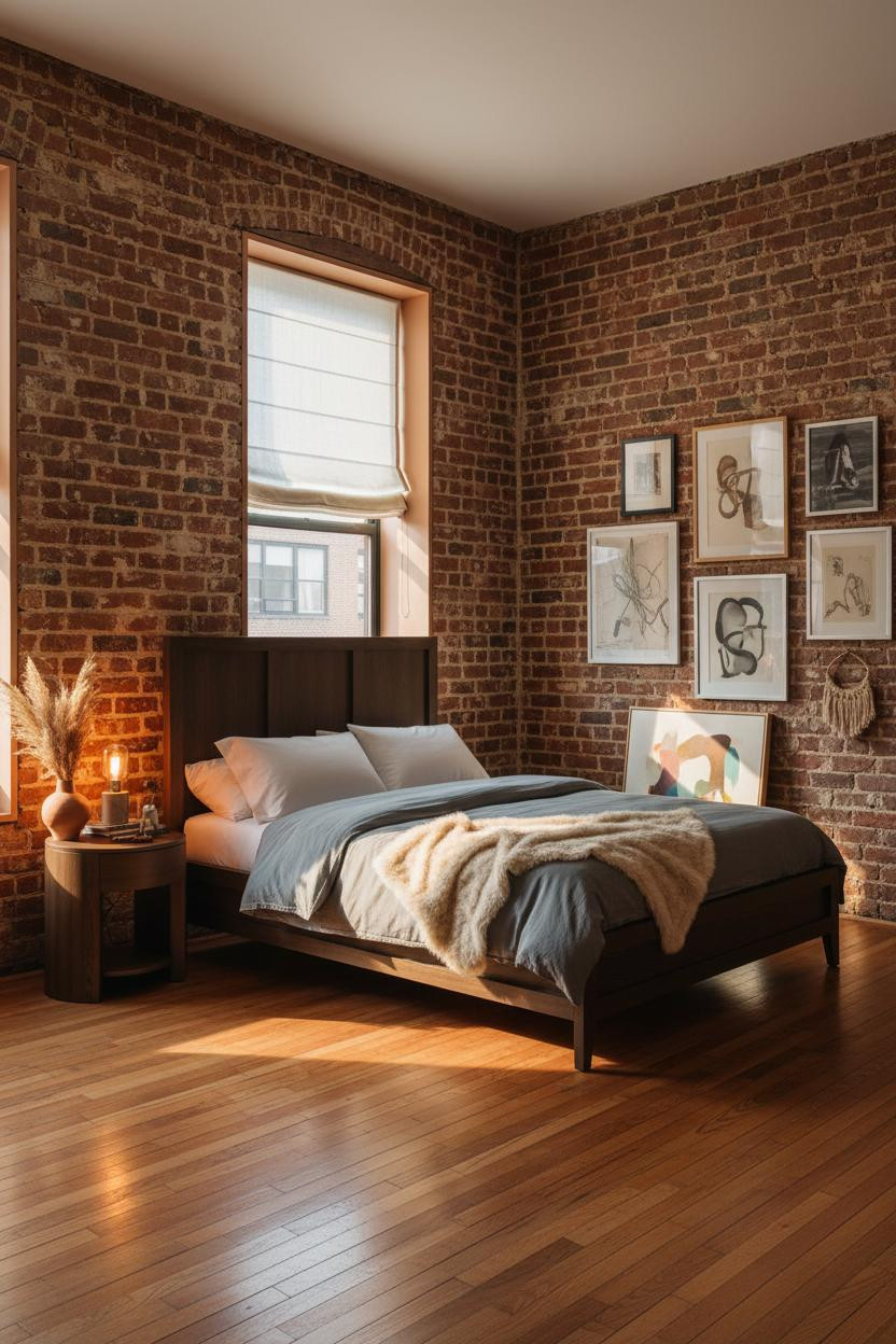
The original brick patina in rust and ochre means you genuinely don't need much else on the walls. And yet. A loose gallery arrangement against it reads differently than it would against plaster. The texture gives each frame its own shadow.
This is the kind of vintage bedroom aesthetic that only works when the brick is original. Faux panels won't carry it the same way. But if you have the real thing, let one canvas lean against the wall at an angle rather than hanging it. That single off-grid moment is what makes the whole arrangement feel unplanned in the best way.
 Our #1 Pick
Saatva Classic Mattress
America's best-selling online luxury innerspring. 365-night trial, lifetime warranty, free white glove delivery.
Shop Saatva Classic
Our #1 Pick
Saatva Classic Mattress
America's best-selling online luxury innerspring. 365-night trial, lifetime warranty, free white glove delivery.
Shop Saatva Classic
The Foundation Of Every Beautiful Bedroom
Walls get repainted. Linen gets swapped. The plaster cracks get filled and re-cracked again. But the mattress stays, and it shapes every morning in that collected room you've been building.
The Saatva Classic is the one I'd put under all of it. Dual-coil support that holds its shape without going stiff, an organic cotton cover that breathes through every season, and a Euro pillow top that's generous without losing structure. It feels like the good hotel kind. Not the business hotel kind.
And honestly, a beautiful room deserves a bed that's actually worth sleeping in.

The rooms people actually live in (not just save) are the ones where the details hold up on Tuesday morning, not just in the photograph. Start with the bed. The rest figures itself out.


