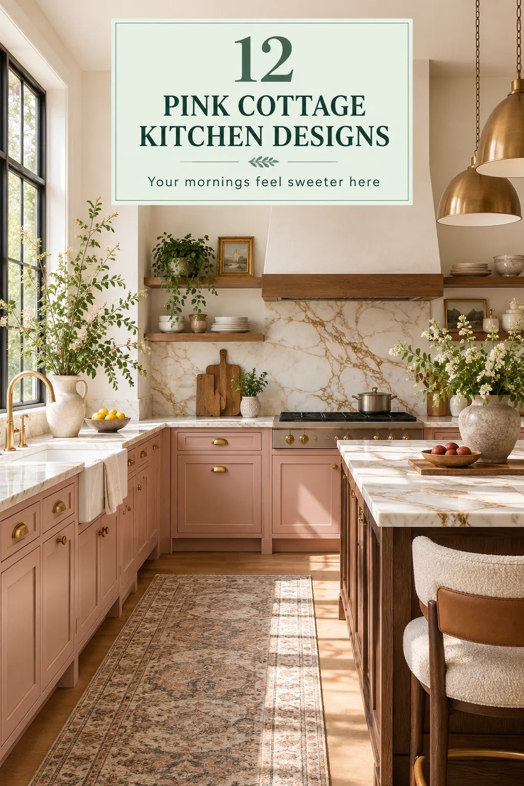
12 Pink Cottage Kitchen Ideas for Sweet, Romantic Charm Without Renovating
29 september 2026Pink cottage kitchen ideas can feel warm and collected with paint, fabric, and hardware, without turning the room into a sugary theme. I once painted every cabinet pink before testing the light, and the kitchen looked completely different by noon. Now I use pink in smaller, smarter doses. You can get the charm while keeping the kitchen practical.
- Paint the lower cabinets in a dusty rose
- Why the Two-Pink Rule works in a cottage kitchen
- Benjamin Moore White Dove keeps the uppers soft
- Swap shiny pulls for unlacquered brass
- Layer gingham, linen, and cotton at the window
- How the Three-Height Light Stack changes the room
- Frame the sink with a warm wood shelf
- Painted wood or plastic for the cottage table?
- Lay a runner that lets the pink breathe
- The plate rack versus another cabinet
- Add a blush backsplash with renter-friendly limits
- Style the counter with the One-Open-Surface Rule
1Paint the lower cabinets in a dusty rose
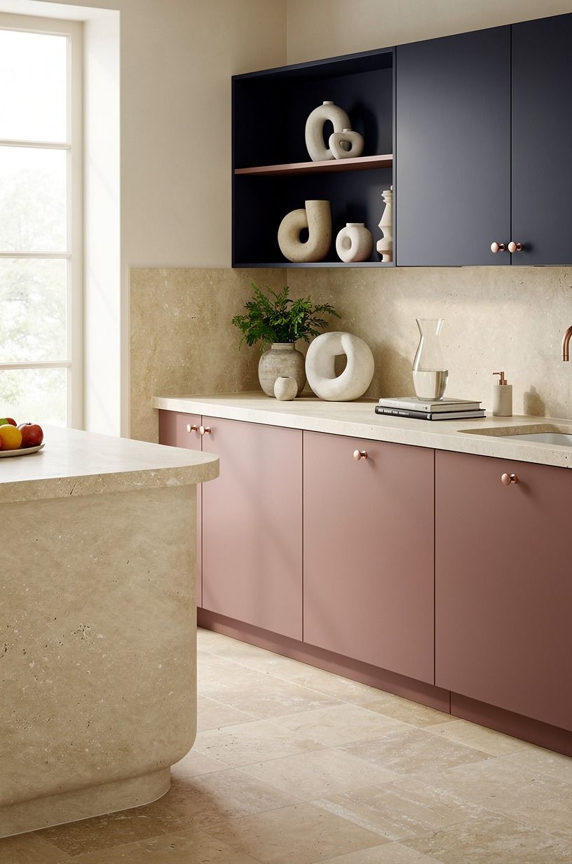
Start with the lower cabinets if you want your kitchen to feel romantic without making every surface compete. Dusty rose can sit beautifully against midnight blue, copper, ivory, and warm travertine, creating a palette with more depth than pink and white alone. I’d skip a blue-based bubblegum pink because it can make pale surfaces look gray and chilly.
Test your sample beside the sink, floor, and brightest window. A small painted board will tell you more than a color card.
Watch it in the morning, at lunchtime, and after sunset. Pink can look soft and powdery in one corner, then surprisingly vivid in another.
If you’re choosing an adjoining wall color, Benjamin Moore Hale Navy HC-154 can steady the palette with its deep blue undertone. The cabinet color can stay gentle because the surrounding shade gives it depth. You’ll want a durable satin finish that wipes clean, especially around the dishwasher and range.
A small lower run is enough to change the whole room. In a galley kitchen, paint only the island or the cabinet doors below the sink.
In a larger room, dusty rose lowers can anchor ivory walls, warm travertine, copper hardware, and an old wooden table. The result feels thoughtful, graceful, and lived-in.
If you’re unsure where to begin, compare this approach with the Two-Pink Rule. It can help you decide whether your room needs one strong surface or two related shades.
2Why the Two-Pink Rule works in a cottage kitchen
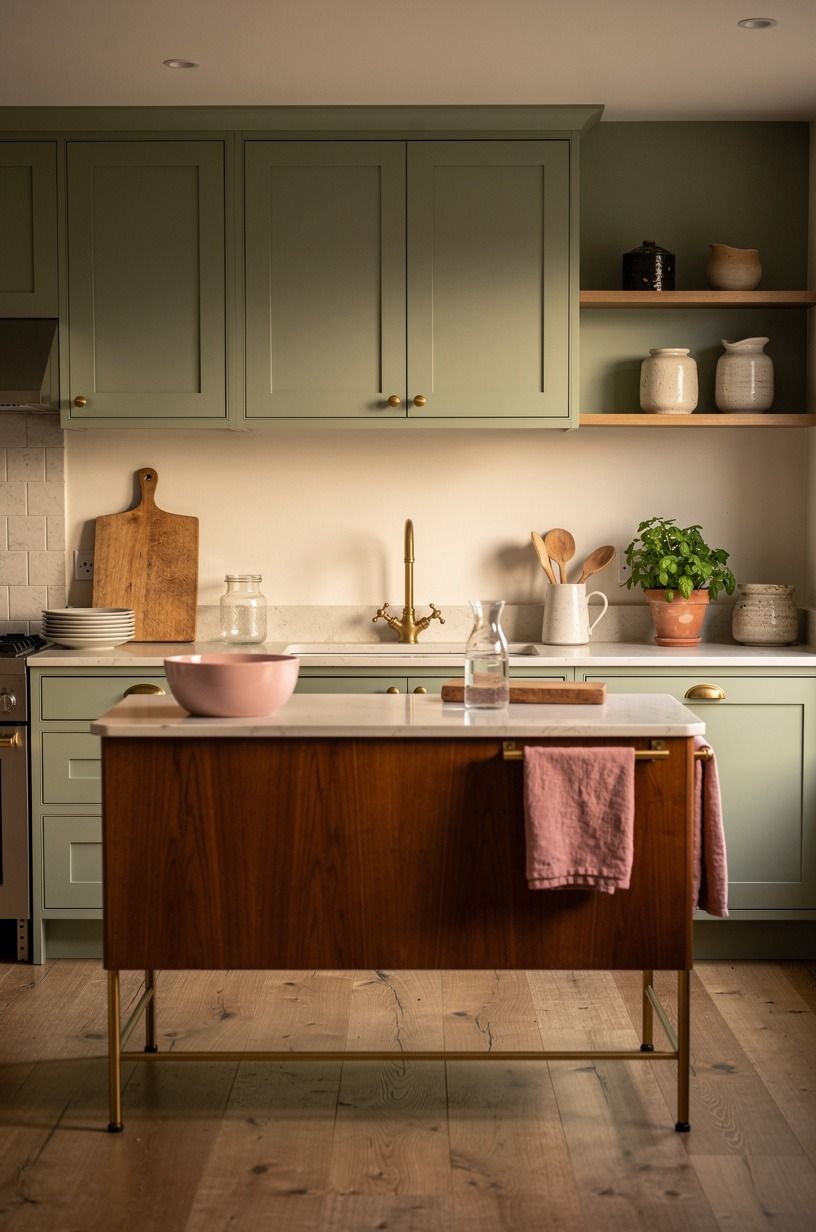
The Two-Pink Rule keeps your palette gentle. Choose one dusty pink for cabinets or a wall, then one lighter blush for fabric or accessories. That’s enough to create a layered color story without making the kitchen feel staged.
Try Benjamin Moore October Mist 1495 on a narrow wall if you want a soft sage wash. Then bring in a deeper rose through a checked curtain, painted stool, or small ceramic bowl. The two shades should feel related without matching perfectly.
Slight variation makes the room feel more collected.
Your eye needs a quiet place to rest, so keep the remaining colors soft and earthy. Warm cream, natural wood, and unlacquered brass developing a gentle patina will make the pink feel grounded. Sage green can add a fresh note, while cream keeps the overall effect bright and welcoming.
If you’re renting, a fabric panel can create the same color story without touching the walls. You could hang one behind an open shelf, use it as a café curtain, or stretch it over a lightweight board. It’ll add softness and color with very little commitment.
Try this rule when shopping: if the pink feels almost identical to the pink you already own, leave it behind. A warmer or cooler variation will add richness. The goal is a dreamy room with a little tension, rather than a collection of matching objects.
3Benjamin Moore White Dove keeps the uppers soft
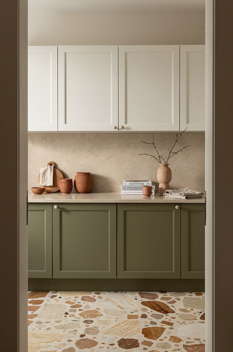
Pink looks more sophisticated when the upper cabinets don’t fight for attention. Benjamin Moore White Dove OC-17 is a reliable warm white because it has enough softness to sit comfortably beside terracotta, stone, and olive. It won’t make the room feel stark or overly modern.
You don’t have to repaint every upper cabinet. If the existing finish is already creamy, clean it thoroughly and change only the lower doors. If the uppers are a harsh bright white, repainting them can make the pink feel calmer and more intentional.
Use the same white on a narrow wall, trim, or ceiling when the kitchen is small. Repetition will make the room feel more expansive. You can then introduce contrast through oversized-chip terrazzo, dark pottery, and a single olive accent.
A white upper section also gives you freedom with the countertop. Pale laminate, honed stone, and warm wood can all work when the cabinet color stays quiet.
I’d keep the backsplash simple if the counters have strong movement. The kitchen already has a charming focal point.
If you’re worried that white will feel plain, add texture rather than another color. A woven shade, handmade bowl, linen towel, or lightly grained shelf will bring a tactile quality to the walls. The room can be restrained and still feel full of personality.
For a smaller kitchen, I’d pair this idea with the warm wood shelf. That combination gives you contrast without adding another major color.
4Swap shiny pulls for unlacquered brass
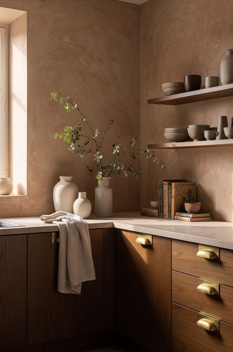
New hardware is one of the quickest ways to make pink cabinetry feel collected rather than freshly themed.
5Layer gingham, linen, and cotton at the window
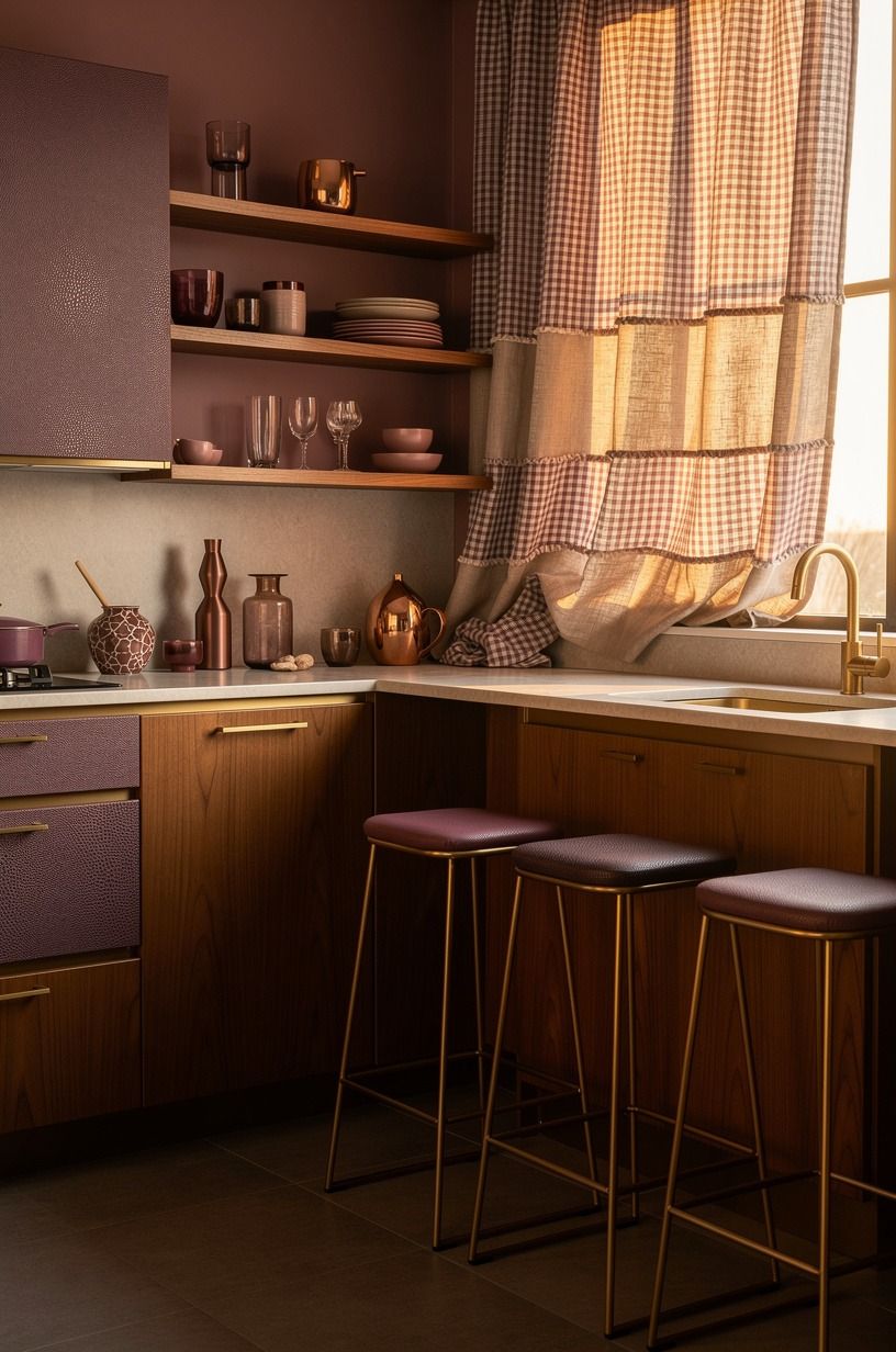
A pink kitchen needs fabric, but the fabric should have restraint. A plum gingham café curtain brings cottage character to a window without blocking all the light. Soft grey linen eases the harder surfaces around the sink, while a rose-gold detail keeps the palette warm without making it too sweet.
I’d skip a ruffled valance unless the rest of your kitchen is extremely plain. Too much trim can make the room feel like a costume. A simple gathered curtain, relaxed Roman shade, or narrow linen panel will look more current and still feel romantic.
Choose one patterned textile and let the others stay quiet. Gingham at the window, a muted grey towel on the oven rail, and a plain cotton runner can feel charming without becoming busy. Your eye will move from the pattern to the wood, then back to the pink.
You can also use fabric to correct the mood of the room. A plum textile will feel deeper and more nostalgic. A grey stripe will feel crisp and practical.
A small shagreen accent creates a richer, more tactile effect when the cabinetry has a stronger pink presence.
If you’re using a tension rod, you can change the curtain when the season shifts. That flexibility is useful in a rental or a small kitchen where every visual detail carries weight. The best textile choice should be beautiful enough to notice and simple enough to live with.
If your window treatment feels too delicate, connect it to the painted cottage table with a matching cushion or runner. The repetition will make both pieces feel considered.
6How the Three-Height Light Stack changes the room
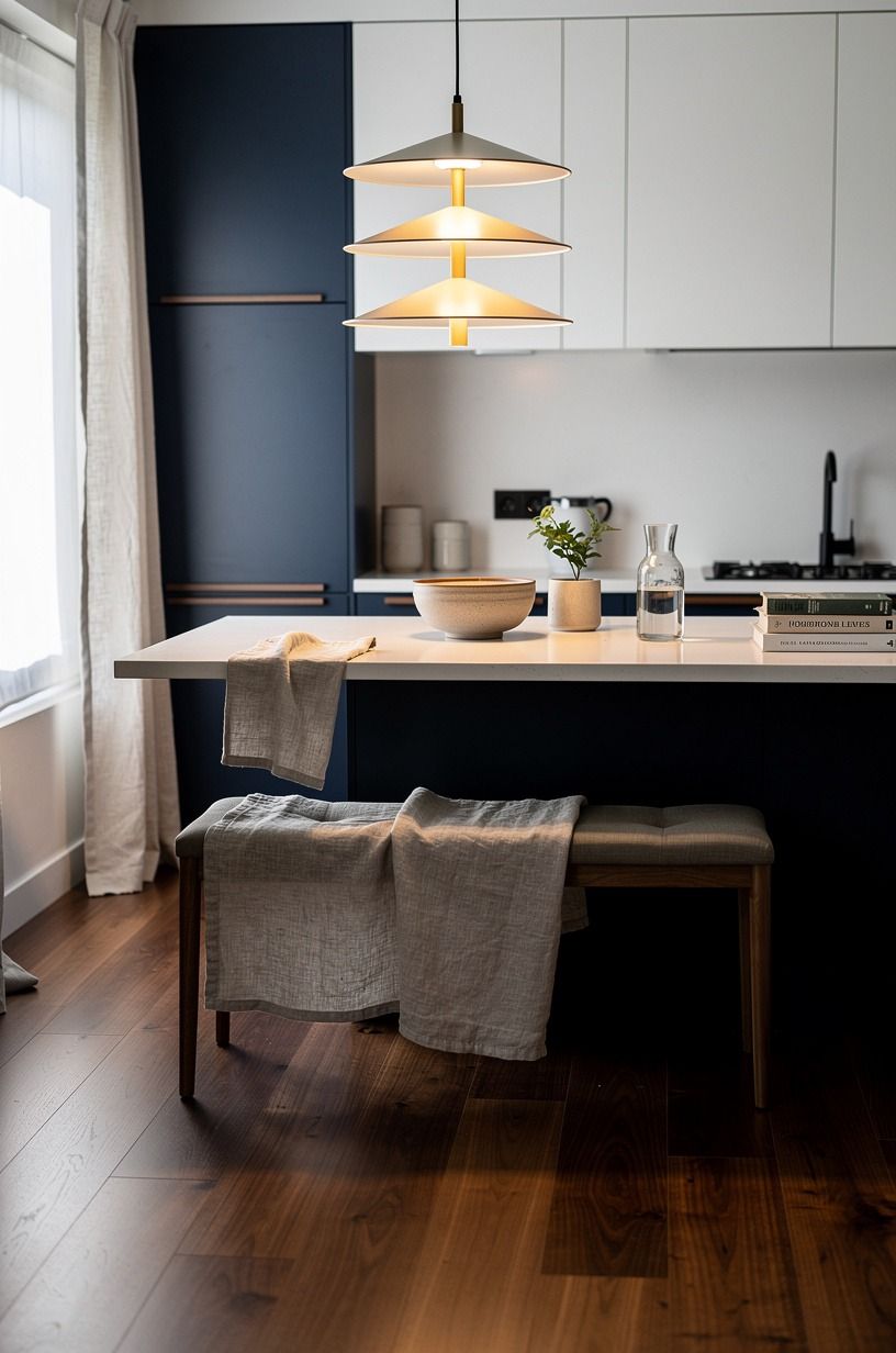
The Three-Height Light Stack gives a pink kitchen a warm glow after sunset. Use one light near eye level, one lower light on the counter, and the existing ceiling fixture more sparingly. This layered approach makes the room feel intimate rather than flat.
A small shaded lamp on a shelf can provide the middle height. Under-cabinet lighting handles the practical work. A pendant above the table or island creates the highest point.
You don’t need all three fixtures to be dramatic. Their different positions will do most of the work.
Choose bulbs around 2700K for a gentle, welcoming color. Pink can look harsh under very cool light, especially beside white cabinets. If you’re installing new fixtures, look for navy-painted metal, walnut, or washed Belgian linen shades that repeat the kitchen’s softer character.
A lamp beside the sink may sound impractical, but it can work on a dry stretch of counter away from splashing. Use a wipeable shade and keep cords secured. The glow will make early mornings and late cleanups feel less ordinary.
Light changes the personality of the pink. Daylight makes it fresh and cheerful.
Warm evening light makes it tender and softly dramatic. Test both before committing to a cabinet color or backsplash.
It’s one of the easiest ways to avoid an unpleasant surprise!
Before you shop, compare your lighting plan with the blush backsplash. Glossy tile and warm bulbs can amplify one another, so you’ll want to test the combination first.
7Frame the sink with a warm wood shelf
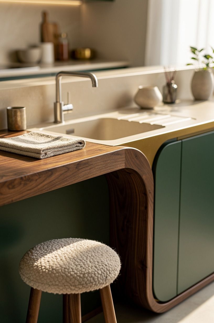
Open shelving can make a pink cottage kitchen feel airy, but only when you edit what sits on it. A warm wood shelf above the sink brings natural grain against painted cabinetry. Emerald green, gold, and cream accessories can give the arrangement more definition, while an organic bouclé cushion nearby adds softness.
I’d use one shelf, not three, unless your wall is wide and your storage is already excellent. A single plank feels generous and calm. Several crowded shelves can make a small kitchen look visually noisy and harder to clean.
Keep the display practical: cream stoneware, a glass jar of wooden spoons, and one small botanical print. Your shelf should look as if you use it every morning. That’s what gives the room its inviting quality.
Repeat the wood elsewhere if you can. A chopping board, stool seat, or table edge will make the shelf feel connected to the rest of the kitchen. Natural wood works especially well with dusty rose because it adds a mellow, organic counterpoint.
If you’re worried about dust, choose closed storage for flour, appliances, and rarely used serving pieces. A cottage kitchen can be charming without making you wipe every plate before breakfast. The best shelf holds what your hands already reach for.
Keep the shelf shallow enough to preserve elbow room around the sink. Rounded brackets can add a traditional note, while hidden supports create a cleaner look. Either way, the shelf should feel sturdy, useful, and easy to live with.
8Painted wood or plastic for the cottage table?
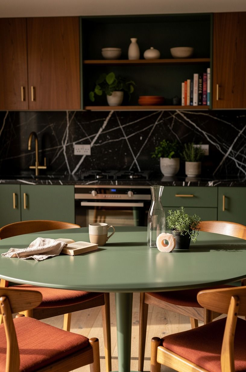
If your kitchen has room for a table, bring in a painted piece with visible character. A forest-green or rust-colored base with natural oak can give the room a grounded center. A Nero Marquina black marble top with white veins adds contrast without making the pink feel overly polished.
Plastic furniture may be easy to clean, but it often feels visually thin beside painted cabinetry and natural textiles. Painted wood has more presence, especially when the edge wear and brush texture remain visible.
You don’t need a valuable antique. A sturdy second-hand table can become the room’s most memorable feature.
Look for a shape that leaves room to move. A round table softens a tight corner and makes conversation easier.
A narrow rectangular table works well in a galley kitchen. If you’re adding chairs, mix finishes carefully. Two painted chairs and one woven seat can feel more relaxed than a matching set.
A small table also gives you somewhere to repeat the palette. Add a linen cushion, a low ceramic bowl, or a single vase of seasonal branches.
Keep the surface useful enough for breakfast and homework. The room should still feel ready for real life.
If the existing table is dark, try a pale runner before repainting it. The contrast may be exactly what the kitchen needs. If it’s too orange, a forest-green or rust-painted base with a natural oak detail can create a fresh, balanced combination.
9Lay a runner that lets the pink breathe
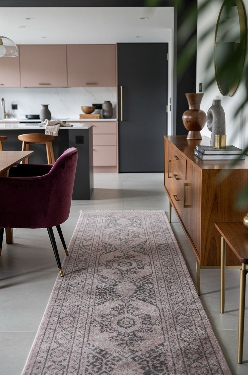
A runner can connect cabinets, floor, and textiles, but the wrong one will make a kitchen look smaller.
Try dusty rose with charcoal and small brass notes if the cabinetry is pale. A deep-pile mohair velvet runner brings softness and depth, while the darker accents stop the pink from feeling sugary. Keep the pattern restrained so the floor supports the room instead of competing with the cabinets.
10The plate rack versus another cabinet
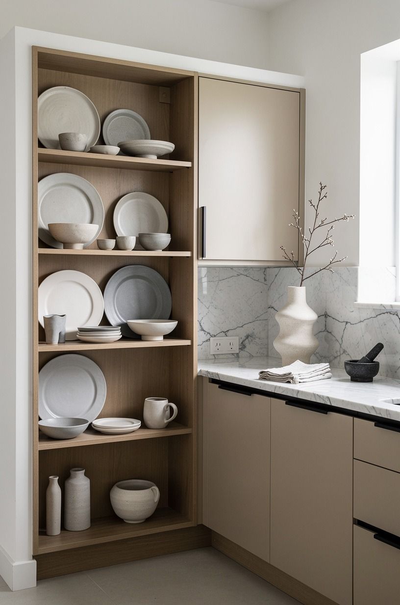
A plate rack gives you storage and personality at the same time. It’s especially useful when you want the cottage feeling of open display without adding a large run of shelves. A narrow rack above a Carrara marble counter can hold everyday plates, shallow bowls, and a few favorite pieces.
Choose a rack with enough spacing for the dishes you own. If the slots are too narrow, you’ll end up balancing plates awkwardly or leaving the rack empty. A painted pine plate rack can blend with warm white cabinetry, while camel or black accents will create a more dramatic focal point.
Another cabinet may give you more concealed storage, but it can make a small kitchen feel heavier. Use the plate rack when you already have a reasonable place for appliances, food, and cleaning supplies. Open storage works best when the practical storage problem has already been solved.
Keep the display limited to two or three tones. Warm white, camel, and black will look serene with Carrara marble and its subtle gray veining. Bright multicolor dishes may be lovely individually, but a full rack of them could pull attention away from the cabinetry.
Mount it securely and leave room for the door swing beneath it. The rack should make breakfast easier, not turn the wall into a delicate obstacle course. A useful piece can still be wonderfully decorative!
If you need more concealed storage, compare the rack with the open-surface rule. The two ideas work best when the display stays edited.
11Add a blush backsplash with renter-friendly limits
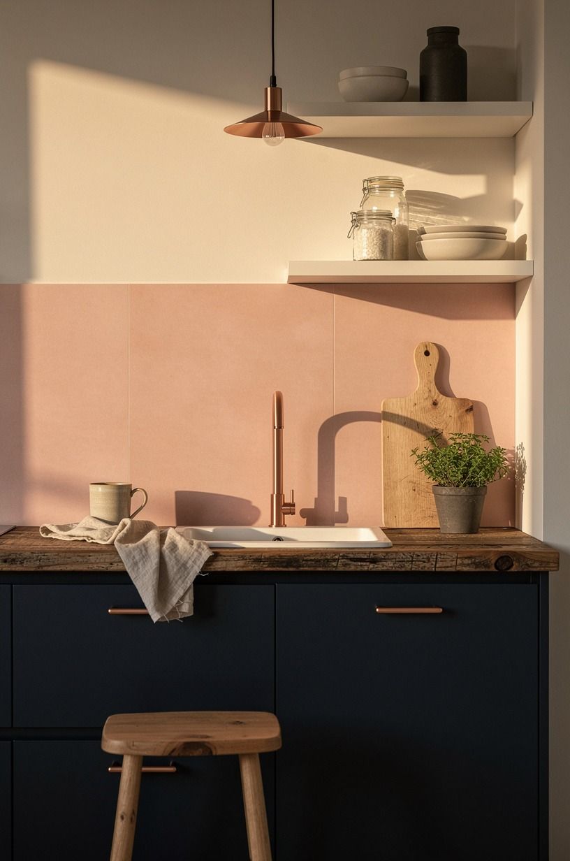
A backsplash is where pink can become bold, so use it with a clear boundary. A midnight-blue backsplash with copper and ivory nearby creates a richer alternative to an all-blush wall. Reclaimed weathered teak can bring warmth to the surrounding shelves or counter area, while keeping the color story connected to the rest of the kitchen.
If you’re using a removable panel, test the adhesive in a hidden spot first. Measure carefully around outlets, corners, and the faucet. A temporary solution should still look intentional, with clean edges and a finish that relates to the cabinetry.
Your backsplash gap is commonly around 18 inches between the counter and upper cabinets, so that narrow zone can carry a strong color without swallowing the room. Keep the counter quiet beside it, perhaps with a reclaimed weathered teak ledge or a simple matte laminate surface.
Don’t pair a busy backsplash with busy curtains. One expressive surface is enough to make the kitchen feel enchanting.
If the tile has a glossy finish, choose matte pottery and linen nearby. If the tile is matte, a small glazed bowl can add a lively glint.
For a lower-cost approach, use a painted beadboard panel behind the sink or range, provided the material is properly protected from heat and moisture. A deep midnight-blue paint can create the same visual feeling with fewer permanent decisions.
You can keep this idea especially calm by pairing it with Benjamin Moore White Dove above the counter. The white gives the darker backsplash room to glow without making the whole kitchen feel heavy.
12Style the counter with the One-Open-Surface Rule
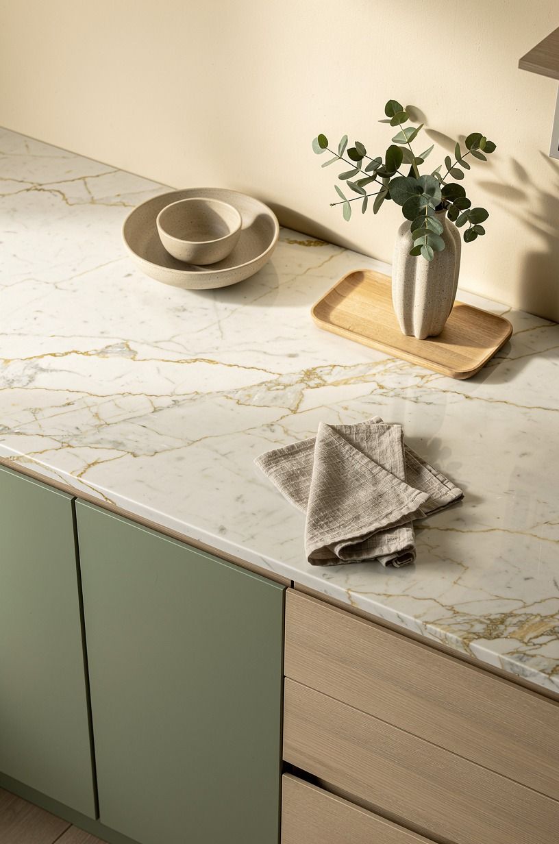
The One-Open-Surface Rule is my favorite way to make a cottage kitchen feel relaxed. Choose one counter zone for display and let the rest work. A Calacatta marble counter with gold veining can hold a cream ceramic crock, natural wooden cutting board, and small sage-green pitcher, while the space beside the stove stays clear for cooking.
This rule keeps the room from drifting into clutter. You can group three useful objects near the sink, then leave a generous stretch of counter empty. That empty space will make the decorative grouping feel more intentional and make daily work easier.
You can also use the rule to plan your budget. A cosmetic refresh costs far less than a remodel, but your priorities matter. Here are typical US ranges for paint, hardware, surface changes, and a full kitchen project:
Your best first move is usually the one that changes the largest visible surface. If the cabinets are sound, don’t replace them simply because a remodel chart makes replacement seem inevitable. Paint, fabric, and light can create a surprisingly generous transformation.
Before buying accessories, clear every counter and live with the room for a day. You’ll notice which areas genuinely need help.
Then return only the pieces that are useful, beautiful, or both. A cottage kitchen feels most romantic when it still has room for lunch.
What I’d Keep and What I’d Skip in a Pink Kitchen
I’ve gone back and forth on pink kitchens because the color can be tender, cheerful, and a little too sweet within the same ten minutes. The solution is to give the pink something honest beside it. Wood grain, aged metal, linen, and imperfect pottery keep the palette from floating into a showroom version of romance.
I’d keep pink on one major surface and repeat it in two smaller places. That might mean lower cabinets, a café curtain, and a small pitcher. It might mean one painted wall, a runner, and a cushion.
You don’t need a pink toaster, pink canisters, pink art, and pink flowers all at once. Your kitchen should still look like a place where lunch gets made.
The colors around pink matter more than the pink itself. Farrow & Ball Studio Green No. 93 can create a deep, moody contrast in a pantry or adjoining room, while Benjamin Moore White Dove OC-17 keeps the main kitchen light.
I’d avoid carrying both strong green and strong pink across every cabinet because the contrast can become theatrical. Let one shade lead while the other appears as a small interruption.
Material choice matters, too. Smooth laminate beside a soft linen curtain feels balanced. Shiny chrome beside a glossy pink cabinet can feel cold.
Aged bronze, cerused oak, and 18-ounce cotton velvet on a seat cushion create variation your hand and eye can read. That’s where romantic charm comes from.
If you’re working with a small kitchen, you’ve got an advantage. A narrow room can handle one memorable color more easily than a huge open plan because the palette has fewer places to scatter. Keep island clearance around 42 to 48 inches if you have an island, and don’t sacrifice movement for a prettier arrangement.
A kitchen that works will always feel more inviting than one that looks polished but makes you bump into every chair. Leave enough space to open the oven, unload groceries, and turn around comfortably. Practicality has its own quiet beauty.
What People Always Want to Know
What is the best pink cottage kitchen approach for a small kitchen?
I’d paint the lower cabinets dusty rose and keep the uppers Benjamin Moore White Dove OC-17. That gives a small kitchen color below eye level and light above it. An IKEA KALLAX birch-effect unit can add open storage without the visual weight of a full cabinet wall.
Where can I find pink cottage kitchen pieces on a budget?
I’d look at IKEA, Wayfair, and Target for curtains, stools, lighting, and simple hardware. I’d also check Facebook Marketplace or a local thrift shop for painted tables and wooden shelves. Your best value may be one older piece with good grain rather than a full matching set.
How much does a pink cottage kitchen makeover cost?
I’d expect a cosmetic refresh to run $300 to $1,500 in the US for paint, hardware, and a removable backsplash. You can spend nothing by rearranging dishes, washing textiles, and styling what you own. The cost rises when you repaint fronts, change lighting, or replace counters.
Can I create this look on a budget?
Yes. I’d start with three low-cost changes: paint one cabinet section, switch the curtain, and regroup the counter items. A thrifted wooden stool, second-hand brass rail, and small cotton runner can add warmth without requiring a full renovation.
Is pink a good choice for a small kitchen?
I think it is, because a small kitchen gives one color more impact. I’d use pink below the counter line, keep the upper walls light, and choose a narrow runner instead of a wide rug. The room will feel more intentional without losing the clear floor area you need.
Can I create a pink cottage kitchen in a rental?
I’d try a tension-rod café curtain, removable backsplash panels, peel-and-stick wallpaper on one temporary board, and freestanding furniture. You can also change cabinet pulls if you store the original hardware safely. A landlord won’t need to approve a color story that never touches the walls.
Where I’d Start First
If I had to pick one, I’d start with the lower cabinets. Pink below the counter line gives your kitchen personality without making every surface compete. Paint there first, live with it for a week, then add fabric and warmer light.
The room will tell you what it still needs.


