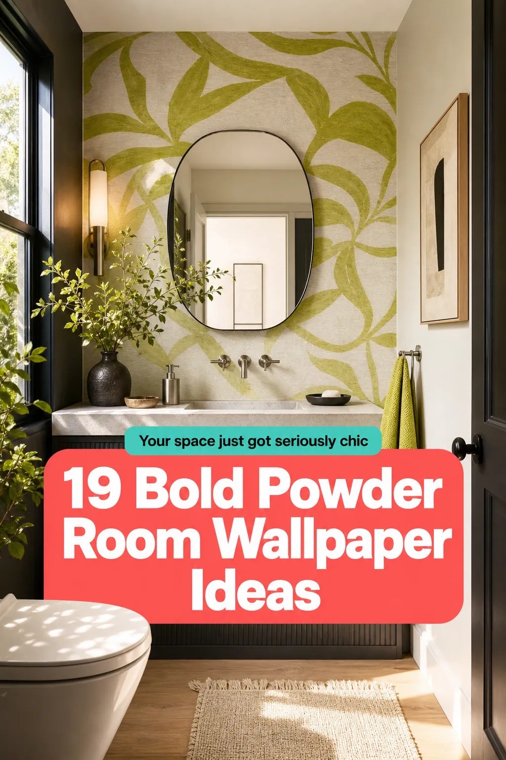
How to Turn a Tiny Powder Room Into a Bold Wallpaper Showstopper - 19 Ideas
24 july 2026The short answer: a tiny powder room becomes a showstopper when you treat it like a jewel box, wrap the pattern with intent, and keep the fixtures quiet. I've seen more guests remember a 24 square foot powder bath than a whole kitchen. Wild, but useful! You don't need a bigger room. You need a braver plan.
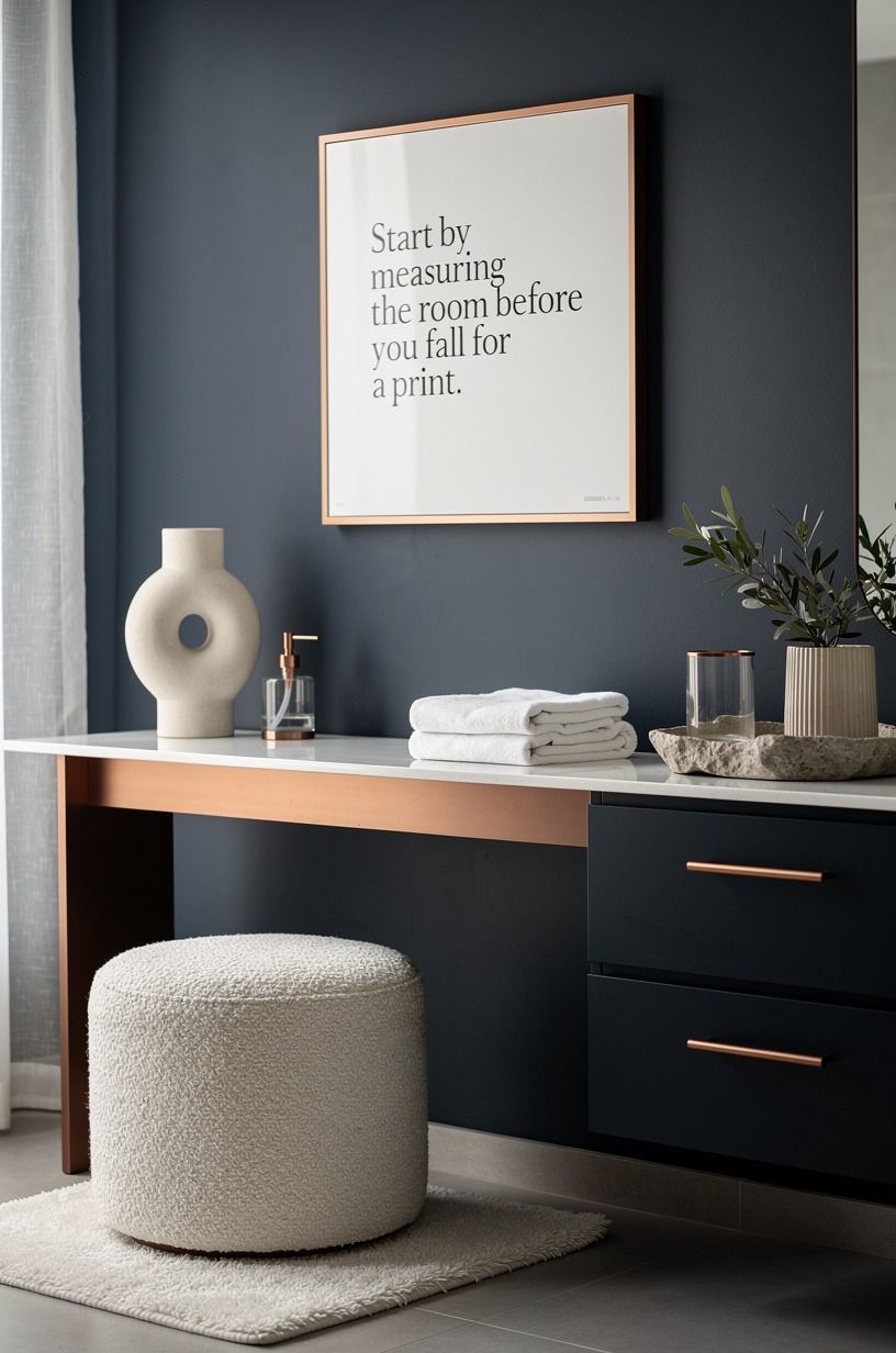
- Start by measuring the room before you fall for a print
- Use the Jewel Box Rule to pick mood before motif
- Order samples and tape them beside the real light
- Set a realistic budget with the Four-Wall Wrap
- Check walls, moisture, and vents before paper goes up
- Should the ceiling get paper too?
- Choose scale with the 18-Inch Breathing Margin
- Match undertones to tile, counters, and metal before color
- Choose grout-line scale over tiny repeats in busy baths
- Plan seams around the vanity with the Vanity Shadow Gap
- Pick paste the wall or peel and stick based on your patience
- Wrap corners like a tailor, not a gift wrapper
- Light it like evening with the Three-Height Glow Stack
- Keep fixtures quiet so the wallpaper can speak
- Add one tactile material that grounds the pattern
- Style the vanity with the One-Breath Rule
- Make a rental version that still feels committed
- Avoid the five mistakes that make bold paper feel cheap
- Finish with a reveal ritual and a maintenance plan
1Start by measuring the room before you fall for a print
Measure every wall before you order anything, because powder rooms look simple and then punish sloppy math. Write down width, height, door swing, vanity depth, and the distance from sink to side wall.
If your toilet clearance is near the common minimum of 21 inches in front, pattern scale matters even more. A huge repeat can feel exciting on a sample board and chaotic when your knees are close to the wall.
I always sketch the room as four flat rectangles, then mark where your eye lands first from the doorway. That first view should get the strongest motif.
You'll want warm copper or polished nickel noted too, since wallpaper color shifts next to metal. Don't buy rolls yet. You're building a map, not shopping.
Typical cost by tier (US averages):
2Use the Jewel Box Rule to pick mood before motif
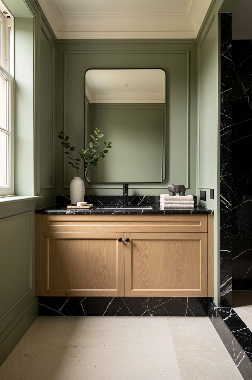
The Jewel Box Rule is simple: in a powder room, choose one dominant feeling first, then let pattern serve it. Do you want moody, fresh, playful, or tailored?
If you skip this, you'll pin fifty looks and none will agree. A dark floral can feel rich, while the same floral in cream can feel sweet and flat.
Pick your mood in one sentence before you compare prints. "Warm and slightly dramatic" is easier to shop than "something bold." I've talked clients out of safe beige grasscloth by asking how they want guests to feel when they close the door.
Quiet room outside, little theater inside. That's the fun of a powder bath!
3Order samples and tape them beside the real light
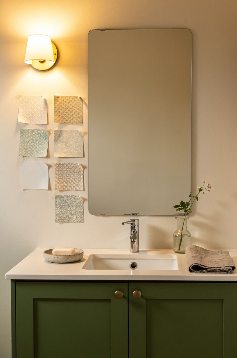
Order at least three samples, and tape them where they'll live, not on a sunny kitchen counter. Powder rooms often have weak natural light, so a print that looks crisp online can turn muddy at night.
Check morning, afternoon, and evening. You'll catch undertones fast.
Put each sample behind the vanity faucet and beside the mirror edge, because chrome, brass, and black change what your eye reads. A Farrow & Ball Red Earth adjacent trim can make a clay toned wallpaper feel richer, while cool white trim can pull it gray.
If the room has no window, judge under the exact bulbs you'll keep. But don't rush this step.
Twenty four hours of looking saves a return.
4Set a realistic budget with the Four-Wall Wrap
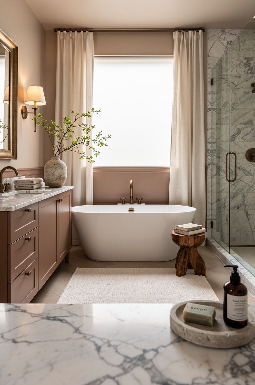
The Four-Wall Wrap means pricing the whole envelope before you fall for a $180 roll.
5Check walls, moisture, and vents before paper goes up
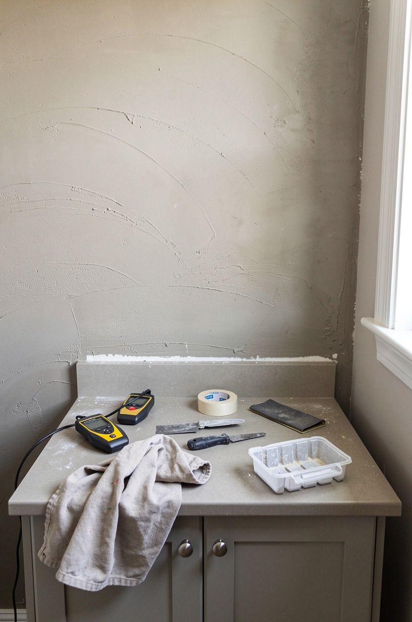
Wallpaper hates bad prep, especially in a bathroom where hands get washed sixty times a day. Look for peeling paint, shiny old enamel, hairline cracks, and mildew near the baseboard.
If your exhaust fan is weak or missing, fix that before any pattern touches the wall. You'll save yourself the heartbreak of seams lifting.
Powder rooms usually have less steam than full baths, but they still need honest airflow. If the room shares plumbing with a shower next door, assume more humidity than you think.
A stain blocking primer is boring and worth it. I'd rather spend one extra day on prep than watch a gorgeous roll bubble behind the sink.
It's not glamorous. It works.
6Should the ceiling get paper too?
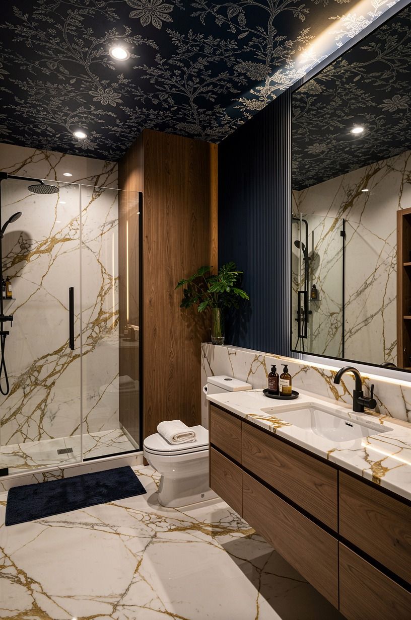
Yes, sometimes, and it's the move that makes a tiny room feel finished instead of busy.
7Choose scale with the 18-Inch Breathing Margin
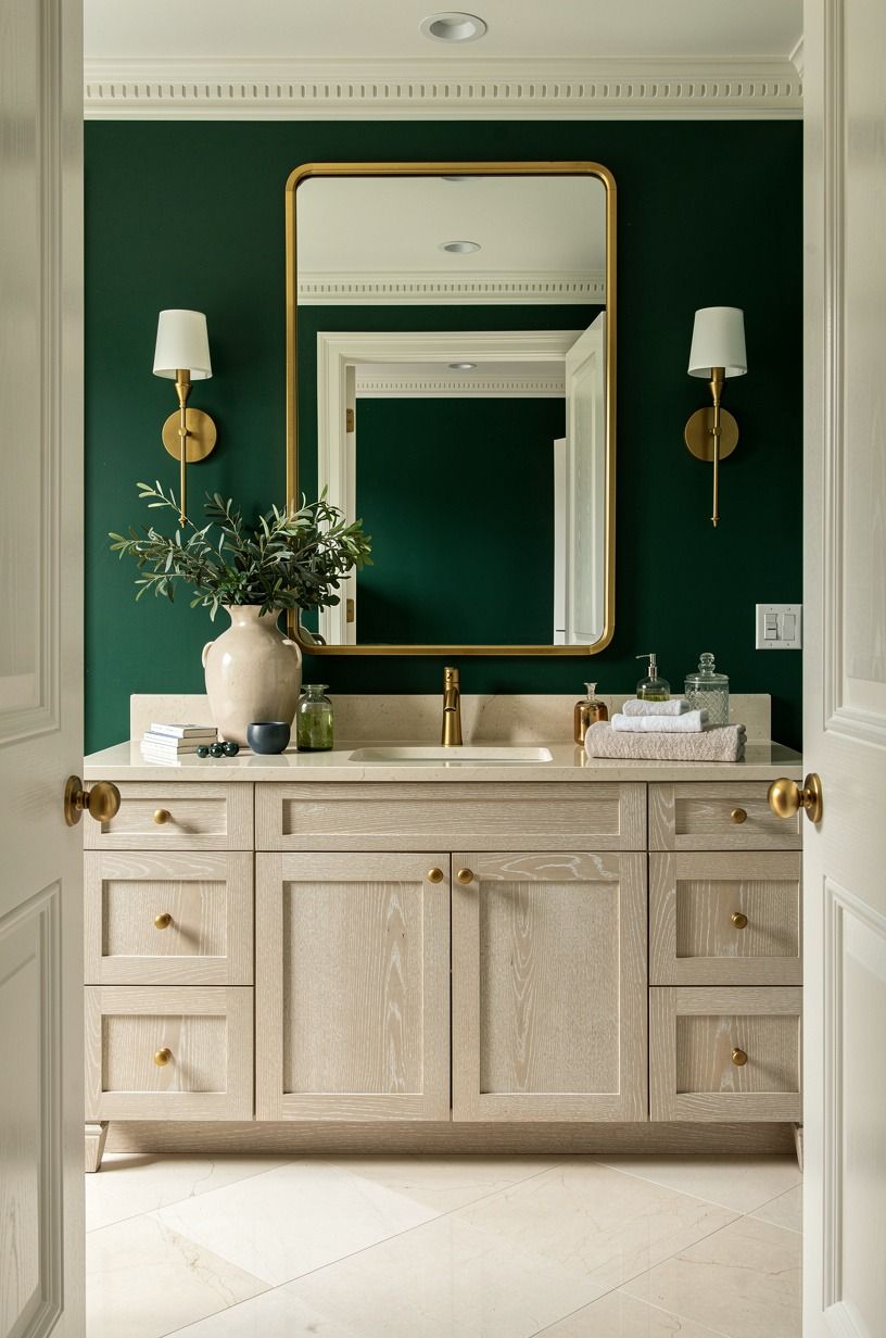
The 18-Inch Breathing Margin is my rule for repeats in small rooms: if a motif needs more than about 18 inches to make sense, you need enough uninterrupted wall to show it. Behind a vanity, toilet, mirror, and sconces, big blooms get chopped into confetti. That can still work, but you have to place the best section where the door opens.
Stand in the doorway and imagine one framed rectangle of wall. That's your hero zone.
Put the repeat's strongest flower, bird, or geometric burst there, even if it means wasting paper elsewhere. A cerused white oak sample near the sink can help you compare pale grain against matte paper.
If every wall is interrupted, choose a smaller repeat with rhythm. Your eye will read intention, not clutter.
8Match undertones to tile, counters, and metal before color
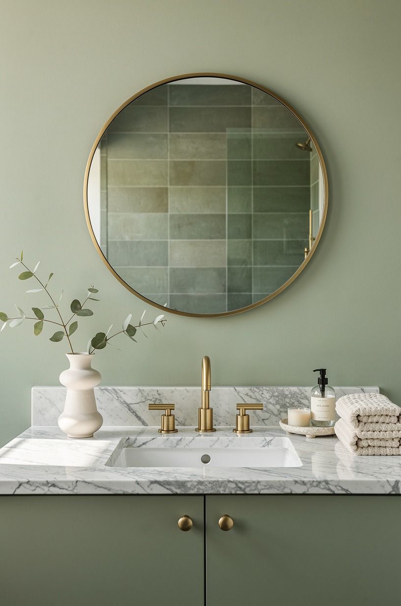
Bold wallpaper fails less from bravery than from undertone fights. A black floral with blue black petals will argue with warm beige tile, while a brown black print can make cool onyx look muddy.
Hold samples against the actual counter, floor, faucet, and mirror frame. If the room has an onyx look top, remember that statement stone typically runs $50 to $100 per square foot, so you'll want paper that respects that investment.
I like one quiet connector between finishes. Warm brass asks for cream, ochre, tobacco, or deep green.
Chrome likes cleaner blues, crisp blacks, and cooler whites. Benjamin Moore Chestertown Buff on trim can warm a stark paper fast.
Don't match everything. Just make sure nothing looks accidentally wrong.
9Choose grout-line scale over tiny repeats in busy baths
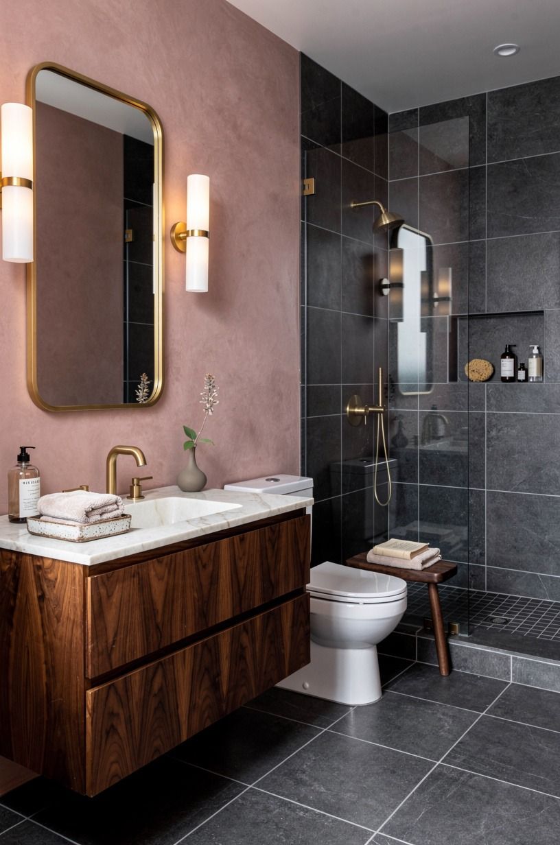
Instead of tiny prints everywhere, borrow scale from the lines already in the room.
10Plan seams around the vanity with the Vanity Shadow Gap
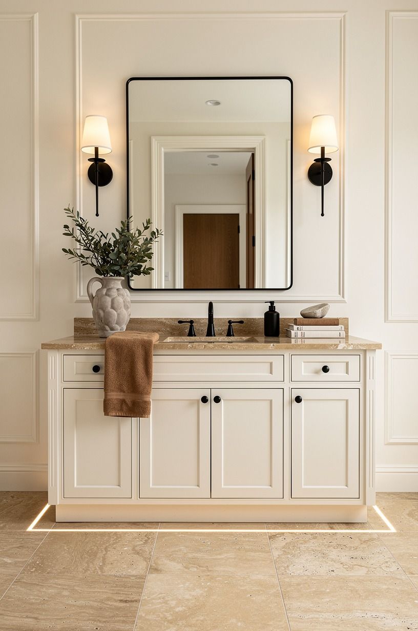
The Vanity Shadow Gap is the dark line where mirror, backsplash, and paper meet, and it's where bad installs show first. Plan seams so they don't land right behind the faucet or at the mirror edge.
Water splashes there, eyes go there, and any lift will announce itself. Move the seam to a corner or a less lit side wall when you can.
If your vanity is 32 to 36 inches tall, center the pattern's best moment slightly above the backsplash line so it isn't hidden by the mirror. A warm travertine tray from CB2 can wait, this zone is about precision. Use a level, not the ceiling line, because old houses lie.
But don't obsess over perfection across every wall. Protect the splash zone hardest.
11Pick paste the wall or peel and stick based on your patience
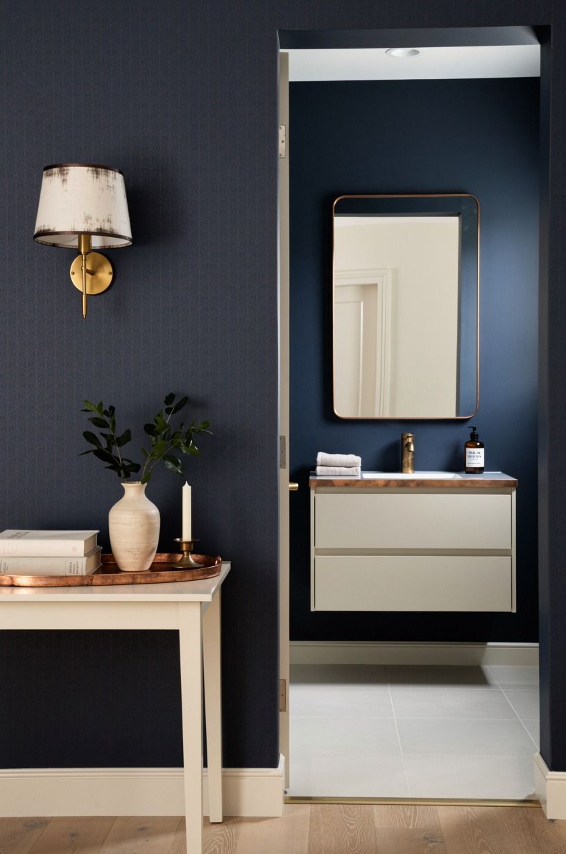
Peel and stick is great for rentals and first timers, but it forgives less than people expect on textured walls.
12Wrap corners like a tailor, not a gift wrapper
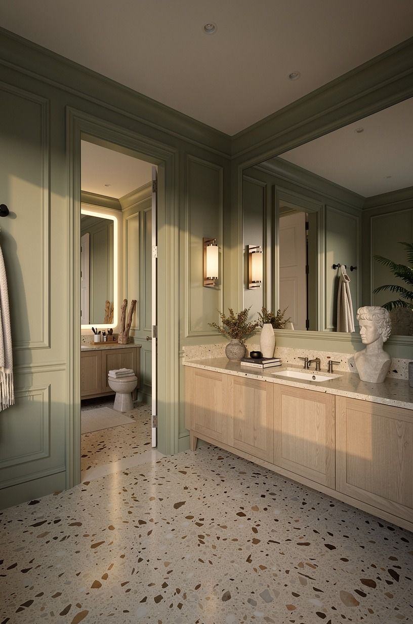
Corners are where bold wallpaper either looks custom or looks like a rushed craft project. Never force one strip to wrap around an outside corner in a bathroom, because temperature shifts can pull it open. Split the strip, overlap cleanly, and keep pattern continuity by eye from the doorway.
Inside corners get a small overlap too, usually toward the less visible wall.
This is where I made a mistake early on: I chased perfect corner matching and ruined two strips near a pedestal sink. Better method.
Work from the hero wall outward, then let corners absorb tiny differences your guests won't clock. A 3/4-inch solid white oak shelf can hide a tricky transition if you need one. But don't add clutter to cover bad cuts.
Fix the cut.
13Light it like evening with the Three-Height Glow Stack
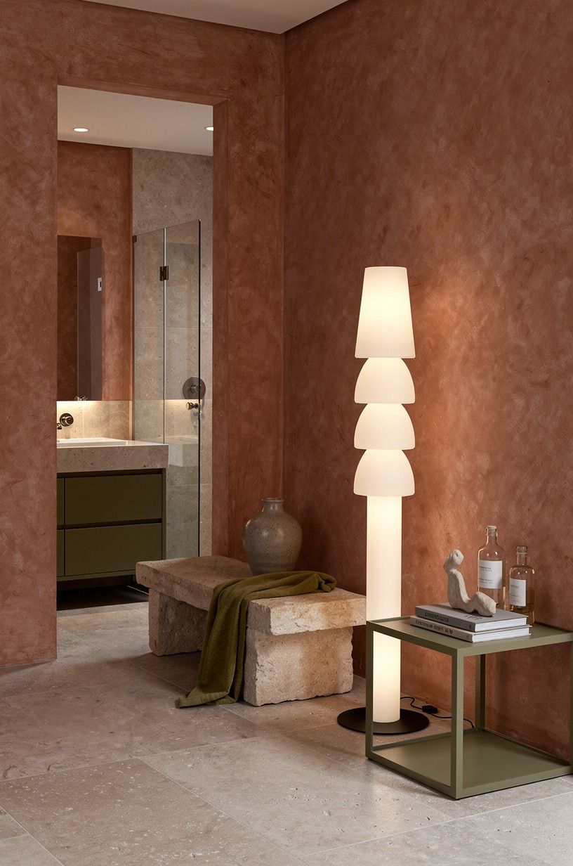
Bold paper needs layered light or it can feel flat and loud at once. Use the Three-Height Glow Stack: low glow near the vanity, mid glow from sconces, and a soft ceiling source that doesn't glare.
Warm bulbs around 2700K keep reds rich and greens from going swampy. Cool bulbs can make a moody paper look like a waiting room.
If hardwiring isn't in the budget, battery sconces can still give you that side wash. Put them where they kiss the pattern, not blast it. A hand-applied Venetian plaster finish, typically $8 to $15 per square foot, pairs nicely with warm metal shades.
You'll know the lighting is right when the paper has shadows. Flat light kills depth. Give your walls a little night.
14Keep fixtures quiet so the wallpaper can speak
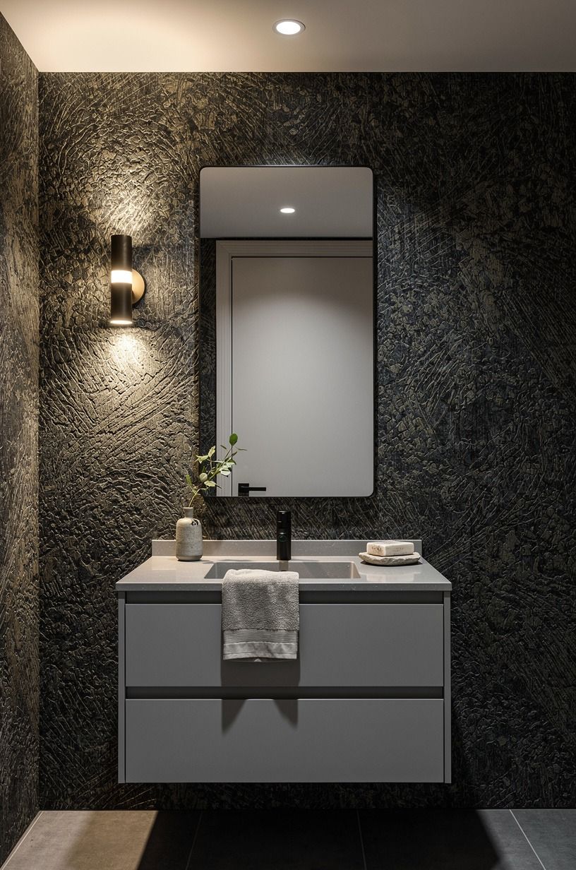
When the walls are bold, fixtures should behave like good backup singers. Simple mirror, clean faucet, calm hardware, one strong finish.
If everything shines, nothing leads. I'd skip ornate frames in a tiny room unless the wallpaper is plain grasscloth.
A black wallpaper bathroom idea works best with either warm brass or matte black, not both fighting for attention. A powder bath wallpaper idea with big birds wants a plain oval mirror and a simple shelf.
A powder room vanity wallpaper moment looks richer when the cabinet color is pulled from the background, not the loudest bloom. Wallpaper powder bathroom ideas succeed when you edit.
Say that twice. Edit again.
15Add one tactile material that grounds the pattern
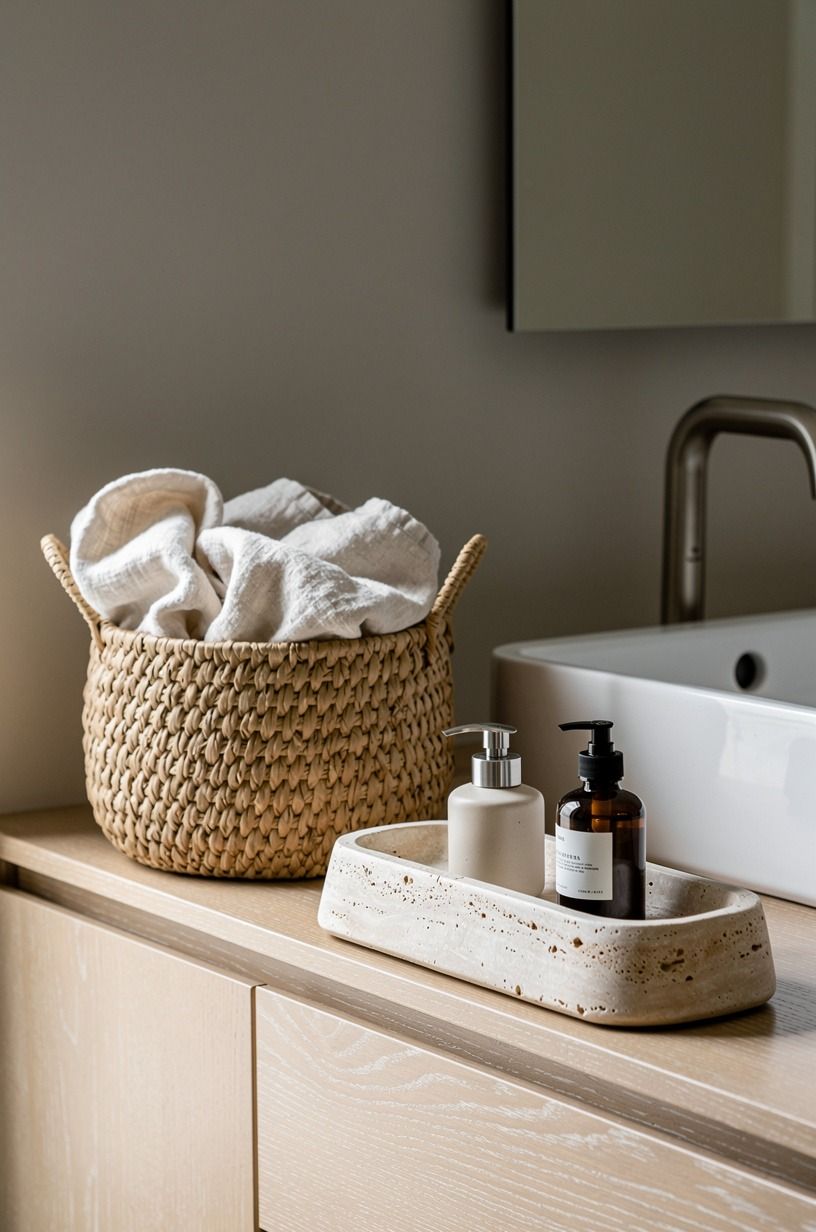
Bold wallpaper needs something you can feel, or the room can turn into a picture of a room. Add one tactile note: honed stone, aged wood, nubby linen, cane, or ceramic with a handmade edge. Keep it restrained.
One material is depth, three is a yard sale.
I like washed Belgian linen against dark floral paper because the slub catches light without competing. A small stone tray, a wood framed mirror, or a linen hand towel can do the job for under dinner out. If the paper is shiny, choose matte texture.
If the paper is matte, a little glaze or metal wakes it up. You're building contrast your fingertips understand before your eyes name it.
16Style the vanity with the One-Breath Rule
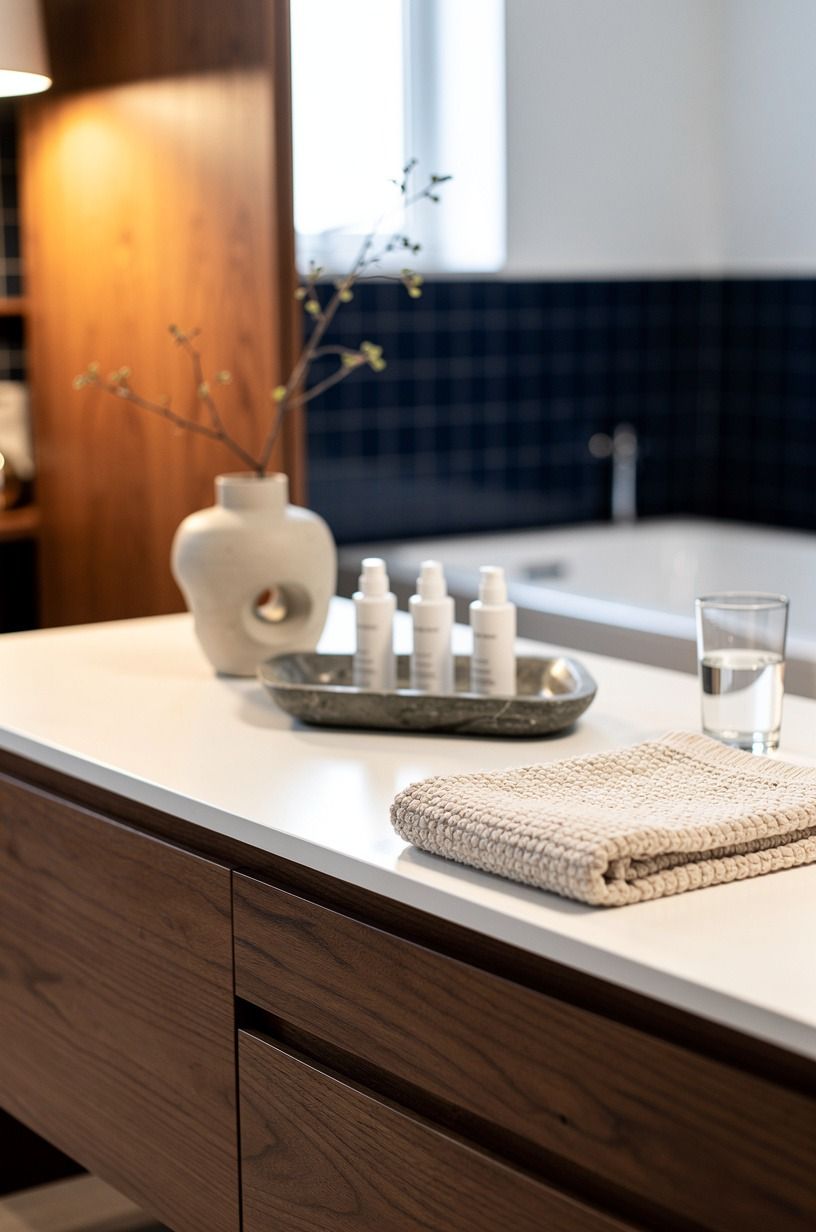
The One-Breath Rule means your vanity styling should read in one breath from the doorway: soap, hand towel, one object, done.
17Make a rental version that still feels committed
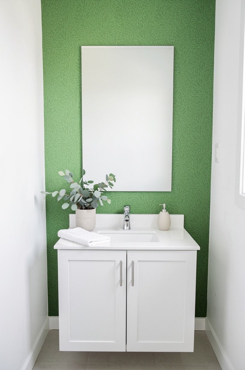
Renters can do this without losing a deposit, but the plan changes. Use quality peel and stick on smooth primed walls, keep it away from direct splash, and paint the ceiling or door for depth.
Removable paper hates cheap orange peel texture, so test a sample behind the door for a week. If it lifts there, don't gamble behind the sink.
You can fake permanence with details that leave no holes: a tension rod for a café curtain, over the toilet shelving that stands on feet, and adhesive hooks rated for the weight. An IKEA HEMNES mirror cabinet can add storage if you own the place, but renters should lean on freestanding pieces.
Bold doesn't have to mean drilled. It has to mean intentional.
18Avoid the five mistakes that make bold paper feel cheap

The fastest mistake is buying enough rolls by square footage alone and ignoring repeat waste.
19Finish with a reveal ritual and a maintenance plan
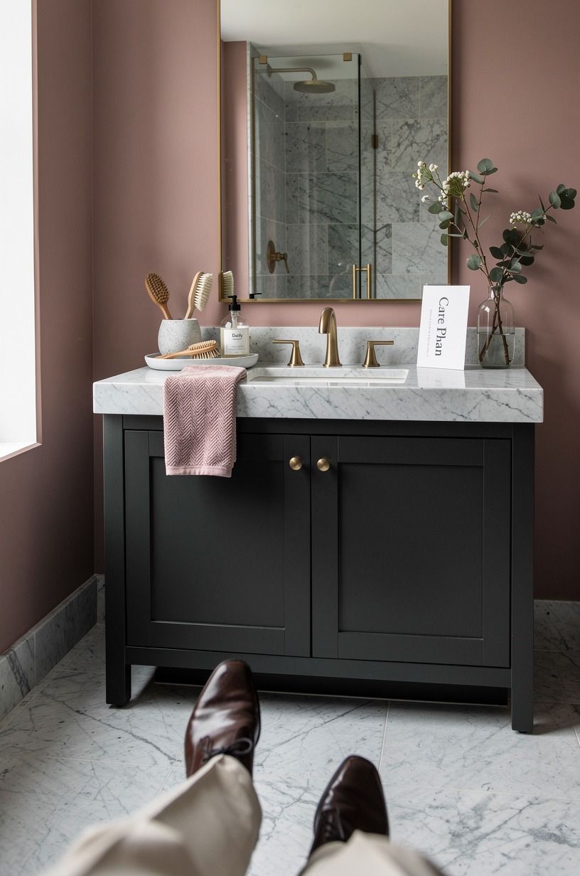
When the last seam is smoothed, don't style immediately. Let paste cure, keep hands off for a day, then clean the room like guests are coming.
Wipe baseboards, polish the faucet, replace the bulb, and wash the mirror edges where dust gathers. The pattern will look sharper when everything around it behaves.
Maintenance is easy if you start right: exhaust on, splashes wiped, no harsh cleaner on delicate paper. Keep the leftover roll labeled with dye lot and date.
I store mine flat behind a dresser, and I've used scraps to line a cabinet back years later. Then do the reveal. Turn off the big light, leave the sconces on, and open the door slowly.
Tiny room, big entrance!
The part I got wrong before I loved bold powder rooms
I used to think small rooms needed small ideas. Safe paint, quiet mirror, maybe one polite print if I felt wild. Then I papered a windowless powder bath in a deep botanical and watched people come out smiling like they'd seen a private club.
It wasn't bigger. It was braver. That's when I stopped treating powder rooms as leftover square footage and started treating them as the one room where you can make a decision in an afternoon and feel it every day.
My first attempt had problems. I chose a dramatic print with a huge repeat, then placed the seam right behind the faucet because I was focused on the doorway view.
Every splash found that edge. I also used a bright white semi gloss trim next to a smoky green paper, and the trim turned the green cold by dinner. The fix was not more stuff.
It was quieter trim, warmer light, and moving the visual weight to the wall guests saw first. You don't need perfection to get the effect, but you do need priorities.
Here's my honest frame if you're stuck: decide whether your room wants mystery or energy. Mystery likes deep grounds, soft shine, dark florals, aged metal, and shadows.
Energy likes crisp contrast, graphic shapes, cleaner whites, and a tighter edit. Both can work in 20 to 40 square feet.
Neither works if you keep apologizing with beige accessories.
And if budget is the thing holding you back, do the envelope before the objects. Prep, primer, paper, light.
A $40 mirror with the right glow beats a $400 mirror under a bad bulb. The boldest choice isn't the loudest pattern.
It's choosing one mood and refusing to dilute it.
What People Always Want to Know
What is the best bold wallpaper for a small powder room?
The best pick is a medium scale pattern with a calm background and one strong accent color. Dark botanical wallpaper hides seams better than stark geometrics in old houses.
If your room has no window, choose warm light and test samples at night. Small room, big pattern, controlled background.
Where can I buy powder room wallpaper on a budget?
Start with Target Threshold, Wayfair house lines, and sale bins at local wallpaper showrooms. Check Facebook Marketplace for unopened rolls, and ask installers about leftovers.
A single roll can cover a tiny bath. No links needed, just patience and dye lot checks.
How much does a powder room wallpaper makeover cost?
A typical US cosmetic bathroom refresh runs about $200-$1,200 for paint, mirror, faucet, and textiles. Add wallpaper, and many DIY powder rooms land around $300 to $1,500 depending on roll quality and prep. Pro installation can push it higher.
Cleaning, decluttering, and fresh caulk are free.
Can I create a bold powder room on a budget?
Yes, and the small footprint helps because you need fewer rolls. Paint the door, swap the bulb to 2700K, and use one sample framed as art before committing.
A matte black faucet can wait if the walls carry the room. Spend on prep first, pattern second, decor last.
Is bold wallpaper worth it in a small space?
Yes, because the powder room is low commitment and high impact. Guests use it, you can close the door, and one roll can change the mood. Keep fixtures simple and let warm 2700K lighting soften the print.
It's the easiest place to be brave without repainting your whole life.
Is bold wallpaper a good idea for a rental?
Yes if your walls are smooth and your landlord allows removable finishes. Use peel and stick away from direct splash, add a freestanding shelf, and try a tension rod for fabric.
Removable wallpaper still reads designed when the edges are clean. Test a sample for a week first.
Where I'd Start First
If I had to pick one, I'd start with samples taped beside the vanity light. Bad light makes good paper look guilty. Order three, watch them for a day, then choose the mood you'd still love at 10 pm.


