The 60/30/10 Rule That Makes a Warm Kitchen Look Expensive
24 july 2026I repainted my own kitchen three times in five years before I admitted the problem wasn't the color, it was the temperature. Every cool gray I tried looked dated within two seasons, while my sister's creamy oak kitchen from a decade ago still looks right.
The shift is real: designers are broadly moving toward creamy whites, taupes, browns, and muted greens, and standard 24-inch-deep base cabinets now wear warm stains far more often than stark lacquer. Here are the six warm palettes I'd stake a kitchen on.
Start With Creamy White, Oak, and Brass
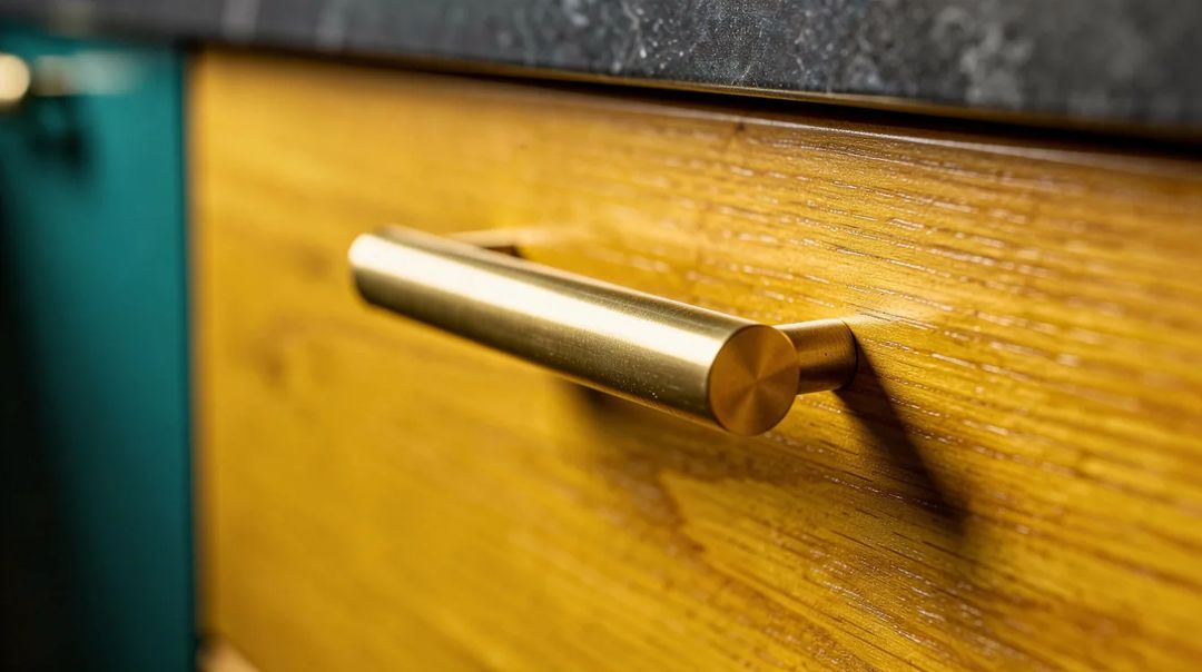
This is the palette I recommend when someone wants light but not sterile. Creamy white walls, warm oak fronts, and unlacquered brass pulls give you a kitchen that reads soft at 7 a.m. And golden at dinner.
For paint, Benjamin Moore Seapearl is the shade designers keep circling back to, with Sherwin-Williams Creamy and Behr Swiss Coffee as solid budget-friendlier matches.
Paint typically runs about $27 a gallon for entry lines and climbs past $70 for premium ranges, so a whole kitchen usually lands around $120 to $200 in paint alone. Money well spent.
My blunt opinion: polished chrome kills this look. Brushed or aged brass is the whole point.
Ground the Room in Stone Beige and Sage-Gray
Stone beige plus a grayed-out sage is the most forgiving combination on this list. It stays neutral without ever tipping cold, which is exactly why it survives trend cycles.
The trick is undertone discipline. Your beige tile, your sage lower cabinets, and your wood shelf all need to lean warm, or the room quietly falls apart.
A matte greige porcelain tile backsplash from Home Depot typically costs around $4 to $8 per square foot, and it's the piece that locks the whole palette together.
Add Depth With Warm Clay and One Inky Blue Moment
Clay tones on a wall or a hood surround bring warmth that white simply can't. The trick is restraint everywhere else.
Then pick one, just one, inky blue accent. An island or a pantry door in something like Sherwin-Williams Dutch Tile Blue gives the room a focal point without turning it into a theme.
Around 30% of the visual weight in cream, a big field of clay, and a single dark note. That ratio is what keeps it refined instead of busy.
Go Moody With Deep Olive, Walnut, and Aged Brass
Green kitchens are everywhere right now, but the versions that last are muted and earthy, never bright. Think olive you could mistake for a neutral in low light.
Pair olive lowers with walnut open shelving and aged brass hardware, and the kitchen instantly feels older than it is, in the best way.
Walnut floating shelves typically run about $60 to $150 each depending on length, and two of them do more for a kitchen than a full wall of upper cabinets.
Honest caveat: this palette needs decent natural light. In a dim galley, deep olive reads muddy.
Try Mocha Brown, Off-White, and Blackened Metal
Brown is back, and I don't mean the orange-toned cherry of 2004. Deep mocha and truffle stains on cabinets feel cozy and grounded, especially against a soft off-white wall.
Blackened steel or matte black hardware keeps it current. Matte black pulls at Lowe's typically cost around $4 to $12 apiece, which makes this the cheapest high-impact swap in the whole article.
A dark-stained island, cream perimeter cabinets, black lighting overhead. That's the formula, and it's hard to mess up.
Lock It In With Proportions, Not Just Color
Palette gets all the attention, but proportion is what makes a warm kitchen feel calm instead of cluttered. Standard base cabinets sit about 24 inches deep and 34.5 inches high, finishing near 36 inches with countertop.
Wall cabinets commonly run 12 inches deep and 30 to 42 inches high, and full-height uppers almost always look more timeless than a awkward dust-gap above short ones.
If you have the space, a roughly 24-inch-deep island with room to walk around it beats an oversized one that pinches circulation. A quiet kitchen is a kitchen you can move through.
Start with the walls, since a gallon of warm white is the cheapest test you'll ever run, then commit to the wood tone before you touch hardware. Color first, metal last, and the palette will outlive every trend cycle thrown at it.


