Gallery Wall Feeling Like Visual Noise? Try These 12 Layouts
31 october 2026A living room gallery wall can feel crowded before the artwork itself becomes excessive. The cleanest arrangements use restraint: a straight row of three substantial frames, a disciplined six-frame grid, or one large piece with two companions, usually with about 2 to 3 inches between frames.
Scale matters just as much. For a sofa around 84 inches wide, a grouping near 56 inches follows the useful two-thirds starting point while leaving the wall enough breathing room.
What you will find inside
- Line Up Three Substantial Frames
- Build a Disciplined Six-Frame Grid
- Anchor the Sofa With One Oversized Print
- Stack Frames in a Narrow Column
- Step Artwork Along the Stair Line
- Square Up a Four-Frame Block
- Pair Two Rows Under One Top Edge
- Contain an Asymmetrical Salon Cluster
- Let a Picture Ledge Set the Boundary
- Wrap a Compact Group Around a Corner
- Frame the Television With Quiet Panels
- Align a Long Row Above the Console
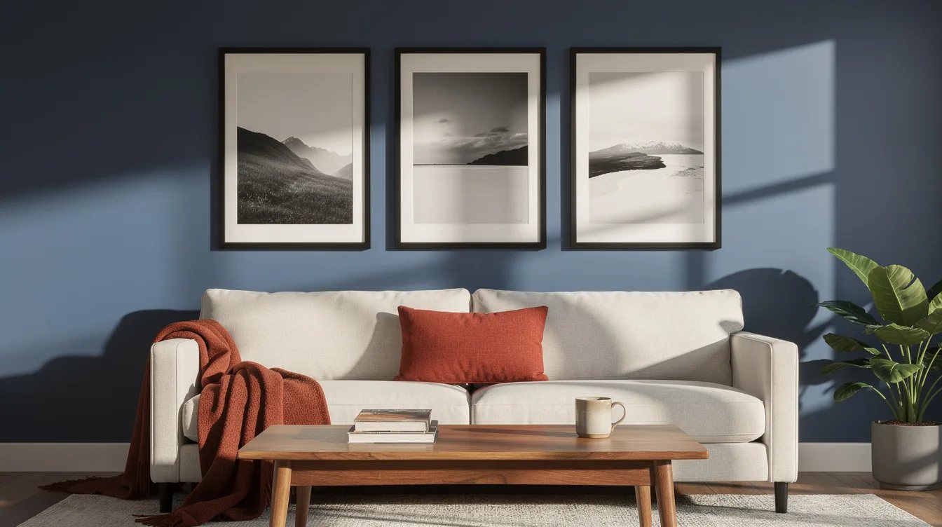
Line Up Three Substantial Frames
Start with three related images in identical IKEA RÖDALM frames, each in the nominal 16-by-20-inch format. The straight row works especially well above a sofa because the strong horizontal edge keeps the wall calm.
Leave about 2 inches between frames and align the top and bottom edges carefully. At the listed $16.99 each, the frame-only cost is about $50.97 before prints, making this the easiest low-risk layout to test.
Build a Disciplined Six-Frame Grid
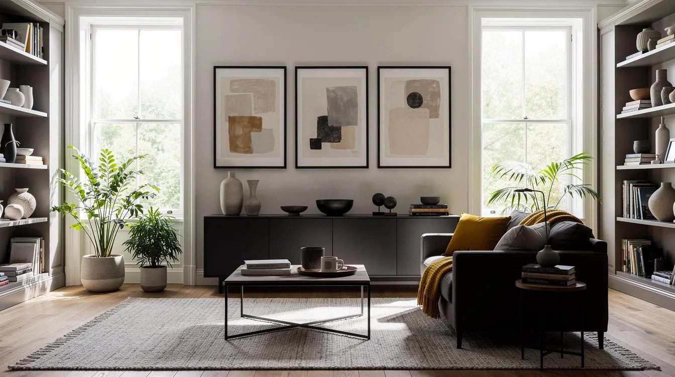
Arrange six matching frames in two rows of three, using the same orientation, mat, and frame color throughout. A six-frame grid gives family photographs enough room to breathe while the repeated edges prevent visual noise.
Six nominal 16-by-20-inch IKEA RÖDALM frames create a planning footprint of roughly 52 by 42 inches with about 2-inch gaps. The listed frame-only cost is about $101.94, and the actual outside measurements should guide your final wall marks.
Anchor the Sofa With One Oversized Print
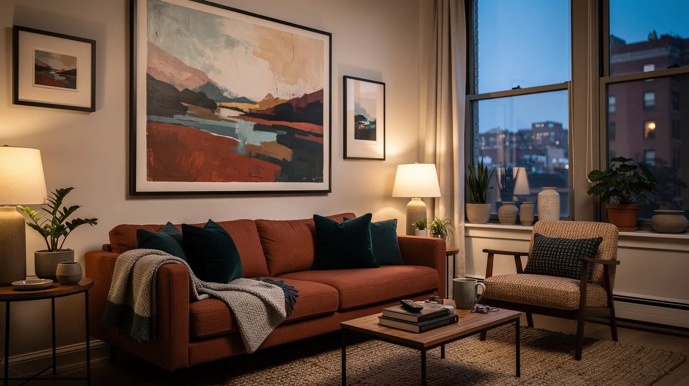
Choose one large landscape or abstract print as the anchor, then place two smaller companions beside it at the same height. A matte paper print inside a black wood frame gives the arrangement enough weight without requiring a crowded collection.
Keep the companions noticeably smaller and repeat one color from the main artwork in their mats or subjects. For an 84-inch sofa, aim for a grouping around 56 inches wide, or roughly two-thirds of the furniture width.
Stack Frames in a Narrow Column
A vertical column solves the awkward wall beside a bookcase, doorway, or tall floor lamp. Use four portrait frames with consistent gaps, then center the column on the available strip of wall rather than on the entire room.
Thin black metal frames keep this tall layout from feeling heavy, especially when the artwork has generous white space. About 2 to 3 inches between frames is enough separation without breaking the column into unrelated pieces.
Step Artwork Along the Stair Line
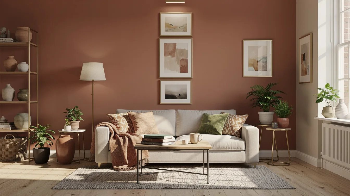
Follow a staircase or sloping architectural line with frames that rise in small, controlled increments. Keep each frame the same size and let the lower edges create the movement, while the artwork remains visually connected.
A warm oak frame softens the harder geometry of a stair wall, but the layout still needs a clear boundary. Keep the outermost pieces close to an imaginary diagonal and skip tiny fillers that would make the slope look accidental.
Square Up a Four-Frame Block
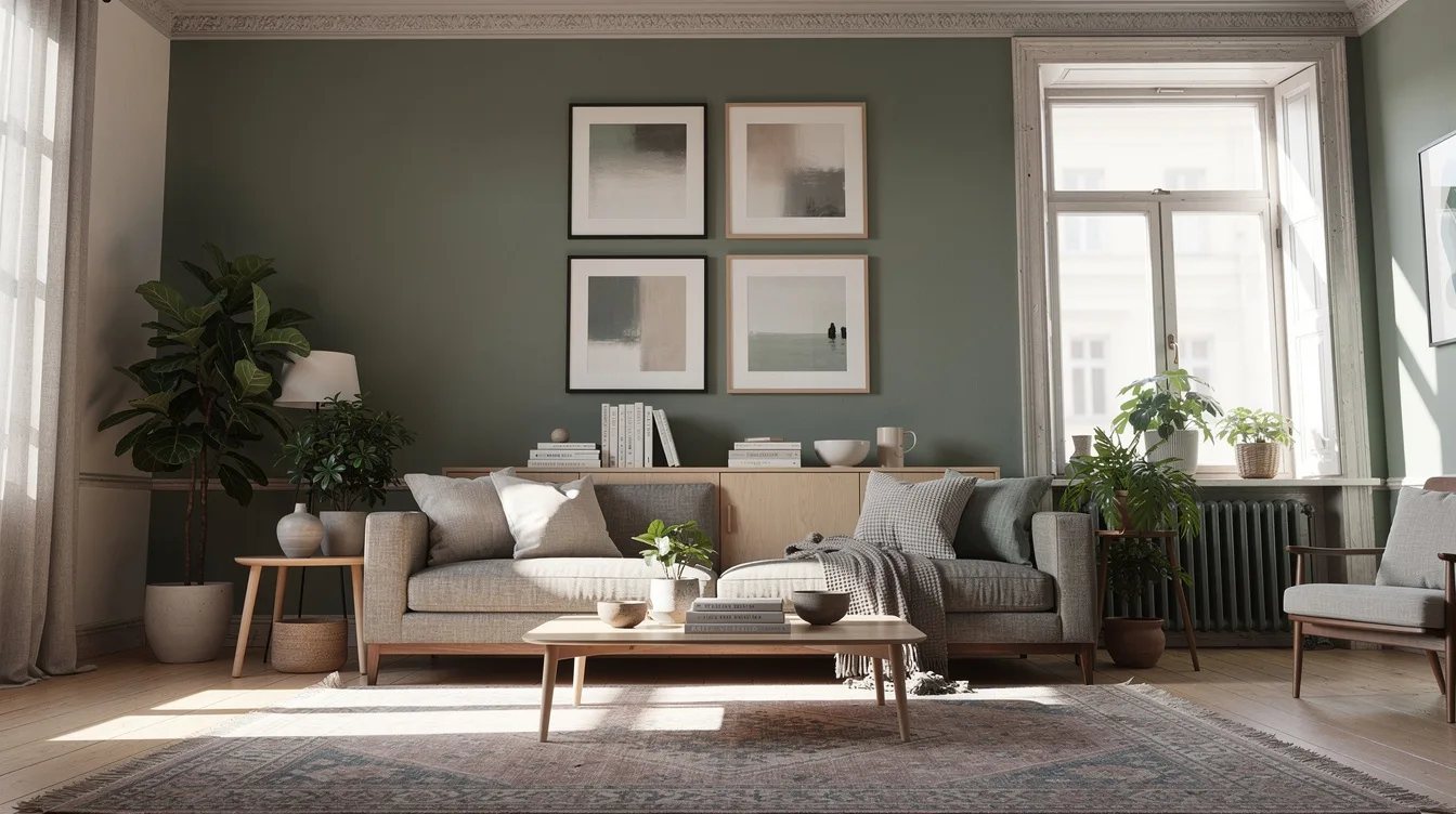
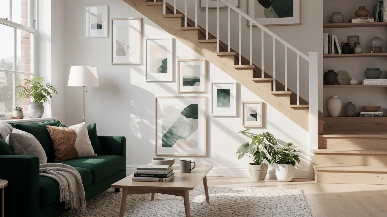
Use four images in a precise two-by-two block when a wall needs structure but does not have room for a broad salon arrangement. Matching sizes and equal gaps make the block read as one large composition.
Choose four photographs with a shared exposure or color treatment, then place them inside white mats to create breathing room around each image. This format suits a compact sofa wall, a reading corner, or the space above a low cabinet.
Pair Two Rows Under One Top Edge
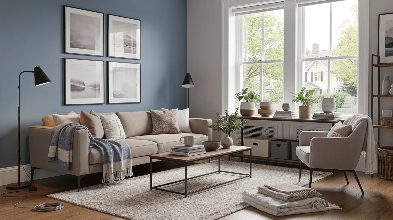
For a wider wall, place two larger frames on the top row and three smaller frames beneath them, keeping the overall grouping centered. The variation adds interest while the shared top edge gives the composition a firm starting point.
Use a single brushed-aluminum frame finish across both rows and keep the lower pieces slightly inset from the outer edges. The result feels intentional when the bottom row supports the larger images instead of stretching farther than them.
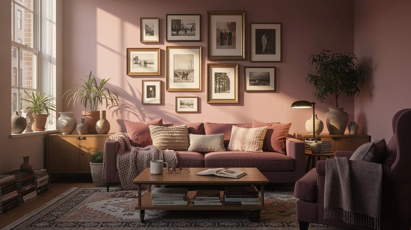
Contain an Asymmetrical Salon Cluster
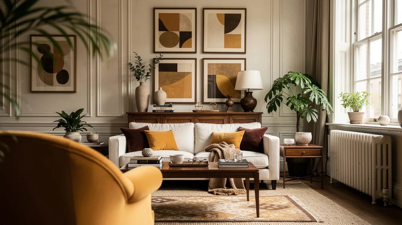
Choose five or seven pieces in different sizes, then arrange them inside one invisible rectangle with a strong central anchor. Asymmetry works when the visual weight balances across the shape, so place the darkest or largest artwork near the center.
A matte black frame can unify mixed artwork, including a small painting, a line drawing, and a photograph. Keep every gap near 2 to 3 inches and remove any piece that pushes the outer boundary too far.
Let a Picture Ledge Set the Boundary
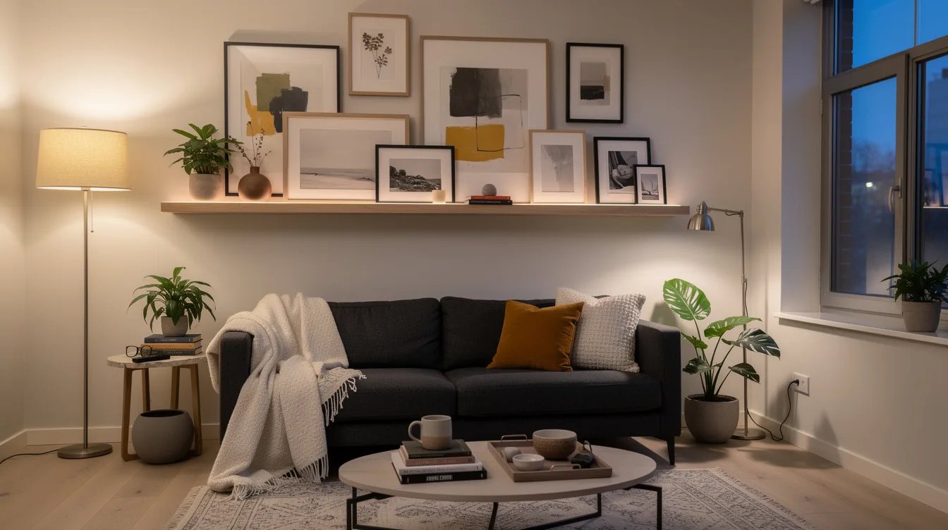
Install one or two picture ledges and lean framed art instead of covering the wall with nail holes. The ledge establishes a clean horizontal limit, which makes a layered collection feel controlled even when the frame sizes differ.
Use an IKEA MOSSLANDA picture ledge with a large frame at the back, a medium frame in front, and one low object beside them. Keep the palette narrow and leave visible ledge space at both ends so the display does not resemble a packed shelf.
Wrap a Compact Group Around a Corner
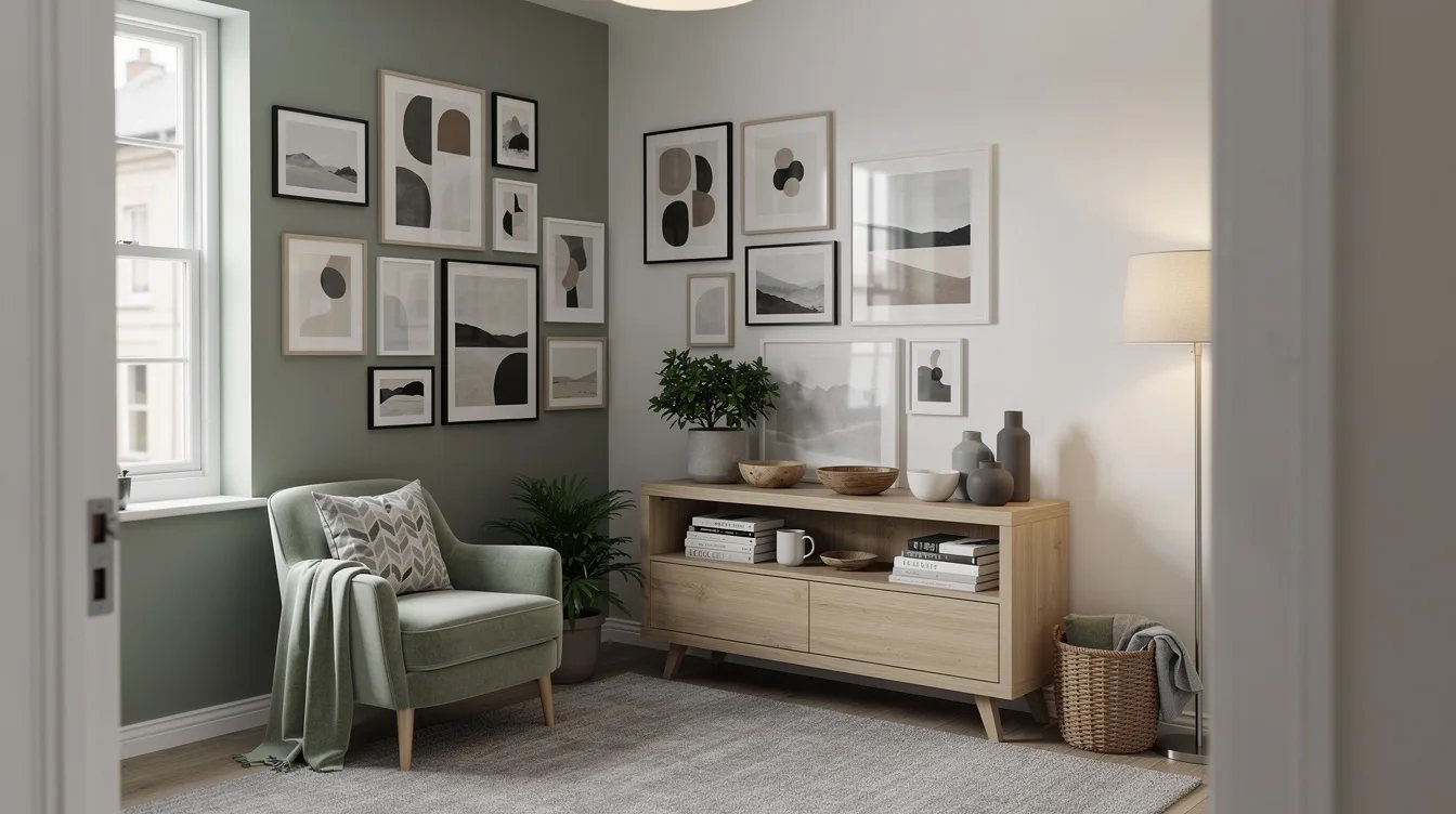
Carry a small arrangement across two adjoining walls when a single wall feels too narrow for the room. Place the largest piece on the primary wall, then continue with smaller pieces around the corner at the same vertical center.
Thin natural wood frames make the transition feel lighter than a heavy black border repeated on both surfaces. Keep the corner itself open by stopping the nearest frames a few inches before the wall break.
Frame the Television With Quiet Panels
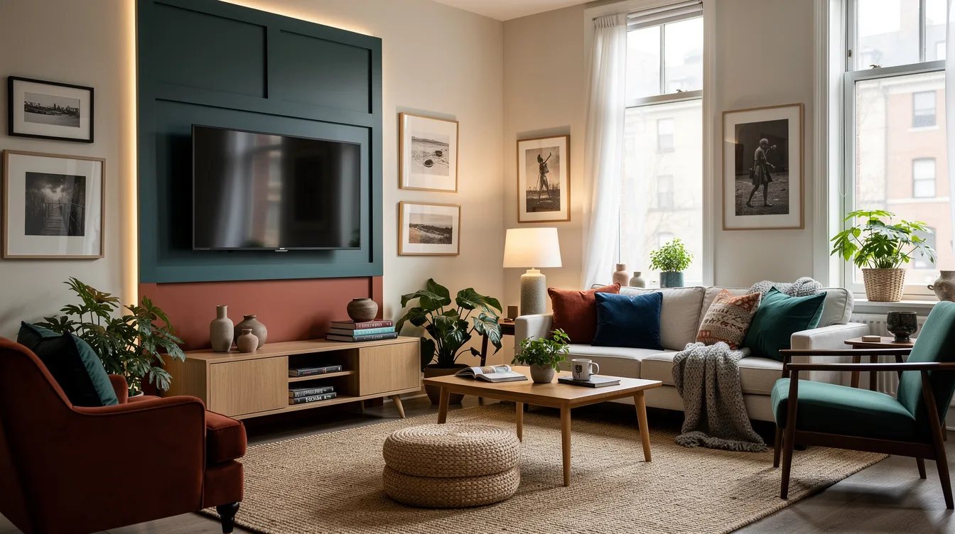
Treat the television as the center of the composition and place matching vertical artwork on each side. The symmetry hides visual clutter around the screen while preserving a gallery-wall effect above a media console.
Choose muted photographs in cream-colored mats and keep the side frames close in height to the television. Avoid small pieces above the screen, where extra edges compete with the strongest rectangle in the room.
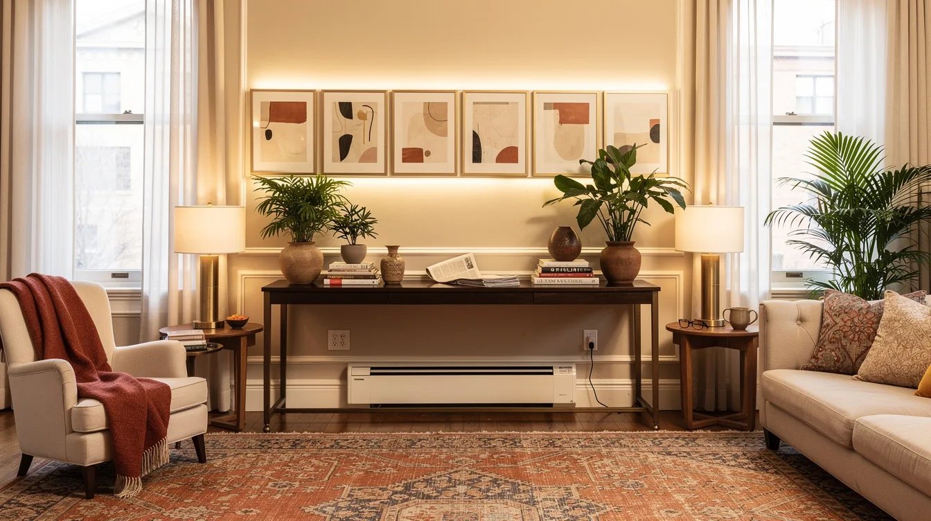
Align a Long Row Above the Console
Place four or five smaller frames in one continuous row above a console, using the furniture as the horizontal reference. The arrangement should feel wider than a single object but still stop well inside the console’s ends.
Identical IKEA LOMVIKEN frames in the nominal 16-by-20-inch format provide a slim aluminum edge and polystyrene front protection. The listed price is $22.99 each, so five frames cost about $114.95 before prints, with the final width determined by the chosen spacing.
Keep reading
- 13 TV Wall Mistakes That Make Your Living Room Look Unfinished
- Narrow Living Room Feeling Cramped? Try These 13 West Elm-Inspired Tables
- 12 Budget Living Room Side Tables That Look Designer for Less
Measure the furniture first, tape the full grouping on the wall, and begin with the simplest layout that fits. Consistent gaps and one clear outer shape will do more for a polished room than another small frame.