I Redid My Bedroom in Romantic Purple, These Dreamy Ideas Changed Everything
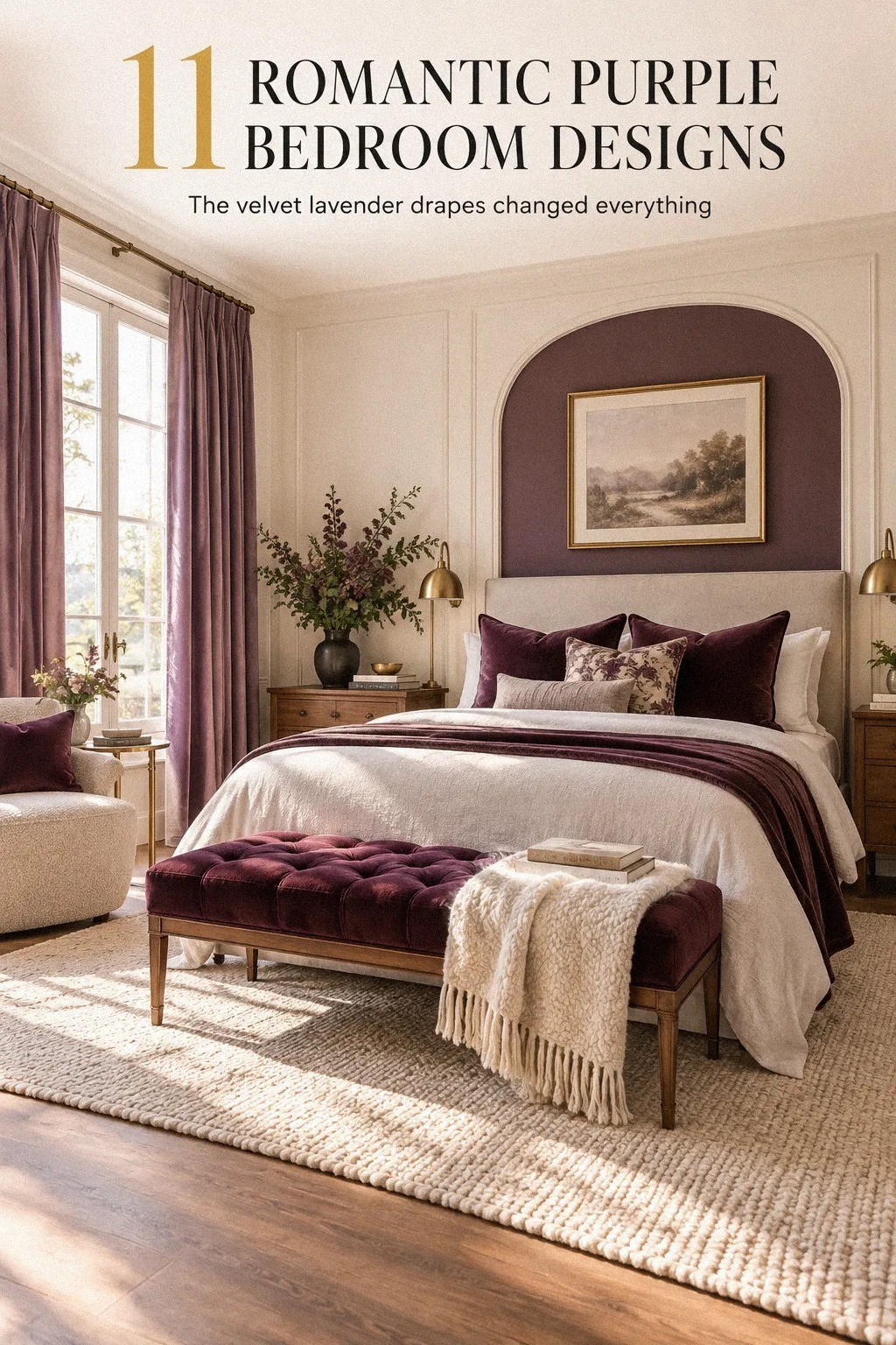
04 october 2026Romantic purple bedroom ideas gave me the warmest result for less than a full renovation, even though I had one weekend and a room that felt flat. I chose muted purple, softened the lighting, and kept the furniture simple. The room became intimate instead of sugary, and I’d make the change again.
Editor's note. Start with the wall-color test, then set the palette with the Two-Purple Rule. From there, the lighting plan, the budget ranges, and the shopping order will keep the room from becoming a pile of attractive but unrelated purchases.
Here's what it looked like before
Before I changed anything, the room had pale walls, one harsh ceiling fixture, mismatched bedside tables, and bedding that slid around every night. Nothing was broken, but nothing felt connected either.
I wasn’t starting with a blank canvas. The queen bed already filled most of the wall, and I needed to work around its 60x80-inch footprint.
You can make a small bedroom feel gathered without replacing everything. I just had to stop treating each item as a separate purchase.
The room also lacked a visual center. The window was pleasant, but the bed didn’t have enough height around it.
The ceiling light flattened every color after sunset, while the small accessories competed for attention. It felt ordinary in a way that was strangely tiring.
I made a short list before buying anything: soften the walls, create height behind the bed, improve the evening light, and give the floor more warmth. That list pointed me toward the ideas below instead of toward random purple accessories.
- Paint the walls with a muted romantic bedroom decor base
- Build the Two-Purple Rule into your room design color palette
- Layer washed linen over one substantial color
- Replace the ceiling glare with the Three-Height Light Stack
- Choose an upholstered headboard with a soft edge
- Frame the bed with the Soft-Edge Art Group
- Mix two woods with the Two-Wood Anchor
- Extend a rug past the bed instead of stopping at the nightstands
- Could a smaller bedroom carry this much color?
- Hang linen drapes to soften the window
- Choose layered storage over a matching furniture set
1Paint the walls with a muted romantic bedroom decor base
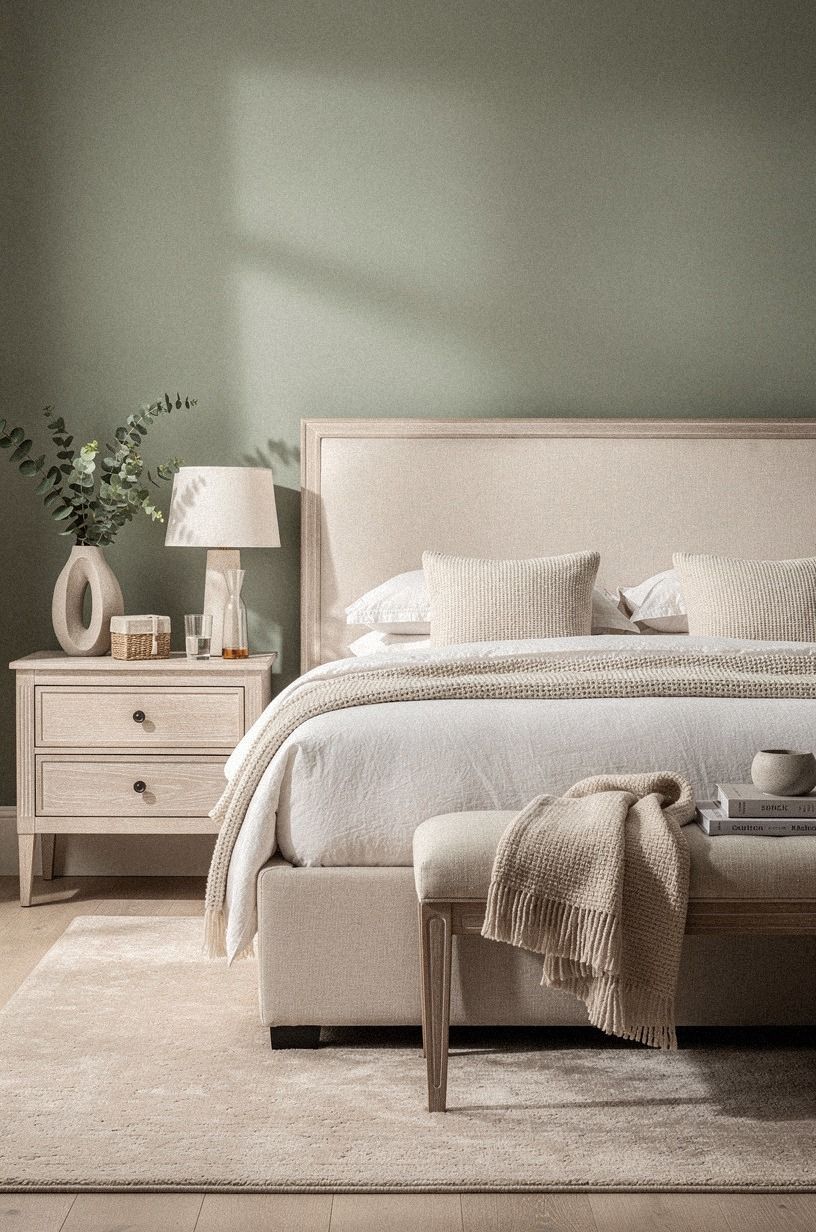
I started with Farrow & Ball Green Smoke No. 47, a muted sage green that gave the purple details a calmer, more grown-up background. I tested it beside the window, behind the bed, and near the closet because the afternoon light changed it more than I expected.
In the morning, it looked gentle. At night, it turned softly earthy.
I also sampled Benjamin Moore Saybrook Sage HC-114 on a separate board. It was lighter and warmer, with a quiet herbal quality that suited the natural wood and cerused white oak I wanted to bring into the room.
The comparison helped me understand why a muted sage worked better than a stronger purple wall. The accents needed a calm, luminous background.
You’ll want to paint a large sample before committing, especially if your room faces north. I skipped bright lilac because it made the room feel sugary and young.
Instead, I used two coats, kept the trim warm cream, and let the cerused white oak add texture. That small test saved me!
Your wall color doesn’t need to be purple to support a purple bedroom. A warm sage, muted taupe, or pink-beige can give deeper accents room to breathe. I used the wall as the backdrop, not the whole story, and I’d choose that approach again.
A romantic bedroom needs atmosphere, but it also needs relief. A full purple room can be soulful and enveloping when the undertone is right. With the wrong undertone, it can feel cold, murky, or overly theatrical by evening.
For a smaller room, I’d begin with the question of how much color the space can carry. The answer depends less on the room’s size than on how many competing colors you introduce.
2Build the Two-Purple Rule into your room design color palette
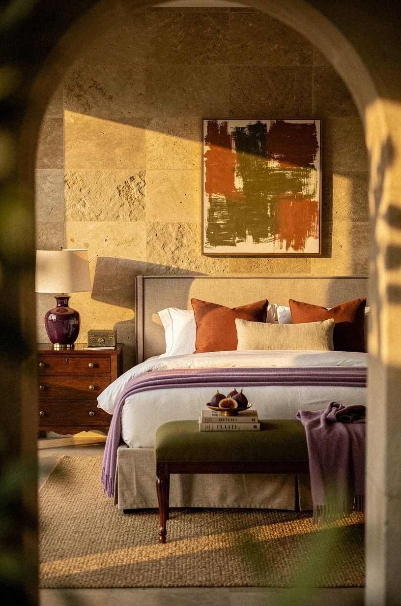
The Two-Purple Rule kept me from buying every purple object I saw. I let terracotta, stone, and olive carry more of the room, then used purple selectively so the palette felt collected rather than themed.
The shagreen accents added a subtle change in texture without introducing another loud color. That combination gave the room warmth and depth while leaving the purple details with something solid to balance against.
3Layer washed linen over one substantial color
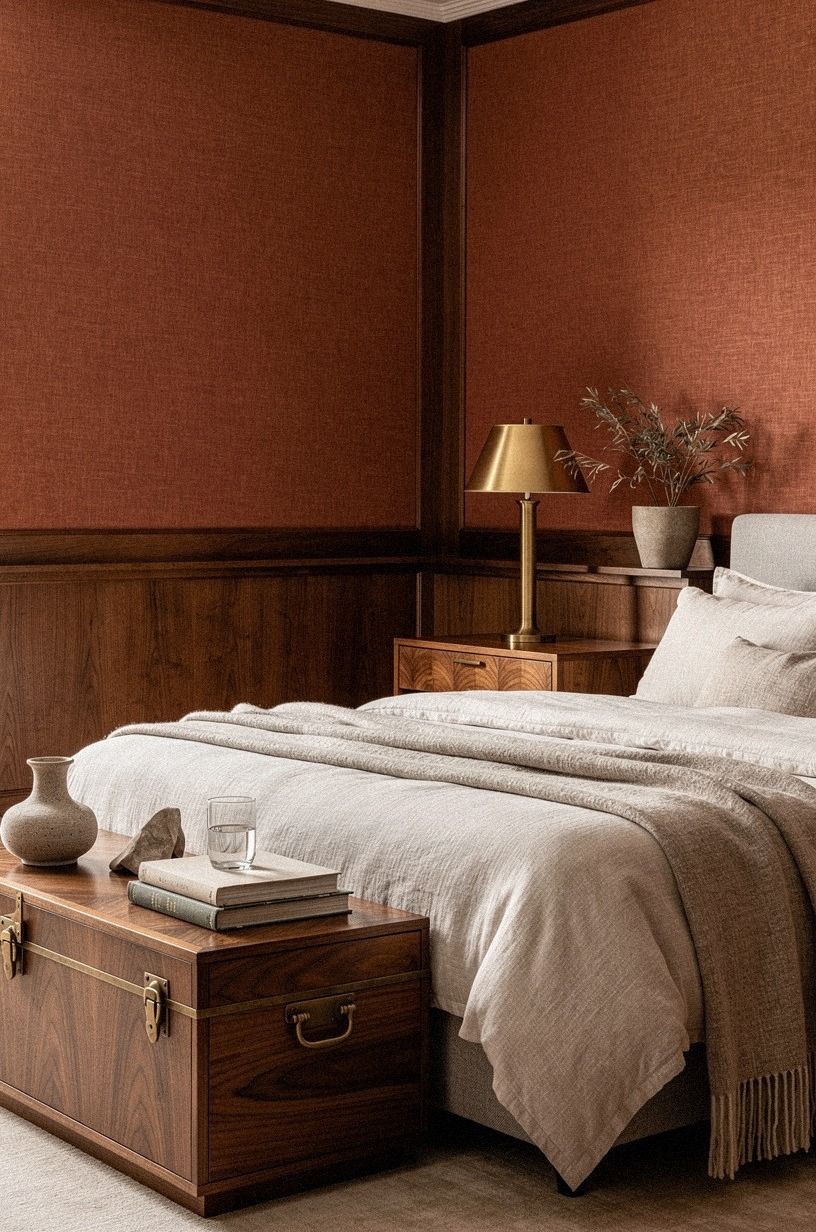
I wanted the bed to feel soft without looking rumpled in a careless way, so I used washed-linen bedding in a soft clay shade. The fabric has enough texture to break up the purple, and it catches the light in small folds instead of shining like polyester. I left the top edge loose rather than making a stiff hotel fold.
Your bedding doesn’t need to match your walls exactly. In fact, I’d skip matching purple sheets because the room starts to look packaged. A 600gsm Turkish cotton blanket at the foot gives your eye a solid horizontal line, while an aged-brass lamp and book-matched walnut nearby add weight to the softer layers.
If you’re working with a king bed, remember the 76x80-inch footprint needs more visual breathing room than a queen. Give your bed space to look generous. The whole room feels softer when the fabric can fall naturally.
I used a fitted sheet in pale clay, two standard pillows in linen, and one smaller cushion in a muted stone tone. That was enough. The restrained combination felt inviting without becoming fussy.
Texture did more work than pattern. The linen looked relaxed, the cotton blanket felt substantial, and the book-matched walnut added a richer note beside the bed. Every layer had a different hand, which made the room feel tactile and soulful.
I also kept the pillow arrangement practical. I wanted to sit up and read without removing half the bed, so I used two sleeping pillows, two standard shams, and one accent cushion. The bed looked finished, but it still worked like a bed.
4Replace the ceiling glare with the Three-Height Light Stack
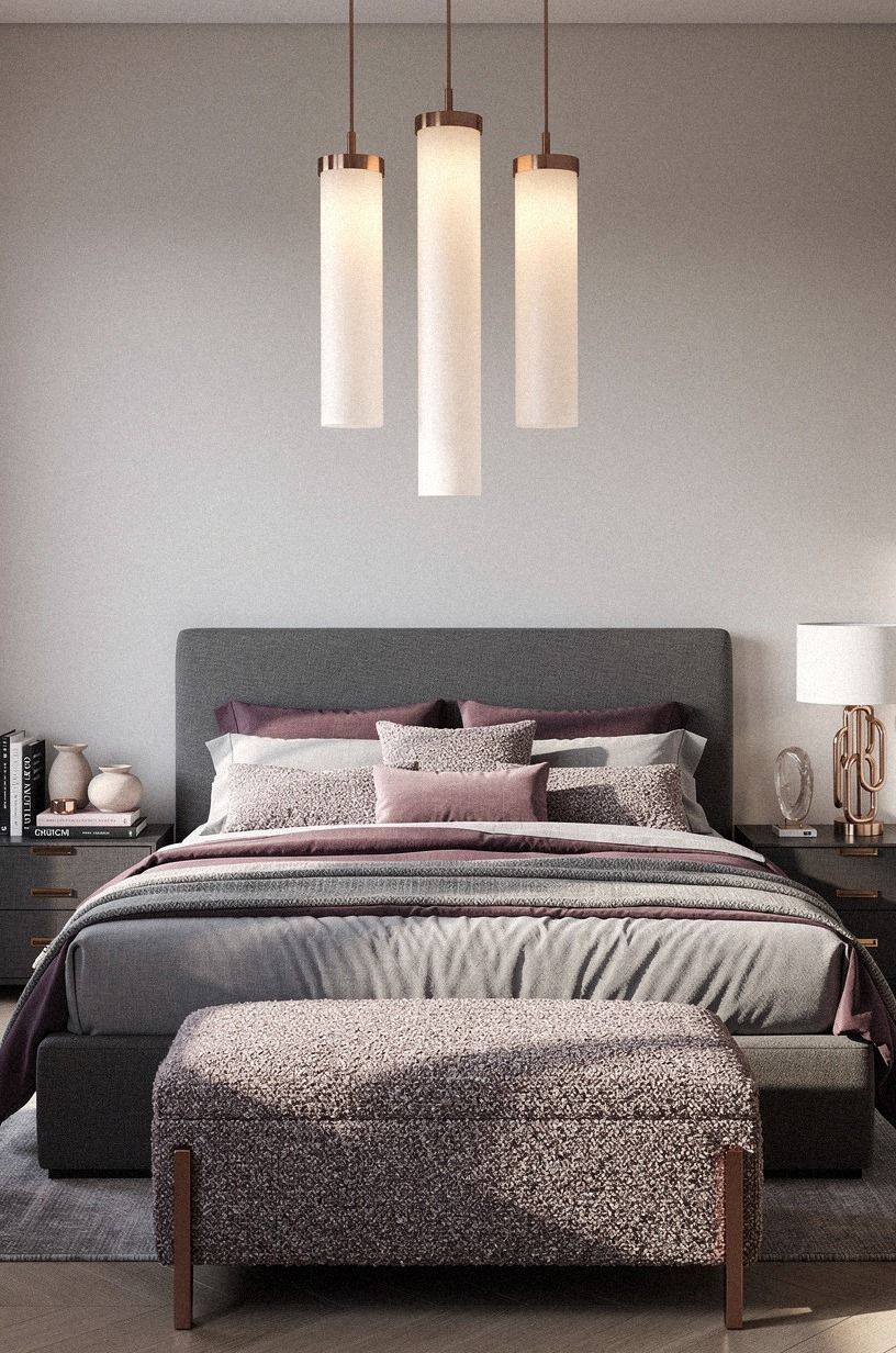
The Three-Height Light Stack was the first change I noticed after dark. Three pools of light made the plum, grey, and rose-gold palette feel layered instead of flat, while an organic bouclé shade softened the brightest source.
5Choose an upholstered headboard with a soft edge
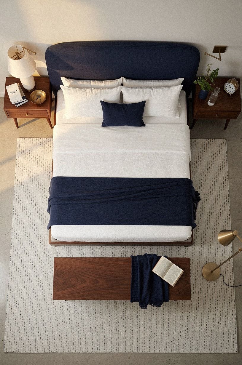
The room needed height, but I didn’t want a carved wood headboard competing with the wall color. I chose a simple upholstered headboard in deep navy, with rounded corners and a low profile. The dark fabric gave the white bedding a crisp edge without becoming glossy.
You can make this work with an IKEA MALM bed frame if your budget is tight. Add a freestanding headboard or mount a padded panel behind the mattress, then keep the bedding white so your eye can separate the layers. I made the mistake of choosing a narrow headboard once, and it looked lost behind the pillows.
Your headboard should be wider than the mattress but not so tall that it crowds a short ceiling. If you’re using a queen bed, let the upholstery extend slightly beyond the 60-inch width. That extra edge makes the bed feel settled rather than squeezed in.
Rounded corners gave the room a tender quality. The shape softened the stronger lines of the dresser and window trim. A straight, boxy headboard would have worked, but the curved edge made the whole bed feel more welcoming.
I’d choose matte navy upholstery with visible depth. Keep the surrounding furniture in walnut and use unlacquered brass hardware where you can. The brass will develop a patina over time, which makes the room feel more personal.
The headboard also gave the bed a clearer visual boundary. That mattered because the room had no architectural feature to frame it. Once the bed had height, the smaller decisions felt more intentional.
6Frame the bed with the Soft-Edge Art Group
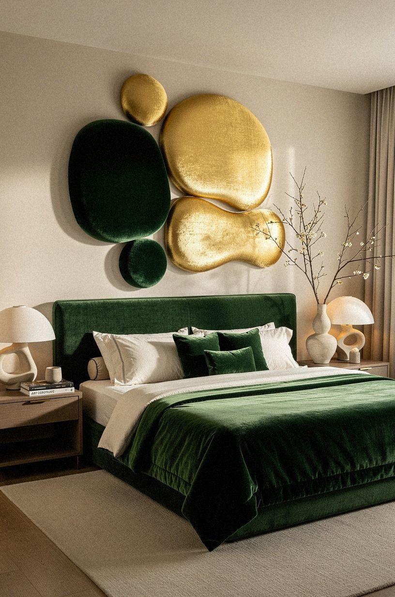
I didn’t want a giant romantic print above the bed, so I built the Soft-Edge Art Group from three small pieces. One was an emerald botanical sketch, one was a muted gold abstract, and one was a cream landscape. Their frames were different, but the spacing stayed consistent.
You can copy the arrangement with thrifted frames and inexpensive mat board. Look for cream, warm gold, or pale wood finishes instead of shiny black. I’d skip a single heart-shaped print because it makes the room literal.
Your artwork can suggest romance through color and texture without announcing the theme.
I hung the center piece lower than I first planned. That kept the grouping connected to the bed, and it gave the wall a quieter rhythm.
A little imperfection helped. The arrangement feels collected rather than ordered from one catalog.
The emerald botanical sketch brought a rich, organic note. The gold abstract gave the arrangement some warmth.
The cream landscape introduced a quiet softness. Together, they created a more compelling mood than one large purple print would have done.
Keep the art close enough to the headboard that it feels like part of the bed zone. If it floats too high, the room can feel disconnected. I left enough room for the pillows to remain visually comfortable without crowding the frames.
A deep-pile mohair velvet cushion repeated the plush texture below without adding another picture. That small connection tied the wall to the upholstered headboard and kept the palette from spreading across every surface.
7Mix two woods with the Two-Wood Anchor
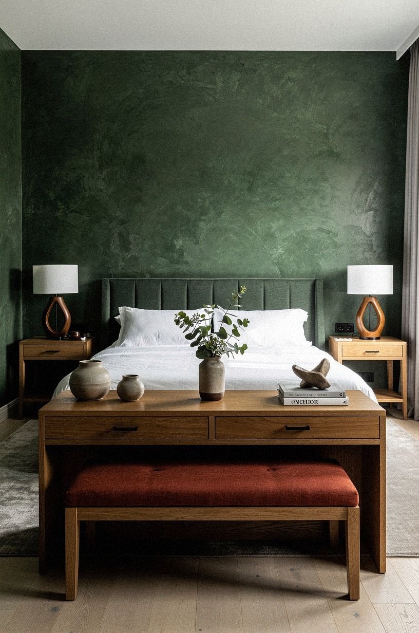
The room became much easier to live with when forest green and rust met natural oak. The oak kept the palette grounded, while hand-applied Venetian plaster added a soft, irregular texture behind the furniture. I used a narrow oak bench at the end of the bed and a darker wood tray on the dresser.
The Two-Wood Anchor means you don’t need every wooden piece to match. Repeat each wood at least twice, then stop. Your eye will read the room as connected without seeing a furniture suite.
I’d avoid pairing forest green with only cool gray furniture because the room can feel chilly by late afternoon.
If you’re shopping on a budget, an IKEA KALLAX in a birch-effect finish can supply the lighter wood note. You can add a darker wood tray or frame without replacing the shelving. That small contrast made my room feel organic, warm, and much less predictable.
Wood grain was essential because the room already had several soft materials. The natural oak added a pale, relaxed texture.
The Venetian plaster felt richer and more grounded against it. That contrast stopped the bedroom from becoming too delicate.
You can also use wood in smaller ways. A picture frame, drawer pull, stool, or small bowl can repeat the tone without adding another major furniture piece. The goal is rhythm, not a matching showroom.
I placed the oak closer to the window and the darker wood on the quieter side of the room. That distribution kept one corner from becoming visually heavy. It also made layered storage feel like part of the design instead of an afterthought.
8Extend a rug past the bed instead of stopping at the nightstands
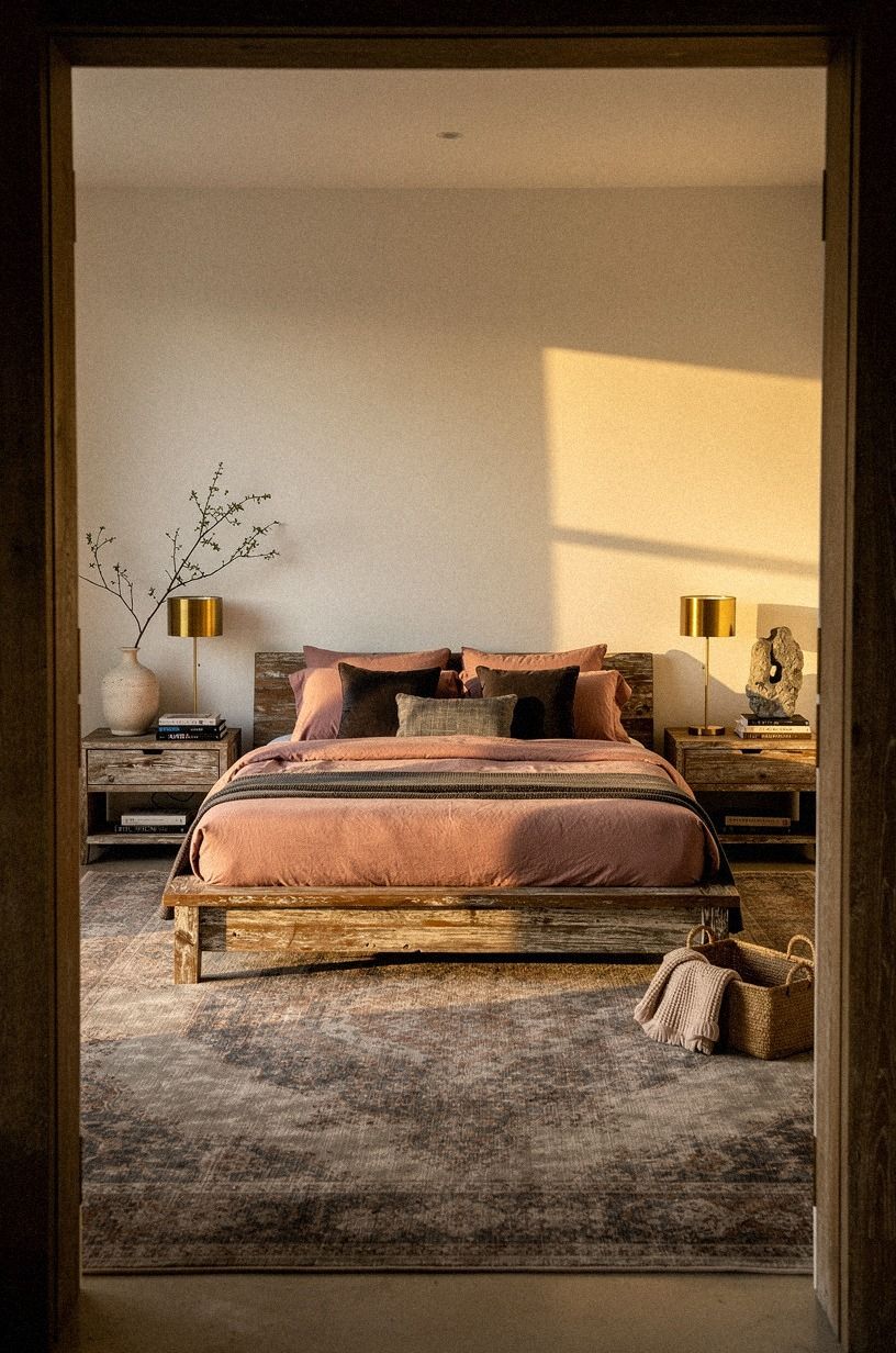
The rug changed the way the room felt underfoot. I used a wool rug in dusty rose and charcoal, then positioned it so the sides extended 18 to 24 inches past the bed. A small brass detail echoed the warmer accents, while reclaimed weathered teak added a grounded note nearby.
You’ll want to measure before you order, especially if your room is narrow. An 8x10 wool rug can cost $400 to $1,500 in the United States, so sizing errors get expensive quickly. I’d skip a tiny rug placed only at the foot.
It makes the bed look disconnected from the rest of the room.
A low-pile rug works better if your door swings inward. Your rug should slide beneath the lower two-thirds of the bed, not fight the door clearance.
The texture matters more than a loud pattern here. Soft, quiet, and slightly worn.
I considered a round rug, but the rectangular shape worked better with the bed and window. The room needed a stable horizontal foundation. The dusty rose and charcoal pattern added interest without introducing another strong color.
A rug is also one of the most noticeable comfort upgrades. You feel it before you consciously notice it. That soft landing made the morning routine feel warmer, which is a small but meaningful luxury.
I measured from the closed door, not from the empty wall. That prevented the rug from becoming a daily obstruction. If your room is particularly tight, I’d solve clearance first and then decide how much rug can extend beyond the bed.
9Could a smaller bedroom carry this much color?
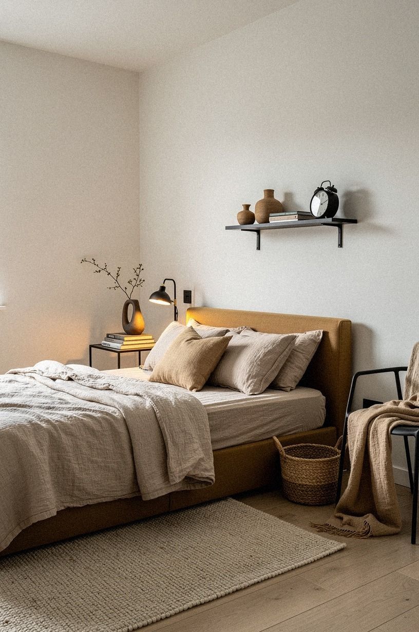
Yes, if you keep warm white as the base, camel as the soft middle tone, and black accents under control. The smaller space needed fewer competing colors, not less personality.
10Hang linen drapes to soften the window
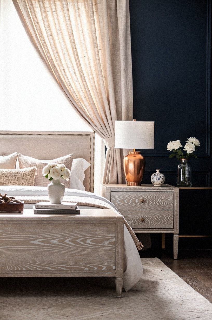
The window needed more than blinds, but I didn’t want heavy curtains swallowing the light. I chose Belgian flax linen drapes in an ivory shade and mounted the rod close to the ceiling. The fabric filtered the morning sun into a pale wash that made the darker colors feel less heavy.
You’ll need to check the fabric width before buying. A pair of linen drapes typically costs $120 to $400, and thin panels can look skimpy when closed. I’d rather buy fewer, fuller panels than hang narrow fabric that barely reaches the floor.
Your curtain rod should extend beyond the window frame so the panels can sit clear of the glass during the day. That move made my room feel wider without changing the window. I paired the linen with copper hardware and let the cerused white oak nearby repeat the natural texture.
The ivory tone was important. Bright white would have felt too sharp beside the midnight blue and copper. A softer linen shade added a quiet, natural quality.
I let the panels skim the floor rather than puddle. That finish felt graceful and practical, especially because the room is small. The drapes now make the morning light feel gentle instead of exposed.
The window treatment also balanced the darker accents. Without it, the midnight blue and walnut furniture pulled the eye toward the bed too strongly. The linen gave the opposite wall enough softness to hold its place.
11Choose layered storage over a matching furniture set
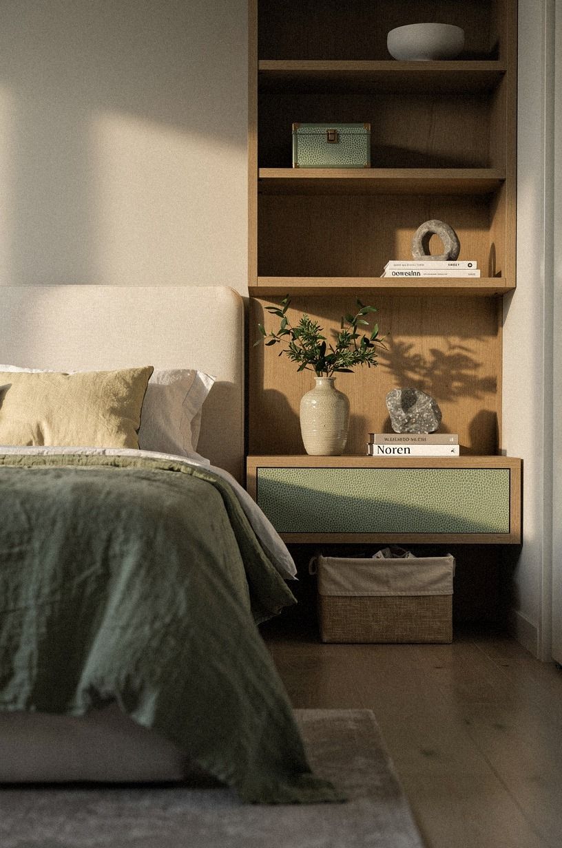
The final design decision was refusing a matching bedroom set. I layered sage green, warm cream, and natural wood through baskets, drawers, and small cabinets, then used shagreen accents to give the arrangement a little more texture.
How much it cost: the honest bedroom makeover ranges
I kept the makeover below a full renovation by painting, reusing the bed frame, and buying the larger pieces slowly. The typical US ranges below helped me decide where to spend and where to wait.
For my room, the best value came from paint, bedding, and lighting because those changes affected the space every day. A wool rug can run $400-$1,500, while an upholstered headboard often lands between $250 and $900. Linen drapes generally sit around $120-$400 per pair, and washed-linen bedding tends to cost $150-$450.
You can start with what you already own. Move the bed, wash the windows, change the bulbs, and edit the surfaces before spending anything.
I’d put your first dollars toward the wall color and one good light source. Those two choices will tell you whether the rest of the palette is working.
The budget tier can still feel beautiful. Paint, secondhand frames, one substantial blanket, and better bulbs created most of the mood in my room. The high-cost version would be wonderful, but it isn’t required for a dreamy result.
I spent in this order: paint, lighting, rug, bedding, then decorative pieces. That sequence meant every later purchase had to support a decision I’d already made. It also kept me from spending heavily on accessories before I knew whether the purple would feel right.
The purple palette I kept beside the bed
The bedside area needed to feel soft but useful. I used one shaded lamp, a small walnut tray, and a ceramic cup in a muted aubergine tone. Nothing matched exactly, but the colors shared enough warmth to sit comfortably together.
I kept the wall behind the nightstand mostly clear. That empty space made the lamp glow more clearly and gave the darker wood room to show its grain. A small bedside area can become visually noisy quickly, especially when the bed already carries several fabrics.
The tray gathered my glasses, hand cream, and book. That sounds minor, but it kept the room looking composed without demanding constant tidying. I’d rather have one useful object than several decorative ones.
The result connected the bedside lighting plan to the larger palette. Warm light, walnut, mauve, and ivory repeated the same quiet idea in a very small area.
The shopping order that saved me money
I started with the fixed elements because they controlled every later decision. The wall sample came first.
Then I chose the rug size, headboard shape, and primary bedding. Small accessories came last.
That order kept me from buying pieces that looked attractive online but failed in the finished room. A lavender cushion seemed charming by itself.
Beside the wall color, it looked dull and slightly blue. Returning it was easy, but avoiding the purchase would have been better.
I also measured every large item twice. The bed width, door swing, rug clearance, and drape length all affected the design. A small bedroom has little room for expensive mistakes.
For affordable pieces, I checked secondhand wood furniture, vintage lamps, local resale listings, and simple ready-made curtains. I spent more on the wool rug because it affected comfort every morning. I spent less on decorative objects because they were easier to replace.
The most satisfying purchases were the ones that solved a problem. The headboard added height.
The rug added warmth. The lamps fixed the evening glare. Beautiful objects are even better when they make the room work harder.
This order also made it easier to pause. I could live with the painted wall for a few days, then decide whether the bedding needed more contrast. That slower pace led naturally to the final restrained styling.
How to keep romantic purple feeling grown-up
The answer was contrast. Purple became more sophisticated beside warm ivory, brown wood, aged bronze, and natural linen. It also benefited from a few sharper edges, including the dresser profile and simple black curtain rod.
I avoided repeating rounded forms everywhere. The headboard had soft corners, but the art frames were square and the bench was clean-lined. That mixture gave the room a confident, balanced feeling.
Natural materials helped too. Linen, wool, cotton velvet, and wood gave the color something tactile to sit against. Shiny synthetic fabric would have made the palette feel louder and less restful.
I also left some surfaces empty. A romantic room doesn’t need every corner filled with flowers, candles, and decorative trays. One small arrangement can feel more elegant than a collection of tiny accents.
The final effect was delicate but grounded, warm but not sugary, and dramatic without becoming theatrical. That balance made the room feel like a place to live.
If the room starts feeling too sweet, add grain, weight, or a darker edge before adding more color. A walnut frame, an aged bronze pull, or a charcoal artwork can do more than another purple pillow.
What I learned from living with romantic purple
I thought the color would be the main event, but the light made the bigger difference. Purple changes quickly from morning to evening.
In direct sun, it can look floral and lively. Under a warm lamp, it becomes quieter and more intimate. That shift is why I tested samples across one full day before painting.
I also learned that romance needs a little friction. If every surface is plush, curved, and pale, the bedroom starts to feel staged.
The aged bronze hardware gave the soft fabrics something grounded to push against. The oak added grain.
The linen added wrinkles. Those details kept the room from becoming overly sweet.
My biggest mistake was buying accessories before deciding on the wall color. I returned a set of lavender cushions because they looked dull beside the finished paint.
You’ll save money by choosing the fixed elements first, then layering the movable pieces. Your room doesn’t need more objects.
It needs a clearer order.
I’d do the makeover again, but I’d spend less on small decor and more on the rug. The rug is what you feel before you consciously notice it. That quiet softness under your feet is what made the room feel welcoming every morning.
The room also taught me to trust restraint. The most beautiful moment is often the empty space beside a lamp, the fold of linen at the foot of the bed, or the small shadow beneath the bench. Those details feel honest because they aren’t trying to perform.
A Few Things Worth Answering
What is the best romantic purple bedroom idea for a small bedroom?
I’d start with a pale wall color and one deeper purple zone. Try IKEA KALLAX storage in a light wood finish, a slim upholstered headboard, and one large rug. You’ll keep the floor visible while giving your eye a clear focal point.
Where can I buy romantic purple bedroom pieces on a budget?
I’d check IKEA, Wayfair, and Target first, then compare those prices with Facebook Marketplace and local thrift stores. You can find secondhand wood furniture for less, especially if you’re willing to repaint it and replace the hardware.
How much does a romantic purple bedroom makeover cost?
I’d expect a budget makeover to run about $200-$800 for bedding, paint, shades, and art. You can spend nothing on furniture if your current pieces work. A mid-range makeover with a headboard, rug, drapes, and lighting often reaches $1,500-$5,000.
Can I create a romantic purple bedroom on a budget?
Yes, and I’d begin with free changes. Rearrange the furniture, lower the lighting, and group your existing art. Then spend on paint or one washed-linen coverlet instead of buying several small accessories.
Is a romantic purple bedroom worth it in a small space?
Yes, because a small room can make a focused color feel more enveloping. I’d keep the furniture shallow, use a rug that extends 18-24 inches past the bed, and leave one wall visually quiet so your room still has breathing space.
Is romantic purple bedroom decor a good idea for a rental?
Yes, especially with removable choices. I’d use peel-and-stick wallpaper behind the bed, a tension rod for linen panels, and removable picture ledges. You can bring in plum cotton velvet through pillows and a throw without painting the walls.
Where I’d Start First
If I had to pick one, I’d start with the wall color. Purple changes every other choice, and the wrong undertone will make your bedding, rug, and lamps work too hard. Paint one large sample, watch it through the evening, and let the room tell you what comes next.
Then fix the lighting before buying decorative objects. A warm bulb and one shaded lamp can reveal whether the palette feels soft, moody, or too cool. After that, choose the rug and bedding.
Those pieces establish the comfort of the room.
The final layer should be personal. Add the art you’d want to see when you wake up, the wood finish that feels warm to you, and the storage that makes daily life easier. The romantic mood will follow from those choices.


