I Tried Green in My Powder Room, It Became My Best Color Choice
29 august 2026Green in a powder room was my best color choice because it made the smallest room in my house feel intentional instead of apologetic. I painted it during a rushed weekend, with guests due the next day. Risky. By dinner, the room had a moody little presence I hadn’t expected.
Here's what it looked like before
Before, it had the full 2005 starter-home package: beige walls, a narrow builder mirror, chrome faucet, and one harsh ceiling bulb that made everyone look vaguely unwell. The vanity was usable, but your eye landed on nothing worth keeping.
I didn’t need a demolition plan. I needed a better point of view. Once I stopped treating the room as a tiny utility box, I could see its useful bones: one solid wall, a decent 32-inch vanity height, and enough floor space to make a strong color feel deliberate.
- Paint the walls with the Green Envelope Method
- Skip bright white trim for powder room ideas green
- Hang a taller mirror above the vanity
- Build the Three-Height Light Stack
- Choose unlacquered brass over polished chrome
- Frame the sink with a quiet stone surface
- Let hand-glazed tile carry the splash zone
- Try the Two-Wood Rule around a moody wall
- Float storage instead of adding a bulky cabinet
- Soften the floor with a washable runner
- Can dark green work with a small powder bath?
- Mix linen, glass, and one imperfect ceramic piece
- Add art that makes the green feel chosen
1Paint the walls with the Green Envelope Method
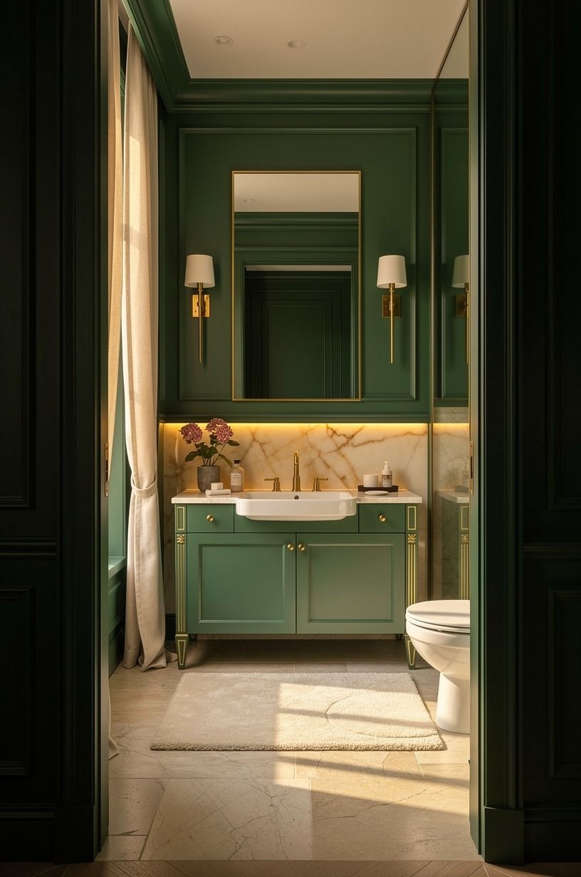
I chose Farrow & Ball Hague Blue No. 30, which reads green enough in a powder room while holding a deep blue shadow at night. You’ll get a more intimate result if you paint the walls, trim, and door in the same finish family instead of leaving bright white breaks everywhere.
I almost chose Sherwin-Williams Sea Salt SW 6204. It’s calming, but it looked too airy against my warm floor and made the room feel undecided.
Hague Blue gave the emerald, gold, and cream palette a richer foundation, especially beside backlit translucent onyx. Bold choice.
Worth it!
2Skip bright white trim for powder room ideas green
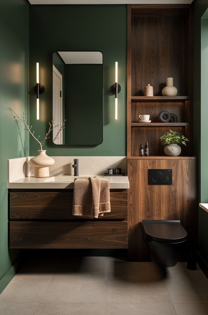
Your trim doesn’t need to announce itself. I used the same green on the baseboards, then let Benjamin Moore Chestertown Buff HC-9 appear only through a small framed print. You can use that warm ochre note in your own room if your green needs a little sunlight beside it.
But don’t pair a dark green wall with icy white trim unless you want the room chopped into stripes. Forest green works beautifully with rust, natural oak, and a book-matched walnut surface, so the finish of the brass gets noticed before the paint line.
3Hang a taller mirror above the vanity
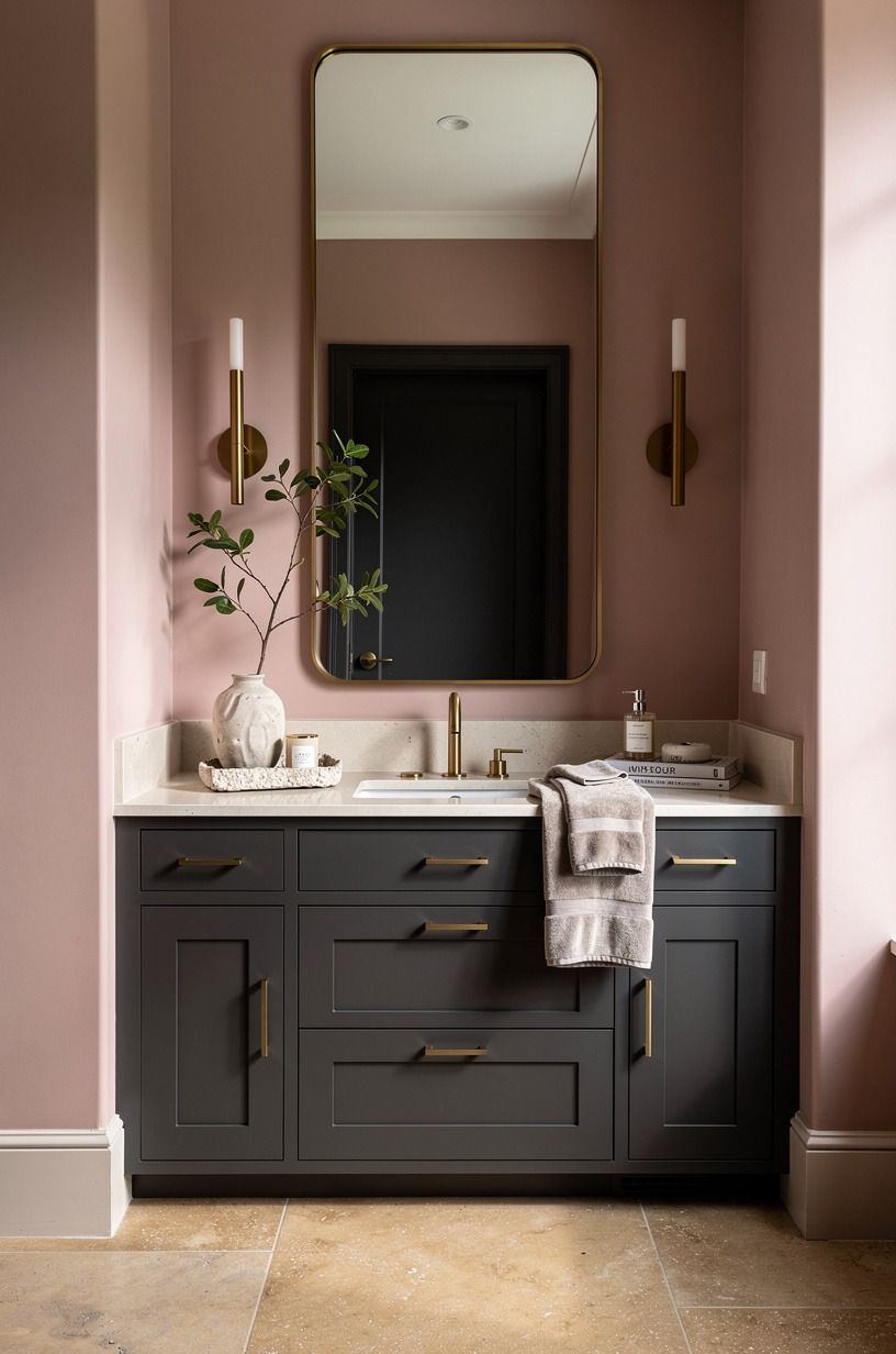
A tall mirror changed more than the color did. I found a rounded Target Threshold arched mirror and hung it so its center met my eye line, not the top of the faucet. You’ll want the bottom edge high enough that it doesn’t fight the backsplash, but low enough to reflect the sink and your hands.
My old horizontal mirror made the ceiling feel low. This one pulled the room upward. Dusty rose, charcoal, and brass gave the area a softer counterpoint, while warm travertine kept it considered rather than precious.
4Build the Three-Height Light Stack
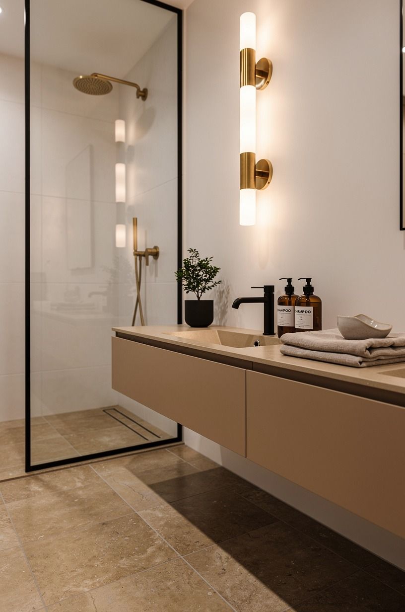
Overhead light alone is brutal in a powder room. I kept the ceiling fixture, added a pair of West Elm Sphere + Stem sconces, and placed one small rechargeable lamp on a shelf. You don’t need all three on at once, but you’ll use them differently: task light for guests, sconces for evening, lamp for a quiet amber glow.
The lamp was the part I resisted. Then I switched it on after dark and understood why designers keep doing it. Against warm white, camel, black accents, and unlacquered brass developing its own patina, the room felt charming without trying too hard.
5Choose unlacquered brass over polished chrome
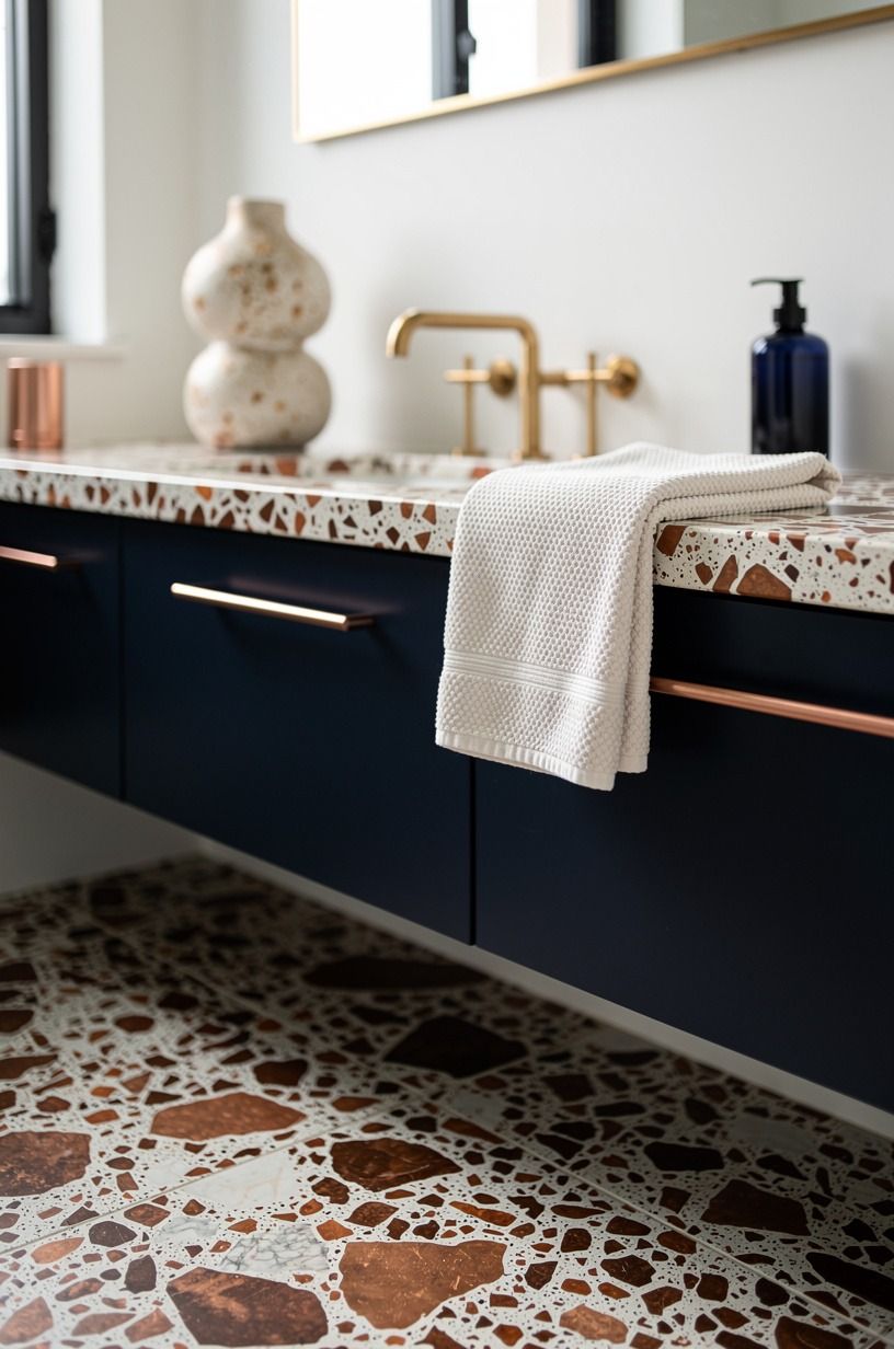
For my powder room with gold accents, I replaced the faucet with an unlacquered brass faucet that will darken and soften over time. A brushed brass faucet typically runs $120-$450, so you can decide whether that’s your investment piece before buying new towels or art.
Chrome is clean, sure, but it felt too cold against the midnight blue, copper, and ivory palette. Brass brought in a little warmth beside oversized-chip terrazzo and made the room feel gathered.
You’ll want to match the undertone, not every single metal item. I left the toilet lever alone for weeks.
Nobody noticed.
6Frame the sink with a quiet stone surface
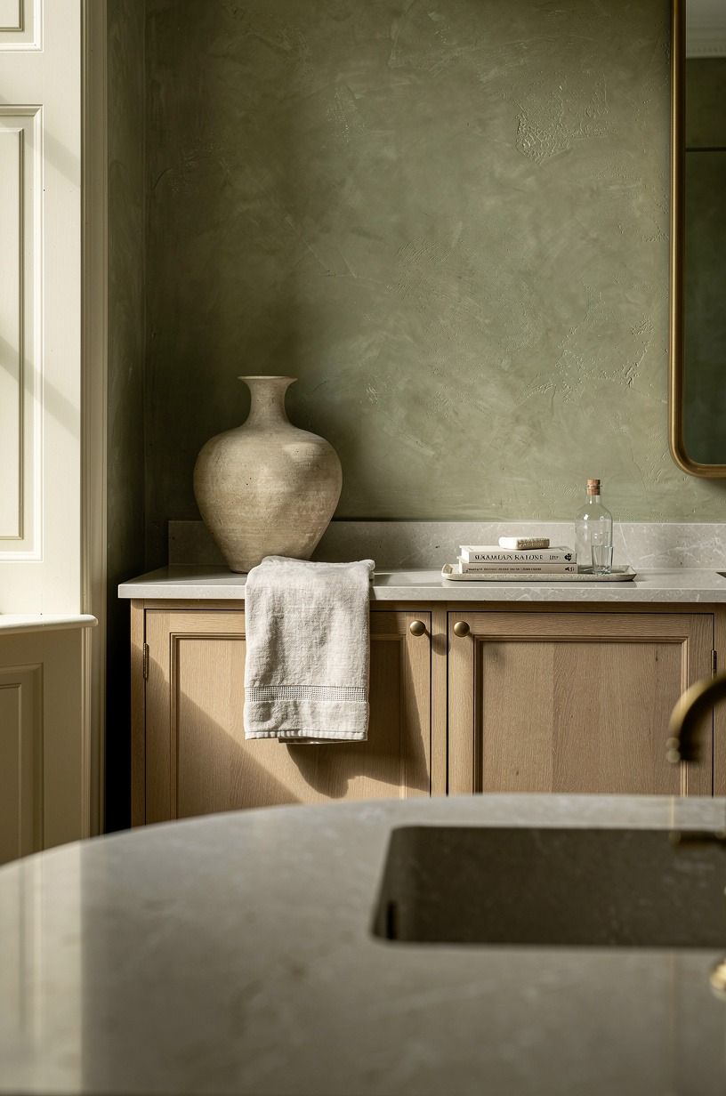
I didn’t replace my vanity, but I did cover the existing top with hand-applied Venetian plaster in a sage green, warm cream, and natural wood scheme.
7Let hand-glazed tile carry the splash zone
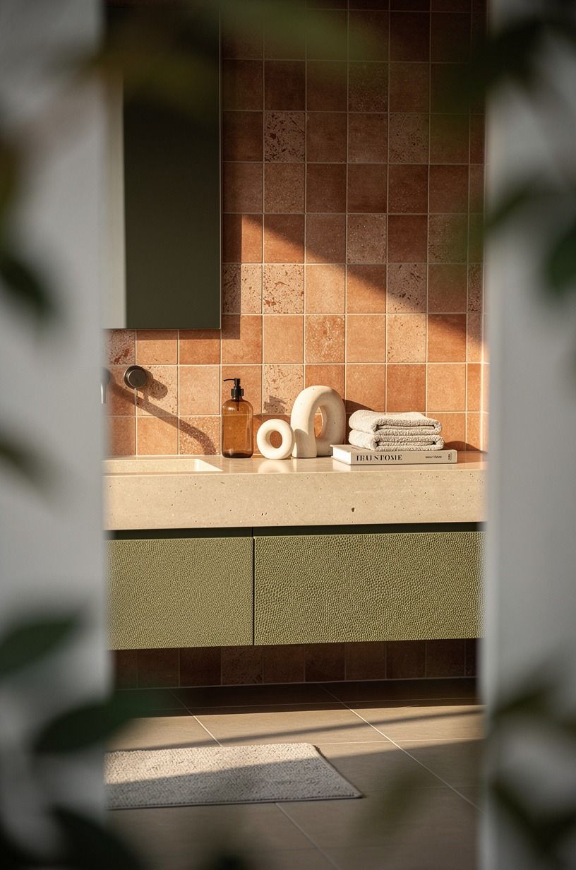
The backsplash is only a small strip, which is exactly why you can be braver with it. I picked a hand-glazed terracotta tile behind the faucet, where its uneven surface brings olive and stone tones into the room. You can use it as a narrow band and still get that lively, imperfect finish.
Tile typically costs $15-$35 per square foot, while subway tile lands around $2-$10. I chose the pricier material in a tiny area and saved the rest of the wall for paint.
That’s the move I’d repeat. The tile doesn’t need to cover every inch to feel luxurious.
8Try the Two-Wood Rule around a moody wall
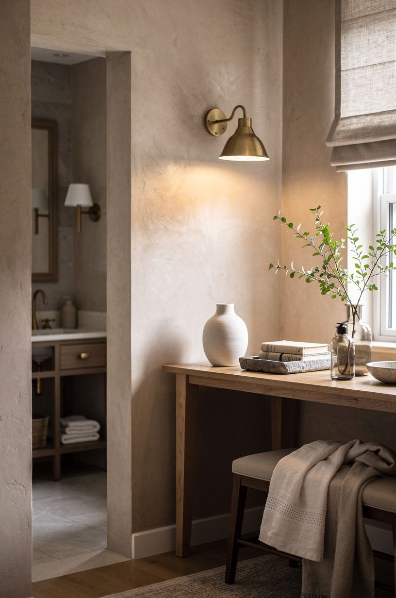
Green needs something natural nearby, but not a full lumberyard. I used a 3/4-inch solid white oak shelf and a small walnut frame, then stopped. You can mix two woods if one is pale and one is dark; three competing stains start to look like leftovers.
And this is where I made an early mistake. I added a bamboo basket, oak shelf, walnut frame, and teak tray all at once.
The room got busy fast. Once I removed the teak, clay, linen, and aged brass worked more quietly beside washed Belgian linen, and the space settled down.
9Float storage instead of adding a bulky cabinet
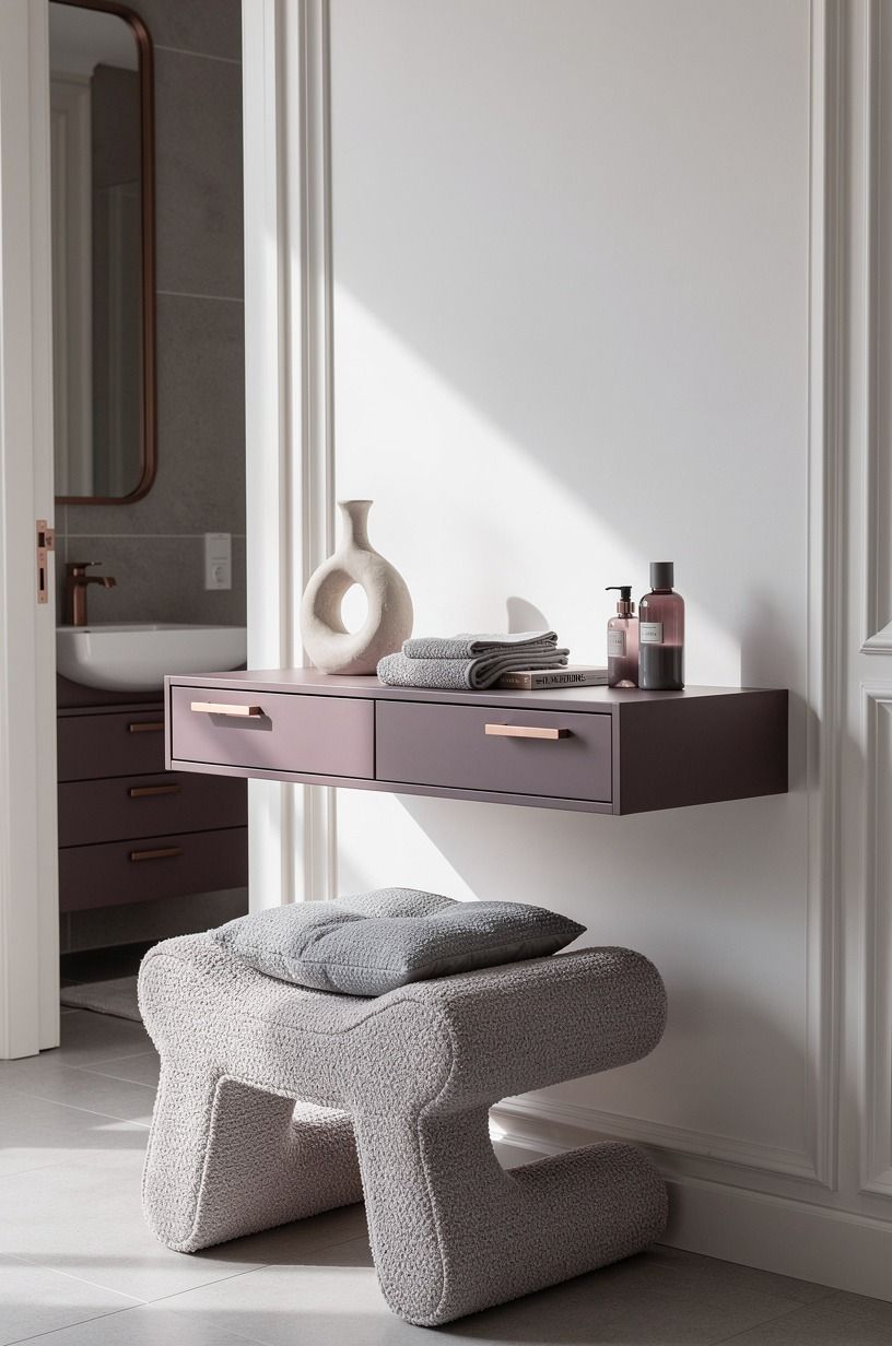
A powder room doesn’t need more furniture. It needs somewhere for a spare roll, hand lotion, and the things you’d rather not display. I installed a slim IKEA EKET wall cabinet beside the vanity, high enough to keep the floor visible.
You’ll make your room feel larger when you can see the baseboard continue underneath storage. My cabinet holds the boring stuff, while a tiny oak shelf holds the nice stuff: folded organic bouclé towel, rose-gold soap bottle, one ceramic dish. No crowded counter.
Such a relief!
10Soften the floor with a washable runner
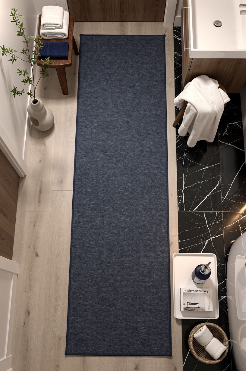
I went back and forth on a bath mat because most of them looked like an afterthought. A muted Ruggable Kamran runner gave the navy, white, and walnut scheme a faded pattern without swallowing the floor. You can choose a washable runner if children, pets, or enthusiastic hand washing are part of your life.
Don’t buy a tiny rectangle just because the room is small. Mine reaches beyond the vanity and gives bare feet a soft landing. Nero Marquina black marble with white veins brings enough contrast that the pattern can hide a surprising amount of lint, which matters more than a pristine photo moment.
11Can dark green work with a small powder bath?
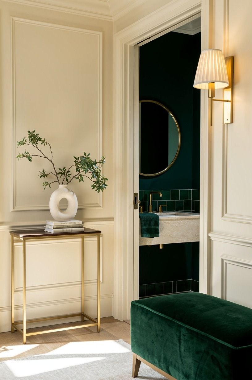
Yes, and I think dark green works better in a small powder bath than in a hesitant large bathroom. Emerald, gold, and cream can feel deeply welcoming here, especially with one deep-pile mohair velvet accent for softness.
12Mix linen, glass, and one imperfect ceramic piece
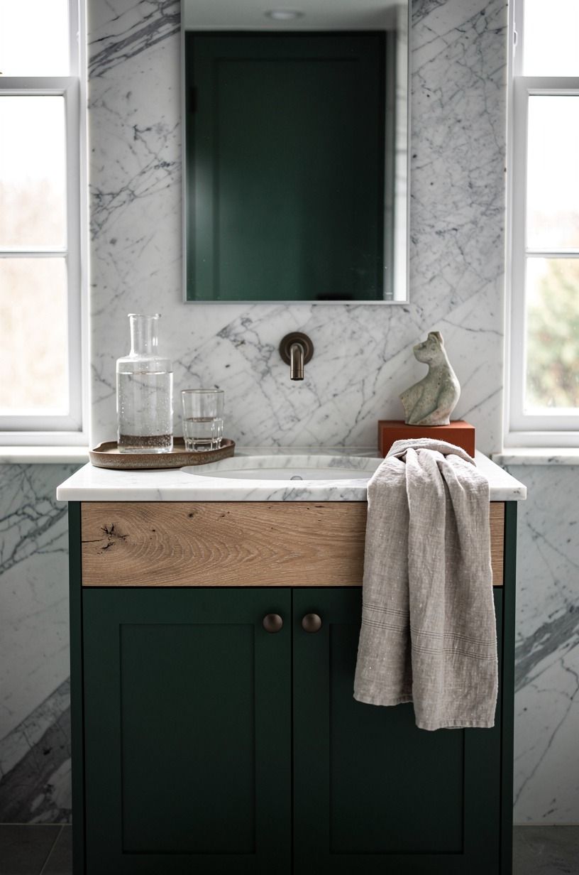
For powder bath inspiration, I styled the sink with textures you’ll want to touch: linen, ribbed glass, and a handmade cream soap dish. That mix made the room inviting even before I turned on the sconces.
I’d skip matching green towels. They disappear into the walls and make the room feel like a theme.
Forest green, rust, and natural oak need a quieter pause, while Carrara marble with subtle grey veining gives the arrangement a little calm. A little unevenness helps too (especially if your house isn’t brand new).
13Add art that makes the green feel chosen
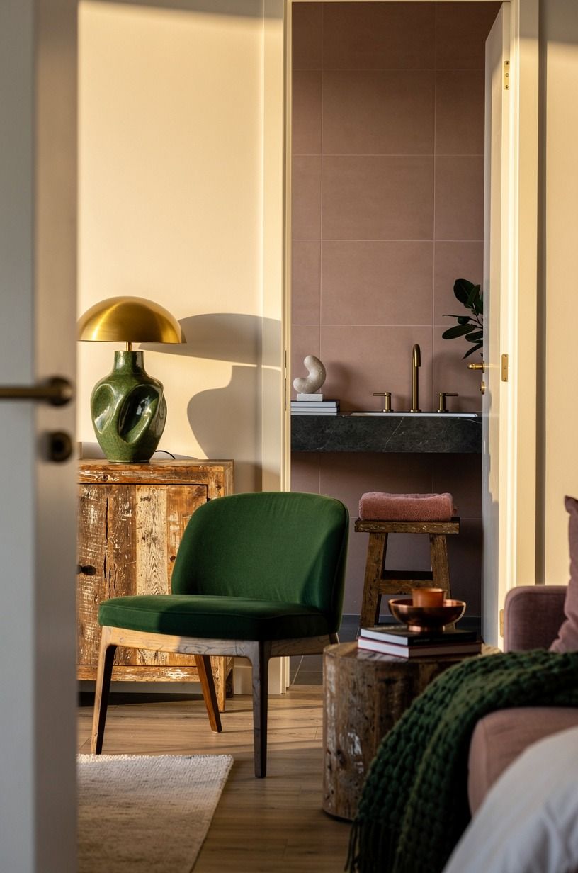
My last addition was a small landscape print in a thin aged bronze frame. You can use art with dusty rose, charcoal, brass, moss, ochre, tobacco, or faded blue, but it should have some quiet space around it. I hung mine beside the mirror instead of directly above the toilet, because that wall deserved a reason to exist.
But don’t use generic bathroom signs. The room already knows what it is.
A real image paired with reclaimed weathered teak made this feel like a tiny room in the house, not a place you rush through before dinner. Everyone asks about that print first.
How much it cost
My own refresh came in at about $1,080, mostly because I kept the vanity and plumbing where they were. You can spend much less if you paint, change hardware, and use a secondhand mirror; you can spend far more once tile and new fixtures enter the picture.
For me, paint was the best value, then lighting. A new vanity would’ve been tempting, but mine still worked and sat within the standard 32-36 inch height range. You’ll save real money when you keep what functions and spend where your eyes and hands land.
Why I think green belongs in a powder room now
I used to think a powder room had to be pale because it was small. That advice survives because it feels safe, not because it always looks good.
I’ve painted enough tiny rooms to know that pale walls can make a small space feel unfinished, especially when the light is overhead-only and the fixtures are basic. Green gives the room boundaries.
It says this little corner has a mood, a purpose, and maybe even a point of view.
What changed my mind was seeing how different the room felt at two times of day. In the morning, Hague Blue looked refined beside the brass and white oak. At night, it turned almost forest-dark, and the sconce light made the hand-glazed tile feel alive.
That movement matters. Flat paint and polished chrome can be perfectly acceptable, but they don’t give you much back.
I also think powder rooms are where you should take the design risk you’d never take in a whole open-plan house. You’re only painting a small amount of wall, and you aren’t trying to make it match the sofa, kitchen, and family calendar.
If it’s dramatic, good. A powder room can handle drama because you only experience it in short, memorable bursts.
My rule now is simple: spend on the sensory parts, save on the invisible ones. Keep functional plumbing. Paint deeply.
Add one metal that warms with age, one natural material, and a light source below eye level. You’ll create a room that feels personal rather than expensive.
And if you change your mind later, it’s still paint. That’s the freedom of it.
What People Always Want to Know
What is the best green for a small powder room?
A deep blue-green such as Farrow & Ball Hague Blue No. 30 is my pick for a small powder room because it gives the walls depth without looking flat. You’ll get the best result with warm lighting and a pale mirror frame.
- Warm brass glow - Cream towel contrast - Tall reflective mirror
Where can I buy green powder room pieces on a budget?
You can find useful green powder room pieces at IKEA, Target, and Wayfair, then look for mirrors and frames on Facebook Marketplace or at thrift stores. Your best savings come from buying the big visual item secondhand, not cheapening every finish.
- Secondhand wood mirror - Target hand towels - IKEA wall storage
How much does a green powder room makeover cost?
A green powder room makeover can cost about $200-$1,200 when you keep the layout and use paint, textiles, a mirror, and a faucet. Paint is the lowest-cost visual change, and cleaning existing hardware is free.
- Paint and supplies - Existing vanity retained - Thrifted art
Can I create a green powder room on a budget?
Yes, and you don’t need new tile to make it feel intentional. Paint the walls, swap in warm bulbs, and bring in a washable runner. Three focused changes will read better than ten small purchases you don’t love.
- Deep wall color - Warm bulb temperature - One textured towel
Is a green powder room worth it in a small space?
Yes, a green powder room is worth it because small spaces can hold a stronger mood without overwhelming the rest of your house. The contained scale helps the color feel deliberate. Keep the 21-inch toilet clearance open so the room stays easy to use.
- Clear floor line - Tall mirror - Wall-mounted storage
Is green a good idea for a rental powder room?
Yes, green can work in a rental if you choose removable updates around your paint rules. No-damage layers such as peel-and-stick backsplash, tension-rod art, and removable hooks let you add warmth without changing plumbing.
- Peel-and-stick tile - Removable art strips - Tension-rod textile
Where I'd Start First
If I had to pick one, I’d start with the green paint. You can’t warm up a cold powder room by scattering accessories over beige walls; they’ll only look temporary.
Paint the envelope first. Then let everything else earn its place.


