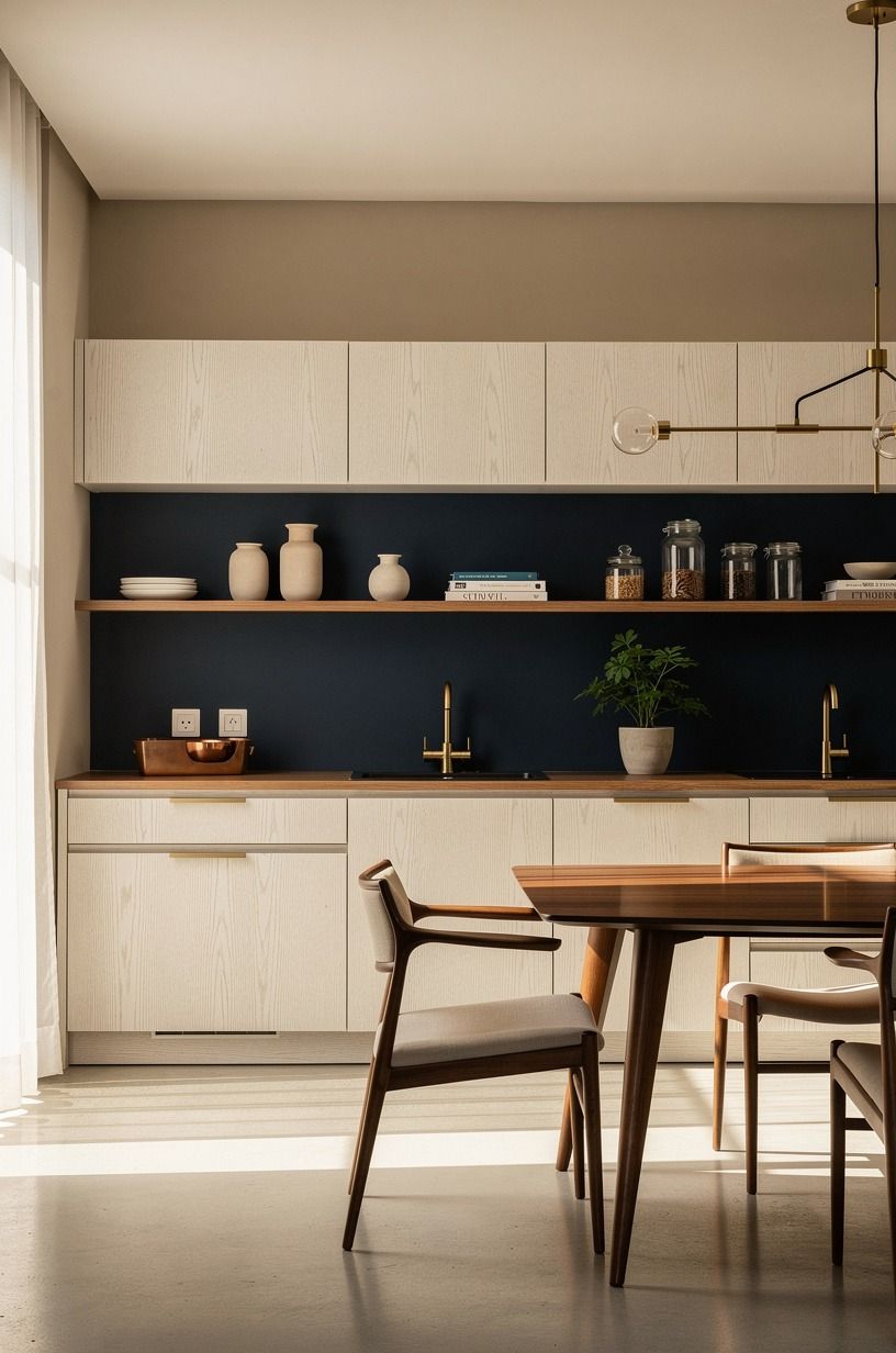
How to Design an Earthy Neutral Japandi Kitchen in Beige, Brown & Clay - 17 Ideas
04 august 2026Earthy neutral Japandi kitchen ideas in beige, brown, and clay work because they replace cold contrast with quiet layers you can live with. I’ve watched white kitchens turn gray by noon, then feel oddly harsh at dinner. Start with the undertones. Your room will tell you what it needs.
- Start with a warm beige base for your kitchen earth tones
- Measure your working zone before buying anything
- Anchor the room with the Two-Wood Rule
- Paint a grounding wall in clay instead of adding more decor
- Choose low-sheen fronts for a more organic finish
- Use hand-glazed tile to make the backsplash earn its place
- Let open shelves follow the Quiet Shelf Formula
- Mix clay ceramics with one dark metal finish
- Hang lighting in the Three-Height Light Stack
- Bring in a brown and beige kitchen idea through seating
- Frame the sink with a soft window treatment
- Build a useful pantry corner with natural kitchen design earth tones
- Lay down a washable runner with restraint
- Swap plastic clutter for the Countertop Landing Zone
- Decide what your budget can honestly carry
- Edit the visual noise before you style the final layer
- Finish with one living, imperfect element
1Start with a warm beige base for your kitchen earth tones
Pick one beige that reads warm against your existing floor, because your walls touch every other decision. Benjamin Moore White Dove OC-17 is a safer choice than icy white for cabinets or surrounding walls, especially if you get afternoon sun.
If your room already leans toward midnight blue, copper, and ivory, let that richer palette guide the accents instead of forcing every surface toward beige. Cerused white oak can soften those darker notes and keep the kitchen from feeling heavy.
I’d skip bright builder white here. It’s clean, sure, but it can turn an earthy tone kitchen into a waiting room.
2Measure your working zone before buying anything
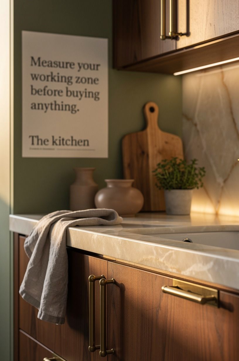
Your counter should sit at the standard 36 in, and your island needs 42 to 48 in of clear walking room around it. You don’t need a larger kitchen. You need fewer collisions while someone opens the dishwasher.
Use painter’s tape to mark your island footprint on the floor. Then walk it with a laundry basket in your hands. That awkward little test saves you from buying a dramatic island that makes your kitchen feel cramped.
A sage green, warm cream, and natural wood scheme benefits from the same discipline. Backlit translucent onyx is dramatic enough on its own, so the surrounding layout should stay easy to use.
3Anchor the room with the Two-Wood Rule
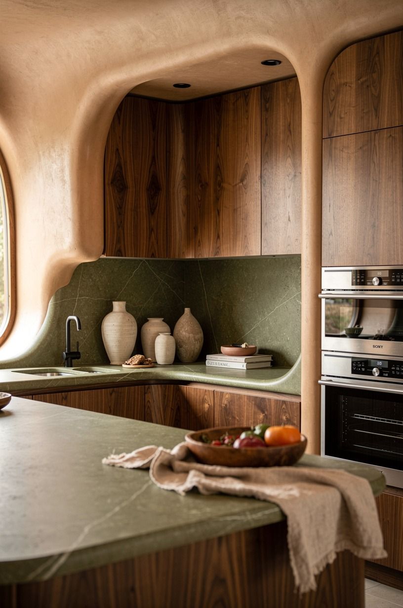
Choose two wood finishes, then stop. A walnut cabinet front with a second, quieter wood tone is enough contrast for a calming Japandi kitchen without making your eye bounce around.
I like book-matched walnut for the larger surface, especially with terracotta, stone, and olive nearby. The grain catches low light differently, which gives the kitchen a lived-in softness without adding clutter.
Don’t add a third orange-toned wood just because it’s on sale. That’s where the refined look starts slipping into accidental.
4Paint a grounding wall in clay instead of adding more decor
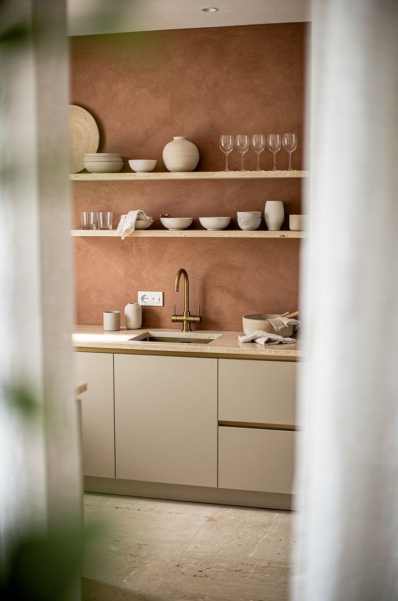
A clay-toned wall gives you warmth before you’ve bought a single object. Pair it with linen, aged brass, and warm travertine so the room feels layered rather than overly themed.
5Choose low-sheen fronts for a more organic finish
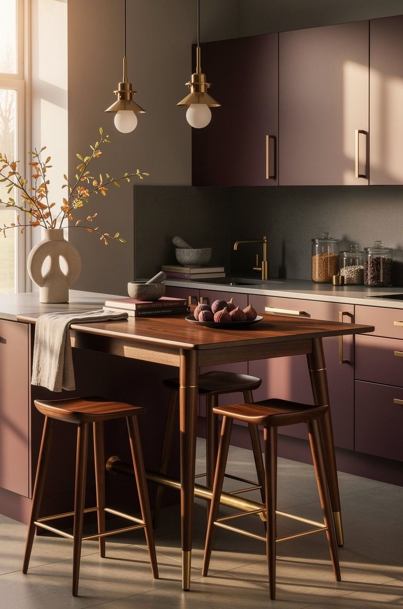
Glossy cabinets reflect every overhead bulb and every fingerprint. IKEA SEKTION VEDDINGE fronts in a soft neutral or repainted Shaker doors with a satin finish will feel quieter in your hands and softer under morning light.
For upper cabinets, 30 to 42 in tall is standard, but your ceiling line matters more than the catalog. If you’ve got a low ceiling, avoid stacking boxes all the way up just to fill space.
Plum, gray, and rose-gold accents work best when the unlacquered brass is allowed to develop a little patina. I made that mistake once. The room looked heavier, not more expensive.
6Use hand-glazed tile to make the backsplash earn its place
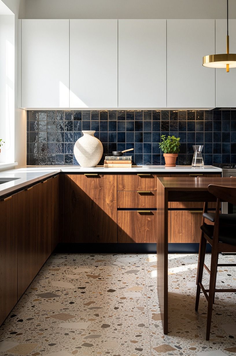
Your backsplash has an 18 in gap between counter and upper cabinets, so treat that strip like a small gallery wall. Oversized-chip terrazzo brings variation and texture without asking for extra decorative clutter.
A terrazzo backsplash can be a splurge, but you can use it only behind the range and choose a simpler field tile elsewhere. Navy, white, and walnut keep the material feeling tailored instead of busy.
I’d choose a warm white base over a cool one every time. Cool white beside walnut can look clinical by 4 p.m.
7Let open shelves follow the Quiet Shelf Formula
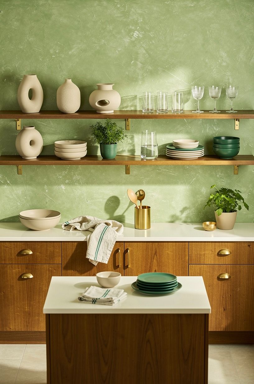
Use one or two shelves, not a whole wall of them. The Quiet Shelf Formula is simple: one stack, one vessel, one useful thing. A stoneware pitcher, everyday bowls, and a hand-applied Venetian plaster backdrop are plenty.
Your shelves should hold objects you’ll touch. If you have to dust around twelve tiny decorative jars, the shelf has already lost.
Emerald, gold, and cream need room to breathe. And leave some empty space. That pause is part of the design.
8Mix clay ceramics with one dark metal finish
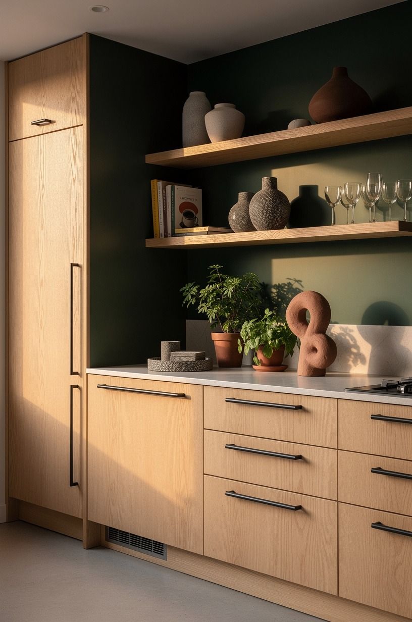
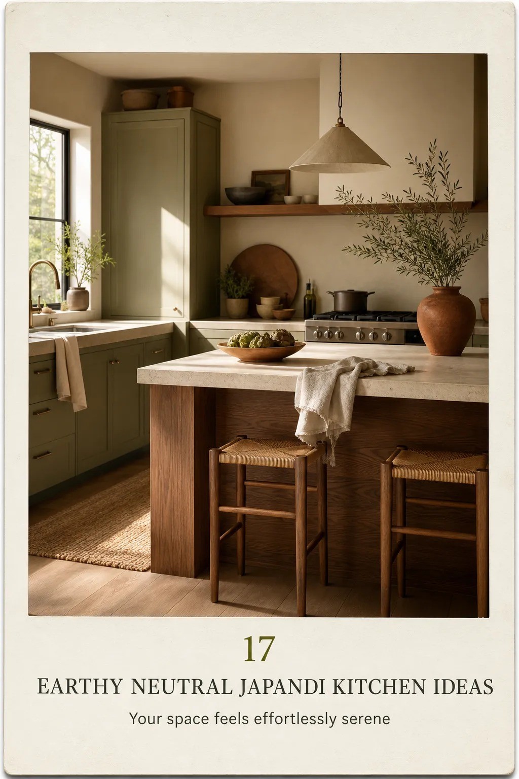
Choose either aged bronze or blackened steel for hardware, then repeat it in small places. Forest green, rust, and natural oak make a strong base for that darker finish, while a few shagreen accents add texture without turning the counter into a collection.
9Hang lighting in the Three-Height Light Stack
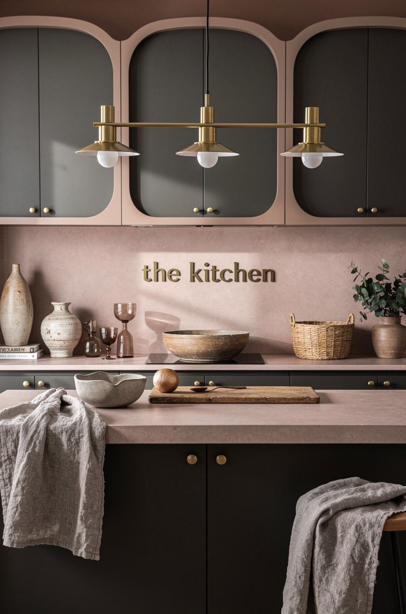
You need light at three heights: ceiling, task surface, and eye level. Start with a simple pendant over the island, add under-cabinet lighting, then use a small lamp on a counter if you have a safe corner.
A pendant with a washed Belgian linen shade can soften dusty rose, charcoal, and brass without feeling too formal. Use warm bulbs. Blue-white light will flatten your beige and brown palette in seconds.
Why spend time choosing clay tile if your bulbs make it look gray? Exactly.
10Bring in a brown and beige kitchen idea through seating
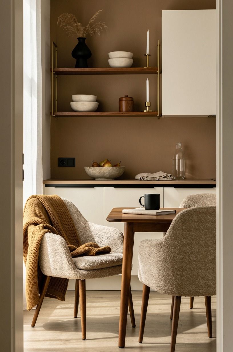
Counter stools are where your kitchen can take a little personality. Warm white, camel, and black accents are especially good with seating in organic bouclé, which adds softness without introducing another loud pattern.
11Frame the sink with a soft window treatment
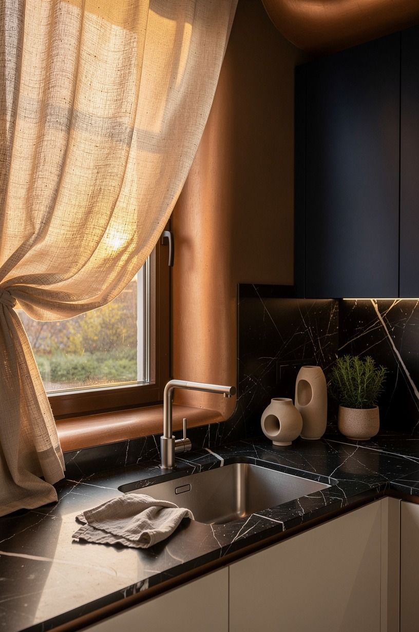
A café curtain in a deep midnight blue can soften a hard window instantly. Mount it inside the window opening with a tension rod, and let it cover only the lower half so you still get the daylight your plants need.
For renters, this is one of the gentlest moves you can make. No holes. No permanent trim.
Just softer light across a counter finished in Nero Marquina black marble with white veining.
I prefer a simple ivory fabric over a patterned one here. The texture is enough, and the copper details get to remain the main event.
12Build a useful pantry corner with natural kitchen design earth tones
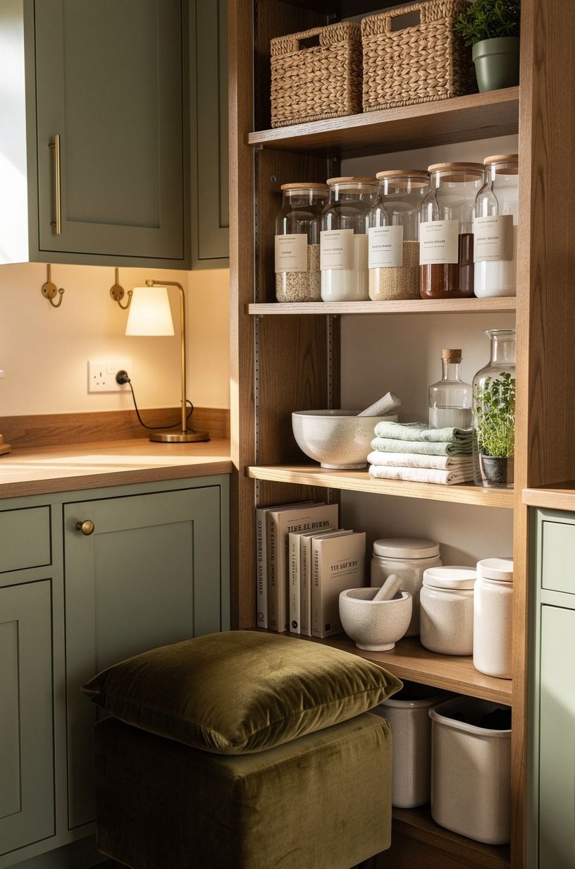
Give your pantry corner a job beyond storage. A sage green cabinet with warm cream walls and natural wood nearby can hold dry goods below while a shallow tray on top keeps oils, tea, or a small lamp within reach.
Use amber glass jars for things you buy often, not every ingredient you own. Rice, oats, coffee. A deep-pile mohair velvet stool or cushion can make a compact pantry corner feel unexpectedly comfortable.
But don’t hide every useful object. A kitchen should feel gathered, not staged for a photo nobody lives in.
13Lay down a washable runner with restraint
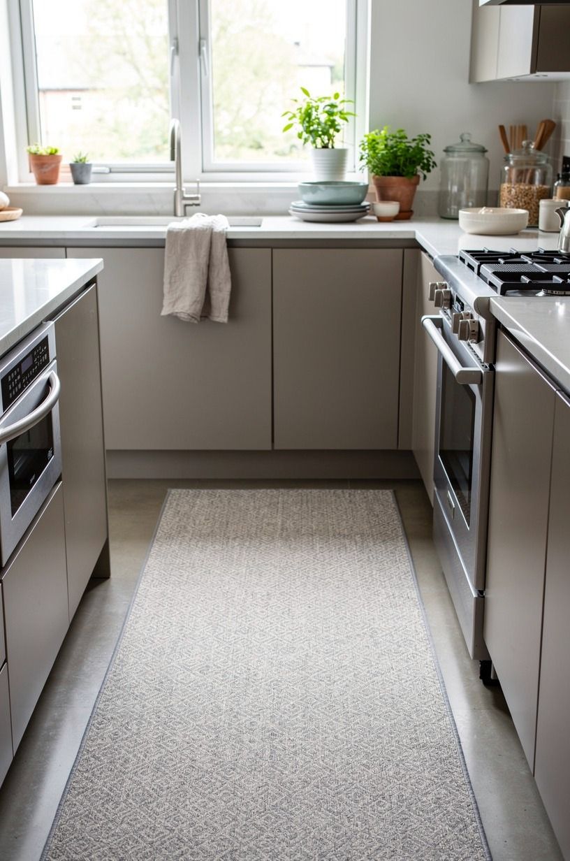
A runner softens the long line between your counter and island, especially over hard tile. Choose a faded brown, oatmeal, or muted rust pattern with enough variation to forgive a dropped spoonful of sauce.
Carrara marble with subtle gray veining pairs best with a runner that stays muted rather than competing for attention. Your runner should be narrower than the walkway, leaving a visible border of floor on both sides.
No tiny bath-mat-sized rug. It makes the room look apologetic.
14Swap plastic clutter for the Countertop Landing Zone
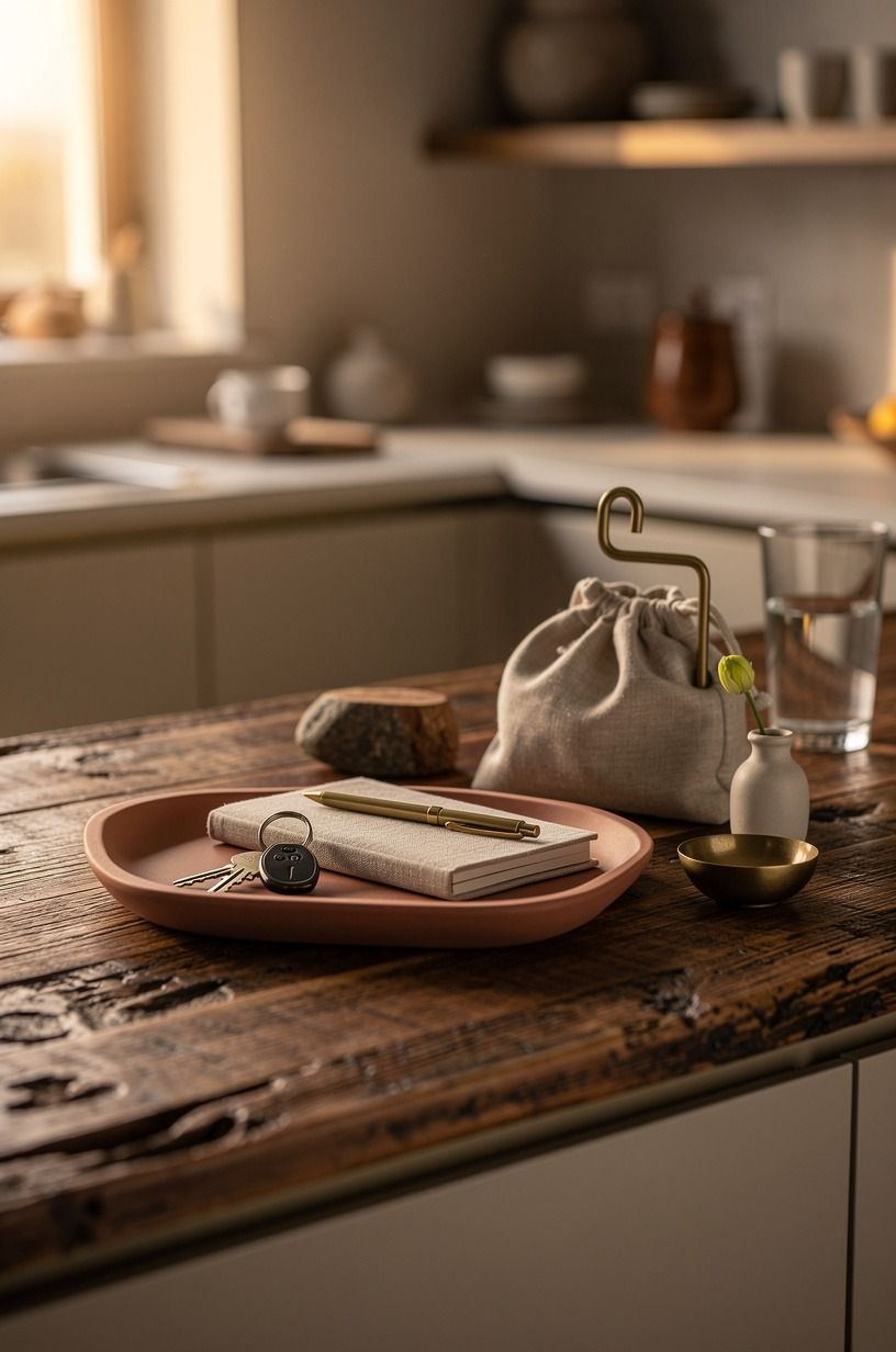
Pick one area near the stove or sink as the Countertop Landing Zone. Your cutting board, utensil crock, and oil bottle can live there, but nowhere else gets to become a permanent pile.
Use a reclaimed weathered teak board leaned against the backsplash and a matte ceramic crock beside it. You’re creating a useful composition, not trying to hide the fact that people cook here.
I’ve found that one defined landing spot makes the rest of your counter look twice as calm. A little boundary. Huge payoff!
15Decide what your budget can honestly carry
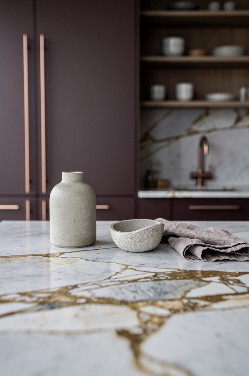
A Japandi look doesn’t require a full renovation, but it helps to know where the money goes. Paint, hardware, and lighting give you the most visible change before you touch cabinets or counters.
For counters, quartz typically runs $60 to $120 per sq ft, while laminate runs $10 to $40 per sq ft. A Calacatta marble surface with gold veining is a high-impact choice, but I’d spend on a faucet before expensive stone if your cabinets still work. You touch the faucet every day; nobody strokes a countertop at breakfast.
16Edit the visual noise before you style the final layer
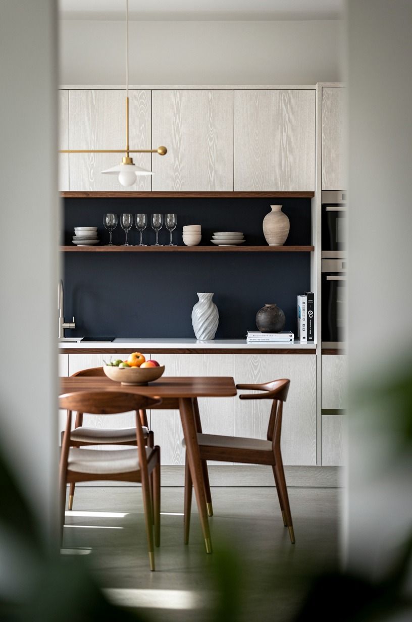
Take everything off your counters, then return only what earns its place. Your coffee maker can stay. The five mismatched bottles of vitamins probably can’t.
Use MUJI glass storage jars inside cabinets, then keep only one ceramic fruit bowl and one cerused white oak board visible. That small edit makes the room feel serene without buying a single decorative item.
And yes, the mail pile needs a different home. I know. Mine tries to move back every week.
17Finish with one living, imperfect element
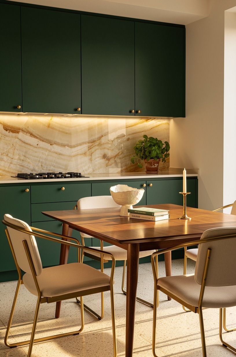
Add one branch, herb pot, or bowl of fruit where your eye naturally lands first. A rosemary plant in a small translucent onyx vessel brings in scent, shape, and a little bit of useful mess.
You don’t need a jungle. One olive branch in a narrow stoneware jug is enough, especially beside emerald, gold, and cream details.
Let it be slightly crooked. Japandi gets dull when every object looks like it’s waiting for an inspection.
Why I Think Earthy Japandi Works Better Than a Perfect Kitchen
I used to think the goal was a kitchen that looked finished all the time. You know the version: every counter bare, every cabinet bright white, no evidence that anyone has made toast in three days. It photographs well.
It also asks too much of normal life.
The kitchens I remember have texture. A linen towel that’s been washed enough times to soften. Walnut marked by an old water ring.
A clay bowl full of garlic because nobody bothered to hide it. Those details make a room feel welcoming because they don’t demand that you become a different person to maintain them.
I’ve gone back and forth on open shelving, dark paint, even pottery collections that get a little too enthusiastic. The answer isn’t that one choice is always right. It’s that you need a visual hierarchy.
Your eye should find the warm wall, then the wood, then the light. Everything else can be quieter.
That’s why I’d rather see a modest laminate counter, a good faucet, and a real wood stool than a giant renovation stuffed with glossy finishes. The expensive version can still feel cold.
The thoughtful version usually doesn’t. And if you’re working in a rental, that’s encouraging: paintable walls, linen, lighting, and a few material changes can give you most of the feeling without pretending you own the building.
Your kitchen doesn’t need to look untouched. It needs to make you want to linger while the kettle boils. That’s the whole point.
A Few Things Worth Answering
What is the best earthy neutral Japandi kitchen idea for a small kitchen?
The best small-kitchen move is a warm beige base with pale oak and one darker accent. IKEA IVAR pine storage keeps your floor visible, while a single brown stool or clay backsplash adds depth without crowding your sightlines.
Where can I buy earthy neutral Japandi kitchen pieces on a budget?
Start with IKEA, Target Threshold, and Wayfair for basic storage, stools, and linen-look textiles. Check Facebook Marketplace for solid wood pieces, too. You’ll often find better grain and sturdier construction than new flat-pack furniture.
How much does an earthy neutral Japandi kitchen makeover cost?
A cosmetic makeover usually costs about $300 to $1,500. Paint, hardware, and peel-and-stick backsplash are the lowest-cost changes, while new counters and appliances push you into a much bigger project.
Can I create an earthy neutral Japandi kitchen on a budget?
Yes, and your cheapest changes are often the most visible. Decluttered counters, warm paint, and secondhand wood can shift the room quickly. Add a linen curtain and replace only the hardware if you’re watching every dollar.
Is an earthy neutral Japandi kitchen worth it in a small space?
Yes, because a small room benefits from fewer competing finishes. A limited palette makes your kitchen feel calmer and more open. Keep walkways clear, use open-leg seating, and repeat the same two wood tones.
Is an earthy neutral Japandi kitchen a good idea for a rental?
Yes, if you focus on removable layers. Peel-and-stick tile, tension-rod curtains, and plug-in lighting give you warmth without a landlord conversation. Keep permanent changes limited to what your lease clearly allows.
Where I’d Start First
If I had to pick one step, I’d start with the wall color. You can’t layer warmth over a blue-gray room; every wood stool and clay bowl will fight it.
Get the undertone right first. Then your kitchen can relax.


