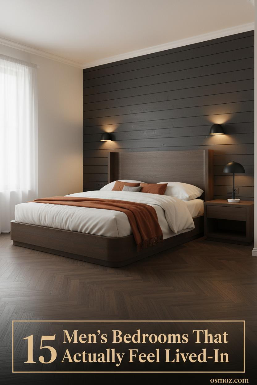
15+ Cozy Men's Bedrooms That Feel Lived-In, Not Staged
19 may 2026The first thing you notice in a great cozy mens bedroom is what's missing. No filler art. No generic grey palette. Just materials that actually mean something and light that makes you want to stay.
These 15 rooms prove you don't need a designer. You need a point of view.
The Gallery Wall That Makes This Room Feel Scholarly
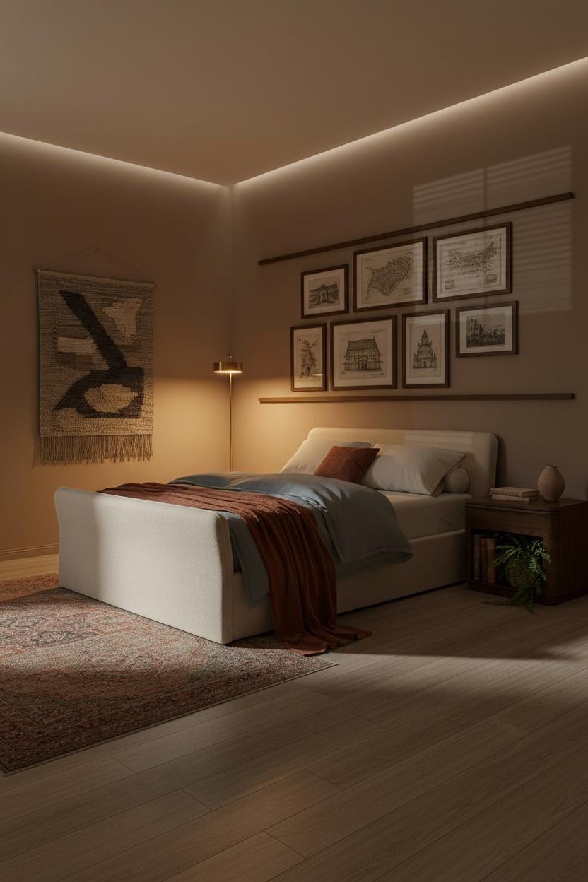


I keep coming back to this one. The whole setup feels like someone's actual reading room, not a mood board.
Why it feels inhabited: Floor-to-ceiling frames in dark walnut give the headboard zone a density that a single piece of art never could. The varying sizes keep it from feeling rigid.
What to copy first: Stick to architectural prints and topographic maps. They read as personal without requiring much effort to find.
When a Backlit Wall Does All the Work
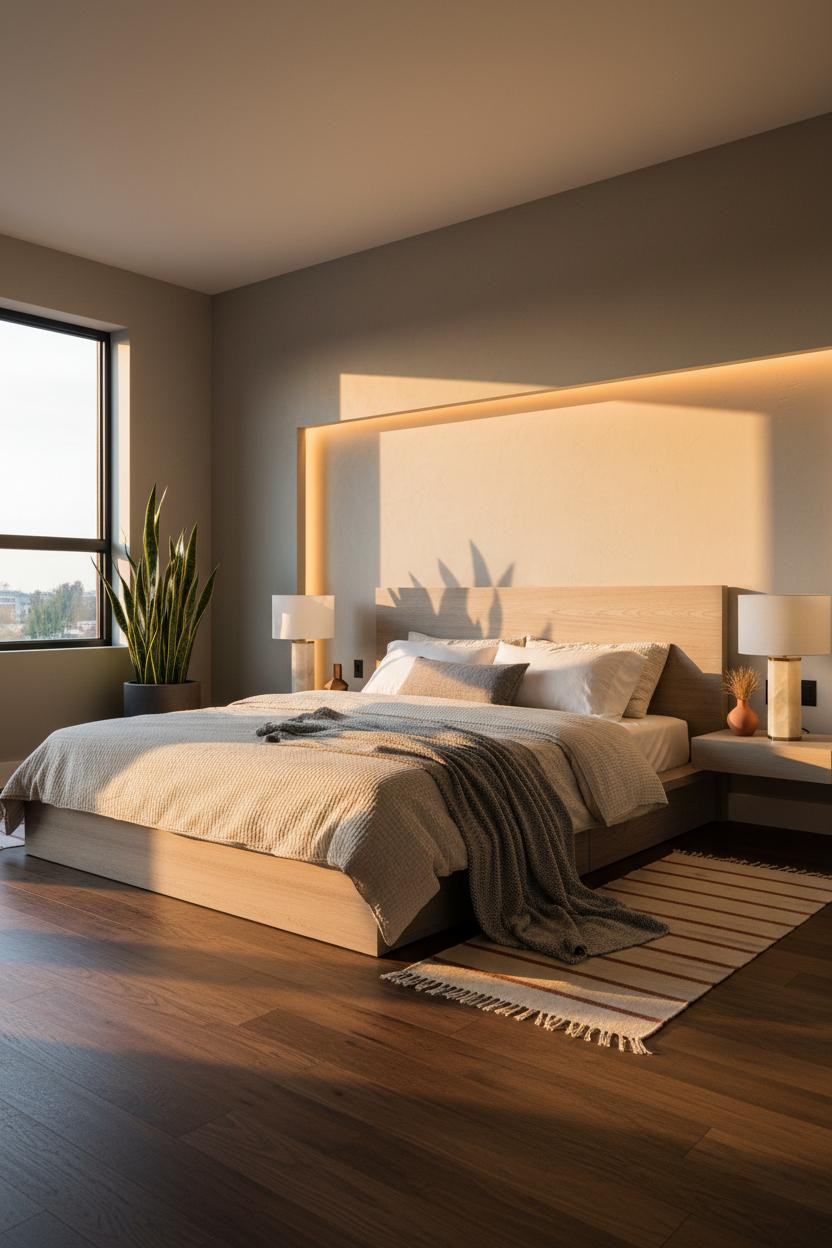

Nothing fancy. That's the point.
The room feels warm and cohesive because almost everything is pulled from the same quiet palette. But the recessed plaster panel behind the bed is what gives it structure. That shallow reveal edge catches raking light in a way paint alone never does.
The smarter choice: Skip the headboard art and let the architectural wall be the feature. A single snake plant in the corner finishes it.
Deep Indigo Walls With a Coffered Ceiling That Earns It
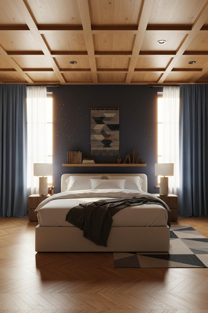
Bold choice. Deep indigo is not a safe wall color. But paired with the right ceiling, it stops being risky and starts being the whole personality of the room.
A honey oak coffered ceiling keeps the indigo from reading as oppressive. Those deep geometric recesses pull warm light downward and give the eye somewhere to land.
Avoid this mistake: Don't run the indigo onto the ceiling too. The contrast between dark walls and a warm overhead plane is what makes this work.
Ivory bedding against that depth is honestly one of the easiest wins in men's bedroom design.
Exposed Brick That Doesn't Feel Like a Loft Cliché
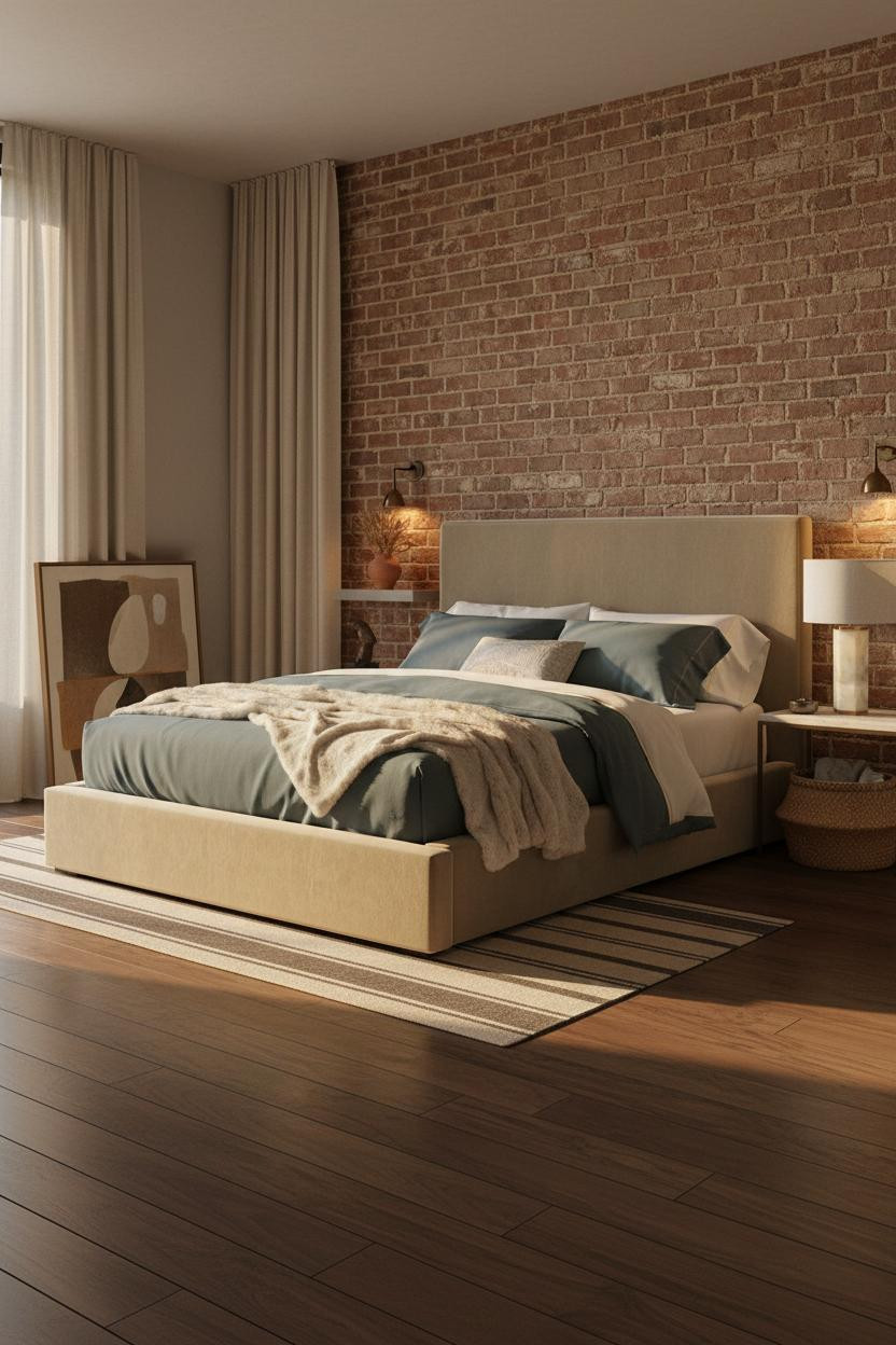

The exposed brick here doesn't read as unfinished. It reads as chosen. That's the difference.
What gives it presence: Paired sconces flanking the red-brown brick wall wash the mortar lines with amber light, pulling out the tactile depth that overhead lighting completely flattens. The rough texture earns the warmth.
One smart swap: Replace your overhead fixture with flanking sconces at brick height. The room feels lived-in and warm in a way that ceiling lighting just can't replicate.
Terracotta Board-and-Batten That Grounds a Whole Room
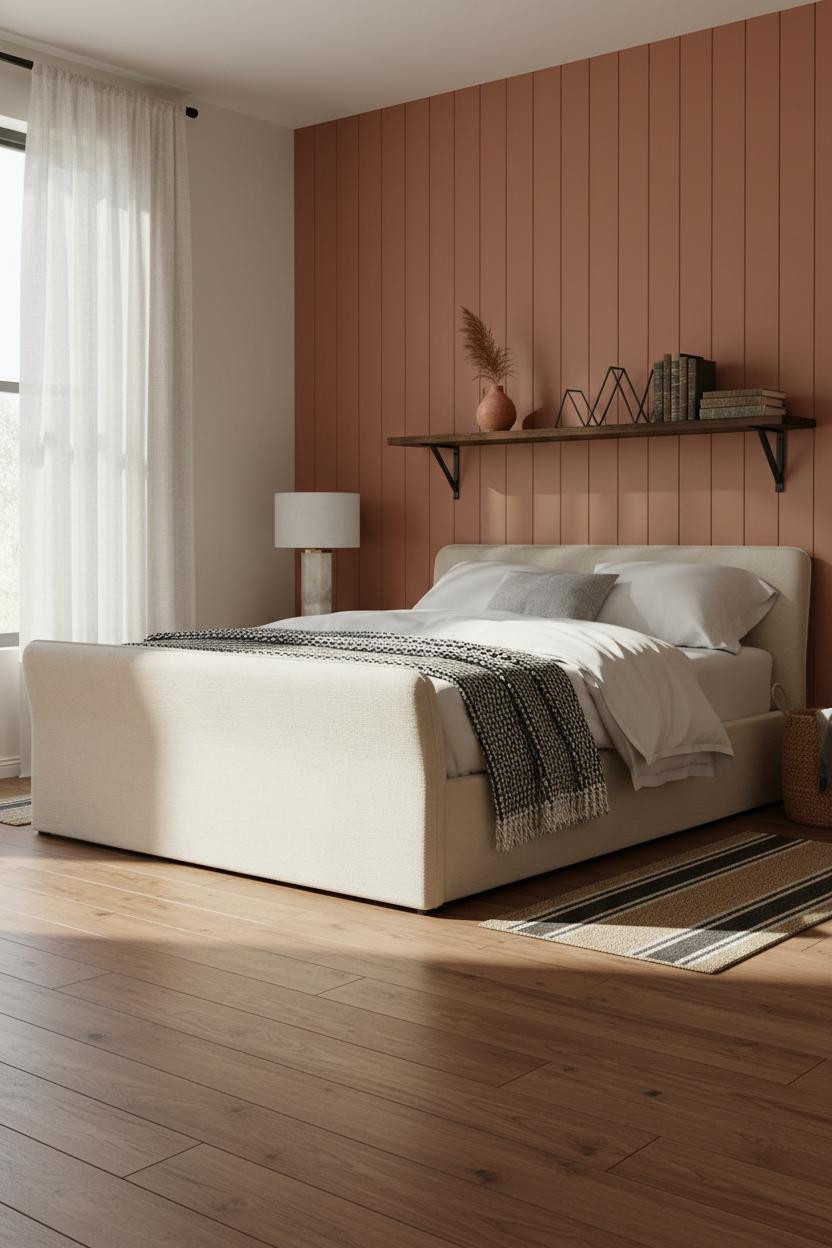
I'm a warmer-is-better kind of person, so this one hit immediately. Terracotta has a way of making a room feel settled rather than decorated.
Why it lands: Floor-to-ceiling board-and-batten in soft clay creates vertical shadow lines that morning light makes crisp without making the wall feel busy. The rhythm is quiet but you feel it.
Pro move: Pair with ivory linen bedding and a graphic black-and-white throw. The contrast keeps the terracotta from feeling one-note.
An Arched Plaster Niche That Frames the Whole Bed
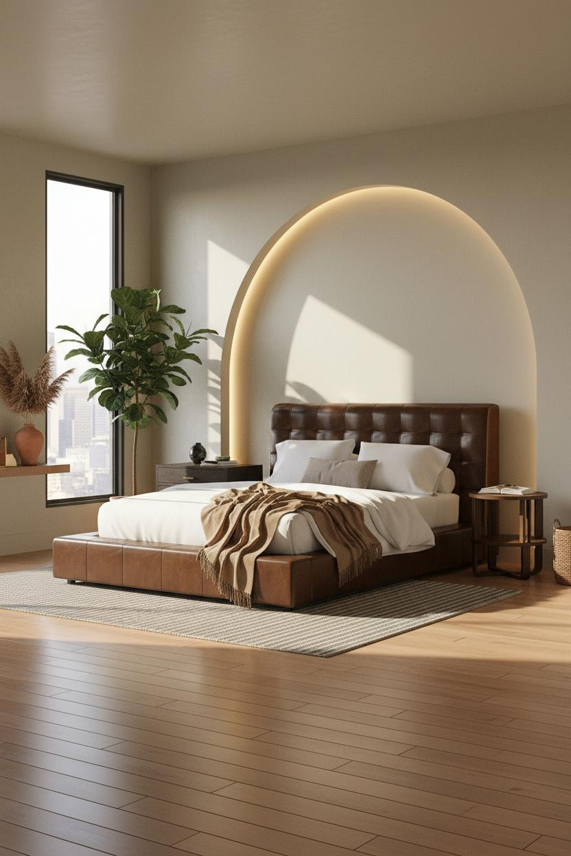


It shouldn't feel this solid. But the arched niche turns what's basically a plaster wall into an architectural moment you can't get from furniture alone.
The reason it feels considered rather than constructed is that smooth troweled plaster picks up raking light along the curved edges, making the arch glow slightly at the reveal. It's a small material detail with a big payoff.
The easy win: Warm maple flooring underneath keeps this from going too cold. Without that, the plaster arch reads stark.
Industrial Steel Windows Done With Actual Warmth
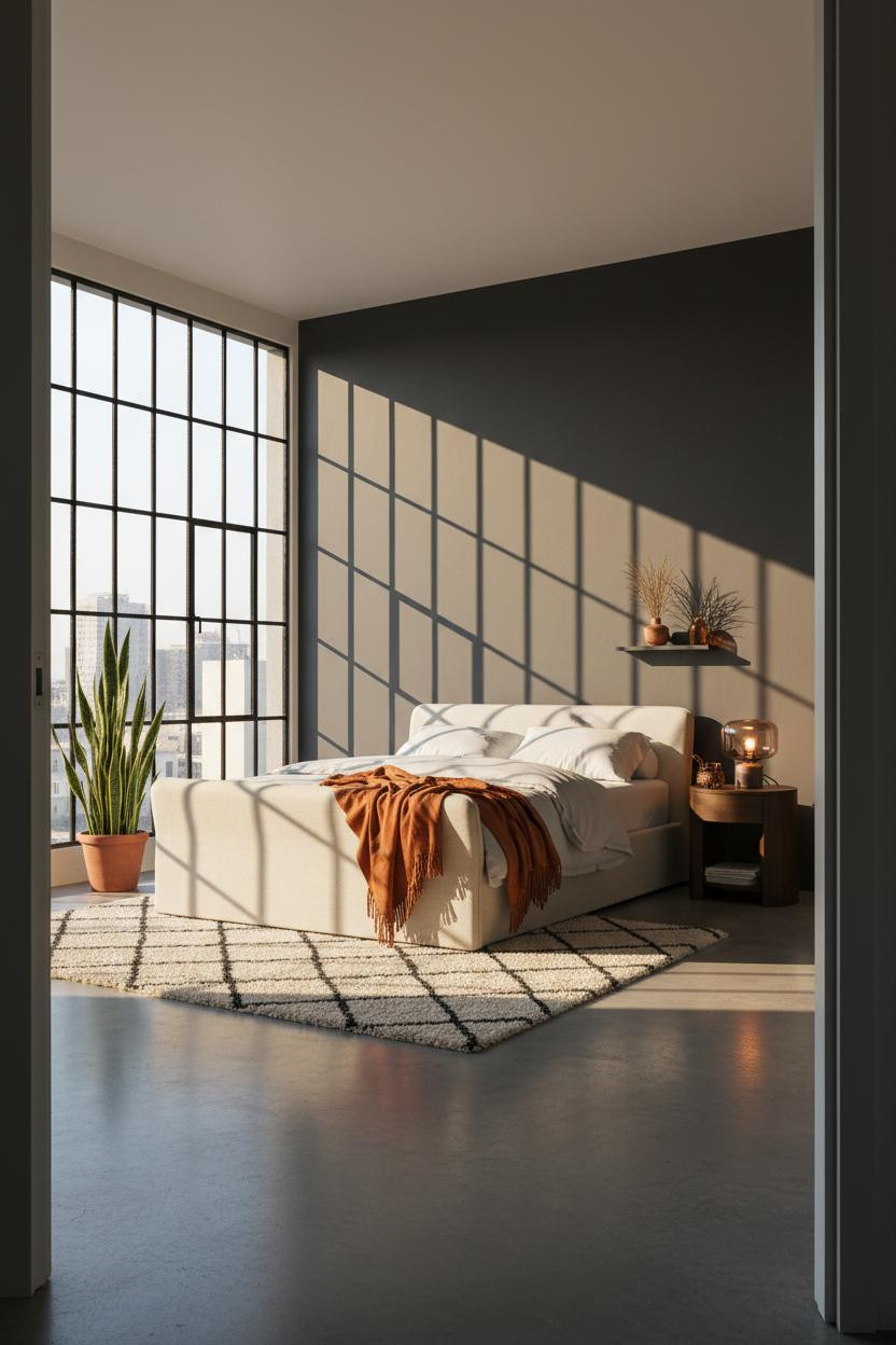
This one is divisive. Raw Crittall-style steel frames can easily tip cold and hard, which is exactly what most industrial rooms do wrong.
Why it holds together: The black grid throws precise shadow lines across charcoal walls, and a corner floor lamp pulls warm amber into the space in a way that feels natural rather than corrective. The two light sources work against each other on purpose.
Where to start: A Moroccan wool rug anchors the concrete floor. That one layer is the difference between a loft that feels grounded and one that just feels cold.
Moss Green Paneling That Somehow Feels Calm
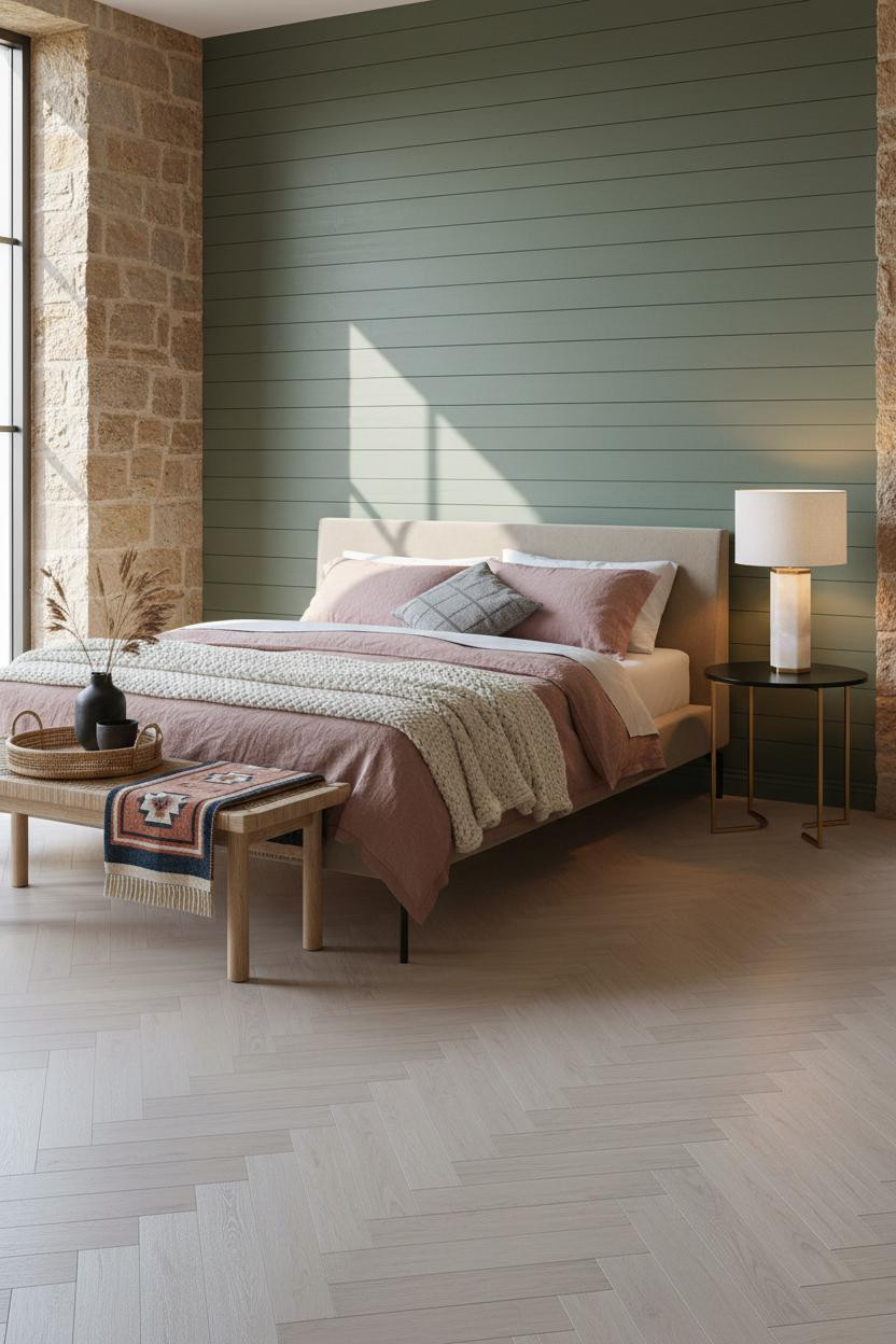

Green walls in a bachelor pad bedroom read as risky until you actually do it, and then somehow the room just settles.
What carries the look: Horizontal tongue-and-groove planks in muted moss keep the color grounded because the grain and shadow grooves break it up. A solid painted wall in the same green would feel heavier and flatter.
Steal this move: Pale ash herringbone underfoot keeps the whole room light while the paneling does its work overhead and behind.
Dark Slate Shiplap With the Right Floor to Balance It
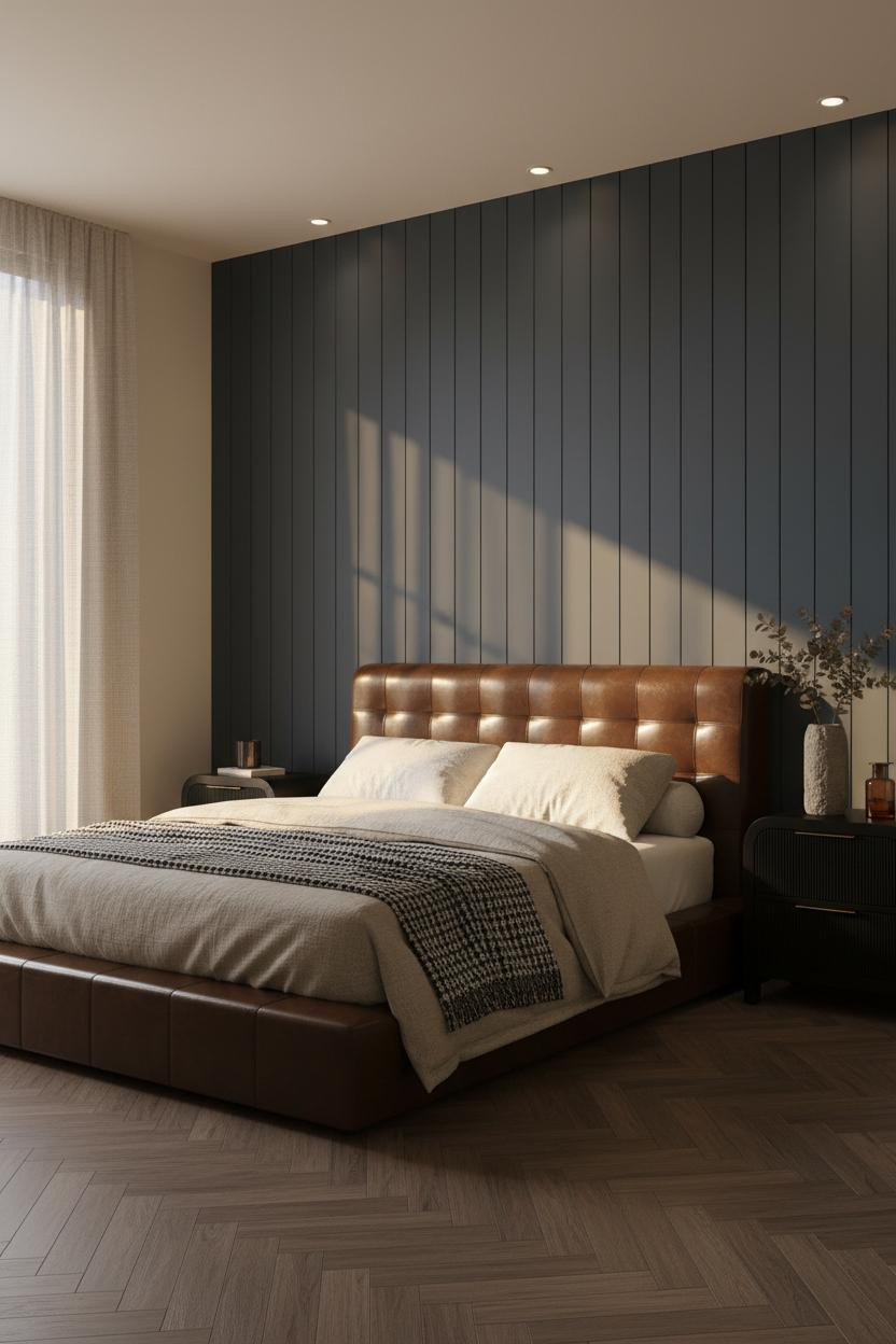
This is the kind of dark bedroom aesthetic that actually translates to real life, not just a Pinterest save you never act on.
Why it looks intentional: The deep slate shiplap behind the bed has horizontal shadow lines that warm afternoon light catches sharply. Cream walls on either side stop the room from feeling like a tunnel.
Dark stained oak herringbone underfoot ties it together, in a way that feels grounded rather than matched. Nothing too precious about it.
Rough-Troweled Plaster With Forest Green Flanking Walls
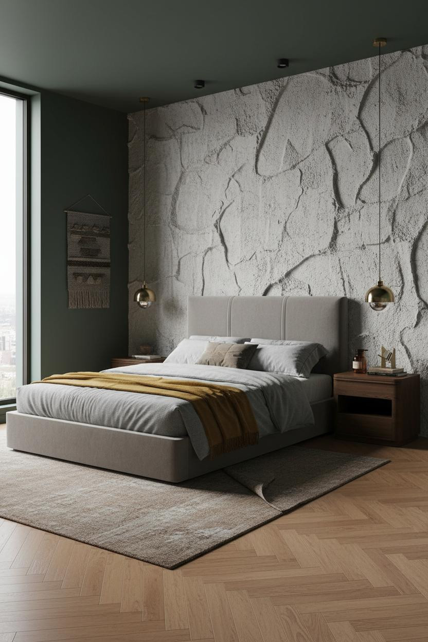

Admittedly, raw plaster as a feature wall sounds like a renovation project. But the finish here is applied, not structural, which means it's more accessible than it looks.
What makes this one different is the combination: rough-troweled plaster catches flat north light at an angle, revealing deep ridges that read as sculptural rather than textured. The forest green flanking walls make the pale plaster pop without adding a contrasting color.
Try this: A mustard wool blanket draped at the foot is the one warm note the room actually needs. Just the one.
Sage Slatted Walls That Change How the Room Breathes
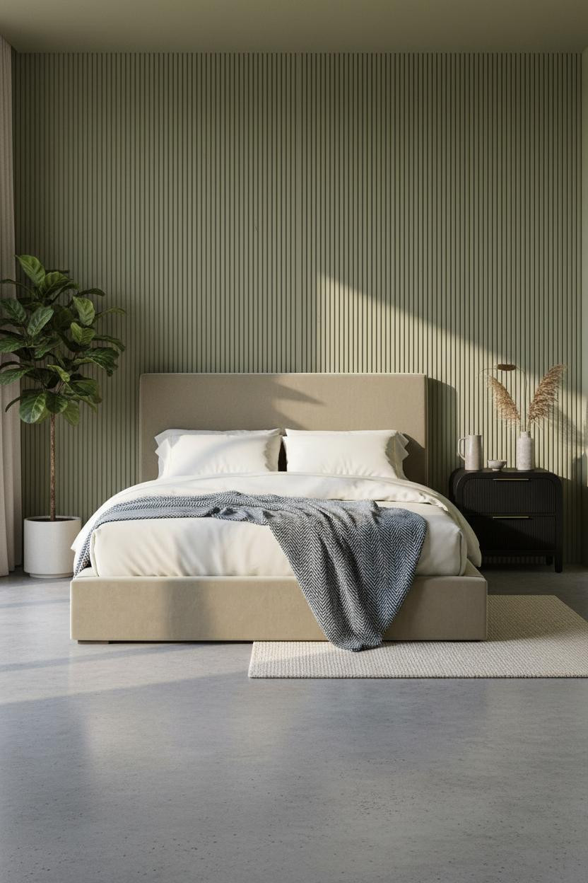
Having a Japandi-style feature wall like this changes how you actually move through the room. The thin shadow lines between each slat make the wall feel alive at different times of day.
The real strength: Vertical slatted panels in warm sage let morning light hit each slat edge differently, which means the wall reads as layered rather than painted. The grain underneath earns its keep.
The finishing layer: Polished concrete floor with a chunky cream wool rug. The contrast in texture does more than any additional color would.
Built-In Walnut Shelving That Replaces a Headboard Entirely
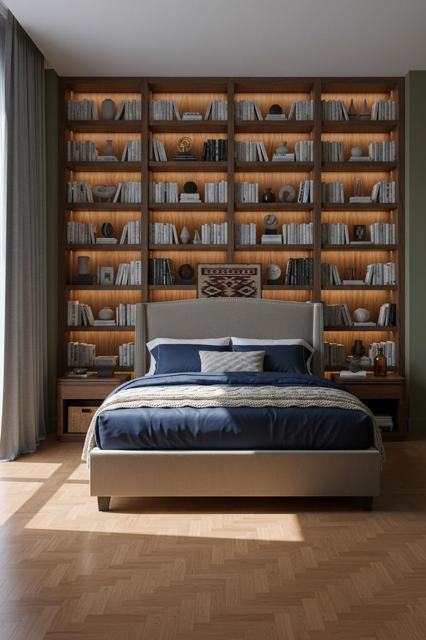

I almost scrolled past this. Glad I didn't.
What changes the room: A floor-to-ceiling dark walnut shelving wall behind the bed replaces art, headboard, and side table styling in one move. The hidden LED strip at the top shelf edge pulls warm amber downward, so the whole unit glows rather than looms. Olive walls flanking it keep the wood from going too dark.
Warm Clay Board-and-Batten With a Rustic Finish
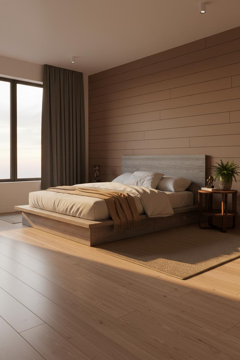
This room feels warm without being heavy, which is harder to pull off than it sounds with a clay-colored feature wall.
Why the palette works: Late afternoon light raking across horizontal clay board-and-batten deepens each shadow groove, making the wall feel almost three-dimensional. Pale birch flooring keeps the overall room from absorbing too much warmth.
The detail to keep: Deep charcoal linen curtains as the contrast note. They give the window actual presence while the clay wall stays the quiet anchor.
Charcoal Shiplap With a Burnt Orange Counterpoint
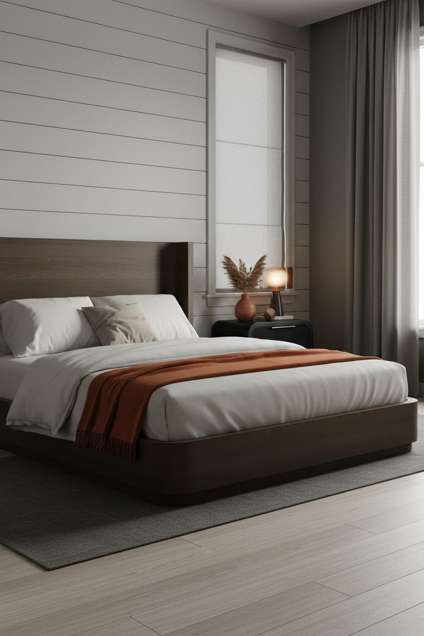

Don't get me wrong. Charcoal shiplap is not a risk-free move. But the rooms that pull it off have one thing in common.
What softens the room: A burnt orange mohair throw at the foot breaks the cool-grey scheme just enough. Bleached oak flooring underneath bounces light back up and stops the walls from closing in.
In a room this dark, the smarter choice is layering warm amber lamplight against the shiplap rather than relying on overheads. The diffused window light in overcast conditions does the rest.
Exposed Brick That Feels Like It's Always Been There
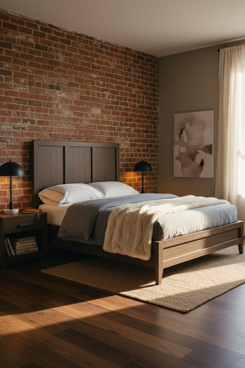
This is the version of a bachelor pad bedroom that actually ages well. Not trendy. Just solid.
Why it feels permanent: Terracotta exposed brick deepened by warm sconce light turns a raw surface into something that looks like it predates the furniture by decades. The mortar lines catch the amber glow unevenly, which is the whole point.
What not to do: Don't paint over the brick to match the walls. The tonal contrast between brick and greige plaster is exactly what stops the room from feeling like a single flat surface.
 Our #1 Pick
Saatva Classic Mattress
America's best-selling online luxury innerspring. 365-night trial, lifetime warranty, free white glove delivery.
Shop Saatva Classic
Our #1 Pick
Saatva Classic Mattress
America's best-selling online luxury innerspring. 365-night trial, lifetime warranty, free white glove delivery.
Shop Saatva Classic
The Foundation Of Every Beautiful Bedroom
Walls get repainted. Linen gets swapped out. The mattress stays. And that's actually where most well-designed rooms quietly fall apart: everything looks right, but the sleep is average.
The Saatva Classic fixes that. Dual-coil support that holds its structure over years, a breathable organic cotton cover that doesn't trap heat, and a Euro pillow top that feels substantial rather than just soft. It's the kind of bed that earns the room around it.

Good design ages well because it's made well. Start with the bed and the rest of the room figures itself out.


