
12+ Modern Vintage Bedrooms That Feel Collected, Not Decorated
05 may 2026The best modern vintage bedroom ideas don't look styled. They look inhabited. Like someone lived there long enough to figure out exactly what the room needed.
These 12 rooms get that balance right. Old materials, clean lines, nothing too precious or too matchy.
The Limestone Arch That Makes Everything Look Intentional
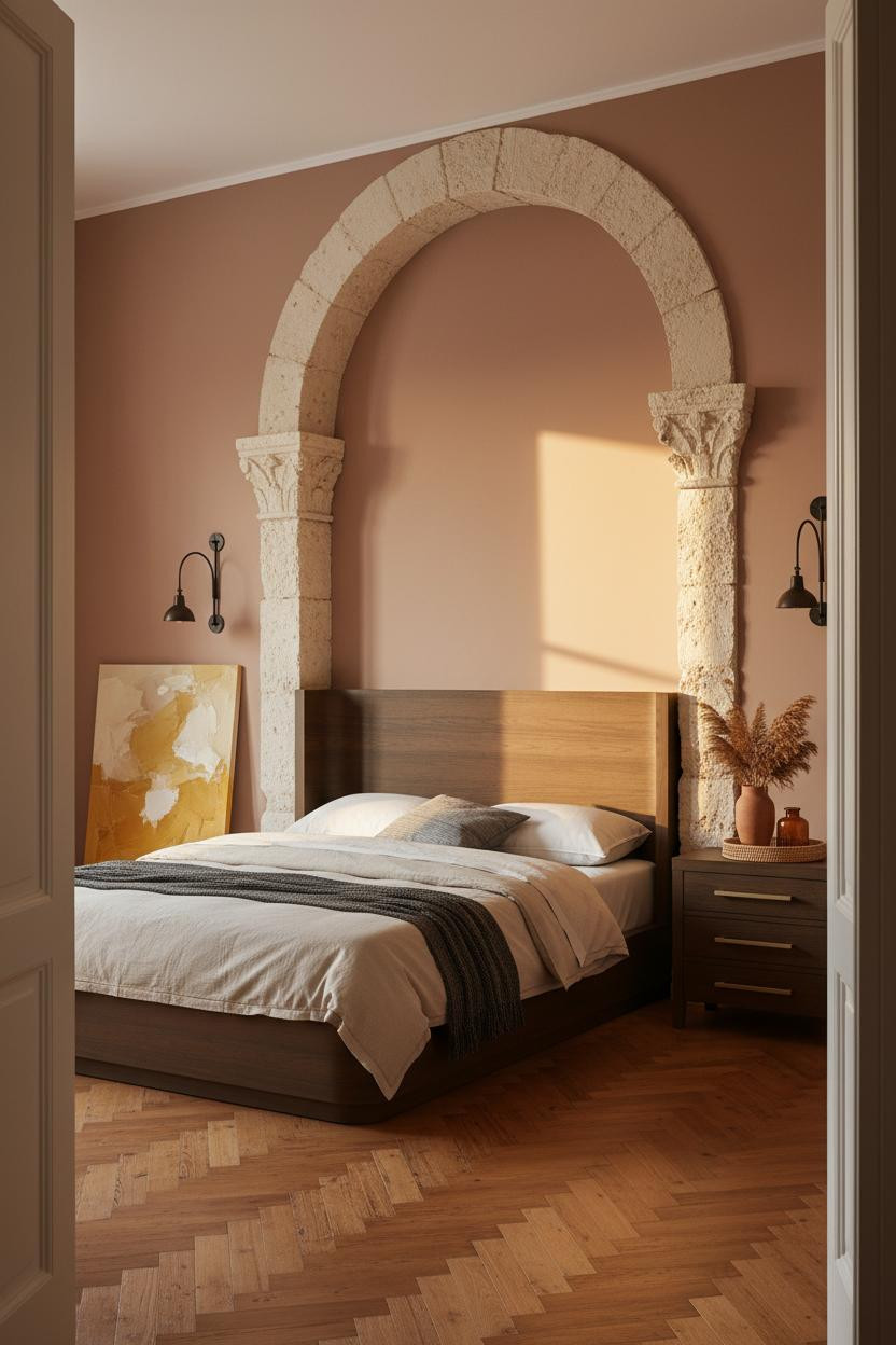

I keep coming back to this one. The arch does something a headboard alone never could.
But it's not just the shape. Rough-hewn pale limestone catches light in a way that smooth drywall can't replicate. Every groove reads as age, and the room feels like it was assembled over decades rather than a weekend.
The part to get right: Warm matte plaster walls are what stop the limestone from reading too cold. That contrast between the rough carved stone and the smooth clay-rose surface is where the whole look lives.
Avoid this mistake: Don't add a second statement. The arch is enough. Keep furniture clean and let the architecture do the talking.
Gallery Walls That Look Collected, Not Curated
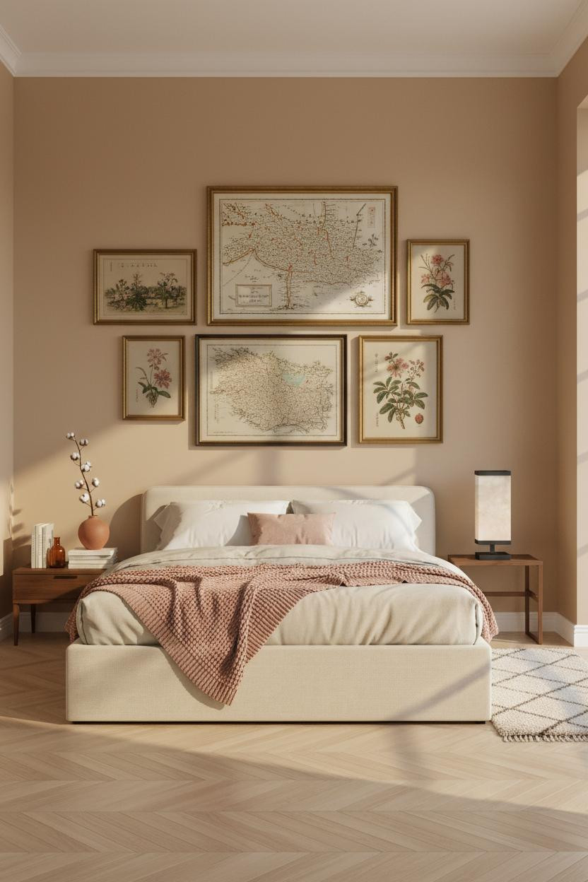

This is the kind of gallery wall people actually want to copy. Not the symmetrical grid kind. The one that looks like the frames arrived from different decades.
What makes it work: Mixing warm gold and dark ebony frames keeps the arrangement from feeling like a kit. The slight tilt on the largest frame is what makes it feel personal rather than installed.
Steal this move: One frame should be noticeably larger than the rest, and it shouldn't hang perfectly level. That single imperfection sells the whole thing.
Why Coffered Ceilings Are Worth Every Penny
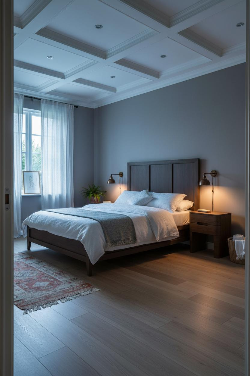
Most people stop at the walls. This room went overhead and the difference is significant.
Design logic: An aged cream plaster coffered ceiling creates shadow depth that flat paint can't touch. Lamplight catches each recessed panel edge differently, so the ceiling actually changes throughout the day.
The easy win: Pair it with bronze wall sconces at a warm setting. The combination feels old-world in the best possible way, while still feeling relaxed enough to sleep in.
Steel Frame Windows That Pull the Whole Palette Together
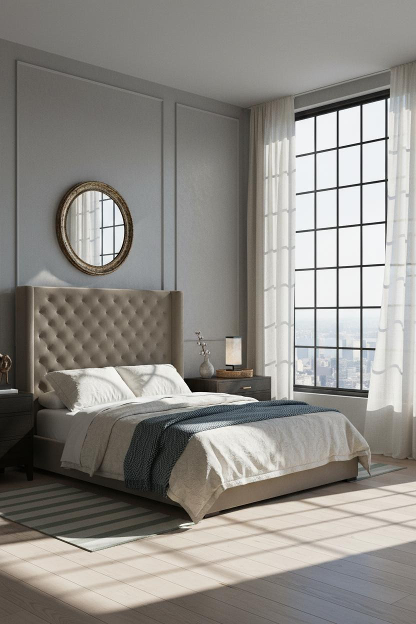

Fair warning. Crittall-style windows are divisive. But this room makes the case for committing fully.
Why it holds together: The slim black steel grid casts geometric shadows across the floor in morning light, and those sharp lines are exactly what justifies the soft sage and cream palette elsewhere. Hard and soft. The tension is the point.
Keep the rest of the room quiet. One warm brass lamp on the nightstand, nothing overhead. The window handles the drama.
Wainscoting in Camel: The Underrated Wall Treatment
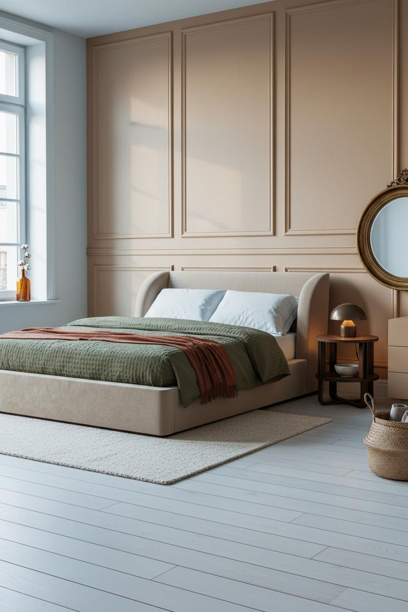


I almost dismissed this one as too traditional. Glad I looked longer.
What gives it presence: Raised panel wainscoting in warm camel paint creates a horizontal rhythm that plain walls can't. The color shift at chair rail height divides the wall in a way that makes ceilings feel taller while still grounding the room below. And the pale birch flooring keeps the whole thing from feeling heavy.
Pro move: Layer a chunky cream wool rug over the birch and the room suddenly feels like a cozy vintage bedroom you'd actually want to spend a Sunday in.
Venetian Plaster and the Art of the Quiet Wall
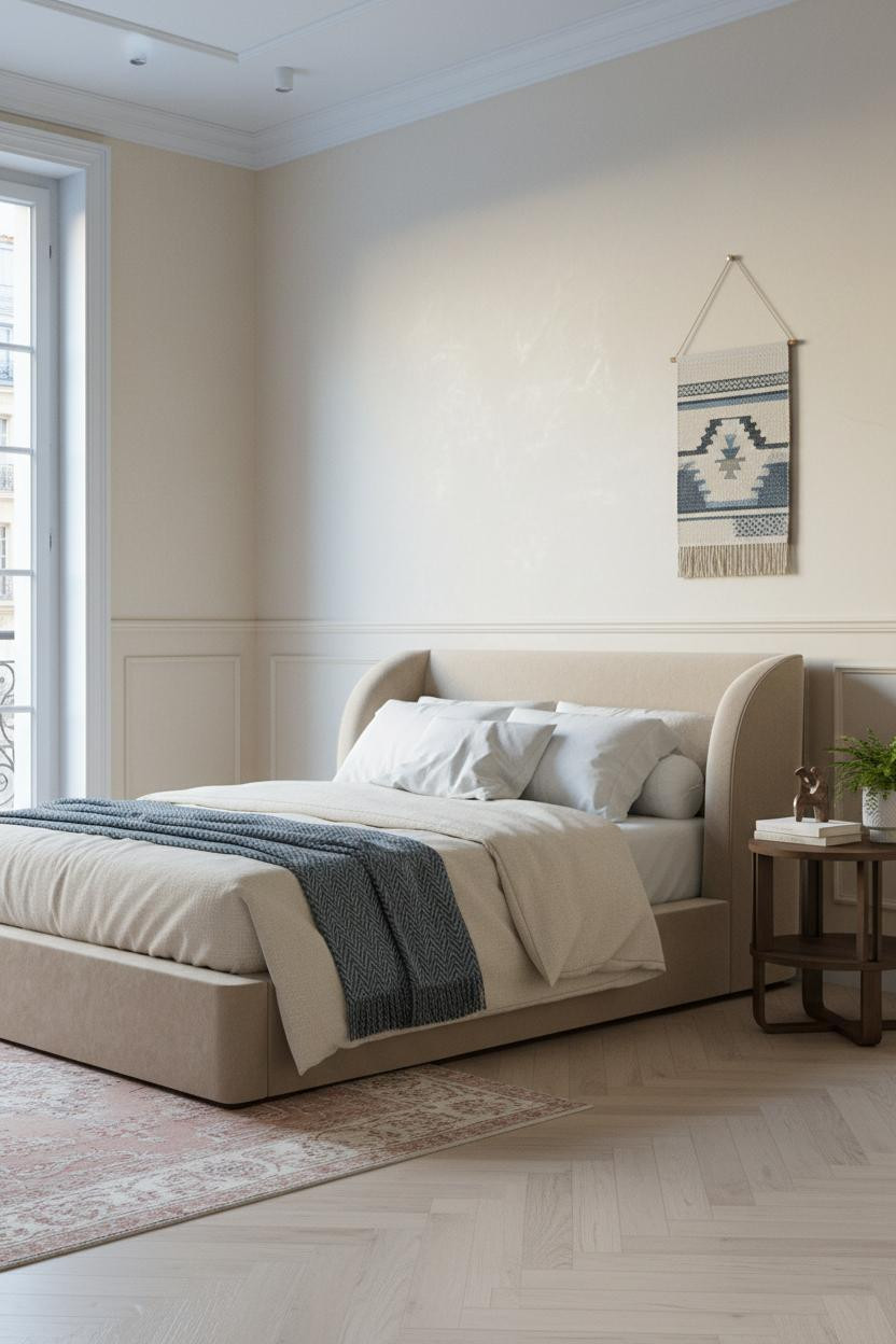
Nothing fancy on the surface. But the room feels expensive the moment you look closely.
The real strength: Handworked Venetian plaster in ivory cream catches raking light in a way that reveals fine texture variation across the wall. It's the same color as plain paint but reads completely differently. That's the whole trick.
Worth copying: Layer a faded overdyed Persian rug in dusty rose over bleached herringbone parquet. The rug adds age without the room tipping into heavy or cluttered.
Sage Built-Ins That Make a Bedroom Feel Like a Library
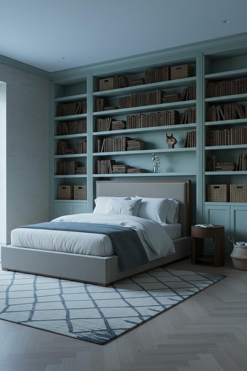
I think sage built-ins are one of the most underused ideas in bedroom design. This one proves why.
Why it feels intentional: The rhythm of filled and empty shelves on the floor-to-ceiling sage painted bookcases is what creates that collected-over-time depth. Woven baskets tucked between vintage leather-bound volumes keep it from reading as too bookish or staged.
The smarter choice: Leave a few shelves deliberately sparse. Negative space on a shelf reads as curation, not emptiness. It's a small move, but it changes everything.
Slatted Wood Walls: More Interesting Than an Accent Wall
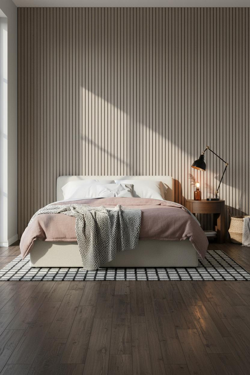
Vertical slatted greige-taupe wood running floor to ceiling behind the bed is the kind of detail that photographs well at every scale. But it also changes how the room feels in person in a way a painted wall genuinely doesn't.
What carries the look: Each slat catches morning raking light differently, so the wall has shadow texture even in a neutral palette. In a small room, the smarter choice is vertical slats over horizontal because they pull the eye upward rather than across.
Where people go wrong: Matching the slat color too closely to the side walls. The contrast between the reclaimed dark walnut flooring and the warm greige panels is what keeps this from feeling monolithic.
Whitewashed Shiplap That Doesn't Feel Farmhouse
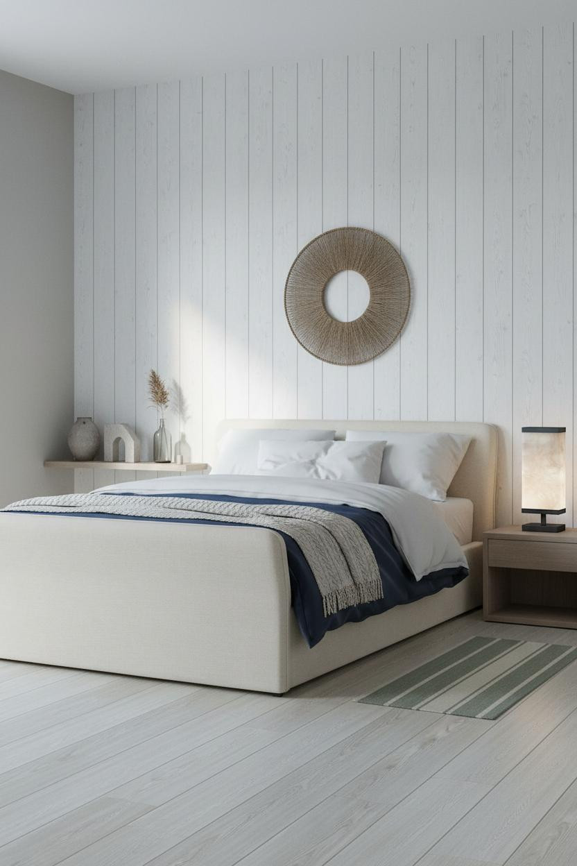
Shiplap has a reputation problem. But whitewashed shiplap with a navy duvet and a woven wall hanging is a completely different conversation.
Why the materials matter: Whitewashed shiplap boards catch cool north light along each subtle grain line, which means the wall has texture without color. Pair that with navy sateen bedding and the contrast actually reads modern, not rustic.
Don't ruin it with barn-style hardware or shiplap on multiple walls. One wall, full height. That's the whole move.
Dusty Rose Board-and-Batten: Romantic Without Trying
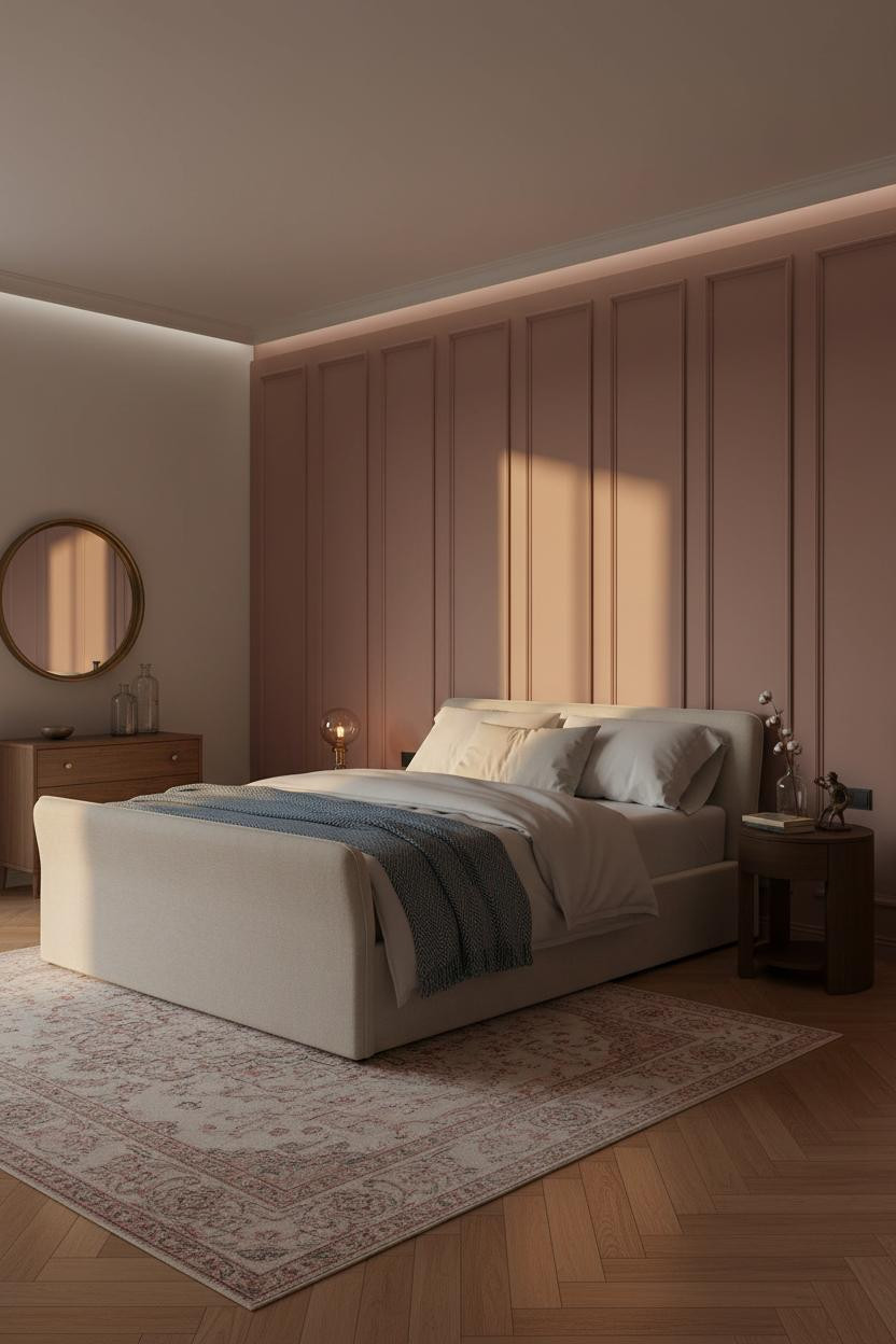
It shouldn't work this well. Dusty rose is a color that could easily tip into something precious. But full-height board-and-batten paneling keeps it grounded.
Why it looks custom: Each vertical batten casts a thin shadow line in raking amber light, so the wall has quiet architectural rhythm. The crown molding above catches warm gold and the room feels calm and cohesive without feeling overdressed.
One smart swap: Pair with a steel-blue herringbone wool throw instead of pink bedding. The contrast is what prevents the room from becoming a monochromatic mood board.
The Tuscan Arched Alcove That Earns Its Sconces
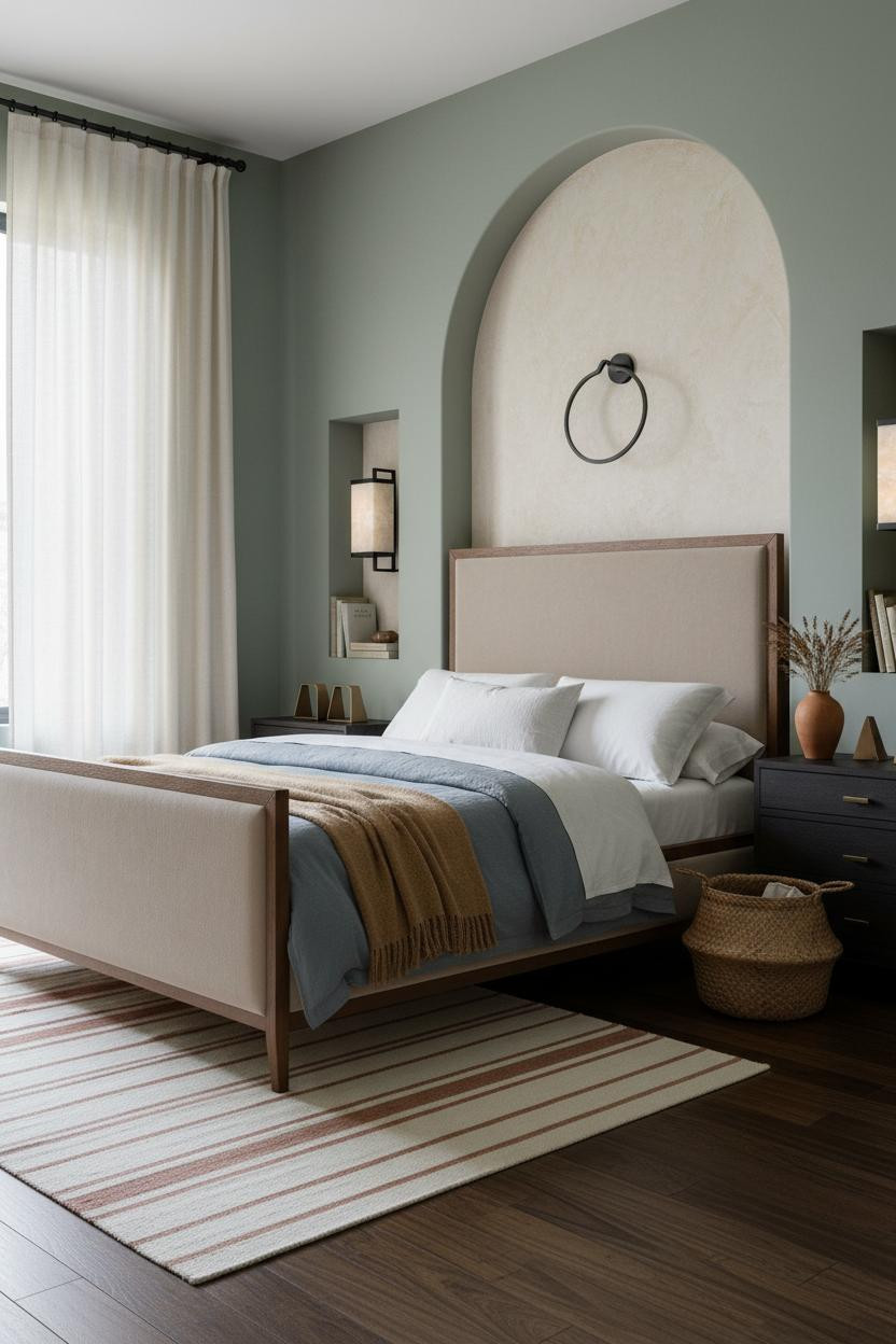

I think wrought-iron sconces are almost always done wrong. Stuck on a flat wall, they look like props. Recessed into a plaster arch, they feel like they've been there for a century.
Why it feels balanced: The arched alcove's curved edges cast a shallow crescent shadow against the aged ivory plaster, and that shadow is what justifies the sconce placement. The arch frames the light. The light earns the arch.
Ideal if your room has dusty sage walls elsewhere. The muted green and the warm plaster cream sit together in a way that feels lived-in and intimate rather than decorated.
Exposed Beams and Provençal Warmth Done Right
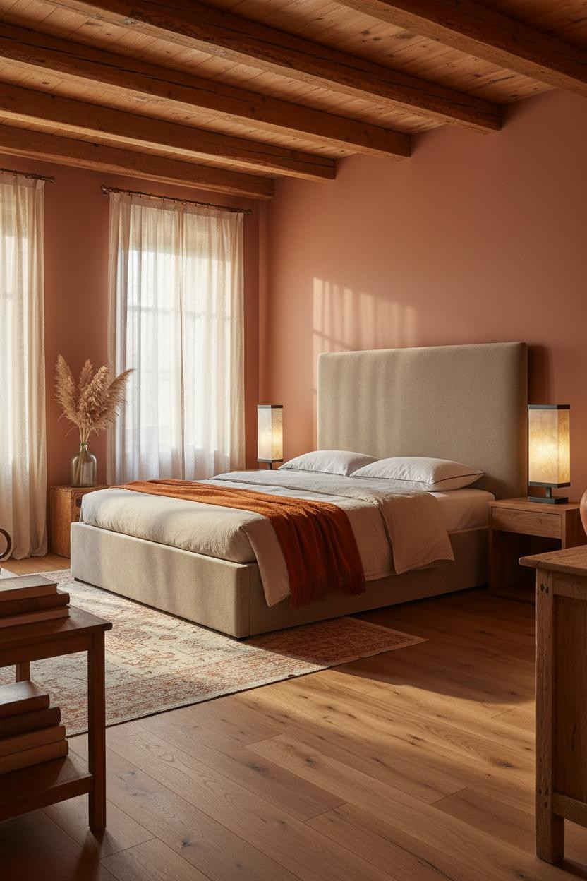
Honestly, exposed beams are one of those elements that either look like a farmhouse rental or like something you've been slowly building for years. This one is the second kind.
What creates the mood: Honey-toned rough-hewn ceiling beams span the full width and cast rhythmic shadow lines down the terracotta walls as the light shifts through the afternoon. The warmth compounds. By evening the room feels like it's glowing.
The finishing layer: Floor-to-ceiling natural linen curtains on a vintage brass rod. They soften the beam structure while still feeling like they belong in the same room. Nothing too precious. Just enough texture to keep things interesting.
 Our #1 Pick
Saatva Classic Mattress
America's best-selling online luxury innerspring. 365-night trial, lifetime warranty, free white glove delivery.
Shop Saatva Classic
Our #1 Pick
Saatva Classic Mattress
America's best-selling online luxury innerspring. 365-night trial, lifetime warranty, free white glove delivery.
Shop Saatva Classic
The Foundation Of Every Beautiful Bedroom
Walls get repainted. Rugs get swapped. The mattress is the one thing that stays. And honestly, it's the one thing most people underspend on.
The Saatva Classic is what I'd put under all of these rooms. Dual-coil support that doesn't transfer movement, breathable organic cotton that doesn't trap heat, and a Euro pillow top that feels soft without losing its shape over time. It sleeps the way a good room feels. Warm, held, unhurried.

The rooms people return to are the ones where everything feels considered, including what's underneath the duvet. Start with the bed. The rest figures itself out.


