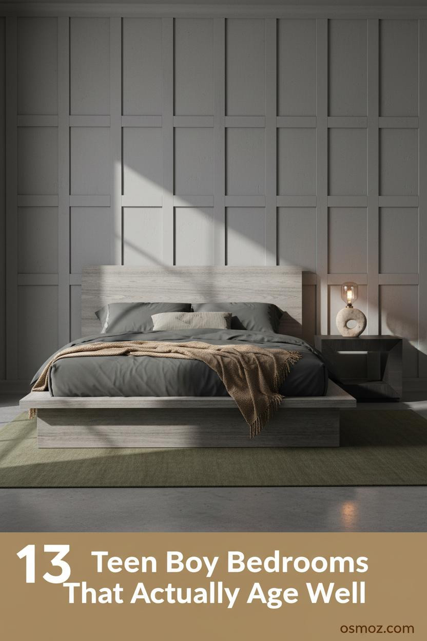
13+ Modern Teen Boy Bedrooms That Actually Feel Cool to Grow Into
21 april 2026The first thing you notice in the best modern teen boy bedroom is that it doesn't look like it was designed for a teen. It looks like someone actually lives there.
These 13 rooms lean earthy, grounded, and real. No cartoon themes. No stuff that ages out in two years.
A Concrete Shelf That Does All the Work
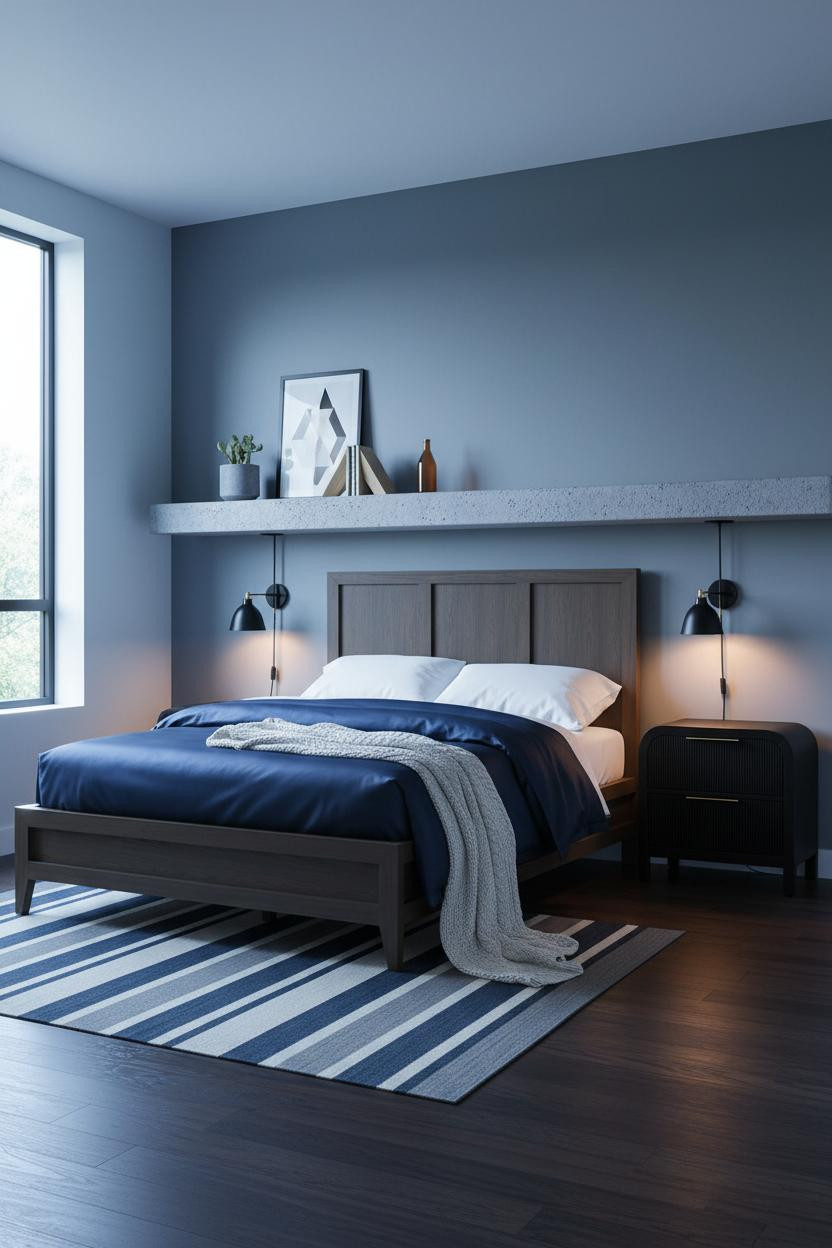
This is the kind of room that makes you want to stop scrolling and actually look.
Why it holds together: The concrete-look floating shelf above the bed creates one clean horizontal line that anchors the whole wall, while the slate blue-grey paint keeps the room from feeling cold.
Steal this move: Lean a poster against the shelf back instead of hanging it. Way more casual, and honestly it looks better.
The Arched Alcove Nobody Expects
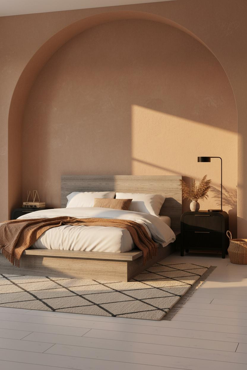
I keep coming back to this one. There's something about a recessed arch that makes a small room feel intentional rather than cramped.
The raw clay plaster inside the niche catches the light differently at every hour, which is why the room feels warm without being heavy. And the botanical details stop it from reading too stark.
Olive Paneling That Ages Well
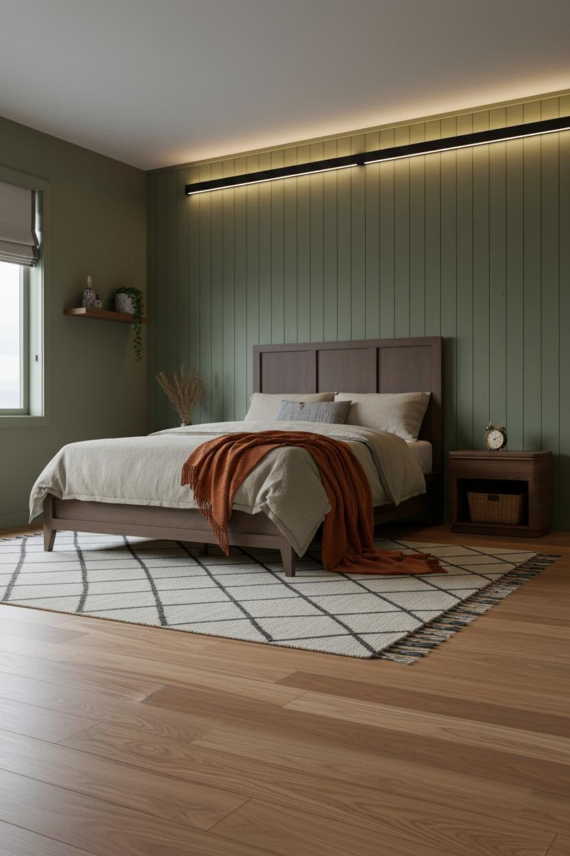
Bold choice. But this is the one a 22-year-old would still want.
The tongue-and-groove paneling in matte olive works because the raw grain is still visible under the paint, so it reads as material rather than just color. It's grounded in a way that plain walls aren't.
Worth copying: Pair it with honey maple flooring. The warm tone keeps the olive from going too military.
Terracotta Shiplap Without the Farmhouse Feel
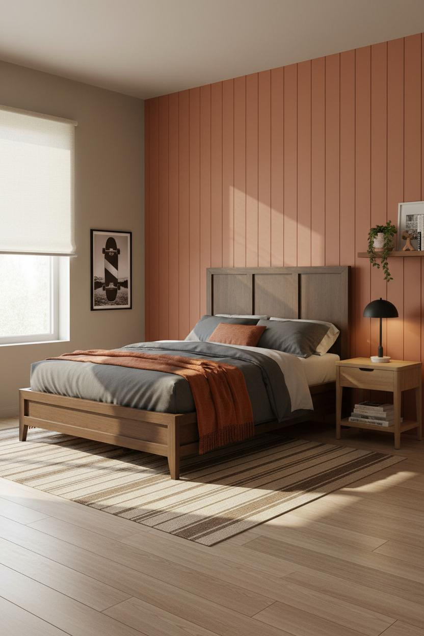
Fair warning: terracotta is everywhere right now. But this version doesn't tip into trendy.
The real strength: Narrow shiplap planks in a clay tone add texture and shadow lines that flat paint just can't replicate, and the charcoal bedding pulls it back from looking too warm-rustic.
In a room like this, the easy win is keeping the flanking walls greige rather than white. White would fight the terracotta. Greige lets it breathe.
Herringbone Wood That Earns Its Place
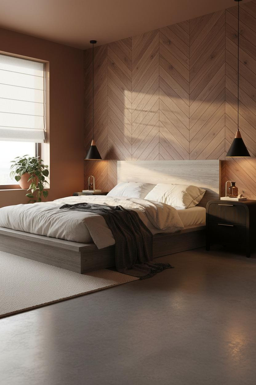
I almost scrolled past this. Glad I didn't.
A herringbone walnut-toned accent wall behind the bed sounds like a lot, but at this scale it acts as a headboard replacement rather than a statement piece. The room feels collected rather than decorated because the rust-clay walls on the flanking sides pull the warmth through. And the concrete floor stops the whole thing from feeling too cozy.
The Industrial Window Wall That Isn't Trying Too Hard
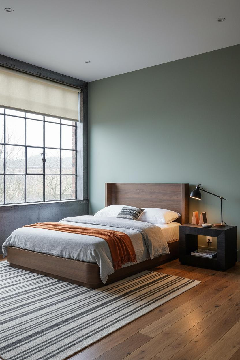

This is the room for the kid who thinks he wants a loft apartment someday. Honestly, same.
What gives it presence: The slim black Crittall-style steel frames create geometric structure that makes even flat overcast light feel purposeful, while the moss green wall keeps the industrial detail from going cold.
Don't ruin it with too much black elsewhere. One industrial element is a statement. Three is a theme.
Raw Walnut Shelves on a Metal Rod System
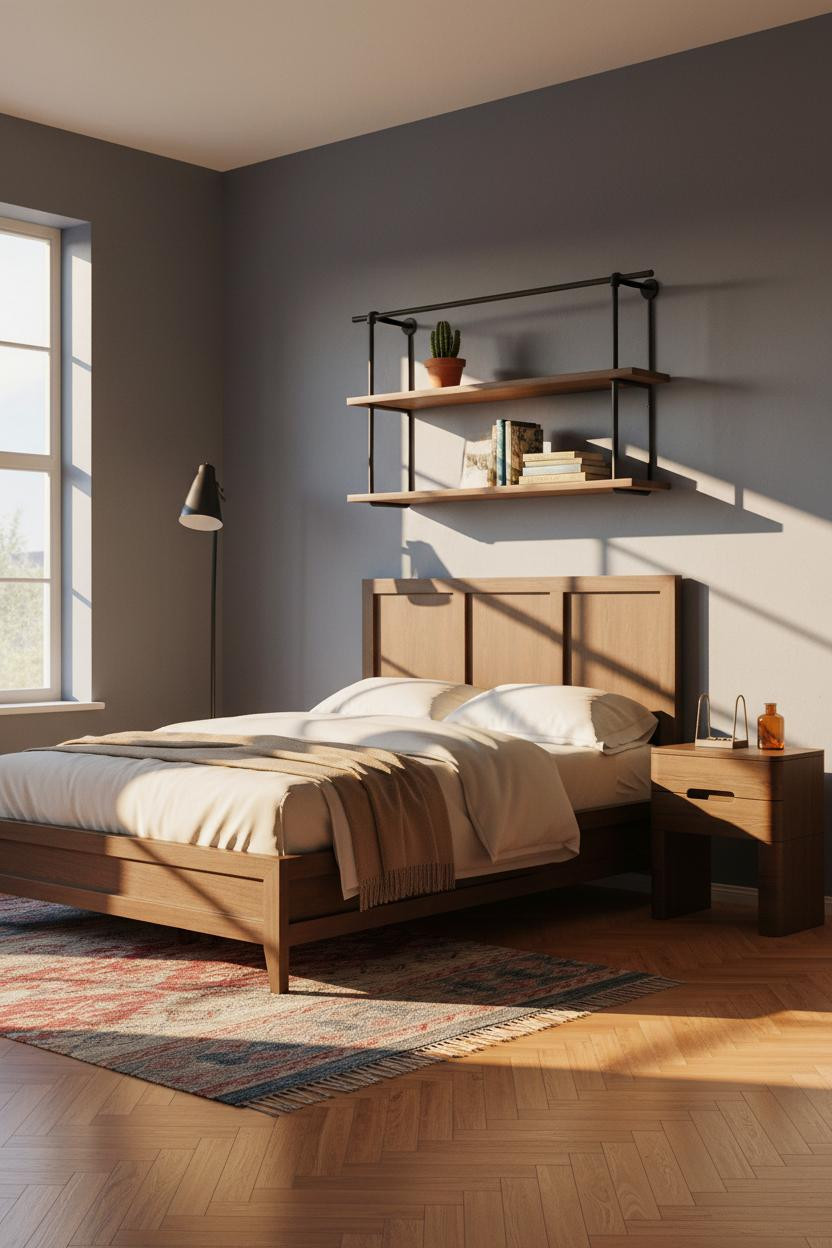
Nothing fancy. That's the point.
What makes this work: Two raw walnut shelves hung at staggered heights on a powder-coated black rod system give you display space and storage while the asymmetry keeps it from feeling too catalog-perfect.
A camel wool throw at the footboard is the one softening move this room needs. Skip it and the whole thing goes too hard.
Board-and-Batten in Stone Grey Hits Differently
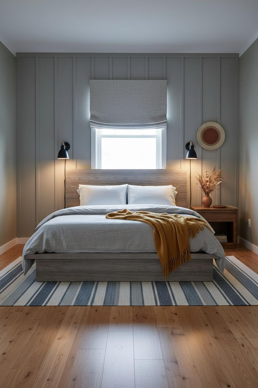
Board-and-batten usually reads coastal or farmhouse. In stone grey, it doesn't.
Why it looks custom: The narrow vertical planks add tactile depth and shadow rhythm that a flat painted wall can't replicate, in a way that feels architectural rather than decorative. The mustard wool blanket at the footboard is the warmest thing in the room, and it earns that contrast.
The smarter choice: Go floor-to-ceiling with the batten. Half-wall reads as an afterthought here.
Forest Green Slats in a Small Room
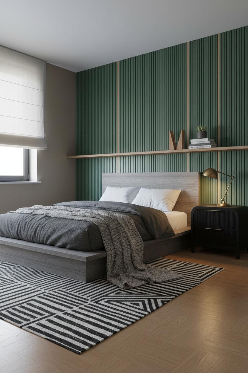
In a space this small, the wall treatment has to work harder than the furniture.
Why it feels balanced: Fluted oak slats in forest green cast fine parallel shadows that give the wall dimension, so the room doesn't need much else competing for attention.
Avoid this mistake: Don't add a rug with too much pattern. The slatted wall is already doing the geometry work. Keep the floor calm.
Half-Height Wainscoting With an Earthy Twist
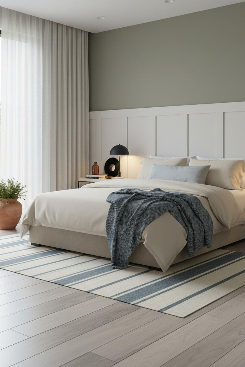

This one is more considered than it looks at first glance.
The warm white board-and-batten wainscoting stops at mid-wall and the dusty olive above it takes over. That split makes the ceiling feel higher, which matters a lot in a small teen bedroom layout. And the low platform bed keeps the proportions from tipping awkward.
The practical move: Place the floor lamp beside a trailing plant in the corner. Two things, one visual anchor. No shelf needed.
Terracotta Board-and-Batten Behind the Desk Zone
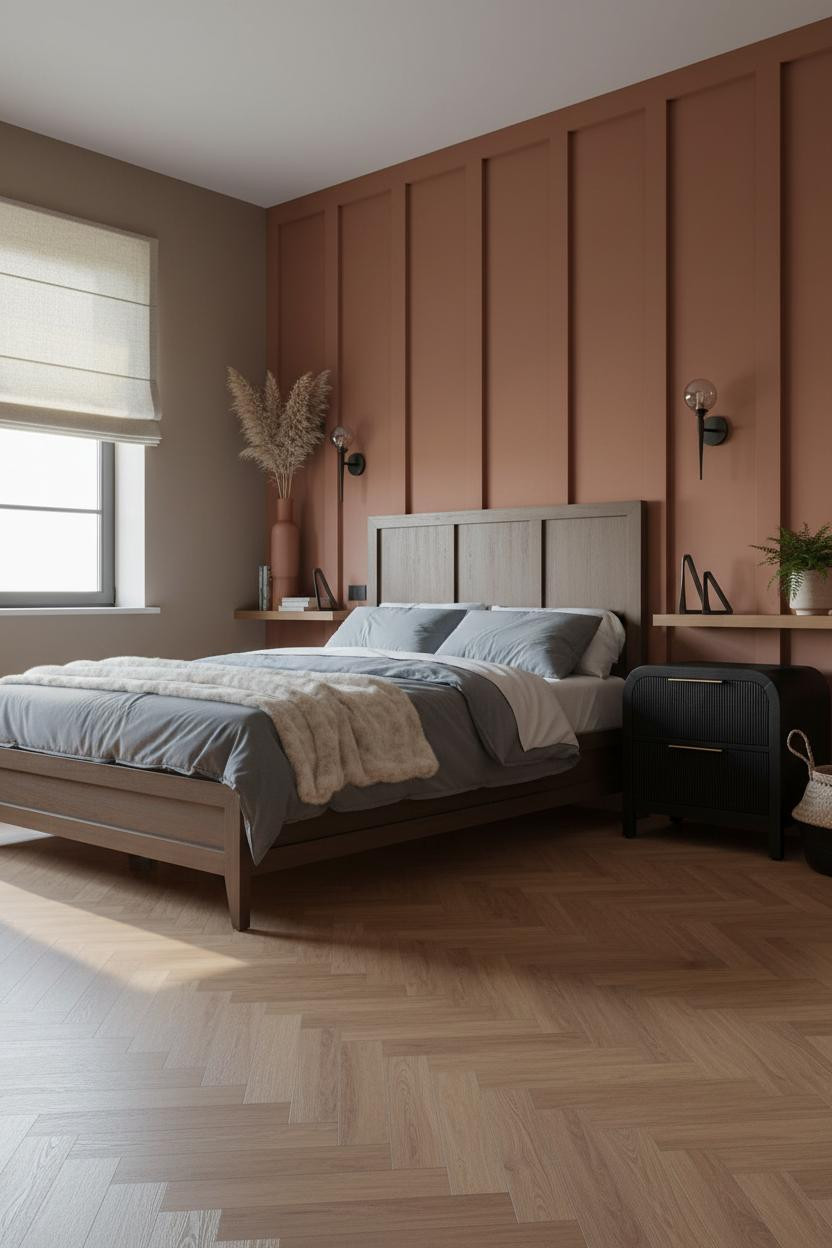
Putting the feature wall behind the desk rather than the bed is a move I don't see enough.
Design logic: Deep terracotta-clay battens absorb morning light in a way that makes the desk zone feel warm and separate from the rest of the room, so the study area actually gets used.
Admittedly, the mushroom walls on the flanking sides are doing a lot of the quiet work here. Change those to white and you lose the whole thing.
Japandi With a Floating Walnut Shelf
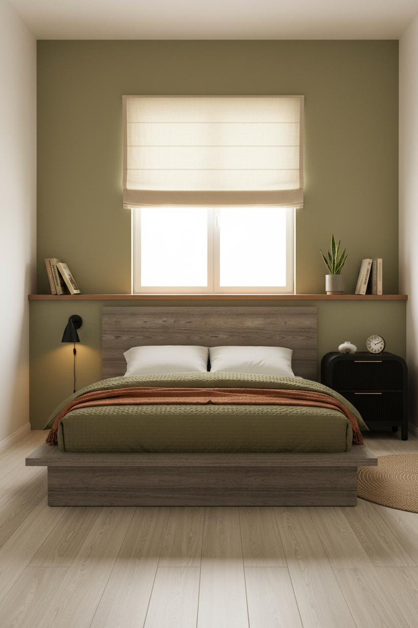
Sometimes the most considered rooms are also the most stripped down. This is one of them.
Why it feels intentional: A single floating walnut shelf above the bed becomes the headboard, the display surface, and the main architectural detail all at once, while the sage green wall behind it keeps the palette warm without adding pattern. Nothing too precious. Just enough to make the room feel like someone made decisions.
Exposed Brick for the Teen Who Wants an Edge
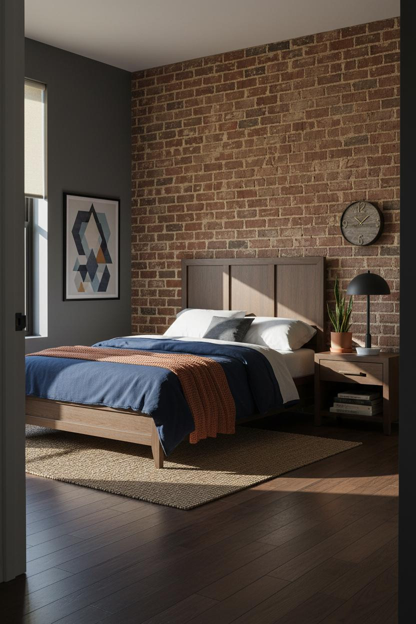
This is the room I'd have wanted at 17 and still want now.
Where the character comes from: The exposed brick brings rust, brown, and warm grey into the room simultaneously, so the charcoal walls on the flanking sides don't feel heavy. They feel grounded. And the jute rug undercuts any risk of the whole thing going too dark.
What to copy first: Lean an oversized poster flush against the charcoal wall. No frame, no hardware. Just the poster and the brick doing the work together.
 Our #1 Pick
Saatva Classic Mattress
America's best-selling online luxury innerspring. 365-night trial, lifetime warranty, free white glove delivery.
Shop Saatva Classic
Our #1 Pick
Saatva Classic Mattress
America's best-selling online luxury innerspring. 365-night trial, lifetime warranty, free white glove delivery.
Shop Saatva Classic
The Foundation Of Every Beautiful Bedroom
All 13 rooms here are built around grounded materials and layouts that don't age out in a year. But none of it matters as much as what you sleep on.
The Saatva Classic is the one I'd put under all of it. Dual-coil support that holds up through years of actual use, breathable organic cotton that doesn't trap heat, and a Euro pillow top with the kind of give that feels right from night one. Walls get repainted. The mattress stays.

Good design ages well because it's made well. Start with the bed and the rest of the room figures itself out.


