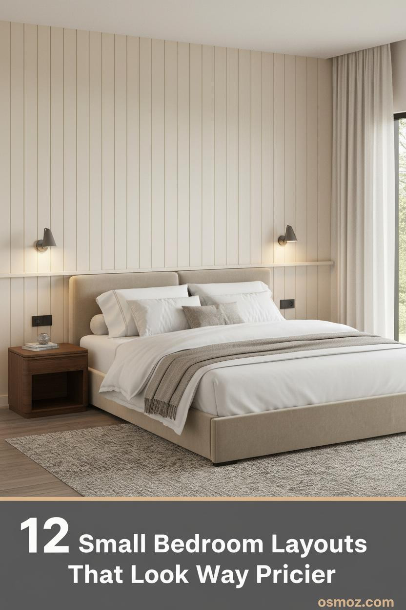
12+ Small Bedroom Layouts That Actually Make the Room Feel Bigger
26 march 2026Think your room is too small to look intentional? Small bedroom layout decisions matter more in a tight space than anywhere else. The wrong furniture placement can make eight feet feel like four. The right one makes you forget the square footage entirely.
These twelve rooms prove it. Each one uses a different strategy, and honestly, most of them cost less than a renovation.
The Arched Niche That Makes Eight Feet Feel Like Twelve
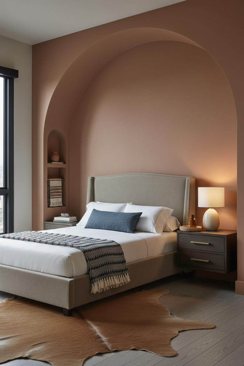

I keep coming back to this one. An arched niche built into a corner is one of those moves that looks expensive but is mostly just drywall and intention.
Why it works: The smooth warm plaster finish on the arch draws the eye up before it ever settles on the floor plan, which makes the room feel taller rather than tight.
The smarter choice: Frame your bed inside the arch rather than beside it. That single decision turns a corner into a headboard, and you reclaim wall space you didn't know you had.
A Terracotta Wall That Actually Earns Its Place
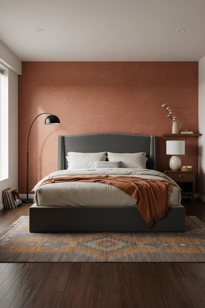
Bold choice. Deep terracotta in a tiny room sounds like a trap.
But a floor-to-ceiling matte plaster wall in that tone actually pulls the ceiling upward, because your eye chases the color instead of measuring the width.
The practical move: Pair it with a storage bed so every inch under the mattress is working. The matte textured plaster surface diffuses light softly, which means the room feels warm rather than closed in.
Why the Platform Bed Is the Smartest Piece in a Compact Room
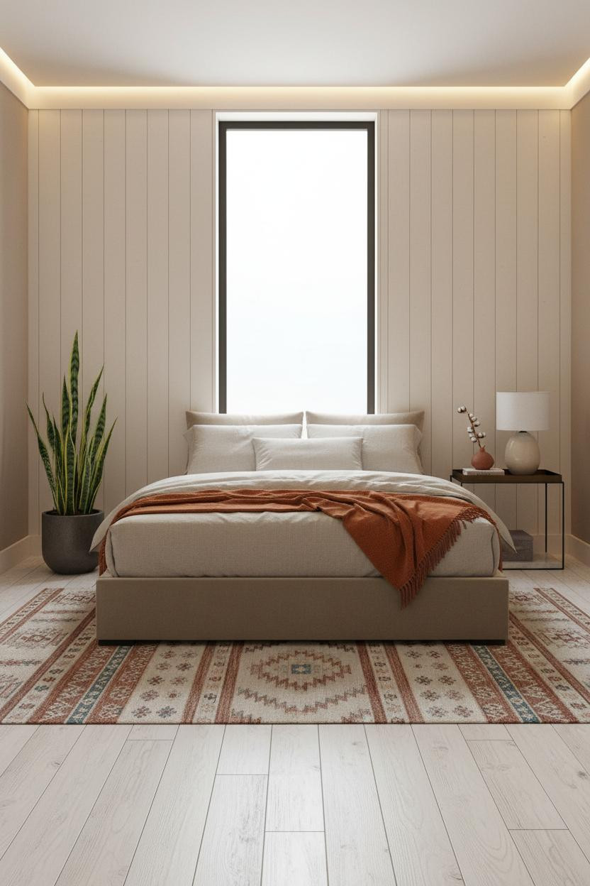

In a small space, the bed's profile matters as much as its size. Low furniture keeps the sightlines clear, and clear sightlines make a room feel twice as wide as it measures.
What makes this work: The board-and-batten wall in cream behind the bed adds vertical rhythm that pulls the eye upward while the low platform keeps the lower half of the room open and breathing.
Pro move: Go platform over a traditional frame and you gain about eight inches of visual headroom. Small move. Big difference.
The Vertical Panel That Changes How the Wall Reads
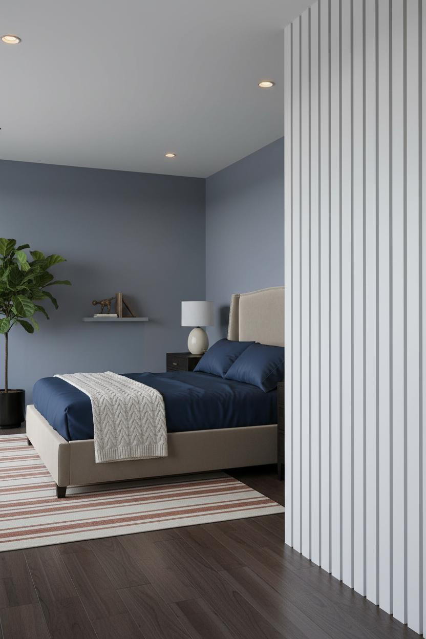
This is one of those rooms where the faded denim blue walls could have felt cave-like but somehow land calm instead.
Design logic: A floor-to-ceiling slatted panel in white-painted timber beside the bed creates thin shadow lines that direct the eye upward, which helps balance the deep wall color while still feeling open.
Hang the panel tight to the bed zone. Keep everything else low and simple. The panel does the work for you, and you're not sacrificing a single inch of floor.
Corner Molding That Costs Less Than You Think
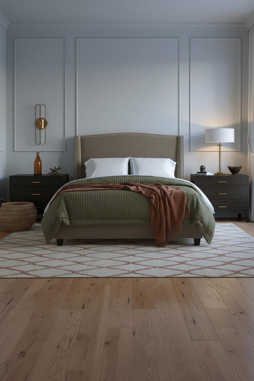
Nothing fancy. That's the point.
Tall corner paneled molding in matte white trim against khaki walls is one of the most underrated tiny bedroom moves there is. Each raised edge catches raking light and casts a thin shadow line, which tricks the eye into reading the wall as deeper than it is.
Worth copying: Run the molding full height, not to chair rail. And add wall sconces flanking the bed so you can ditch the table lamps and free up nightstand surface.
The Honey Wood Wall That Grounds the Whole Room
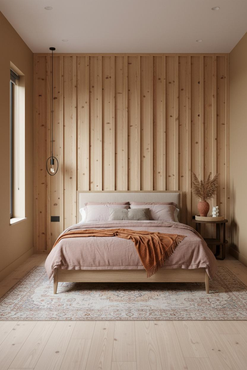

I was skeptical about warm honey board-and-batten in a compact bedroom. It can feel heavy if the proportions are off.
Why it holds together: The vertical battens in warm honey-painted timber pull the eye toward the ceiling rather than across the floor, so the room feels tall rather than narrow. Camel walls flanking the feature wall keep everything in the same tonal family, which helps the space read as cohesive.
The easy win: Keep the nightstand compact and low beside it. A wide nightstand at mid-height breaks the vertical momentum the battens are working to create.
Floor-to-Ceiling Shelving Without the Bulk
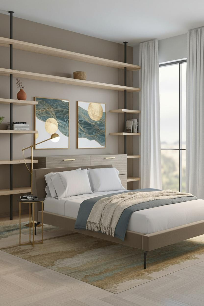

Having proper storage in a tiny room changes how you actually use it. Not just where things go. How the whole space feels on a Tuesday morning.
Recessed corner shelving in pale ash wood at six inches deep keeps the floor plan fully open. The slim metal brackets add just enough contrast. And because the shelves run the full eight-foot height, the room feels generous rather than maxed out.
Avoid this mistake: Don't overfill the shelves. Three objects per shelf, loosely arranged, reads as collected. Four objects tightly spaced reads as cluttered. The difference is real.
What a Single Floating Shelf Above the Bed Can Do
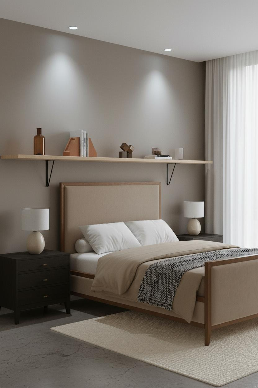
I almost scrolled past this. Glad I didn't.
What gives it presence: A full-width floating shelf in pale birch with slim black pin supports spans the wall above the headboard at about ten inches deep. It pulls the eye up and adds storage without claiming an inch of floor. The dove grey walls keep everything quiet so the shelf reads as intentional, not crammed in.
Steal this move: Mount it high enough to clear a reading lamp. Leave the nightstand surface clear. The shelf handles display. The nightstand handles function. Clean division, calm result.
Corner Built-Ins That Double Your Storage Without Moving a Wall
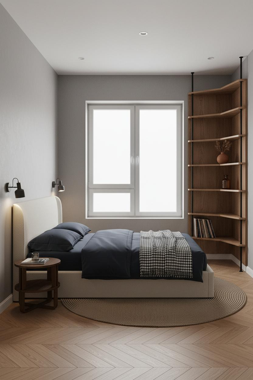

Most people treat corners as dead space. That's the real waste in a tiny bedroom layout.
The real strength: A floor-to-ceiling corner unit in walnut-toned wood at 36 inches wide creates strong vertical lines in a zone that usually just collects clutter. The shallow shelves add real storage in a way that feels considered, not stuffed in.
Where people go wrong: Using deep shelving. Six to eight inches is plenty. Go deeper and you eat floor space. Go shallower and the unit looks like an afterthought.
How Built-In Wardrobes Make a Small Room Look Designed
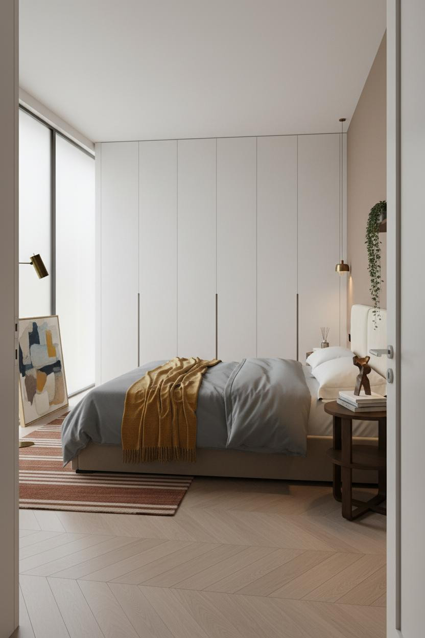
This is the layout I'd choose if I were starting over in a small room. Full-width, floor-to-ceiling built-in wardrobes in flush matte white panels run wall to wall, and the recessed pulls cast thin shadow lines that draw the eye upward. The room feels thought-through because it actually is.
Why it feels expensive: Flush panel doors eliminate visual noise. No hardware. No gaps. The whole wall reads as one clean surface, which makes the room feel larger rather than packed.
One smart swap: Lean an oversized canvas against the wardrobe base instead of mounting art. It anchors the horizontal plane and keeps things from looking too sterile.
Dusty Rose and Dark Walnut Is a Better Combination Than It Sounds
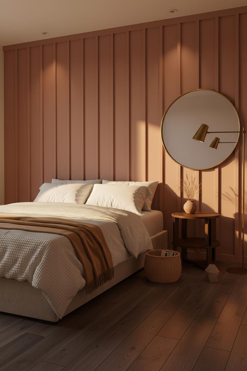
Fair warning. Dusty rose reads precious on a mood board and genuinely warm in person. There's a difference.
The board-and-batten wall in dusty rose works because of the dark walnut flooring beneath it. The contrast is what gives each surface definition. Without it, the room would feel soft in a flat way. With it, the room feels warm and cohesive.
What to copy first: Mount an oversized round mirror above the nightstand. It bounces light across the compact layout and adds a focal point that isn't the wall color itself.
The Sage and Oak Layout That Gets Scandi Right
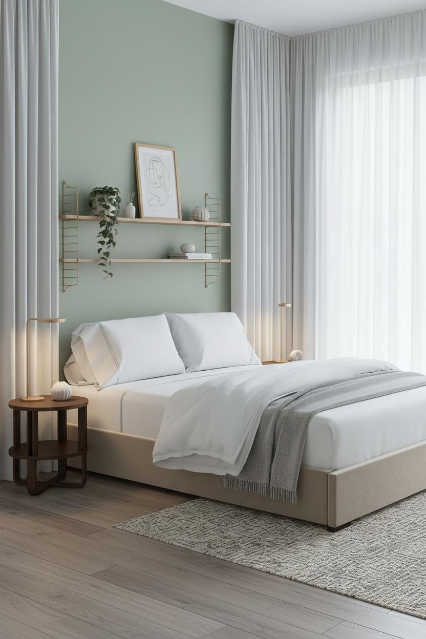
The room feels calm and cohesive in a way that doesn't happen by accident. Soft sage walls with natural oak floating shelves and bleached plank flooring keep everything in the same light register, which is exactly why the space reads as airy rather than small.
What carries the look: Sheer floor-to-ceiling curtains hung high and wide make the single window feel twice its size, which floods the compact layout with morning light in a way that feels almost generous for the square footage.
Skip this: Don't add a second color to the shelf objects. One trailing plant, one small ceramic, and a minimal wooden frame is enough. Just enough texture to keep things interesting.
 Our #1 Pick
Saatva Classic Mattress
America's best-selling online luxury innerspring. 365-night trial, lifetime warranty, free white glove delivery.
Shop Saatva Classic
Our #1 Pick
Saatva Classic Mattress
America's best-selling online luxury innerspring. 365-night trial, lifetime warranty, free white glove delivery.
Shop Saatva Classic
The Foundation Of Every Beautiful Bedroom
Walls get repainted. Shelves get rearranged. The mattress stays. And in a small bedroom, where you spend a larger proportion of your time than in any other room, it matters more than the layout ever will.
The Saatva Classic has a dual-coil support system that holds up without going stiff, a breathable cotton cover that doesn't trap heat in a smaller room, and a Euro pillow top that feels right from the first night. Not just comfortable. Actually right.
Get the layout sorted. Then get the bed right. The rest figures itself out.

Good design ages well because it's made well. Start with the bones, choose furniture that earns its square footage, and put the most effort into the piece you spend eight hours on every single night.


