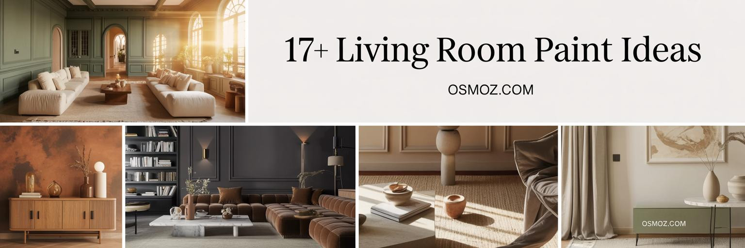
17+ Living Room Paint Color Ideas for Layered, Light-Filled Interiors
18 january 2026Living room paint color ideas transcend surface decoration—they architect spatial perception, manipulate natural light, and define architectural character. When Farrow & Ball formulates 'Hague Blue' or Benjamin Moore perfects 'Revere Pewter', these aren't merely pigments—they're curated instruments of atmospheric design that transform residential interiors into gallery-worthy compositions.
These 17 interiors showcase museum-quality color thinking: from dramatic jewel-tone lacquers in Parisian Haussmann apartments to serene coastal palettes in Hamptons beach houses. Expect sophisticated multi-tone schemes, lime plaster textures, and materials that cost more per gallon than standard paint budgets. This is color as architectural investment.
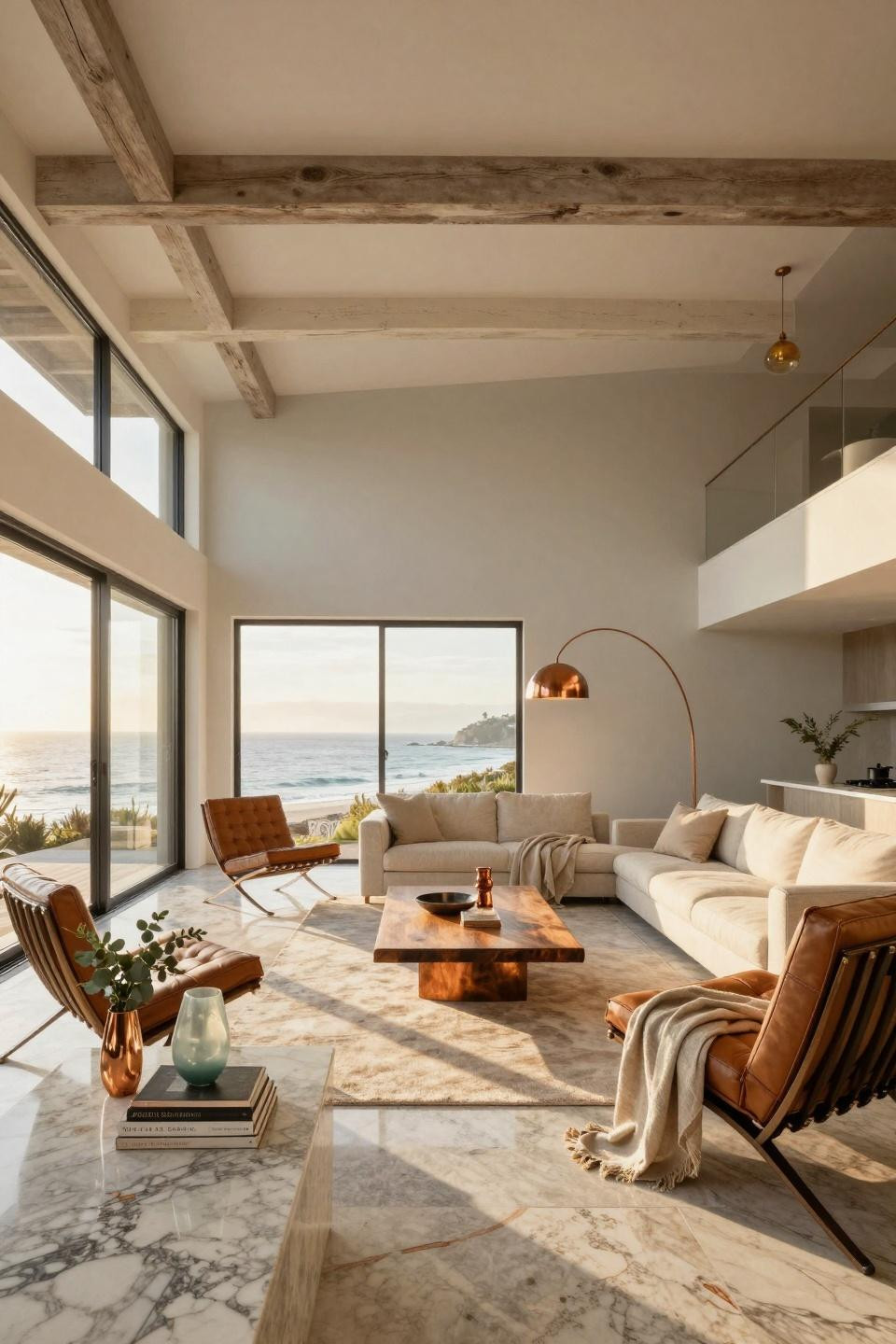
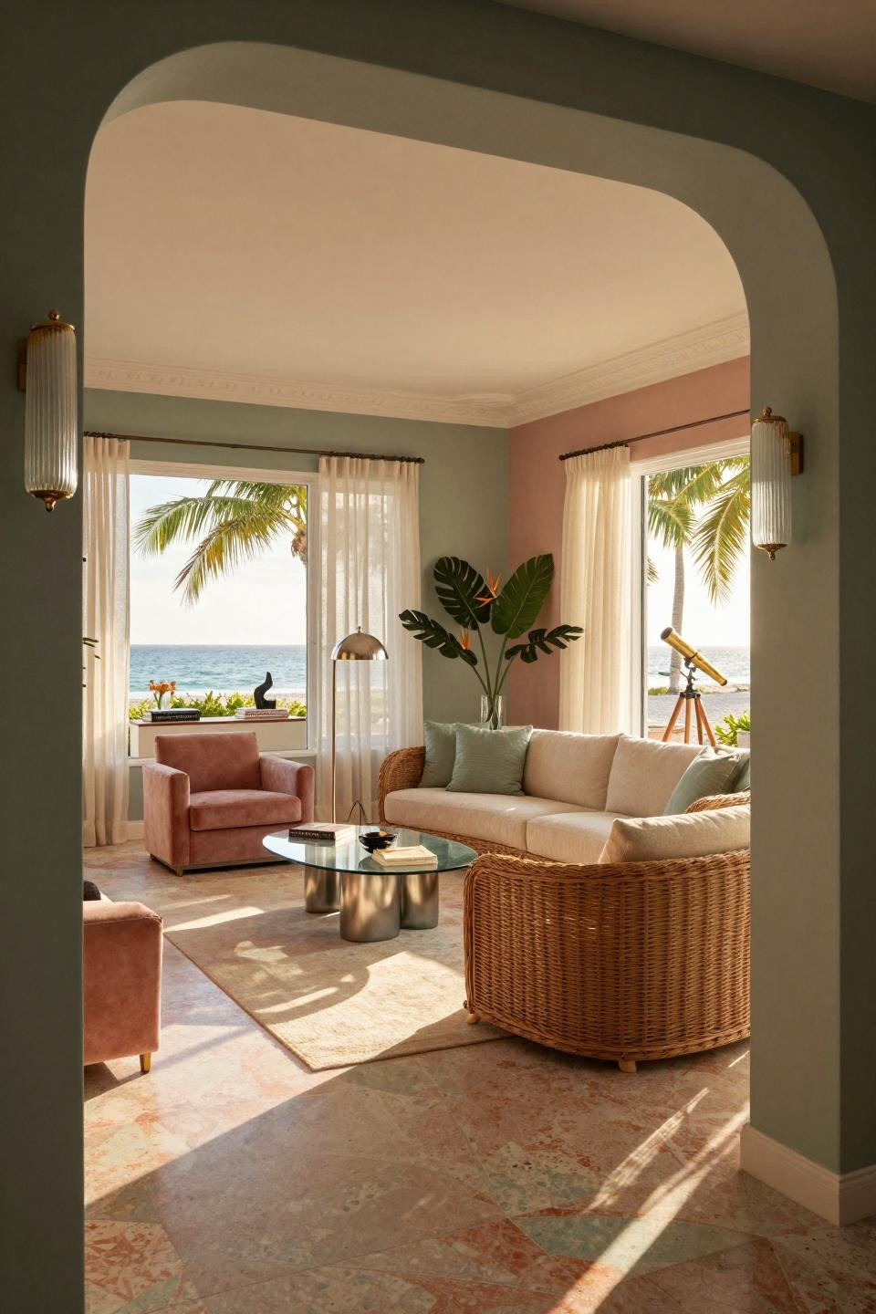
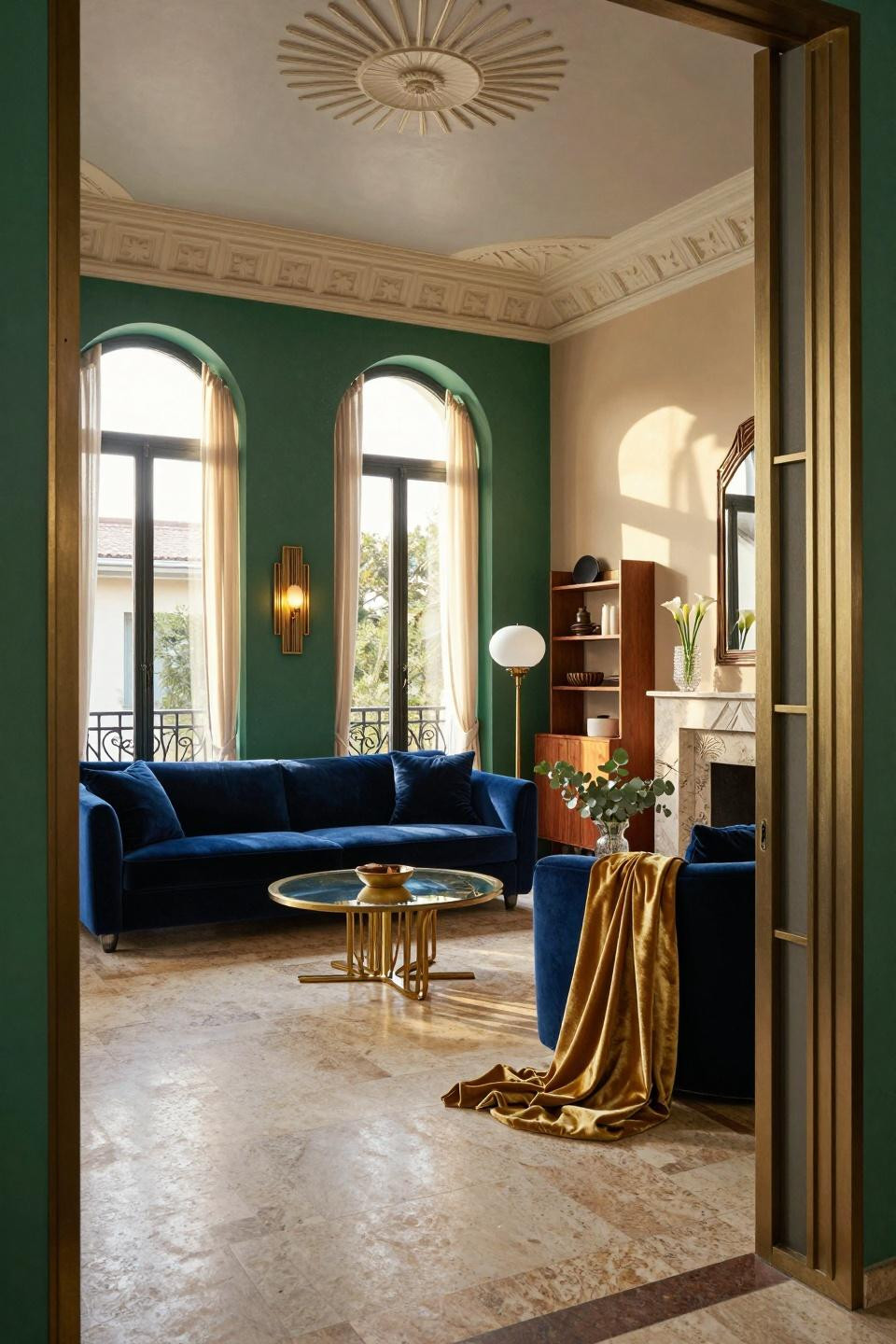
Tri-Tone Coastal Sophistication in Hamptons Beach House Architecture
This Amagansett residence demonstrates how sophisticated paint color blocking creates architectural drama without structural intervention. The demonstration wall features three distinct Benjamin Moore and Farrow & Ball tones—'Pavilion Gray' upper section, 'Gray Owl' mid-zone, 'White Dove' wainscoting—creating visual layers that emphasize the twelve-foot ceiling height while maintaining coastal serenity.
Reclaimed Douglas fir beams in natural finish contrast against the cool grey palette, while blackened steel window frames anchor the color transitions. The tri-tone approach allows each architectural element—ceiling plane, wall surface, millwork detail—to occupy distinct visual territory while maintaining tonal harmony through neutral undertones.
Design-conscious audiences seeking Coastal Living editorial quality will recognize how this palette elevates standard beach house aesthetics into Sotheby's International Realty territory. The scheme appeals to those who understand paint as spatial tool rather than decorative afterthought, where each tone serves architectural purpose beyond surface color.
High-Gloss Lacquer Drama in Parisian Art Deco Revival
Farrow & Ball 'Railings' in high-gloss lacquer transforms this 6th arrondissement Haussmann apartment into a mirror-like jewel box. The reflective finish amplifies fourteen-foot ceiling heights and bounces late afternoon sunlight across Versailles parquet, creating dynamic light play impossible with flat paint. This is chromatic architecture—walls become reflective surfaces that multiply spatial perception.
The lacquered surface demands impeccable wall preparation and professional application, but rewards with museum-quality depth. Geometric shadows from floor-to-ceiling French windows create moving patterns across the glossy surface throughout the day, transforming static color into temporal experience. Book-matched Calacatta Gold marble fireplace provides warm material contrast against the cool grey walls.
This approach suits collectors and design purists who appreciate Baccarat-level craftsmanship in every surface. The high-gloss finish elevates paint from background element to primary architectural feature, commanding attention like gallery-installed artwork rather than neutral backdrop.
Navy and Pink Lacquer Contrast in Tribeca Industrial Loft
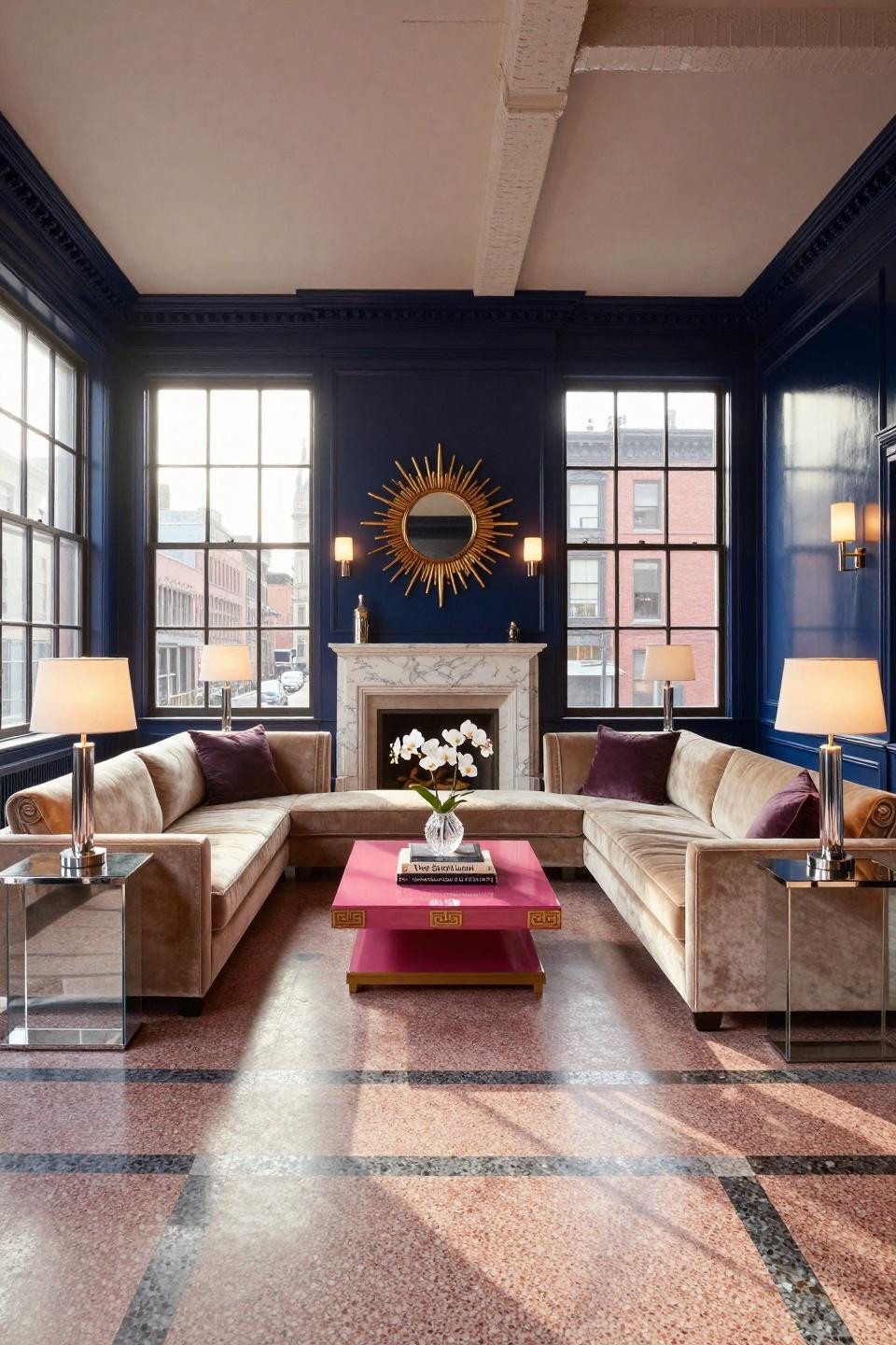
Benjamin Moore 'Hale Navy' lacquer anchors this Tribeca loft with saturated depth, while Farrow & Ball 'Pointing' trim creates crisp architectural definition. The high-contrast scheme emphasizes original cast iron columns and fourteen-foot ceiling heights, transforming industrial bones into Hollywood Regency sophistication. Lacquered surfaces reflect terrazzo flooring patterns, multiplying geometric detail through chromatic reflection.
This color strategy demonstrates how bold saturation in architectural paint creates gallery-like focus. The navy walls recede visually, making the Christian Liaigre champagne velvet sectional appear suspended in space—a curatorial trick borrowed from museum exhibition design where dark walls foreground light-toned objects.
Affluent homeowners seeking statement interiors without structural renovation will recognize this approach. The paint scheme alone transforms generic loft space into Architectural Digest-worthy composition, proving color selection carries equal weight to furniture investment in sophisticated interiors.
Three-Tone Coastal Greige Palette in Malibu Glass House
This Pacific-facing Malibu residence deploys Farrow & Ball 'Pointing' soft grey, Benjamin Moore 'Pale Oak' warm greige, and pure white ceiling in subtle gradation. The three-tone scheme creates spatial depth while maintaining coastal serenity—each wall plane occupies distinct tonal territory without chromatic discord. Lime wash texture adds dimensional quality impossible with standard latex paint.
Silver Cloud quartzite flooring with copper veining reflects the neutral paint palette, creating material conversation between horizontal and vertical surfaces. The sophisticated greige tones bridge cool coastal light with warm interior materials—white oak beams, bleached teak furniture, brushed copper fixtures—demonstrating how paint mediates between architectural elements.
Design enthusiasts seeking Coastal Living editorial sophistication will appreciate how this palette avoids coastal clichés (blues, nauticals) while maintaining beach house serenity. The approach suits those who understand neutrals as complex color relationships rather than absence of color.
Lime Plaster Texture in London Georgian Townhouse Restoration
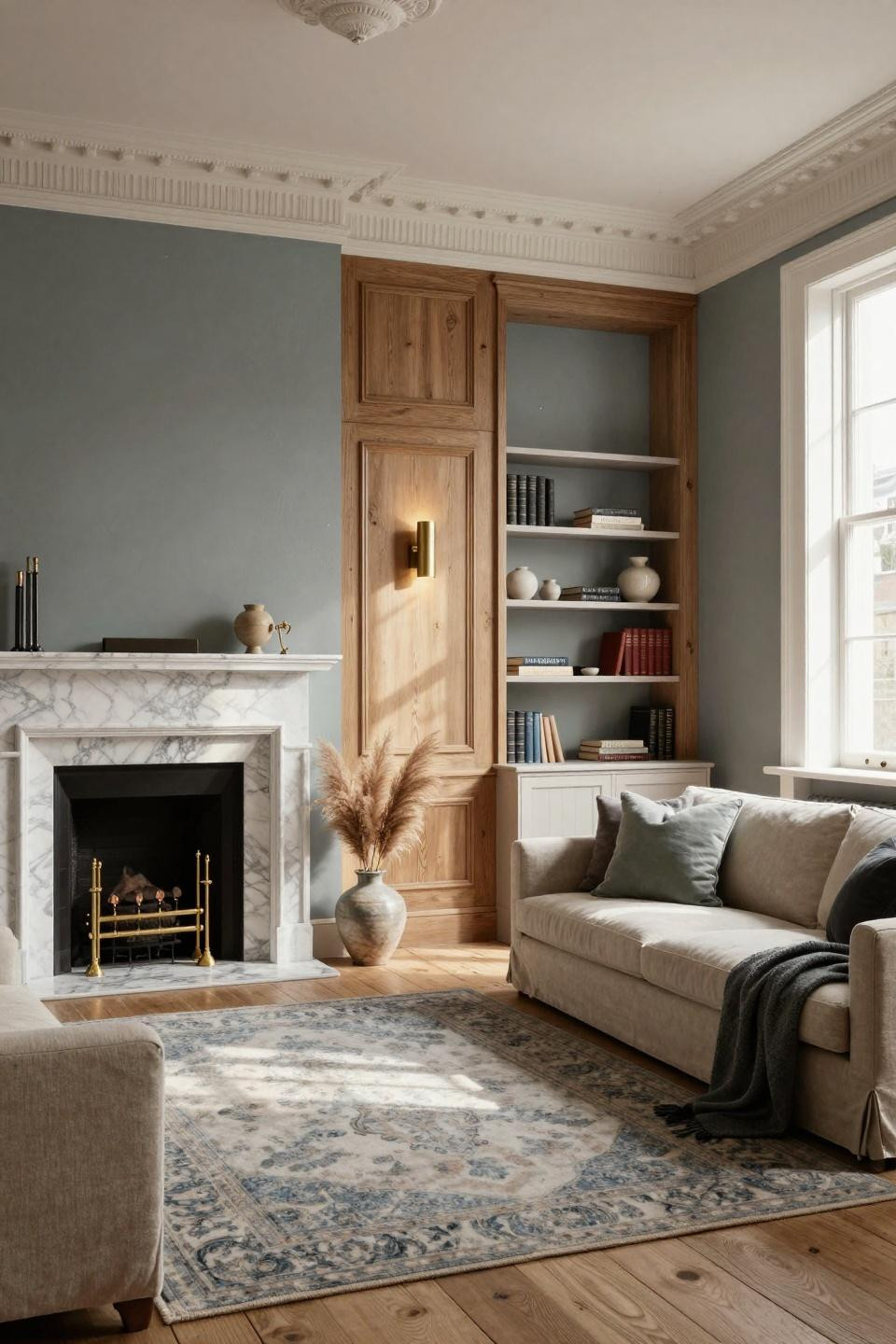
Benjamin Moore 'Revere Pewter' in lime wash finish brings dimensional authenticity to this Kensington Georgian restoration. Unlike flat modern paint, lime plaster creates subtle surface variation that captures light like antique plaster—historically appropriate while reading contemporary. The technique suits original fourteen-foot ceilings and Georgian moldings, respecting architectural heritage without period pastiche.
Cerused oak paneling frames one wall in Farrow & Ball 'Railings', creating dramatic contrast against the soft greige lime wash. This material differentiation—smooth lacquer versus textured plaster—adds architectural complexity through surface treatment rather than color alone. Honed Carrara marble fireplace provides third textural layer, demonstrating how paint participates in larger material palette.
Collectors of period architecture will recognize this approach as authentic restoration thinking. The lime wash honors Georgian craftsmanship while serving modern aesthetic sensibilities—a balance requiring both historical knowledge and contemporary design authority.
Wabi-Sabi Sand Tones in Milanese Palazzo Sanctuary
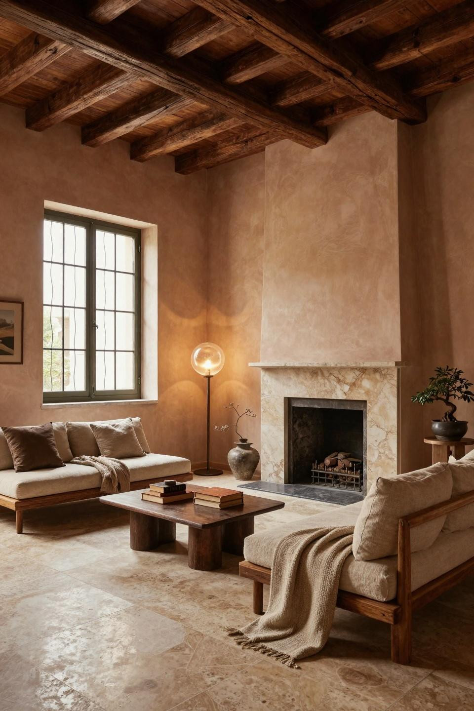
Hand-troweled lime plaster in warm sand tones embraces wabi-sabi philosophy in this 17th-century Milanese palazzo. The irregular surface texture celebrates imperfection—visible trowel marks, subtle color variation, organic irregularities—creating contemplative atmosphere antithetical to modern paint's uniform perfection. This approach suits centuries-old timber beams and honed travertine floors, where new materials must show appropriate age.
Natural terracotta, sand, and bronze tones create warmth without saturation, allowing architectural bones and natural materials—reclaimed teak, aged bronze, hand-thrown ceramics—to occupy visual prominence. The paint becomes neutral ground rather than decorative statement, honoring Japanese spatial philosophy adapted to Italian palazzo context.
Design-conscious audiences seeking serene sanctuaries will appreciate how this palette supports contemplative living. The warm neutrals create refuge from chromatic excess, demonstrating sophistication through restraint—a luxury increasingly rare in maximalist-dominated interiors.
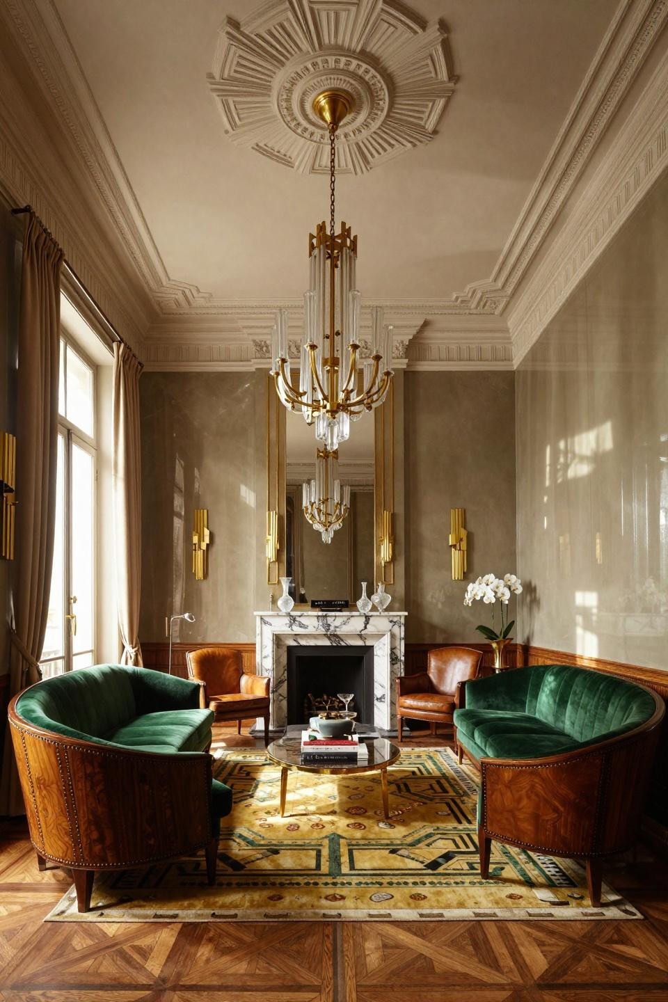
Sapphire and Blush Lacquer Drama in Parisian Haussmann Apartment
Farrow & Ball 'Hague Blue' sapphire lacquer creates jewel-box drama in this 6th arrondissement residence. The deep saturated finish transforms walls into reflective surfaces that multiply candlelight and afternoon sun, while adjacent walls in warm taupe and soft blush pink prevent chromatic monotony. This multi-tone approach demonstrates how sophisticated color schemes layer tones rather than commit to single-color orthodoxy.
The sapphire wall anchors Christian Liaigre's ivory bouclé commissioned sofa, creating maximum contrast that foregrounds furniture as sculptural object. Museum-quality lighting design—Apparatus sconces, Baccarat chandelier, hidden cove LEDs—ensures the lacquered surfaces perform throughout day and night cycles, shifting from cool blue to warm purple as light temperatures change.
Affluent homeowners seeking investment-level interiors will recognize this palette as signature AD100 designer territory. The lacquered finishes alone represent significant budget allocation, signaling commitment to material excellence beyond standard residential paint specifications.
Art Deco Sage and Rose in Miami Beach House Revival
Farrow & Ball 'Green Smoke' moody sage pairs with 'Pink Ground' dusty rose in sophisticated Art Deco revival palette. The color combination honors 1940s South Beach heritage while reading thoroughly contemporary—a balance requiring precise tone selection where saturation levels and undertones must align despite chromatic opposition. Curved porthole windows and terrazzo floors provide architectural context for the period-appropriate scheme.
The sage and rose tones create atmospheric depth impossible with single-color approaches. Morning light renders the sage almost grey, while golden hour amplifies rose warmth—chromatic variation that transforms static rooms into dynamic spaces responding to natural light cycles. Patricia Urquiola's natural rattan furniture bridges the two paint tones through neutral materiality.
Design enthusiasts seeking tropical modern sophistication will appreciate how this palette avoids coastal blues while maintaining beach house levity. The approach demonstrates color knowledge—understanding how warm pinks and cool greens can coexist through careful undertone management.
Moroccan Terracotta and Saffron in Parisian Riad-Inspired Interior
Farrow & Ball 'Red Earth' and 'Setting Plaster' in lime wash finish create Moroccan warmth within Parisian Haussmann architecture. The tadelakt plaster texture—Moroccan technique creating polished, water-resistant surface—adds dimensional quality while warm terracotta and ivory tones honor North African design heritage. This cross-cultural palette demonstrates how sophisticated color thinking transcends geographic orthodoxy.
Hand-carved Moroccan cedar screens and zellige tile patterns provide chromatic context for the warm paint tones. The earthy palette allows jewel-tone textiles—silk velvet cushions, Beni Ourain rugs—to provide saturated contrast without overwhelming spatial serenity. Afternoon sunlight through cedar screens creates geometric shadows across tadelakt surfaces, animating static color through moving light.
Collectors of global design will recognize this approach as authentic material practice rather than decorative pastiche. The tadelakt application requires specialized craftsmen, elevating paint from DIY project to artisan installation—appropriate investment for museum-quality interiors.
Emerald and Blush Lacquer Contrast in Beverly Hills Estate
Deep emerald lacquer faces soft blush pink in high-gloss finishes, creating maximum chromatic drama in this Beverly Hills Hollywood Regency estate. Polished brass trim separates the opposing tones, transforming potential discord into intentional duality. The lacquered surfaces reflect canyon views and afternoon light, multiplying spatial perception through chromatic reflection—walls become active participants in light modulation rather than passive backdrops.
This wall color combination demonstrates advanced color theory—emerald's cool depth recedes spatially while blush's warm lightness advances, creating perceived dimension despite flat wall planes. The approach requires confidence and commitment; lacquered jewel tones offer no neutral retreat, demanding furniture and styling rise to equivalent sophistication levels.
Design-conscious audiences seeking statement interiors will recognize this as signature Kelly Wearstler or Jonathan Adler territory. The paint investment alone signals luxury sensibility where color carries equal budget allocation to furniture, lighting, and art.
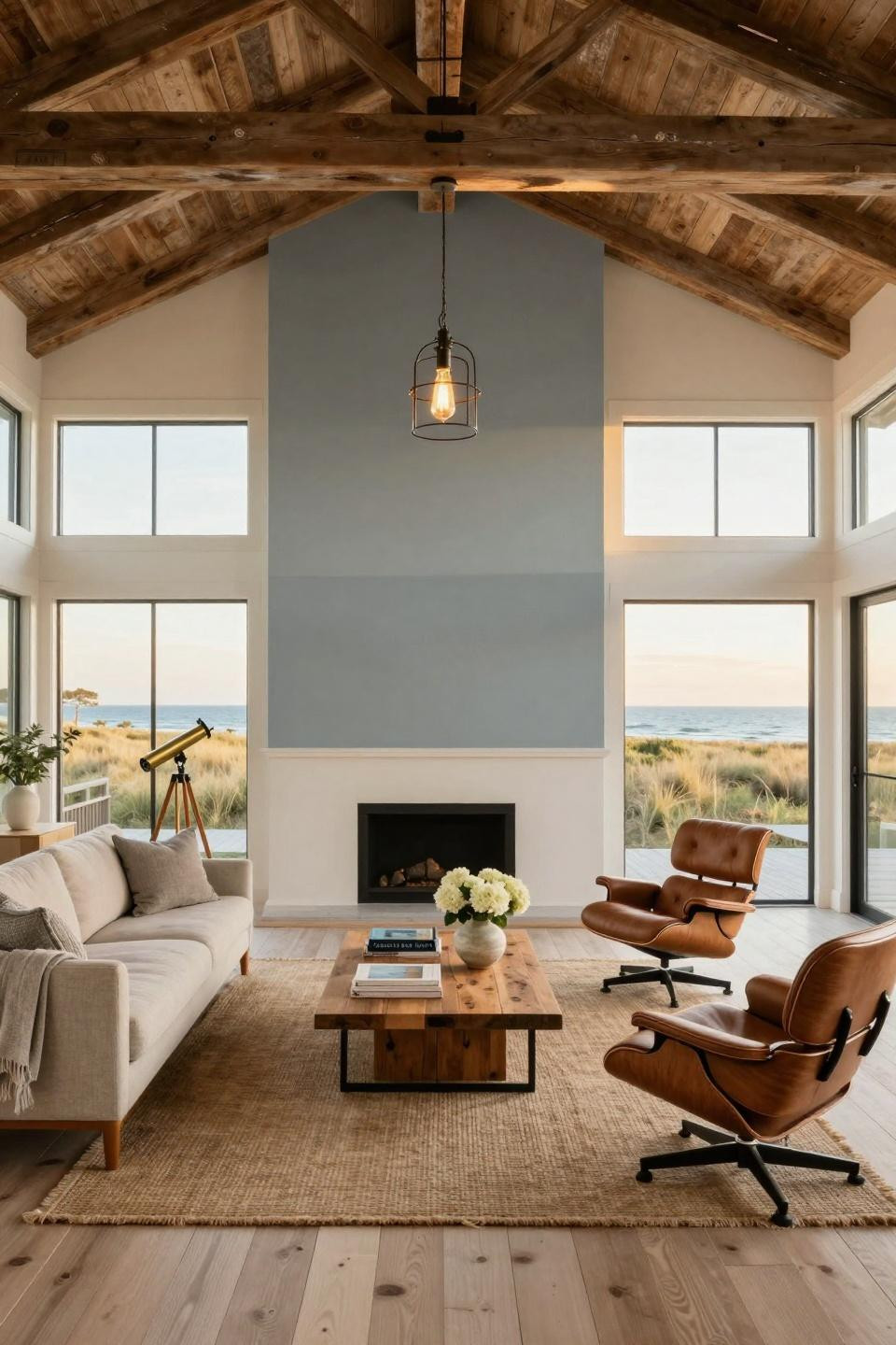
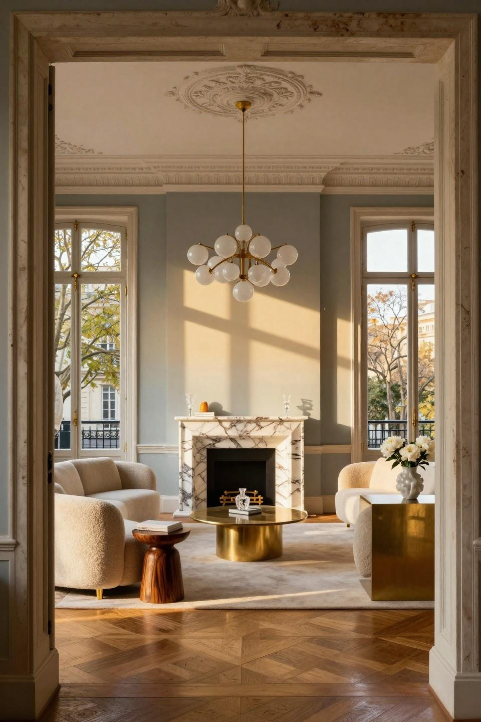
Pale Oak and Pavilion Blue in East Hampton Beach House Elegance
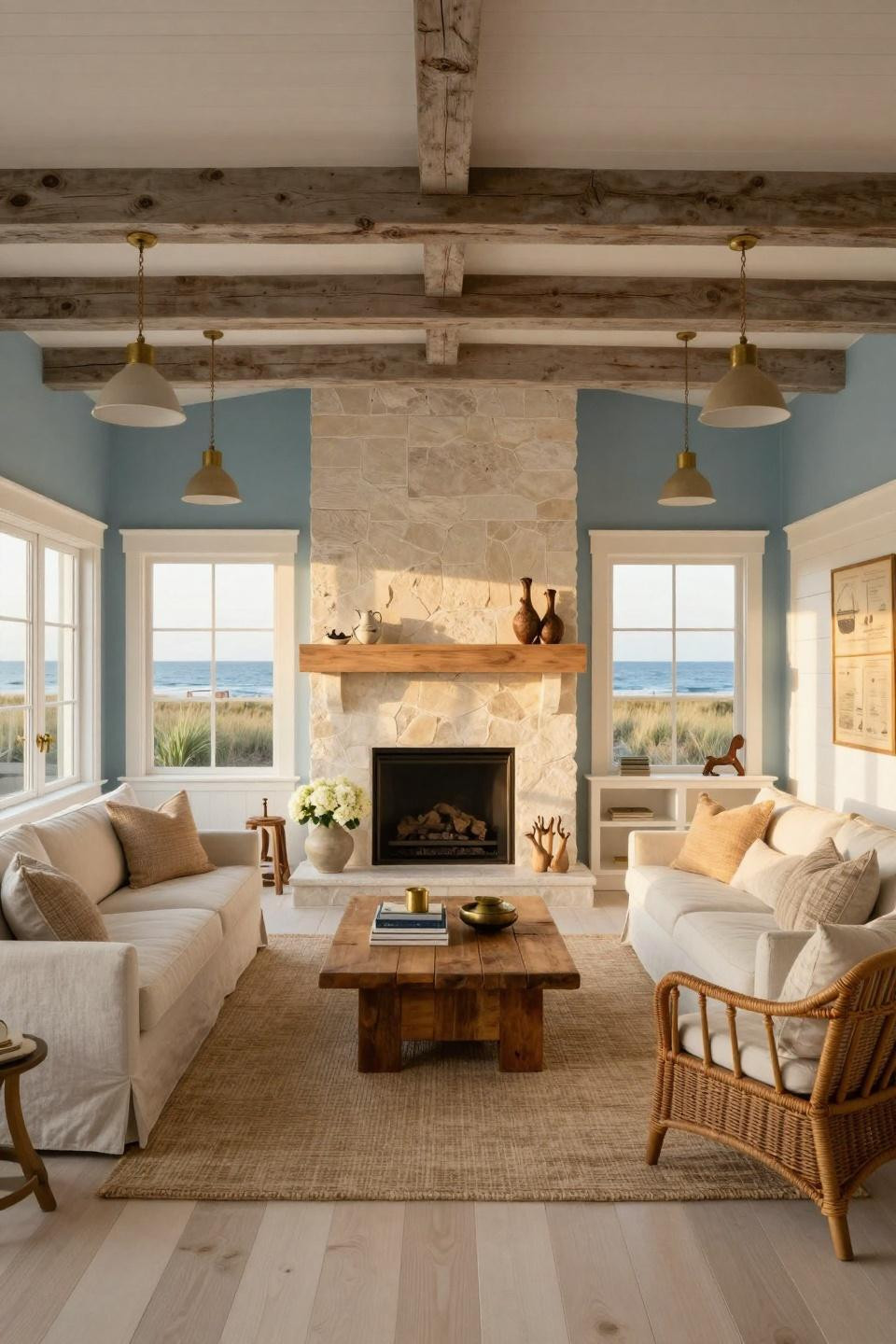
Benjamin Moore 'Pale Oak' provides warm neutral foundation while Farrow & Ball 'Pavilion Blue' accent wall introduces coastal reference without cliché. This sophisticated palette avoids expected beach house blues, instead using blue sparingly as accent against dominant warm neutrals. The approach demonstrates restraint—allowing natural materials (limestone fireplace, white oak floors, linen upholstery) visual prominence rather than competing through saturated color.
Shiplap wainscoting in crisp white creates architectural division between 'Pale Oak' walls and blue accent, preventing chromatic bleeding while adding historical detail appropriate to Hamptons vernacular. The three-tone scheme—warm neutral, cool blue, crisp white—provides sufficient variety without chromatic chaos, balancing serene beach house atmosphere with editorial sophistication.
Affluent homeowners seeking Coastal Living editorial quality will appreciate how this palette honors regional aesthetic while avoiding coastal design clichés. The scheme suits those who understand beach house design as architectural discipline rather than decorative theme.
Ombre Gradient Walls in Minimalist Parisian Apartment
Custom-commissioned ombre paint treatment transitions from Farrow & Ball 'Pavilion Gray' at baseboard through 'Lamp Room Gray' to 'Mizzle' at crown molding. This graduated tonal approach creates unprecedented architectural depth, transforming flat walls into dimensional surfaces through chromatic gradation. The technique requires exceptional application skill—seamless transitions between tones without visible banding or brush marks.
Book-matched Calacatta Gold marble fireplace provides sculptural focal point against the gradient walls, while Minotti cashmere bouclé seating and Lindsey Adelman chandelier occupy distinct visual layers within the tonal progression. The ombre effect emphasizes fourteen-foot ceiling heights, drawing eyes upward through gradual lightening—spatial manipulation through color rather than structure.
Design purists seeking museum-quality interiors will recognize this as bespoke artisan work. The graduated paint treatment represents significant investment in material excellence, appropriate for residences where every surface receives equivalent design attention.
Neutral Palette Study Wall in Tribeca Gallery Loft
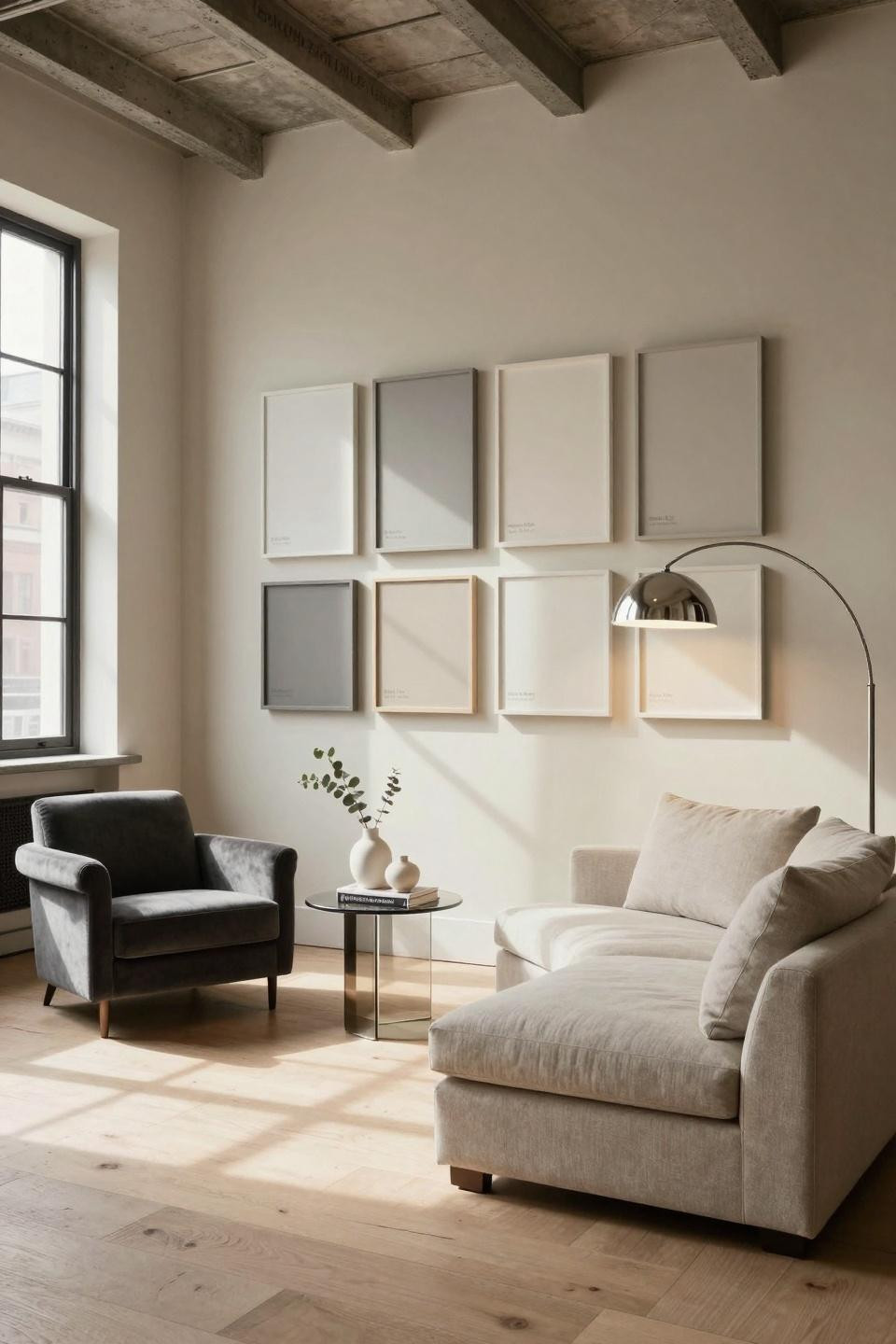
This Tribeca loft transforms paint selection into art installation—framed samples of Farrow & Ball 'Pavilion Gray', Benjamin Moore 'Classic Gray', 'Revere Pewter', and 'White Dove' create editorial display demonstrating sophisticated neutral palette thinking. The installation celebrates color as primary design consideration, elevating paint from utilitarian necessity to curated aesthetic statement worthy of gallery presentation.
Focal wall in Farrow & Ball 'Elephant's Breath' with lime plaster texture demonstrates the depth achievable through premium paint and artisan application. The subtle grey-beige appears cool in morning light, warm in afternoon glow—chromatic complexity invisible in paint chips but essential to sophisticated interiors. B&B Italia linen seating in stone tones allows the paint story to dominate visual attention.
Architecture lovers seeking Architectural Digest editorial quality will appreciate this meta-approach where the paint color selection process becomes design feature. The installation demonstrates commitment to color excellence, treating paint as primary architectural material rather than decorative afterthought.
Hague Blue Drama with Quartzite Fireplace in Malibu Villa
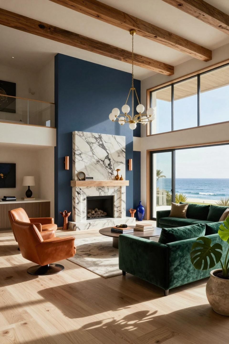
Farrow & Ball 'Hague Blue' creates dramatic depth in this Malibu contemporary villa, while Benjamin Moore 'Pale Oak' and 'Swiss Coffee' on adjacent walls prevent chromatic monotony. The multi-tone approach allows each wall plane distinct identity while maintaining spatial coherence through neutral undertones. Taj Mahal quartzite fireplace surround with dramatic veining provides sculptural focal point against the saturated blue backdrop.
Cerused oak millwork frames the fireplace wall, creating material contrast—smooth paint, textured quartzite, open-grain wood—that adds dimensional complexity. The Hague Blue recedes spatially despite saturation, making the room feel larger while providing gallery-like drama for Kelly Wearstler lighting and B&B Italia emerald velvet seating to occupy foreground attention.
Luxury real estate buyers seeking Pacific coastal sophistication will recognize this as signature AD100 designer palette. The paint scheme demonstrates how saturated color creates architectural impact without structural intervention, transforming standard rooms into museum-quality spaces through chromatic authority alone.
Warm Terracotta in London Georgian Coastal Sanctuary
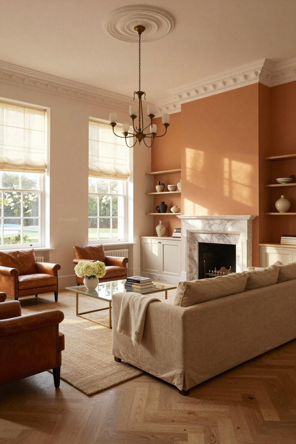
Farrow & Ball 'India Yellow' creates warm terracotta glow in this Kensington Georgian townhouse, paired with 'Pointing' soft white on adjacent walls. The warm ochre tone honors Georgian heritage while reading thoroughly contemporary—a balance requiring precise color selection where historical accuracy meets modern aesthetic sensibilities. The palette suits restored fourteen-foot ceilings and original marble fireplace without period costume.
Ralph Lauren Home linen sofa in sand colorway anchors the warm color scheme, while cognac saddle leather chairs and brass fixtures provide tonal variation within warm spectrum. The monochromatic approach—all warm tones, no cool contrasts—creates serene sanctuary atmosphere, demonstrating sophistication through chromatic restraint rather than multi-color variety.
Design enthusiasts seeking coastal chic elegance will appreciate how this palette avoids coastal blues while maintaining beach house serenity. The warm terracotta tones create refuge atmosphere appropriate for London townhouse sanctuary, proving sophisticated color thinking transcends geographic context.
Jewel-Box Emerald and Champagne in Milan Art Deco Revival
Deep emerald green lacquer anchors this Milan Centro Storico residence, while soft champagne on remaining walls and pearl grey ceiling create sophisticated layered palette. The color blocking emphasizes 1920s Art Deco moldings and geometric plaster details, using paint to highlight rather than obscure architectural ornament. High-gloss lacquered surfaces reflect afternoon light across travertine floors, multiplying spatial perception.
The emerald and champagne combination demonstrates advanced color relationships—cool saturated green balanced by warm neutral champagne, both unified through grey ceiling that bridges chromatic opposition. Vintage brass and glass furniture, sapphire velvet seating, and geometric cushions occupy the jewel-box palette without chromatic discord, proving how sophisticated paint schemes support rather than compete with furnishings.
Collectors seeking museum-quality interiors will recognize this as signature 1920s glamour translated for contemporary living. The paint treatment alone transforms generic spaces into Sotheby's International Realty territory, demonstrating color investment as architectural strategy.
Alpine Terracotta and Burnt Sienna in Swiss Chalet Luxury
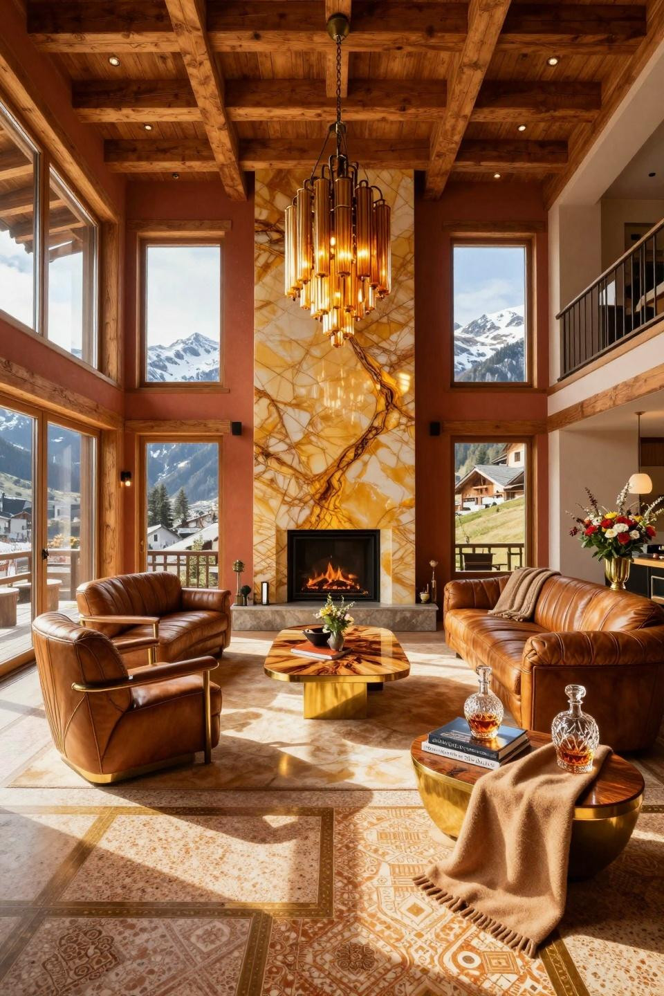
Custom lime plaster in rich terracotta and burnt sienna creates warm sanctuary in this Gstaad chalet. The hand-applied plaster suits 200-year-old reclaimed timber beams and heated terrazzo floors, where modern paint would appear incongruous against centuries-old materials. The warm earth tones honor Alpine vernacular while serving contemporary luxury aesthetic, demonstrating how sophisticated color thinking respects architectural context.
Backlit honey onyx fireplace surround provides luminous focal point against the terracotta walls, creating material conversation between matte plaster and translucent stone. The warm color palette—terracotta walls, honey onyx, cognac leather, amber glass—creates monochromatic sophistication where tonal variation replaces chromatic variety, proving luxury through material restraint.
Affluent audiences seeking billionaire-level craftsmanship will appreciate how this palette elevates mountain retreat beyond rustic cliché. The custom lime plaster represents significant artisan investment, appropriate for residences where every surface receives museum-quality attention and budget allocation.
Curating Your Chromatic Architecture
These luxury living rooms demonstrate paint as architectural instrument—spaces where Farrow & Ball lacquers converse with lime plaster textures, where Benjamin Moore neutrals create spatial depth through tonal gradation, where color blocking emphasizes fourteen-foot ceilings and original moldings. This is paint as investment, as material excellence, as curatorial decision requiring design authority beyond chip selection.
Save the palettes that speak to your spatial sensibility. Whether drawn to jewel-box lacquers or wabi-sabi lime wash, each scheme here offers masterclass in sophisticated color thinking. Visit osmoz.com for curated paint color excellence where every tone receives architectural consideration.


