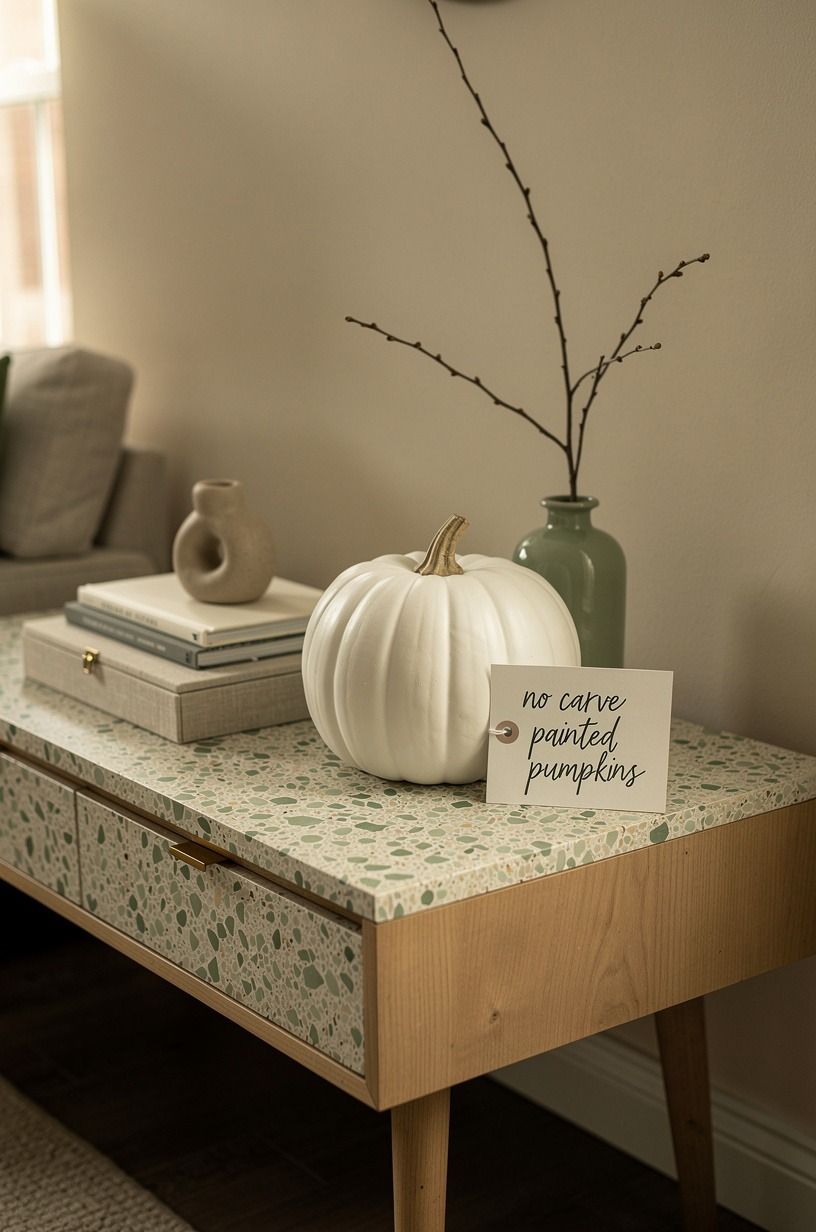
17 No-Carve Painted Pumpkin Designs That Last All October Without Rotting
17 september 2026No-carve painted pumpkins can last all October when you keep the surface clean, the paint layer thin, and the display away from damp soil. I learned that after sealing a pumpkin too late and watching the stem wrinkle first. These designs use matte color, fabric, and ordinary table styling to keep the season warm without a carving knife. Small change, much less mess!
- Paint the Whole Pumpkin in Chalky White
- Layer a Spotted Milk-Paint Finish
- Swap Orange for Deep Green
- Follow the Two-Tone Pumpkin Rule
- Brush a Blue-and-White Delft Motif
- Build a Checkerboard Pumpkin
- Stencil Botanical Shadows
- Use the Three-Height Stem Stack
- Dip the Bottom in Aged Bronze
- Budget the Display with Real Numbers
- Wrap the Stem Instead of Painting Every Inch
- Letter One Word in Hand-Painted Script
- Create the Matte-and-Gloss Contrast
- Turn Mini Pumpkins into a Harvest Still Life
- Paint a Moody Black-and-Cream Pair
- Add a Terracotta Wash for Warmth
- Choose Painted Pumpkins Over Plastic Orange
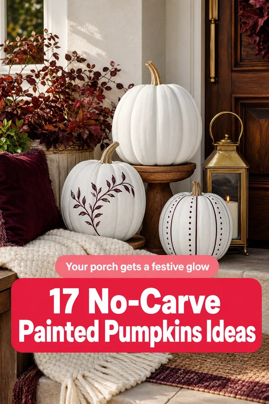
1Paint the Whole Pumpkin in Chalky White
Warm-cream pumpkins look airy, calming, and far more collected than a pile of bright orange gourds. For your first no-carve pumpkin idea, brush on Benjamin Moore White Dove OC-17 and leave a little of the natural ribbing visible. That uneven coverage gives your pumpkin a gentle plaster effect, and you won't need a flawless hand to get it.
I like this design on a natural wood console where the pale surface catches lamplight. Your eye will read the pumpkin as a rounded object, especially beside a 600gsm Turkish cotton runner and an oversized-chip terrazzo bowl. A glossy white finish loses that softness, so I'd skip it.
Keep your composition simple: warm-cream pumpkin, sage-green glass, dried wheat, and one natural wood candlestick. If you're working with several sizes, put the largest behind the others and let your smallest pumpkin sit near the edge. The staggered shape makes your display feel relaxed rather than arranged with a ruler.
2Layer a Spotted Milk-Paint Finish
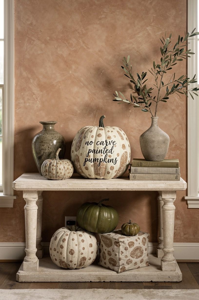
This painted pumpkin design borrows the quiet irregularity of old milk paint. Start with a stone-colored base, then stipple small marks in Farrow & Ball Pigeon No.25, using a nearly dry brush.
You want soft-edged spots, not polka dots that look printed. I tested a sponge first, and it left circles with hard borders.
Your pumpkin will look more earthy if the marks follow the ribs instead of sitting in a perfect grid. Keep your hand loose. A little unevenness is what makes this easy pumpkin decorating idea convincing, and you don't have to repaint every mistake.
Set it beside a shallow tray with a hand-applied Venetian-plaster finish, then repeat the olive tone in one nearby textile. The result is cozy without becoming themed.
But don't add black lettering or striped ribbon here. Your spotted finish already has enough movement, and another graphic note will make the arrangement feel busy.
3Swap Orange for Deep Green
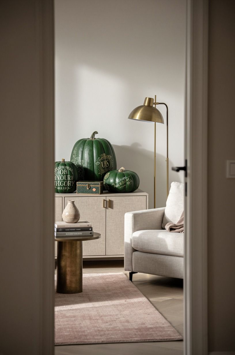
Warm clay gives no-carve Halloween pumpkins a moody, organic quality that works long after October. Paint one medium pumpkin with Sherwin-Williams Cavern Clay SW 7701 first, then add a thin veil of muted terracotta while the base is still slightly soft. The layered color keeps the surface from looking flat.
I made the mistake of painting the stem to match. Your pumpkin will look more refined if you leave the stem raw or brush it with muted brown. The stem is the small dry branch that keeps the painted surface connected to the garden, so it deserves its own texture.
Place this design near a West Elm Anton solid wood console or a shagreen tray. A clay pumpkin can handle brighter neighbors, but your display shouldn't turn into a color contest. One soft linen pumpkin, one clay pumpkin, and a handful of dried leaves will feel inviting every time!
4Follow the Two-Tone Pumpkin Rule
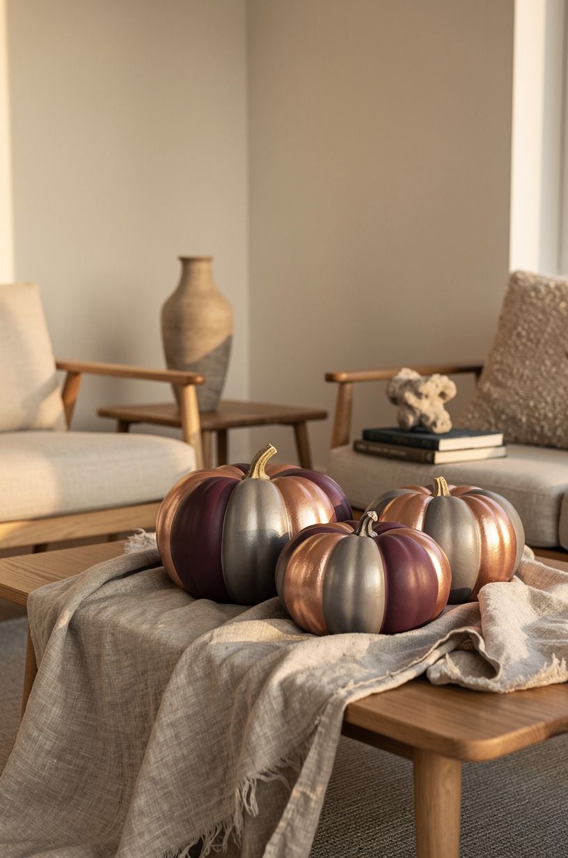
The Two-Tone Pumpkin Rule is simple: use one color on the upper ribs and another below the widest point. For your pumpkin painting DIY, pair Benjamin Moore Dinner Party AF-300 with soft grey, or use Farrow & Ball Pelt No.254 with a muted rose-gold accent. Keep the division slightly irregular so it feels brushed by hand.
I prefer the lower half in the darker shade because it visually anchors your pumpkin. If you reverse it, your design can feel top-heavy, especially on a narrow shelf. Your eye needs a grounded base, and the darker color supplies that weight without adding another object.
Use painter's tape only if you want a crisp stripe. I wouldn't use it on deeply ridged pumpkins, since paint can creep beneath the edge and leave a fussy line.
A small angled brush gives you better control, and you can soften the border with a dry brush before it cures. A strip of washed Belgian linen nearby will soften the plum, grey, and rose-gold combination.
5Brush a Blue-and-White Delft Motif
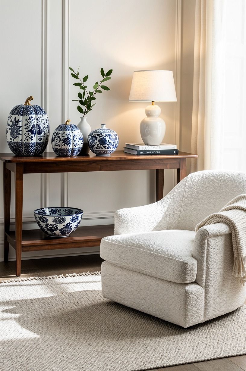
Blue-and-white painted pumpkins bring a peaceful, collected feeling to a porch or dining table. Use a warm-white base, then paint loose tulips, dots, and curling stems in Farrow & Ball Hague Blue.
You don't need to copy a historic plate. Your goal is the rhythm of the pattern, not museum-level precision.
I start with the largest flower near the front rib and let the smaller marks trail behind it. That approach keeps your motif visible from the doorway, where a pumpkin often gets seen first. Thin paint is better than thick paint here, because the ridges should still show beneath the brushwork.
A CB2 Primitivo boucle bench makes a handsome background for this design, especially beside a walnut side table. And if your pattern feels too formal, add one plain pumpkin beside it. The contrast gives your display a softer, more lived-in finish without burying the hand-painted detail.
6Build a Checkerboard Pumpkin
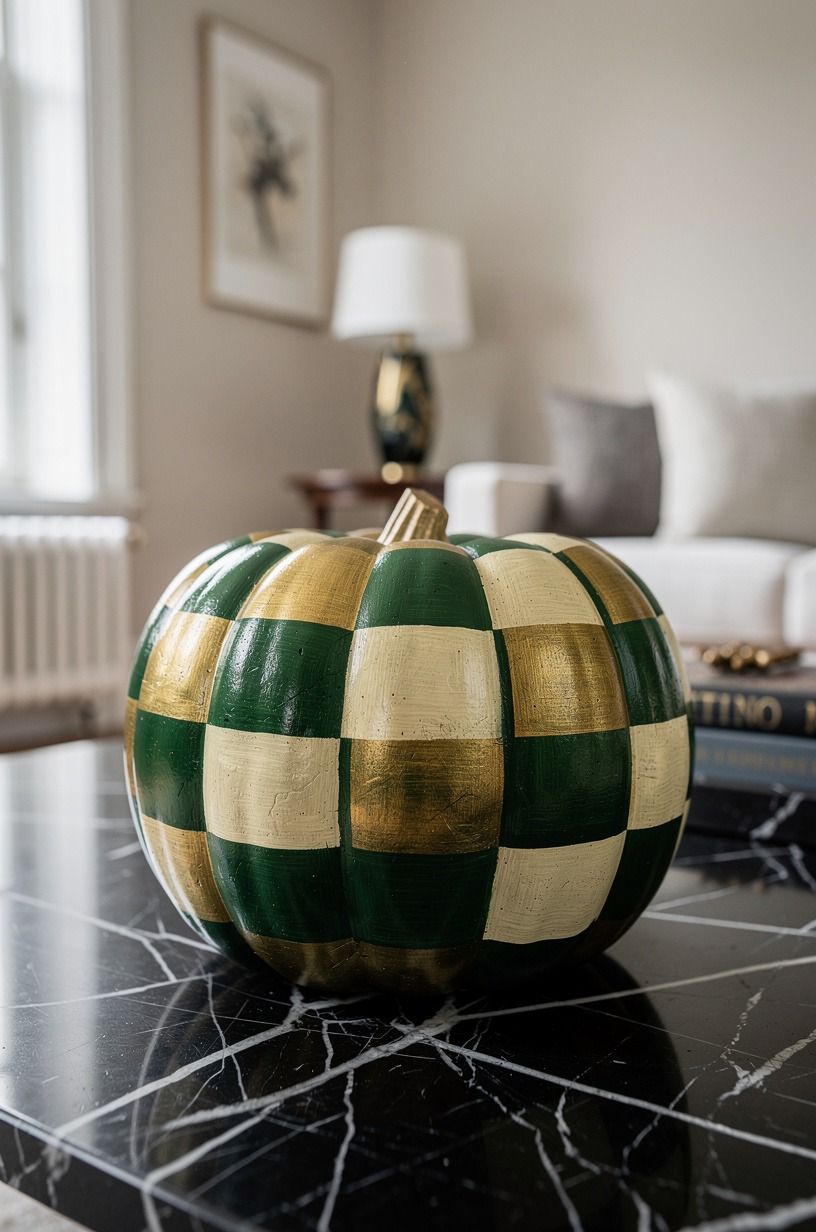
A checkerboard pumpkin is bold, graphic, and surprisingly charming beside traditional fall colors. Paint the base in warm cream, then mark alternating emerald and gold squares along the ribs with a small flat brush.
Your squares don't need identical edges. Slight variation keeps the pattern from looking like a sticker.
Work in sections and let your hand follow the pumpkin's curve. I tried forcing straight horizontal lines once, and the design fought me at every turn. Your pumpkin already has its own geometry, so let the natural grooves guide the blocks.
Keep the surroundings quiet. A Nero Marquina black marble tray, dried grasses, and one cream cushion are enough to support the pattern.
I'd skip a second checkered object nearby, since your eye needs somewhere to rest. This is one of the more modern no-carve pumpkin ideas, and it works best when you give it room.
7Stencil Botanical Shadows
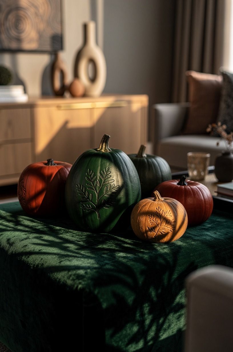
Botanical shadows make painted pumpkin designs feel gentle rather than overtly spooky.
8Use the Three-Height Stem Stack
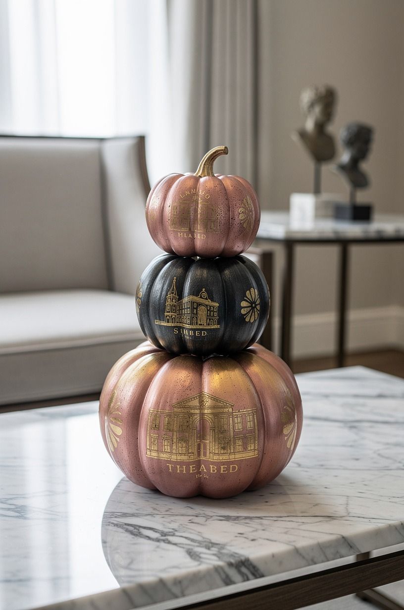
The Three-Height Stem Stack is a proprietary little arrangement rule for your painted pumpkins: low pumpkin in front, medium pumpkin beside it, tall stem or dried branch behind. Paint the pumpkins in related shades such as dusty rose, charcoal, and Sherwin-Williams Iron Ore SW 7069.
This isn't about buying more. Your existing bowls, books, and branches can create the height change. I often use a Carrara marble bowl as the base in a small entry, then place the tallest piece toward the wall so the display doesn't block keys or mail.
Your pumpkin colors should get quieter as they move backward. The front one can carry the strongest pattern, while the rear one stays almost plain.
Why let every object shout when your eye only needs one clear focal point? A calm background makes the painted surface feel more captivating.
9Dip the Bottom in Aged Bronze
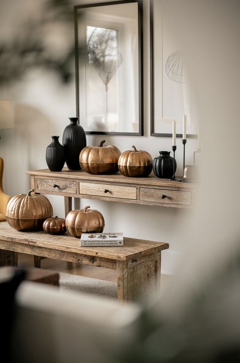
Aged bronze at the base gives a plain pumpkin a refined, slightly dramatic finish.
10Budget the Display with Real Numbers
Painted pumpkins can be inexpensive, but the room around them can become a bigger styling project. If you're refreshing a console, rug, and lighting at the same time, these typical US figures give your budget a useful frame. Your pumpkin design may cost very little when you reuse paint and fabric, while the wider room has a different scale.
I’d keep your seasonal spending in the budget tier and use what you own first. A painted gourd on a Calacatta marble slab with gold veining can look more intentional than a crowded cart of decorations. You don't need a new room to make the pumpkin feel considered.
For a larger display, remember the surrounding proportions. Hang art with its center about 57-60 in from the floor, choose a rug large enough for furniture to overlap it, and keep three lighting sources in the room. Those numbers help your pumpkin arrangement sit inside the room instead of floating awkwardly on its own.
11Wrap the Stem Instead of Painting Every Inch
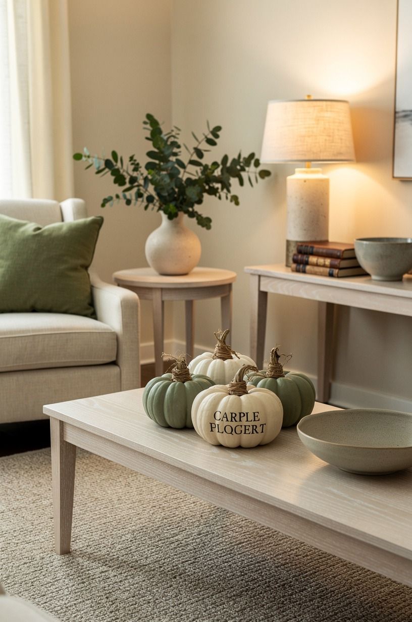
Sometimes the best no-carve Halloween pumpkin is mostly natural. Paint only the body in muted cream, then wrap the stem with a narrow strip of Belgian flax linen or soft cotton. Tuck the end beneath the first wrap, and your pumpkin gets texture without another loud pattern.
Your hands will notice the difference before your eyes do. The fabric feels dry and nubby beside the smooth paint, and that contrast makes the object more inviting.
I wouldn't use shiny ribbon here. It catches light too sharply and makes the pumpkin look like a gift package.
Set this design beside a cerused white oak stool or tray. The wrapped stem works especially well in a reading corner, where your display can feel gathered rather than seasonal-only. If you're renting, this is an easy way to bring fall color into your room without attaching anything to the wall.
12Letter One Word in Hand-Painted Script
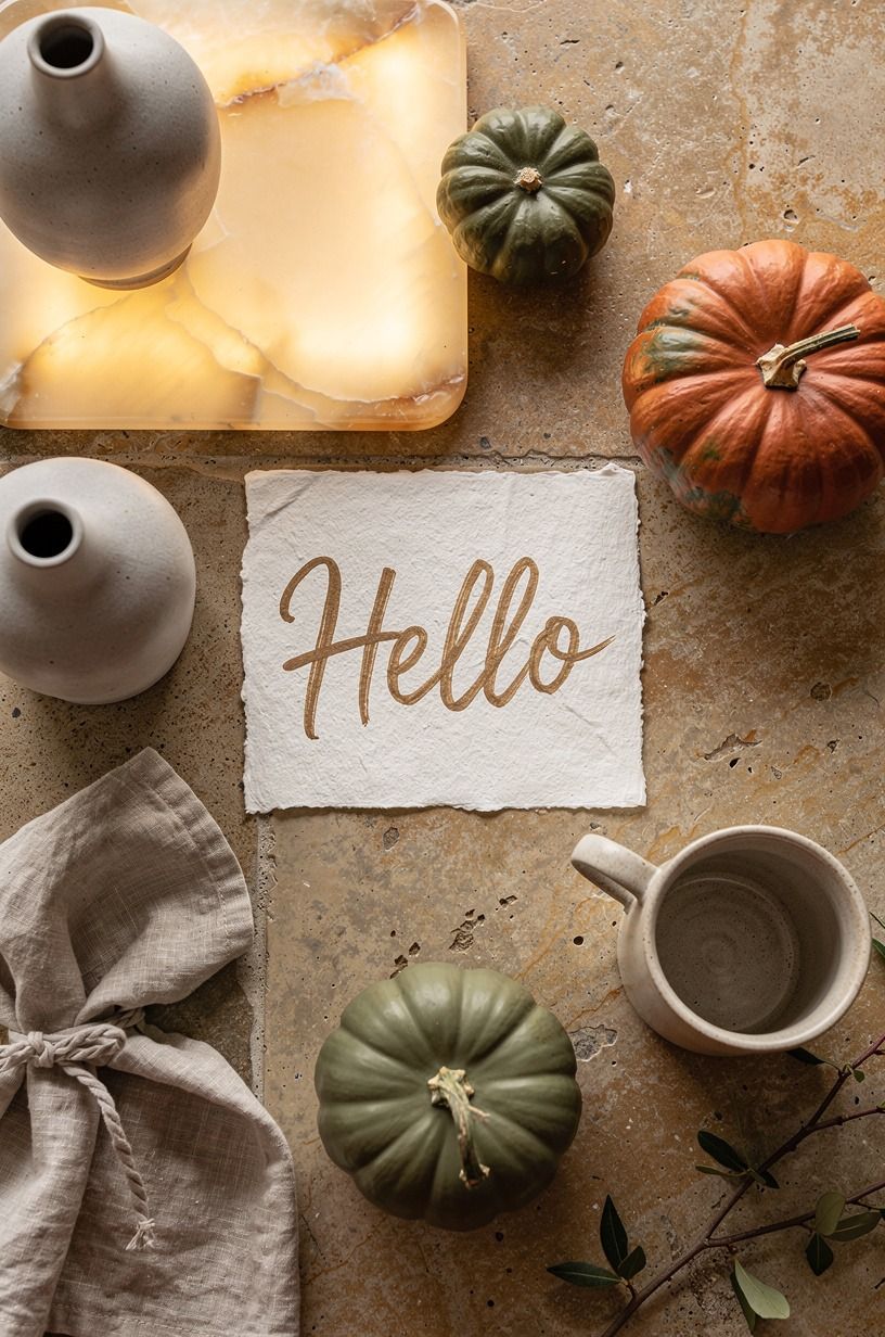
Choose one short word, such as “gather,” “boo,” or “harvest,” and paint it across the widest part of your pumpkin.
13Create the Matte-and-Gloss Contrast
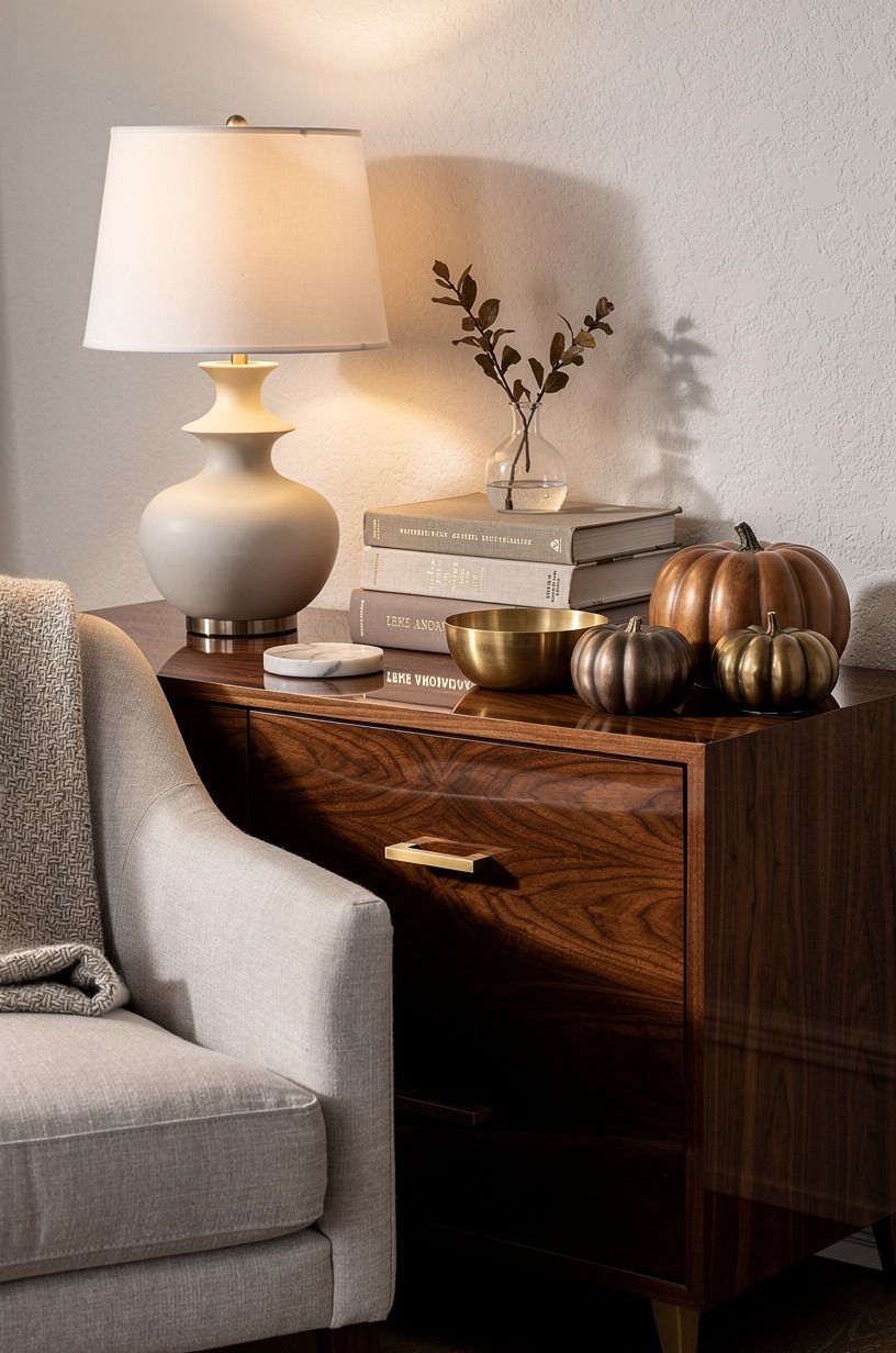
The Matte-and-Gloss Contrast uses finish instead of extra color. Paint the pumpkin in matte clay, then add a few glossy aged-brass-toned leaves or curved lines across selected ribs. Your hand should place the shiny marks where the light naturally lands, not distribute them evenly.
I like this design on a dining table because the finish changes as people move around it. In morning light, the pumpkin looks quiet.
At night, the gloss picks up the lamp and becomes more captivating. You don't need glitter, sequins, or a crowded centerpiece to make the surface shift.
Use a book-matched walnut board and a linen runner nearby, then stop. The warm wood gives your pumpkin enough contrast without turning the arrangement slick. If your room already has glossy furniture, keep the painted lines sparse so the design stays soft and welcoming.
14Turn Mini Pumpkins into a Harvest Still Life
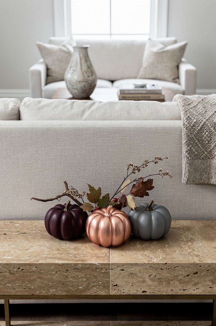
Mini pumpkins work best as a still life when each one has a different job.
15Paint a Moody Black-and-Cream Pair
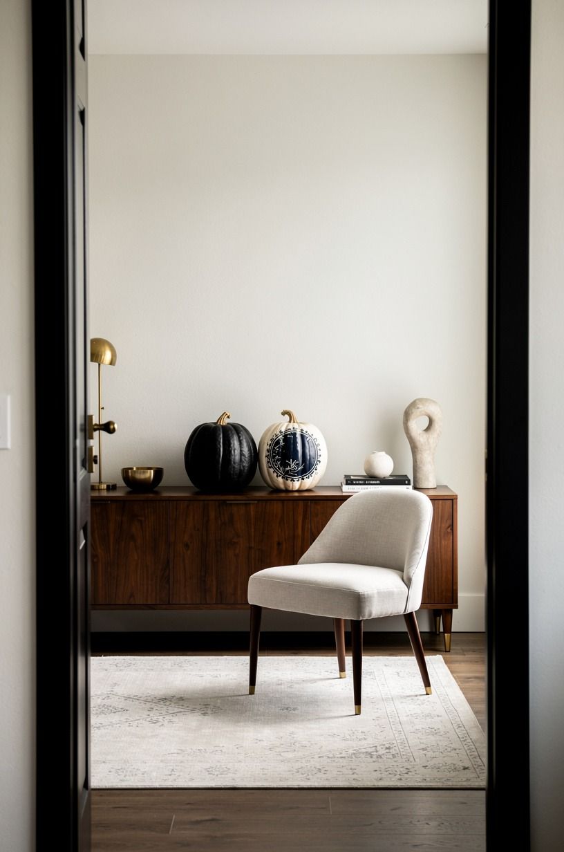
A navy-and-white pair gives your no-carve pumpkin ideas a sophisticated, slightly moody direction. Paint one pumpkin in warm white and the other in Farrow & Ball Hague Blue, leaving both stems natural. The pair feels stronger than two identical pumpkins because the contrast creates a clear visual conversation.
Your navy pumpkin needs a matte surface. A shine can make it look plastic, while matte paint absorbs light and shows the ribs more clearly. I’d place the pair against a pale wall or near a walnut console, where the dark shape has enough breathing room.
Don't add orange just because it's fall. Navy, white, and a little dried brown foliage already carry the season.
But if your room is very dark, use the white pumpkin in front so your display doesn't disappear after sunset. An unlacquered brass lamp with a warm bulb will keep the arrangement inviting.
16Add a Terracotta Wash for Warmth
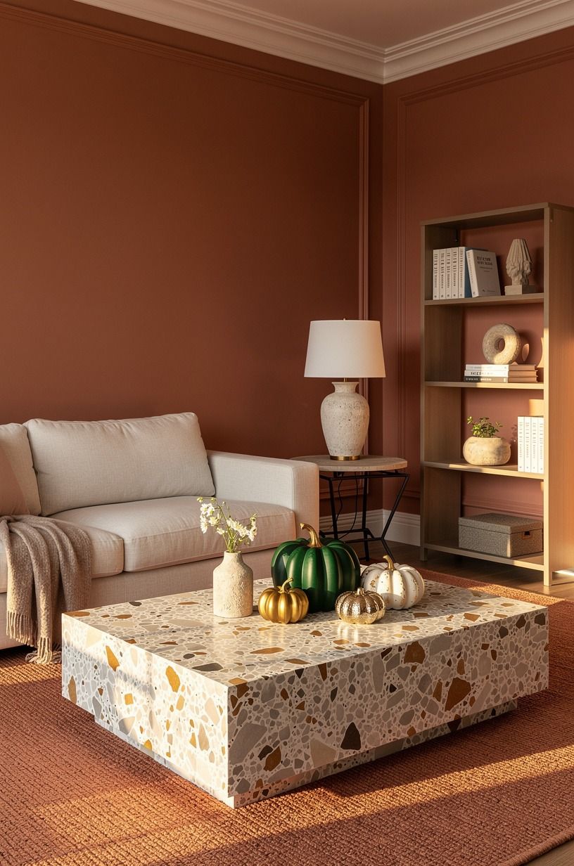
An emerald wash gives a pale pumpkin the richness of painted stone without hiding its shape. Mix a thin layer of Farrow & Ball Green Smoke No.47 with warm cream, then brush it over the ribs and wipe back the high points. Your result should look layered and softly worn.
I prefer this technique on faux pumpkins with exaggerated grooves, since the wash settles into the recesses. The surface catches afternoon light in little bands, and your pumpkin feels more like pottery than foam. If you're using a real pumpkin, work gently around the stem so the paint doesn't pool there.
Place it beside a gold-toned tray, a warm-cream linen runner, or an oversized-chip terrazzo pedestal. Emerald can become heavy if you repeat it everywhere, so keep the color to one object and let the rest of your room stay calm. This is rich, earthy, and easy to live with past Halloween.
17Choose Painted Pumpkins Over Plastic Orange
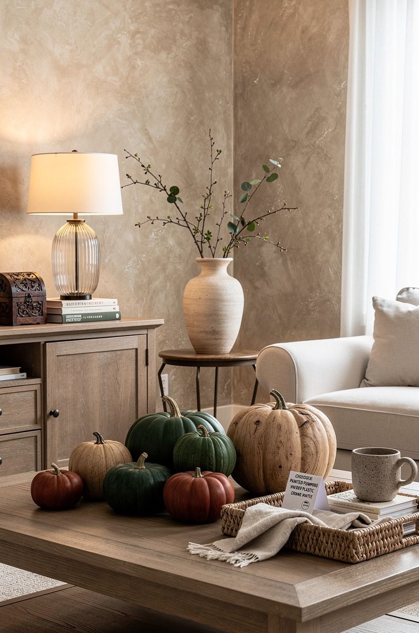
Painted pumpkins over plastic orange is my favorite contrast for a front entry.
Why I Stopped Chasing Perfect Pumpkins
I used to think a painted pumpkin needed a flawless base coat, identical stripes, and a stem that looked untouched. That approach made the work fussy, and the result looked less personal than the lopsided pumpkin I was trying to correct. Once I let the ribs show through, I started noticing the good details: the dry brush catching one ridge, the tiny nick near the stem, the way terracotta darkened in the grooves.
My favorite pumpkins now have some resistance in them. Farrow & Ball Pigeon No.25 looks different on a smooth faux surface than it does on a ribbed real pumpkin.
That isn't a problem for you to solve. It's the reason the pair feels gathered instead of mass-produced. I’d choose a thin, imperfect layer over a heavy coat every time.
I also stopped buying a separate object for every surface. Your entry doesn't need a pumpkin, a sign, a lantern, and a basket all competing for the same glance. One painted shape, one rough material, and one warm light can carry the season.
In my home, Benjamin Moore White Dove OC-17 made the strongest backdrop because it let the pumpkin's texture do the work.
The practical lesson is less romantic but just as useful: start with a dry surface, keep the base raised, and don't place a real pumpkin beside a damp door mat. You’ll get more October out of a restrained arrangement than an overloaded one. And yes, I still make uneven marks on purpose now.
The Questions I Get Asked Most
What are the best no-carve painted pumpkins for a small space?
The best pick is a matte white pumpkin paired with a small two-tone design. Your arrangement stays light, and Benjamin Moore White Dove reflects more lamp glow than a dark finish. Use a narrow tray, a low stack of books, and one pumpkin so your surface doesn't feel crowded.
Where can I buy painted pumpkin supplies on a budget?
Look at Target, IKEA, Wayfair, Facebook Marketplace, and local thrift shops for trays, paintable faux pumpkins, and baskets. Your cheapest finds may already be in a cupboard. A KALLAX birch-effect cube or secondhand wood board can give the display structure without an affiliate purchase link.
How much does a painted pumpkin makeover cost?
A small pumpkin-focused makeover can run about $100 to $300 if you buy paint, pumpkins, a tray, and seasonal fabric. Your cost can be near zero when you reuse supplies. For a broader room refresh, the typical budget tier is $200-$800, as shown above.
Can I create painted pumpkins on a budget?
Yes, and you can start with three free moves: reuse a bowl as a tray, paint pumpkins with leftover wall paint, and gather branches from your yard where permitted. Your strongest low-cost finish is often matte cream with one earthy accent, such as terracotta.
Are painted pumpkins worth it in a small space?
Yes, painted pumpkins are worth it because their color gives your room a seasonal cue without taking much floor area. Put your tallest stem toward the wall and keep the arrangement low. Your small space will benefit from one clear focal point rather than many scattered decorations.
Are no-carve painted pumpkins a good idea for a rental?
Yes. They’re removable, portable, and don’t require holes, adhesive, or wall changes. Your renter-friendly display can use a tension rod for a fabric backdrop, a freestanding tray, and removable textiles.
Choose a sage mohair velvet accent if you want softness without permanent color.
Where I’d Start First
If I had to pick one, I’d start with the matte white pumpkin. It lets the ribs, stem, and candlelight do more work than a loud pattern can. Paint that one first, then build around it with what you already own.
You’ll have a calmer display before you buy another thing.


