11 Japandi Kitchen Ideas That Feel Calm Without Looking Cold
06 july 2026Japandi kitchen ideas work best when you warm up the calm with wood, stone, and one dark anchor. I learned that the hard way after styling a kitchen that was so pale and so careful it felt like a rental showroom instead of a room you could exhale in. The good version isn't empty. It's edited, tactile, and a little imperfect. These 11 moves are the ones I use if you want that Japanese calm and Scandi warmth without freezing the whole space.
What does "Japandi" actually mean when it lands in a kitchen?
The shorthand everyone forgets: Japandi isn't a furniture style. It's a discipline about how much you leave alone.
Take the strictest line a Japanese teahouse would tolerate, cross it with the warmth a Scandi cottage already had, and what you're really agreeing to is fewer pieces on the counter, more grain on the floor, and zero shine anywhere it doesn't earn its keep. In a real kitchen that reads as light oak fronts, a stone counter you can set a hot pan on, plaster or limewash instead of glossy paint, and one black object per room just so your eye has somewhere to land. If you've been thinking of it as "minimalism" or "warm minimalism," you're halfway there.
The half you're missing is the texture, and texture is what separates a calm room from a builder showroom with better lighting. If you want the bedroom version of the same idea, my Japandi bedroom guide walks through the matching restraint there.
Pick one wood, then earn the second one (How do you mix without going busy?)
Most Japandi kitchens I've seen go wrong because people tried to mix three wood tones on day one. Don't.
Pick the dominant wood first, usually the floor or the island, and let everything else fall at least twenty degrees lighter or darker on the same scale. White oak reads warm, ash reads cooler, walnut anchors the room.
Once you've made that choice, you can pull a second tone through on a shelf, a stool frame, or a small accessory, but never on the same plane as the dominant wood. It's the rule that keeps Japandi from drifting into generic "farmhouse with a Japanese bowl," and it's the reason your eye can rest in the room.
If you're debating how to commit, my oak kitchen cabinet guide and the two-tone cabinet guide cover both halves of that call.
The Three-Tier Japandi Budget (What do you actually need to spend?)
I'm going to lay out the honest numbers, because the gap between a Japandi refresh and a Japandi remodel is enormous, and most people don't need to be in the top tier.
The cosmetic tier gets you shockingly far if your layout already works. Repaint the pantry door in Sherwin-Williams Evergreen Fog SW 9130, swap the pendants, add cafe curtains, edit the counter, and the room shifts hard.
If the layout fights you, though, no ceramic bowl in the world will save it. That's when the budget tier stops being useful and you start the design conversation for real.
- Install slim oak slats on the island (The Quiet-Stripe Rule)
- Pair slab cabinets with finger-pull edges
- Run a limestone backsplash behind open shelves (Stone over tile?)
- Style one ceramic rail beside the stove
- Choose a pale wood waterfall breakfast bar (The Two-Tone Waterfall Move)
- Ground the room with matte black stools
- Hide small appliances behind tambour doors (The Appliance Vanish Rule)
- Layer linen cafe curtains over the sink
- Set handmade bowls on a floating oak shelf
- Frame the range hood in warm plaster (Why does this feel softer?)
- Soften stone counters with woven pendant lights (Instead of metal shades)
- Lean a single oil painting on the counter against the tile
- Choose a Farrow & Ball Inchyra Blue far wall (Why one accent wall is enough)
1Install slim oak slats on the island (The Quiet-Stripe Rule)
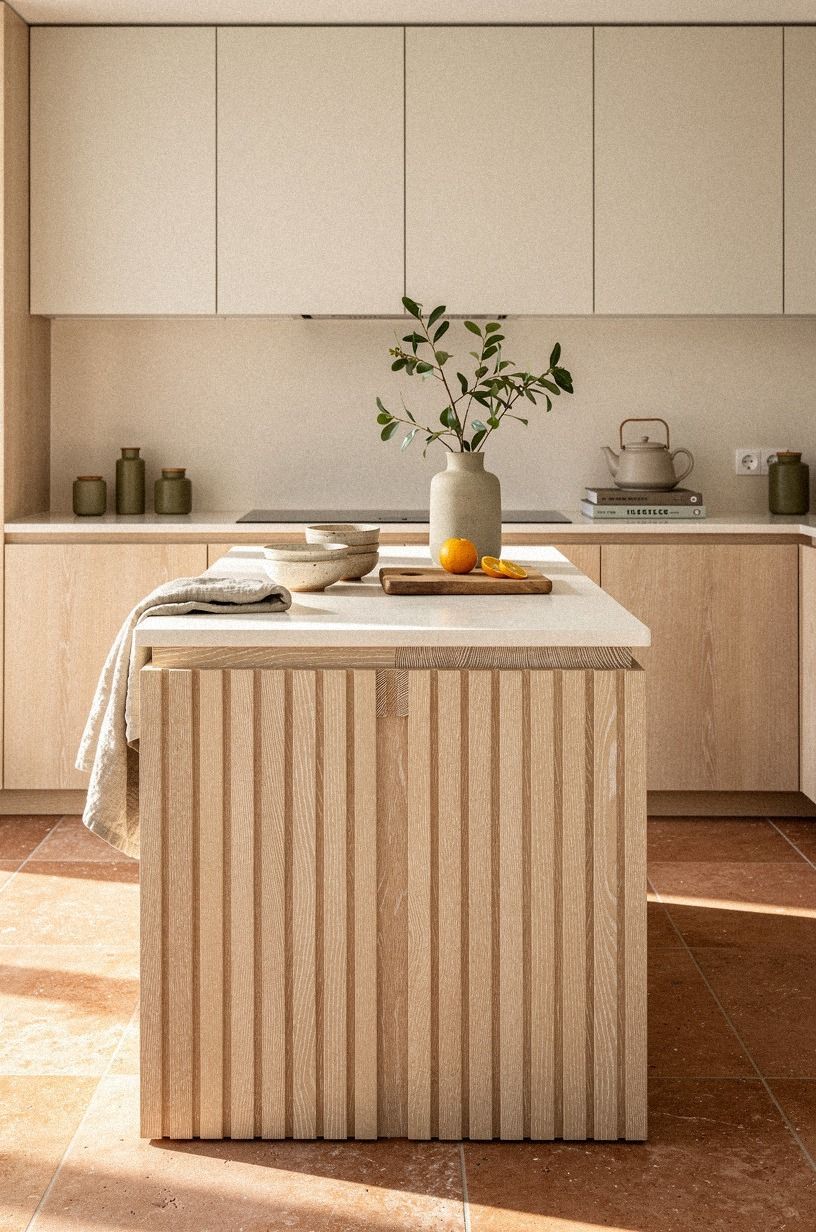
Start with the island if your kitchen design japandi still feels flat, because that's the surface your eye hits first when you walk in. Slim slats in cerused white oak add rhythm without adding clutter, and that difference matters more than people think. I made the mistake once of using chunky battens instead of narrow ones, and the island looked heavier, not calmer.
If you're planning a full wrap, keep the reveals consistent and give yourself the standard 42 to 48 in of clearance all around so the detail reads clean instead of crowded.
What makes this work is the diagonal grain play you get as light moves across the room. You do not need ten accessories after that.
You need one bowl, one branch, maybe a stack of linen napkins, and then you stop. But keep the countertop quiet.
A pale counter over 3/4-inch solid white oak slats looks better than a busy stone here, because the island should hum, not shout. If you're shopping for the read, an IKEA KALLAX birch-effect cube or a slim West Elm frame gives you the same restraint on a budget. That is the whole Quiet-Stripe Rule, and it pays off every single time!
2Pair slab cabinets with finger-pull edges
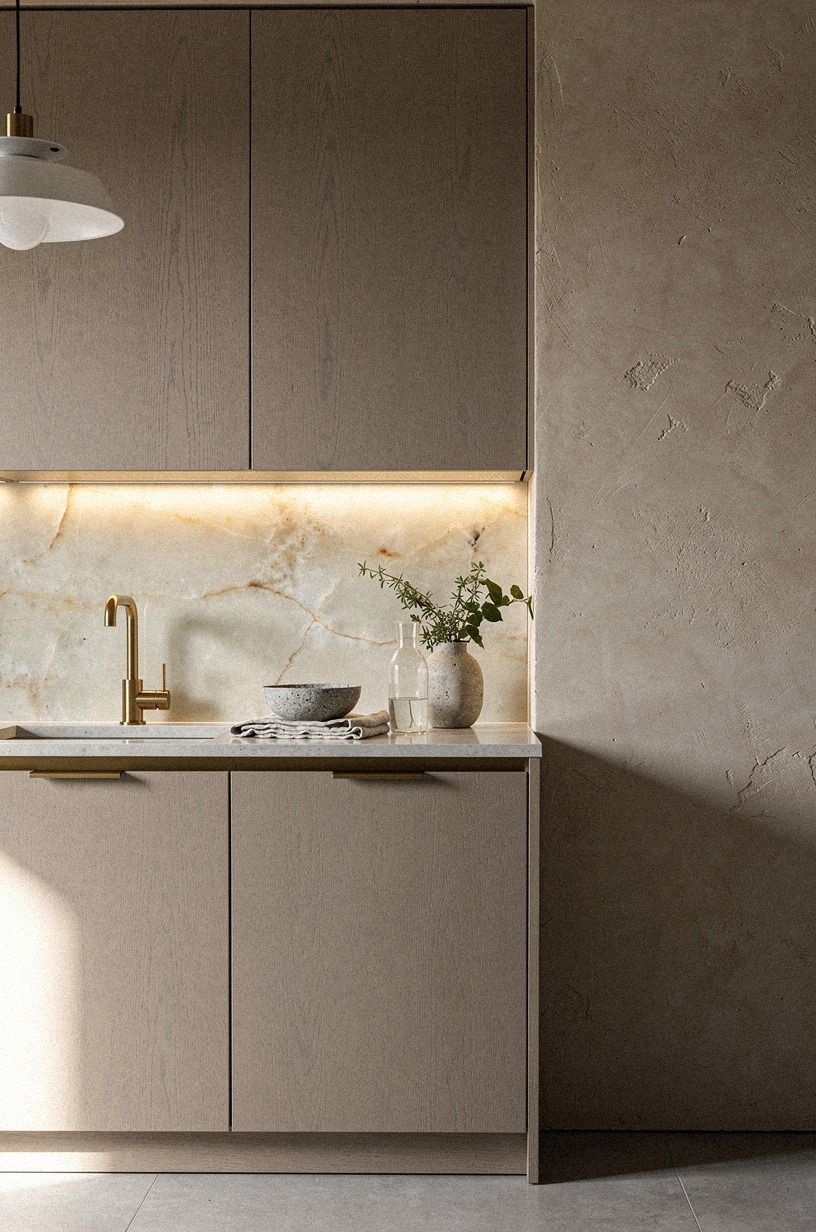
Skip ornate fronts if you want japandi kitchen inspiration that stays warm.
3Run a limestone backsplash behind open shelves (Stone over tile?)
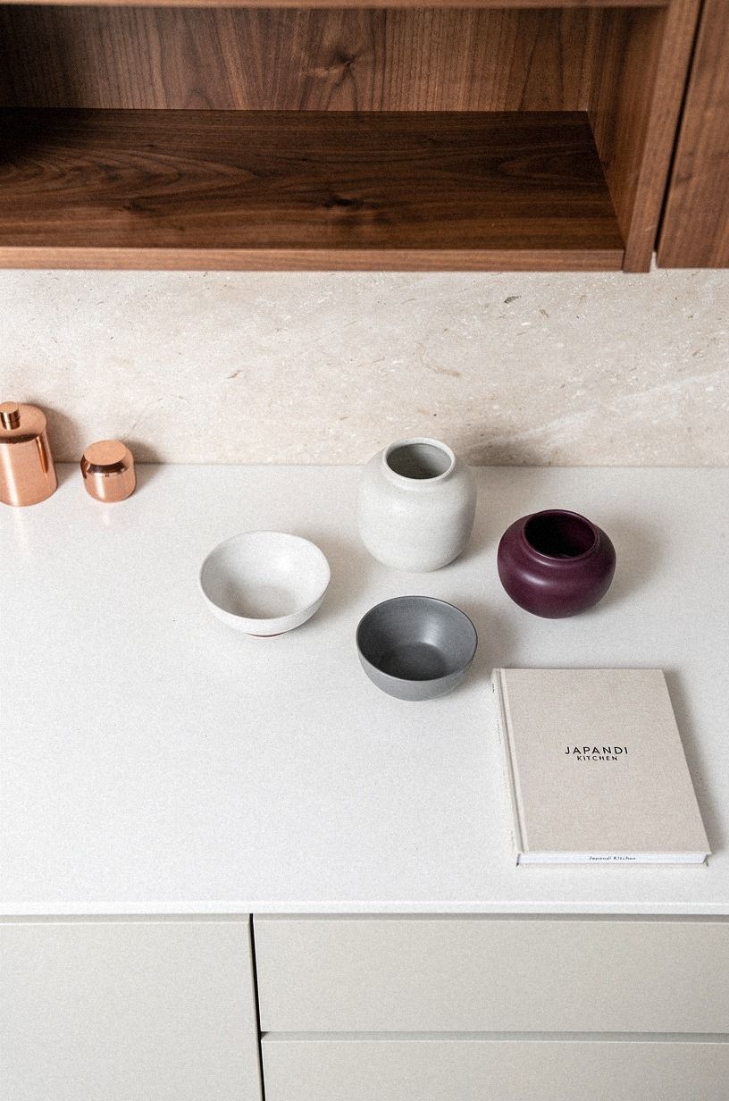
If you want scandinavian and japanese interior ideas to feel grounded instead of precious, run a limestone slab or limestone-look panel behind your open shelves. The beauty is the quiet spread of tone. Your mugs, bowls, and cutting boards get a backdrop, but they don't start arguing with each other.
And because the shelf line usually sits over the 18 in backsplash gap, that soft stone band ends up doing a lot of visual smoothing for you.
The overhead view matters here. You should be able to look down at the pale counter edge, see the shelf shadow, and still read the stone as one big field. Honed limestone with soft fossil movement is the better pick than high-contrast marble for this exact reason.
I also like book-matched walnut shelf brackets in a room like this, because the darker line keeps the wall from washing out. Want a shortcut?
Use fewer objects than you think you need. Two stacked bowls, a tea tin, a board.
Done. If you need the upper-cabinet version of the same restraint, my open shelving guide covers when to keep the boxes and when to lose them.
4Style one ceramic rail beside the stove
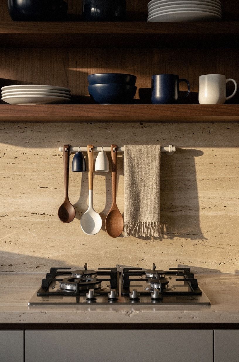
Anchor the cook zone with one simple rail, not a whole wall system. That is the part people overdo. A single ceramic rail beside the stove gives you one warm line for tools and one obvious landing zone for the pieces you use every day, and it keeps the cooktop wall from turning into a display problem.
You can see why in a 45-degree editorial view: the rail, the walnut utensil, the pale vessel, the stone behind it. Enough.
No more.
I like a rail in warm travertine territory rather than glossy white tile, especially when the backsplash already has sandy movement. Hang a linen potholder, one wooden spoon, and maybe a small hand-thrown jar for salt.
That is enough. But do not hang five matching brass tools unless you want the room to lose its hush.
One useful cluster feels lived in. A packed rail feels merchandised.
Unlacquered brass works as the single accent, not as a kit. And in a Japandi kitchen, lived in wins every time.
5Choose a pale wood waterfall breakfast bar (The Two-Tone Waterfall Move)
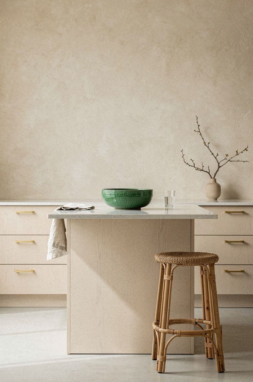
A waterfall breakfast bar is one of the fastest ways to make a kitchen feel finished, but the pale wood version lands softer than stone on stone. If your frame is airy and symmetrical, let the waterfall edge be the warm move that keeps the room from floating away.
You want the front panel, the side return, and the top to read as one calm block. Then you let the cream plaster walls and the empty air around it do the rest.
This is also where dimensions save you from a pretty mistake. At standard counter height, 36 in is the line most people want, and stools tucked under a pale waterfall bar look best when you don't overfill the overhang. I would rather see two seats than four squeezed tight.
Natural ash veneer or pale oak gives you the right softness, while a yellow oak stain can make the whole zone feel more builder grade than restful. The Two-Tone Waterfall Move is simple: keep the cabinets lighter with a tinted Pale Oak OC-20 tone, then let the breakfast bar carry the wood note.
If you've got a window next to the bar, the farmhouse breakfast nook guide shows how the same instinct plays at a small built-in.
6Ground the room with matte black stools
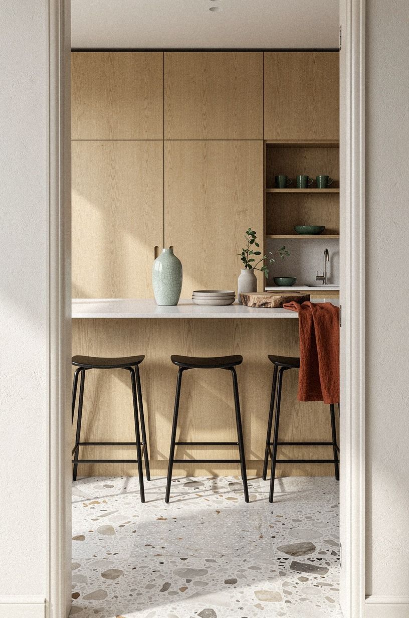
Every pale kitchen needs one firm note, and matte black stools are often enough. When you view the room through a doorway and the island sits beyond it, those dark shapes give your eye somewhere to land before it drifts into all the oak and plaster.
That's why this move works in japandi modern interior design even when everything else stays restrained. You aren't breaking the calm.
You're giving it a pulse.
I prefer stools with a slim frame and a seat that does not look overpadded. Matte black oak or blackened ash works better here than glossy metal, because shine pulls the whole kitchen toward industrial.
And if you're deciding between leather and wood seats, I would skip thick cognac leather in this room. It warms things up, sure, but it also starts to dominate. The black stool should ground the room, not turn into the main character.
Article Sven tan leather is the seat to copy if you want warmth without shine, but only on one stool at most. Less drama, more balance.
So much better! The same black anchor idea carries beautifully into a banquette seat, and the boho breakfast nook guide shows the cushioned version.
7Hide small appliances behind tambour doors (The Appliance Vanish Rule)
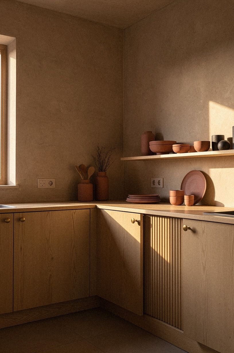
If your counters always look busy by 8 a.m., this is the move I would steal first.
8Layer linen cafe curtains over the sink
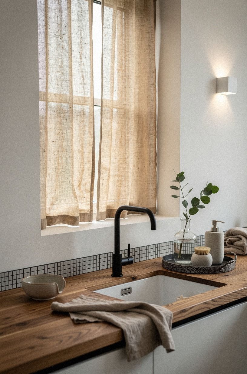
Bring in softness at the sink if the room still feels too exact. Cafe curtains in linen give you movement, privacy, and a warm edge of color right where daylight can make a kitchen turn clinical.
In a relaxed three-quarter view, the curtain should feel slightly off to one side, not pulled military straight. That's why camel linen works so well.
It filters the light and makes the wall color look richer without asking for much.
Use Belgian flax linen on a slim tension rod and let the hem kiss the lower sash instead of stopping awkwardly high. And if you rent, this is one of the easiest no-damage changes you can make.
But do not choose bright white linen unless your walls are already creamy. Against warm white plaster, crisp optic white can look cold in seconds. Sherwin-Williams Evergreen Fog SW 9130 on a nearby pantry door or stool leg also plays nicely with camel, if you want one muted green note without repainting the whole room.
If you like the linen-over-window play, the cozy kitchen cabinet curtain look carries the same soft-edge idea to your uppers, and it's the cheapest way I know to take a builder-grade kitchen from cold to genuinely calm in an afternoon.
9Set handmade bowls on a floating oak shelf
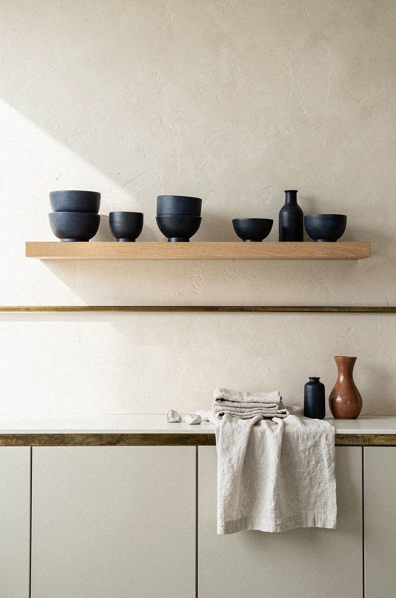
Use the floating shelf as a quiet display, not a storage dump. From a low perspective, handmade bowls read almost architectural when they're lined up against the underside of the shelf and the front edge stays clean. You want the objects to feel chosen, not collected all at once from every open cabinet.
That's the difference between warm restraint and visual fatigue.
I like a shelf deep enough for bowls but shallow enough that you can't start stacking pitchers behind them. White oak floating shelf construction at about 10 in deep usually keeps you honest.
Set three to five bowls in off-white, sand, or iron-speckled clay, then leave breathing room between each one. And yes, odd numbers help, but the better rule is uneven silhouette.
One footed bowl, one wide serving piece, one matte tea bowl. A small CB2 Primitivo bouclé-style linen runner beneath the shelf repeats that same warm cream without competing. That's how your shelf keeps its calm from floor level all the way up.
If you want the matching restraint for the bedside, my japandi nightstand guide walks the same edit-by-subtraction idea.
10Frame the range hood in warm plaster (Why does this feel softer?)
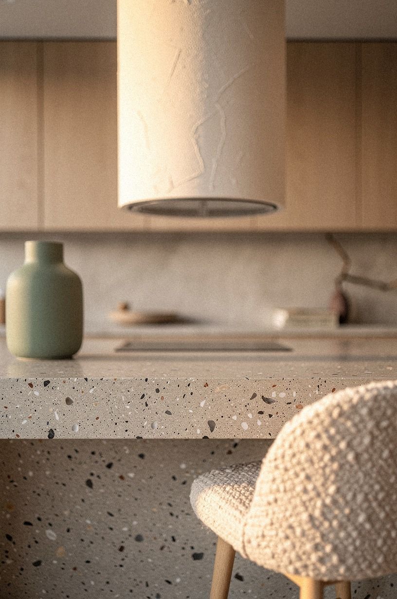
Because a plaster hood has curve, depth, and a hand-finished blur that hard cabinet lines don't.
11Soften stone counters with woven pendant lights (Instead of metal shades)
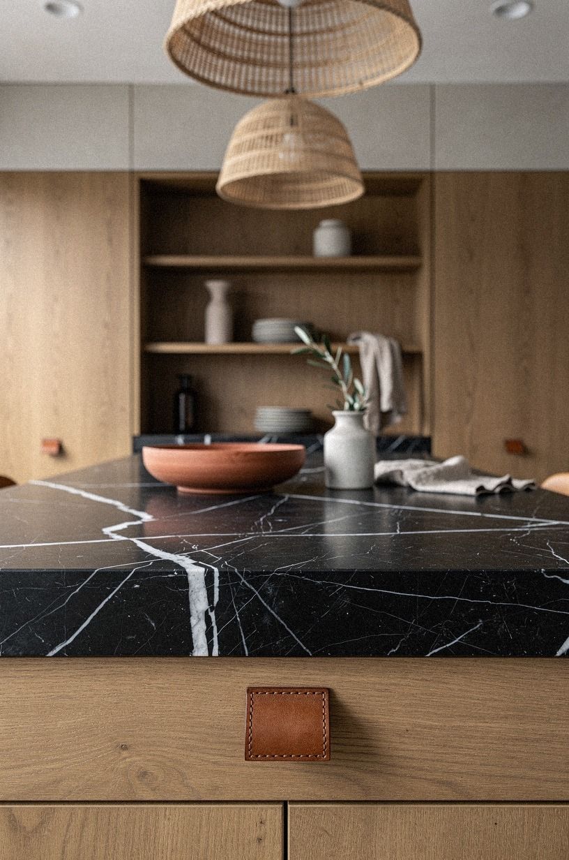
This is the move that keeps black stone from turning severe. When you look low across a dark counter and see the pendant glow above it, you understand the whole point right away: hard surface below, soft texture above. That's a better balance than running polished metal pendants over dark stone, especially if the countertop is Nero Marquina marble with bright white veining.
The stone already gives you contrast. You don't need another sharp note hanging over it.
If you're tuning the under-counter glow too, the under-cabinet lighting guide covers the working light, and this is the ambient companion to that.
Choose woven pendants with an open weave so the light falls in a loose pattern instead of one blunt spotlight. I prefer two medium pendants over one giant drum if your island is long, because the repetition feels steadier and more Japanese in spirit.
And keep the bulbs warm. Really warm.
2700K is the warmest tone I'd go for in a kitchen: anything cooler and you've already lost the hush. Why ruin a quiet counter with blue light at night?
Woven shades, dark stone, and a little shadow are what make the room feel calm instead of sterile. Total keeper!
12Lean a single oil painting on the counter against the tile
A small oil painting leaning against the splash, propped between the salt crock and the cookbook stack, does more than any wall art will. The reason is depth.
A framed picture above the stove reads like a magazine spread. The same painting on the counter reads like a life someone is living.
Pick something quiet, a still life, a faded landscape, even an abstract in two muted tones. The goal is one moment of color that doesn't compete with the bowl of apples you already own.
I'd skip prints here. They look correct in a real Japandi kitchen, but they photograph flat and read cheaper than they are.
A small oil on linen in a thin walnut frame at maybe 8 by 10 in is enough. You can find originals at local studio sales for $40 to $150, and one well-chosen piece will outlast three rounds of "what should I hang above the stove" indecision.
The other thing a leaning painting does is soften the tile line. Your eye reads the whole counter as a still life instead of a kitchen surface, and that shift is half the point of the style.
13Choose a Farrow & Ball Inchyra Blue far wall (Why one accent wall is enough)
One far wall in Farrow & Ball Inchyra Blue does more for a Japandi kitchen than two coats of cream on every wall. The reason is that all-pale rooms are where Japandi loses its nerve. They go cold, not calm.
A single deep, slightly greyed blue wall at the back of the kitchen gives every pale surface something to talk to, and the eye finally has somewhere to rest. Inchyra reads almost black-blue in the morning and a real deep teal by lamplight.
You don't need to commit to a bolder shade. Just one wall.
The cost is real but reasonable. A Farrow & Ball Estate Emulsion gallon runs about $110, and one gallon covers roughly 350 sq ft on new drywall, two coats. Most kitchen accent walls take a single gallon with primer.
I'd pair it with Benjamin Moore White Dove OC-17 on the ceiling and trim so the blue doesn't bully the room. If you're afraid of going too dark, sample the blue on a 2 by 2 ft board first and live with it for three days.
You'll know by breakfast whether the wall is staying.
Why Japandi kitchens work when the warm pieces do the heavy lifting
The part people get wrong is thinking Japandi means stripping everything back until the kitchen feels morally pure. It doesn't. It means fewer notes, better notes, and a reason for each one.
I keep coming back to that because the cold versions always share the same problem: too much white, not enough grain, and no visual weight below the counter line. You can feel the hesitation in them.
If I were helping you decide where your money should go, I'd put it into the surfaces that hold the eye the longest: fronts, counters, backsplash, lighting. That's also where the numbers tend to land in a real US remodel, and it's why my budget tier above is the one I'd actually start with.
Paint the pantry door in a muted green like Farrow & Ball Pigeon No. 25 or push toward a deeper olive with Benjamin Moore Essex Green HC-188 if you want more drama. If your room runs pale, skip the green and try Farrow & Ball Inchyra Blue on a far wall, then build the rest of the calm around that one decision. Then swap the pendants, add cafe curtains, edit the counter, and your kitchen can shift hard without demolition.
If the layout fights you, though, no ceramic bowl in the world will save it. That's when you stop shopping for styling pieces and start looking at what interrupts flow. Appliance clutter.
Tight clearances. Upper cabinets that crowd the room.
I used to chase the pretty fix first. Now I don't. Warmth isn't about adding more objects.
It's about choosing the few materials that keep giving back to you every time the light changes. The same logic governs almost every Japandi conversation, and it's the reason the most popular kitchen cabinet colors right now lean quiet rather than loud.
How do I know when to stop editing? (The Empty-Hand Test)
The most reliable test in any Japandi room is this: walk in, set your coffee down, and look around without moving anything. If your eye lands on three to five objects per zone, and each one earns its place against the wall behind it, you're done. If two things could disappear without you noticing, those are the ones that should go, and they should disappear before you buy anything new.
I've done this exact pass in a friend's kitchen, and we filled a small box with objects I would've sworn mattered. The room didn't miss them.
It finally exhaled. The same rule protects you during the floor sample stage too: lay three wood pieces next to each other, choose one, leave the rest at the store.
What People Always Want to Know
What is the best Japandi move for a small kitchen?
The best move for a small kitchen is slab cabinets with finger-pull edges plus one floating shelf. Slab fronts keep the room visually open, and that single detail buys you more calm than any lighting swap.
Where can I buy Japandi pieces on a budget?
Start with IKEA, Target, and Wayfair, then check Facebook Marketplace for stools, shelves, and ceramic bowls. You can get the look without paying designer-store prices if you hunt for oak tones, matte black frames, and simple woven shades instead of matching sets. The honest move is patience: sellers list the right stools every six weeks, and you do not want to settle for the wrong pair.
A single Target Threshold wood stool is usually the entry point, then a West Elm rattan pendant if you want the warming read later.
How much does a Japandi kitchen makeover cost?
A cosmetic version usually runs about $300 to $1,500, while a refresh with lighting, faucet, and repainted fronts can reach $3,000 to $12,000. The smartest savings come from keeping your layout and changing the surfaces you see and touch most. The full remodel tier starts near $25,000 and climbs fast, so delay that one until the bones are right.
For the cosmetic break-down, my budget kitchen cabinet makeover guide walks through what a weekend can actually buy you.
Can I create a Japandi kitchen on a budget?
Yes, and you don't need a full remodel. The low-cost wins are real: edit the counters, hang Belgian flax linen cafe curtains, paint one door in a muted green, and swap harsh pendants for woven ones. Free restraint beats random shopping every time.
The fastest single upgrade is the lighting swap, because it changes how every other surface reads.
Should I go painted or stained cabinets for the Japandi look?
I'd pick stained wood over painted nine times out of ten. Stain shows the grain, which is half the point of a Japandi kitchen.
The room is supposed to reward your eye up close as well as across the room. Painted fronts only work if you've got a quiet stone counter, a textured plaster wall, or a woven pendant doing the grain work for you.
The longer version is in my painted vs stained cabinets guide, and the white vs wood comparison covers the related call.
Is Japandi a good idea for a rental?
Yes, especially if you focus on reversible layers. Rent-friendly swaps can change the mood fast: peel-and-stick backsplash, tension-rod cafe curtains, removable puck lighting, and freestanding black stools.
I'd avoid anything that locks you into a landlord's bad finish. Tension rods, peel-and-stick tile, and freestanding furniture are your whole toolkit.
How do I stop my Japandi kitchen from looking like a catalog page?
Add one lived-in detail in every zone: an open cookbook on the counter, a half-used candle, a wooden spoon resting against a bowl. Catalog rooms are sterile because nothing looks touched.
Your kitchen needs one warm smudge per surface, and you'll instantly feel like the room is yours. The whole point of this style is fewer objects, all of them clearly used.
How do I keep my Japandi kitchen from going yellow in warm light?
Pick your bulb temperature on purpose. 2700K is the warmest practical choice for a kitchen and it won't push white plaster into cream territory.
Anything above 3000K reads sterile, anything below 2700K turns every pale surface the color of old paper. If your pendants came with cool bulbs, swap them first. It takes ten minutes and changes the whole room.
Promise.
Where I'd Start First
If I had to pick one, I'd start with the woven pendant lights. Dark counters can turn severe fast, and overhead texture fixes that in one move. Pin that idea for later and let the stone stay strong while the light does the softening.


