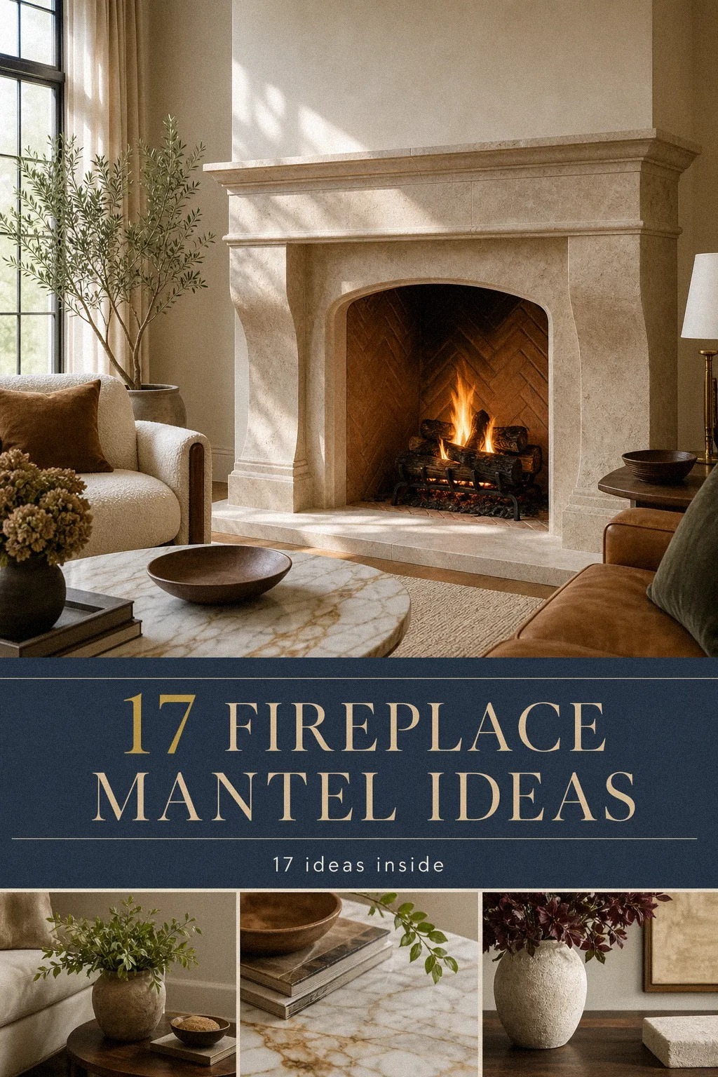
I Finally Figured Out How to Decorate a Fireplace Mantel, The Formula Always Works
27 june 2026How to decorate a fireplace mantel finally clicked for me when I stopped styling objects and started building one calm arc across the whole fireplace wall. I'd been moving pretty things around for months and still getting that choppy, overfilled look. Then I cleared it, rebuilt it in a better order, and the room softened almost immediately.
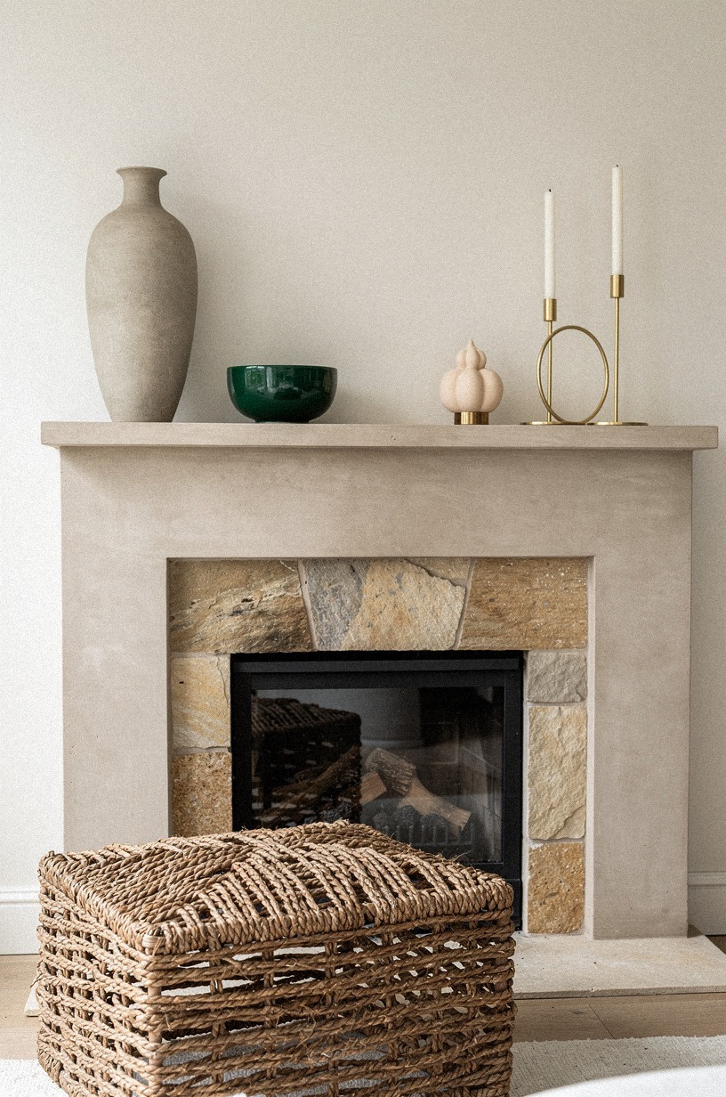
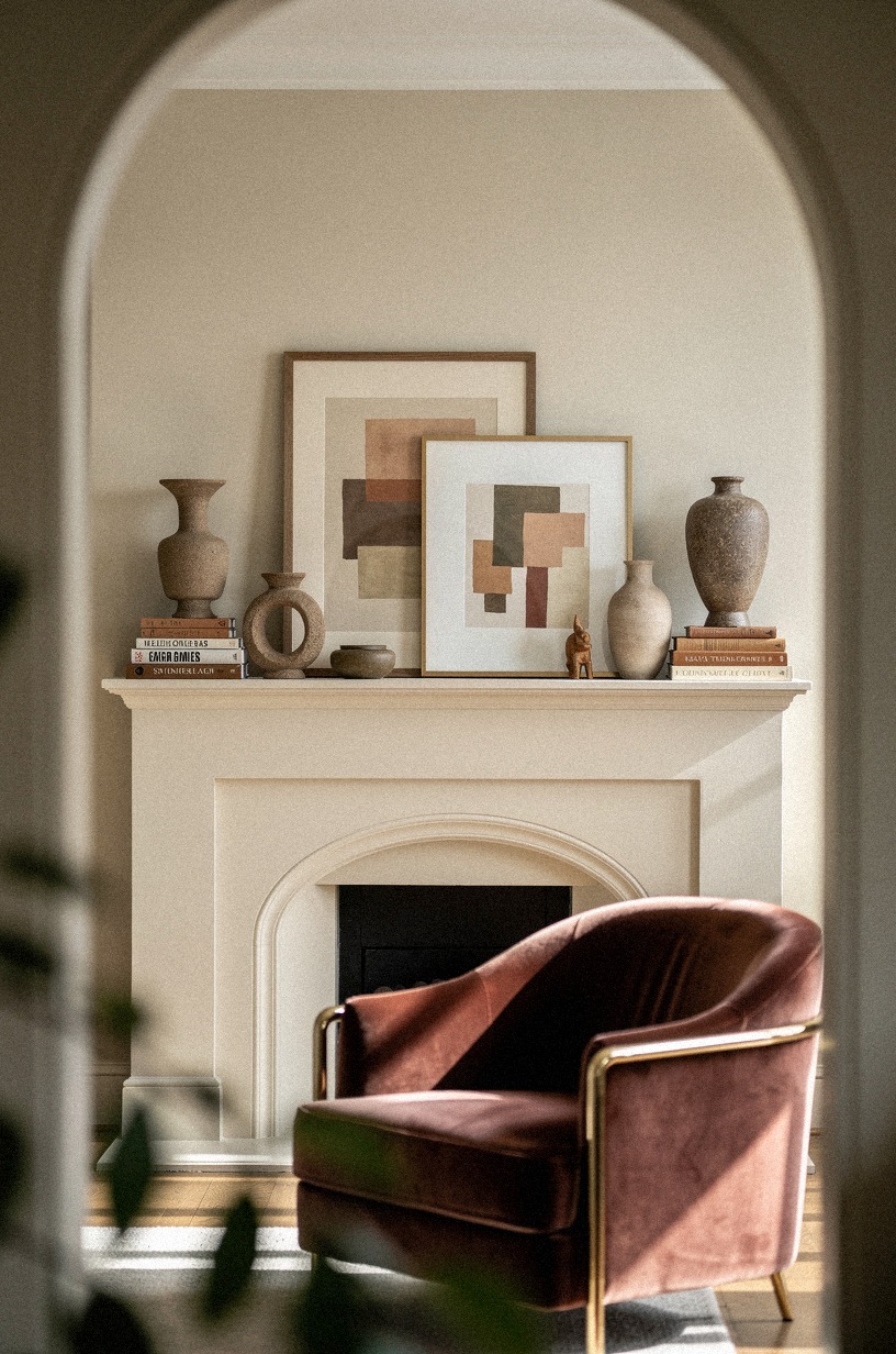
Here's what it looked like before:
Before this makeover, my mantel had the full indecisive living-room problem. Too many small frames.
Two candleholders that were the wrong height. One shiny bowl that looked expensive on its own and weirdly frantic once it hit the stone.
From the sofa, the whole shelf felt like a row of unrelated errands instead of one focal point.
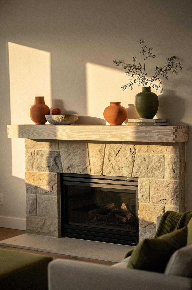
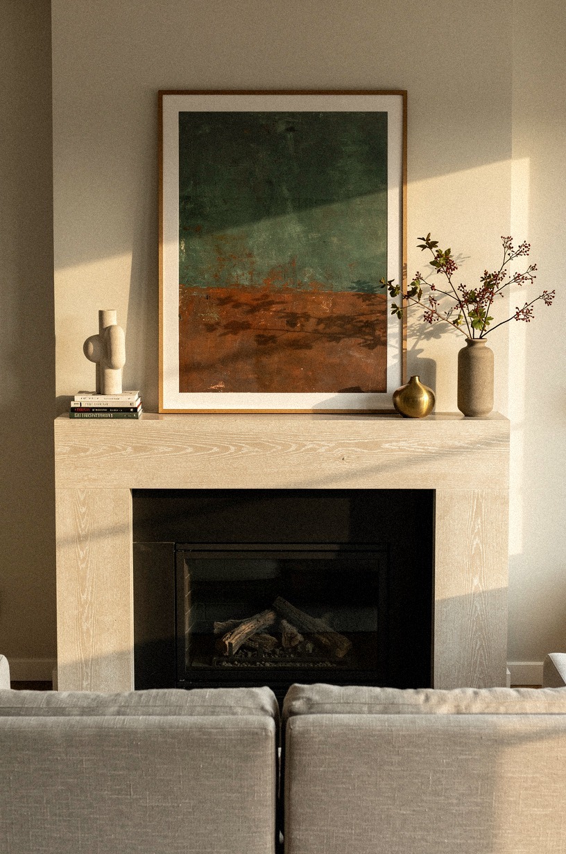
The fireplace itself was good. Terracotta stone at the surround, a simple cerused white oak mantel shelf, and enough breathing room around the hearth to let the architecture show. That was the part I kept missing.
You don't need more objects when the bones are already carrying the room. You need a better sequence.
If your wall is fighting you the same way, my mantel decor ideas to pull your whole living room together piece shows the same reset from a wider angle.
- Cleared the mantel down to the stone surround
- Chose one framed print to set the mood
- Centered it slightly above the mantel shelf
- Added a round mirror behind the artwork
- Placed the tallest vase on the left
- Balanced it with stacked books on the right
- Tucked a low brass bowl near the center
- Grouped three taper candles beside the vase
- Let one trailing stem soften the edge
- Repeated warm brass in a small picture frame
- Pulled colors from the living room rug
- Kept the middle lower than both sides
- Set one sculptural object on the books
- Moved the lamp closer to the fireplace
- Framed the hearth with a woven basket
- Removed the extra pieces that felt busy
- Lit the candles and checked the whole room
1Cleared the mantel down to the stone surround
First, I took everything off until only the stone surround and the pale white oak shelf were left. That gave me one honest read on proportion.
If your mantel still feels busy after you buy new pieces, this is usually why. You're styling on top of old noise, not on top of the shelf itself.
I wiped the shelf, stepped back about 8 feet, and looked at the entire wall instead of the objects in my hands. But I didn't rush to fill the middle again.
The terracotta and stone were already warm, and the oak had that dry cerused grain that does half the texture job for you. If you need a clean benchmark for that stripped-back start, my simple fall mantel guide helps you see why an empty shelf can read stronger than a crowded one.
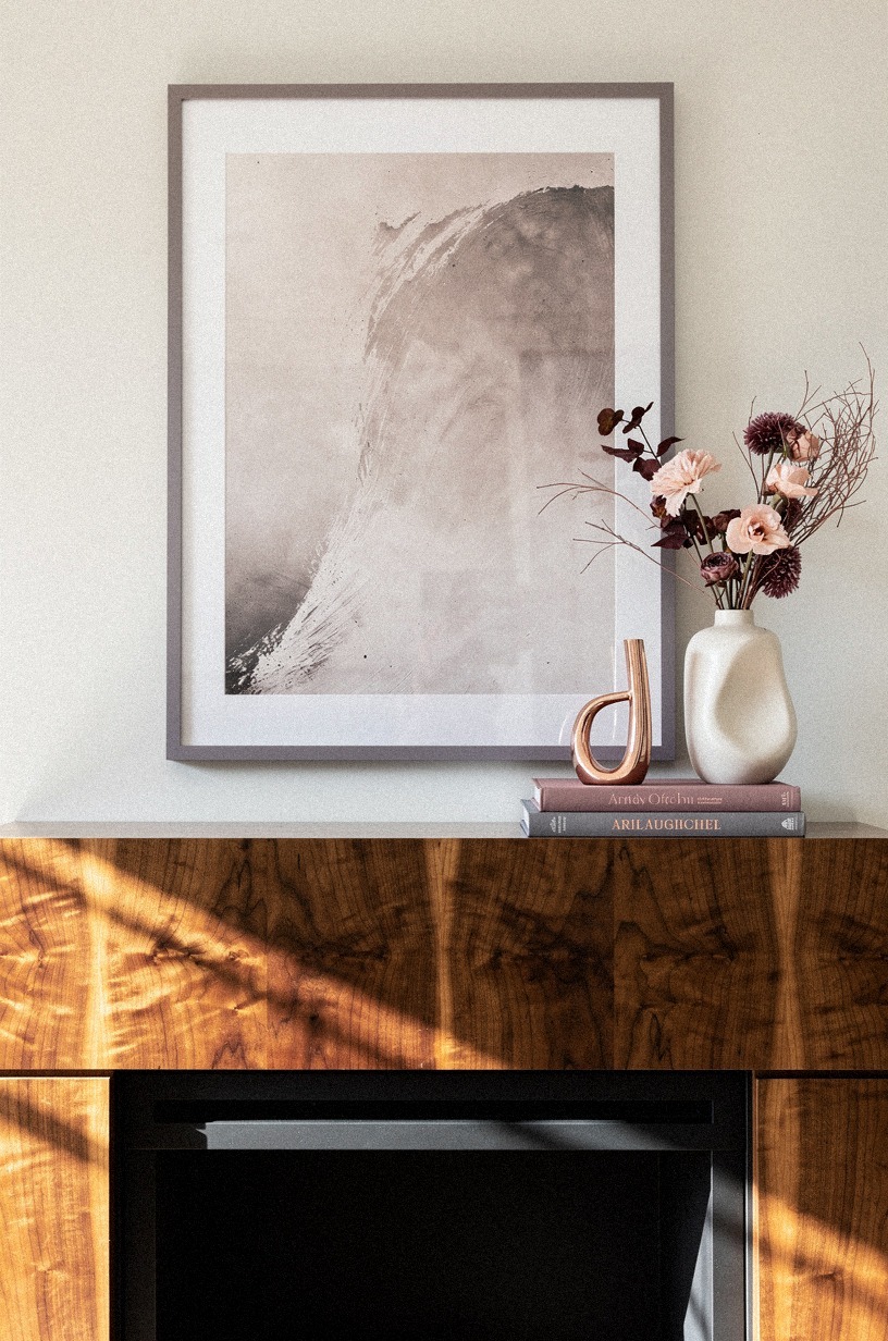
2Chose one framed print to set the mood
Then I picked one framed print and made it the emotional center of the wall. Mine was quiet art, not loud art.
Clay, linen, and a washed landscape tone that could sit with the fireplace instead of arguing over it. If you're trying to decorate my mantel with ten little sentimental pieces at once, this is the moment to stop yourself.
One print does a job that three small ones usually cannot. It sets the mood before you add the support pieces.
I leaned toward a slim walnut frame with a soft matte finish because glossy black would have felt too sharp against the stone. And I skipped typography completely. A mantel wants atmosphere, not commentary.
Huge difference! My vintage mantel ideas article makes the same case with older frames and warmer paper tones.
3Centered it slightly above the mantel shelf
This was the spacing move that changed everything for me.
4Added a round mirror behind the artwork
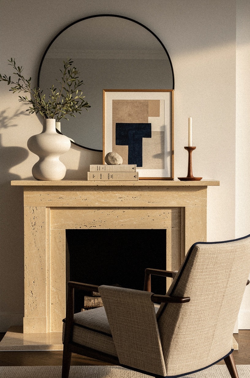
After the print found its spot, I layered a round mirror behind it. That sounds backwards until you see it in a real room.
The mirror gives the wall a larger silhouette, and the print keeps the mirror from becoming one more hard circle. Together they feel softer than either piece does alone.
The version that worked best for me had warm travertine on the shelf, a navy, white, and walnut room around it, and one raw linen note nearby so the mirror didn't turn slick. I let the artwork overlap the mirror just a touch.
Not much. You should still read the mirror shape immediately from the doorway.
If your fireplace wall also has to manage a screen nearby, my mantel with a TV guide shows how this layered look stays calm under more pressure.
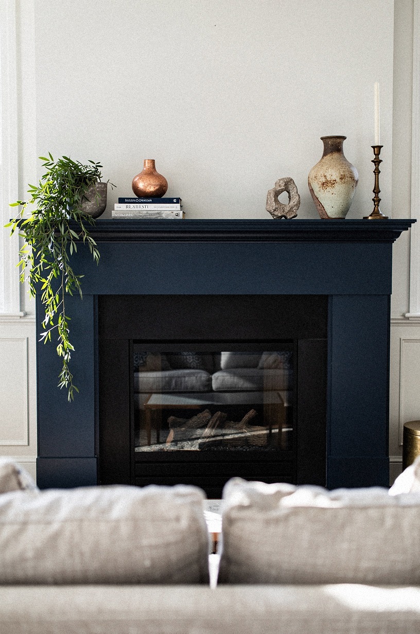
5Placed the tallest vase on the left
Next came height, and I wanted it to land in one deliberate place. I put the tallest vase on the left so the eye would climb there first, then travel down across the center.
On a calm mantel, one strong vertical note works harder than two medium ones. That was a useful lesson for me because I used to mirror everything and flatten the whole shelf. That old mirror-everything habit got me every time!
The vase that made sense here was a matte ceramic vessel with an easy chalky finish, not shiny glass. Against emerald, gold, and cream accents, it gave the fireplace enough lift without dragging focus away from the hearth.
I kept the stone visible below because the hearth still needed to feel like part of the story. If you love asymmetry but want it cleaner, my modern fall mantel ideas show why one tall move is often enough.
6Balanced it with stacked books on the right
Once the vase had claimed one side, the other side needed weight without matching the height.
7Tucked a low brass bowl near the center
Here is where the middle finally started making sense. I tucked a low brass bowl near the center, but not dead center, so the art and mirror still held the main axis. The bowl was there to catch light and calm the transition between the tall vase and the book stack.
Low pieces matter because they stop the mantel from turning into a skyline.
In a dusty rose, charcoal, and brass palette, that warm metal felt especially right against hand-applied plaster and stone. But I kept the bowl nearly empty.
One bead strand, maybe one match cloche, done. If you fill it with six unrelated trinkets, the entire point disappears. Why buy a beautiful low object just to bury its shape?
For another look at center-of-shelf restraint, my fall mantel decor guide shows how one low accent can steady a whole wall.
8Grouped three taper candles beside the vase
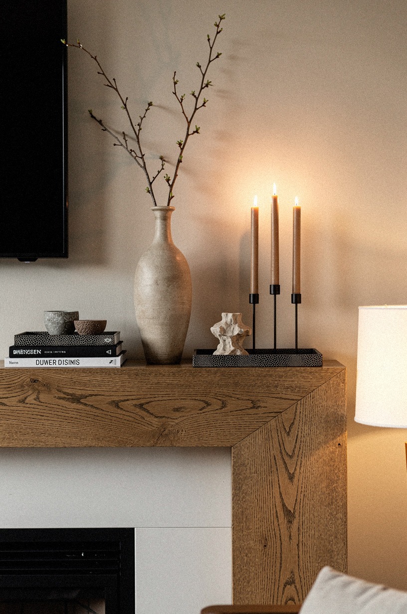
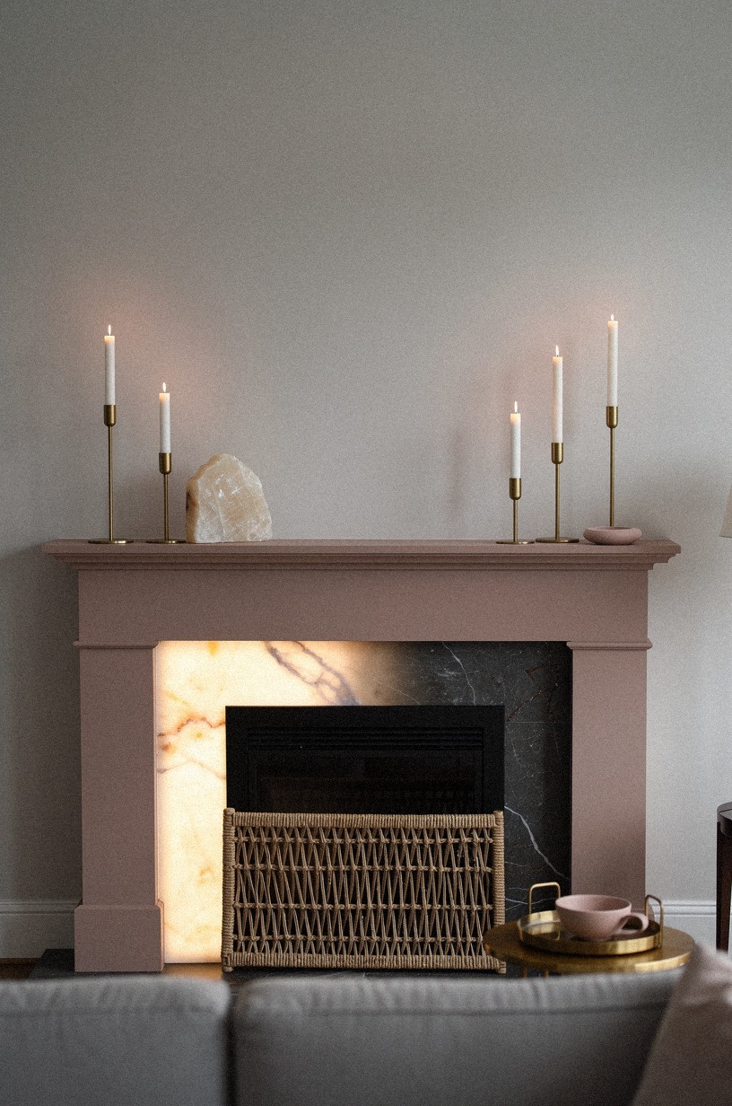
The candles came in after the larger architecture was already set. I grouped three tapers beside the vase, not across the whole shelf, because I wanted one warm cluster instead of a dotted line of flame. On a mantel with warm white, camel, and black accents, that little rise of candles looks collected instead of formal.
I used mixed heights so the candle line felt like a soft echo of the vase rather than a matching trio. Unlacquered brass candleholders made the most sense here because the patina keeps them from feeling crisp in the wrong way.
And yes, taper height matters. Short, medium, taller.
That small stagger reads richer immediately. You notice it right away!
If you're still unsure how to mix candle heights without getting stiff, my fall mantel candle guide gets very specific.
9Let one trailing stem soften the edge
This was the move that kept the mantel from turning severe. I let one trailing stem soften the outer edge so the whole shelf had a gentle release instead of a hard stop.
Not a full cascade. Not a leafy waterfall.
Just one line of movement slipping outward from the arrangement.
From the low floor-level angle, you could see why it worked: the mantel stayed architectural, but the stem broke the grid just enough. I liked olive branch here because the leaf shape stays thin and the color lands beautifully against warm stone.
Eucalyptus works too if the finish is dry, not waxy. But keep the drop short.
My fall mantel garland ideas piece can help if you tend to overdo the greenery part.
10Repeated warm brass in a small picture frame
One metal note can look accidental. Repeated twice, it starts sounding intentional.
So I repeated the warm brass in a small picture frame and set it into the composition where the eye could catch it after the bowl. This was especially good in a room with sage green, warm cream, and natural wood, because brass feels warmer when the palette around it is already quiet.
I kept the frame small on purpose. If the repeat is too large, it turns into another anchor and starts fighting the main art.
A slim brass frame beside organic shapes gave the mantel one clean glint without tipping it toward shiny. And I didn't add brass anywhere else.
Two or three repeats is enough. My warm minimalist living room ideas show why one material echoed lightly can do more than a whole shopping list of accents.
11Pulled colors from the living room rug
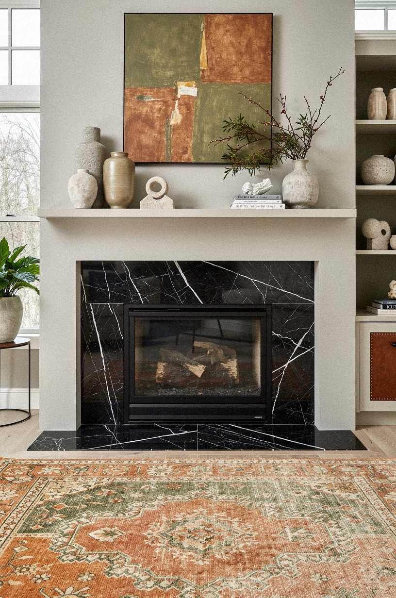
At this point, the shelf looked good on its own, but the room looked better only when I tied it back to the rug. So I pulled the mantel colors from the living room rug: terracotta, olive, and one darker note that could speak to the Nero Marquina black marble detail in the fireplace zone. That's when the shelf stopped floating and started belonging.
You can do this without matching things literally. I didn't go hunting for a rug-colored vase.
I just made sure the tones repeated from floor to hearth in a way your eye could follow naturally. If the rug already carries the room, let it coach the mantel.
And if your walls lean softer, Benjamin Moore Revere Pewter HC-172 can be a useful bridge between those warmer rug tones and stone. My fall living room color ideas go deeper on that room-wide handoff.
12Kept the middle lower than both sides
This was the quiet rule behind the whole formula.
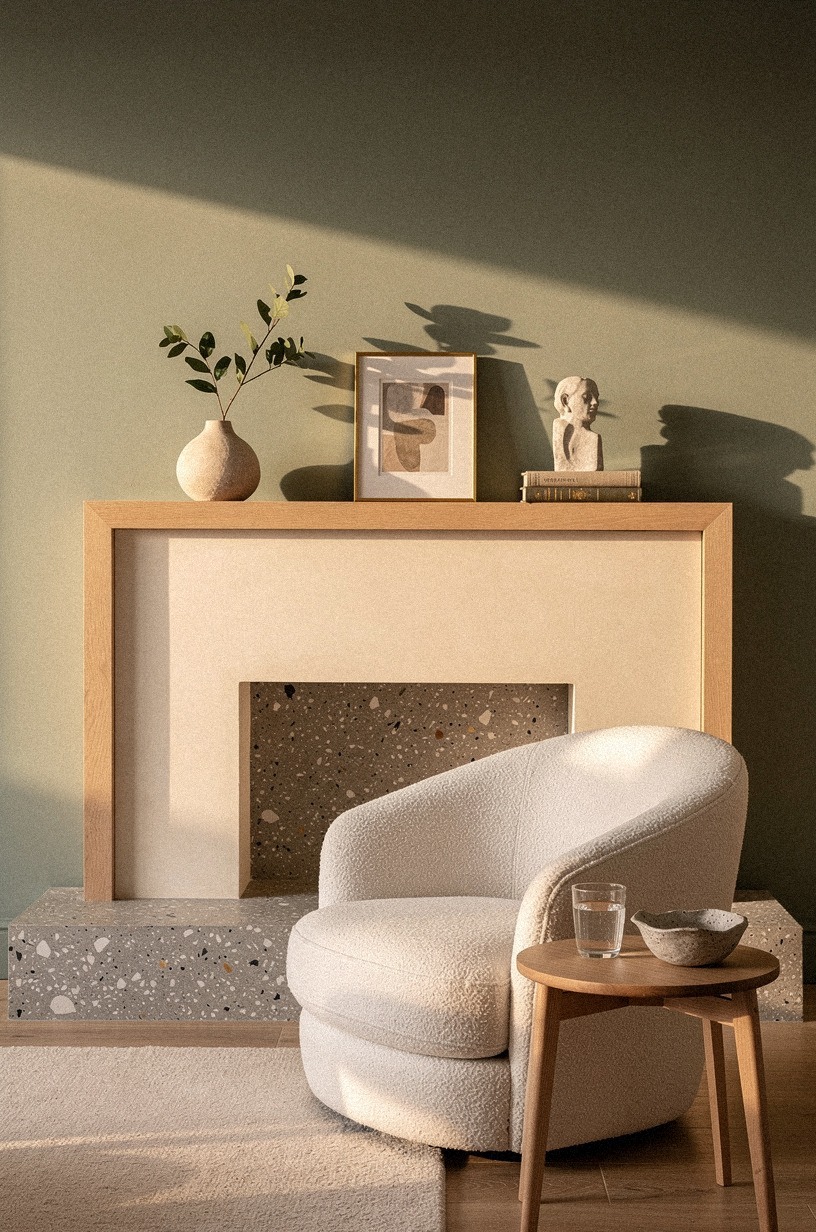
13Set one sculptural object on the books
After the books went down, they needed one top note so they didn't feel like storage. I set one sculptural object on the stack and stopped there.
One is enough. That's the whole point.
It was there to give the right side a little lift without building another busy cluster.
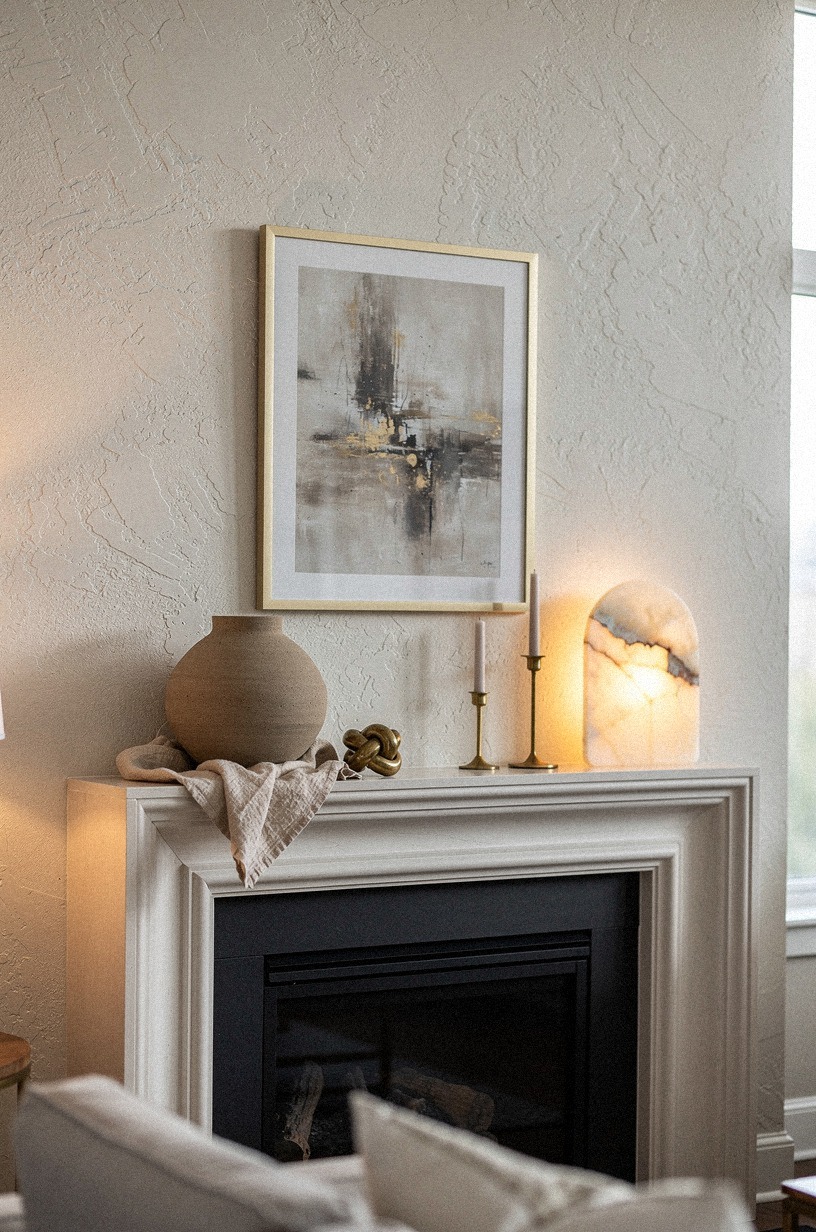
On a Carrara marble fireplace with subtle grey veining, I loved a curved ceramic or dark wood object that felt hand-shaped rather than polished. Plum and grey around the room gave it a little depth, but the object itself stayed simple.
You want shape, not novelty. I'd skip anything witty or overdesigned here. A mantel isn't improved by cleverness.
My elegant mantel ideas show how one sculptural piece can read far richer than a whole stack of fillers.
14Moved the lamp closer to the fireplace
But this step was less about decor and more about atmosphere. I moved the lamp closer to the fireplace so the mantel glowed evenly at night and the styling didn't die the second daylight left. The first-person view in that moment told the truth: the lamp had been too far away, and the whole wall was paying for it.
In a navy, white, and walnut room, that closer pool of light made the art, mirror, and brass all read warmer at once. I stick to warm bulbs only, ideally around 2700K, because cooler light makes linen shades and oak feel flat. But keep the base quiet.
The glow is the feature. If you're building evening warmth across the whole room, my cozy reading nook ideas use the same low-light logic beyond the fireplace wall.
15Framed the hearth with a woven basket
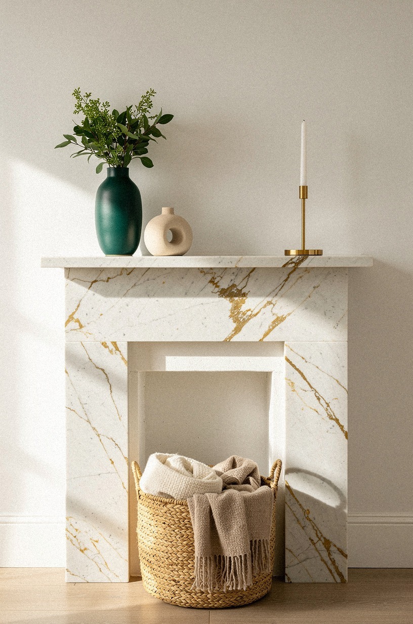
And the shelf was finally working, but the hearth still needed an answer. I framed it with a woven basket below so the fireplace had a grounded lower half and the mantel didn't feel like it was hovering by itself. That move was especially right with emerald, gold, and cream accents around a Calacatta marble fireplace, because the basket texture softens all that stone immediately.
I like one generous woven seagrass basket filled with birch logs or rolled throws, depending on whether the fireplace is working. Tiny baskets don't help.
They read like accessories. A bigger basket reads like part of the architecture of the room.
And if one side of the hearth is already occupied by a chair, just use one. My farmhouse mantel ideas show how basket scale changes the whole lower wall.
16Removed the extra pieces that felt busy
This was the hardest part because the objects were not bad.
17Lit the candles and checked the whole room
But last step, I lit the candles and checked the whole room from eye level, not from three inches away. That final check matters because the mantel doesn't live by itself.
It lives with the rug, the chair, the lamp, the hearth, and the sightline from the doorway. In a dusty rose, charcoal, and stone palette, the lit tapers were the moment everything finally clicked.
You aren't checking for more stuff at that stage. You're checking for rhythm. Does the eye move from floor to firebox to shelf to art without getting stuck?
Does one side feel too loud? Does the lamp support the glow or compete with it?
And yes, this is where I finally admit I'd been styling too close for too long. My dark moody mantel ideas use that same room-level check to keep glow from turning gloomy.
What did the Quiet Arc Formula teach me about mantel balance?
The biggest shift for me was realizing that a mantel isn't a shelf problem. It's a room problem.
I used to stand at the fireplace with a new frame in one hand and a candleholder in the other, trying to solve the look from six inches away. That almost never works because your eye doesn't experience a fireplace from six inches away.
You see it from the sofa, from the doorway, from the kitchen, from the chair angled by the hearth.
Once I started treating the mantel as one calm arc instead of a line of objects, the decisions got easier. One tall move.
One low bridge through the center. One grounded answer on the opposite side. That was the formula. The print and mirror gave me width.
The vase gave me rise. The books and sculptural object gave me weight. The bowl and stem kept the middle from going stiff.
Suddenly the shelf looked edited instead of underdone.
I also learned that color needs a messenger. If the rug carries terracotta and olive, the mantel should echo that in a quieter voice, not start a new conversation in icy marble and chrome. This is where paint helped me see the room better too.
A wall in Farrow & Ball Hague Blue No.30 can handle more brass and shadow than a wall in Benjamin Moore Revere Pewter HC-172. A soft Sherwin-Williams Evergreen Fog SW 9130 backdrop makes oak and travertine feel almost powdery.
Those named colors matter because they force you to think in undertones, not in generic words like warm or neutral.
And the honest money lesson? Spend on proportion before you spend on prettiness.
A better mirror size. A better lamp position.
A basket that is large enough to read from across the room. The cheaper filler pieces are what usually make a mantel feel expensive in the wrong way.
That part surprised me! The stronger silhouette is what makes a modest room feel finished. That was the part that surprised me most, and it is why I'd use this formula again tomorrow.
How much it cost
Because I reused the mantel shelf, the main print, and most of the books, this makeover sat at the low end of a typical refresh instead of turning into a full living-room renovation. That's worth knowing before you shop. A mantel can look completely different without dragging you into sofa money or millwork money.
For room planning, the other numbers I keep in my head are these: a sofa usually lands around 35 to 40 inches deep, a coffee table around 16 to 18 inches high, and most living rooms look more settled when the front legs of the seating sit on an 8x10 or 9x12 rug. Those measurements matter because the mantel has to relate to the furniture, not just to the wall.
A Few Things Worth Answering
What is the best How to Decorate a Fireplace Mantel (A Simple Formula That Always Works) for a small living room?
The best version is one oversized anchor plus one side cluster, because clear scale beats more decor in a small room. I'd use a round mirror, one vase, and one low book stack, then let the shelf breathe. My small mantel decor guide is a good proportion check.
Where can I buy How to Decorate a Fireplace Mantel (A Simple Formula That Always Works) pieces on a budget?
Start with IKEA, Target Threshold, and Wayfair for frames, candleholders, and baskets, then look at Facebook Marketplace or thrift shops for books and older brass. Secondhand texture usually looks better here than boxed-up matching sets. My vintage mantel ideas prove that fast.
How much does a How to Decorate a Fireplace Mantel (A Simple Formula That Always Works) makeover cost?
A typical mantel refresh costs about $100 to $300, especially if your art and books are already in the house. The free wins are the most powerful ones: clear the shelf, move the lamp, edit the books, and reuse one basket or bowl you already own.
Can I create a How to Decorate a Fireplace Mantel (A Simple Formula That Always Works) on a budget?
Yes, and editing is free, which is why this works so well. Clear everything first. Pull colors from the rug you own.
Move a lamp closer. Reuse books, a bowl, and one vase. Then buy only the missing anchor if the wall still needs one.
Is a How to Decorate a Fireplace Mantel (A Simple Formula That Always Works) worth it in a small space?
Yes, because a fireplace wall can organize the whole room when the footprint is tight. The smaller the room, the more each sightline matters. Keep the middle low, keep one side taller, and let the hearth below support the shelf rather than disappear.
Is How to Decorate a Fireplace Mantel (A Simple Formula That Always Works) a good idea for a rental?
Yes, because most of the smartest moves are removable. Lean art, use rechargeable picture lights, move in a basket, and add plug-in lamp light instead of hardwiring anything. If you need more renter-safe wall logic, my mantel with a TV guide includes no-drama placement ideas.
Start with the Quiet Arc
If I'd to pick one, I'd start with clearing the shelf to the stone surround. You can't judge proportion while old filler is still shouting at you. Strip it back first, and every choice you make after that lands cleaner.


